


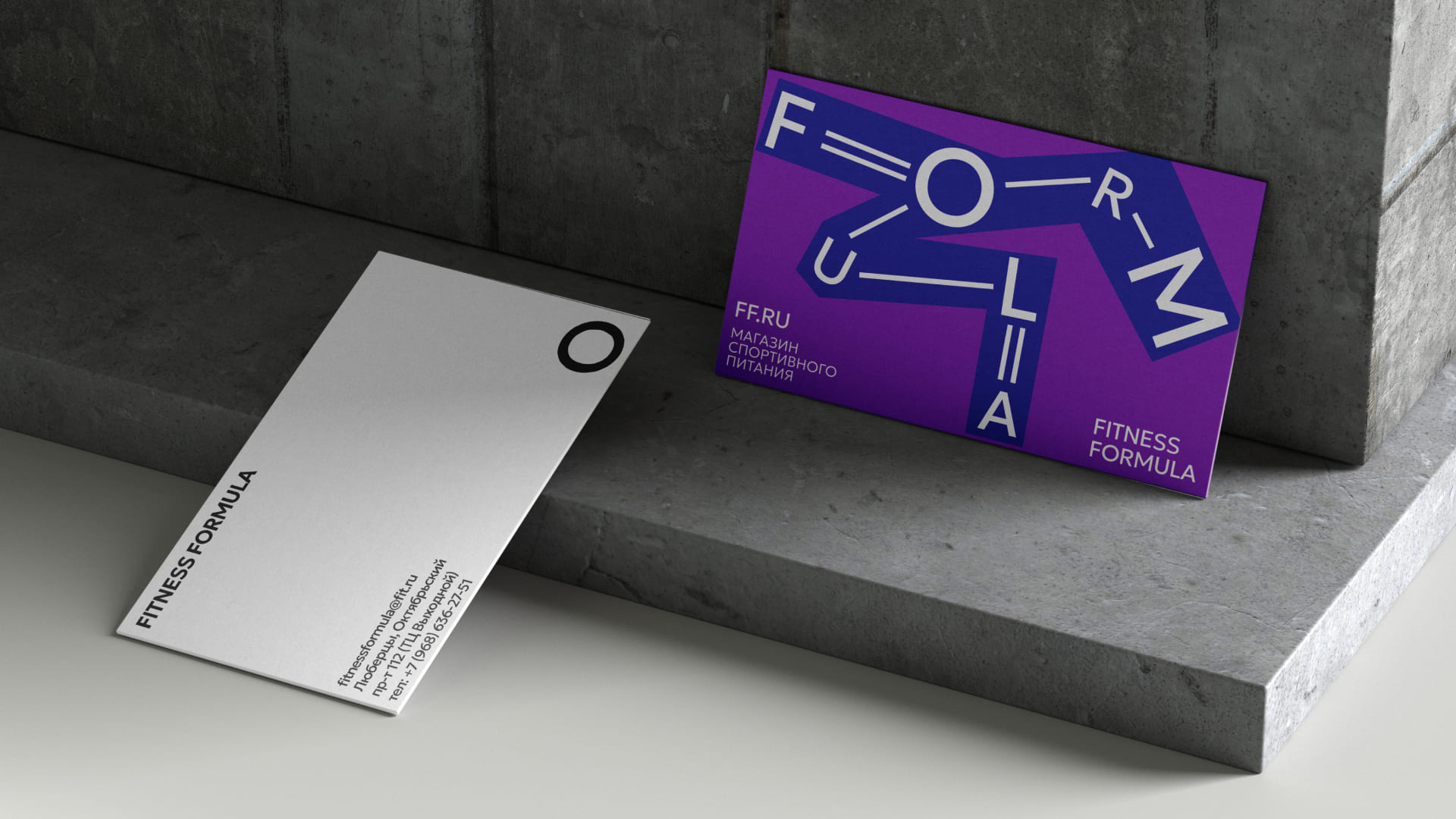
“Fitness Formula” is a chain of stores for sports and dietary nutrition, dietary supplements and accessories. It is oriented towards sports enthusiasts who maintain a balance between a beautiful body and a healthy lifestyle.
The majority of customers and clients in the store are mainly fitness enthusiasts who aim to have the ideal body and athletes who are involved in this field professionally.
According to a nationwide database study, only 30% of the population are highly involved in sports and more than 50% of the population is not consistently involved in sports, making them our ideal new audience.
The purpose of the rebranding is to attract this new audience, in the face of the average person who is not an athlete, but sometimes promises himself that he will go to the gym. The person who tries to maintain a balance between health and pleasure. His body isn’t perfect, like anything in this world, but he’s happy. Sometimes he just lacks certain vitamins or supplements, that he will be able to find in the “Fitness Formula” store.
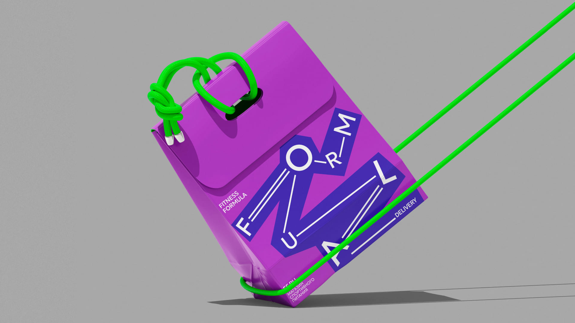
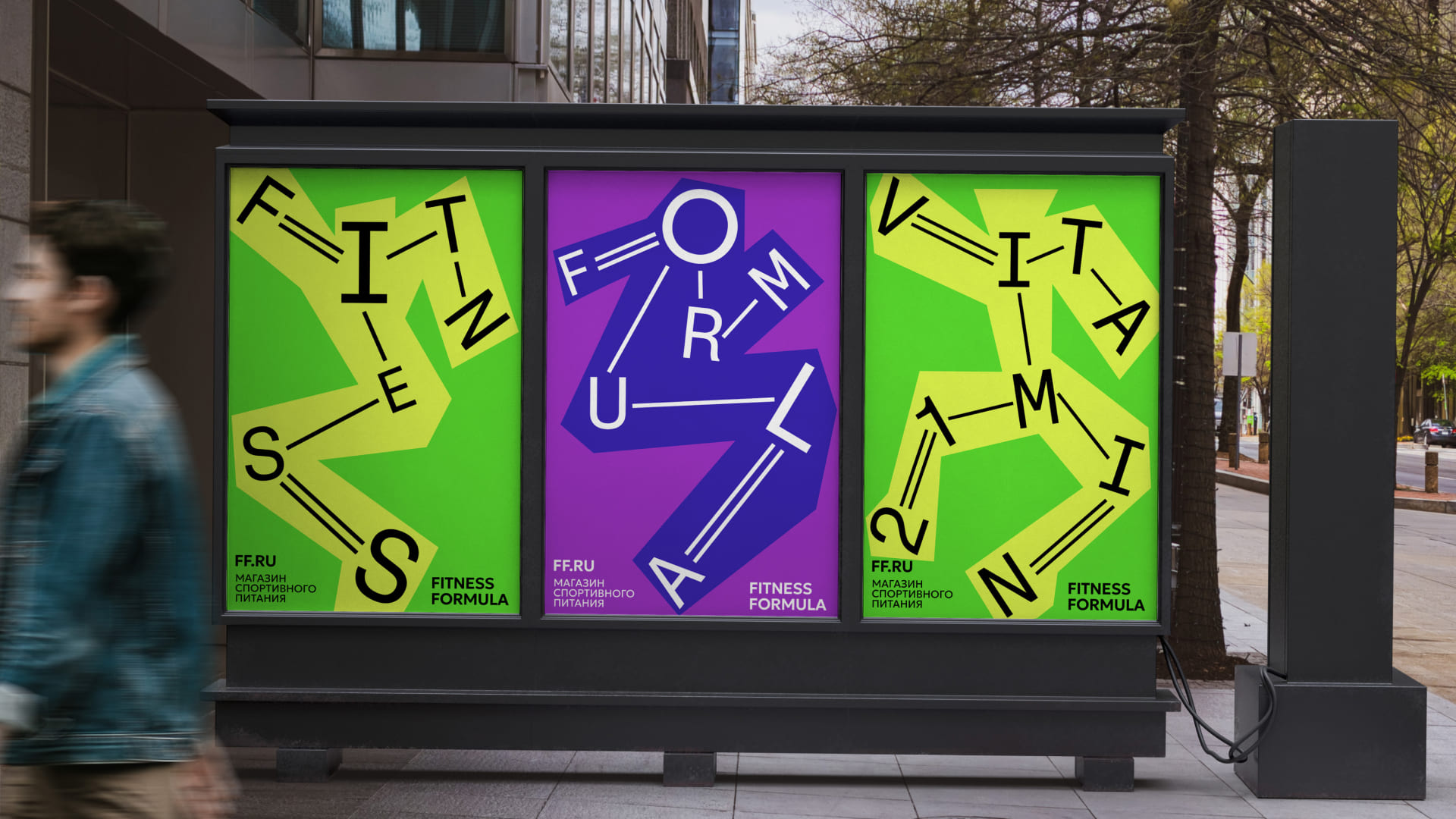
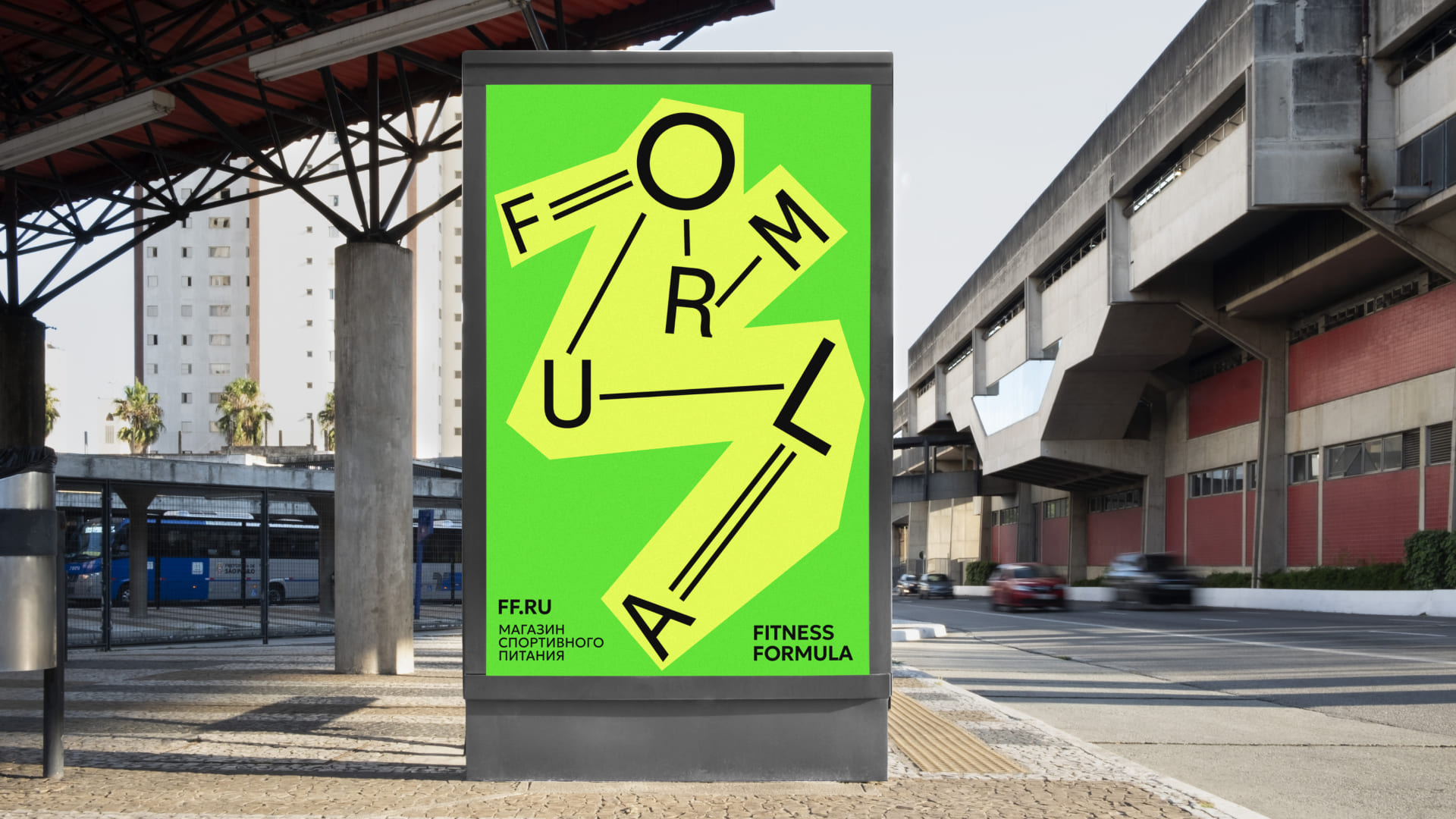
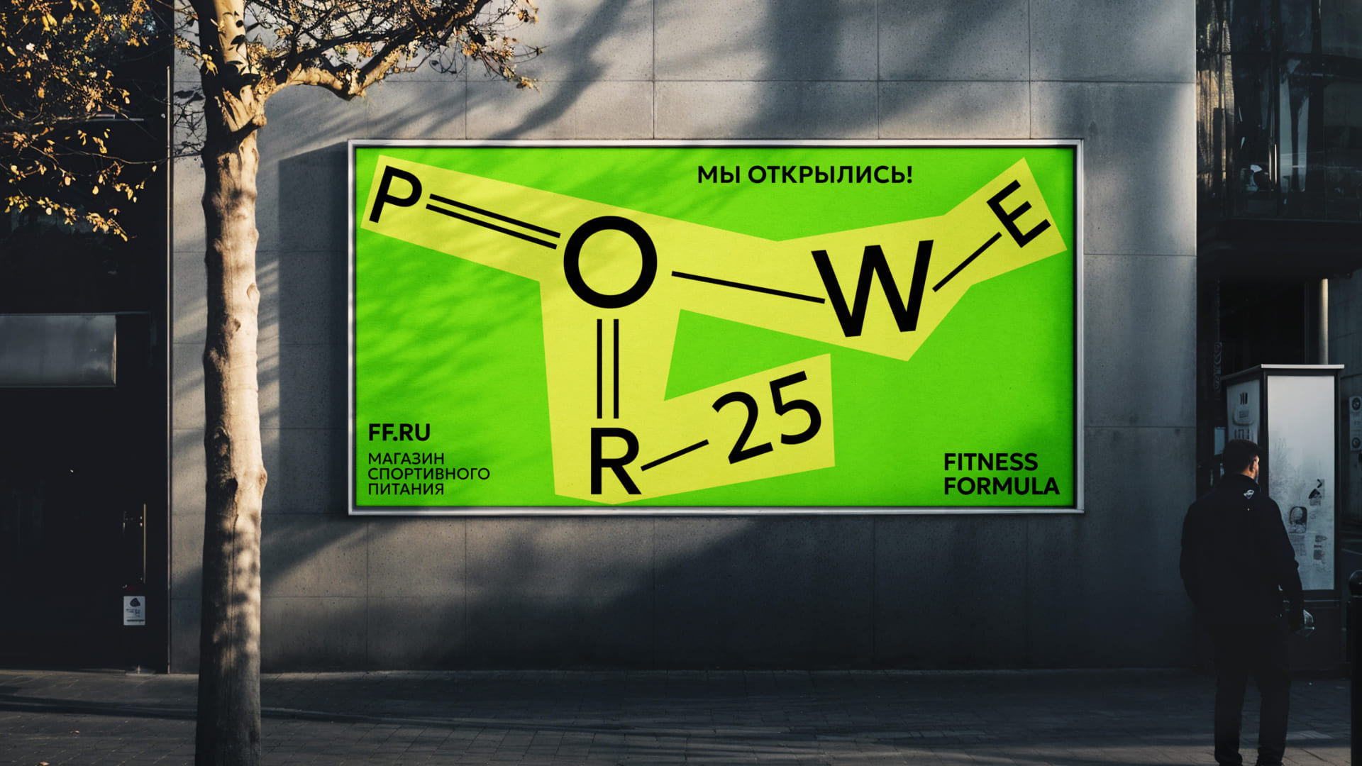
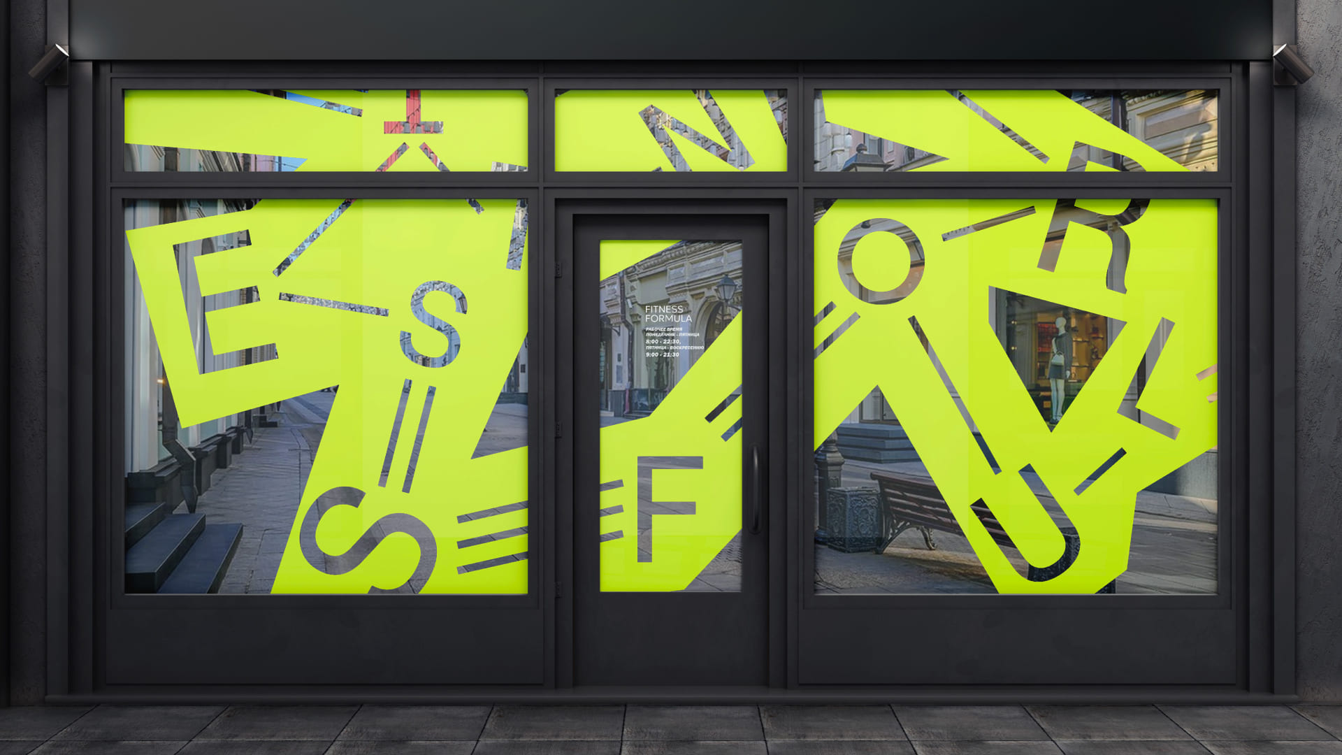
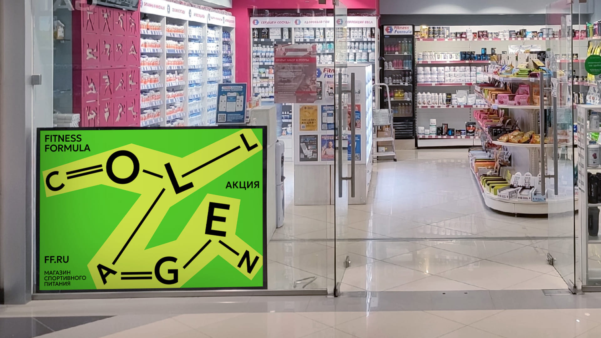
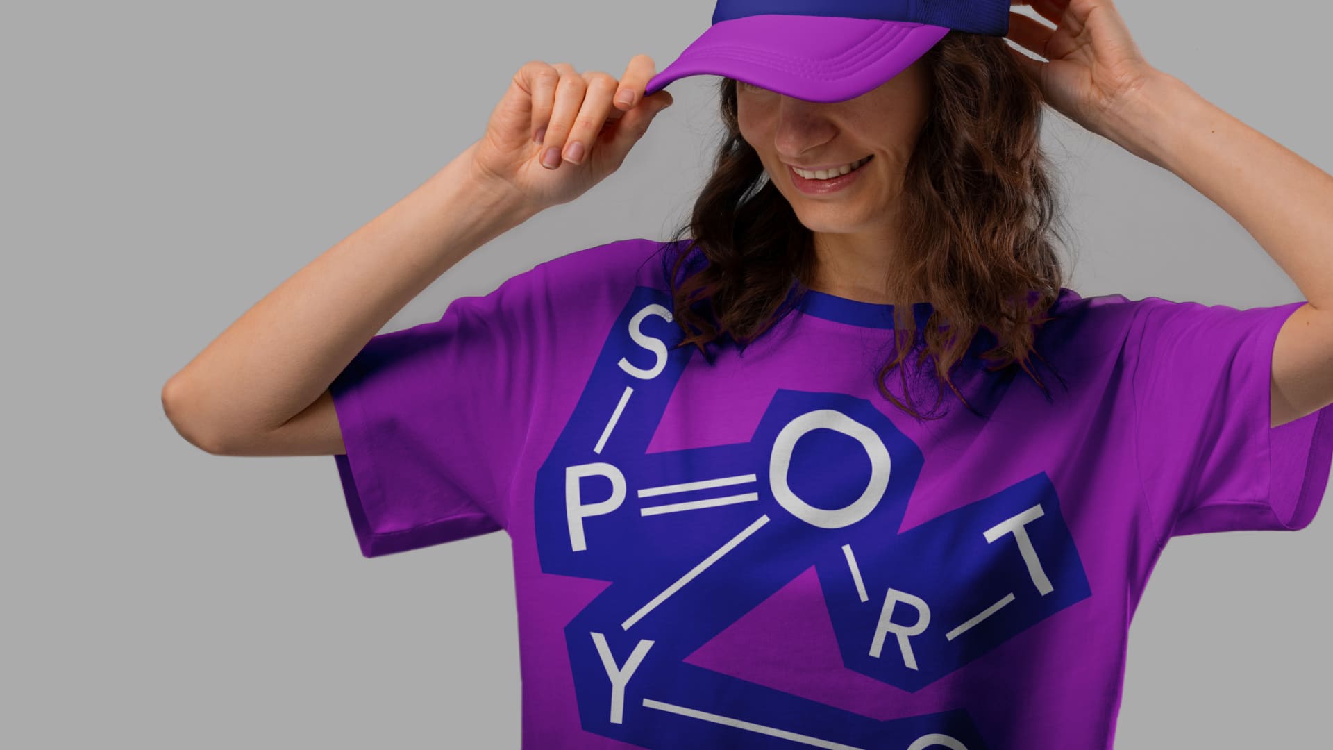
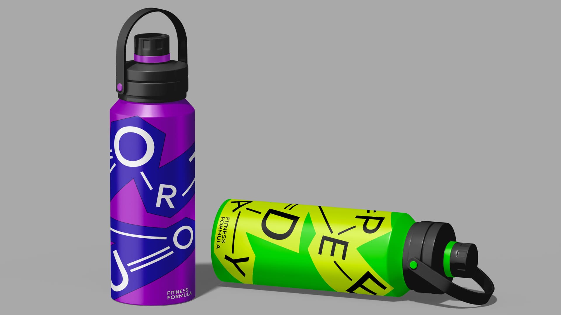
The idea of the design is based on an example of the chemical composition and structure of substances found in sports supplements and vitamins.
The sports food store aims to be open to all of its users, regardless of: whether they play sports professionally or not, what their standard is for a beautiful body, gender and the needs of the user. The shop aims to be a gathering place for all who want to improve themselves in some way and enjoy life. This is why one of the most important features of the design is that it is not sexualized in any ways and does not exemplify the bodily ideal, which does not repel or embarrass the average person. The goal was to create a neutral and emotional design that was both appealing, colourful, dynamic, and doesn’t impose the standard of an idolized body that can depress or demotivate the average person who doesn’t have the ability or the time, sometimes, to look like a model. This is why in the visuals of the design there is used typography as a tool to resemble human silhouettes, avoiding associations with body and gender standards, which is a sensitive subject for the average person.
CREDIT
- Agency/Creative: Stefka Stoykova
- Article Title: Student Stefka Stoykova Delivers a Dynamic Visual Language for Fitness Formula
- Organisation/Entity: Student
- Project Type: Identity
- Project Status: Non Published
- Agency/Creative Country: Russia
- Agency/Creative City: HSE Moscow
- Market Region: Europe
- Project Deliverables: Brand Identity
- Industry: Retail
- Keywords: Fitness, Formula, Sport
-
Credits:
Curator: Pavel Borisovsky


