


Spectra is a gaming hardware brand built for a new generation of players who demand real performance without the aggressive look typical in the industry. Designed for those who value both precision and aesthetics, Spectra offers a full range of affordable and high-end components known for their reliability, quality, and performance. The brand empowers gamers to build and play their own way, without conforming to the loud, hyper-masculine visuals often seen in gaming culture.
The brief I received for Spectra called for a minimalist, distinctive identity, something that would stand out on shelves while remaining approachable and easy to adapt across packaging and product types. Because I’m not a gamer myself, I began the project with market research, speaking with gamers to understand what they appreciated and disliked in current hardware branding. I immersed myself in the industry, analyzing competitors’ logos, colors, websites, packaging, and messaging. Since my goal was to design something different, I first needed to understand what “the same” looked like.
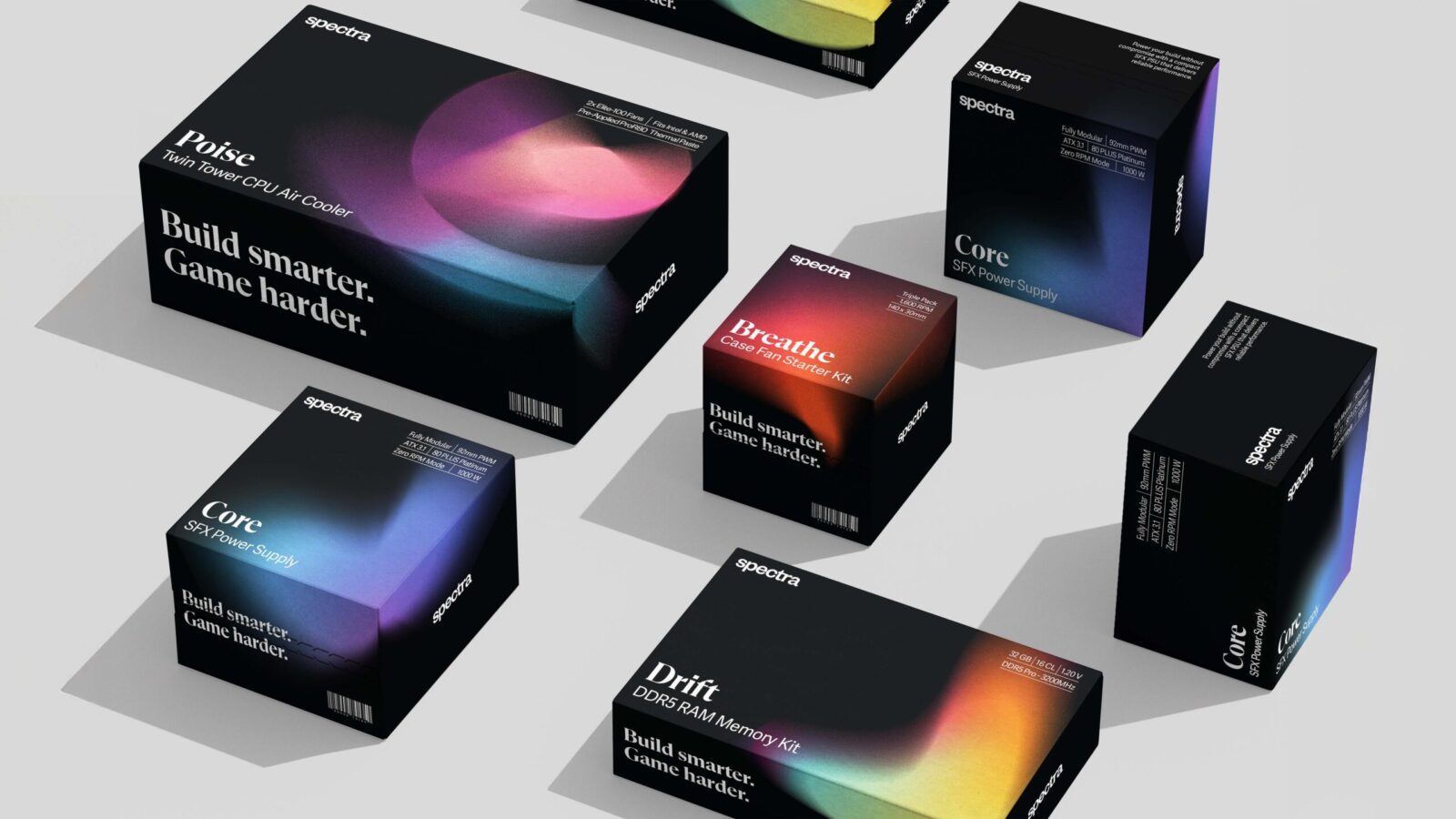
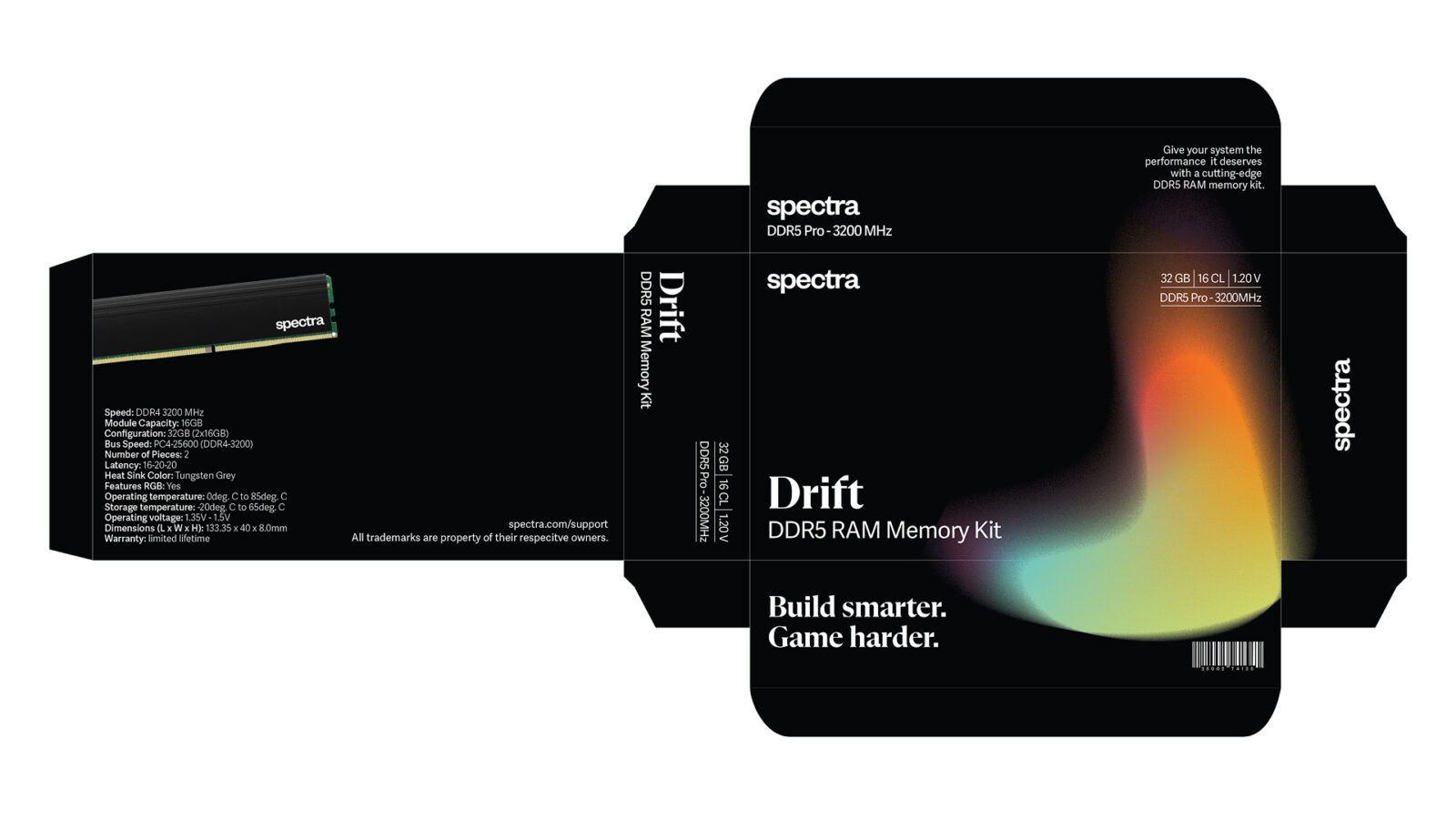
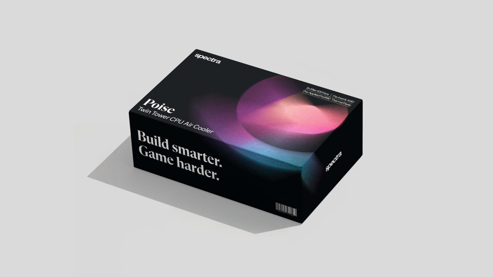
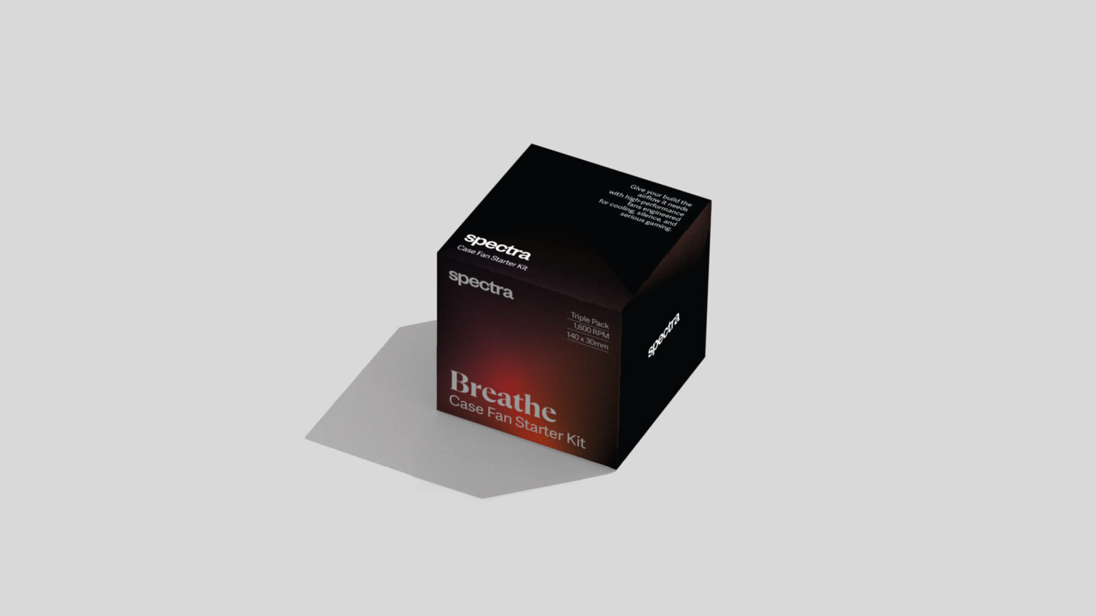
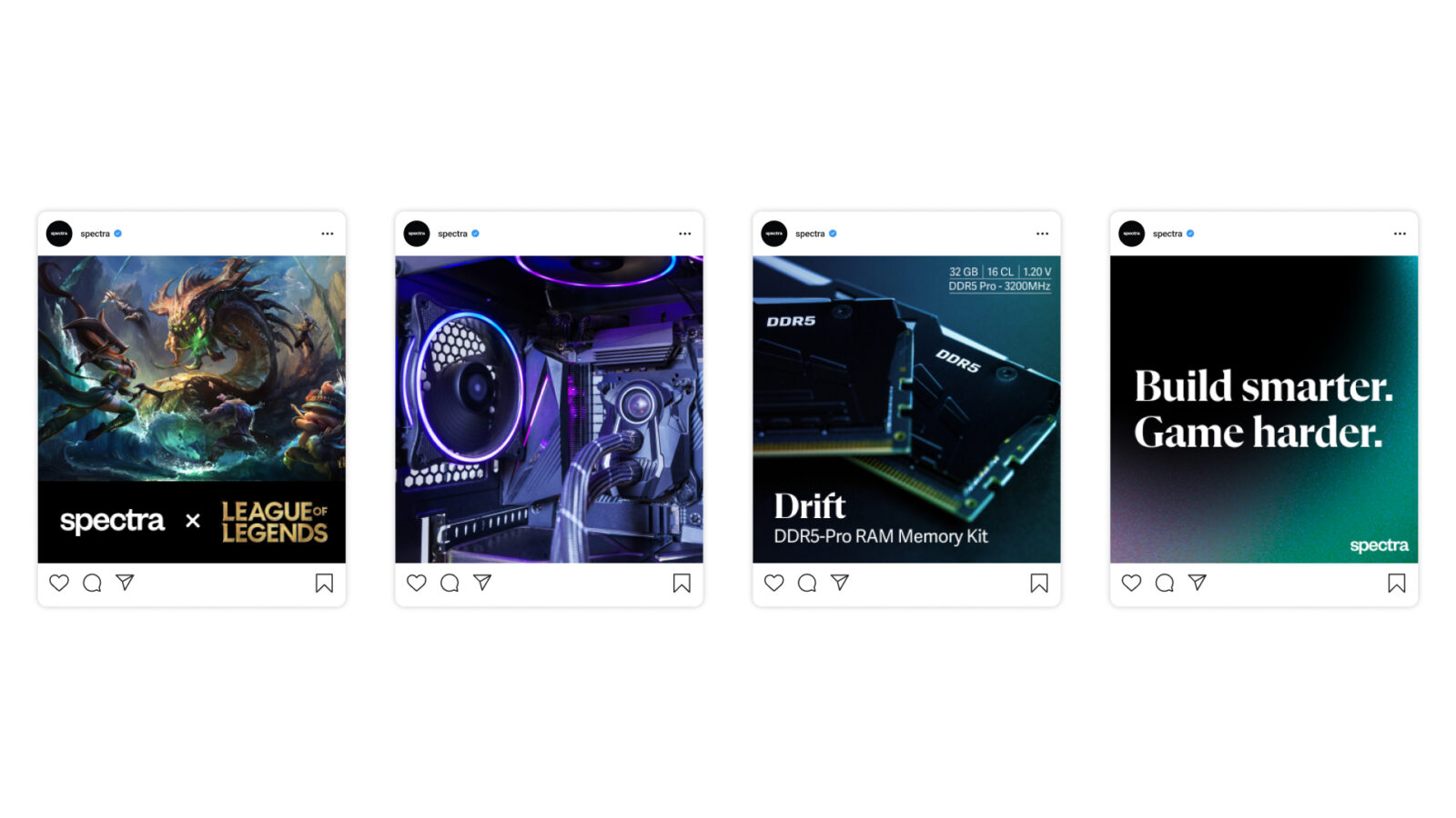
The design process started with a simple typographic logo and ligature between the letters T and R. I drew inspiration from the gaming community’s fascination with RGB lighting, aiming to capture that sense of brightness and energy while keeping the overall look refined and balanced. This led to the creation of a gradient system which includes a unique color gradient and shape for each product line. This approach gives every product its own identity while maintaining cohesive brand recognition. The gradients balance vibrancy with sophistication, adding color and energy without overpowering the design.
Set against a black background, the colors appear vivid, appealing to a primarily male audience while avoiding the stereotypical red-and-black palette often seen in gaming branding. The clean, typographic layout prioritizes clarity, allowing users to find specs and key information instantly. This minimalist approach prevents visual overload, instead emphasizing a sense of control, confidence, and performance.
Spectra’s visual language balances technical precision with calm clarity, strength without arrogance, performance without chaos. The result is a brand that feels modern, intelligent, and quietly powerful, reflecting the mindset of gamers who build with intention and play with purpose.

CREDIT
- Agency/Creative: Solène Trahand
- Article Title: Student Solène Trahand Designs Spectra to Balance Performance and Visual Restraint
- Organisation/Entity: Student
- Project Status: Non Published
- Agency/Creative Country: United States of America
- Agency/Creative City: San Diego
- Project Deliverables: Brand Design, Brand Identity, Branding, Design, Graphic Design, Identity System, Logo Design, Packaging Design
- Industry: Technology
- Keywords: WBDS Student Design Awards 2025/26 , Branding, packaging, gaming, video games


