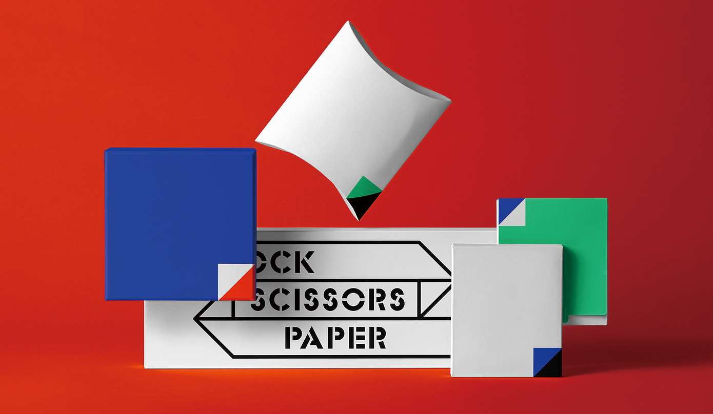
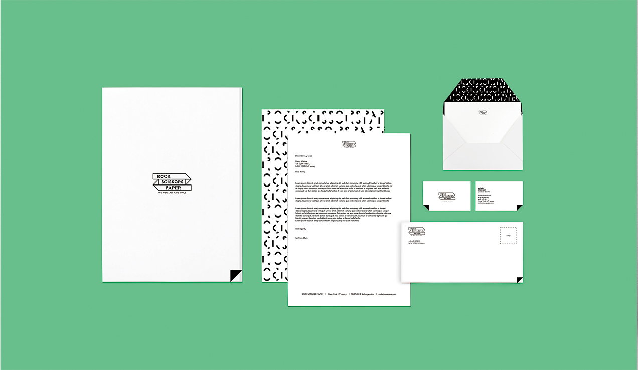
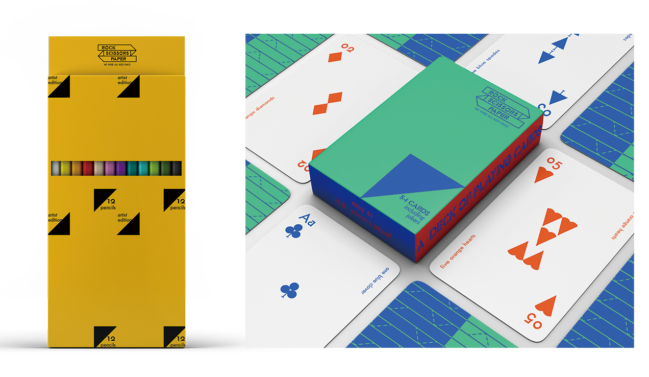
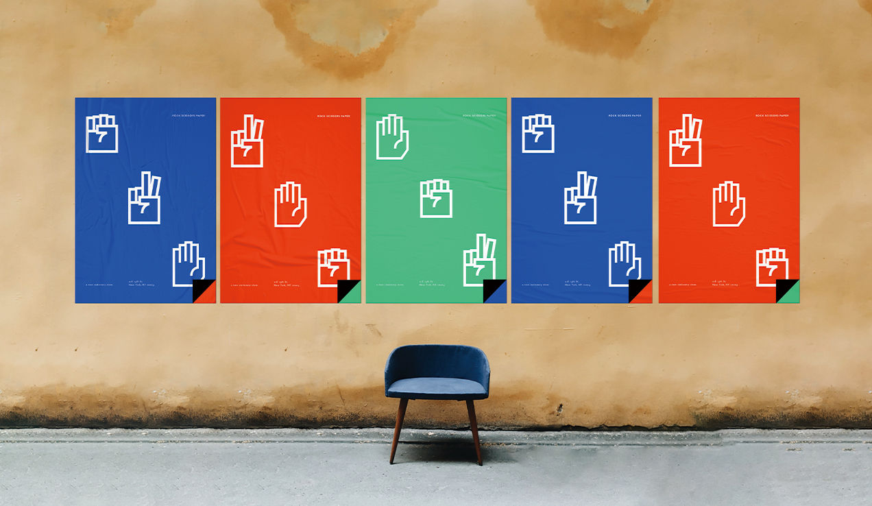
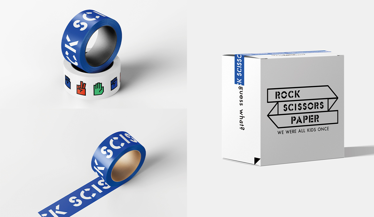
It is a new stationery brand which I named Rock Scissors Paper. I made it nostalgic, playful, and futuristic. The logo was inspired by a folded paper letter that I used to send to my friends in my school year. I set 3 representative colors that match with each word – Rock, Scissors, and Paper. I worked on brand identity, product design, space (exterior and interior), web design, posters, and media facades.
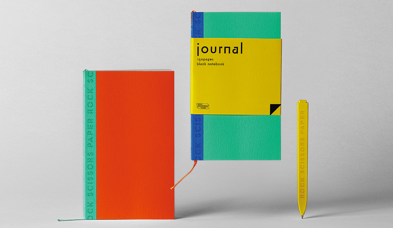
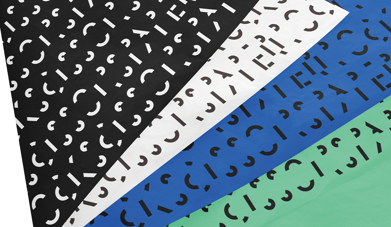
I used Futura Stencil for the type logo and the main typeface and Futura Classic for the secondary typeface. I thought the ‘Stencil’ typeface gives the feeling of handcraft which aligns well with a stationery brand. Futura Classic is from the same family as Futura Stencil. It has a good combination with each other. It gives the exact mood of futuristic and nostalgia at the same time.
I used a triangle shape as a graphic element that represents the whole brand identity. It makes people think of a normal paper as a folded one. It helps people to re-think the material of paper itself. Since the brand is a stationery one and even ‘paper’ is a part of the brand name, it’s important to make people feel the material. The little triangle is located in the bottom-right edge and mainly in black color. It can be in different colors depend on a color of a product.
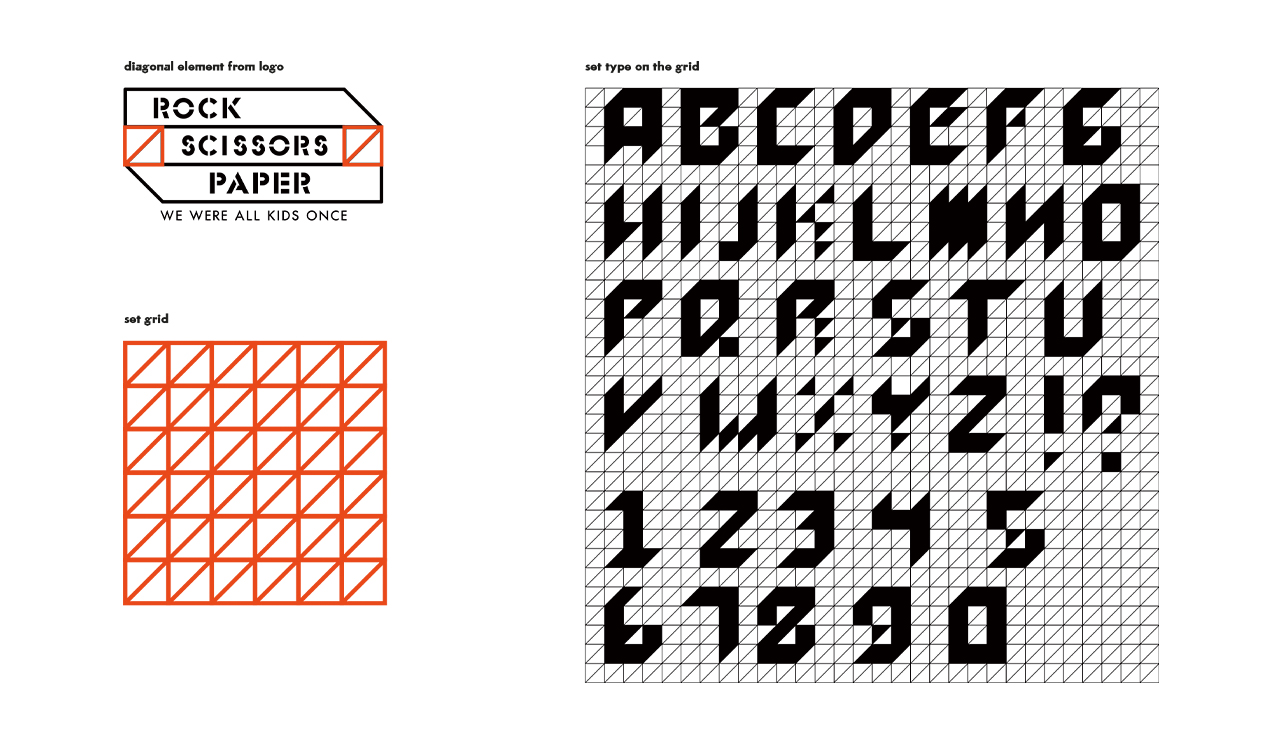
Since the physical store of the brand has a big white square storefront, I thought it’s good to use it as a billboard. I designed several media facades for a different purposes. It can give information to people on the street. It includes the date, time, or temperature of a day. Even it can tell if there is a sale ongoing. For discounting version of the facade, I designed new typefaces to use. I set grids based on the diagonal from the logo. It’s focused on catching the eyes of random people on the street. I put Ready, Set, and Play with numbers and the words share the same initial letters with Rock, Scissors, and Paper.
CREDIT
- Agency/Creative: So Youn Chun
- Article Title: Student So Youn Chun Creates Branding for New Stationery Brand Rock Scissors Paper
- Organisation/Entity: Student
- Project Type: Identity
- Project Status: Non Published
- Agency/Creative Country: United States
- Agency/Creative City: New York
- Market Region: Global
- Project Deliverables: Brand Design, Brand Identity
- Industry: Manufacturing
- Keywords: WBDS Student Design Awards 2021/22
-
Credits:
Educational Institution Name: School of Visual Arts - Advertising & Design
Educator's Name: Eric Baker


