Concept
De La Terre is a ceramics brand celebrated for its dedication to artisanal craftsmanship and the creation of products designed to last a lifetime. With a strong e-commerce presence, De La Terre seeks to connect with customers who value quality and the rich history behind handmade goods.
Approach
The design process for the De La Terre website began with a comprehensive discovery phase. This phase included a creative questionnaire to gather insights into the brand’s vision and goals, a competitive audit to understand the market landscape, and persona development to ensure the website would resonate with its target audience. The goal was to craft an immersive, one-of-a-kind e-commerce experience that not only showcases the products but also tells the compelling story behind the brand and its creations.
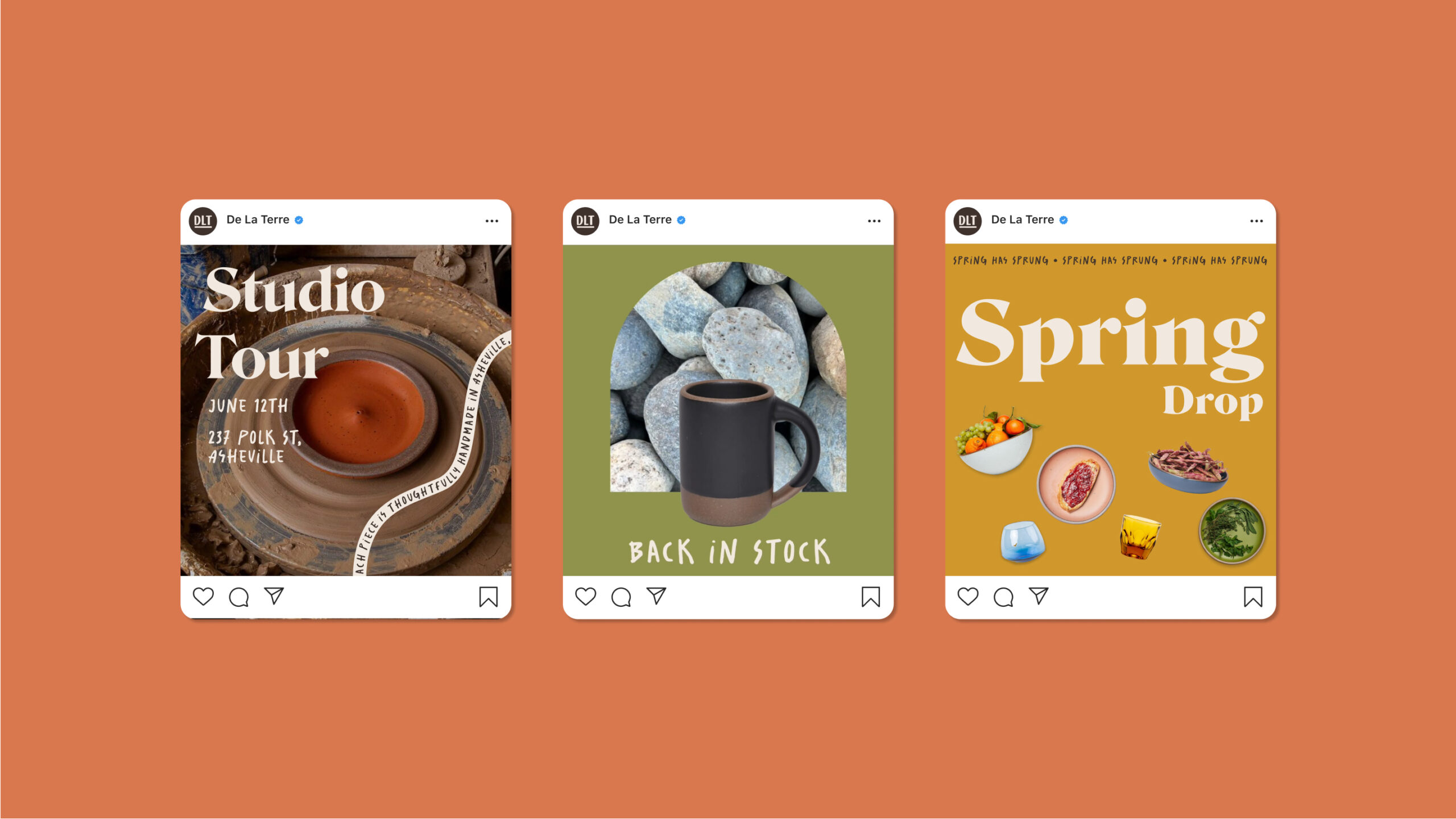
The final brand identity is anchored by an understated wordmark that reflects the brand’s focus on quality and craftsmanship. The wordmark features modified letters that have a quirky, imperfect presence, adding a touch of personality that sets De La Terre apart from more conventional brands. This uniqueness is further enhanced by a carefully curated typographic palette. The Salted typeface, a quirky handwriting font, injects a sense of individuality and warmth into the brand. This is balanced by the use of Roslindale and Publico typefaces, which provide a more refined and trustworthy look, reinforcing the brand’s commitment to quality.
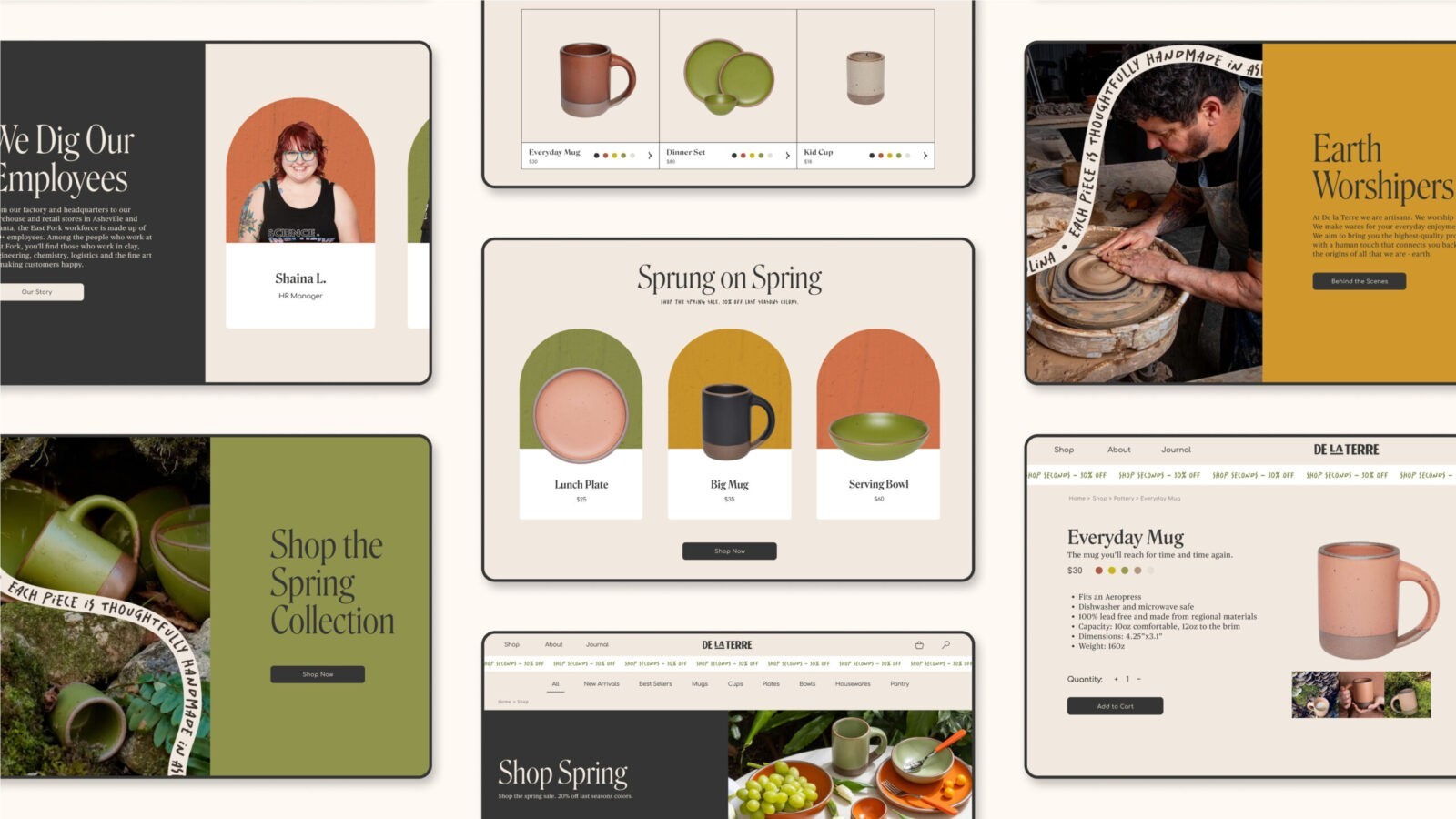
The website design for De La Terre is rich in visual language, with elements that draw the user into the brand’s world. Animated type-on-a-path, tombstone image frames, and engaging micro-interactions create a dynamic and interactive user experience. The color palette was meticulously chosen to align with the rustic spirit of the brand and its ceramic products, using earthy tones that evoke a sense of warmth and authenticity.
Imagery plays a crucial role in the website’s storytelling, featuring scenes from the crafting process that highlight the artisanal nature of the products. These visuals not only showcase the beauty of the ceramics but also immerse the viewer in the story of how each piece is made, reinforcing the brand’s dedication to artisanal craftsmanship.


CREDIT
- Agency/Creative: Sarah Minarik
- Article Title: Student Sarah Minarik Creates Digital Design for De La Terre E-Commerce Platform
- Organisation/Entity: Student
- Project Status: Non Published
- Agency/Creative Country: United States of America
- Agency/Creative City: San Diego
- Project Deliverables: Digital Application, Graphic Design
- Keywords: WBDS Student Design Awards 2024/25 , Digital Design: E-Commerce
- Keywords: WBDS Student Design Awards 2024/25
-
Credits:
Educational Institution: San Diego City College
Educator's Name: Sean Bacon & Bradford Prairie


