


Papalote Mexican Restaurant
Papalote is a contemporary Mexican restaurant concept rooted in authenticity, nostalgia, and the festive culture of Mexico. The name “Papalote” meaning kite, carries symbolic weight since papalotes in Mexico are playful, handmade, crafted with care, and always dancing with the wind. It felt perfectly aligned with the brand: grounded in tradition yet moving freely.
Solution
The visual strategy centers on the handcrafted style of Mexican street lettering and signage. Bold colors, lively character, and expressive forms shape the identity, and by incorporating these raw influences together into a clean, consistent system, the brand feels both culturally authentic and highly functional for a modern dining setting.
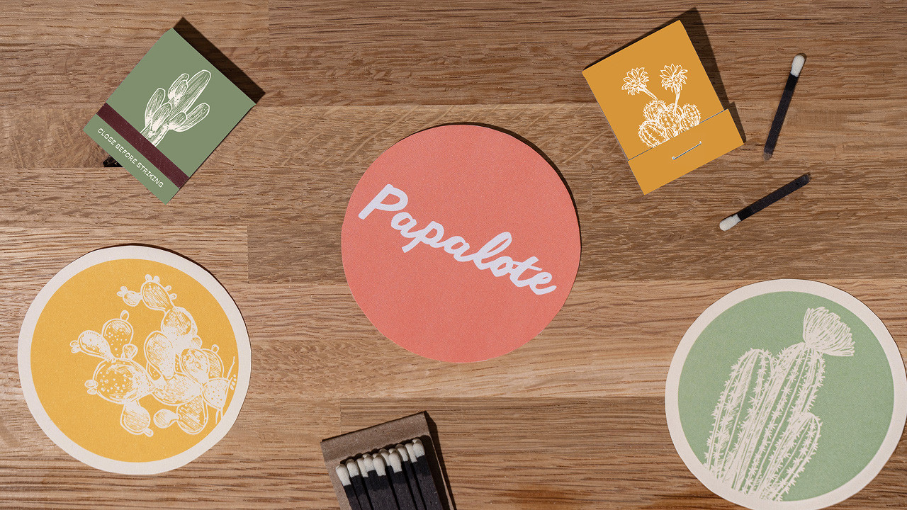
The Papalote wordmark logo draws directly from rotulos, the hand-painted lettering seen throughout the streets of Mexico. Its intentionally imperfect, energetics forms add a sense of movement that sets the tone for the entire brand.
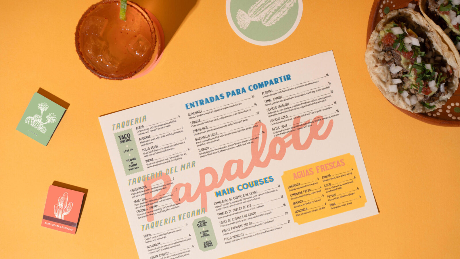
The menu design reflects the vibrancy and richness of Mexican food culture. Its typographic system uses multiple typefaces, intentionally echoing the eclectic combinations found in Mexican street visuals. This creates a clear hierarchy while giving the brand a friendly, expressive personality across all printed materials.
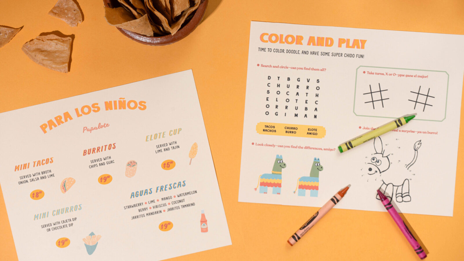
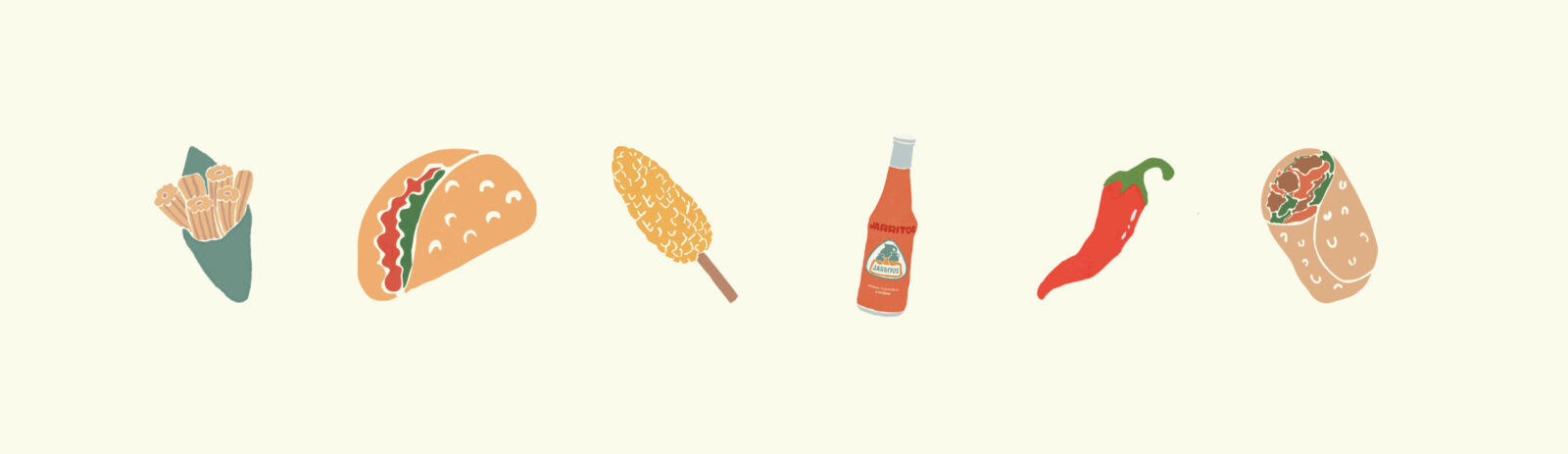
To extend Papalote’s warmth and accessibility, I designed a kids menu supported by a set of hand-drawn style illustrations of simple, traditional Mexican foods. The playful line work and soft palette naturally ties back to the brand’s handcrafted identity and make the experience inviting for the younger diners while keeping everything cohesive.
Social media also plays a key role in bringing the identity to life. Bold, colorful typography and subtle motion captures the brand’s vibrancy, while the blend of Spanish and English words keeps communication authentic and relatable to a wider audience.
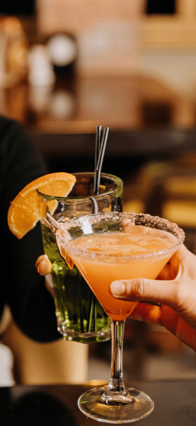
Overall, Papalote celebrates Mexican visual culture through a fresh, modern lens. It honors tradition with intention while offering a playful, memorable experience that stands out within contemporary restaurant branding.

![]()

CREDIT
- Agency/Creative: Renata Gutierrez-Garcia
- Article Title: Student Renata Gutierrez-Garcia Celebrates Mexican Street Lettering in the Identity of Papalote
- Organisation/Entity: Student
- Project Status: Non Published
- Agency/Creative Country: United States of America
- Agency/Creative City: San Diego
- Project Deliverables: Brand Creation, Brand Design, Brand Identity, Brand Naming, Design, Graphic Design, Illustration, Logo Design, Photography, Photography Styling
- Industry: Hospitality
- Keywords: WBDS Student Design Awards 2025/26 , cultural, vibrant, contemporary, colorful, bright, branding, illustration


