Planet sushi is a new Japan, a favorite restaurant that keeps up with the times and the development of culture. Japan now is not only about cherry blossoms, samurai and geisha, modern Japan is about diversity, grotesque, contradiction, high technology.
Brand positioning: The rebranding of the restaurant chain was carried out in order to expand the target audience, to show what was long overdue in the DNA of the brand, but was not broadcast through design. When you come to the Planet Sushi, you find yourself in another world and encounter other impressions — you can feel special during everyday life, become the main character of the film, catch life and taste its diversity.
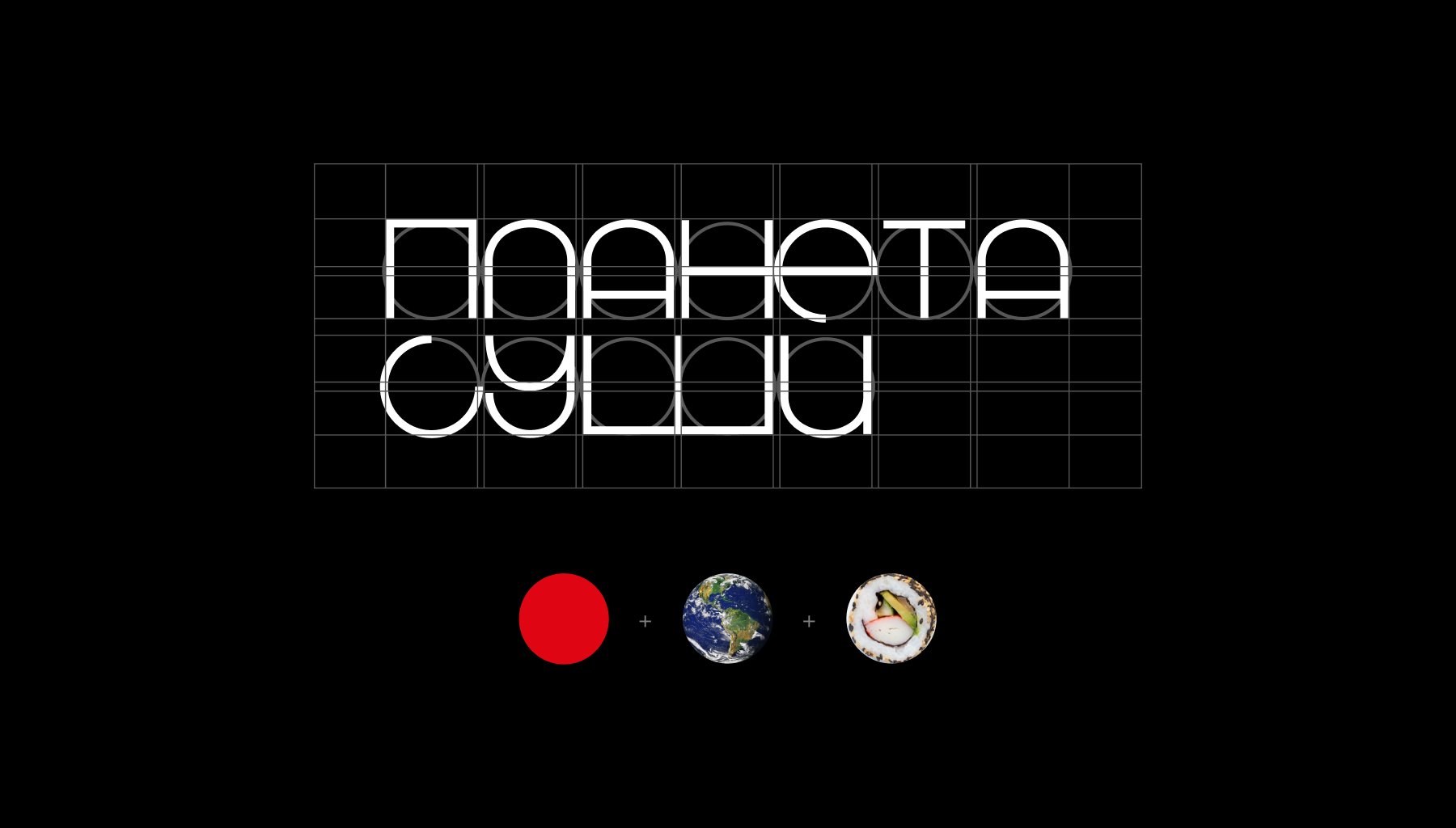
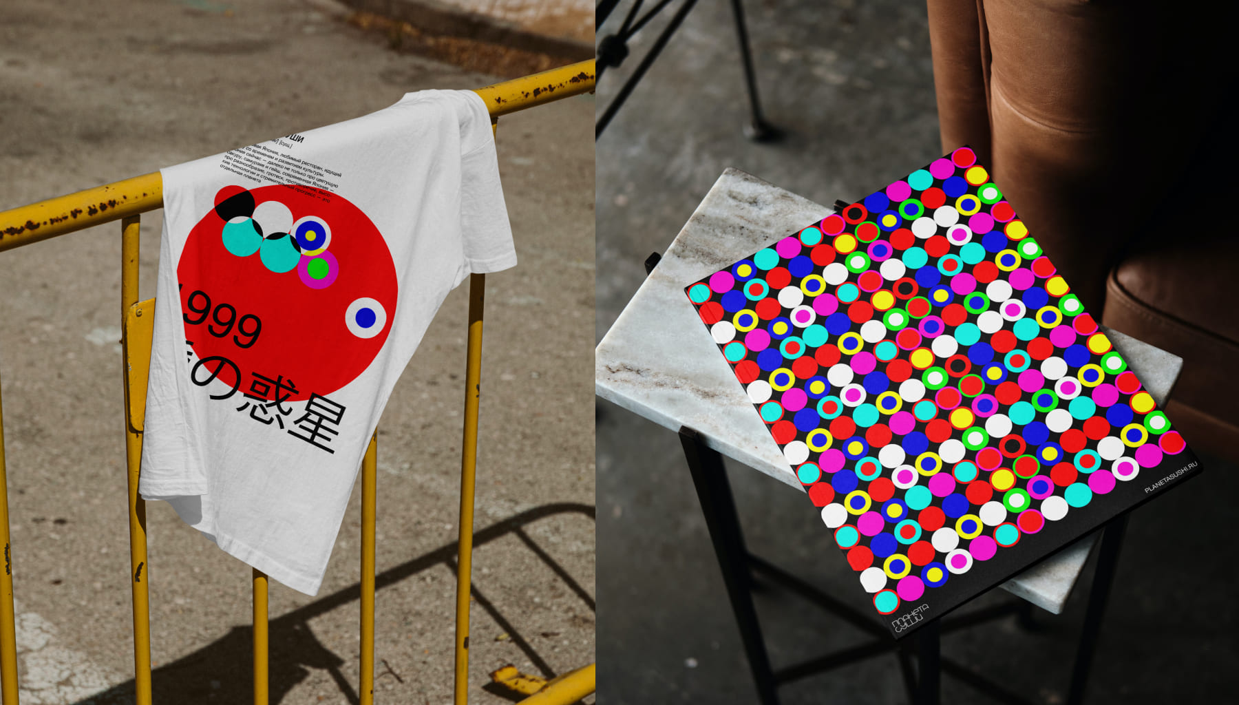
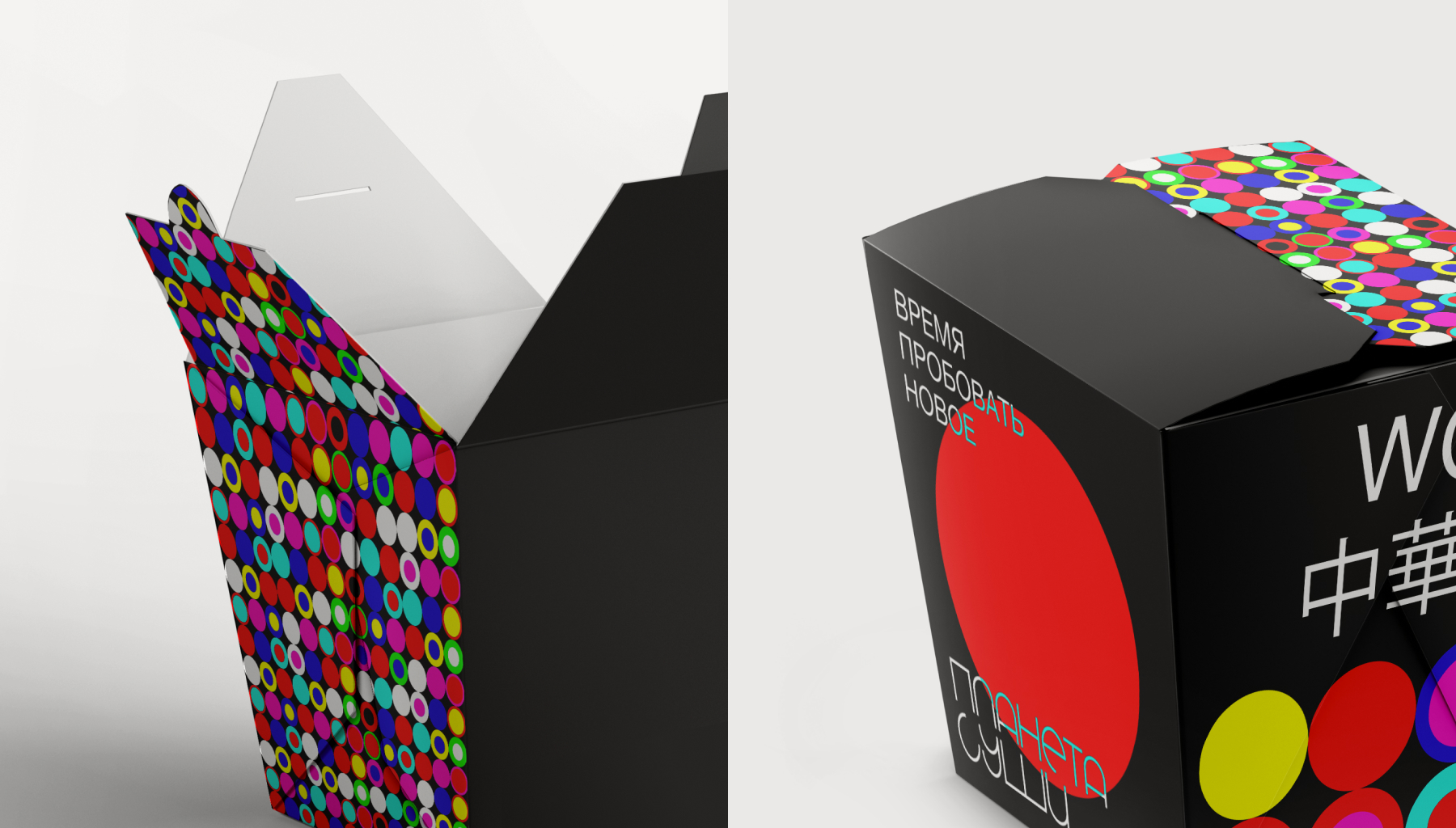
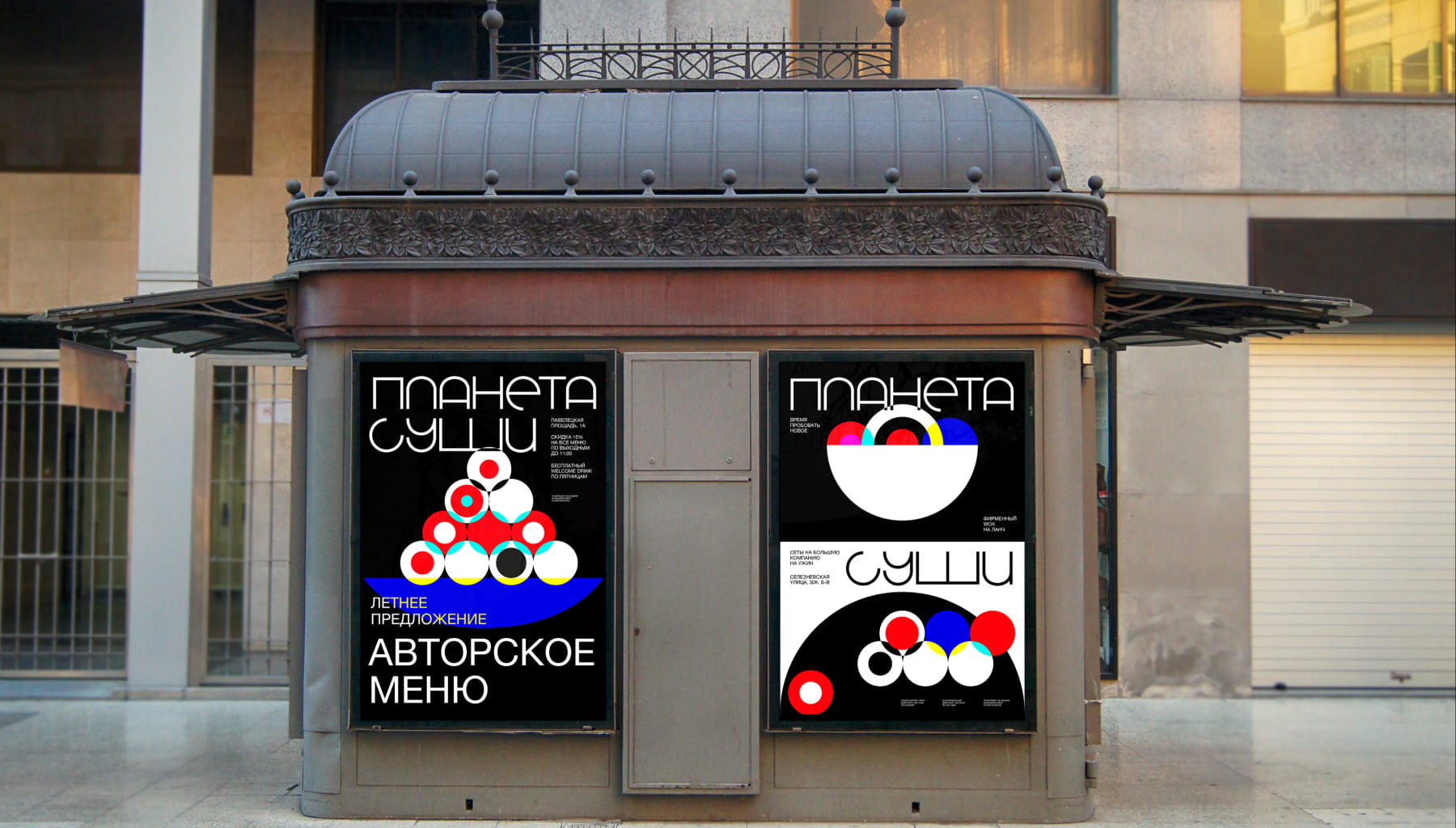
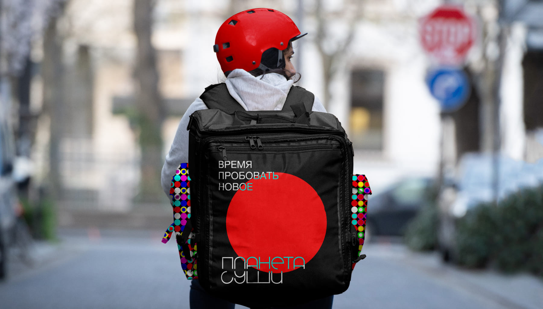
Visual image: A circle was chosen as the basis of the identity: the rising sun on the flag of Japan, the shape of the rolls and the simplified shape of the planet. The visual image is based on the technique of applying colors by Karel Martens, to achieve the effect of the lights of Tokyo at night — a new, diverse and bright Japan.
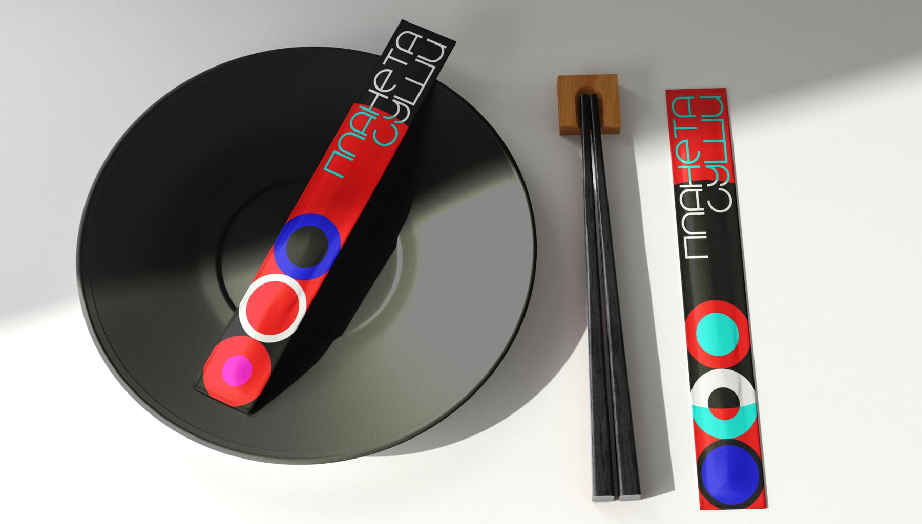
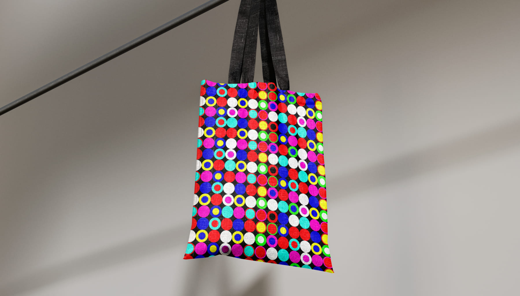
Colour palette: The colour palette consists of bright and contrasting shades that together make up a harmonious composition — like thousands of different signs, lights and tabloids.
Style scaling: The multicoloured circles are formed into a pattern that scales to any format. The circle can also be used as an independent element with a typographic composition, and collected in an illustration.
CREDIT
- Agency/Creative: Veronika Potapova
- Article Title: Student Rebranding of the Planeta Sushi Restaurant Chain by Veronika Potapova
- Organisation/Entity: Student
- Project Type: Identity
- Project Status: Non Published
- Agency/Creative Country: Russia
- Agency/Creative City: Moscow
- Market Region: Global
- Project Deliverables: Art Direction, Brand Identity, Identity System, Illustration, Logo Design, Rebranding
- Industry: Food/Beverage
- Keywords: branding, brand identity, rebranding, restaurant
-
Credits:
Tutor: Pavel Borisovsky


