


Make/Shift is the 2025 California College of the Arts MFA Design Thesis Exhibition. Its identity draws from the duality of its name: to make and to shift. At once generative and transitional, it reflects how design students respond to changing worlds while shaping new ones.
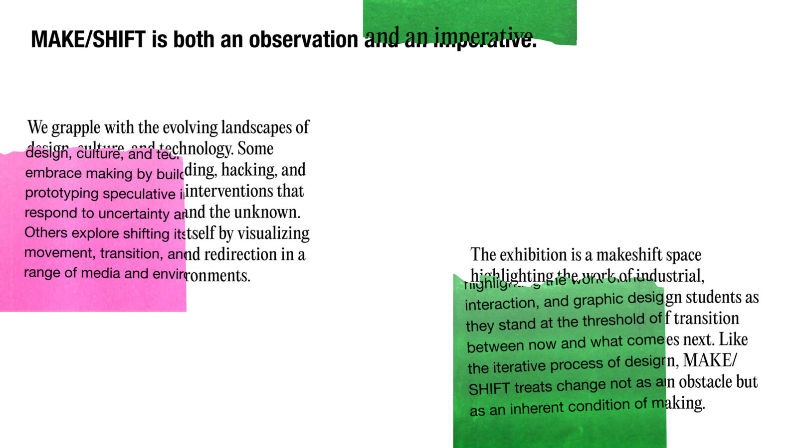
The exhibition itself was a makeshift space, presenting the work of industrial, interaction, and graphic design students at a moment of transition, between study and practice, present and future. Like design itself, Make/Shift frames change not as an obstacle but as the very condition of making.
As part of the graphics team, I helped develop a system that could hold the plurality of student projects across industrial, interaction, and graphic design. The result is an identity that is flexible, immediate, and alive to the constant negotiations between making and shifting.
THE VISION
A dynamic exhibition identity that is collaborative, and reflective of the conditions of design in our studio, embracing change not as disruption but as a mode of practice.
Make/Shift signals transition: students moving from inquiry to resolution, from school to practice, from speculation to action. The identity needed to visualize that tension between the temporary and the permanent, the iterative and the resolved.
VISUAL LANGUAGE
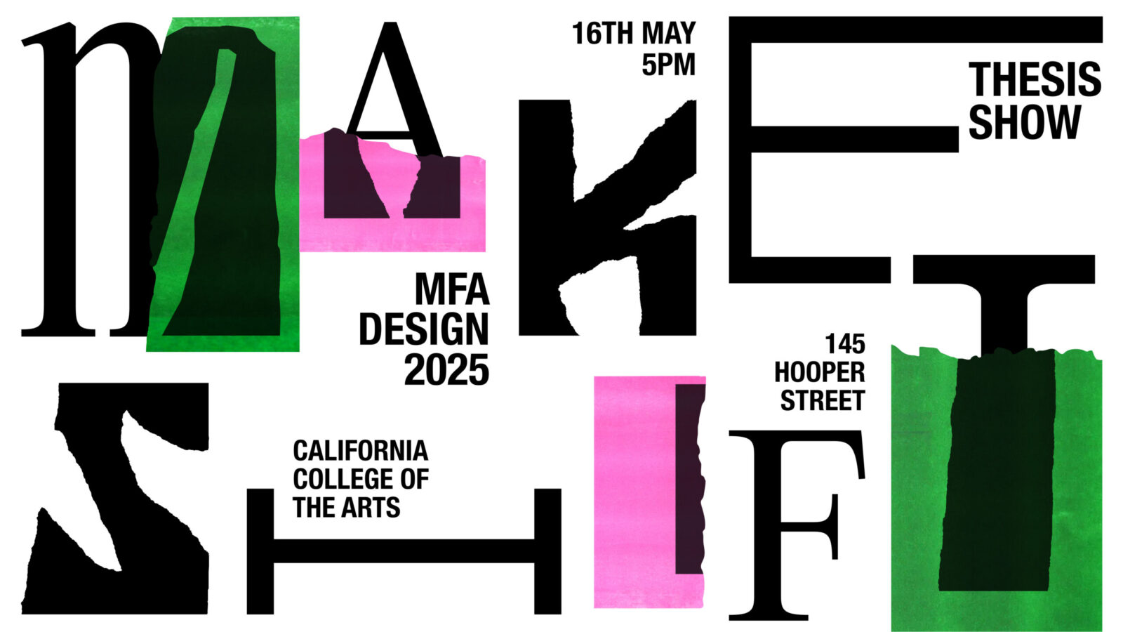
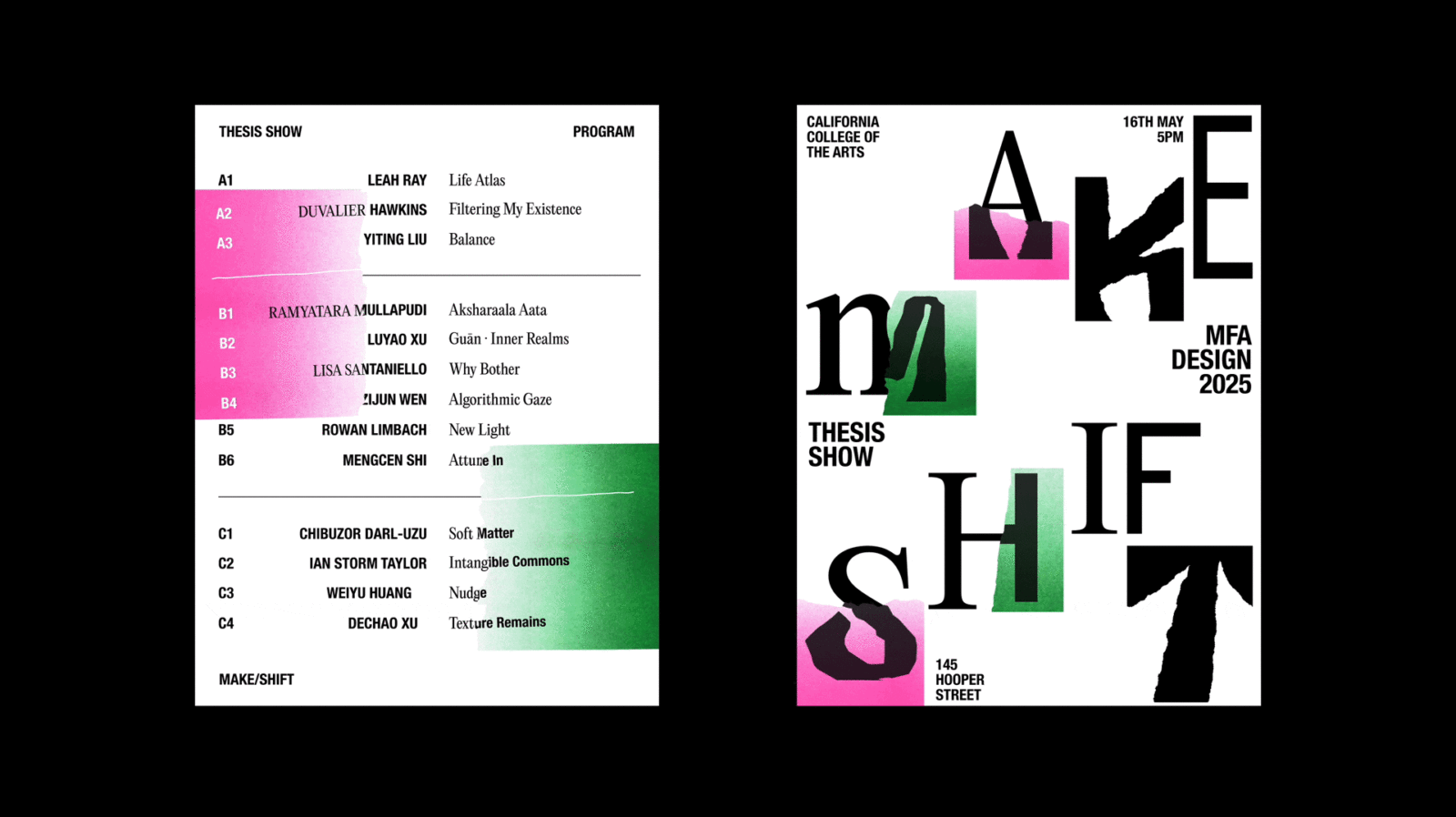
Fragmented in form, layered in transition.
The identity builds from tearing, layering, and recomposition, visual gestures that embody making and shifting. Risograph printing introduces grain, overprints, and imperfections, lending the system a tactile quality that embraces process.
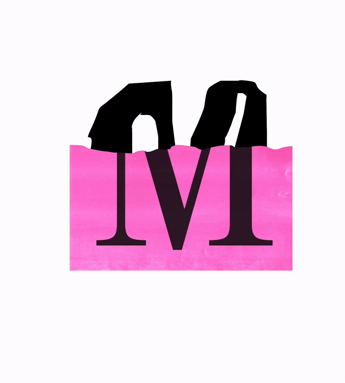
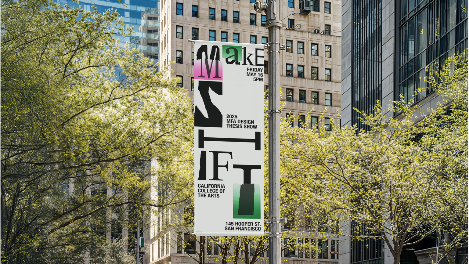
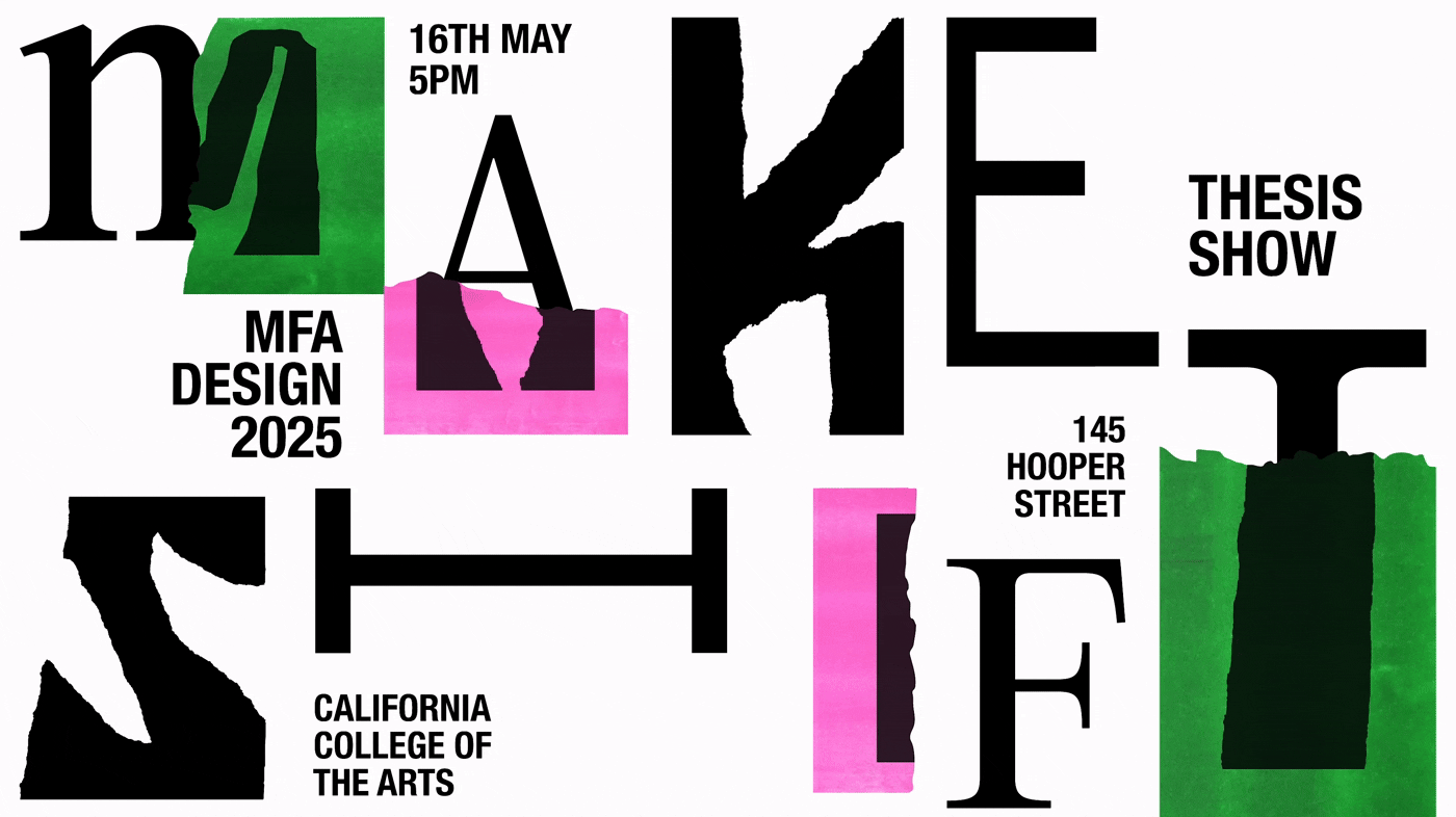
The palette uses gradients of riso fluorescent pink and green against stark black and white, capturing the tension between bold immediacy and structured order. Typography juxtaposes serif and neo-grotesk letters with imperfect, cut and ripped letters, fractured and recombined to reflect the act of rearranging parts into new wholes.
EXHIBITION TRANSLATION
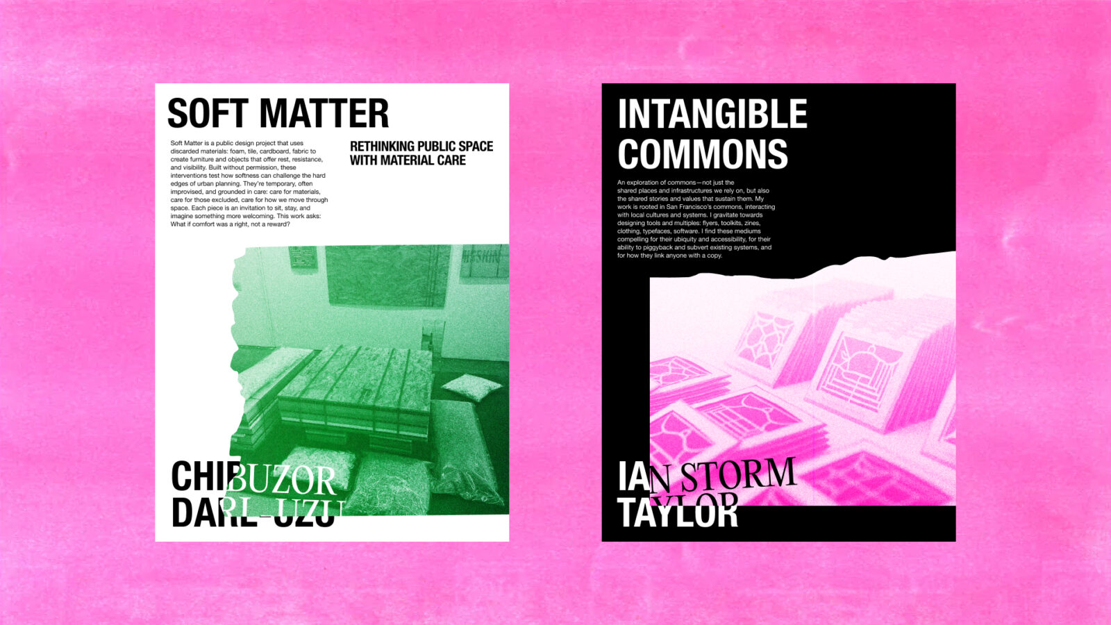
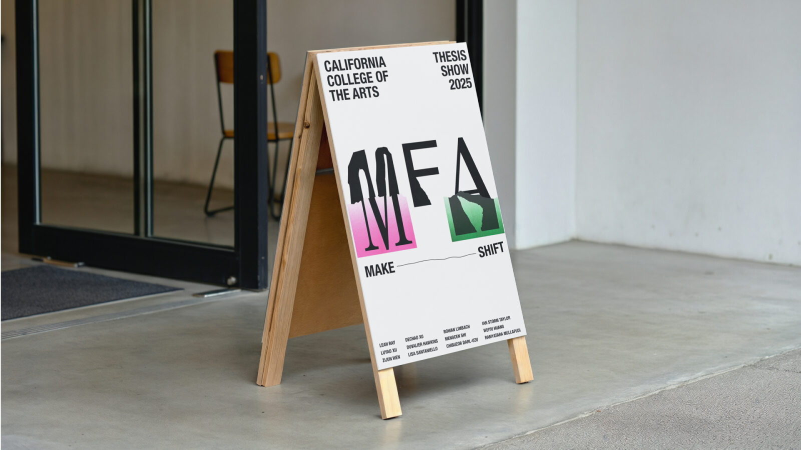
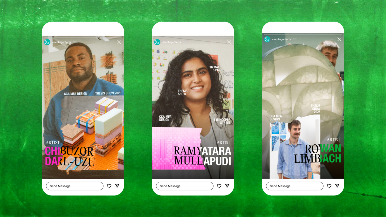
The identity extended across posters, programs, signage, and social media. Layouts play with disfunction and process, letters split, torn, or shifted off grid, creating a sense of instability and discovery that mirrors the transition from student to practitioner.
Printed matter brings tactility, with risograph overprints adding texture and imperfection. Motion graphics push these shifts further, animating type in constant reconfiguration. Online, the system translates into dynamic layouts that echo the layered, physical qualities of the print identity.
Rather than providing a single fixed look, the system created a shared vocabulary of disruption and reassembly, coherent yet never static.
IMPACT
Celebrating flux.
Make/Shift gave over thirty thesis projects a unifying frame while honoring their individual directions. The identity amplified the energy of the graduating class by treating change as its central material, visible in jagged edges, shifting layers, and riso textures.
By leaning into imperfection and transition, the system positioned the exhibition as both a culmination and a launch, celebrating design not as resolution but as a practice always in motion.

CREDIT
- Agency/Creative: Ramyatara Mullapudi
- Article Title: Student Ramyatara Mullapudi Shapes the Make/Shift Identity for a Design World in Transition
- Organisation/Entity: Student
- Project Status: Non Published
- Agency/Creative Country: United States of America
- Agency/Creative City: San Francisco
- Market Region: San Francisco
- Project Deliverables: Branding, Exhibition Design, Identity System, Motion Graphics, Poster Design, Typography, Writing
- Industry: Education
- Keywords: WBDS Student Design Awards 2025/26 , Identity Design, Exhibition, Typography, Expressive, Risograph
-
Credits:
Designer: Ramyatara Mullapudi
Designer: Ian Storm Taylor
Writer: Lisa Santaniello


