


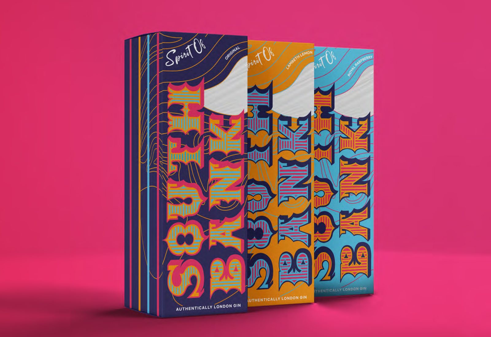
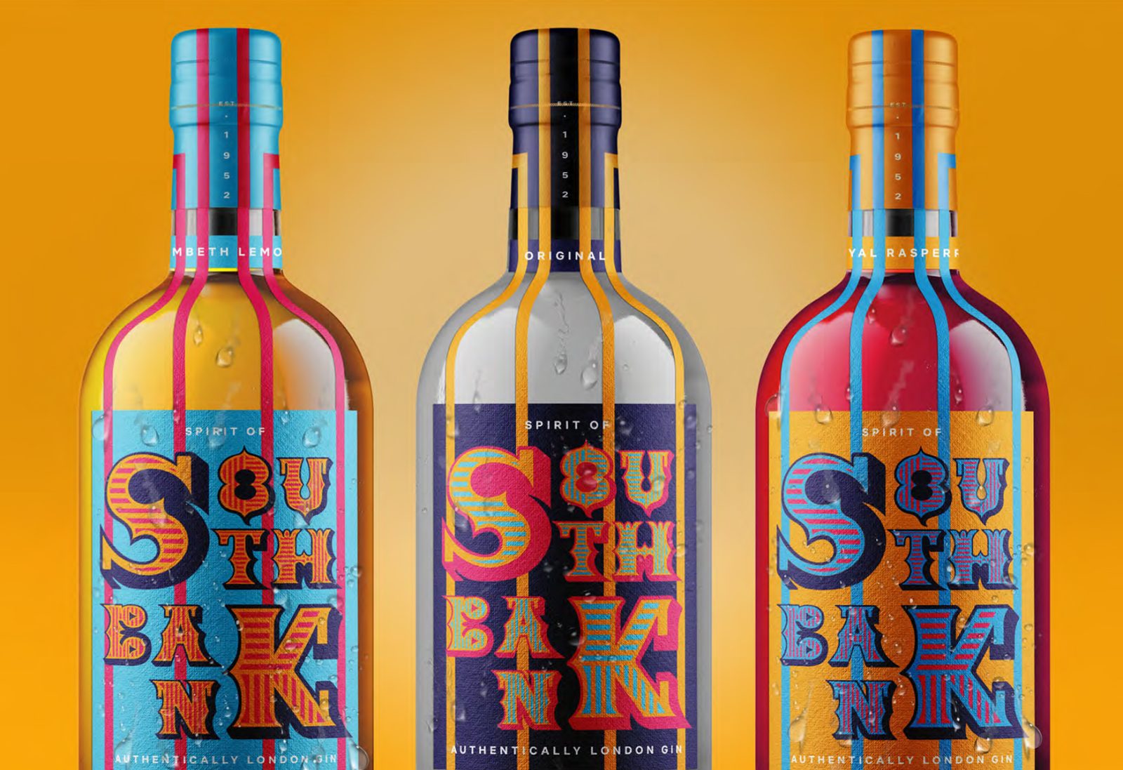
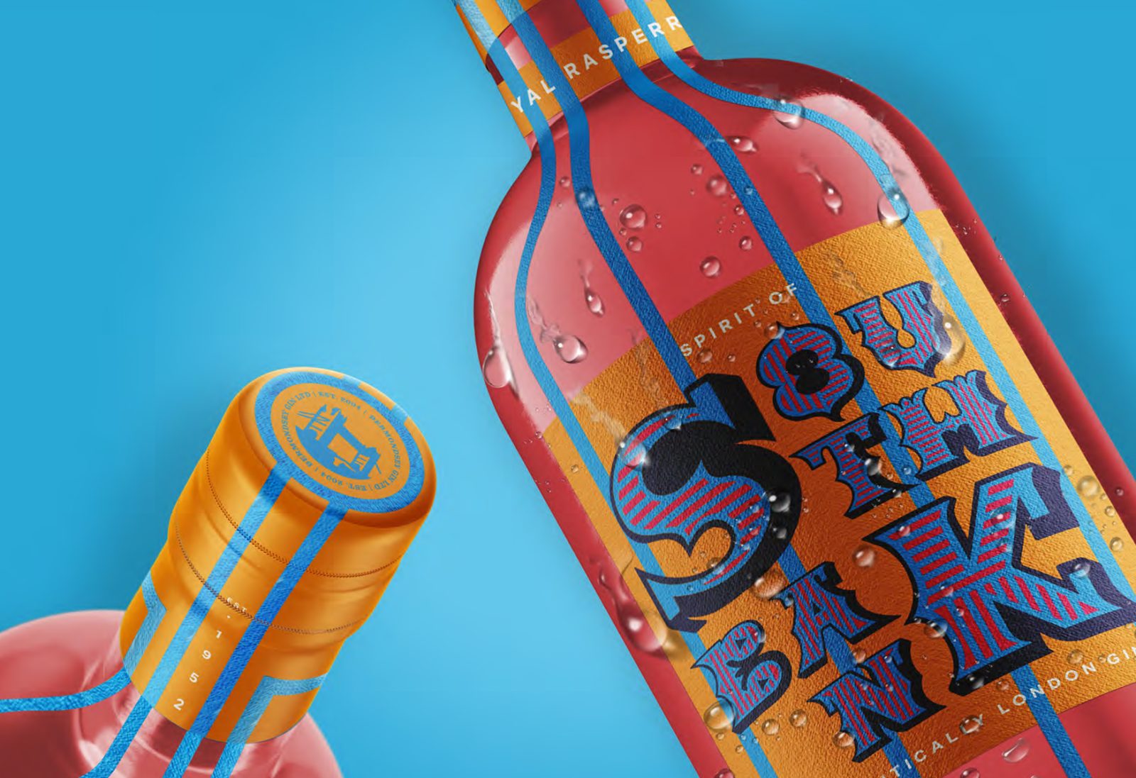
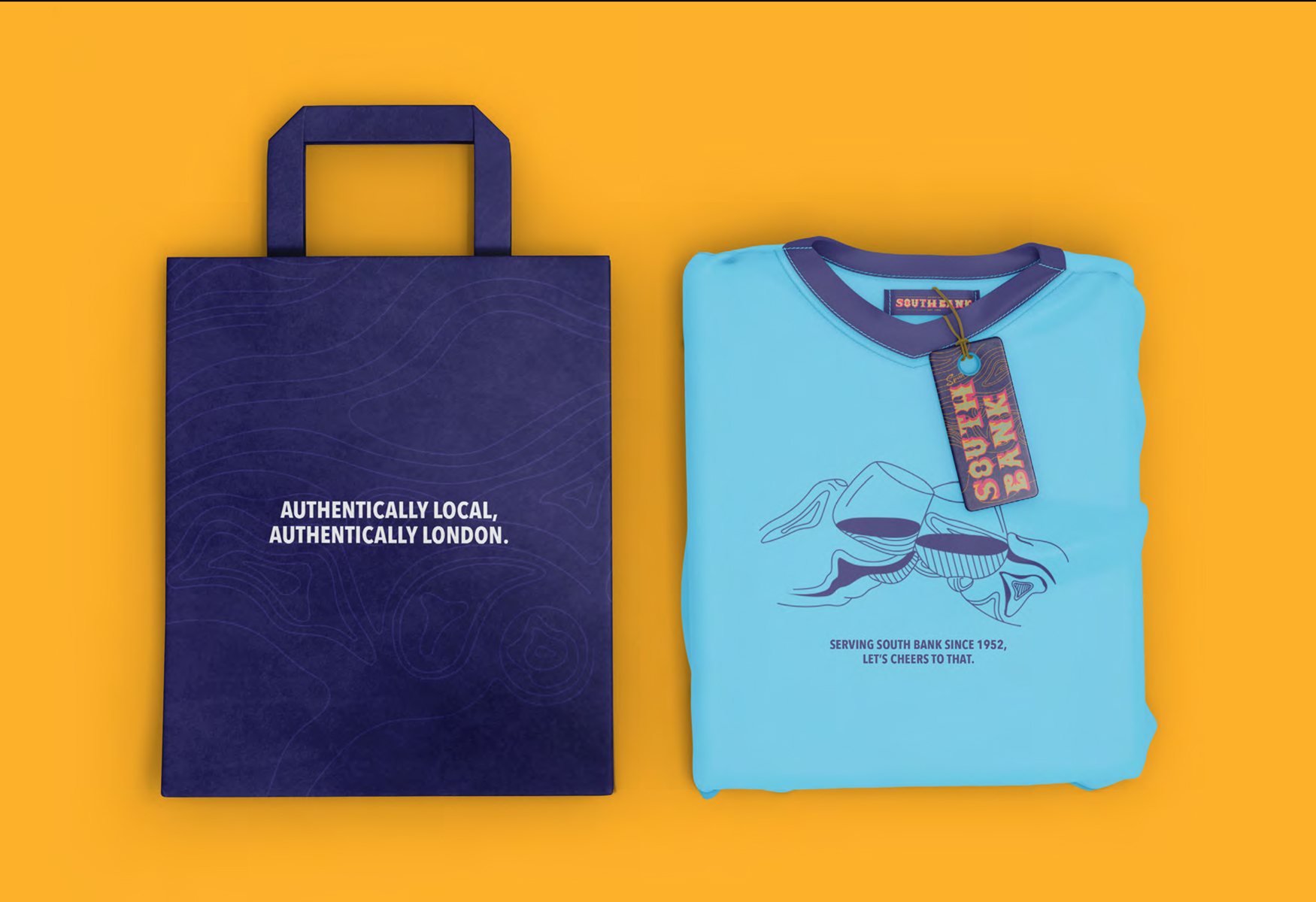
‘Soutbank Gin’ was created in response to a brief asking for the creation of a locally sourced product with a focal point on the importance of character and individuality within a brand identity. Highlighting its authentically local origins, this identity celebrates the distinctive and rich features of London’s South Bank, encouraging visitors to support a local business.
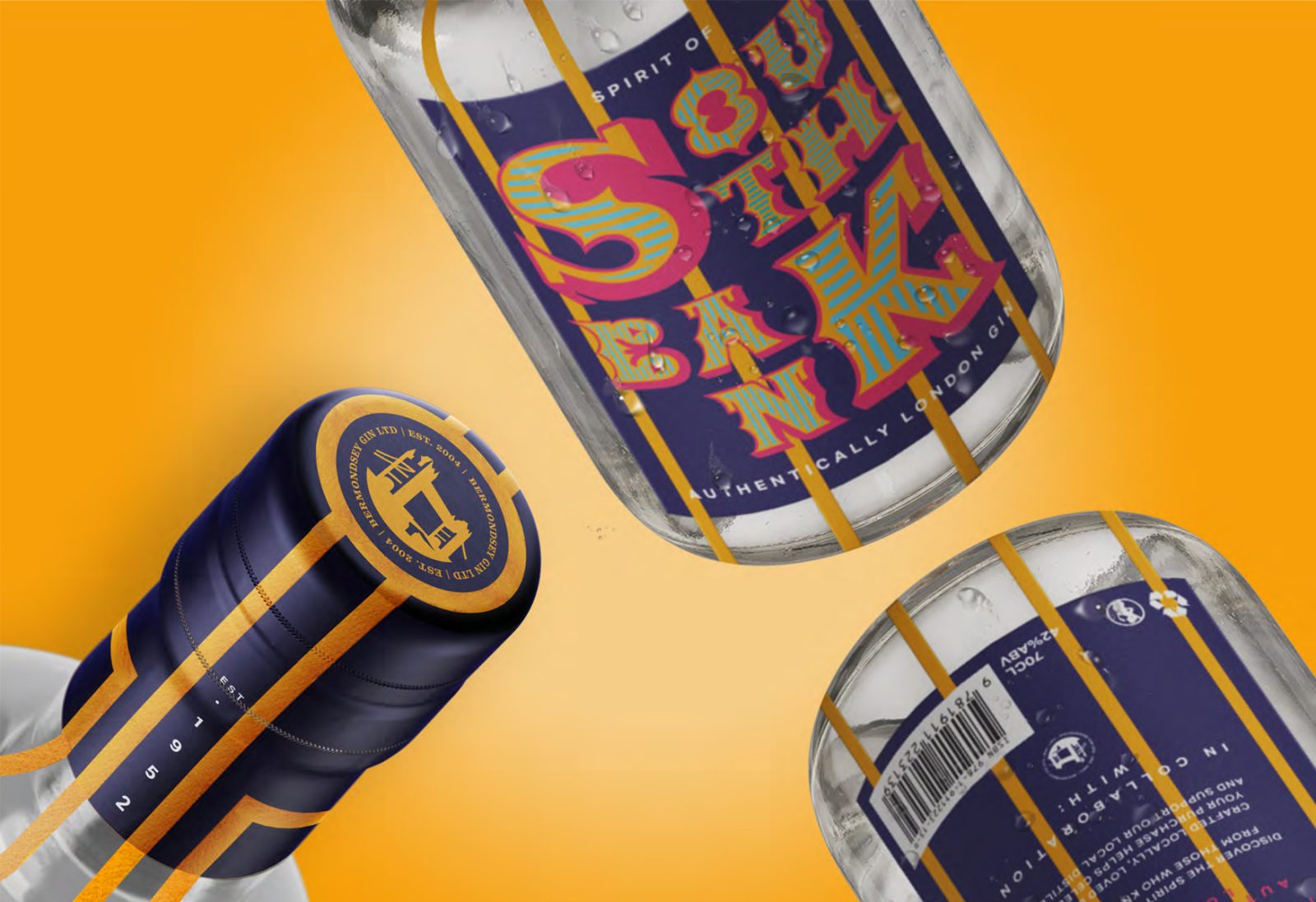
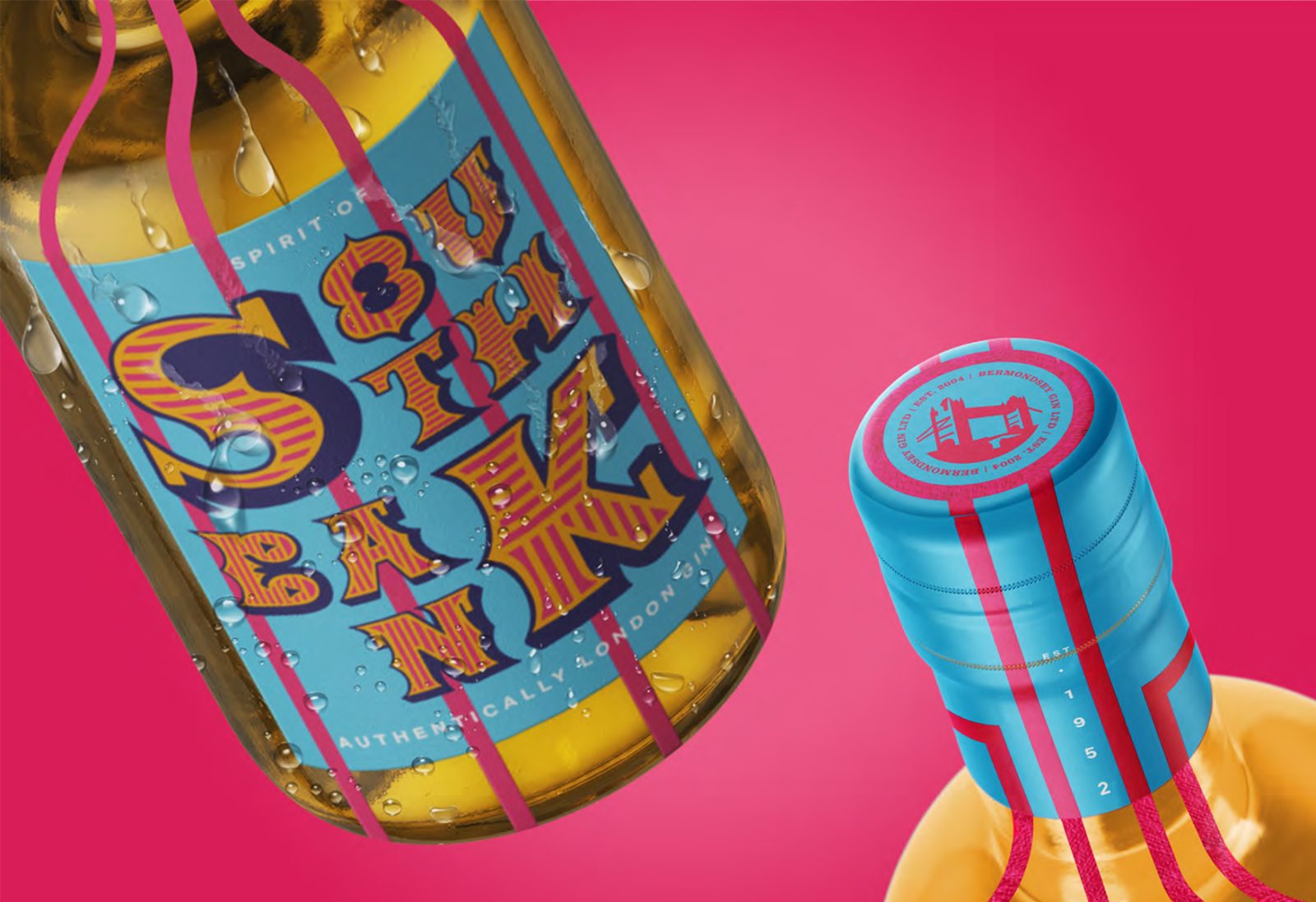
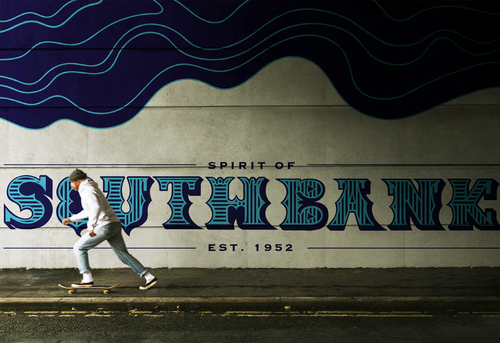
The display typeface was influenced by many London street artists, incorporating features that would define the brand’s uniquely local characteristics. Inspired by the street art commonly seen around the city, the typography creates an eye-catching visual identity with a bold central focus that is easily applied across different applications. The vertical lines and colour palette used are intentionally reminiscent of many pieces of 1950’s art; recognising those as the formative years of a significant shift in the impact of art and design within Britain.
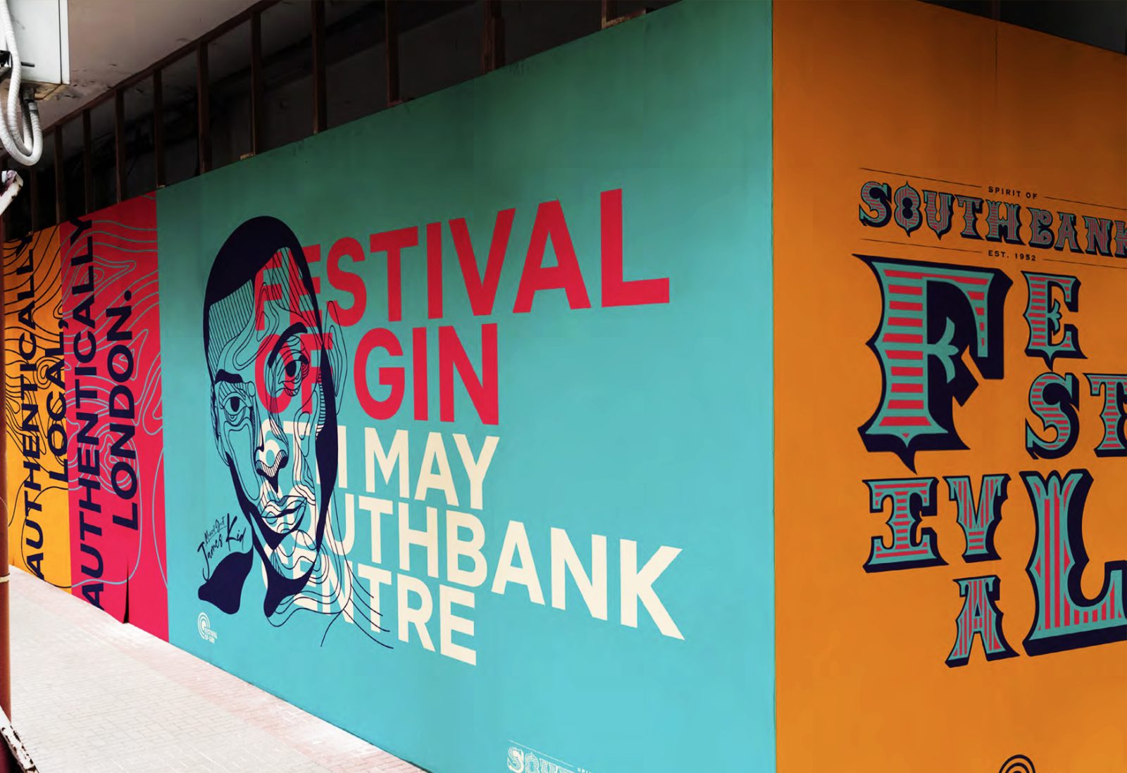
In 1951 South Bank hosted the ‘Festival of Britain’, a national exhibition designed with the aim of promoting a feeling of recovery after the devastating effects of World War II. The festival helped reshape British arts, crafts, designs and sports for a generation and asserted the vital contribution of art to social culture.
Inspired by this, the wider brand campaign advertises the ‘Festival of Gin’. It features the use of crystallographic line drawings – illustrating a mapped outline of Southbank and its surrounding area – creating a contrast which compliments the bold and defined appearance of the typography. Many of these patterns – which were effective in using as illustrative elements – were directly inspired by exhibitions from the festival. The inclusion of these visual elements honour the original festival’s purpose to celebrate the importance of artistic contribution to society and highlights the significance of unique and purposeful design.
CREDIT
- Agency/Creative: Jessica Hoare
- Article Title: Student Packaging Design Concept Southbank Gin
- Organisation/Entity: Student
- Project Type: Packaging
- Project Status: Non Published
- Agency/Creative Country: United Kingdom
- Agency/Creative City: Watford
- Project Deliverables: Packaging Design
- Industry: Food/Beverage
- Keywords: WBDS Student Design Awards 2022/23
-
Credits:
Educational Institution: University of Hertfordshire - School of Creative Arts
Educator's Name: Nick Lovegrove


