


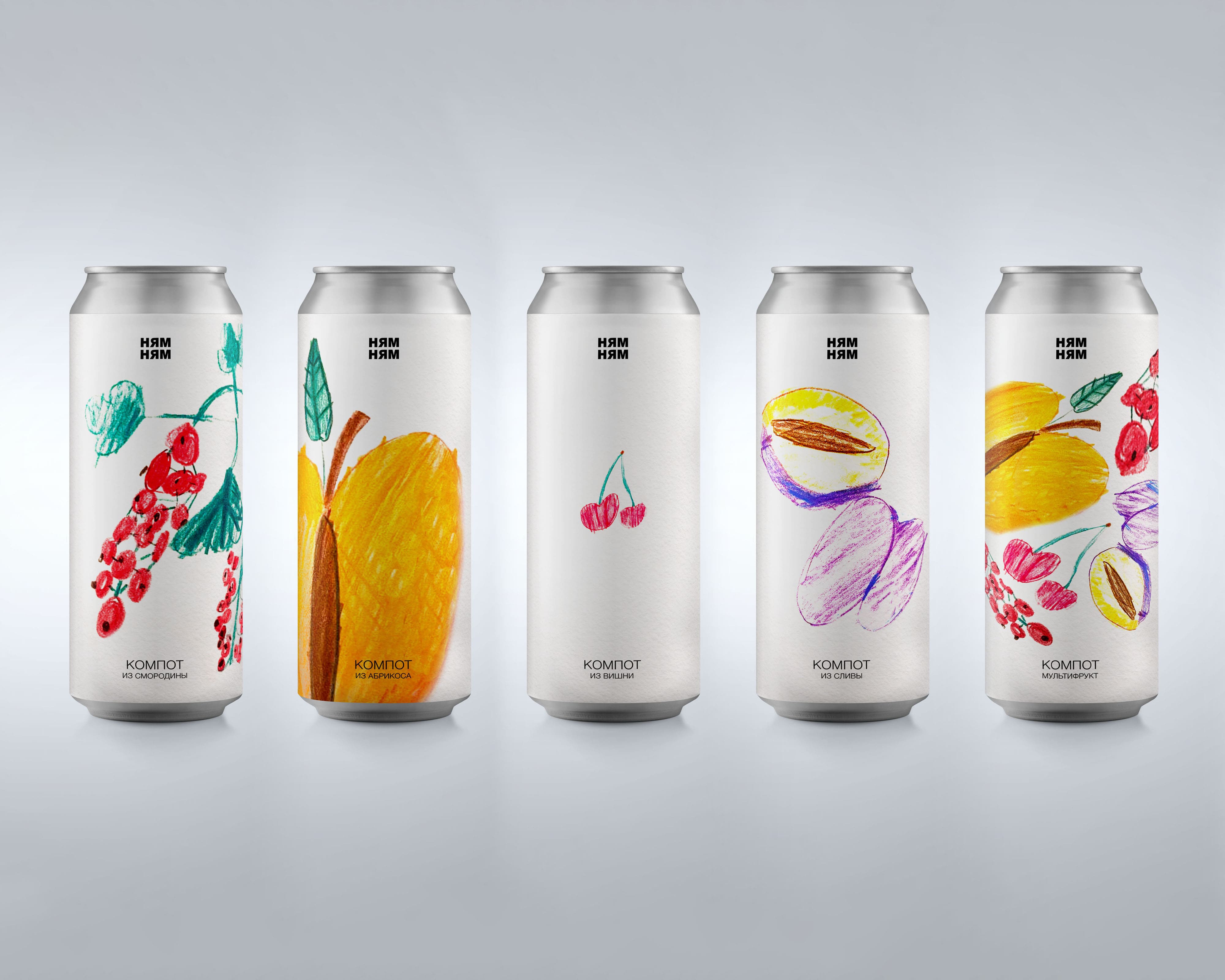
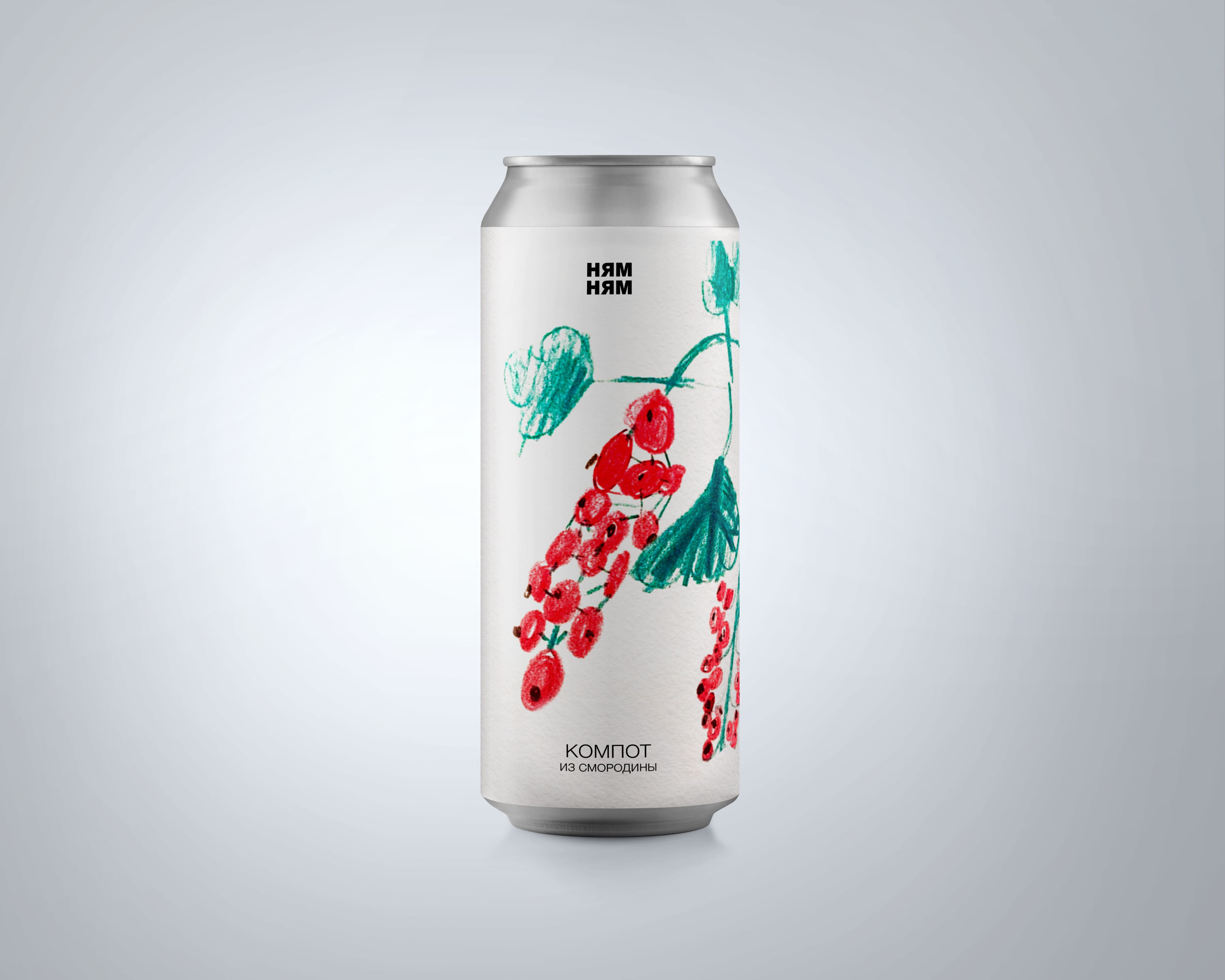
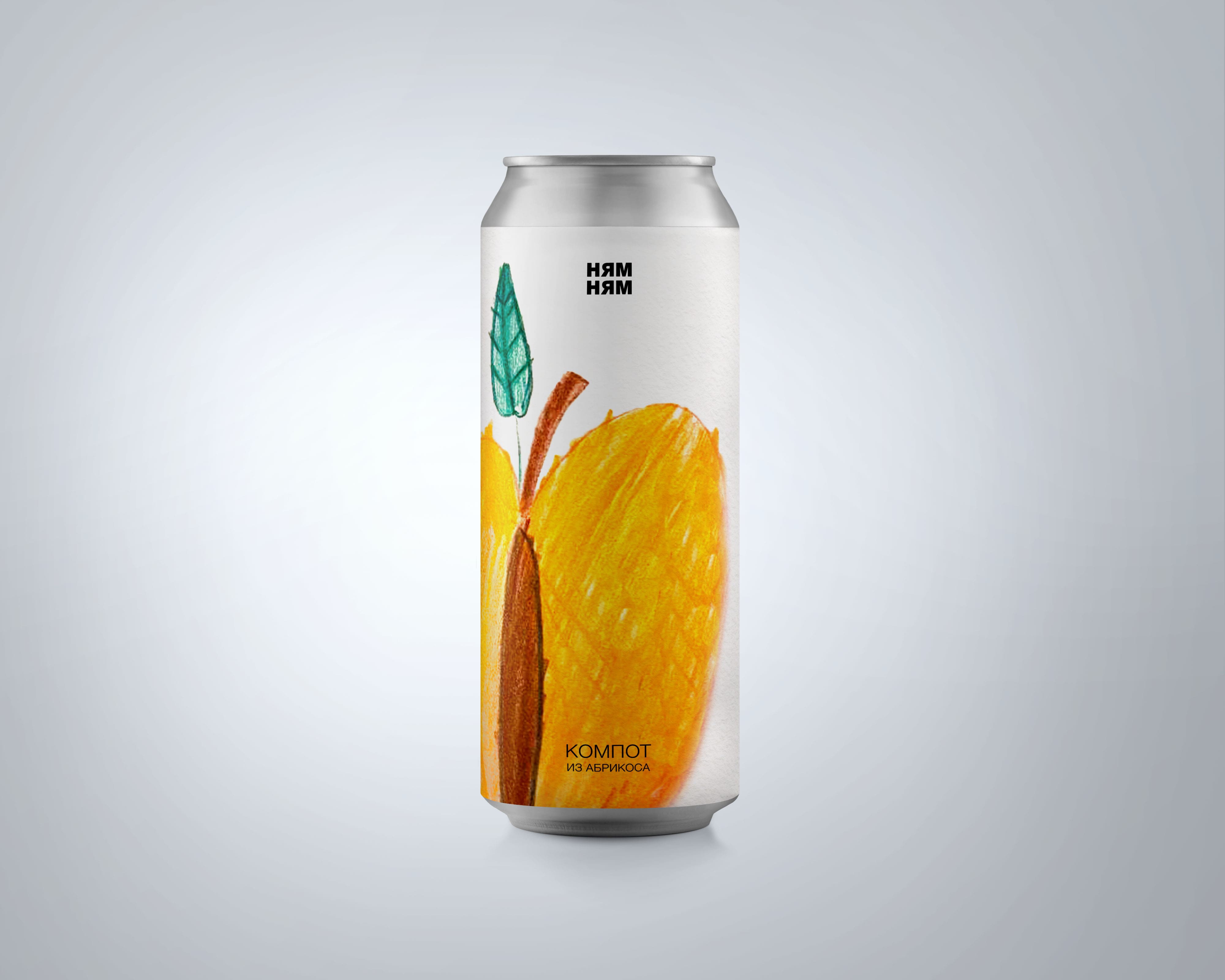
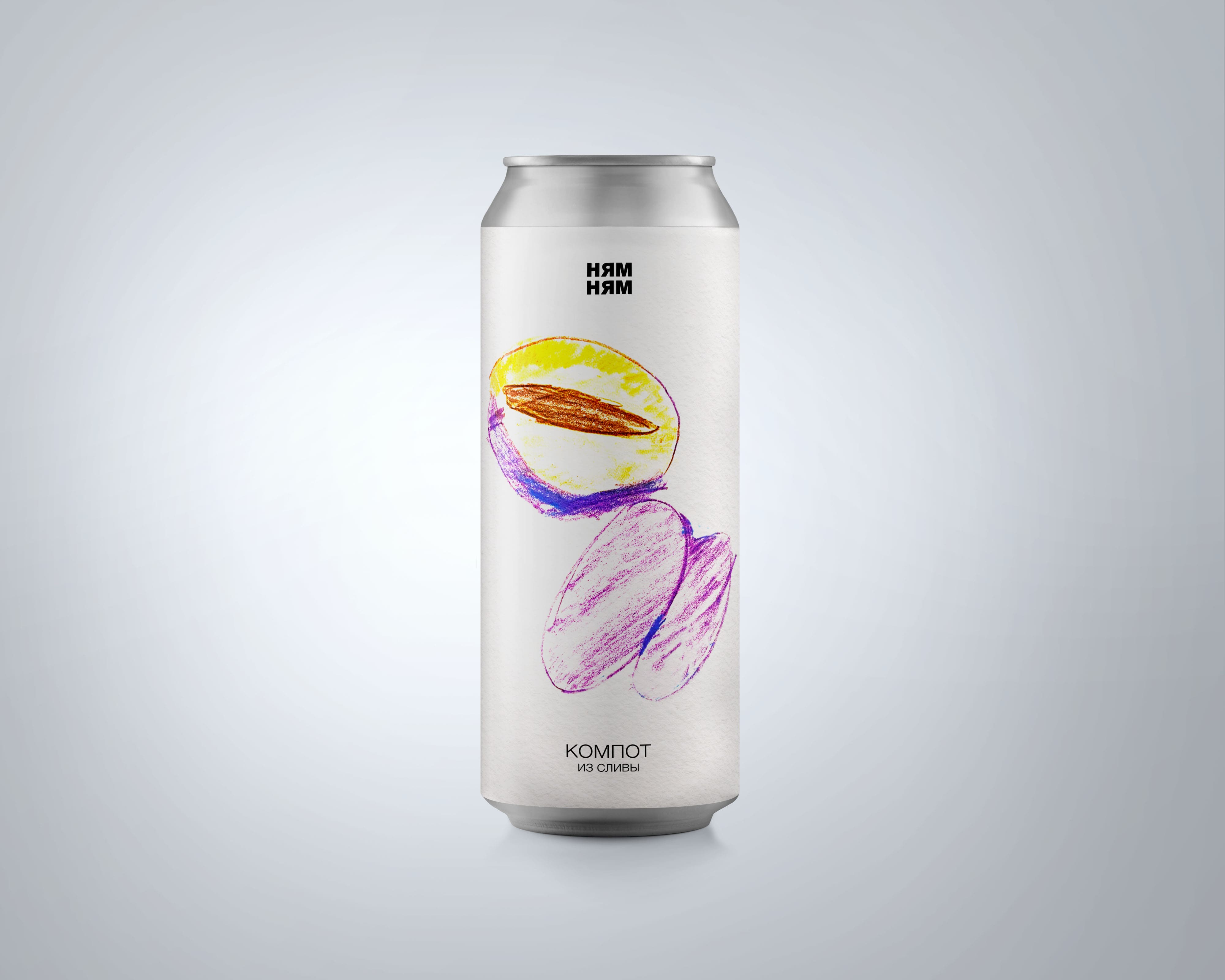
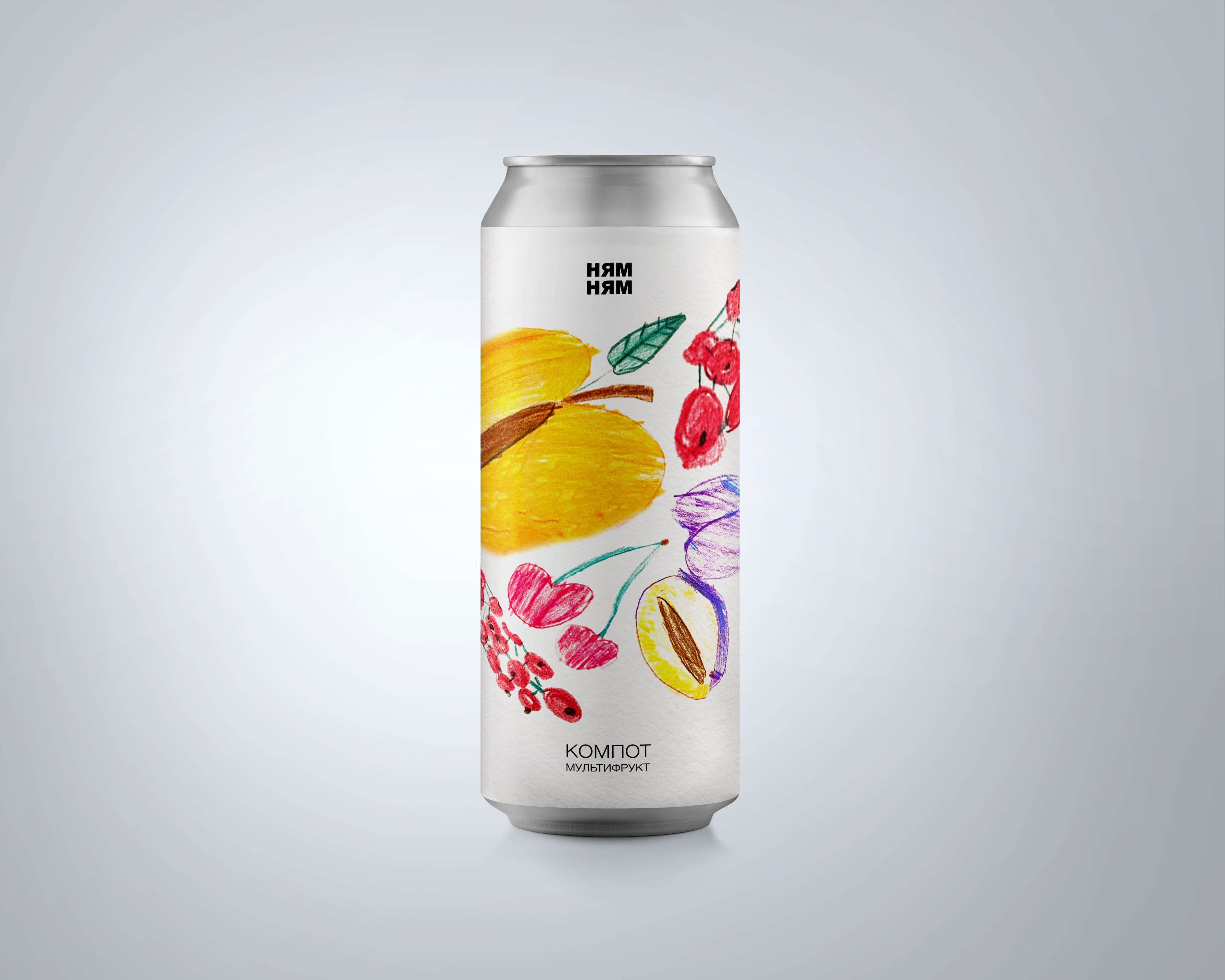
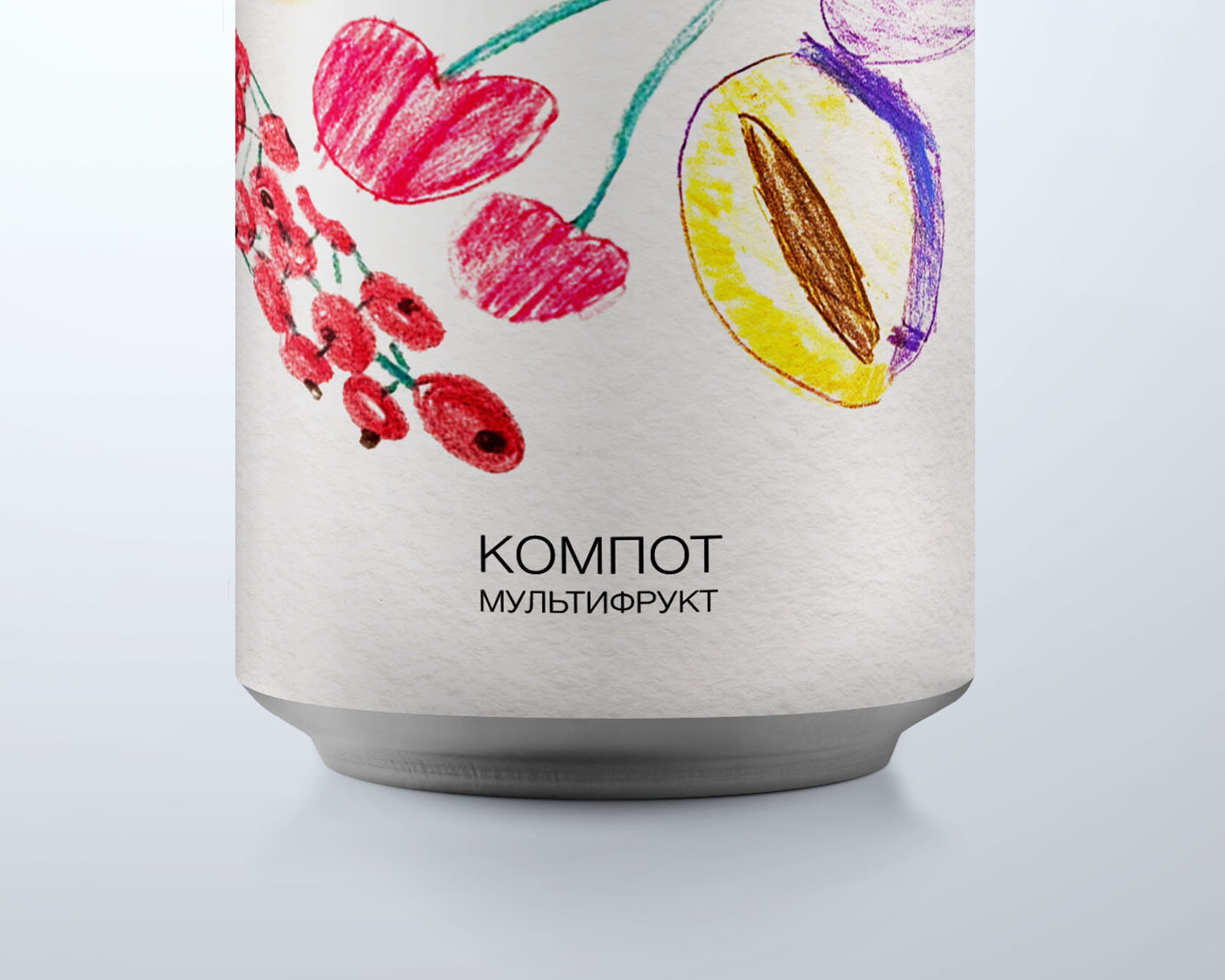
To show that the manufacturer does not use dyes and preservatives, such a graphic solution as children’s drawings was chosen. Because children don’t add anything extra to their work. They are clean and natural.
Nowadays, a lot of people are starting to abuse fast food products. This is due to lack of time for a balanced breakfast, lunch or dinner. It’s easier for us to have a snack on the go than to cook healthy food for ourselves. Even delivery is sometimes not able to deliver food fresh. And some of us consider pills unsafe, because they can only worsen our health.
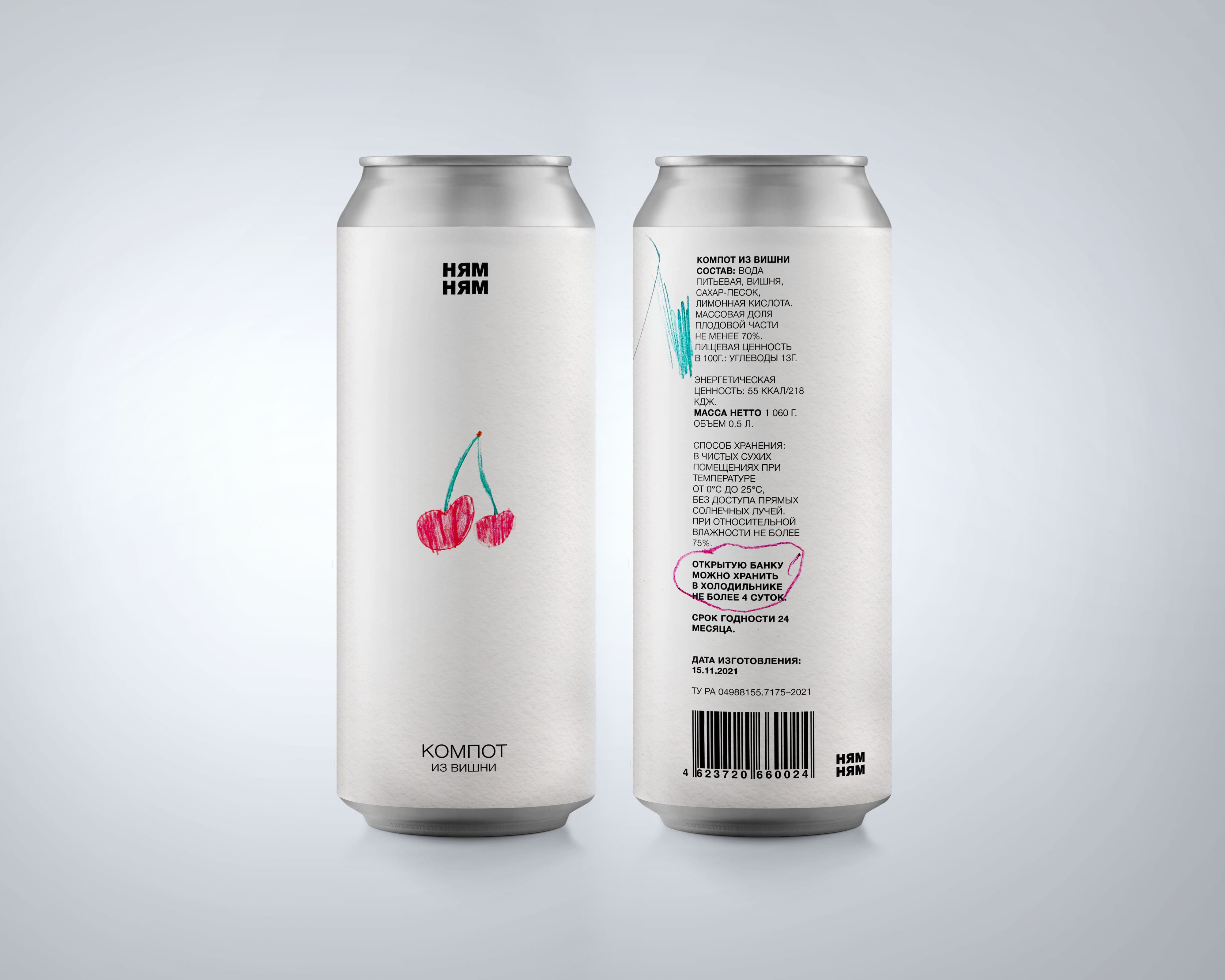
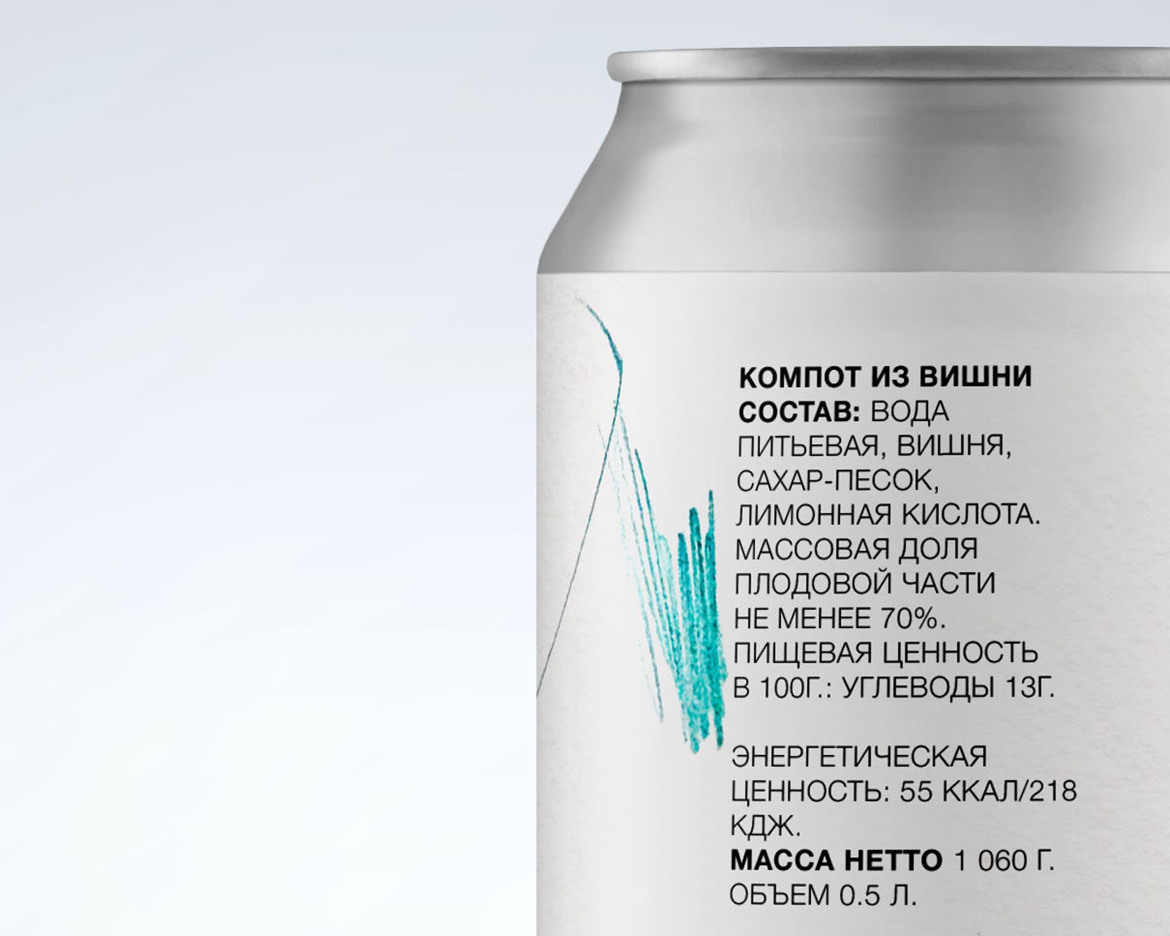
That’s why we created a brand that aims to help people get as many vitamins as possible. Our compote contains about 70 percent of the juice of fruits such as currant, apricot, cherry, plum and a mix of all these flavors.
I asked Masha (my friend’s seven-year-old sister) to draw a couple of light drawings for my project. In the end, I got the result I wanted. Clean, without unnecessary decorations fruits. If I started drawing myself, I would not be able to convey the main idea of my packaging-simplicity, that is, the naturalness of our product.
The Yumnyam logo refers us to childhood, because we experience all the most joyful, bright and intense emotions during this period of our life. Therefore, the packaging and logo refer our potential buyer to his memories from childhood, causing trust, which we have no right not to justify.
Our product is aimed at an audience of all ages, as it is useful and understandable for every person.
CREDIT
- Agency/Creative: George Sapozhkov
- Article Title: Student Packaging Design Concept for The Most Natural Compote
- Organisation/Entity: Student
- Project Type: Packaging
- Project Status: Published
- Agency/Creative Country: Russia
- Agency/Creative City: Moscow
- Market Region: Europe
- Project Deliverables: Brand Design, Design, Drawing, Packaging Design
- Format: Can
- Substrate: Metal, Pulp Paper
- Industry: Food/Beverage
- Keywords: #brand #packaging #juice #compote #can
-
Credits:
creator: George Sapozhkov
curator: Evgeny Kashirin


