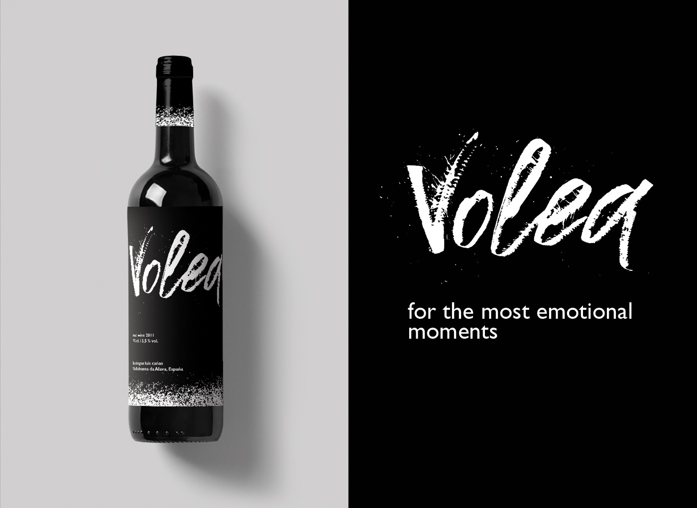
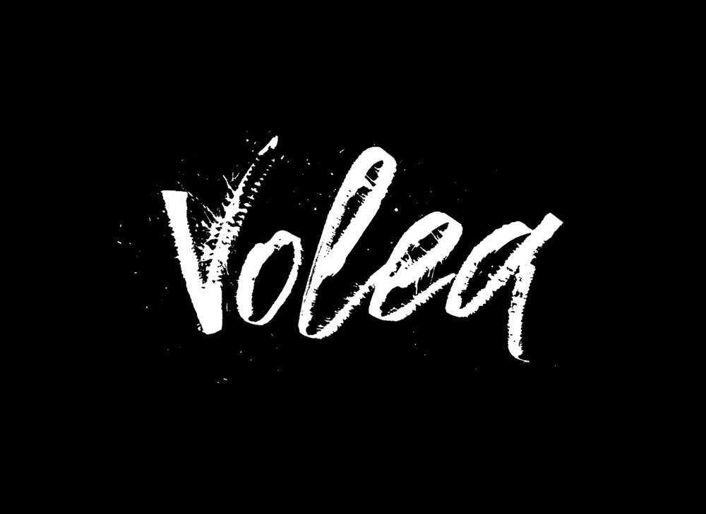
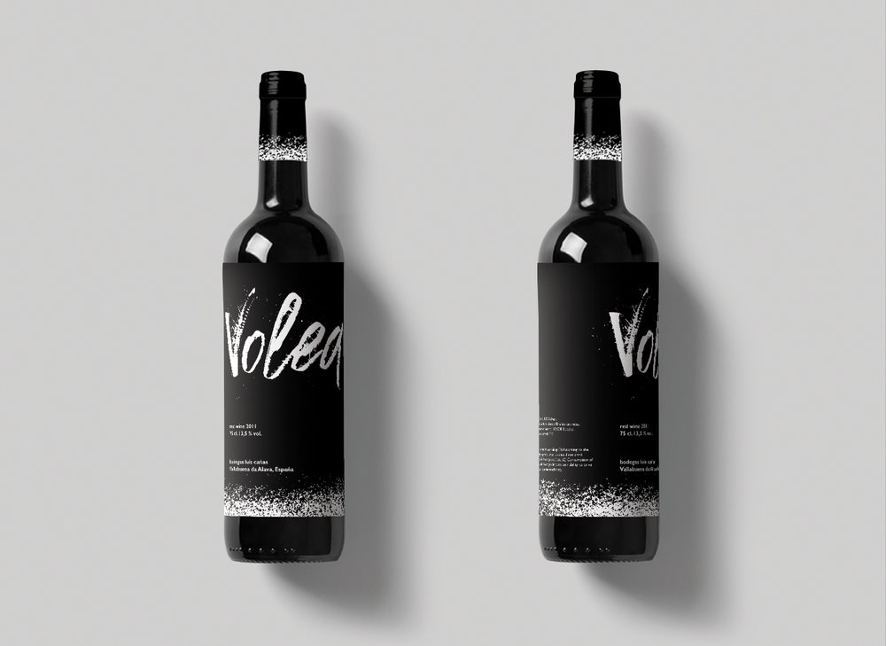
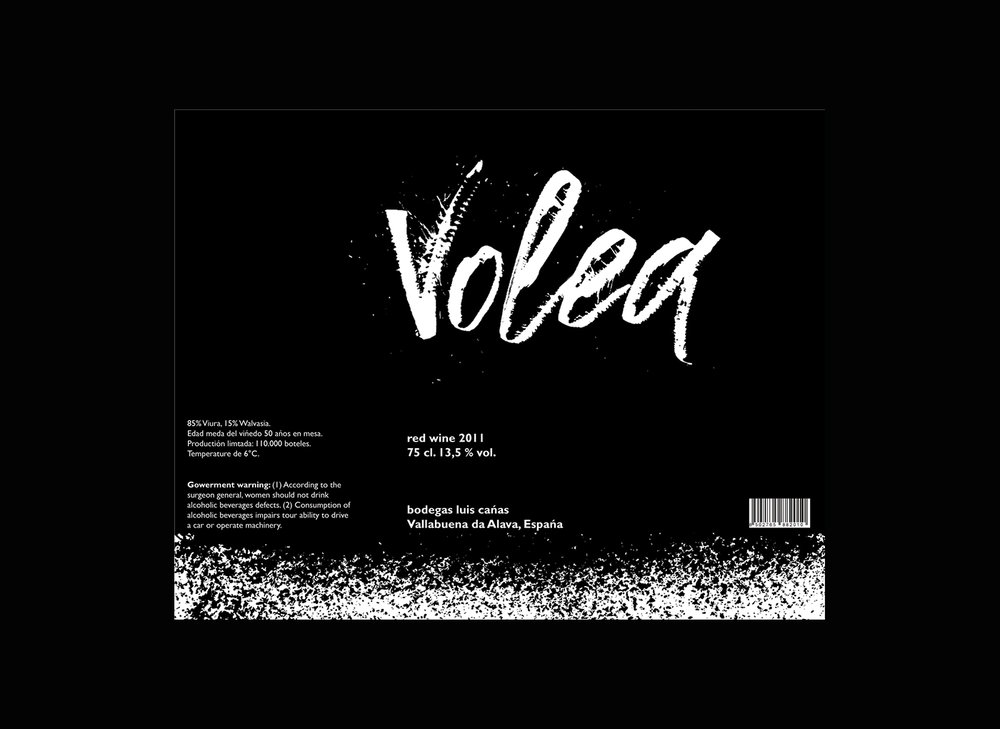
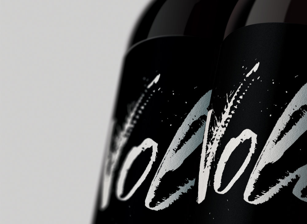
“This project is built on the basis of the lettering. In this case a tool of the cola pen was used. Volea in the translation from Spanish – volley. This wine can not lie for long. It should be drunk as soon as possible, in one gulp. Therefore, there is a small gradient on the label, which seems to raise the black color to the neck of the bottle. This wine is for emotional moments. Everything is built on expression, on the possibility of releasing steam.”
CREDIT
- Agency/Creative: Anna Kamenkova , British Higher School of Art & design
- Article Title: Student Packaging Design Concept for Spanish Wine
- Organisation/Entity: Student Concept / Non Published
- Project Type: Packaging
- Agency/Creative Country: Russia
- Market Region: Global
- Format: Bottle
- Substrate: Glass
FEEDBACK
Relevance: Solution/idea in relation to brand, product or service
Implementation: Attention, detailing and finishing of final solution
Presentation: Text, visualisation and quality of the presentation


