


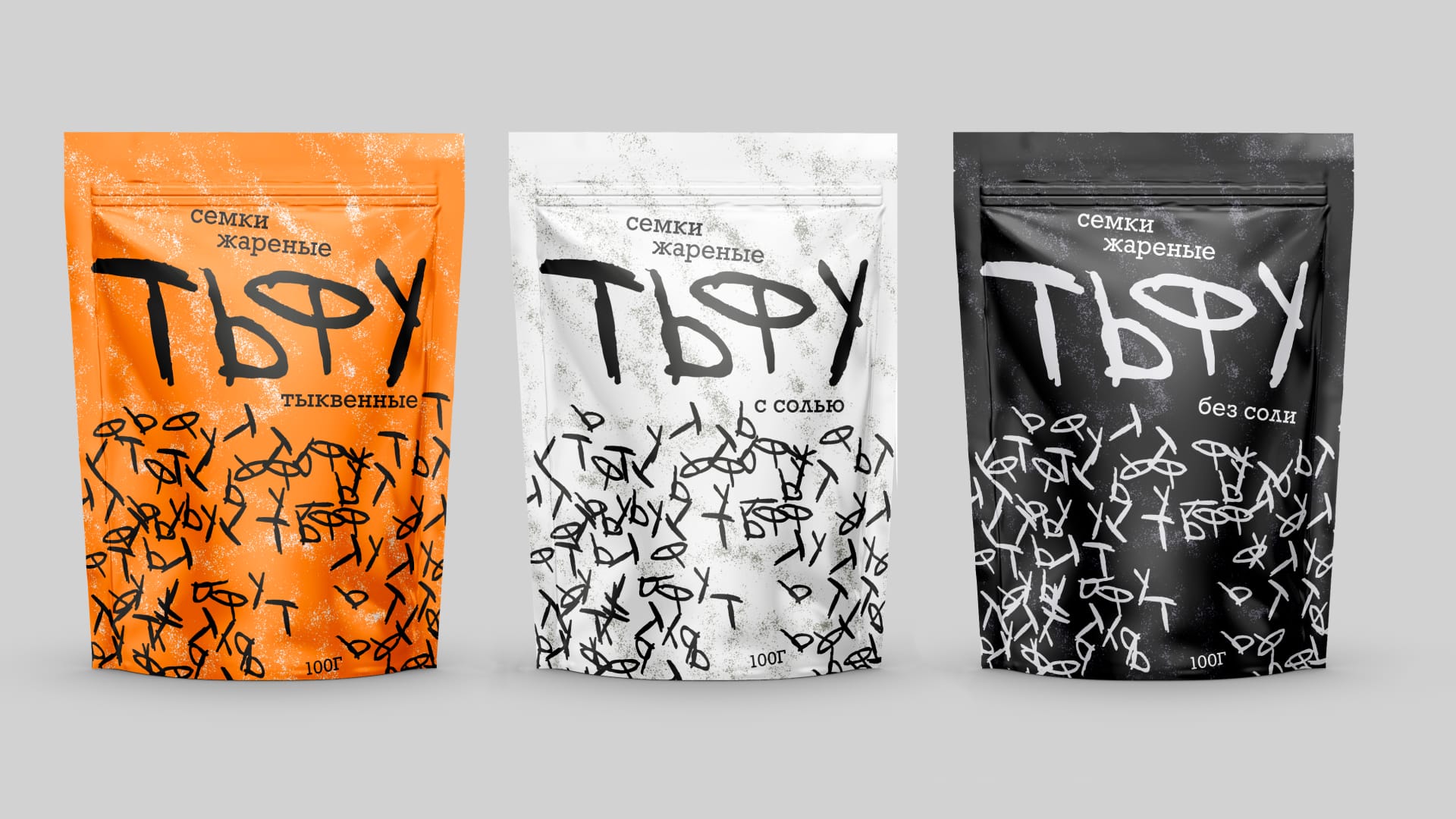
My task was to create a packaging design based on a Russian interjection.
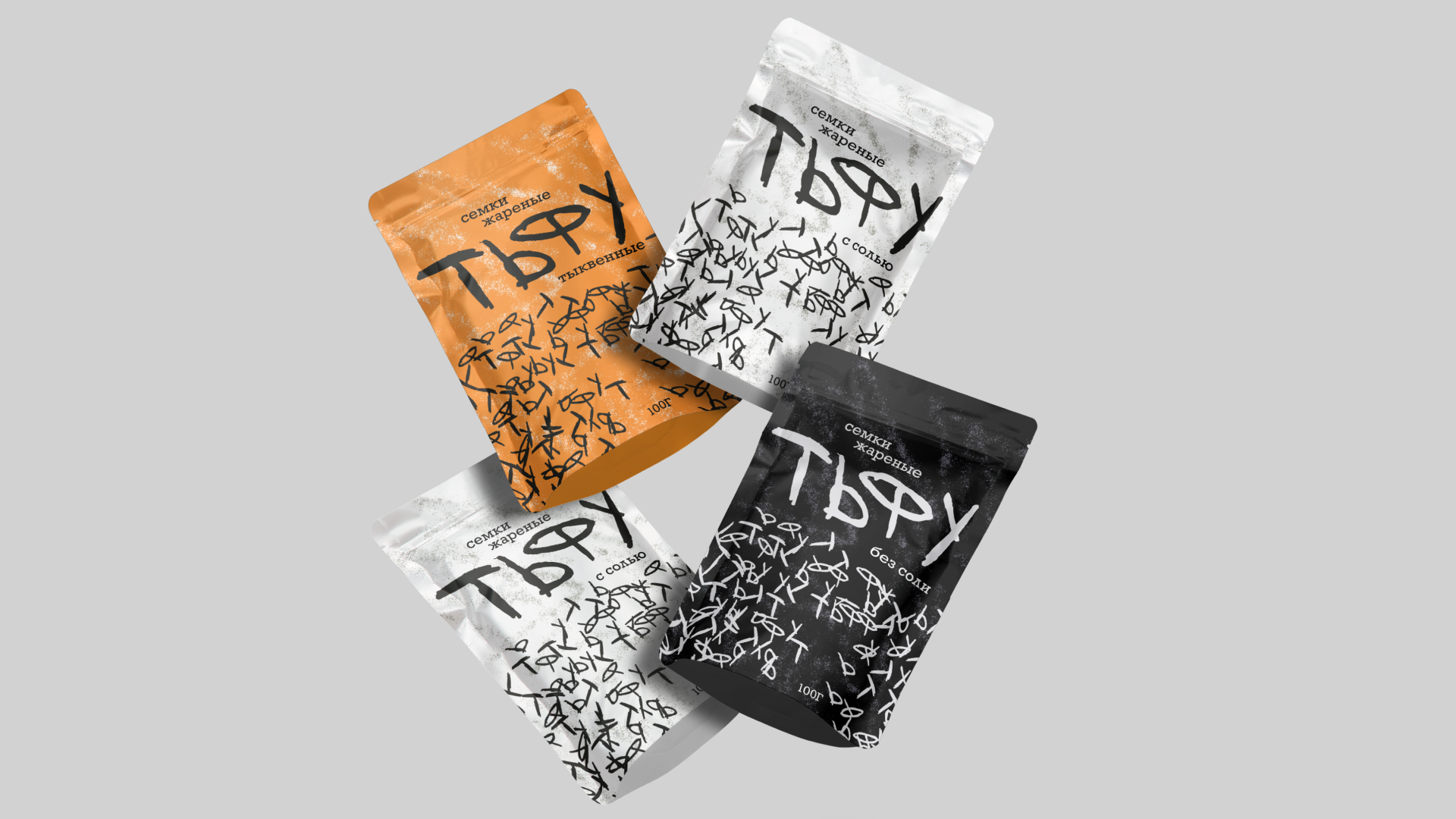
For this project, I chose the interjection “tfu” — “тьфу” — a sharp, expressive sound that instantly evokes the familiar gesture of cracking sunflower seeds and spitting out the shells while sitting on a courtyard bench. This sound is deeply embedded in everyday Russian culture and reflects a specific social atmosphere: relaxed conversations, informal gatherings with neighbors, and the simple, almost meditative pleasure of eating seeds outdoors. It’s a small but iconic cultural ritual that shapes the visual and emotional foundation of the project.
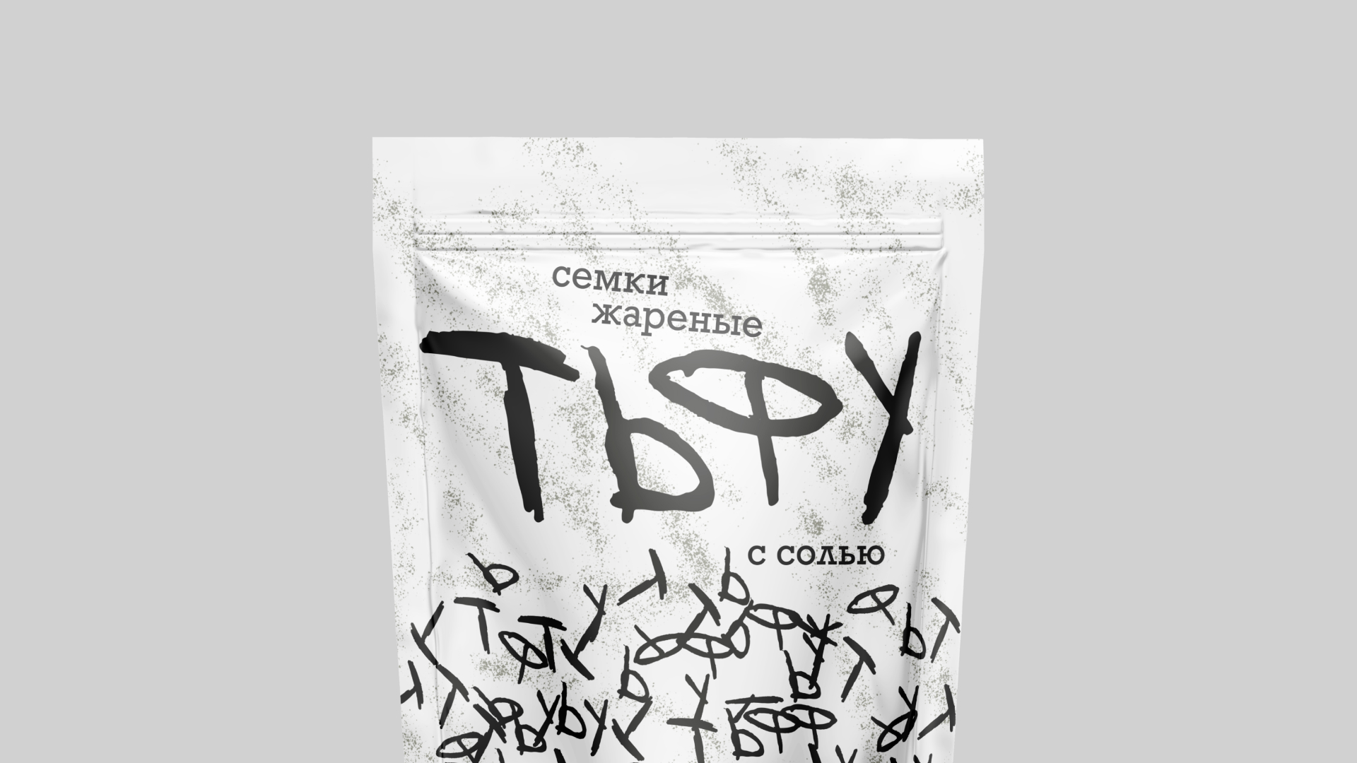
The product itself is roasted sunflower seeds, and my goal was to translate the essence of this sound into a graphic form. I focused on the abrupt, staccato rhythm of “tfu”: the dry click of a seed cracking between the teeth, the swift motion of spitting out the shell, and the brief burst of energy that accompanies each gesture. These qualities became the basis of the visual language. Through sketching and typographic experiments, I looked for ways to capture this physicality — through sharp angles, irregular dynamics, and movement within the lettering.
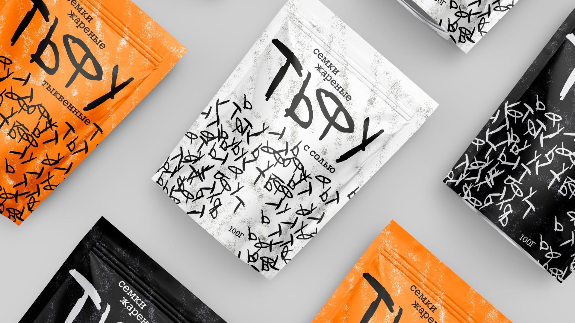
One of the key visual inspirations came from the scattered seed shells left around benches and courtyards. Their chaotic silhouettes and playful randomness became an important part of the concept. I incorporated these shapes as textural accents and subtle motifs, reinforcing the sense of authenticity and grounding the design in real, everyday observations.
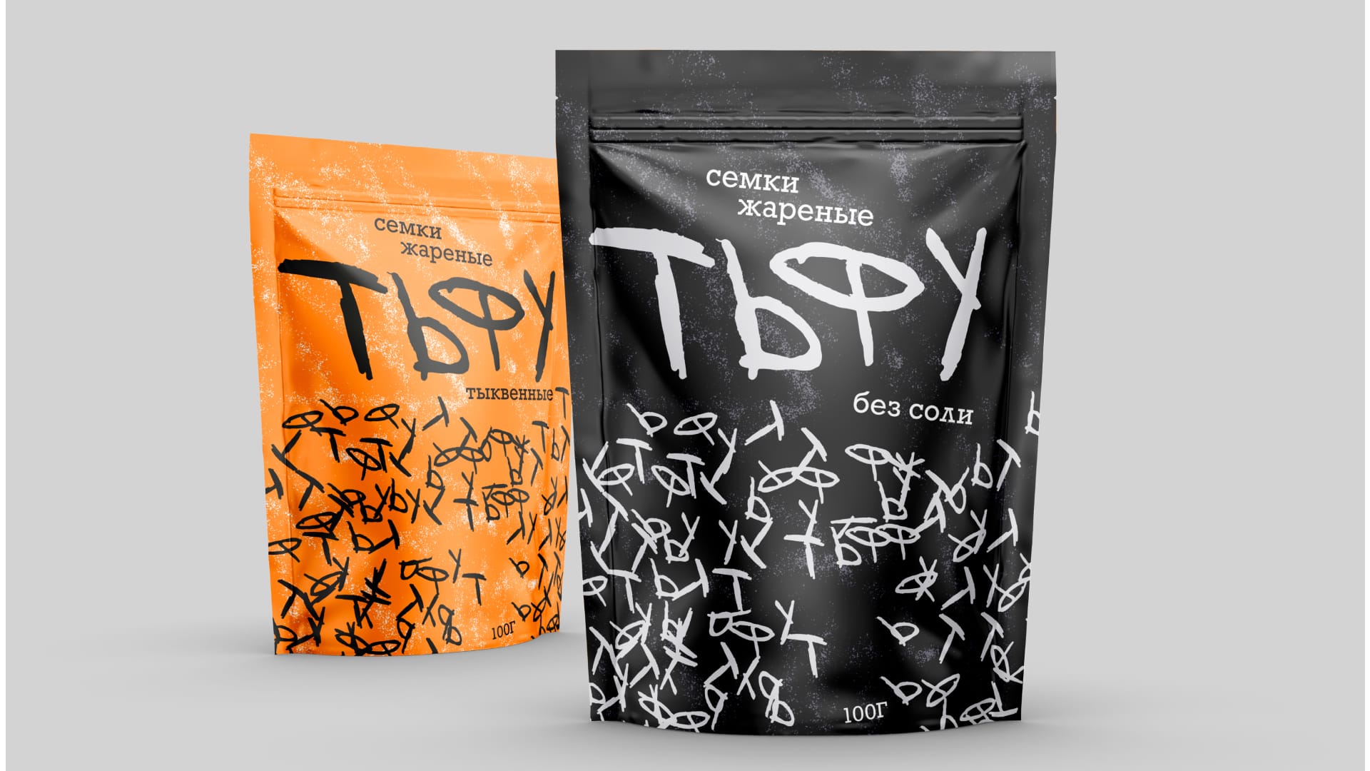
The final lettering aims to embody both the gesture and the sound, giving the word itself a vivid, onomatopoeic quality. The packaging turns an ordinary habit into a bold, character-driven identity that celebrates the cultural symbolism of sunflower seeds.
The product can be sold in small kiosks, convenience stores, and local street markets where impulse snack purchases are most common. It would also fit naturally into park cafés, stadium kiosks, and seasonal street vendors near playgrounds and courtyards — locations closely tied to the culture that inspired the design.
CREDIT
- Agency/Creative: Liza Pokrovskaya
- Article Title: Student Packaging Design Concept for Seeds by Liza Pokrovskaya
- Organisation/Entity: Student
- Project Type: Packaging
- Project Status: Non Published
- Agency/Creative Country: Russia
- Agency/Creative City: Moscow
- Market Region: Global
- Project Deliverables: Lettering, Packaging Design
- Format: Bag
- Industry: Food/Beverage
- Keywords: seeds, package, people food, product
-
Credits:
Curator: Natalia Burdenkova


