Overview
Latitude stands as a testament to the allure of travel and the fond memories that ensue, meticulously packaged in the form of a portable canned wine. Designed specifically for millennials with an affinity for the outdoors, this brand encapsulates the spirit of adventure. Drawing from elements synonymous with travel, Latitude is an invitation to journey into nostalgia, reflection, and cherished memories.
Approach
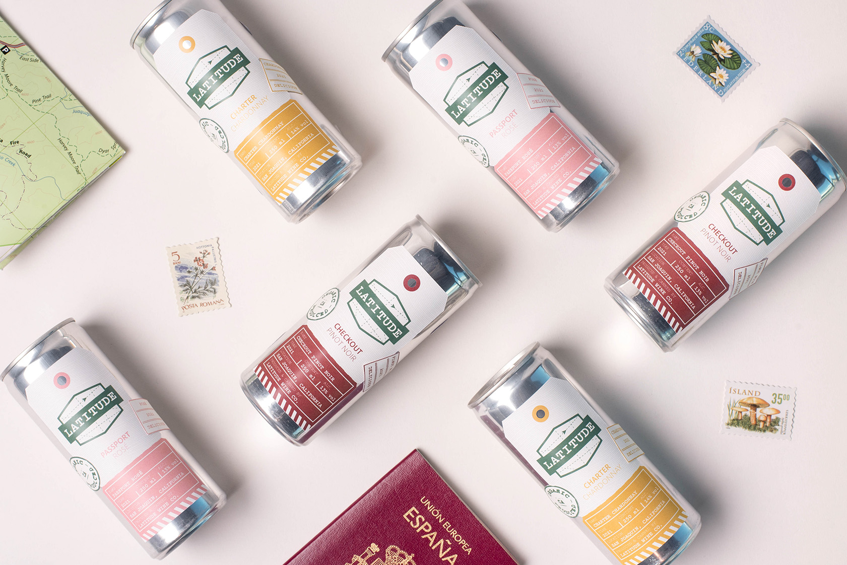
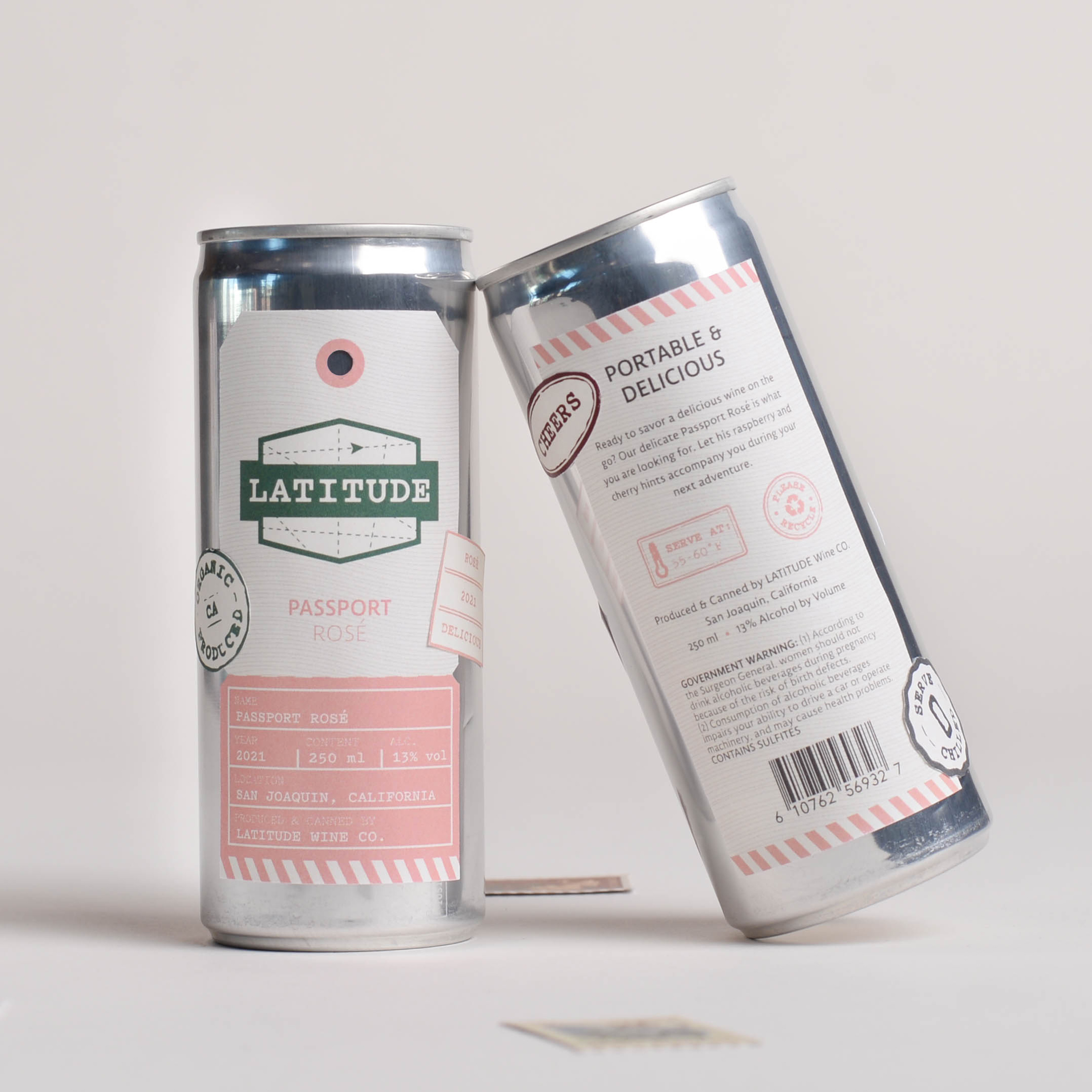
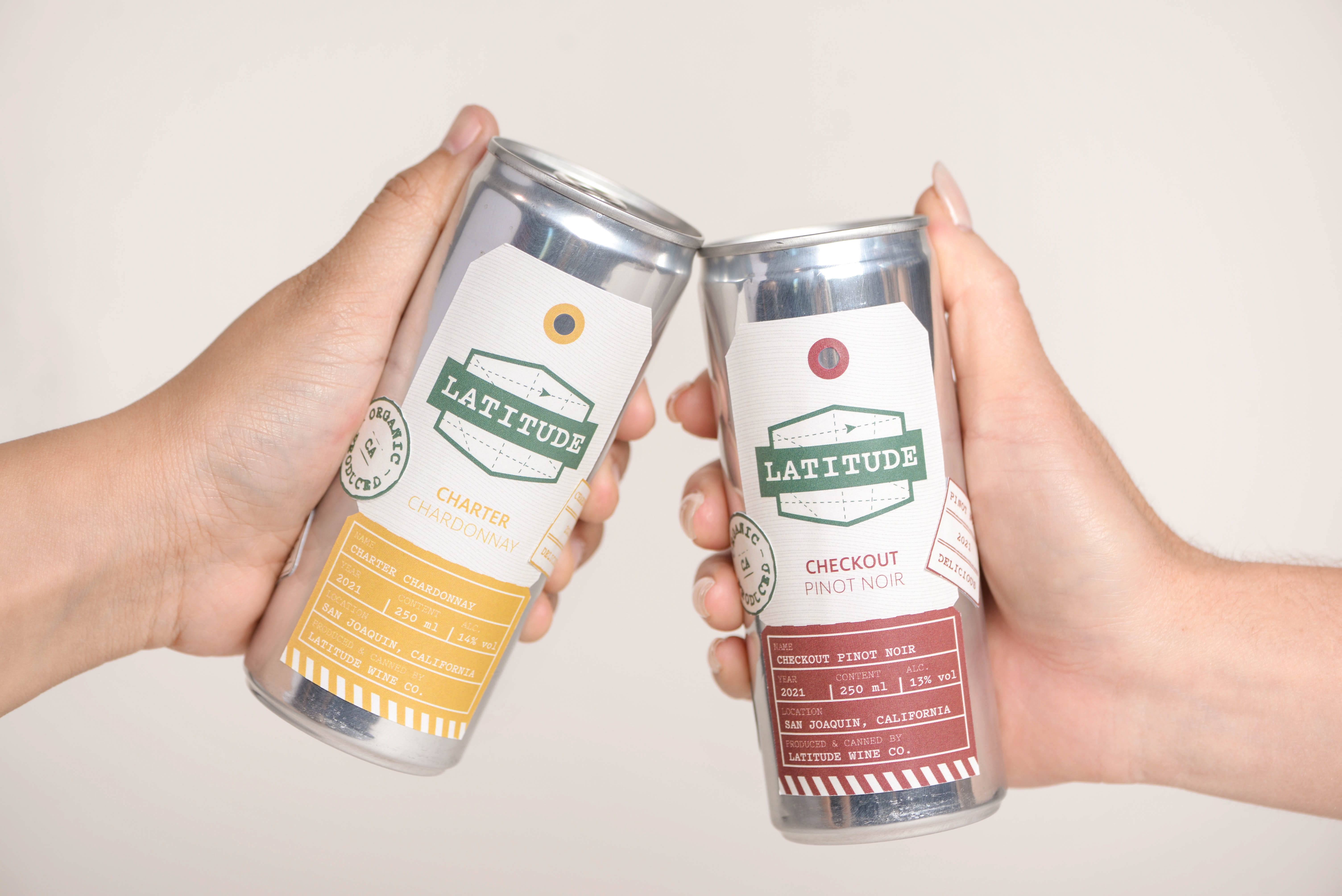
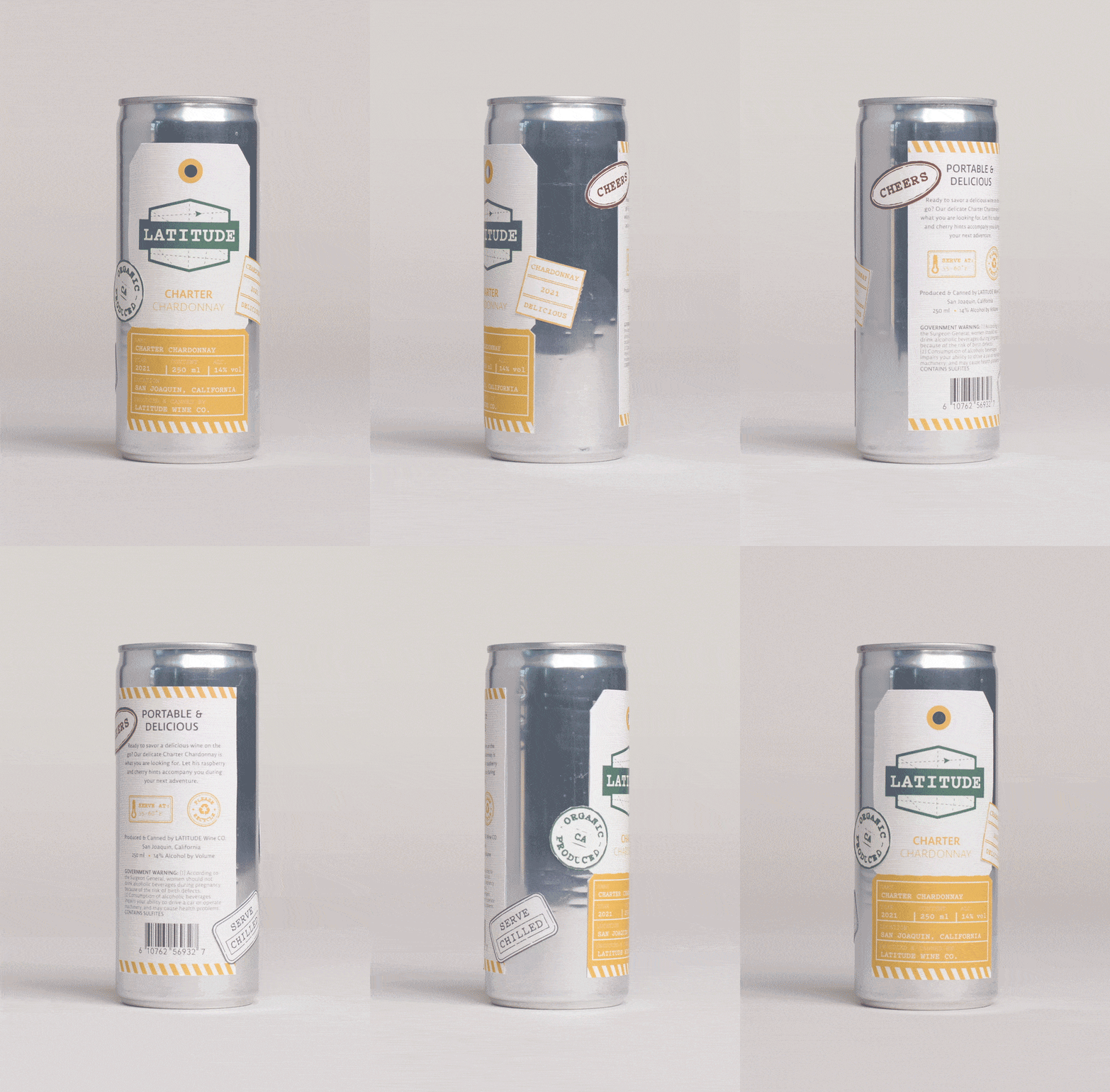
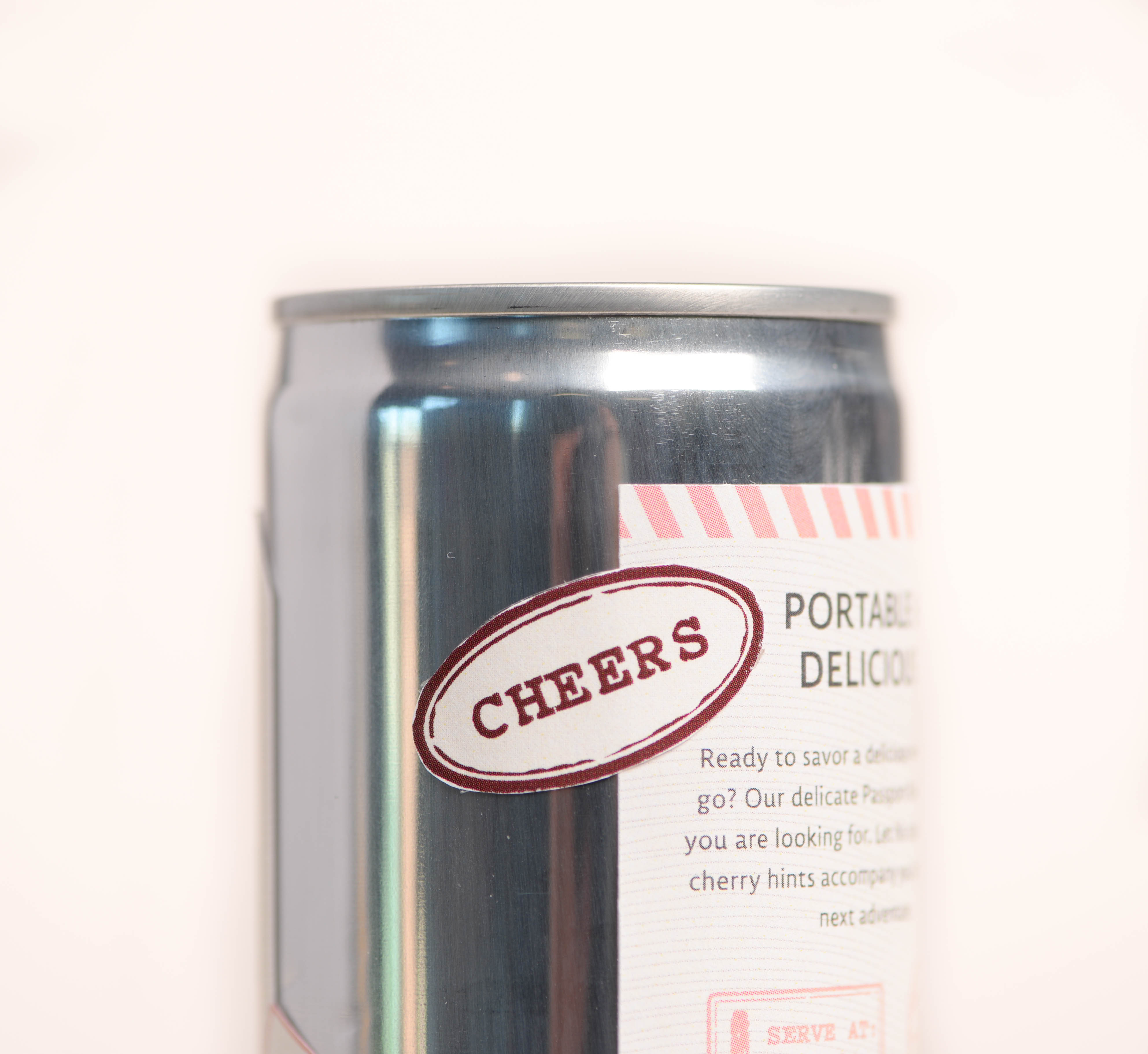
To truly resonate with the adventurous soul, I integrated core travel motifs into the design framework, infusing the brand with elements like passport stamps and luggage tags. These elements don’t merely serve as decorative facets; they capture and evoke the essence of exploration. The brand’s crest logo employs a dash line and a compass arrow, subtly alluding to the ongoing journey and the spirit of movement. Further diving into typography, I opted for the typeface ‘Pitch’, a monospace typewriter font, which imbues the design with a warm, analog feel, reminiscent of vintage travel correspondence.
Through custom-cut labels styled to resemble passport and travel-centric motifs, they overlap in a strategic manner, creating a differentiated, layered appearance. This approach not only provides a tactile experience but also distinguishes Latitude from its competitors in the wine market, including other canned wine brands. Adding to the narrative, each flavor gets its moniker inspired by various facets of travel.
Four-Can Pack
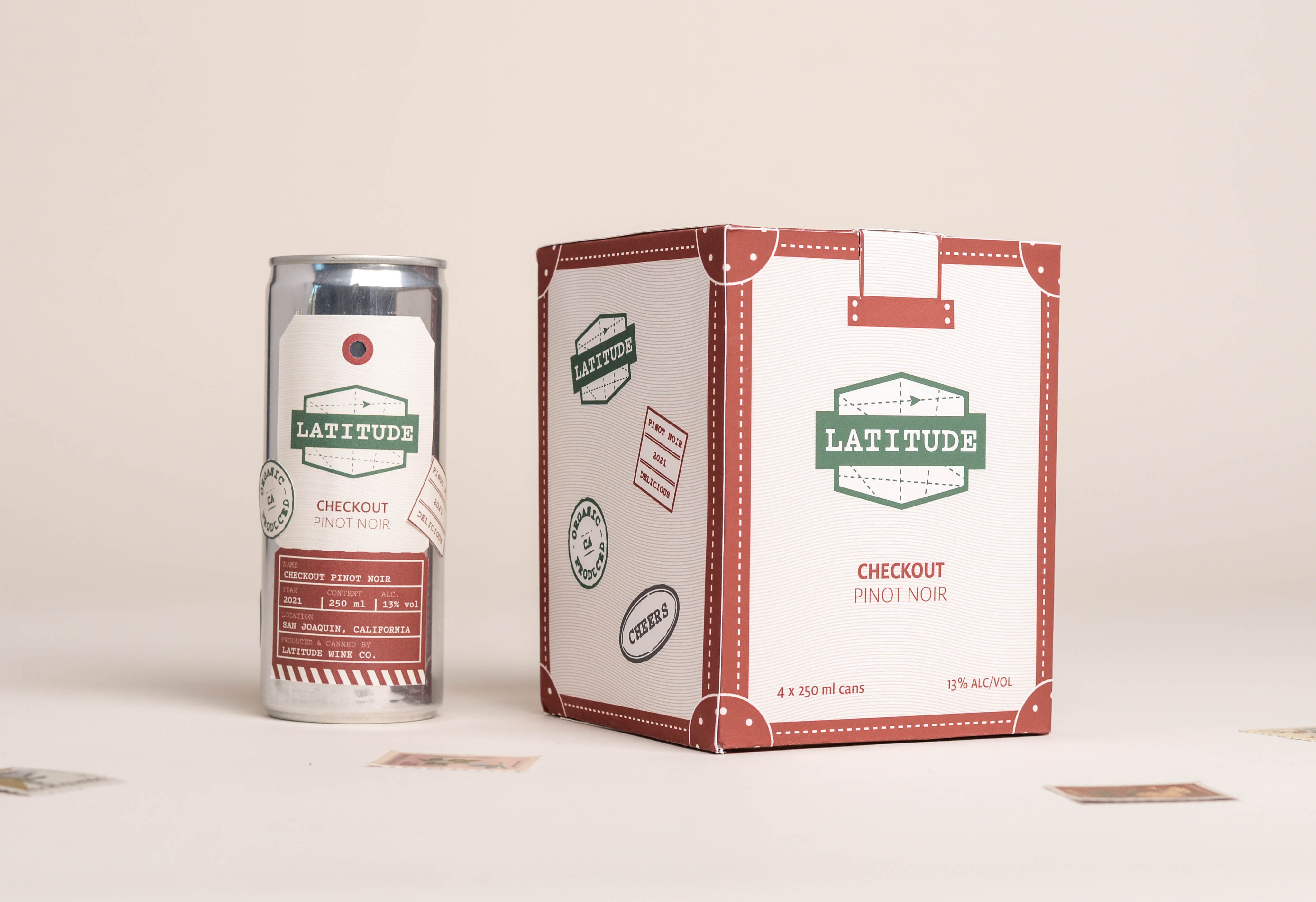
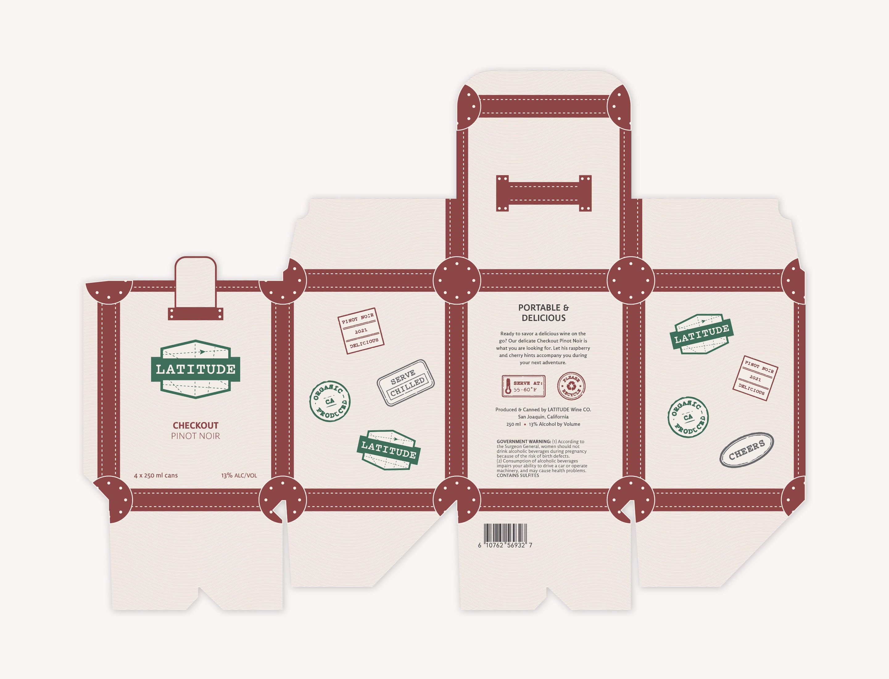
Latitude’s packaging is a direct reflection of its ethos. Each four-can pack, crafted keeping the millennial wanderlust in mind, invites users to a timeless escapade. The design, echoing the aesthetic of vintage suitcases, coupled with passport stamps and luggage tags, beckons to the free spirit, waiting to explore the uncharted.
Marketing
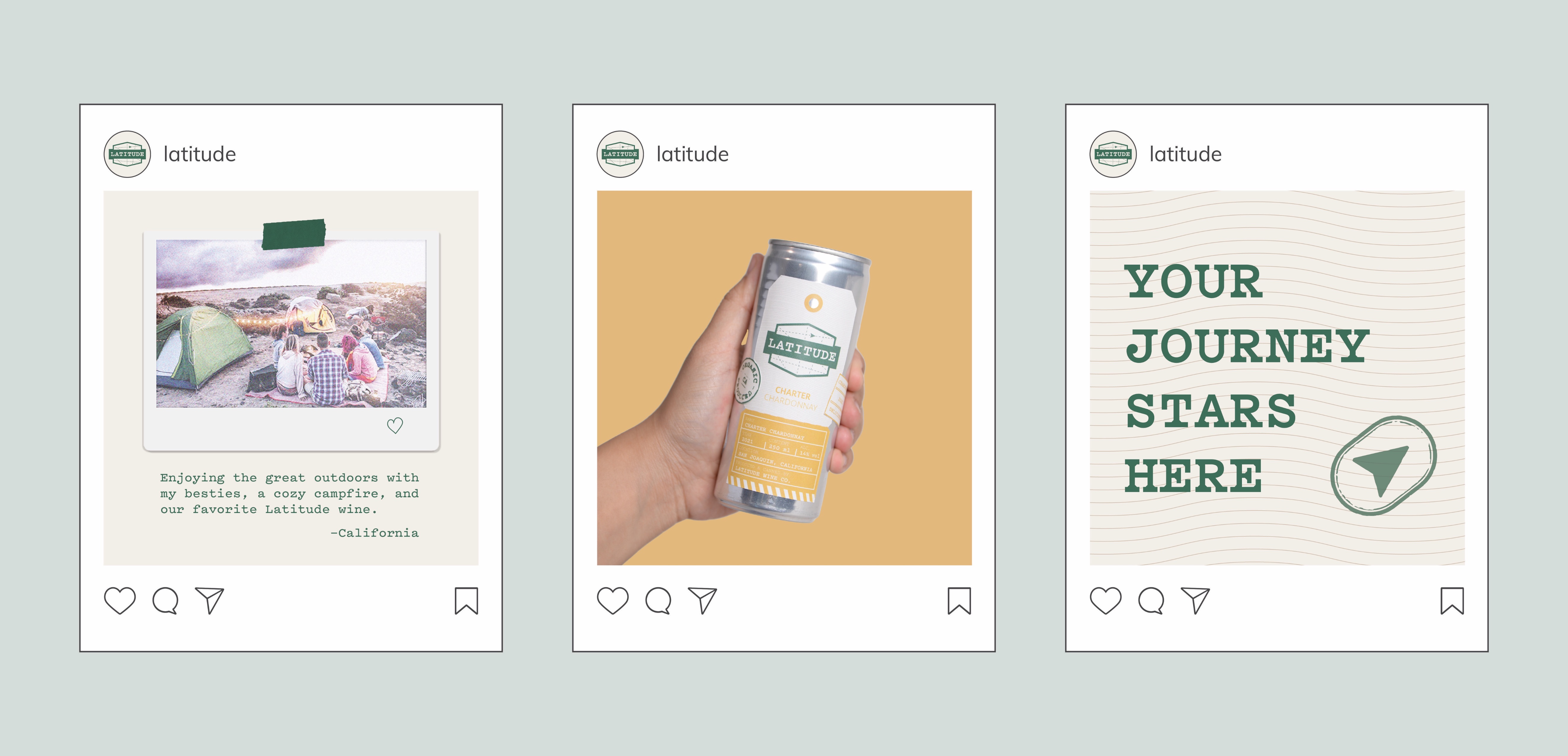
To extend the brand’s narrative and ethos, Latitude’s social media strategy is woven with aspirational content. Posts and marketing copy are meticulously crafted, not only promoting the product but inspiring followers to embark on adventures, create memories, and share moments of joy with friends.

CREDIT
- Agency/Creative: Laura Rodríguez Porras
- Article Title: Student Packaging Design Concept For Latitude Travel-inspired Canned Wine
- Organisation/Entity: Student
- Project Type: Packaging
- Project Status: Non Published
- Agency/Creative Country: United States
- Agency/Creative City: San Diego
- Market Region: North America
- Project Deliverables: Packaging Design
- Format: Box, Can
- Industry: Food/Beverage
- Keywords: WBDS Student Design Awards 2023/24
- Keywords: Packaging Design, Product Creation
-
Credits:
Educational Institution: San Diego City College
Educator's Name: Sean Bacon and Bradford Prairie


