


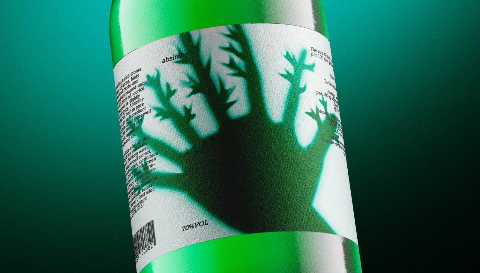
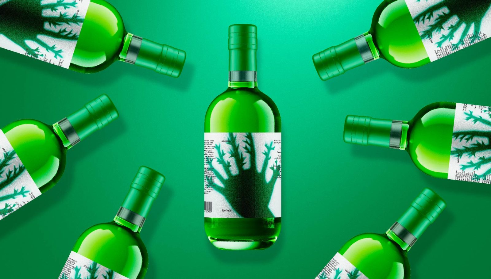
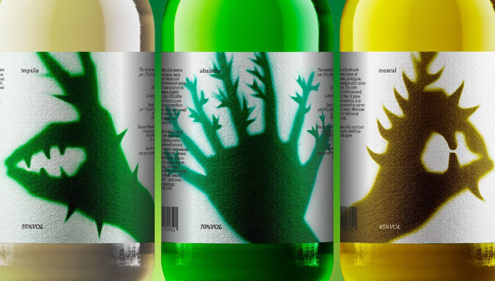
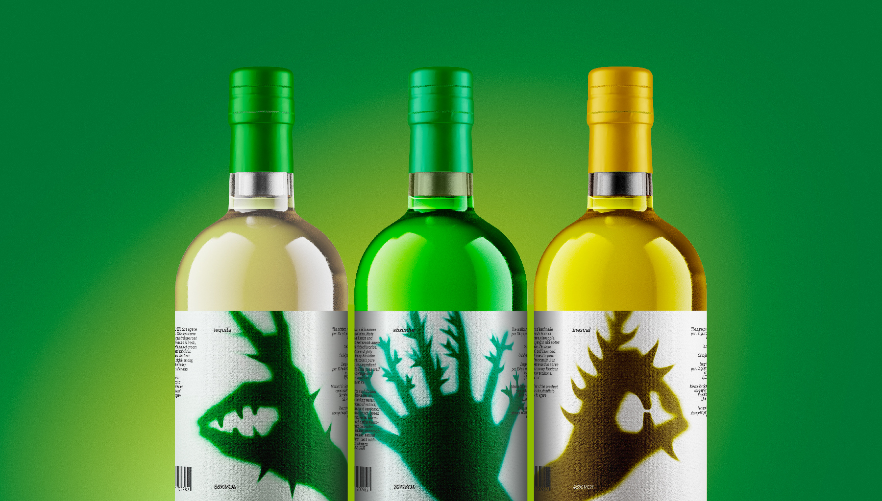
The goal of this project is to instill an inexplicable feeling of fear. The main solution was the shadows of human hands that turn into monsters. The created dissonance from an understandable and recognizable silhouette, placed in an unnatural environment and transformed into an incomprehensible image, encourages the user to study and examine the product.
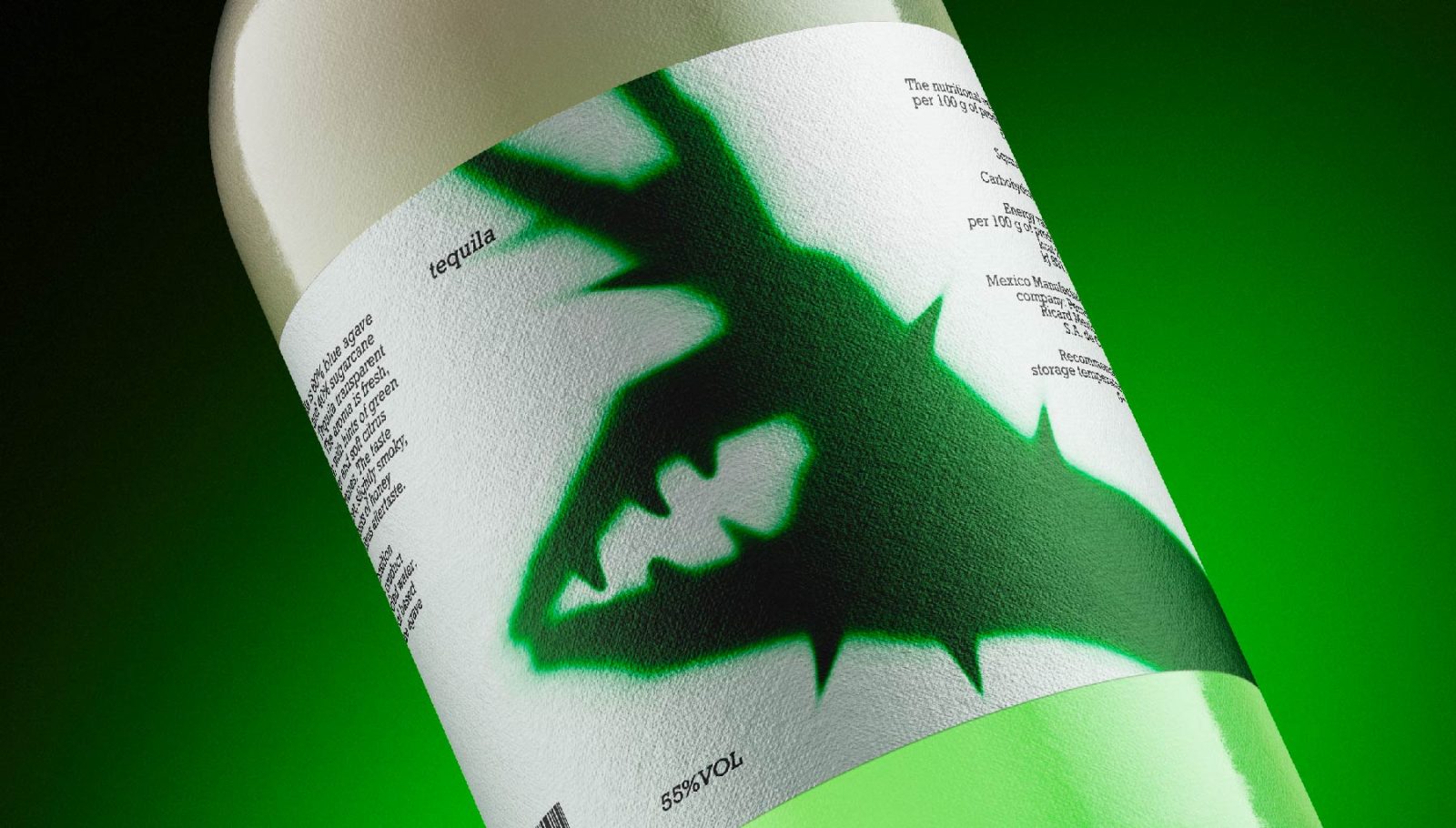
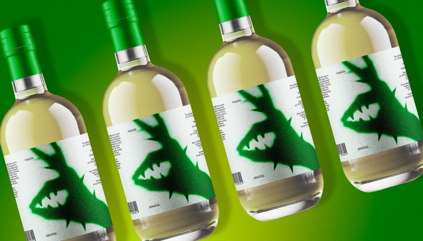
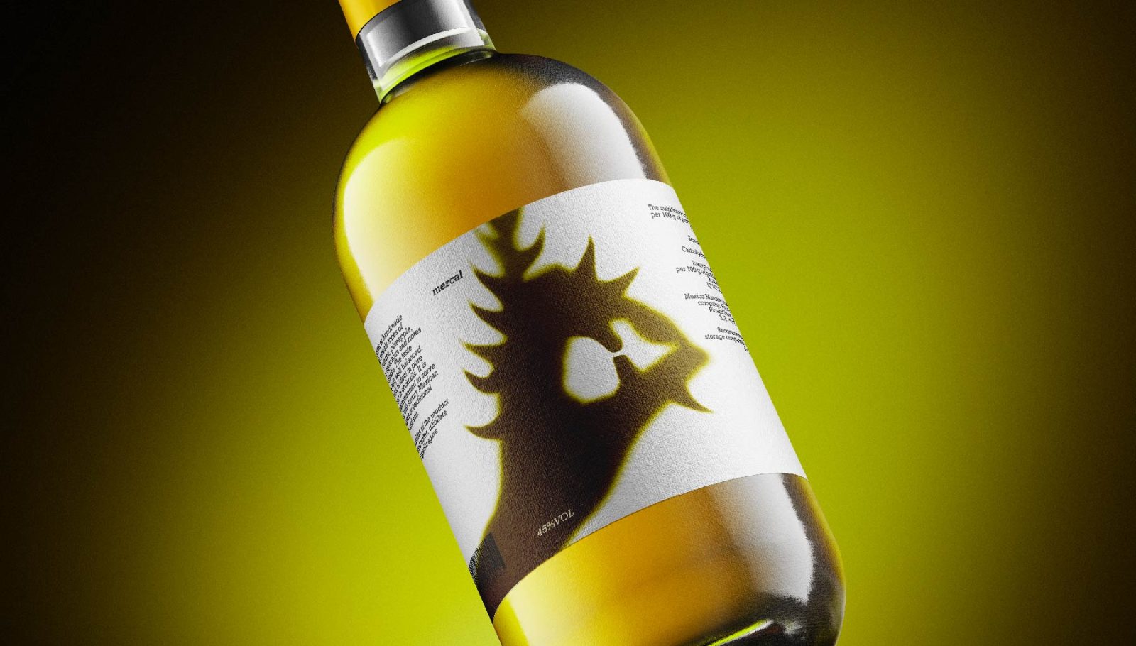
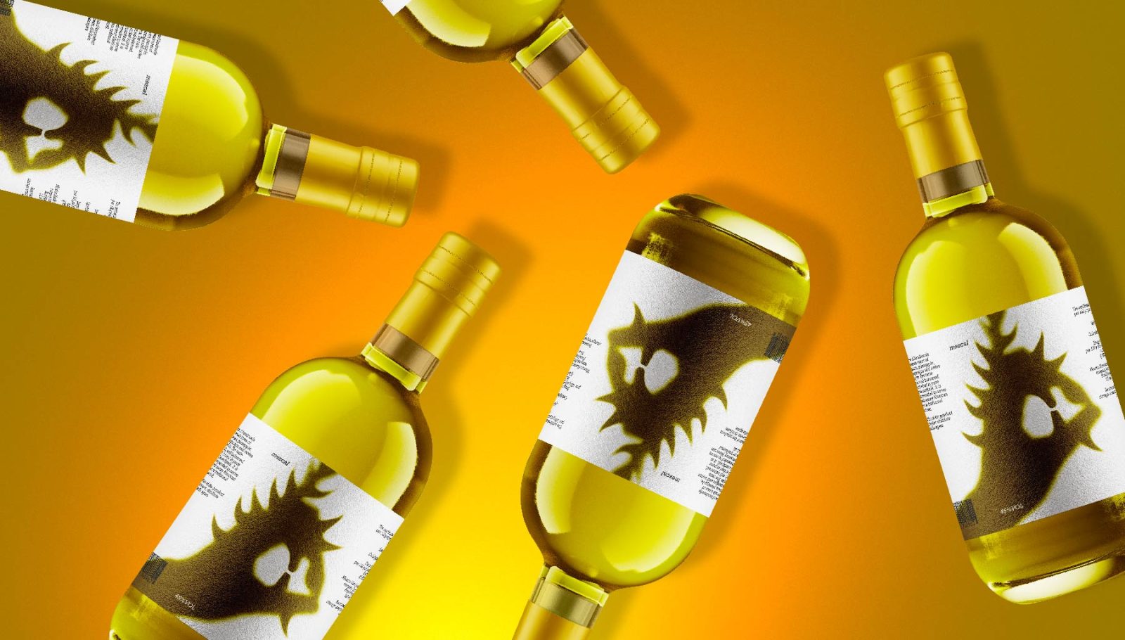
The project is primarily illustrative rather than typographical. The main technique is to blur the shadow a little and distort it in accordance with the plant on which the drink is made.
Tequila is a strong alcoholic drink, a type of mezcal, obtained by distilling fermented cactus juice. This drink has a sharp, bright and unusual taste; these sensations were conveyed through the deformation of the shadow and the addition of cactus spines.
Mezcal is a drink obtained by distilling fermented agave juice. Just like tequila, mezcal is made from the juice of cactus plants, this drink has a bright yellow color, so the similarity between tequila and mezcal is emphasized by the shape of the shadow, but the spines are also changed to blossoming agave leaves.
Absinthe is an alcoholic drink, usually containing about 70% (sometimes 75%, 80% or even 90% alcohol. The most important component of absinthe is an extract of wormwood, the essential oils of which contain a large amount of thujone. To convey the greatest intimidation, the shadow was deformed by increasing the amount fingers from which shoots of wormwood grow.
Despite the fact that the series of labels was created using the same techniques, each of them has its own, special character, reflects the principles of production, and most importantly, is eye-catching, bright and emotional. In the modern design environment, for which it is important to create an emotional connection with the user, this solution is most relevant, because the user is tired of the monotonous, characterless or too noisy design.
CREDIT
- Agency/Creative: Alexandra Kashentseva
- Article Title: Student Packaging Design Concept for A Series of Alcoholic Drinks Based on Plant Extracts
- Organisation/Entity: Student
- Project Type: Packaging
- Project Status: Non Published
- Agency/Creative Country: Russia
- Agency/Creative City: HSE Art and Design School
- Market Region: Global
- Project Deliverables: Packaging Design
- Format: Bottle
- Industry: Food/Beverage
- Keywords: horror, tequila, mezcal, absinthe, plant extract, shadow, illustration, packaging design
-
Credits:
Curator: Leonid Slavin


