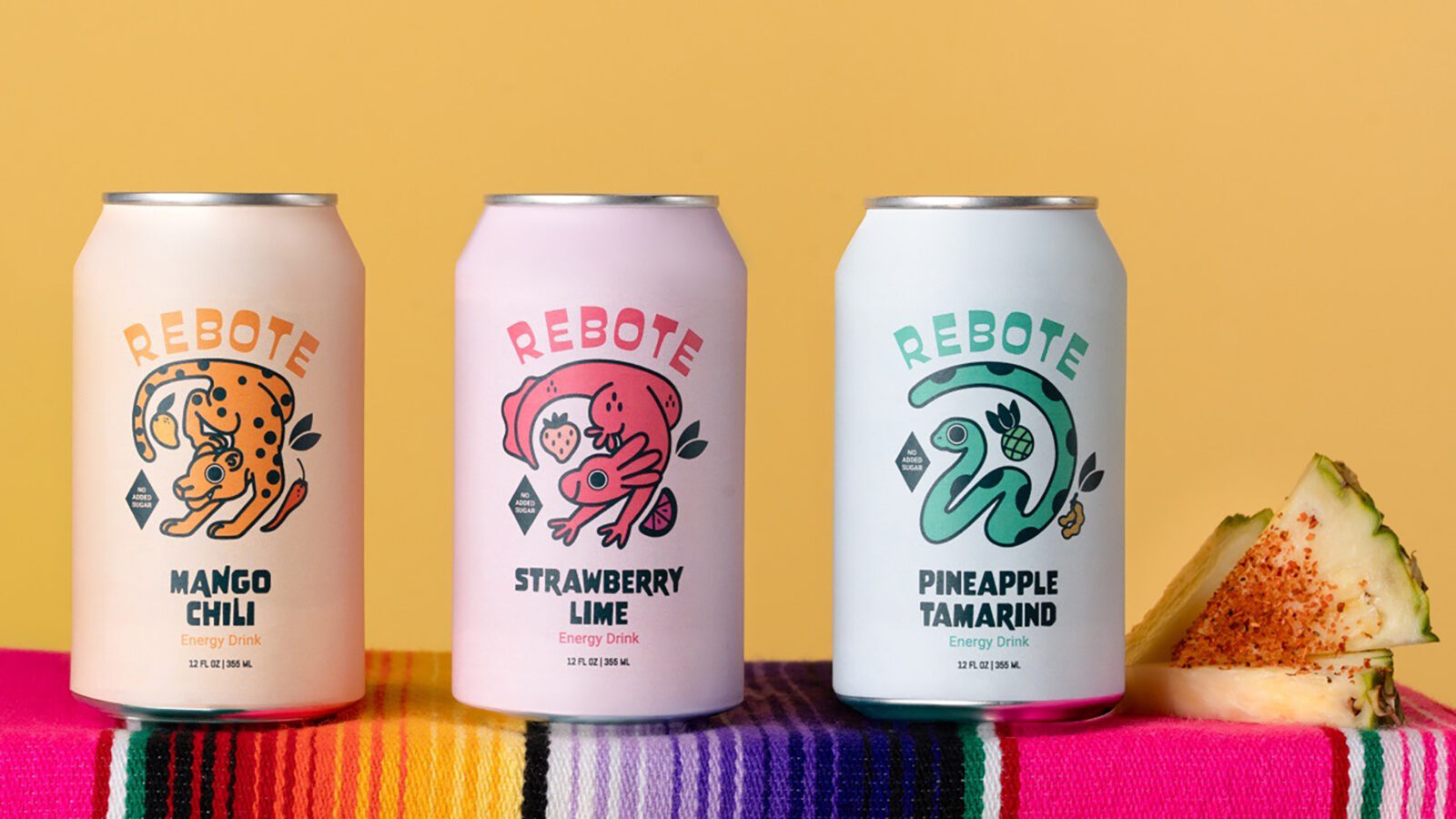
Rebote is a conceptual energy drink brand built around the idea of renewal and momentum. The name translates to bounce back, and that theme guides the visual system, the illustrated characters, the flavor identities, and the overall brand experience. The project includes full packaging design, illustration, typography, layout development, and product photography.
The visual direction is shaped by my Mexican heritage. The bold colors, playful forms, and expressive patterns common in everyday Mexican design have always influenced my creative approach. In Rebote, these influences appear in a contemporary and intentional way. They inspire the rhythm of the typography, the vibrancy of the palette, and the personality of the illustrated characters.
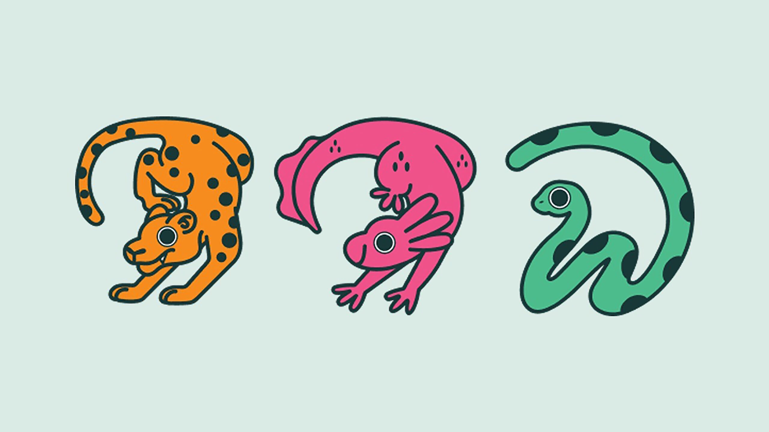
The illustrated characters play a central role in defining the brand’s personality and visual direction. I developed three character-driven cans, each paired with a distinct flavor. The process began with loose gesture sketches to define personality and movement, followed by geometric structuring that gave the characters clarity and consistency. All illustrations use clean outlines and flat color to maintain a tactile, graphic quality. Across all characters, consistency in line weight, geometry, and color application ensures the illustrations function as core brand assets rather than decorative elements.
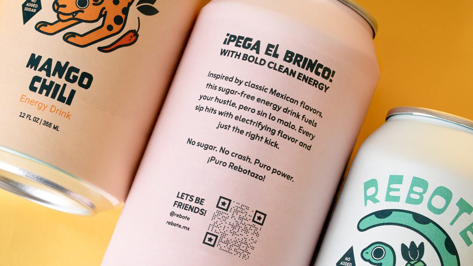
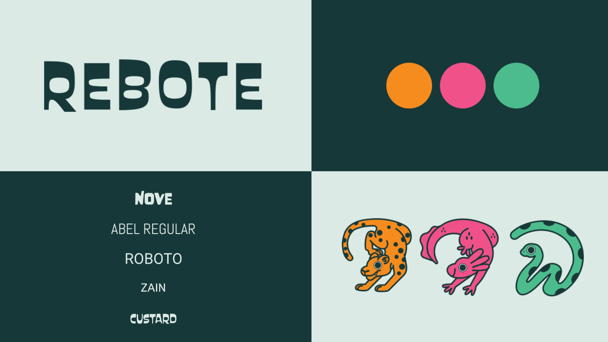
Typography supports the brand through a combination of Nove, Abel Regular, Roboto, Zain, and Custard. Each typeface serves a clear functional purpose. Nove establishes a strong foundation, Abel introduces vertical rhythm, Roboto handles essential information, Zain softens the tone, and Custard brings an approachable quality that complements the illustrations. Hierarchy is built through contrast rather than uniformity, echoing the sense of movement embedded in the brand’s name.
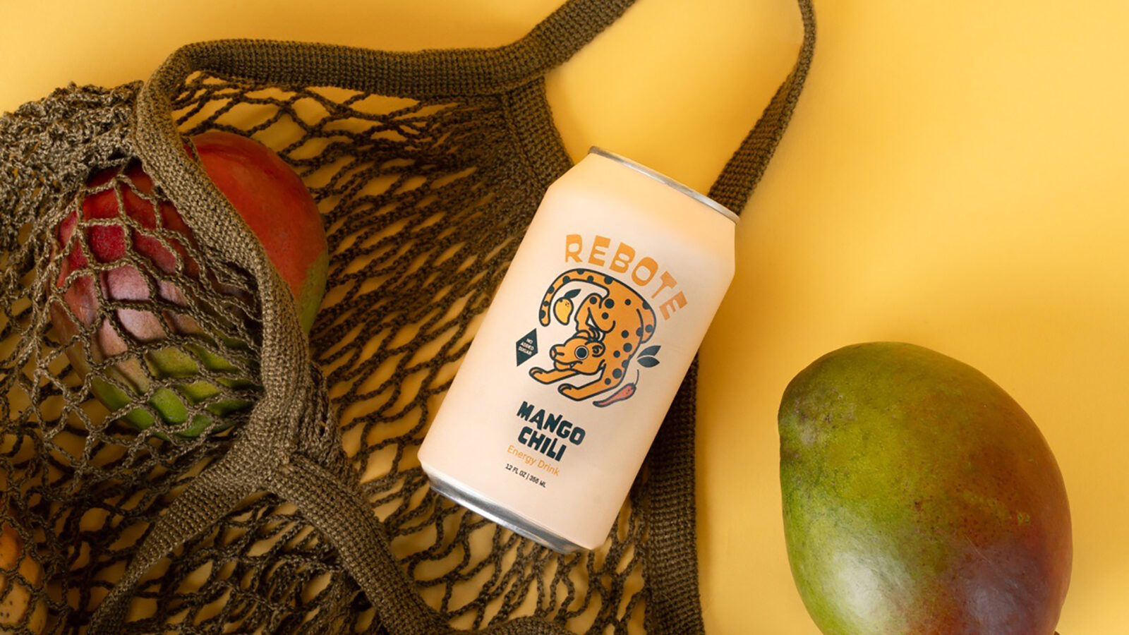
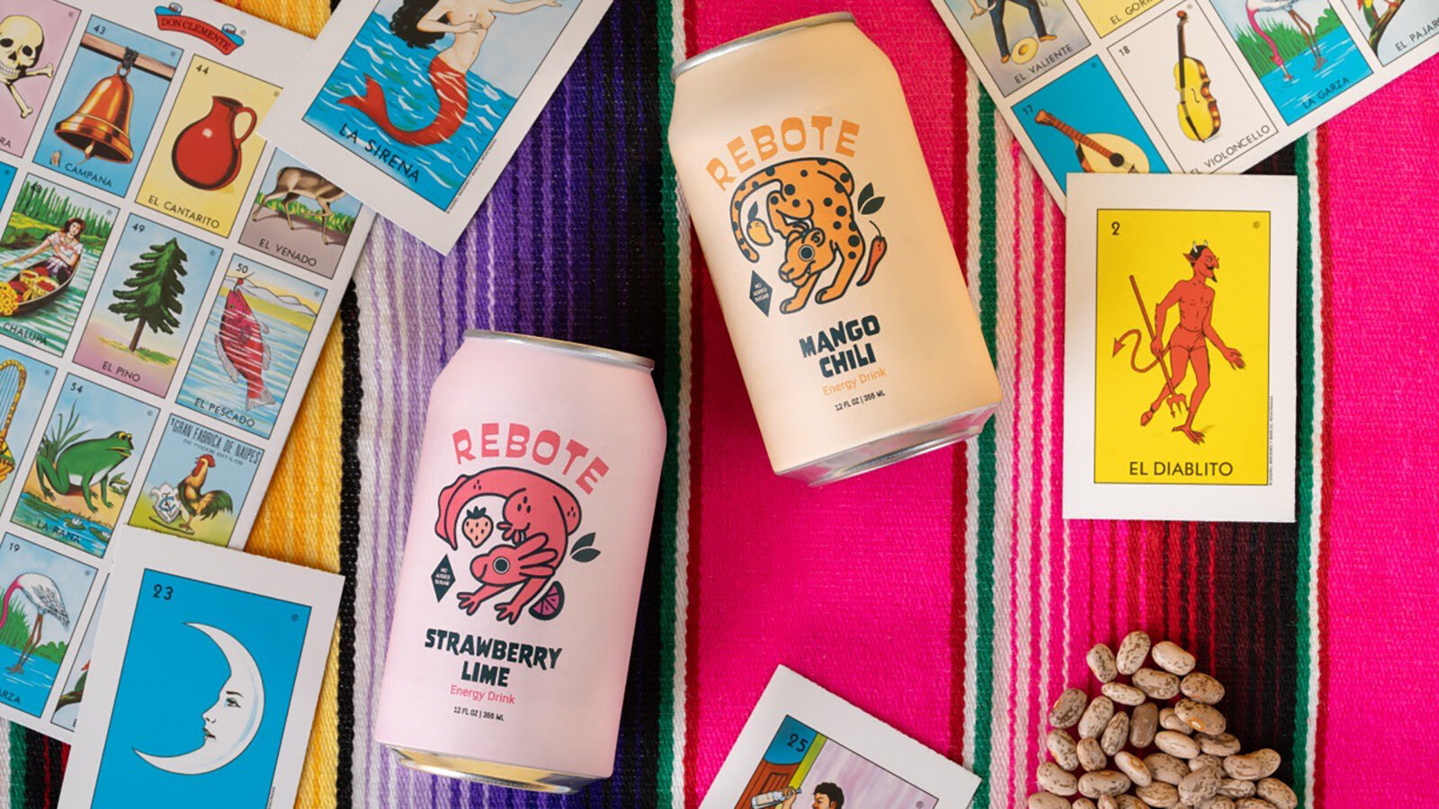
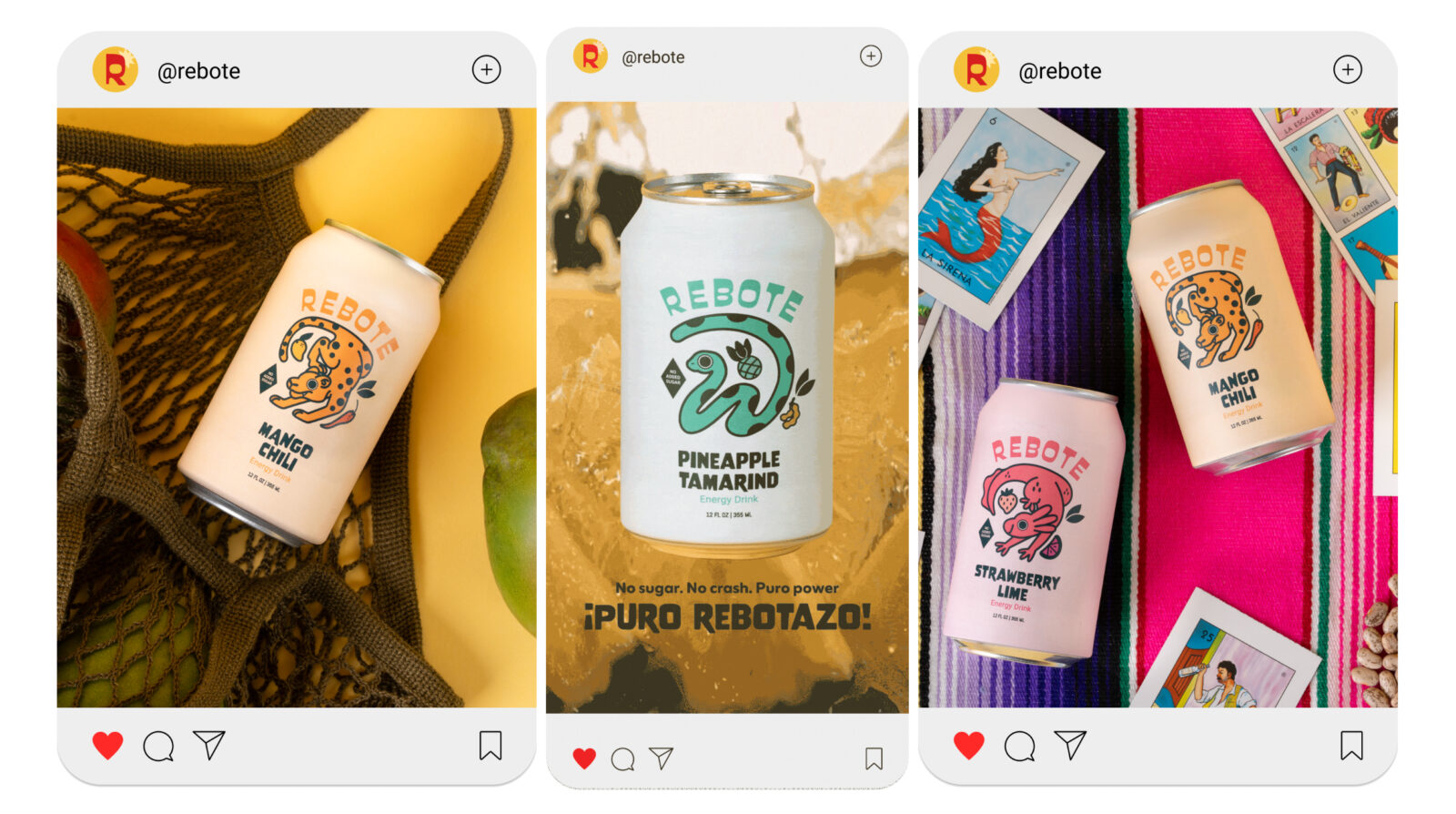
Photography completes the project and situates the packaging within a bright, fresh visual world. I used natural ingredients and clean lighting to highlight the energy and clarity of the brand. The compositions are simple and direct, placing emphasis on the cans while supporting the identity with real textures and color cues from the flavor profiles. I incorporated traditional elements such as Lotería cards and a Mexican zarape to ground the imagery in cultural context. These objects were selected for their graphic presence and symbolic value, which allowed the photography to echo the brand’s roots.
Rebote functions as both a branding and illustration study. It explores how character, motion, and cultural influence can combine to create a contemporary, expressive identity. The project demonstrates a balance between playfulness and structure, and reflects a design approach rooted in authenticity, clarity, and visual storytelling.

CREDIT
- Agency/Creative: Miroslava Morin
- Article Title: Student Miroslava Morin Introduces Rebote as a Character Driven Energy Drink Brand
- Organisation/Entity: Student
- Project Status: Non Published
- Agency/Creative Country: United States of America
- Agency/Creative City: San Diego
- Project Deliverables: 2D Design, Advertising, Advertising Photography, Art, Art Direction, Brand Design, Brand Identity, Character Design, Design, Digital Art, Drawing, Graphic Design, Illustration, Packaging Design, Photography, Product Design, Product Naming, Product Photography, Sketching
- Industry: Food/Beverage
- Keywords: WBDS Student Design Awards 2025/26 , Culturally informed, balance, typographic hierarchy, expressive silhouettes, brand cohesion, visual rhythm, intentional composition, contemporary, color logic, pattern, structural, character-driven, form exploration, spatial balance, palette harmony, illustration, system, motion, unified


