


Xochimilco: 21+ Paletería Bar
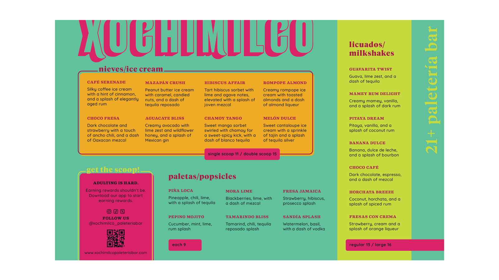
Xochimilco is a modern paletería bar that reimagines the flavors of Mexico City for an adult audience. The concept blends nostalgia with complexity by offering traditional Mexican treats like paletas, ice cream, and milkshakes infused with tequila, mezcal, and other regional spirits. The brand is rooted in the everyday culture of Mexico City, from the naming and logo to the brand personality and color palette.
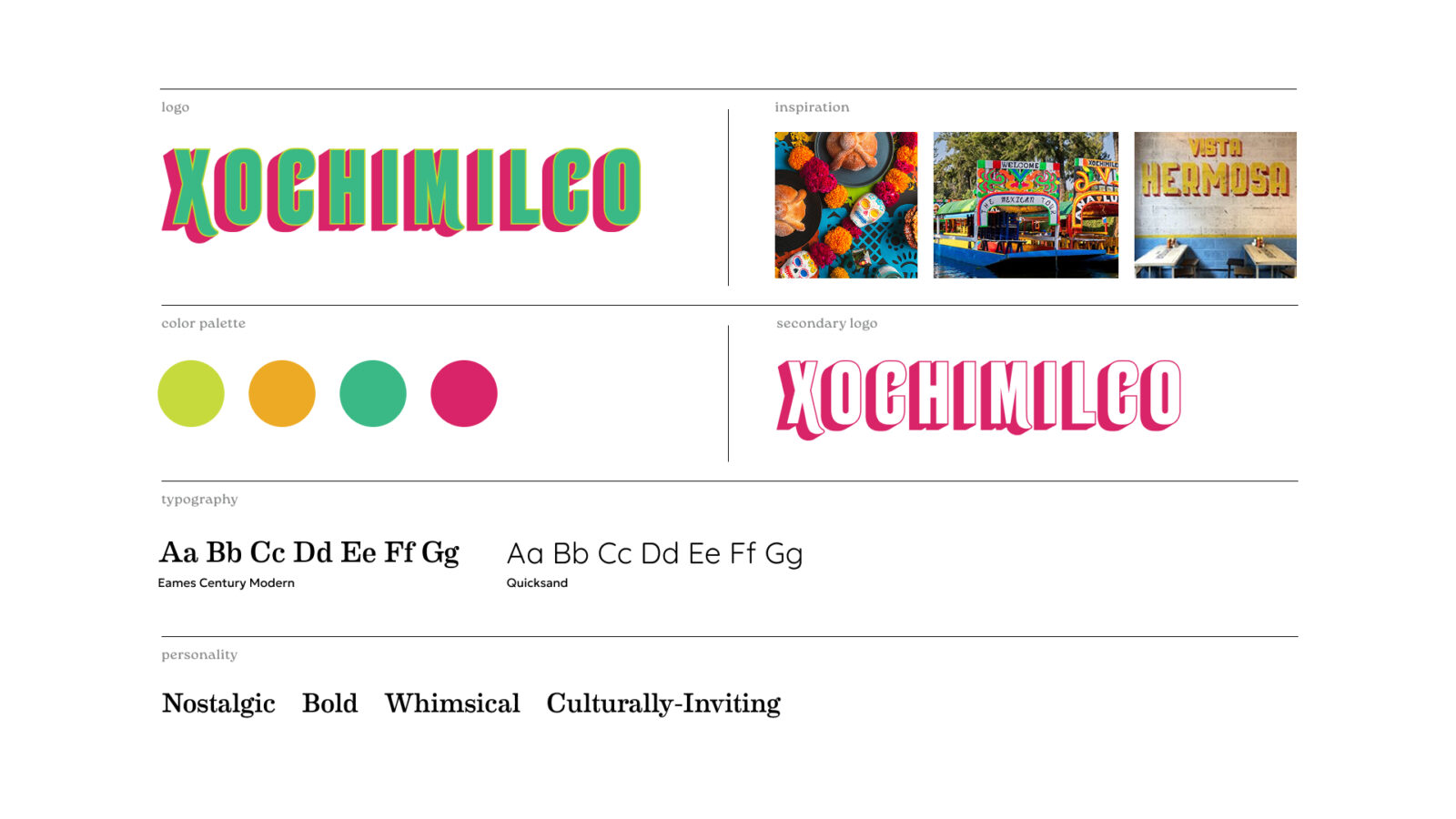
Brand Identity
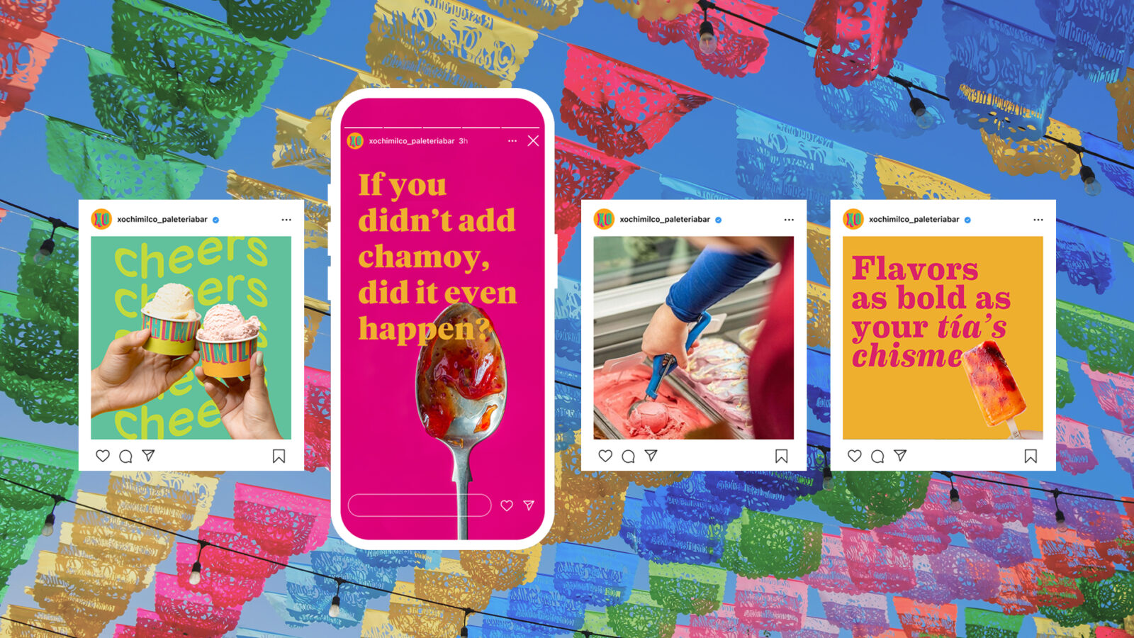
Xochimilco’s brand personality is best described as nostalgic, bold, whimsical, and culturally inviting. Whether someone has visited or lived in Mexico City or is simply a fan of Mexican culture, the brand offers an experience that transports its audience to the streets of Mexico City through flavor.
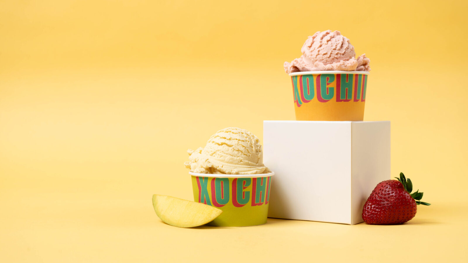
The name comes from one of the most visited sites in Mexico: Xochimilco, a lake located in the heart of Mexico City. The iconic trajineras (gondola-like boats) that fill the Xochimilco canals served as inspiration for the bold and colorful packaging design.
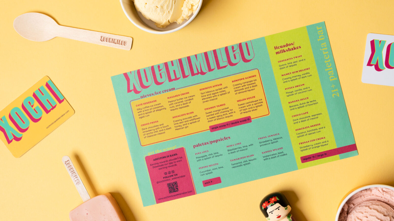
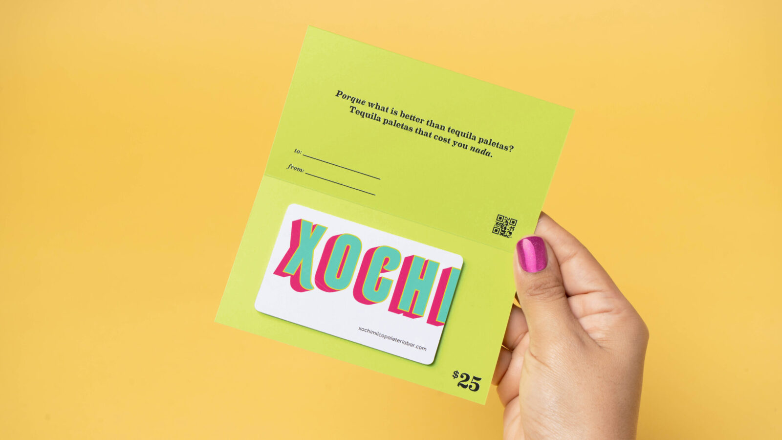
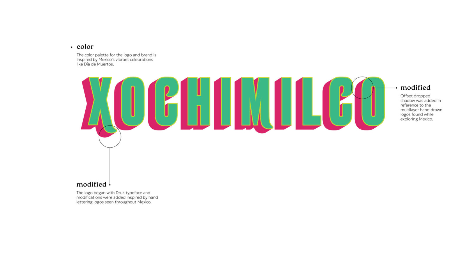
The logo draws inspiration from the hand-lettered signage found throughout Mexico City known as rótulos. Built from the Druk typeface, the logo incorporates subtle but impactful modifications to emulate the hand-painted character of rótulos commonly seen at family-owned businesses. A secondary logo was added for more versatile application.
The color palette reflects not only the vibrant trajineras but also other cultural celebrations filled with vivid hues, such as Día de Muertos. The brand’s personality is bold with a pinch of humor and wit, echoing the charm and attitude of Mexico City locals.
Brand Concept
The heart of Xochimilco is the idea of transportation through flavor. The brand reconnects adults with the recipes they grew up around and elevates them through craft and thoughtful spirit pairings. By blending memory, tradition, and fresh design, the brand creates a space where Mexican culture feels celebrated rather than commercialized.
The Experience
Xochimilco creates an atmosphere that is vibrant, welcoming, and rooted in culture. The brand is designed for adults who want a taste of home presented in a fresh, fun, and boozy way. Every detail is meant to spark connection, celebration, and nostalgia, from the color palette to the witty copywriting. It is a celebration of Mexican creativity, everyday culture, and the joy of discovering something both familiar and new.
CREDIT
- Agency/Creative: Marlene Arias Leon
- Article Title: Student Marlene Arias Leon Brings Xochimilco 21+ Paletería Bar to Life With a Culturally Driven Brand Identity
- Organisation/Entity: Student
- Project Status: Non Published
- Agency/Creative Country: United States of America
- Agency/Creative City: Temecula
- Project Deliverables: Advertising Photography, Brand Creation, Brand Design, Brand Experience, Brand Identity, Brand Mark, Brand Naming, Brand Tone of Voice, Branding, Copywriting, Creative Direction, Design, GIF Animation, Graphic Design, Identity System, Logo Design, Packaging Design, Photography Styling, Product Photography, Props Design
- Industry: Hospitality
- Keywords: WBDS Student Design Awards 2025/26 , Mexican culture, paletería, boozy treats, tequila, mezcal, nostalgic, vibrant, playful, bold, colorful, traditional flavors, ice cream, paletas, packaging, branding, personality, cultural, typography, celebration, humor, wit, flavorful, creative


