


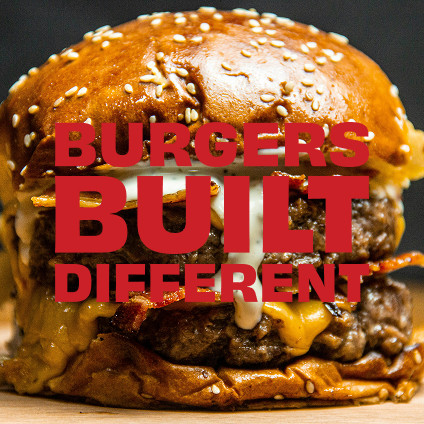
Boiga is a fast-casual restaurant concept rooted in the energy and vibrancy of New York City and inspired by the iconic regional burger traditions found across the United States. The creative direction aims to build a brand that could stand confidently within NYC’s fast-moving and highly competitive food culture while offering guests a sense of discovery and adventure through familiar American classics, reimagined with a modern twist.
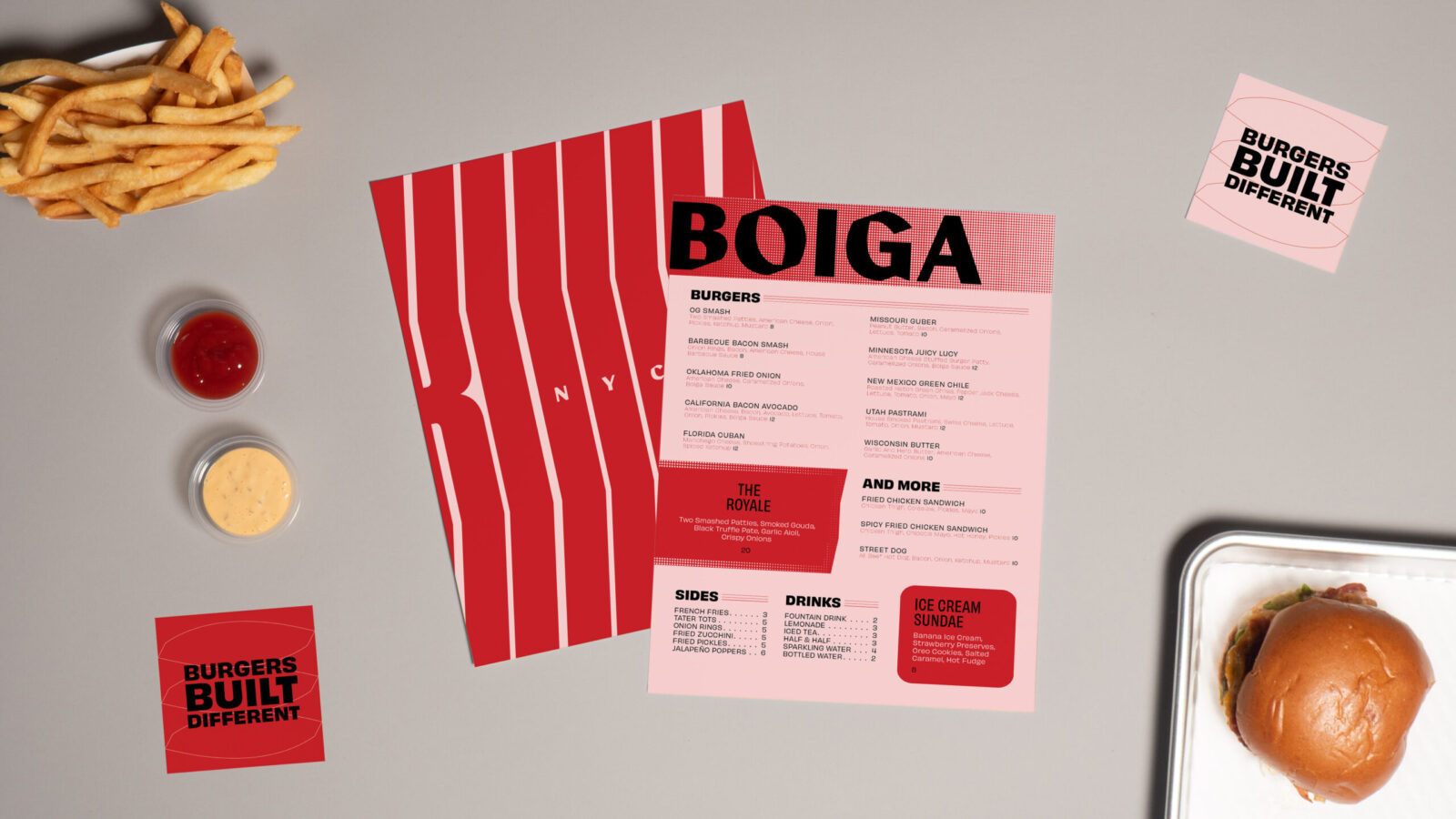
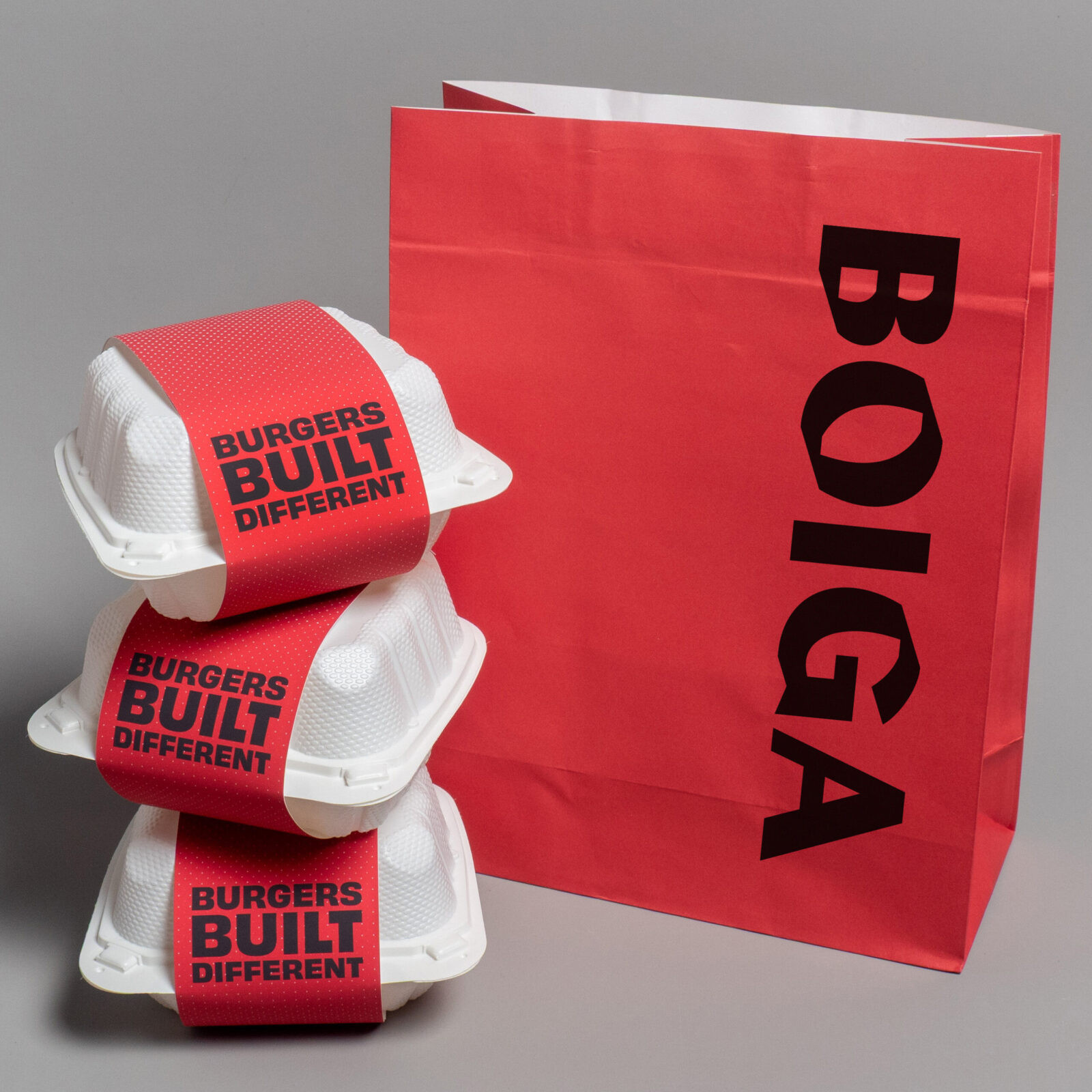
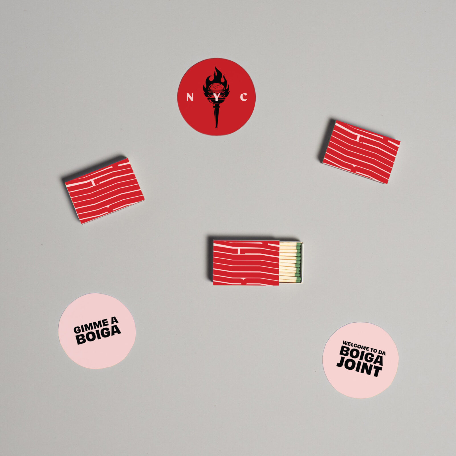
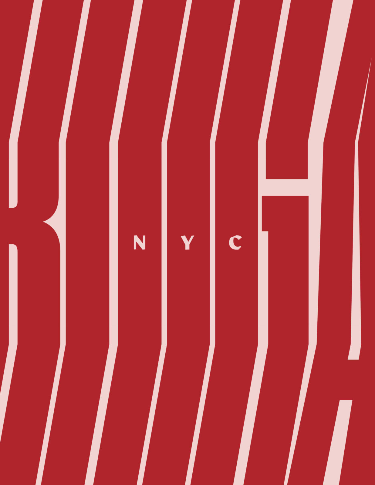
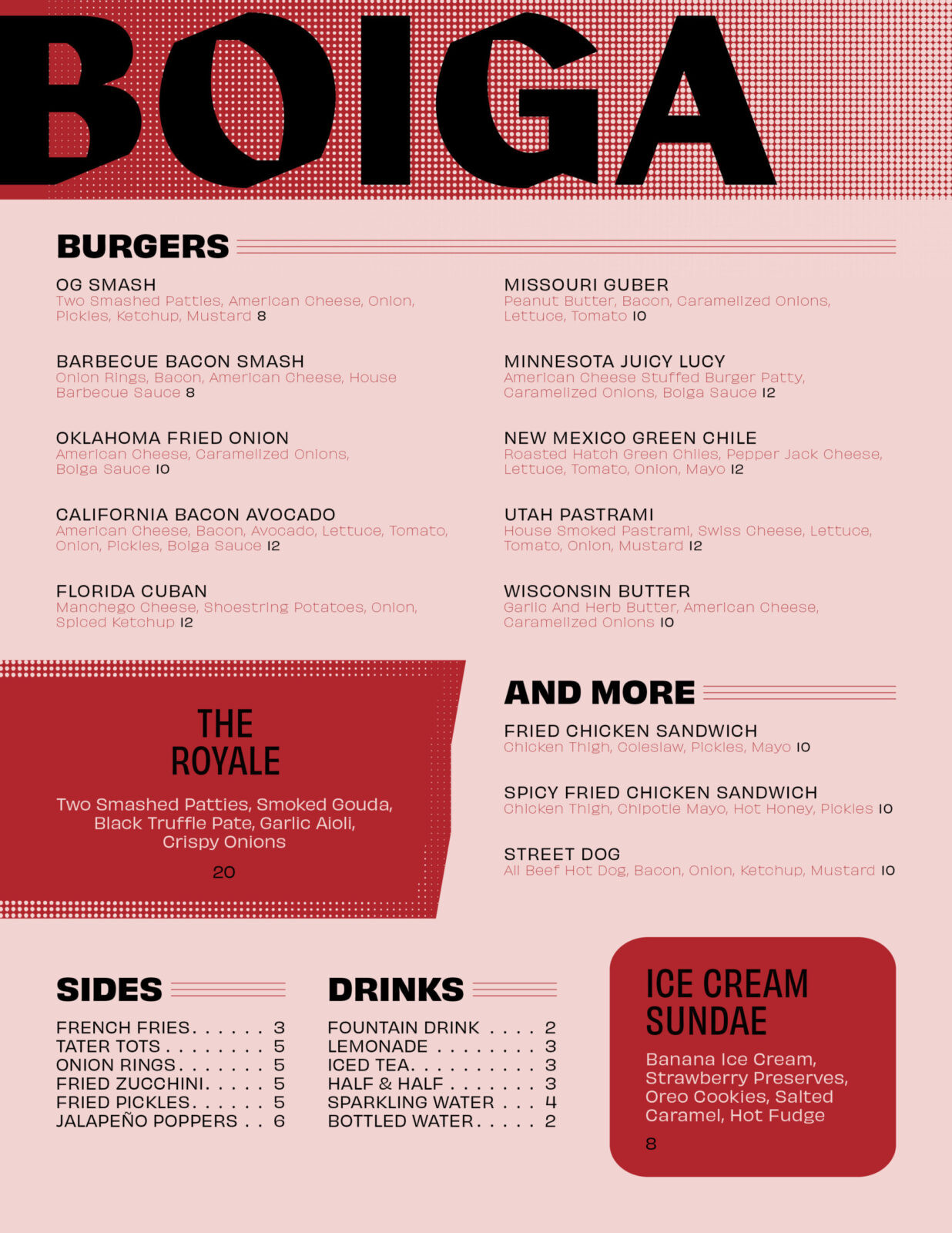
The visual identity is intentionally bold, modern, and type-driven. The menu design prioritizes a clear hierarchy and organization of elements. Typography takes the lead across every touchpoint, anchoring the brand with a confident voice that mirrors the city’s relentless pace and energy. Large-scale type treatments are clear, assertive, and impossible to ignore. Complementing the typography, a series of abstract patterns and halftone textures introduce depth and visual rhythm. These graphic elements provide visual interest and create a sense of movement, reinforcing the dynamic energy of the city while giving the brand a unique, instantly recognizable aesthetic.
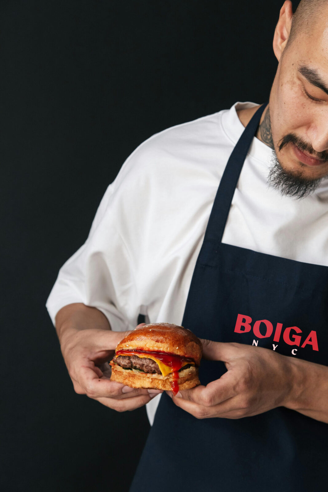
Boiga’s color palette or red, pink, and white energizes the entire system. These bold, vibrant hues create strong contrast and immediate impact, allowing the brand to feel approachable, exciting, and modern while maintaining a clean, contemporary edge. The interplay between color, texture, and typography produces a visual identity that is confident and expressive.
Tone of voice plays an equally important role. Copy throughout the brand is playful and inviting. It reflects the spirit of exploration that defines the menu. The language is meant to be fun enough to stand out in a crowded market, yet aligned with the brand’s bold and modern aesthetic.
Altogether, Boiga’s design system captures the unique intersection of American comfort food and New York attitude. It asserts itself in the city’s dynamic environment through confident typography, striking color, and layered graphic texture, creating a cohesive brand experience that feels fresh and memorable.

CREDIT
- Agency/Creative: Mark Dabu
- Article Title: Student Mark Dabu Designs Boiga to Capture New York Attitude Through Typography and Color
- Organisation/Entity: Student
- Project Status: Non Published
- Agency/Creative Country: United States of America
- Agency/Creative City: San Diego
- Project Deliverables: 2D Design, Brand Creation, Brand Design, Brand Identity, Brand Naming, Branding, Creative Direction, Design, Graphic Design, Identity System, Logo Design, Packaging Design
- Industry: Food/Beverage
- Keywords: WBDS Student Design Awards 2025/26 , Burger, Menu, Restaurant, Food


