


Bloom is a conference where business and cannabis intersect at a defining moment for the global industry. Bringing together influential leaders across policy, finance, retail, and innovation, the event serves as a hub for conversations that move the market forward. Attendees gather to discuss the strategies, risks, and opportunities shaping cannabis in emerging markets. Bloom positions the industry not as a niche space or cultural trend, but as a legitimate, rapidly scaling sector with the potential to reshape economies.
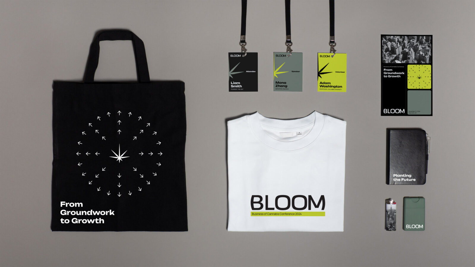
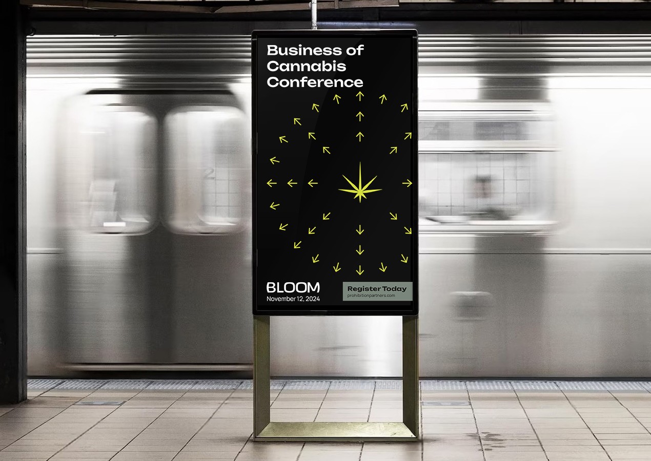
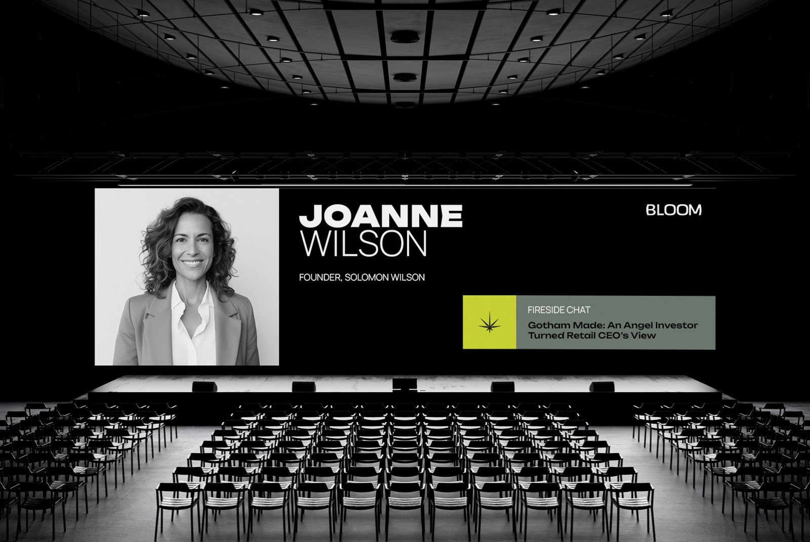
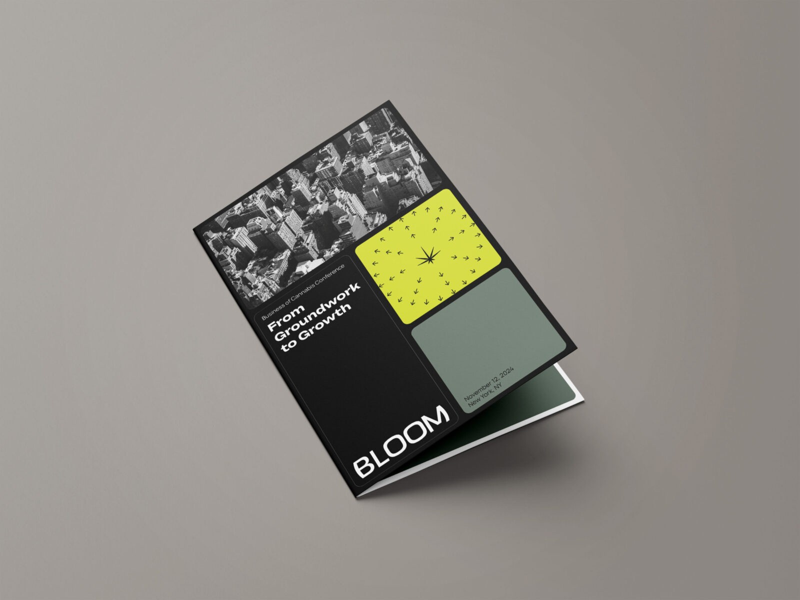
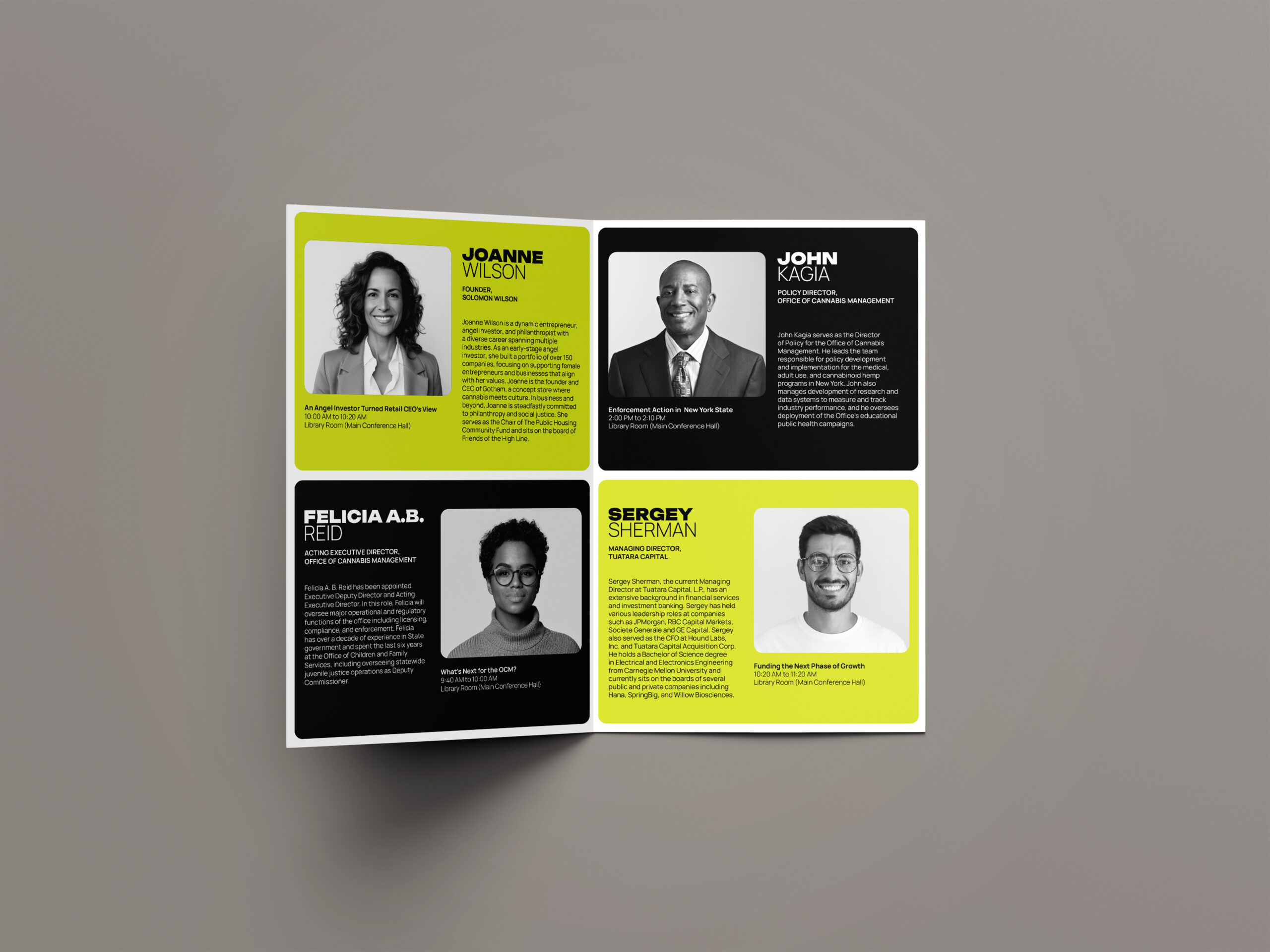
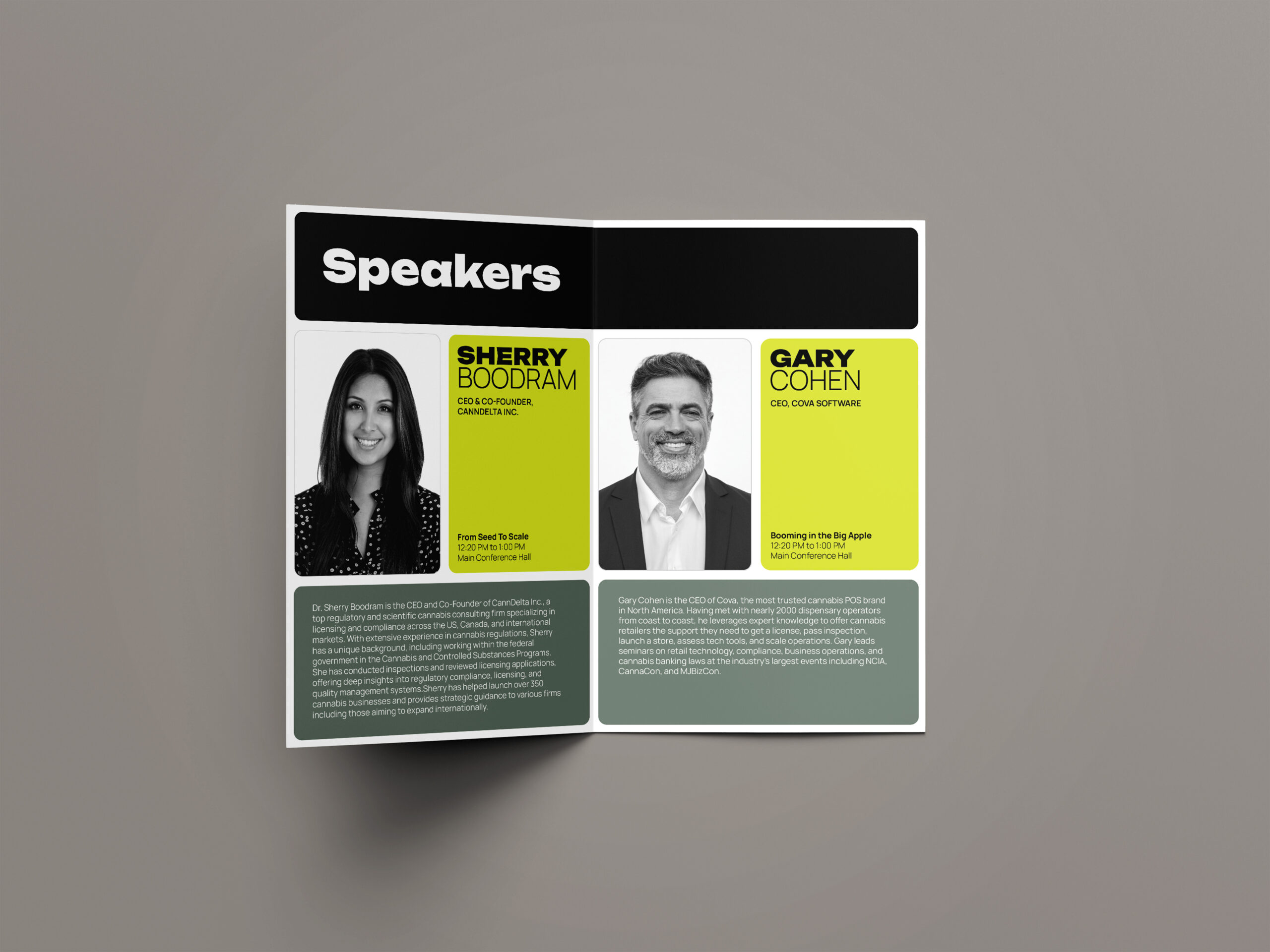
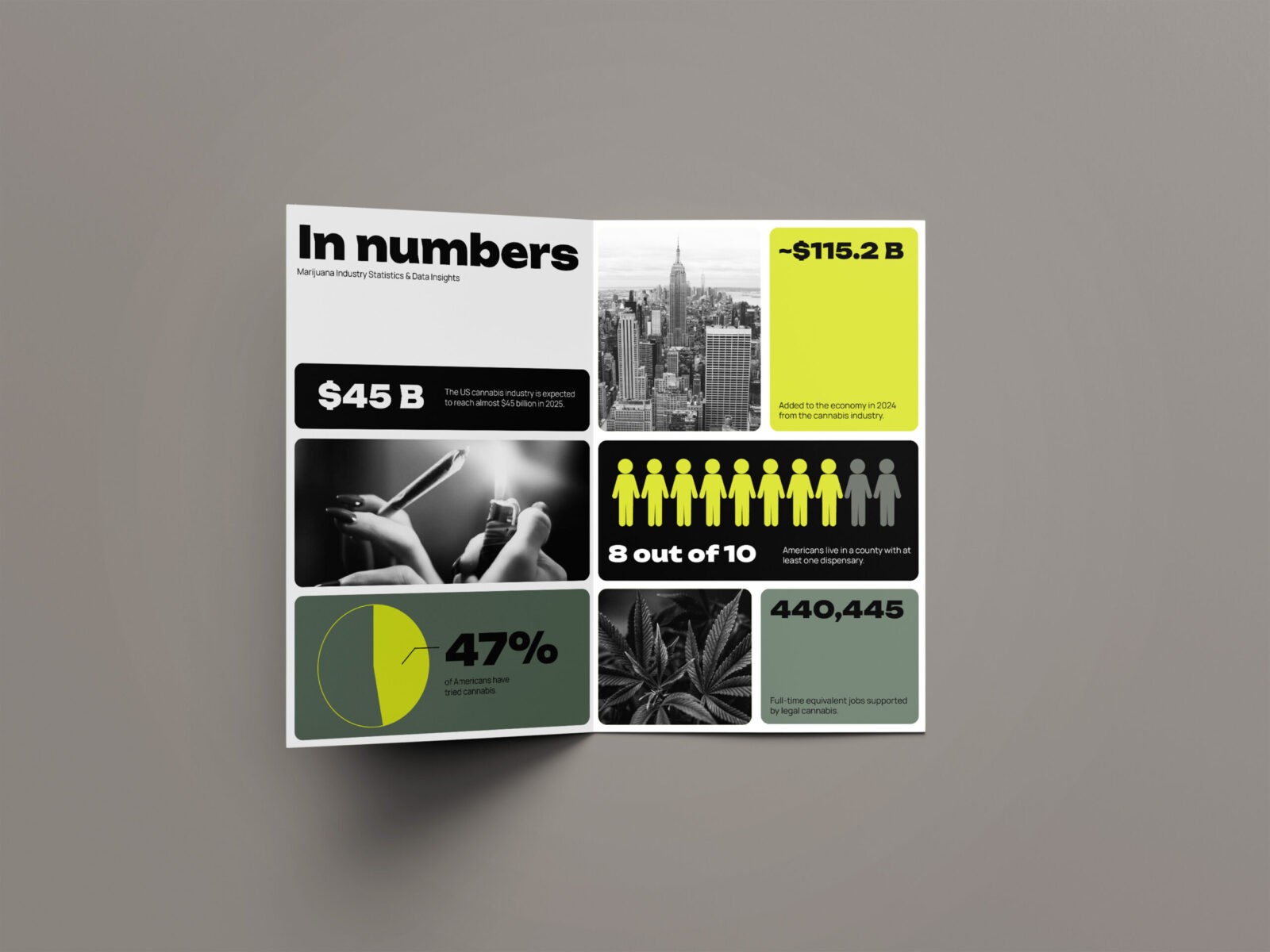
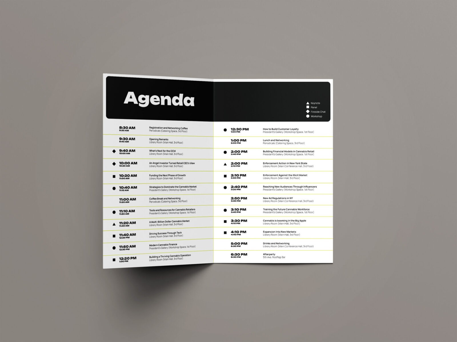
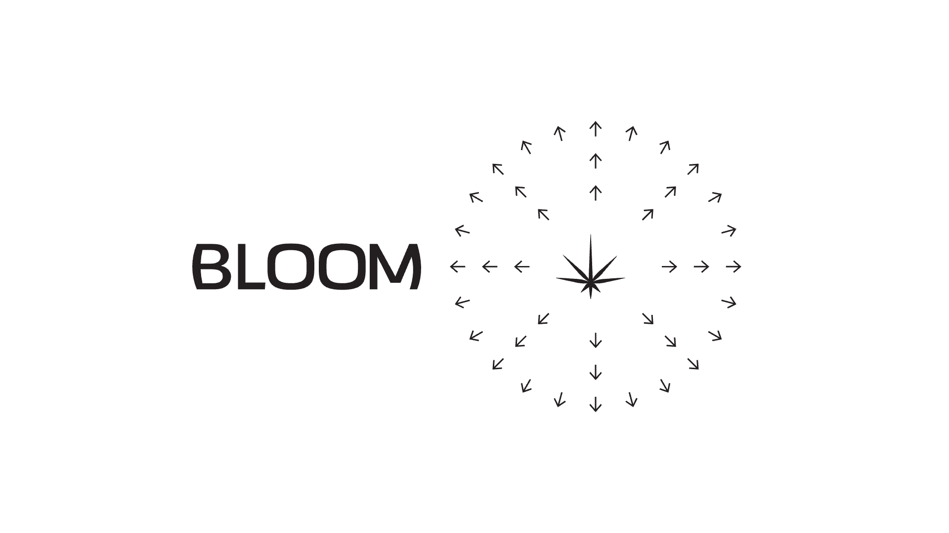
The visual identity reflects this elevated perspective with a system that is clean and mature. Utilizing a grid, the design emphasizes clarity and rationality, grounding the conference in professionalism while still creating space for energy and momentum. The palette of black, grey, and muted green establishes a serious, modern tone. A volt accent introduces a sense of momentum and distinction. This balance helps communicate Bloom’s role as both a credible authority and forward-looking. A key graphic element created for the system features a cannabis flower with arrows radiating outward in all directions. This visual functions as a metaphor for expansion symbolizing how the cannabis market continues to grow, diversify, and push into new territories. The result is a system that feels intentional and is capable of adapting to a wide range of needs.
The overall design extends seamlessly into both print and digital applications, including the full redesign of the Business of Cannabis x Prohibition Partners conference website. The new digital experience prioritizes clarity, accessibility, and a polished visual language that aligns with Bloom’s elevated direction. Across layouts, marketing materials, and on-site collateral, the system remains cohesive and adaptable.
The unified design system allows Bloom to establish itself as a trusted platform for industry leadership. It captures the momentum of an emerging market while grounding the brand in professionalism, reflecting an industry that is maturing, evolving, and ready to grow.

CREDIT
- Agency/Creative: Mark Dabu
- Article Title: Student Mark Dabu Creates a Clean and Authoritative Identity for the Bloom Conference
- Organisation/Entity: Student
- Project Status: Non Published
- Agency/Creative Country: United States of America
- Agency/Creative City: San Diego
- Project Deliverables: 2D Design, Advertising, Brand Identity, Brand Naming, Brand Redesign, Branding, Design, Environmental Graphics, Graphic Design, Identity System, Infographic, Interaction Design, Logo Design, User Experience, User Interaction, Web Design
- Industry: Pharmaceutical
- Keywords: WBDS Student Design Awards 2025/26 , Cannabis, Business, Conference, Design


