


Overview
Xochi is a menstrual care brand on a mission to not only dismantle period stigma but to also honor the diverse experiences of all menstruators. It is built on the belief that menstrual care should be honest, inclusive, and beautifully uncomplicated. Instead of conforming to the traditionally feminine, hyper-saturated language of the menstrual care aisle, Xochi reshapes the narrative through intentional restraint. Every choice, from color to typography, serves one purpose. To create space where all menstruators feel seen, respected, and affirmed.
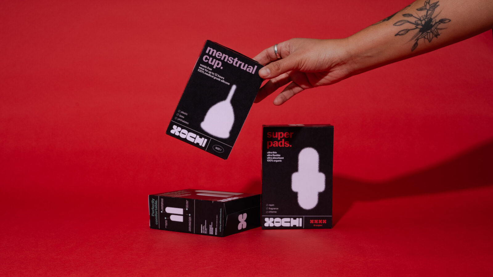
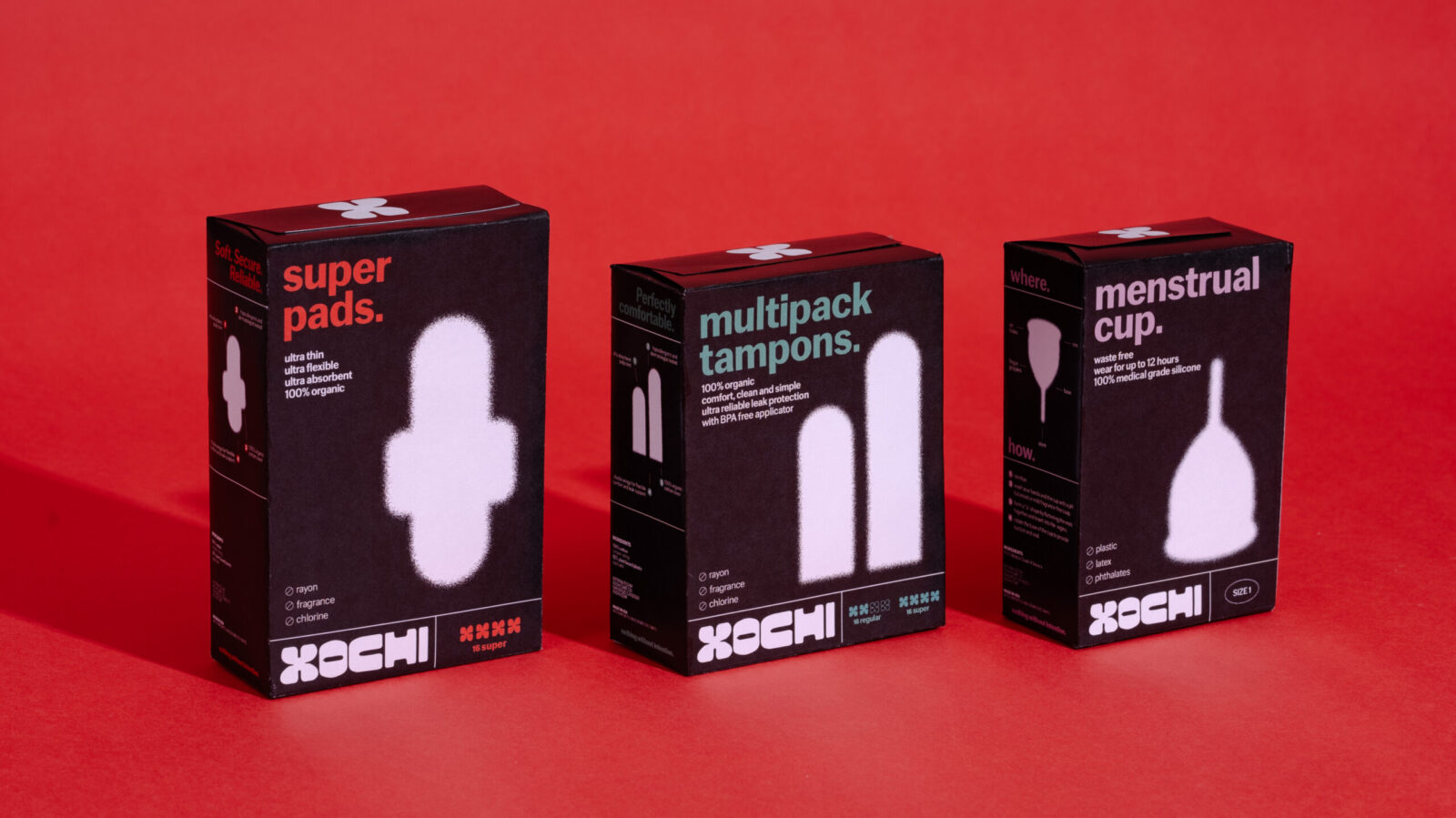
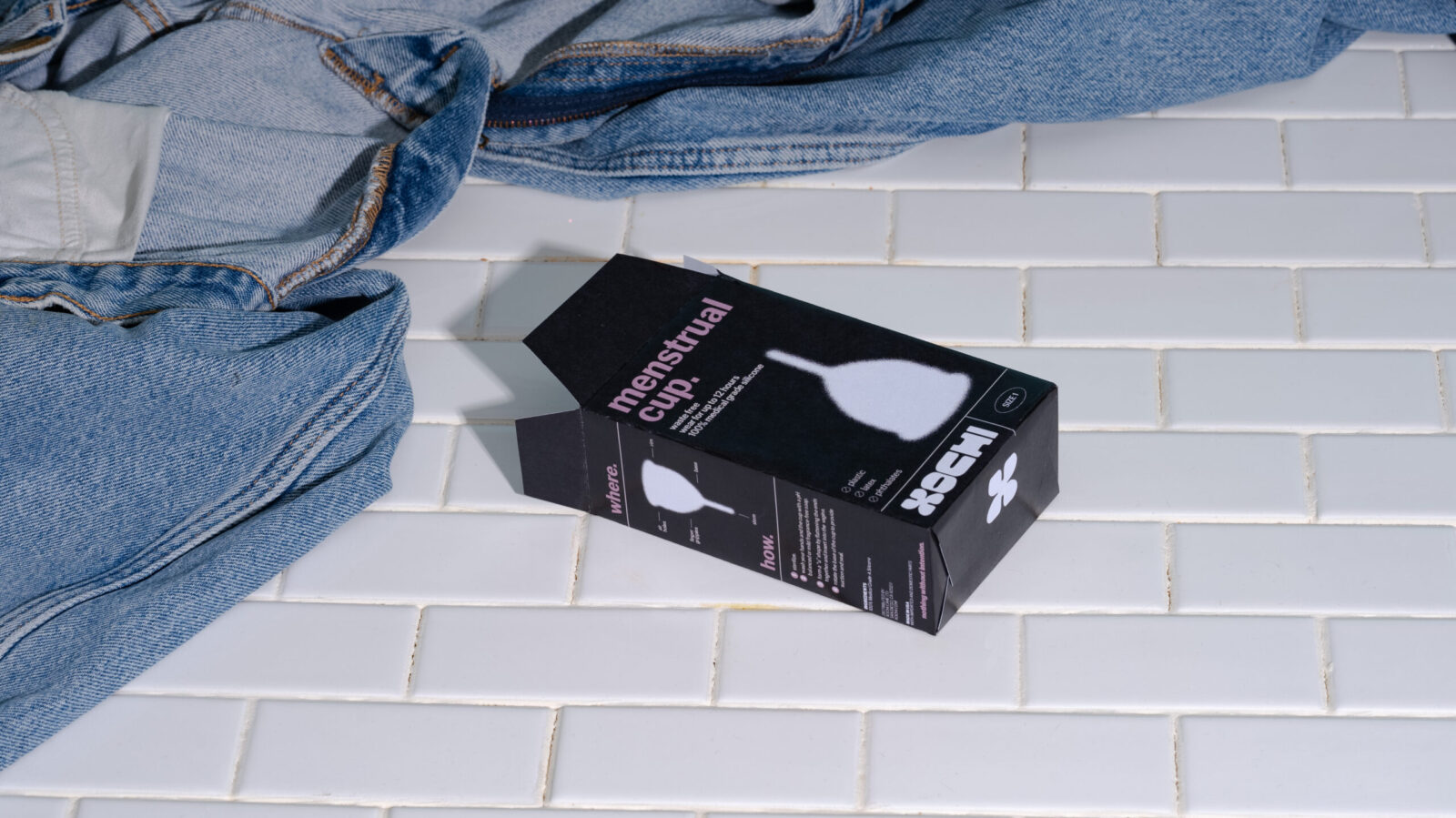
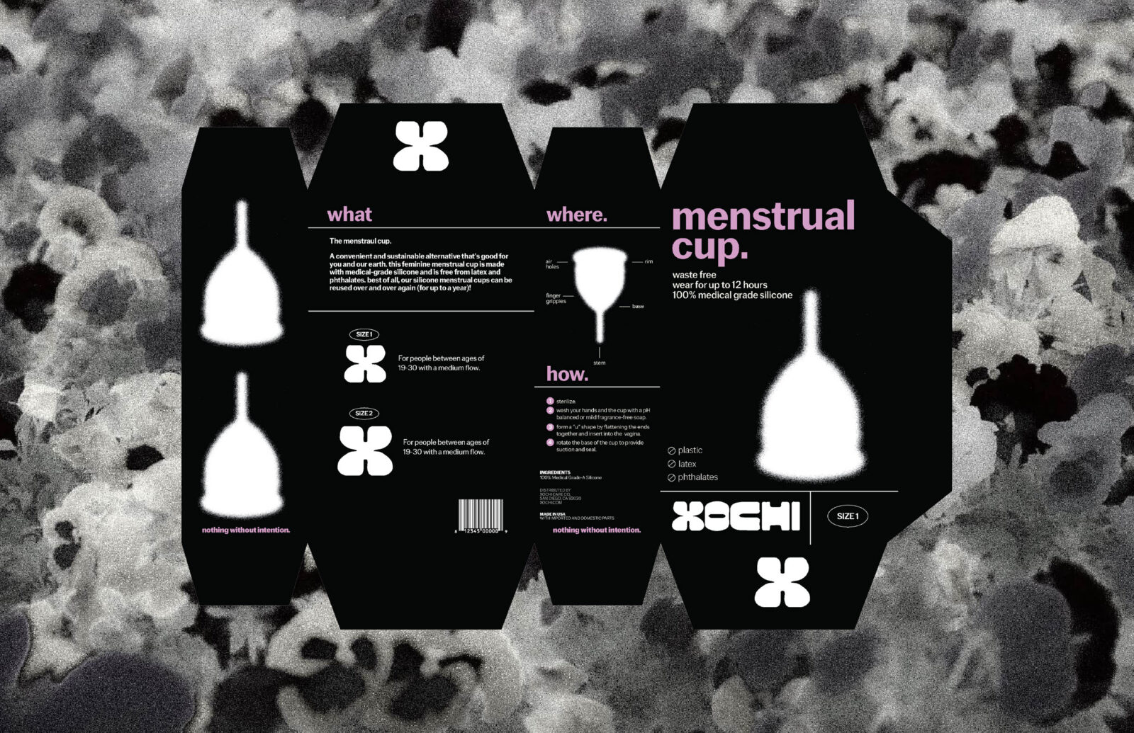
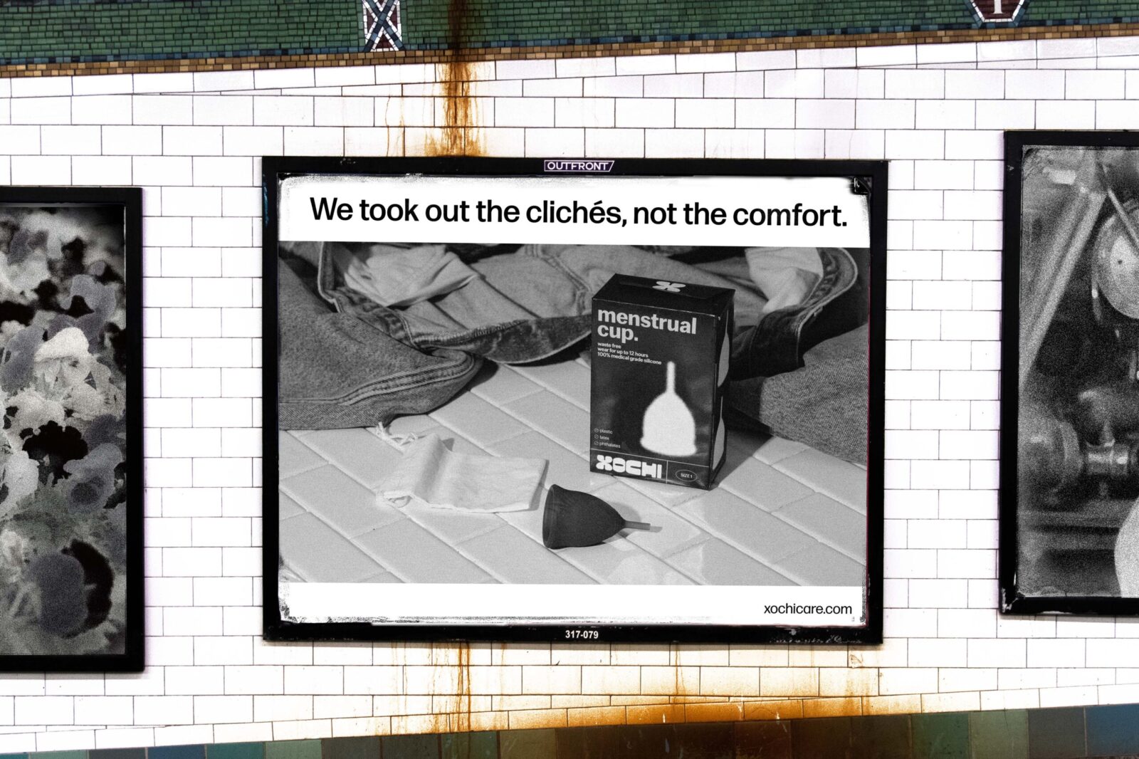
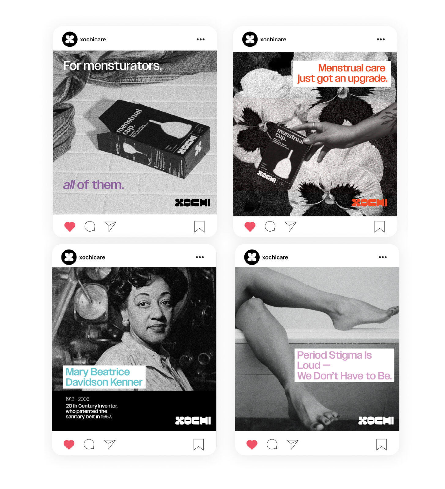
By using a stark black and white palette, the design is intentional, minimal, and bold. It stands out by not trying to shout. No floral motifs, no pastel clichés, just clarity and care. This visual restraint reflects Xochi’s values, inclusive, gender-neutral, and uncompromising in its commitment to comfort and dignity for all bodies. This restrained approach is not neutrality for neutrality’s sake. It is a purposeful reframing of menstrual care as human-centered, not gendered
Research/Background
The design process began with a walk through the menstrual care aisles at local big-box retailers. The dominant shelf language felt overwhelmingly hyper-feminized and unrelatable. As a gender non-conforming designer with a trans-masc partner, I personally experienced how existing products failed to represent the full range of menstruator identities. I asked myself, what would a product look like that my partner would buy without hesitation, perhaps even feel proud to own and keep in their cabinet?
This project started as an answer to that question. I conducted observational research in-store, collected user feedback from a diverse group of menstruators, and reviewed existing product design systems. The insights were consistent. Many people want discreet, effective care that doesn’t rely on gendered cues. They want products that communicate dignity, not denial.
Engagement
The soft color accents in typography introduce subtle warmth and approachability, balancing the monochrome system and reinforcing the brand promise of comfort and care. Imagery is candid and body-positive close crop shots of hands, everyday contexts, and diverse skin tones that normalize menstruation as part of life rather than something to hide.
Every design decision serves to amplify Xochi’s mission, to make menstrual care feel accessible, dignified, and inclusive. The visual language invites conversation, quietly powerful, never performative.

CREDIT
- Agency/Creative: Marcie
- Article Title: Student Marcie Designs Xochi as an Inclusive and Gender-Neutral Menstrual Care Brand
- Organisation/Entity: Student
- Project Status: Non Published
- Agency/Creative Country: United States of America
- Agency/Creative City: San Diego
- Project Deliverables: Advertising, Advertising Photography, Brand Creation, Brand Design, Brand Identity, Brand Naming, Brand Tone of Voice, Branding, Design, Graphic Design, Identity System, Logo Design, Packaging Design, Packaging Guidelines, Product Design, Product Naming, Product Photography, Tone of Voice
- Industry: Beauty/Cosmetics
- Keywords: WBDS Student Design Awards 2025/26 , Menstrual Care, Hygiene, Period Care, Sanitary Products, Androgynous, Inclusive, Gender-Inclusive,


