Overview
Agua Diabla is a local Mexican beer celebrated for its rich gold color and malty flavor. Originating from Tijuana, B.C., Agua Diabla has earned a reputation as a devilishly refreshing beer, perfect for accompanying Mexican dishes and elevating the ambiance at any party. The brand draws inspiration from an urban legend where the Devil was said to have danced with a woman at a famous Tijuana dance bar in the 1960s, revealing his true form to the astonished onlookers. This blend of tradition, mystery, and celebration is at the heart of Agua Diabla’s identity.
Solution
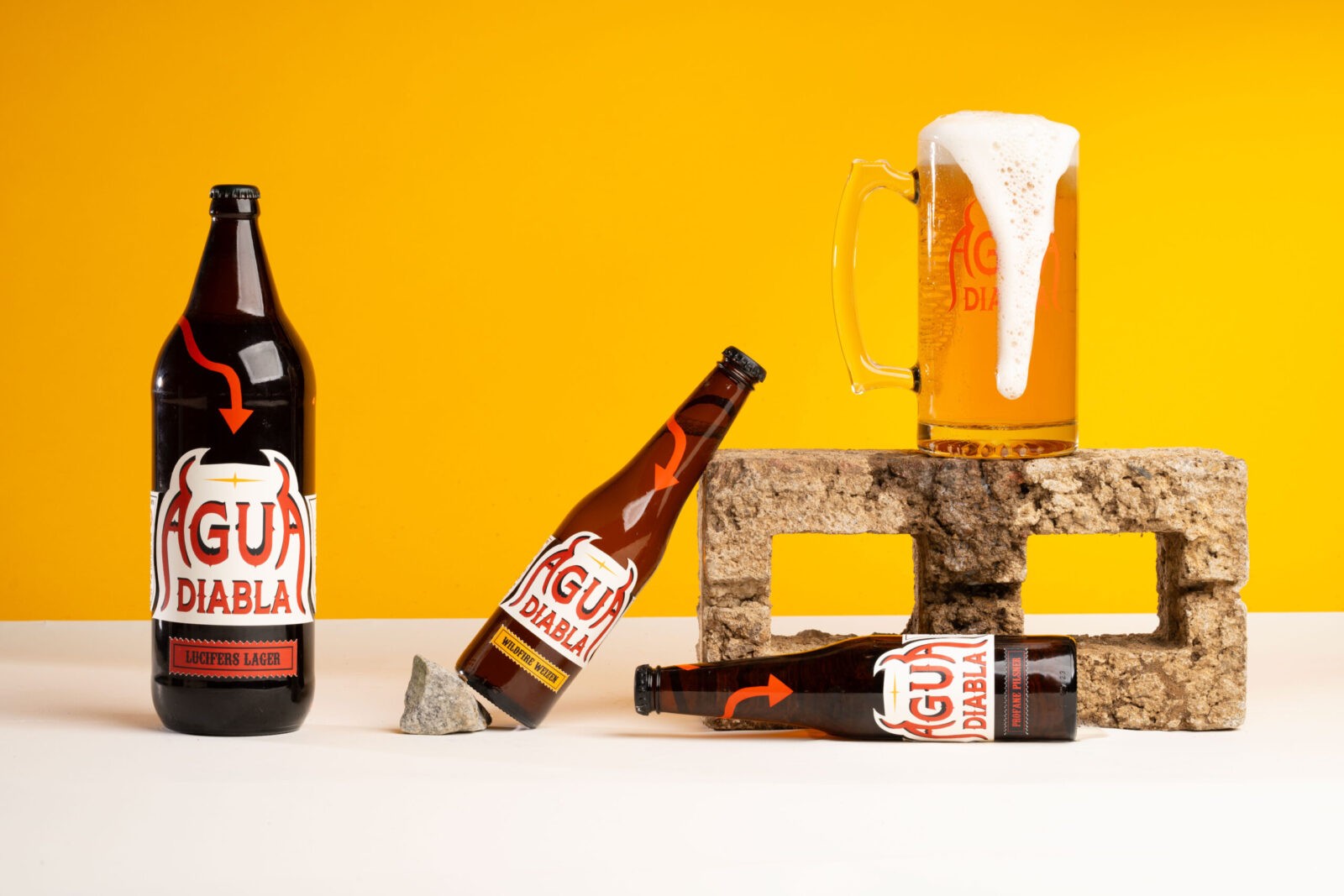
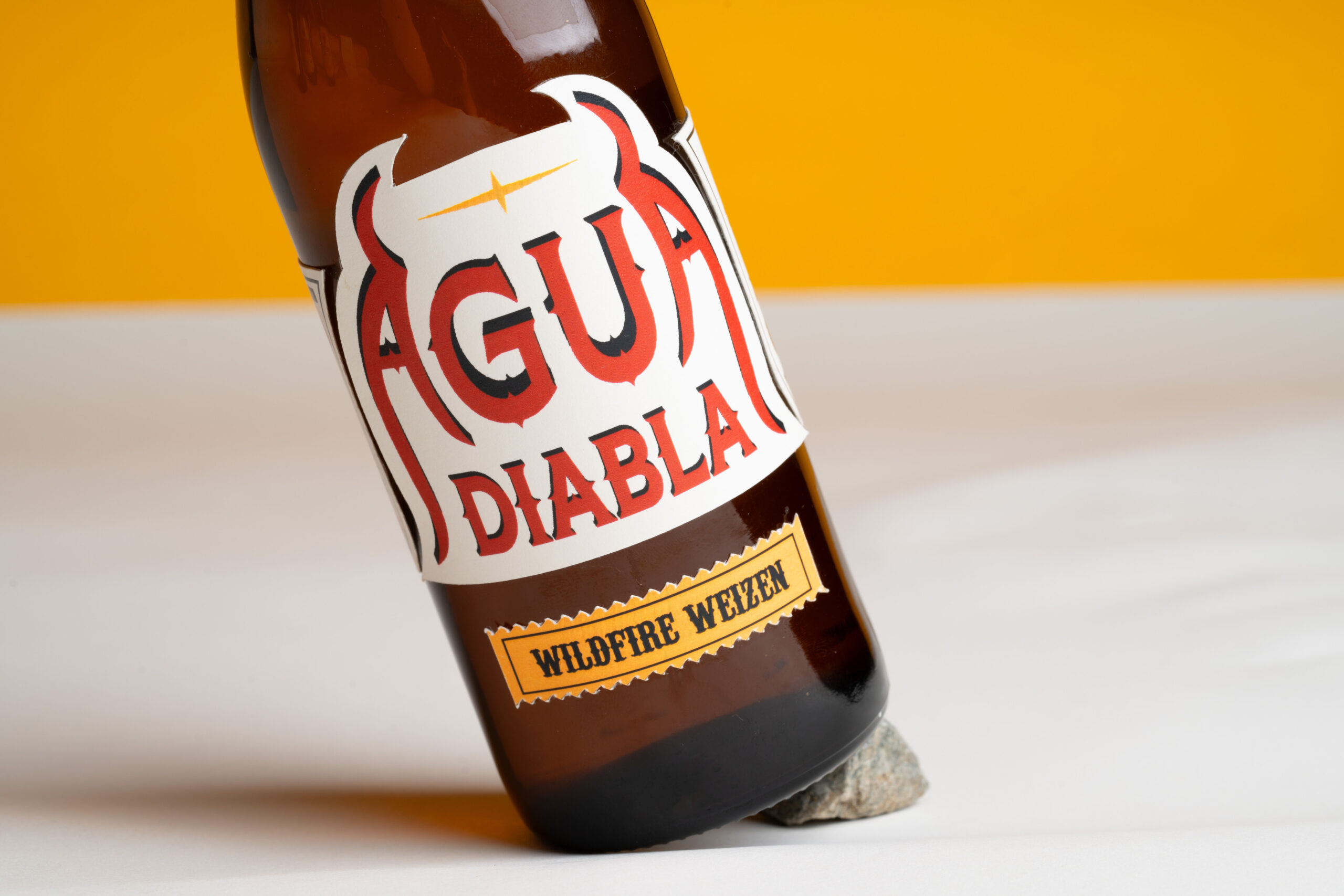
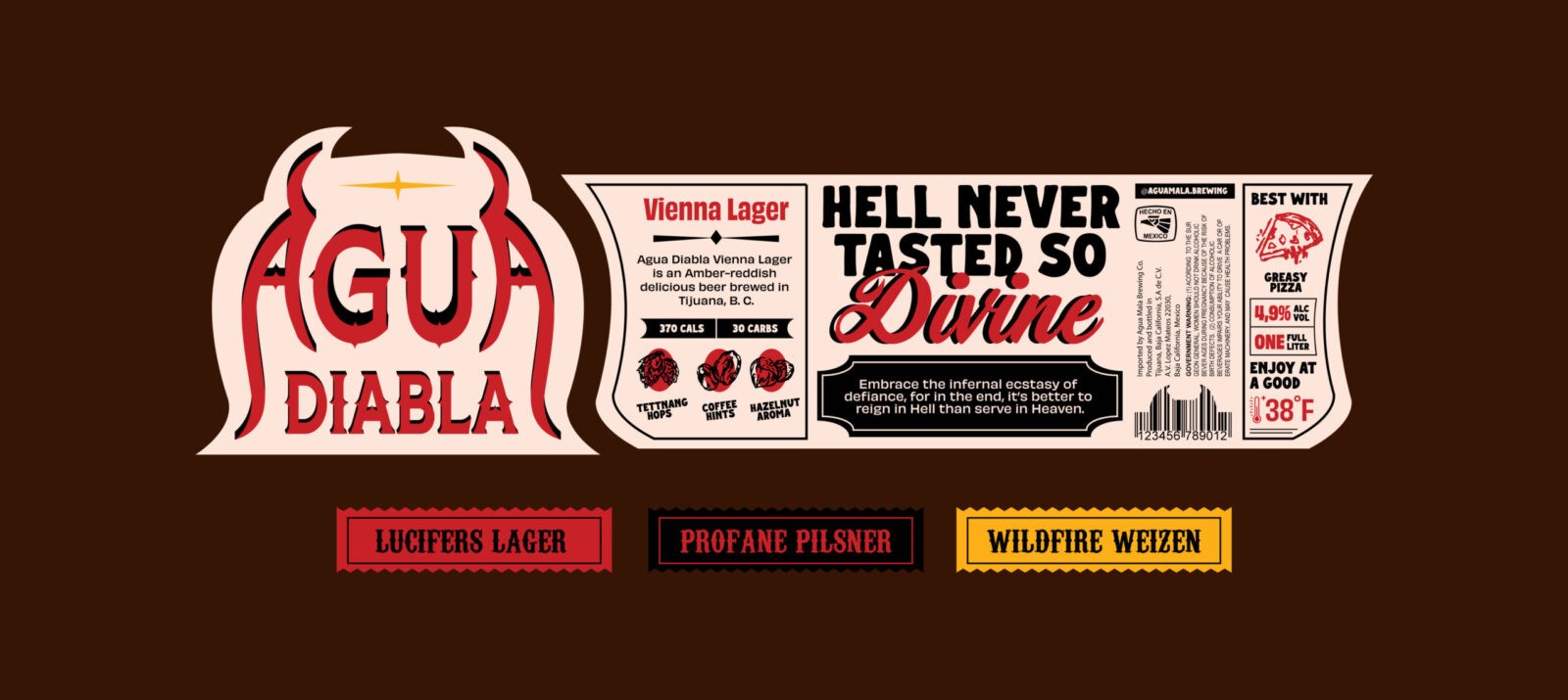
The branding for Agua Diabla was meticulously crafted to embody the spirit of Mexico, with a strong emphasis on the cultural elements that make the beer unique. The hand-lettered logotype is deeply inspired by the traditional sign painting found across Mexico, a craft that has become iconic in the visual landscape of Mexican streets. An extensive sketching phase was undertaken to explore various design possibilities before finalizing the logo. The final composition features symmetrical ‘A’s adorned with devil horns and shadowed letters, adding a mischievous and bold character to the brand’s identity.
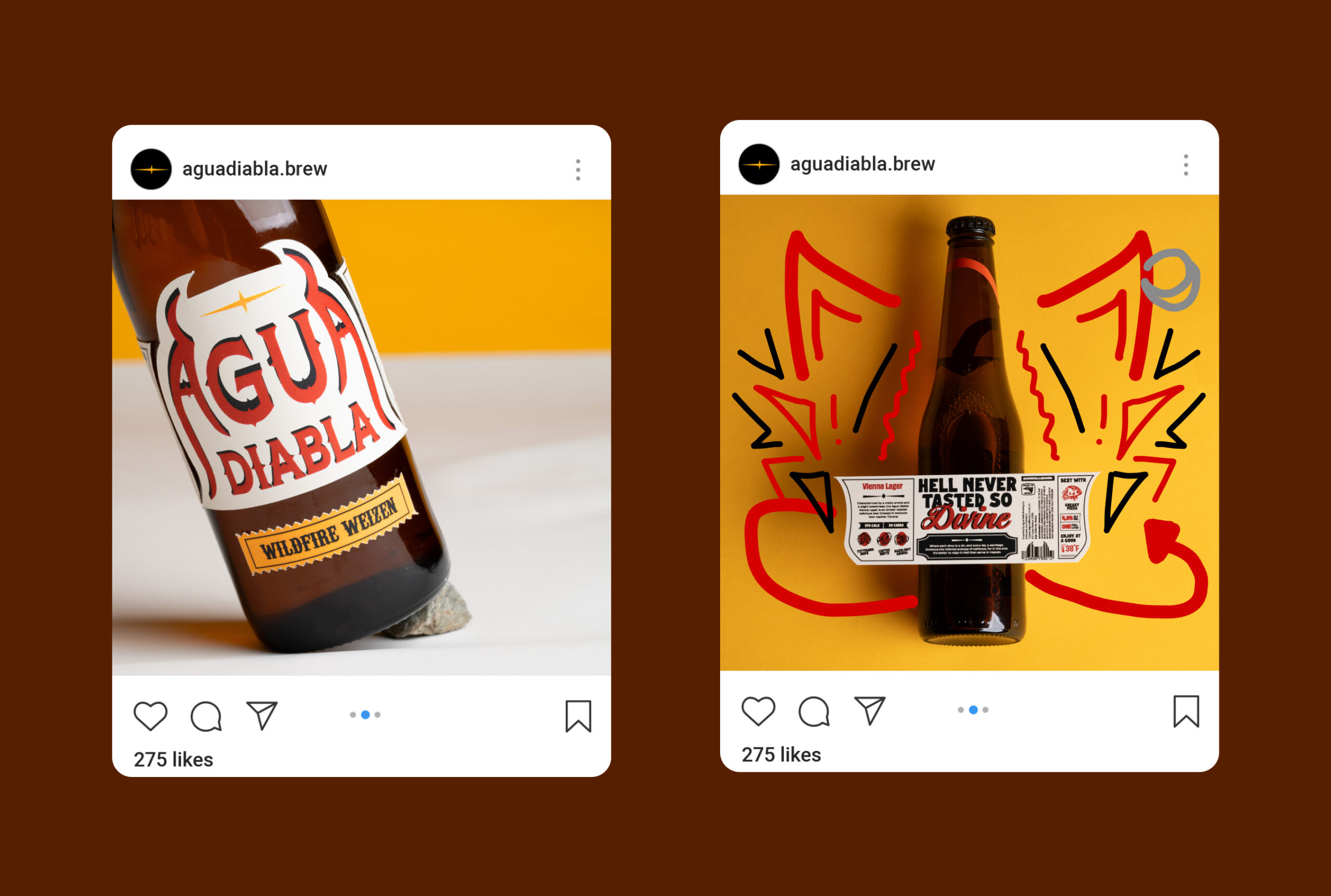
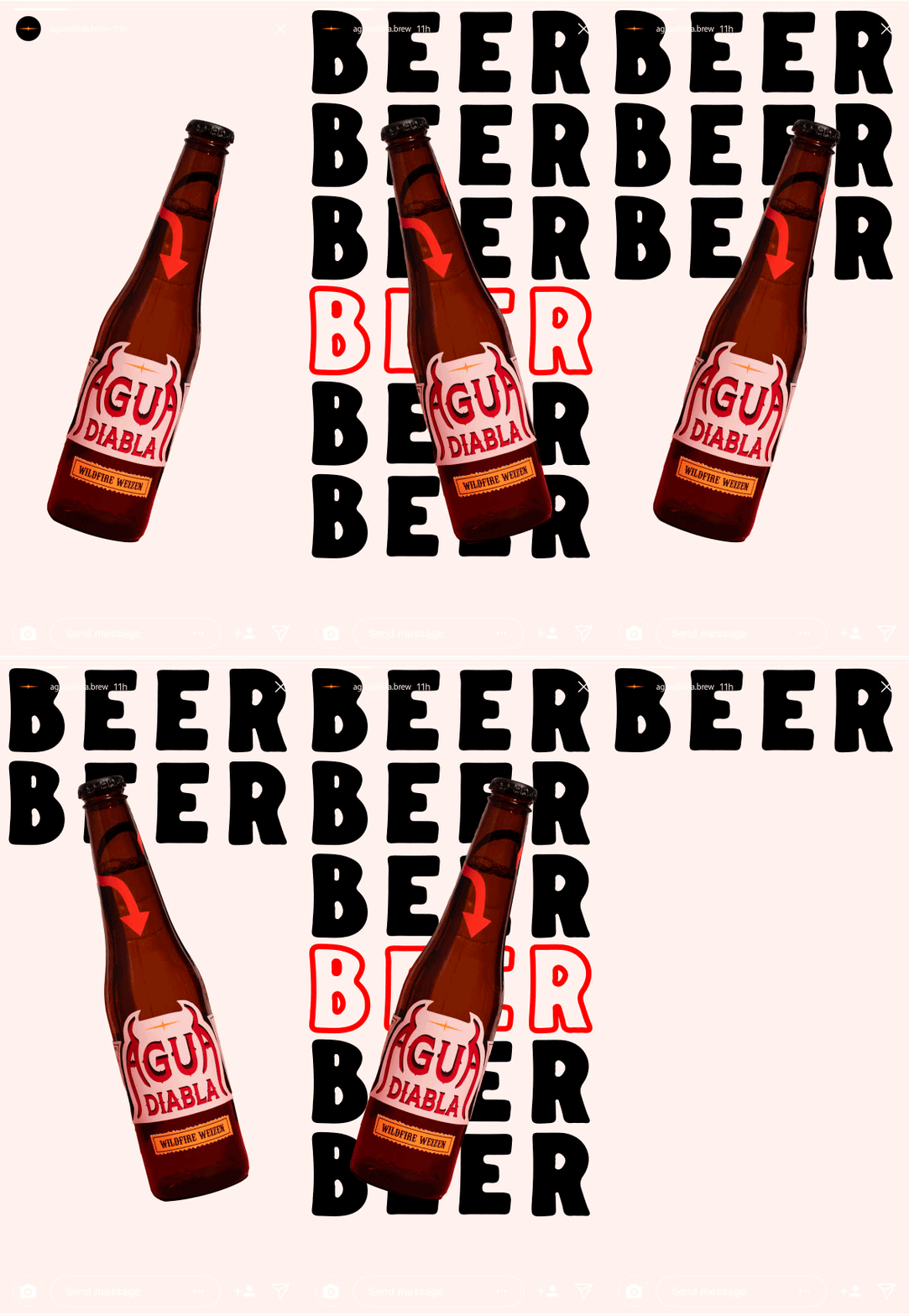
This distinctive logo is paired with hand-drawn illustrations, adding texture and personality to the brand’s visual language. The illustrations are designed to be as lively and engaging as the beer itself, contributing to a sense of tradition and festivity. The typography palette is a blend of quirky typefaces that mirror the eclectic styles often seen in Mexican sign painting, reinforcing the brand’s roots in Mexican culture.
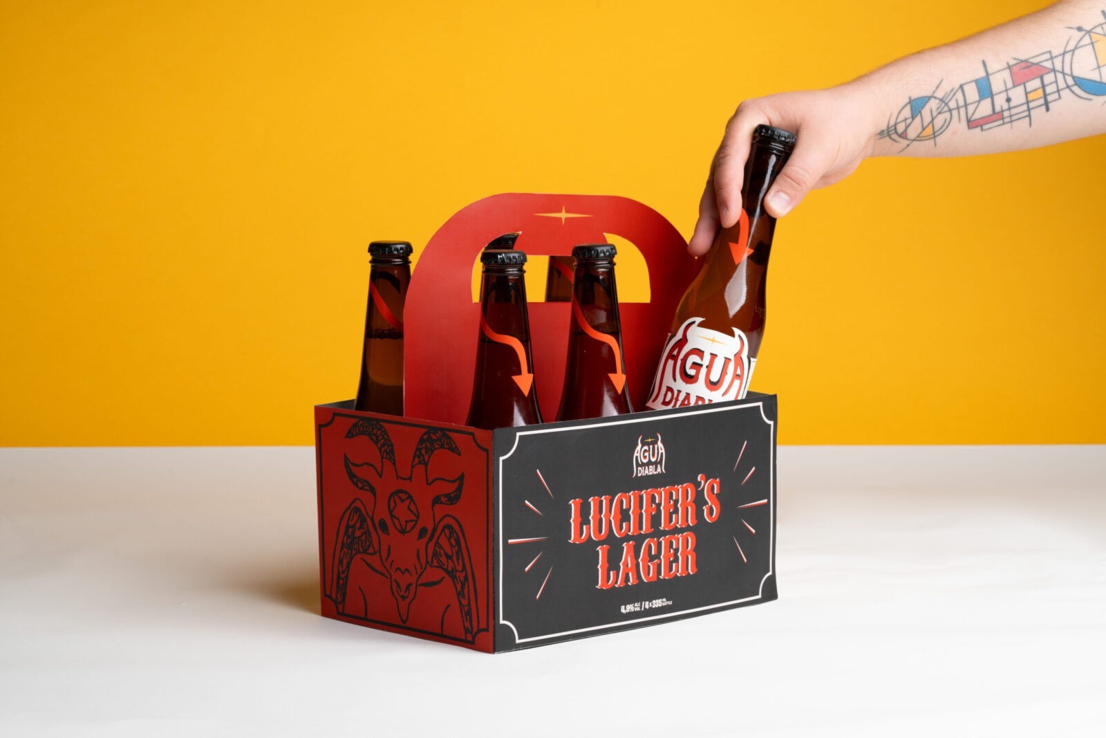
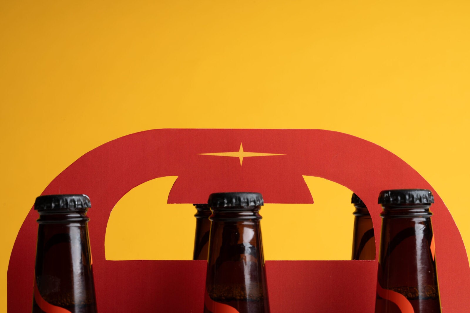
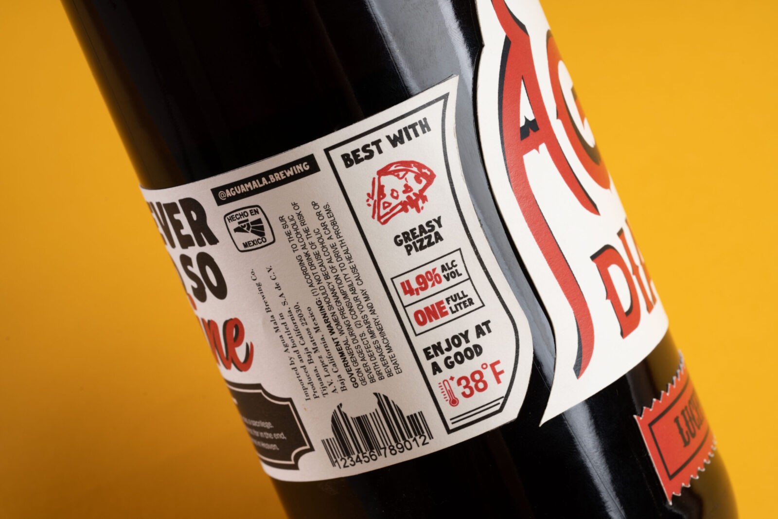
The final label design is a three-piece composition with a custom die-cut shape that enhances the bottle’s visual appeal. The intricate lockup of type on the label is carefully balanced to convey key messaging, product information, and value propositions, all while maintaining a bold and captivating appearance. Special details are woven into the design, such as a food pairing suggestion that recommends enjoying the beer with “greasy pizza,” and a barcode subtly adorned with devil horns. A devil tail element playfully wraps around the bottle neck, further differentiating Agua Diabla on the shelf and adding a fun, whimsical touch. The six-pack design for Agua Diabla also incorporates the devil horn shape into the handle, offering an extra layer of playful detail that aligns with the brand’s mischievous and celebratory theme.
CREDIT
- Agency/Creative: Lina Guerrero
- Article Title: Student Lina Guerrero’s Packaging Design Captures the Spirit of Agua Diabla Beer
- Organisation/Entity: Student
- Project Status: Non Published
- Agency/Creative Country: United States of America
- Agency/Creative City: San Diego
- Project Deliverables: Packaging Design
- Industry: Food/Beverage
- Keywords: WBDS Student Design Awards 2024/25
- Keywords: WBDS Student Design Awards 2024/25
-
Credits:
Educational Institution: San Diego City College
Educator's Name: Sean Bacon & Bradford Prairie


