


Overview:
Soft by nature, rebel by choice. Fremoo is a Portland-made, dairy-free milk and ice-cream brand shaped by the tension between milk’s softness and the act of choosing differently for the sake of personal values. Founded by a coffee-obsessed animal activist, the brand aims to challenge the “alt-milk” performative aesthetics and their overly playful personality. Targeting local Portlanders who are flavor-driven but value-led, Fremoo resists chasing trends and rejects a hyper-polished voice. Instead, it frames dairy-free as an everyday practice rooted in intention, not hype. This becomes the core challenge for the packaging design and the branding overall.
Solution:
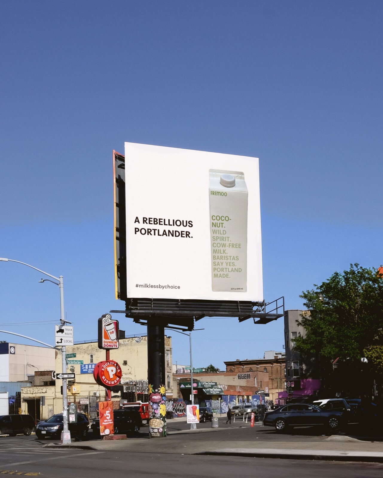
Inspired by morning rituals – bare, imperfect, grounding moments – and by Portland’s protest culture, the design system embraces contrast: raw yet steady, minimalistic yet bold. These tensions guide the design decisions and result in a bold, memorable, but intentionally undersigned identity.
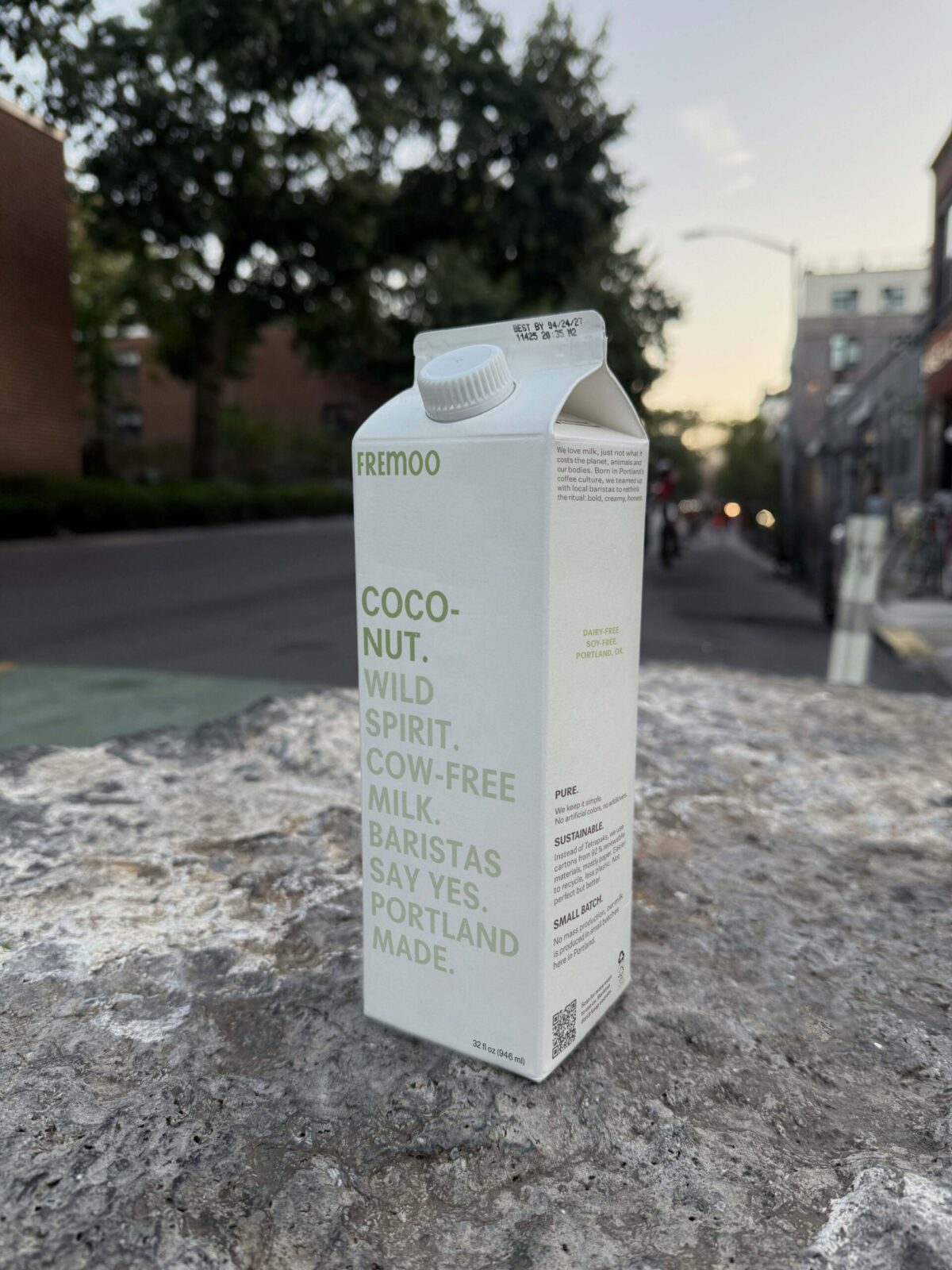
Typography plays an important role in expressing Fremoo’s edgy but imperfect personality. The logo wordmark carries a tension through a modified rounded typeface: the condensed uppercase opening reflects the rebellious choice of going dairy-free, while the softer, more extended second half with its imperfect finish shows milk’s inherent softness even in plant-based form.
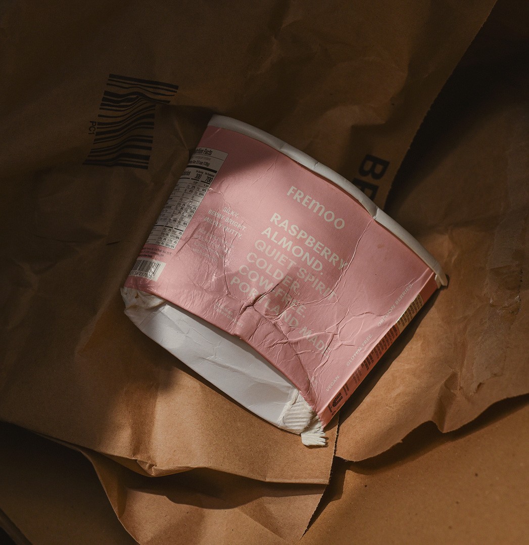
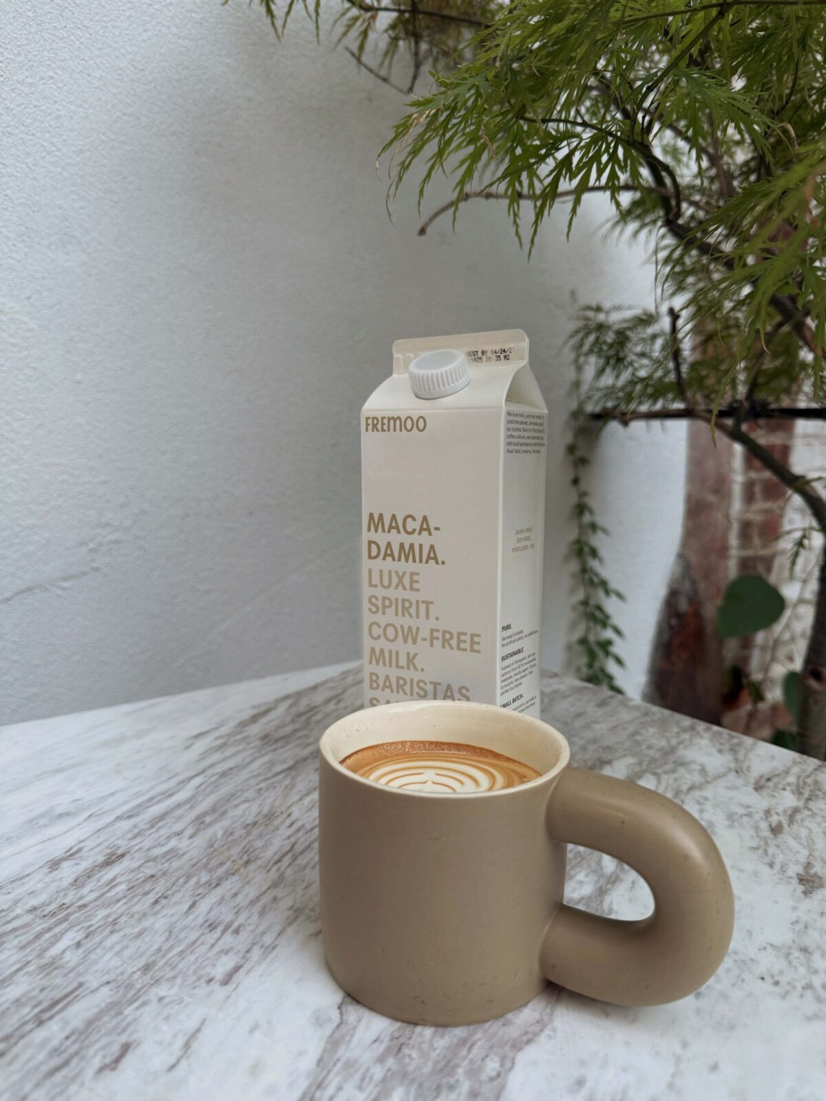
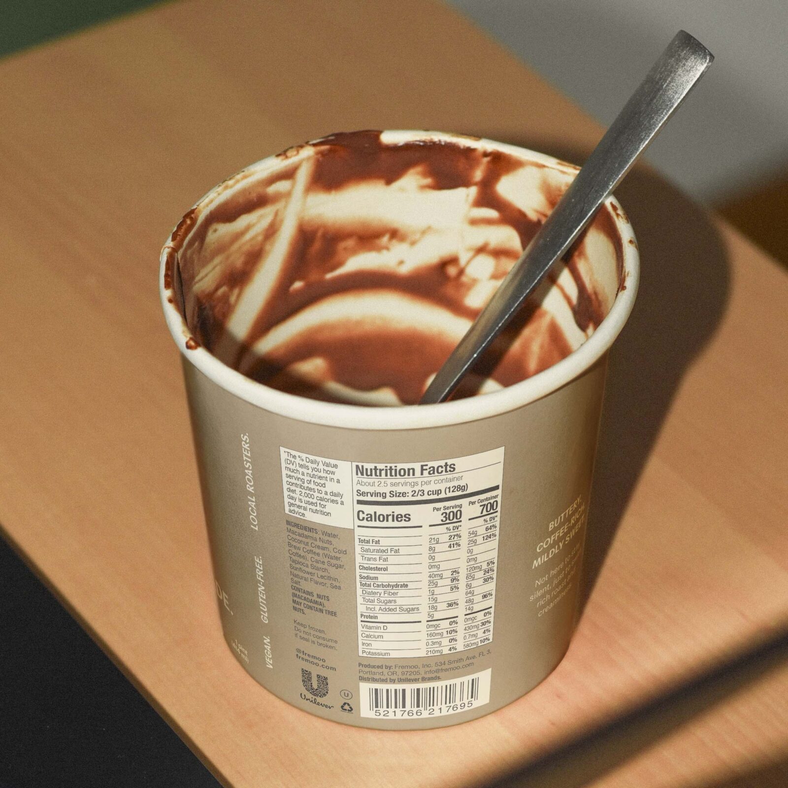
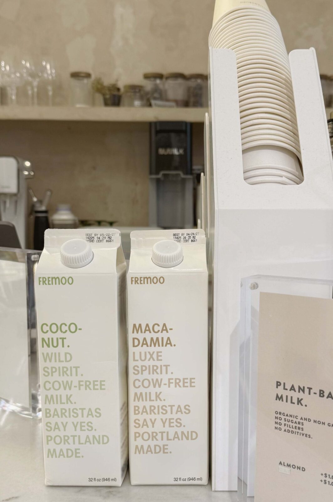
The packaging builds on this contrast. Instead of bright colors and friendly graphics, Fremoo adopts a restrained and utilitarian aesthetic. The packaging layout reinforces the branding duality. The front functions as a declarative, poster-like statement inspired by protest signages, while the side panels carry information in a calm, airy structure inspired by morning rituals. This duality balances Fremoo’s identity without drifting into coldness. Soft neutrals distinguish the flavor profiles, with clean typography and small handwritten cues adding a human touch. Overall, the cartoons feel almost like rally posters – simple, brief, quietly rebellious, while avoiding any selesy tone of voice.
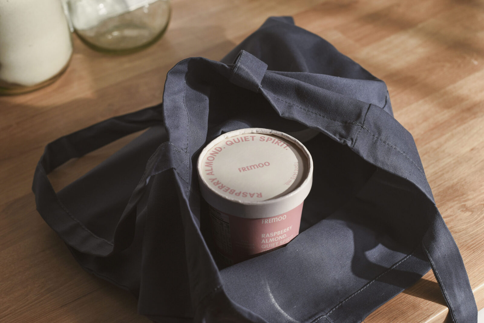
Each flavor uses tonal shifts and personalization to add a uniqueness to the branding identity but stay within the undersigned character. The ice-cream line extends this system with warmer, more playful tones, reflecting the nature of ice cream itself, yet keeping the small-batch identity.
Overall, Fremoo becomes a brand for the intentional, conscious audience with a soft rebellion within a clean, honest design language.


CREDIT
- Agency/Creative: Kristina Anastasidi
- Article Title: Student Kristina Anastasidi Designs Fremoo as a Quietly Rebellious Dairy-Free Milk and Ice Cream Brand
- Organisation/Entity: Student
- Project Status: Non Published
- Agency/Creative Country: United States of America
- Agency/Creative City: New York City
- Market Region: Portland, United States
- Project Deliverables: Art Direction, Brand Creation, Brand Design, Brand Identity, Brand Naming, Brand Tone of Voice, Branding, Concept Art, Copywriting, Creative Direction, Design, Graphic Design, Identity System, Logo Design, Packaging Design, Poster Design, Research, Tone of Voice, Writing
- Industry: Food/Beverage
- Keywords: WBDS Student Design Awards 2025/26 , Packaging, Brand Design Creation, conceptual packaging, alternative milk design, dairy-free, rebellious design, minimalistic bold typography


