ELF Cosmetic Rebrand by student Katie Wald
A different kind of makeover.
Overview
Elf Cosmetics is one of the most accessible cosmetic brands on the market, known for its affordability and widespread availability in almost every major drugstore across over fifteen countries. The brand has garnered a devoted consumer base, primarily made up of women in their mid-teens to early twenties. However, despite its popularity, Elf’s existing branding lacks the playfulness and youthful energy that resonates with its core audience. The brand often struggles to differentiate itself on shelves compared to direct competitors such as NYX and Maybelline.
Following an extensive audit of the brand and its competitors, a comprehensive makeover was proposed. The challenge was to invigorate the typography, color palette, and imagery to better reflect the company’s target audience while preserving its existing brand equity.
Solution
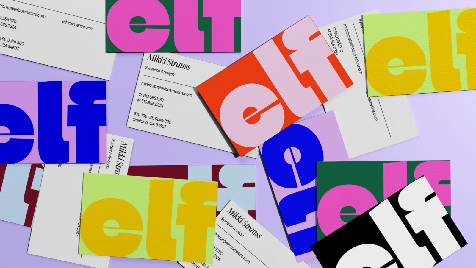
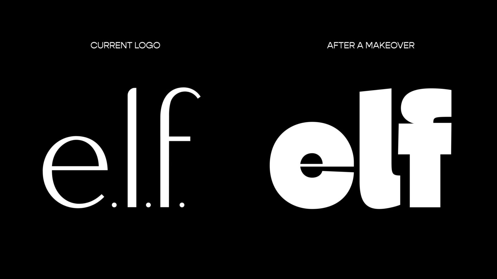
The evolution of the Elf wordmark logo was a key component of this rebranding effort. The new typography was designed with a heavy and bold appearance, conveying confidence and modernity. Additionally, the Elf brand name was simplified by removing the unnecessary periods in the old logo, streamlining the brand’s identity and making it more visually impactful.
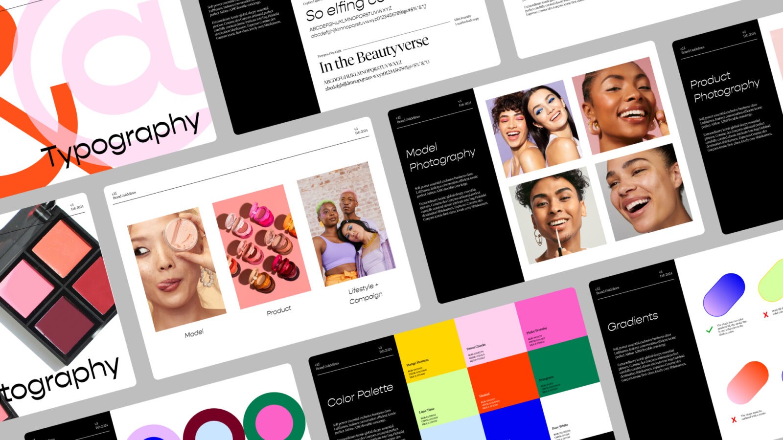
To ensure consistency and clarity in the new branding, an extensive set of brand guidelines was developed. These guidelines document every aspect of the new brand language, including brand messaging, personality, typography usage, color palettes, brand identifiers, photography, marketing strategies, and graphic elements. This comprehensive guide serves as a resource for designers and marketers, ensuring that every touchpoint of the brand remains true to its revitalized identity.
The new brand typography features a mix of the Gopher and Tiempos typefaces. Gopher brings a unique and playful personality to the brand, thanks to the reverse stress of its characters, which adds a quirky and memorable touch. Tiempos, on the other hand, elevates the brand with its refined letterforms, maintaining an authentic and personable ethos that appeals to Elf’s audience.
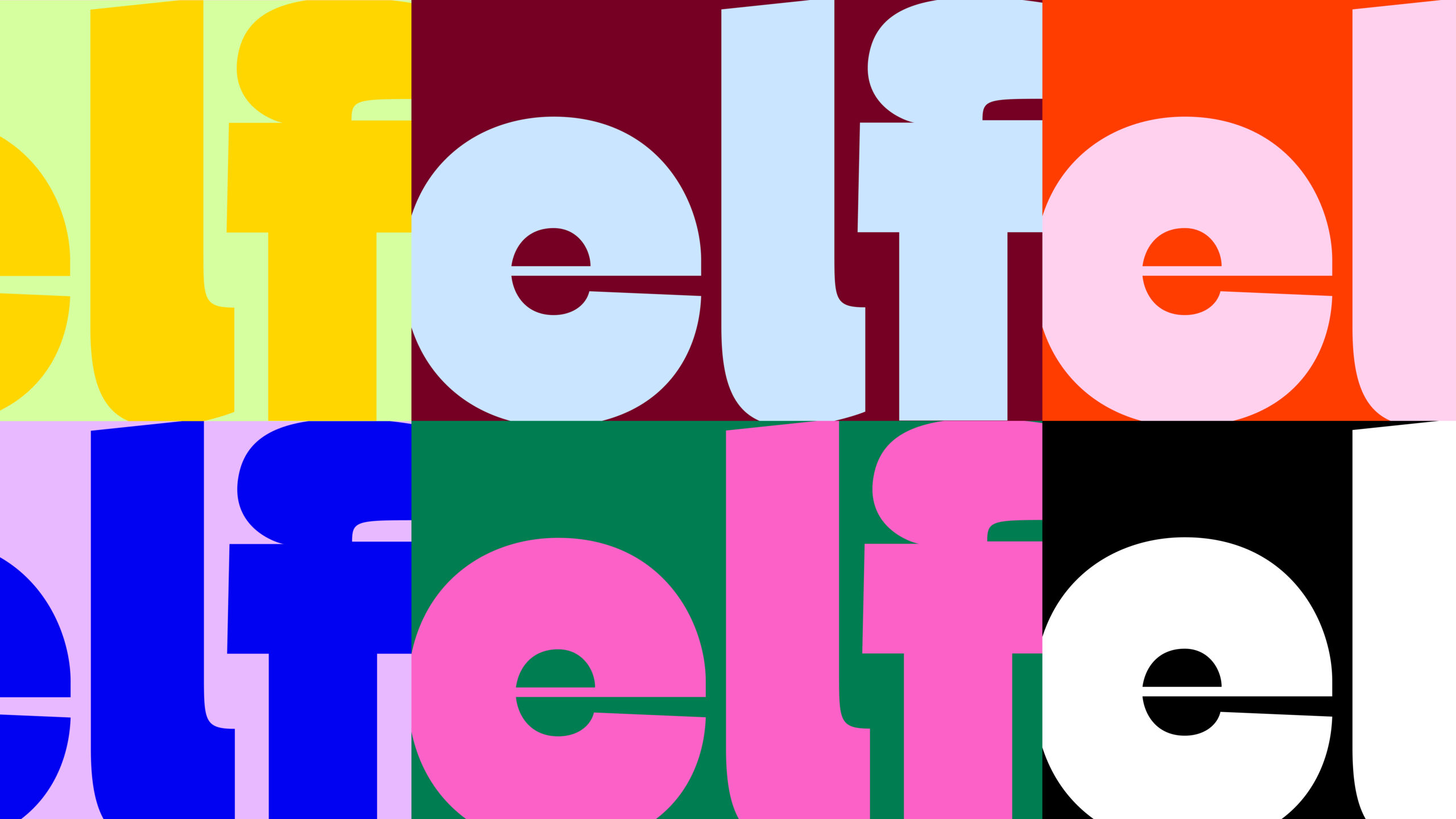
A significant part of the rebranding was the development of an extensive color palette. Each color in the palette is given a fun, memorable name, such as “Mango Moment” and “Pinky Promise,” which helps evoke the brand’s playful personality and provides a common vocabulary for designers working within the system. The palette also includes a range of gradients, adding depth and sparkle to the brand’s visual identity and allowing for more dynamic and engaging designs.
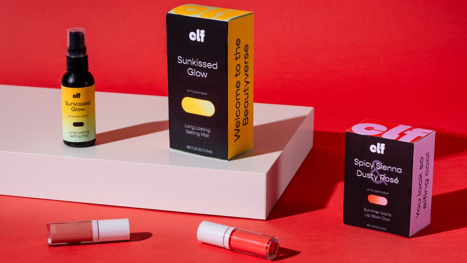
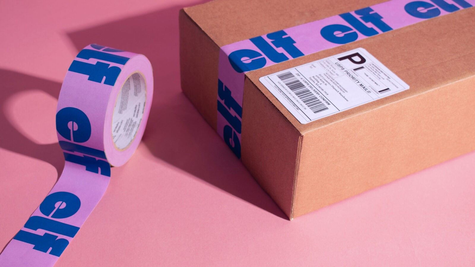
Packaging design was also reimagined to incorporate the new color palettes. The colors are blocked out on the various panels of the boxes, with the logo applied in an oversized manner to maximize brand visibility. This vibrant color is balanced with the strategic use of black on the front of packaging forms, ensuring easy readability and creating a cohesive system that stands out on shelves.
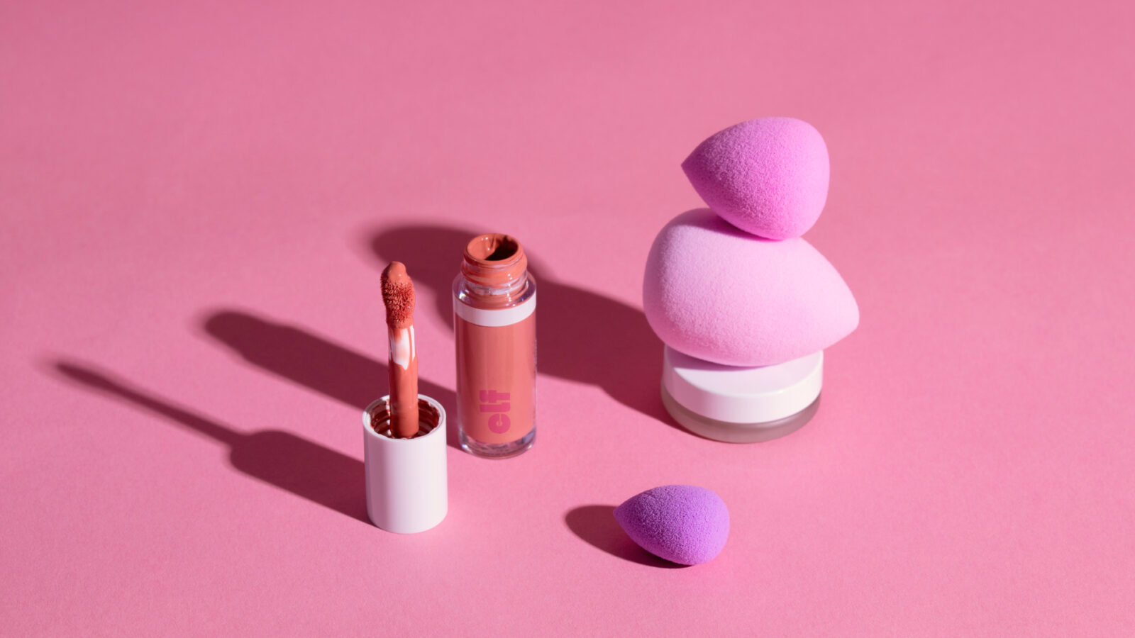
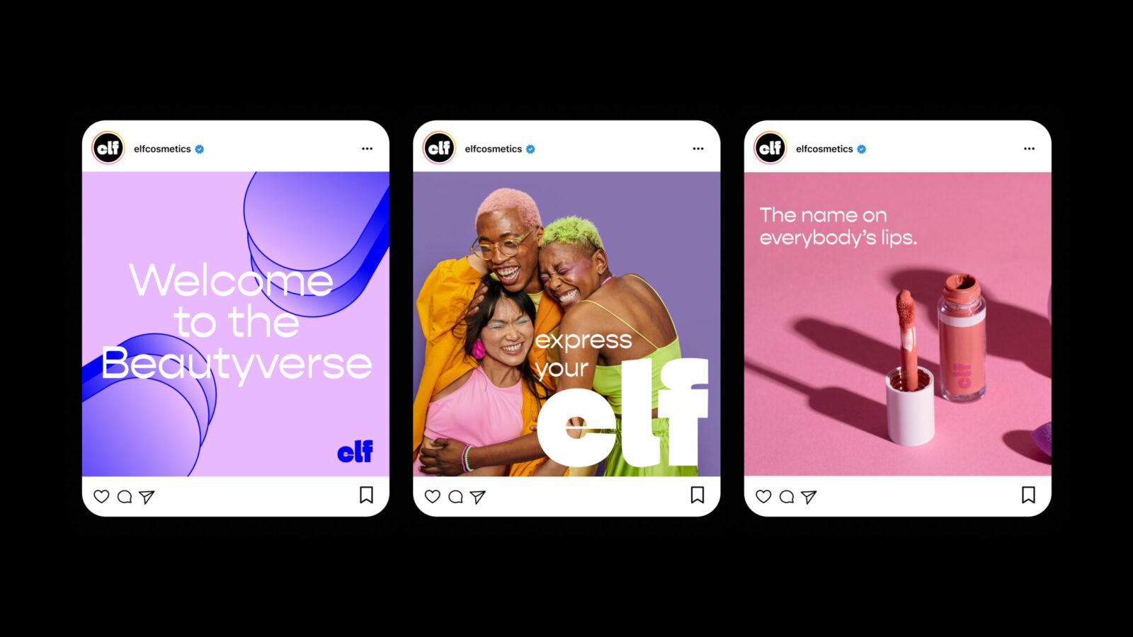
Elf’s new social media strategy embraces the brand’s refreshed identity by combining fun, bold messaging with striking imagery. Posts feature diverse models showcasing expressive and creative looks, aligning with the brand’s mission to be inclusive and celebrate individuality. The result is a social media presence that not only engages but also inspires Elf’s youthful and vibrant audience.
CREDIT
- Agency/Creative: Katie Wald
- Article Title: Student Katie Wald’s Bold ELF Cosmetics Rebrand Brings Playful Energy to an Iconic Beauty Brand
- Organisation/Entity: Student
- Project Status: Non Published
- Agency/Creative Country: United States of America
- Agency/Creative City: San Diego
- Project Deliverables: Brand Identity, Brand Redesign
- Industry: Beauty/Cosmetics
- Keywords: WBDS Student Design Awards 2024/25
- Keywords: WBDS Student Design Awards 2024/25
-
Credits:
Educational Institution: San Diego City College
Educator's Name: Sean Bacon & Bradford Prairie


