


Cuties California Clementines is a household brand synonymous with healthy snacking. As the brand matured, the visual identity required modernization to ensure versatility across digital platforms and merchandise. The challenge was to execute a comprehensive corporate rebranding. It needed to broaden the demographic appeal beyond just “families with young children” to a wider audience of health-conscious adults. This had to be done without losing the core values of fun and approachability.
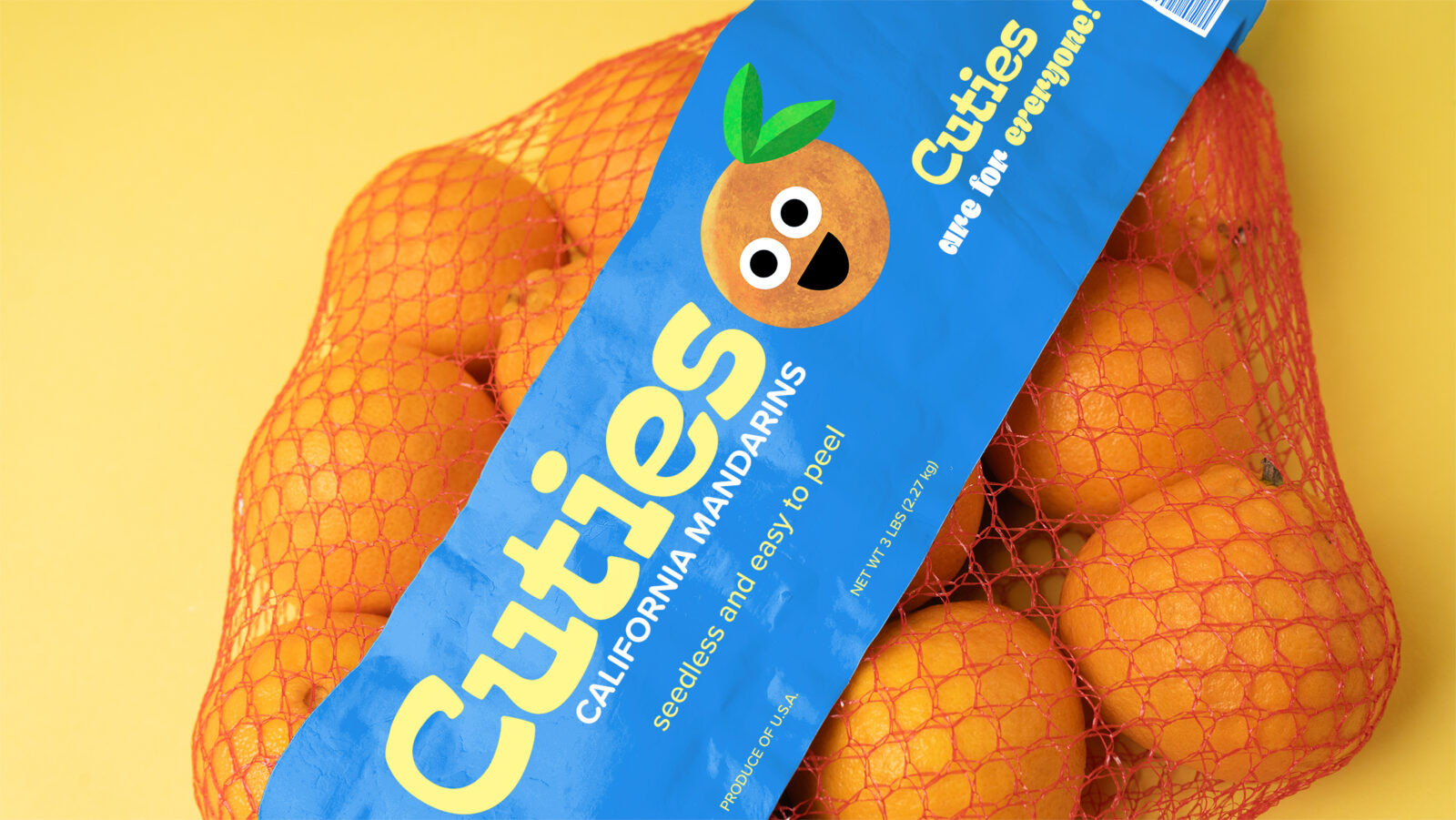
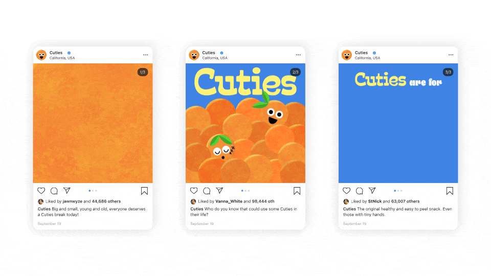
The rebranding strategy centers on the inclusive slogan, “Cuties are for everyone.” This shift positions the product not just as a lunchbox staple for kids, but as a convenient, peelable snack for any lifestyle. The visual concept retains critical brand equity, specifically the iconic orange mesh bag. It simultaneously overhauls the graphic language to be fresher, more contemporary, and highly scalable.
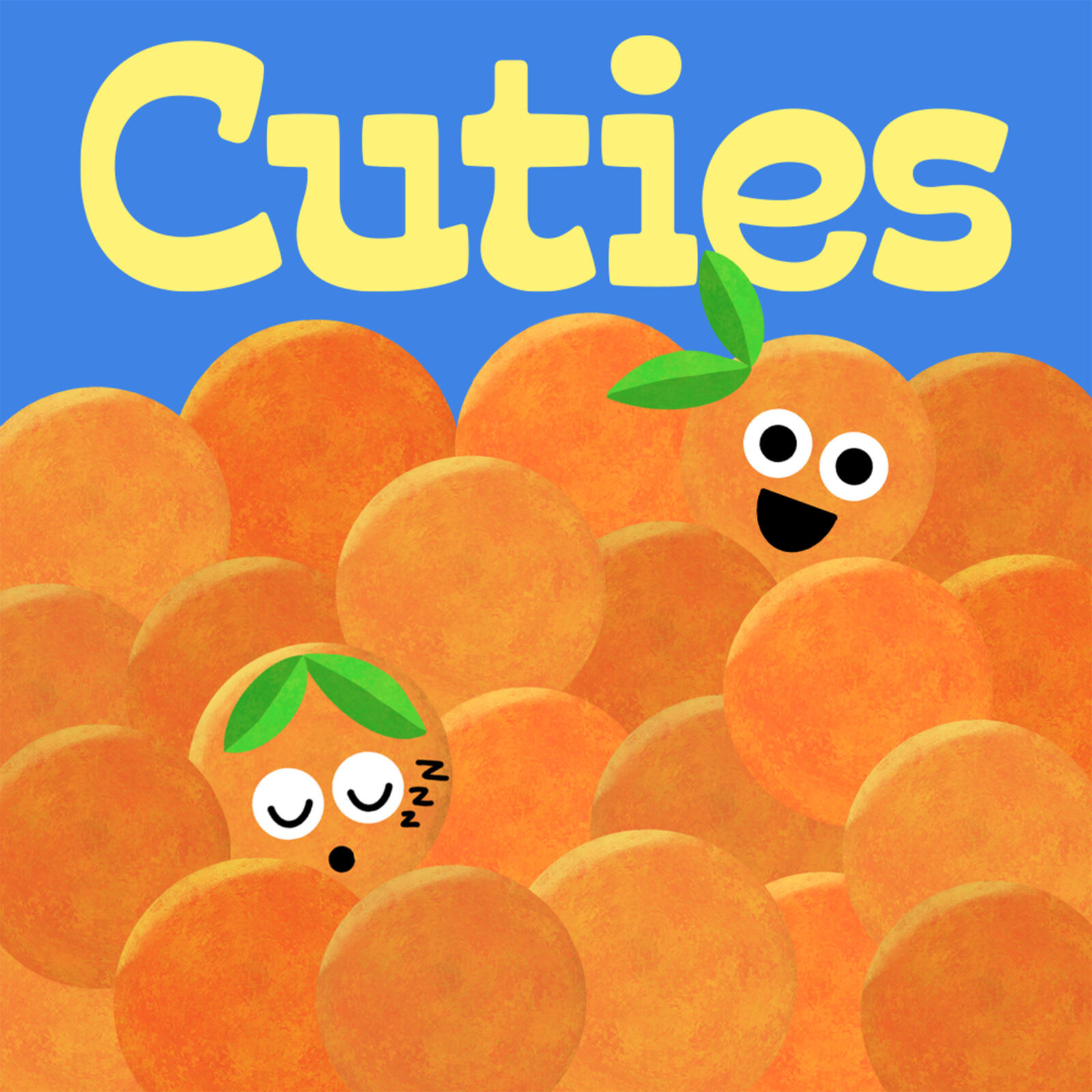
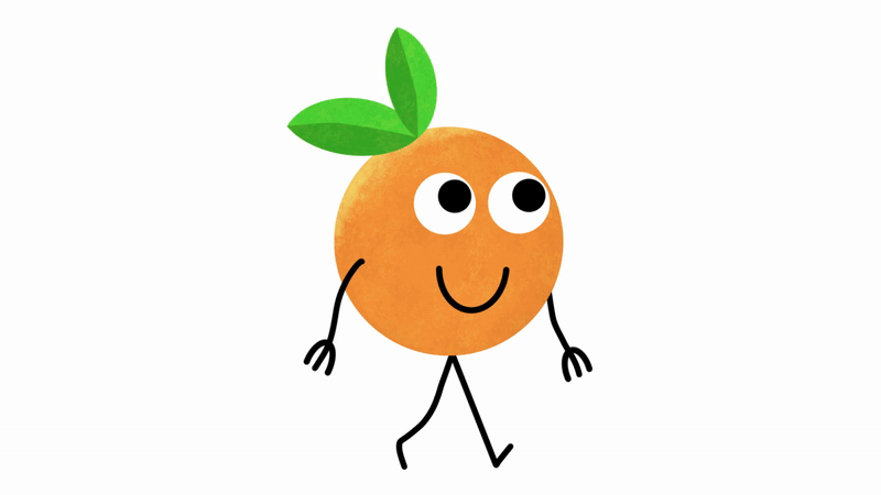
The core of the rebrand is the redesign of the mascot. To ensure scalability, the character was simplified into a paint-textured body with basic facial features. A modular design system was developed. For advertising and merchandise, the mascot gains arms and legs to engage in activities like running, sleeping, or reading. This brings the “Cuties are for everyone” personas to life. For packaging, where space is limited, a simplified limbless version is used to maintain visual cleanliness at small sizes.
The typographic system reinforces the friendly personality. The primary wordmark utilizes a modified version of Quirkwood Bold, customized to feel organic and soft. This is paired with a bespoke, rounded typeface created specifically for taglines and social media assets. While the brand retains its signature orange to ensure instant shelf recognition, the existing secondary palette of blue and yellow was refined. These hues were adjusted to better complement the new visual system, providing high contrast for merchandise items like tote bags and apparel.
A critical strategic decision was made to preserve the existing physical packaging format. The orange mesh bag and label dimensions remain unchanged. This ensures that the product remains instantly recognizable to loyal customers in the grocery aisle. The design update focuses strictly on the label content. It deploys the new wordmark and simplified mascot to create a cleaner, more modern shelf presence. The result is a brand evolution that respects its history while establishing a flexible visual system for the future.

![]()


CREDIT
- Agency/Creative: John Wise
- Article Title: Student John Wise Develops a Flexible Visual System for Cuties California Clementines
- Organisation/Entity: Student
- Project Status: Non Published
- Agency/Creative Country: United States of America
- Agency/Creative City: San Diego
- Project Deliverables: 2D Design, Advertising, Advertising Photography, Animation, Art Direction, Brand Design, Brand Experience, Brand Identity, Brand Mark, Brand Redesign, Brand Refinement, Brand Rejuvenation, Brand Strategy, Brand Tone of Voice, Branding, Character Design, Copywriting, Creative Direction, Design, Digital Art, Digital Painting, Drawing, Food Photography, Food Styling, GIF Animation, Graphic Design, Identity System, Illustration, Label Design, Lettering, Logo Design, Motion Graphics, Packaging Design, Photography, Photography Styling, Product Photography, Rebranding, Retail Design, Tone of Voice, Type Design, Typography
- Industry: Food/Beverage
- Keywords: WBDS Student Design Awards 2025/26 , Rebranding, Brand Identity, Mascot Design, Packaging Design, Typography, Food and Beverage, Illustration, Social Media Campaign, Merchandising, Visual System, Character Design, Advertising.


