


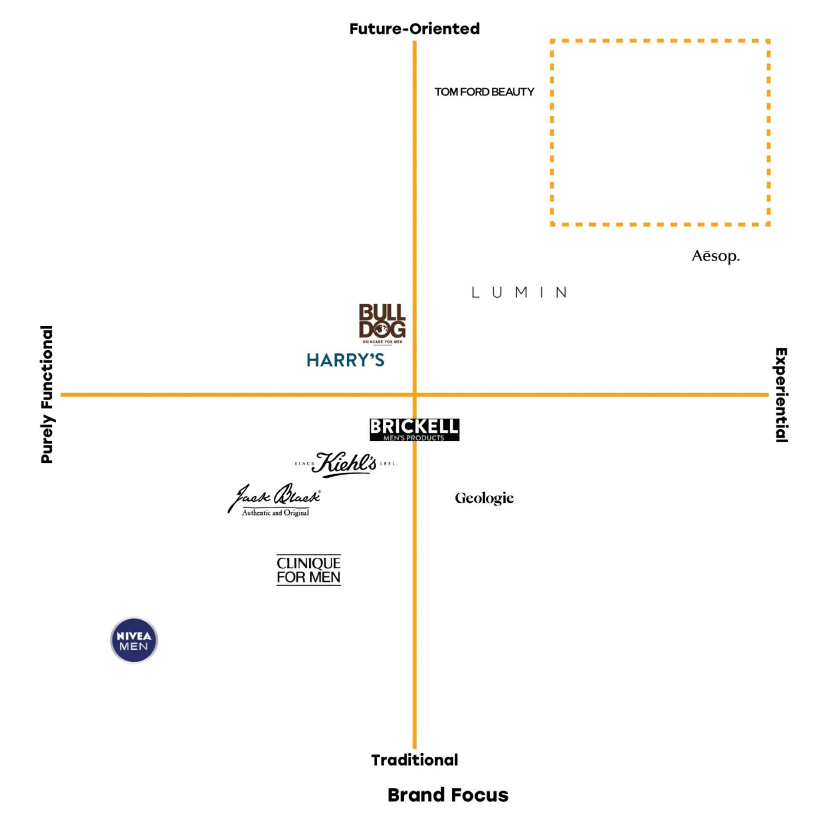
Men’s skincare branding typically relies on aggressive hyper-masculinity or sterile clinical aesthetics. The market is saturated with “rugged” brands using dark color palettes or “medical” brands using stark white minimalism. The goal for Hudson Skincare was to reject these tropes. The project required a brand identity that felt sophisticated, contemporary, and approachable without relying on the standard visual codes of the male grooming aisle.
The design philosophy targets the “Modern Man.” This consumer values clarity, efficiency, and high aesthetics. He seeks products that are straightforward to use but distinct enough to display on a bathroom counter. The concept focuses on “tactile visibility.” It uses texture and color to create a sensory unboxing experience that communicates quality before the product is even used. The brand positioning aims for the intersection of high efficacy and high design, separating itself from mass-market competitors.
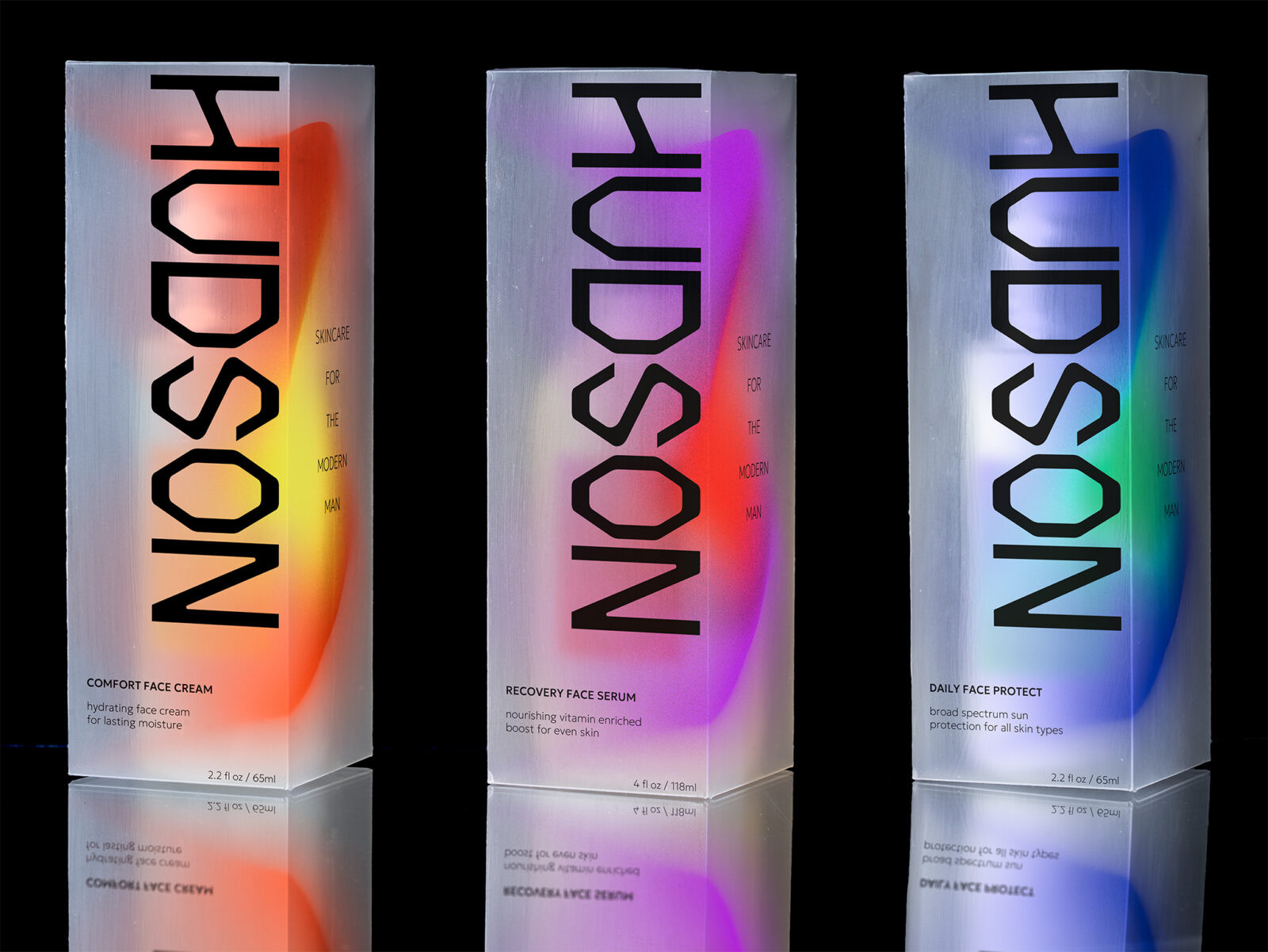
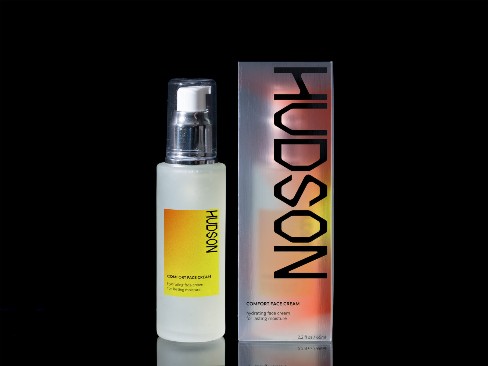
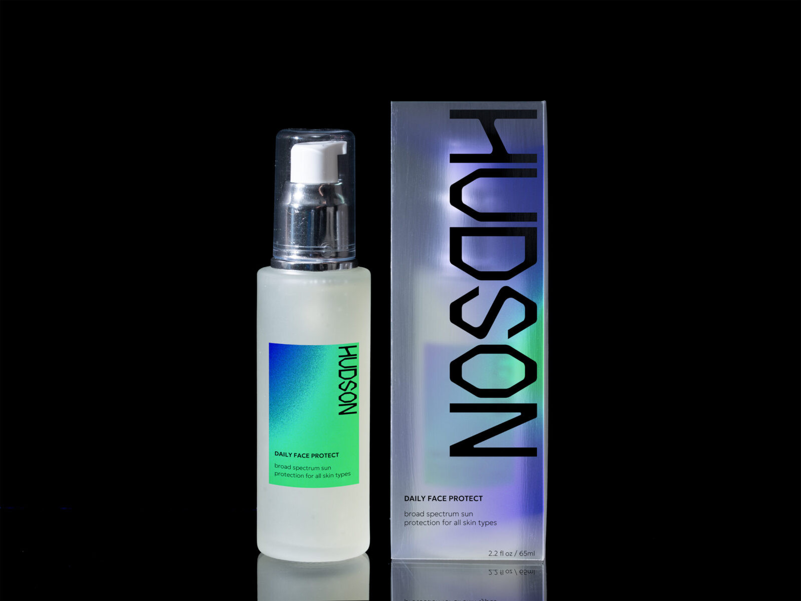
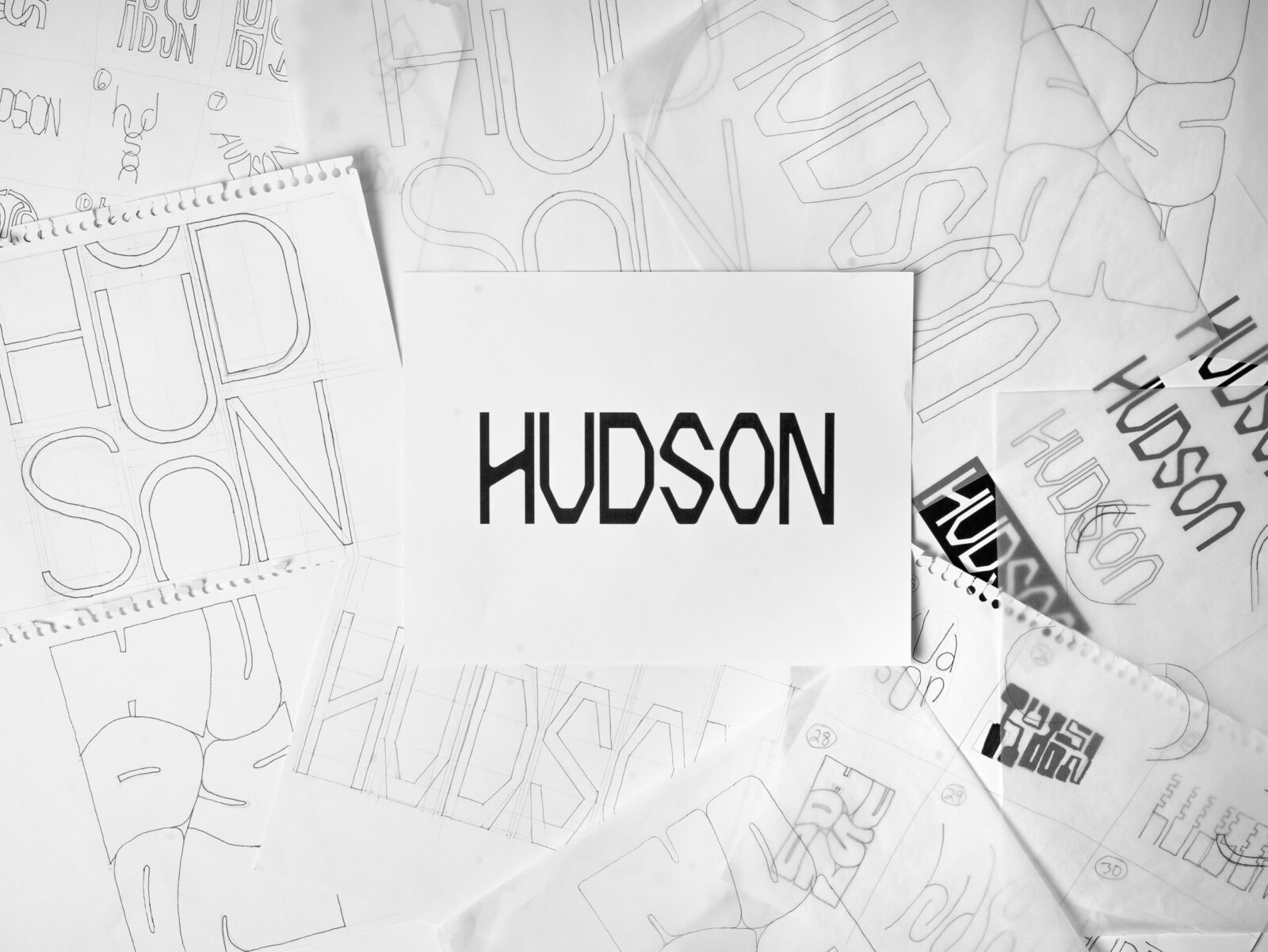
The execution centers on a custom hand-lettered wordmark. While the sector is dominated by generic sans-serif logos, Hudson establishes a unique identity through bespoke lettering that balances structural weight with organic nuance. This human element is strategically paired with Geologica, a modern variable sans-serif. This combination ensures that while the brand feels distinct and sophisticated, the information hierarchy remains clean and legible. The logo is oriented vertically on the packaging, maximizing negative space to create an imposing, confident shelf presence.
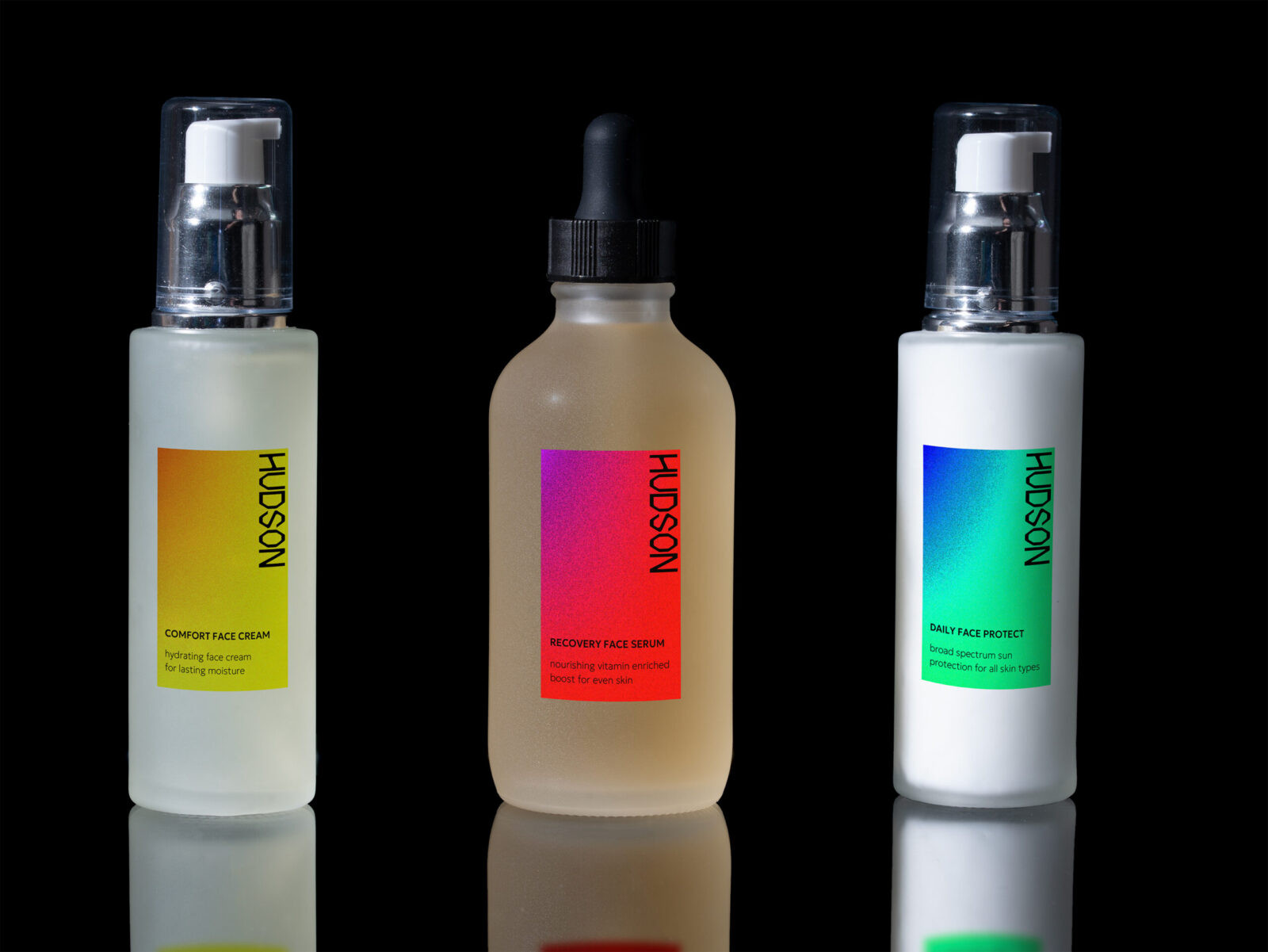
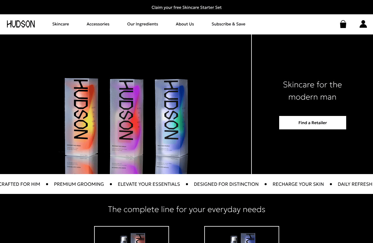
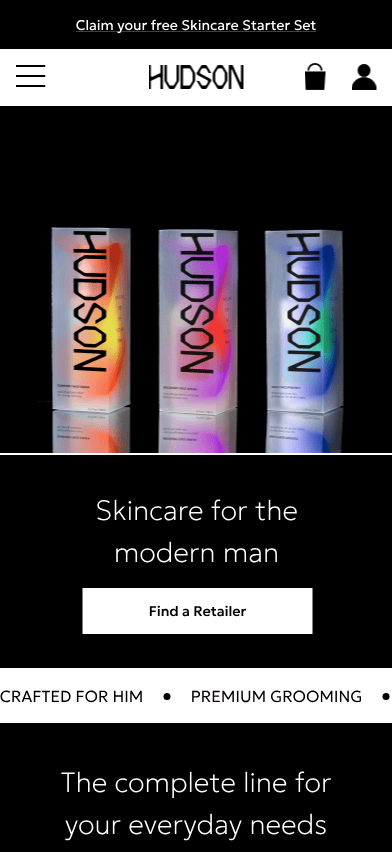
The packaging system utilizes a strategic combination of frosted materials and vibrant color gradients. The frosted finish provides a tactile, premium quality that diffuses light. Beneath this layer, bright gradients serve a functional purpose. They act as a color-coding system to differentiate the product lines: orange for Comfort Face Cream, purple for Recovery Face Serum, and blue for Daily Face Protect. This ensures that the system is intuitive and easy to navigate while maintaining a unified shelf presence.
The result is a brand identity that stands out through bold typography and material innovation. It positions Hudson as a forward-thinking choice for the contemporary consumer.
CREDIT
- Agency/Creative: John Wise
- Article Title: Student John Wise Designs Hudson Skincare as a Contemporary Alternative to Traditional Men’s Grooming
- Organisation/Entity: Student
- Project Status: Non Published
- Agency/Creative Country: United States of America
- Agency/Creative City: San Diego
- Project Deliverables: Advertising, Advertising Photography, Animation, Art Direction, Beauty Photography, Brand Creation, Brand Design, Brand Experience, Brand Identity, Brand Mark, Brand Naming, Brand Strategy, Brand Tone of Voice, Branding, Creative Direction, Design, Graphic Design, Identity System, Label Design, Lettering, Logo Design, Packaging Design, Photography, Photography Styling, Product Design, Product Naming, Product Photography, Retail Design, Tone of Voice, Type Design, Typography, User Experience, Web Design
- Industry: Beauty/Cosmetics
- Keywords: WBDS Student Design Awards 2025/26 , Packaging Design, Men's Skincare, Grooming, Hand-lettering, Typography, Visual Identity, Product Design, Luxury, Cosmetic Packaging, Graphic Design, Brand Strategy, Materiality, Variable Type.


