


The hospitality sector often relies on clichéd visual tropes. Pizza branding frequently defaults to “old world” rustic or hyper-minimalist fast-casual aesthetics. The objective for Firelite was to carve out a distinct visual space. The project required a brand identity that felt fresh and contemporary while evoking a sense of comfort and nostalgia. It positions the establishment as a slightly above-midrange destination for older millennials who value authenticity.
The design concept bridges two distinct eras. It blends mid-century modern inspiration with contemporary graphic design principles. The goal was to cultivate a “warm nostalgia.” This creates a feeling of familiarity without feeling dated. The personality is fresh, warm, and inviting. It targets diners who appreciate a relaxed environment with a focus on craft and community gathering.
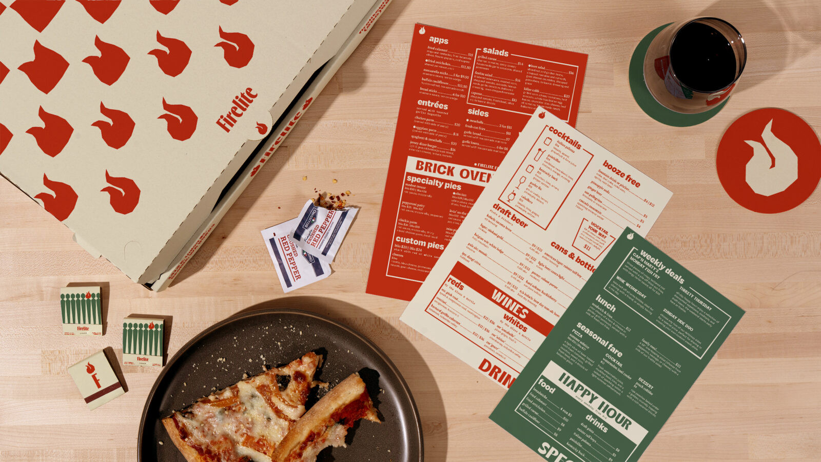
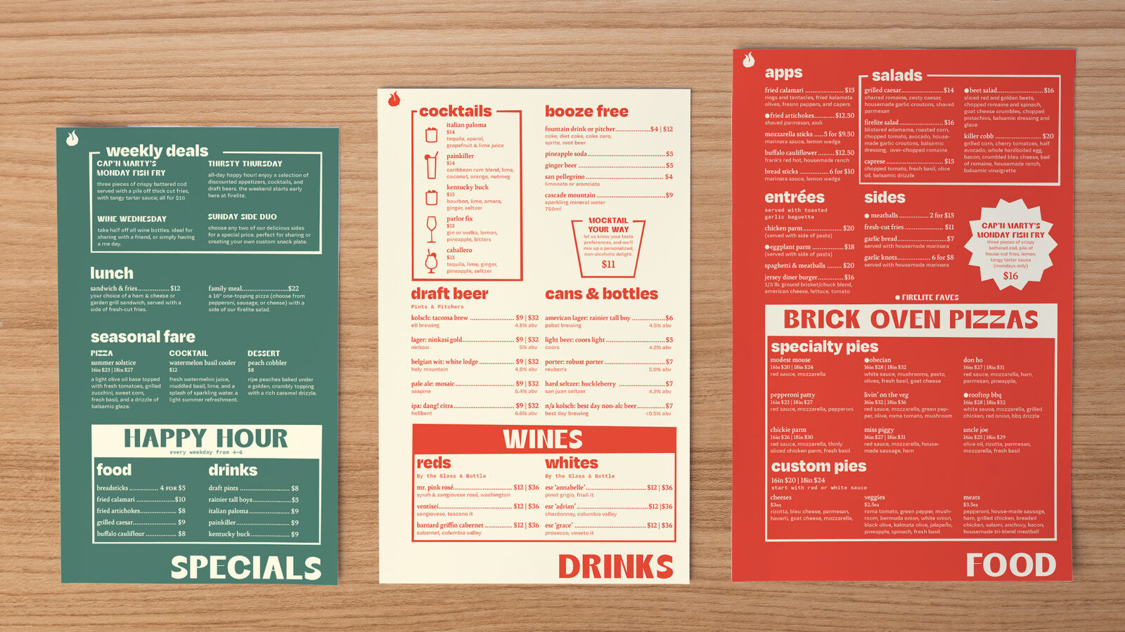
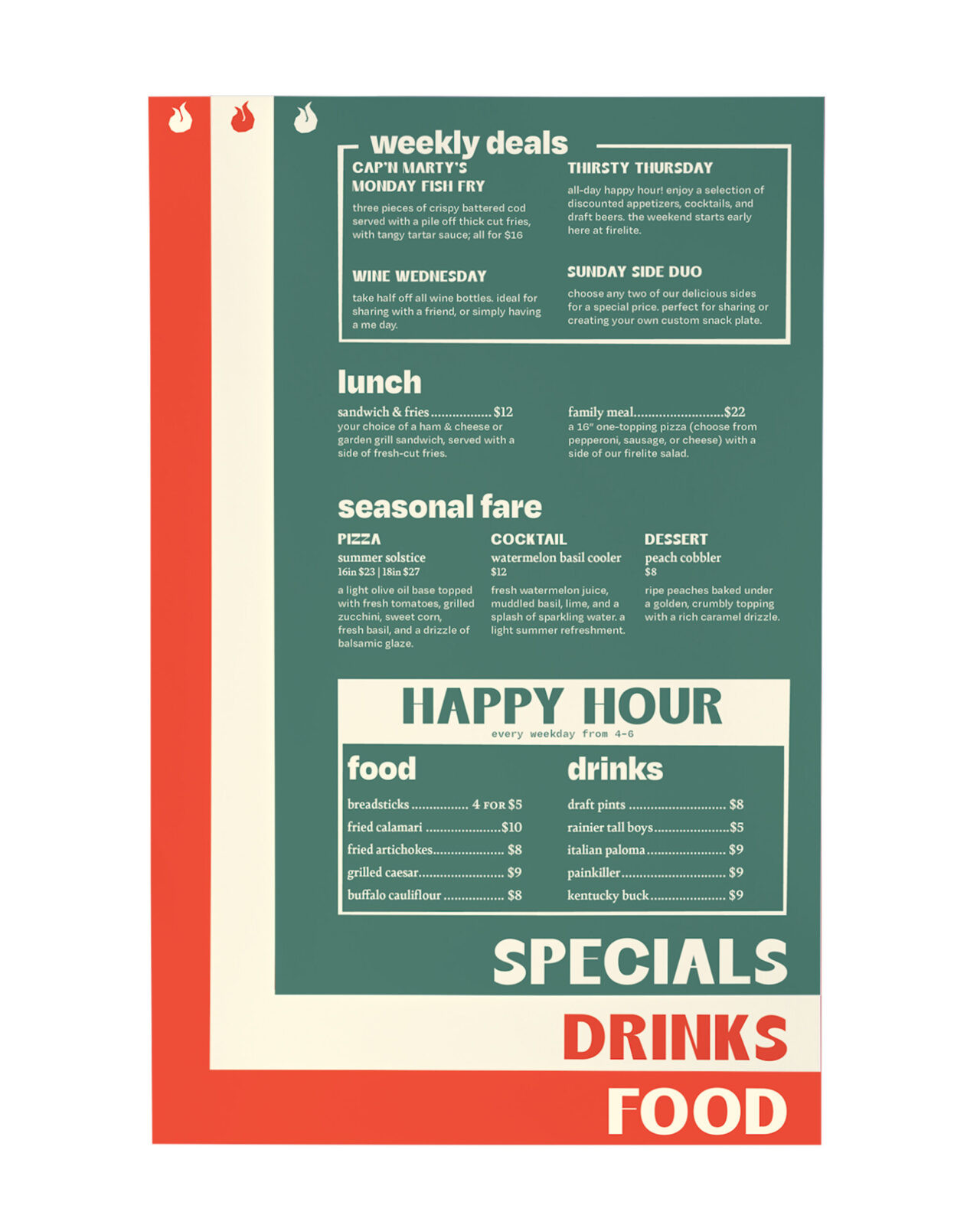
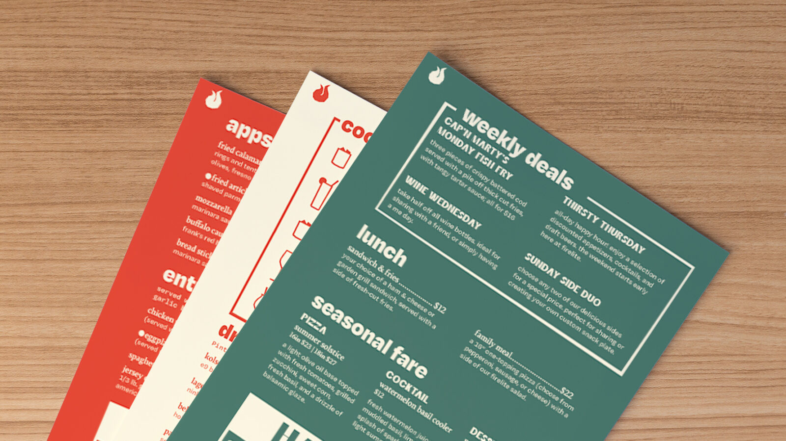
The execution relies on a mixed typographic system to carry this voice. It utilizes four distinct typefaces: Thrillers for the logo, paired with Degular, Bely, and Degular Mono. This combination balances the character of display faces with the strict utility required for functional menu design. The design intentionally mixes structured grid-based layouts with organic shapes to give the collateral a tactile, paper-cut appearance.
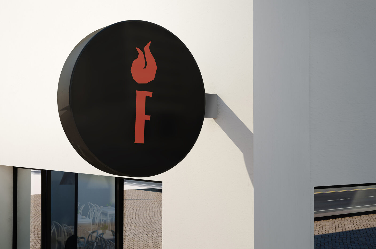
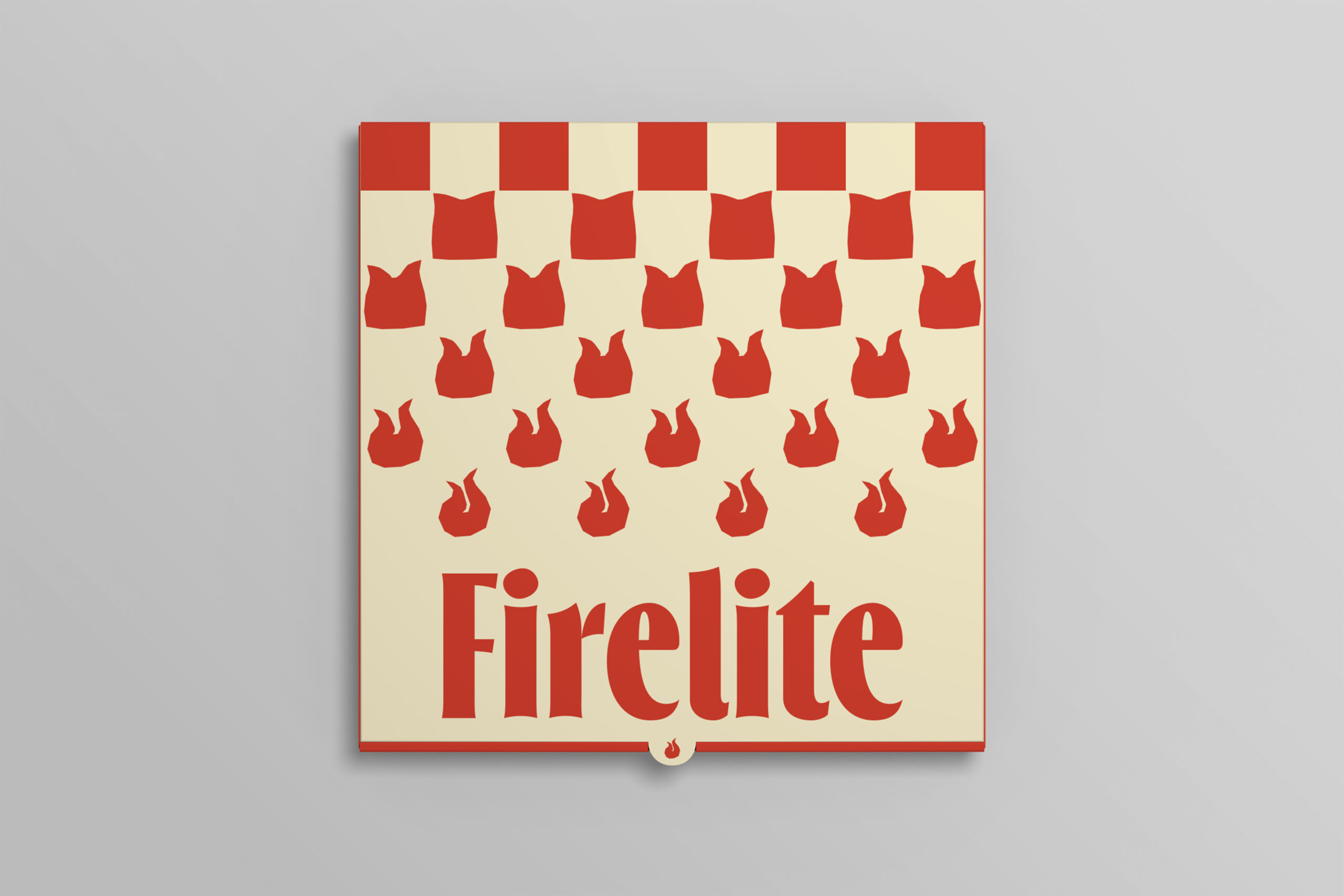
The visual identity is anchored by an organically shaped flame logo. This motif is repeated in patterns across the packaging, often paired with a classic checkerboard border to subtly reference the heritage of the pizza category. The color palette reinforces the retro atmosphere. It uses muted, warm tones designed to look as if they have naturally faded over time. This approach avoids the aggressive, stereotypical bright reds of the category, replacing them with deeply saturated, comfortable hues.
A key feature of the collateral is the stackable menu system. The three menus are designed with incrementally varying widths and heights to mimic a physical file system. When stacked, the titles of the menus behind are visible. This creates a functional yet visually dynamic hierarchy. The result is a cohesive brand world that feels comfortable and established.

CREDIT
- Agency/Creative: John Wise
- Article Title: Student John Wise Designs Firelite to Reframe Contemporary Pizza Branding
- Organisation/Entity: Student
- Project Status: Non Published
- Agency/Creative Country: United States of America
- Agency/Creative City: San Diego
- Project Deliverables: Advertising, Advertising Photography, Art Direction, Brand Creation, Brand Design, Brand Experience, Brand Identity, Brand Mark, Brand Naming, Brand Strategy, Branding, Creative Direction, Culinary Arts, Design, Environmental Graphics, Food Photography, Food Styling, Graphic Design, Identity System, Logo Design, Packaging Design, Pattern Design, Photography, Photography Styling, Product Photography, Typography
- Industry: Hospitality
- Keywords: WBDS Student Design Awards 2025/26 , Brand Identity, Hospitality Design, Restaurant Branding, Mid-century Modern, Typography, Menu Design, Pizza, Food and Beverage, Print Design, Packaging, Art Direction, Visual System, Nostalgia.


