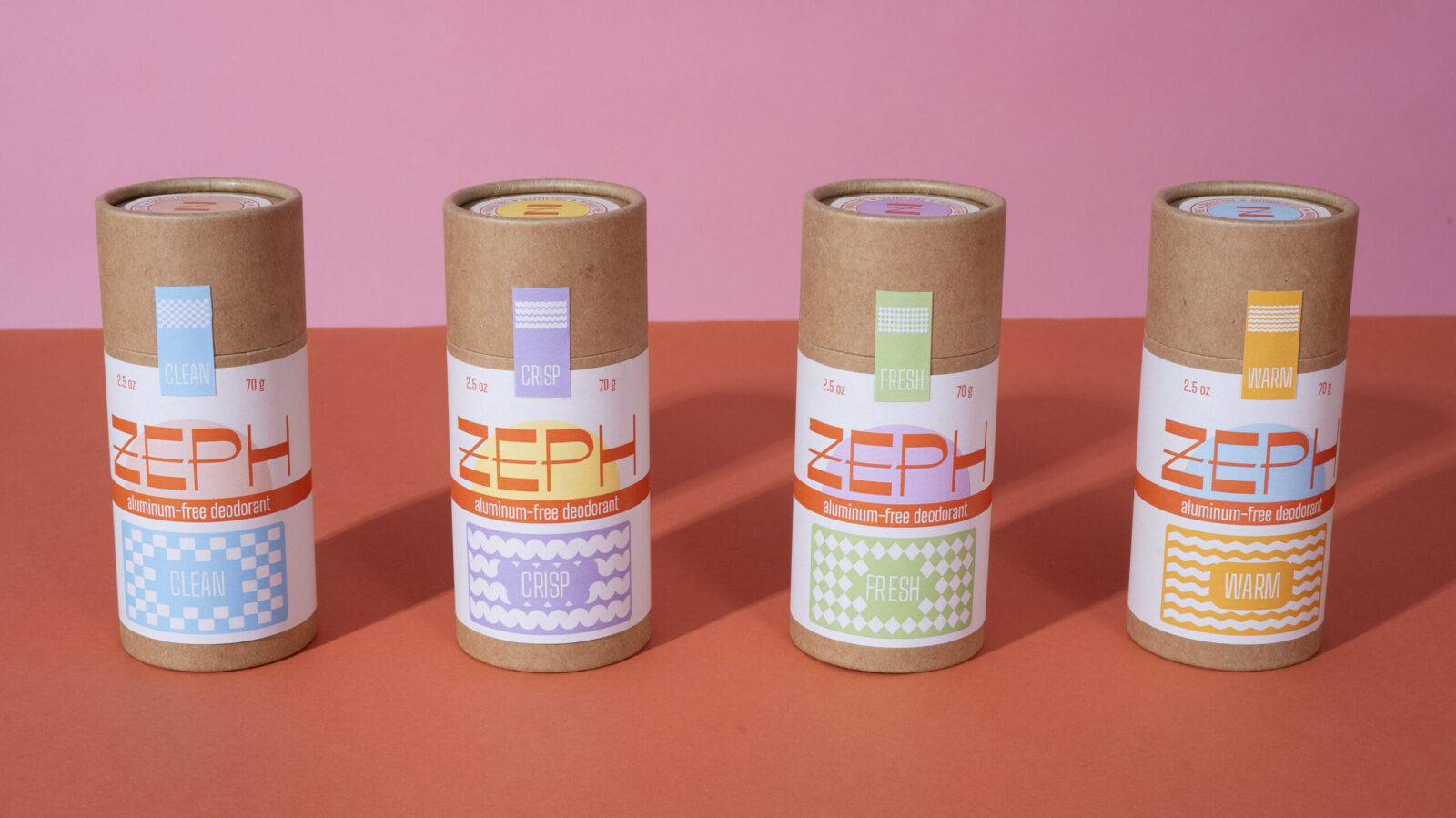
Zeph is a gender-neutral deodorant brand designed to bring a sense of charm, ritual, and clarity to an everyday product. The goal was to create a deodorant that feels refreshingly free of the usual gender cues and instead focuses on the simple pleasure of scent, material quality, and thoughtful design. In a category that often leans heavily on coded colors and aggressive fragrance tropes, Zeph offers a quieter, more inviting alternative. Each variant highlights a curated scent experience that anyone can enjoy, which shifts the focus from gender to mood, atmosphere, and personal preference.
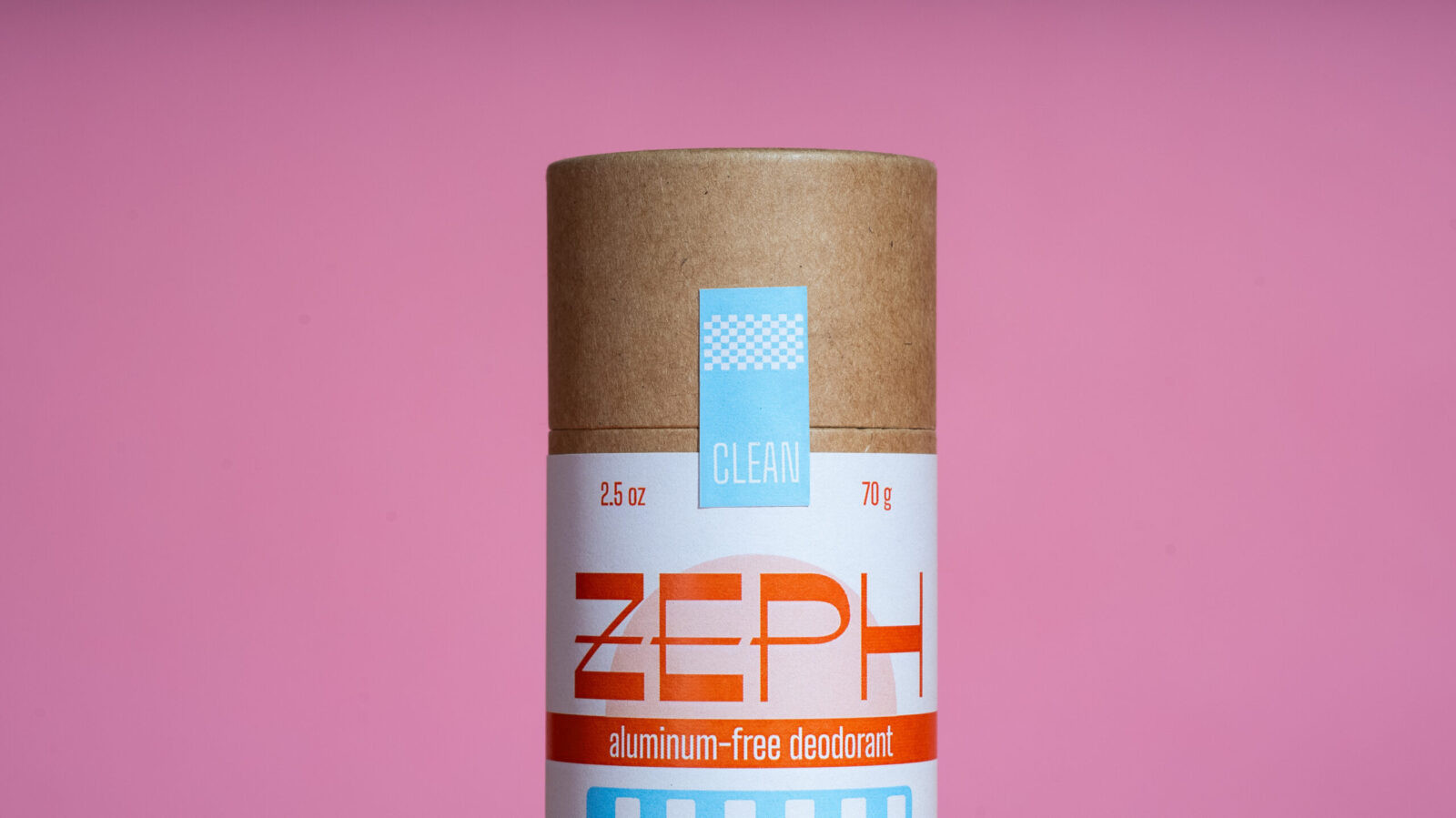
The visual identity draws from an idealized version of mid century utility. While researching references, I found myself returning to the tactile appeal of playing card decks, cigarette boxes, and other small goods that balanced ornament with function. These objects carry a humble elegance that felt perfect for a product that is meant to be used every day without feeling disposable. Zeph borrows from that world through a condensed sans serif, simple geometry, and a vintage-inspired color palette that feels both familiar and refreshed. The typographic story stays restrained but has just enough character to feel friendly and refined at the same time.
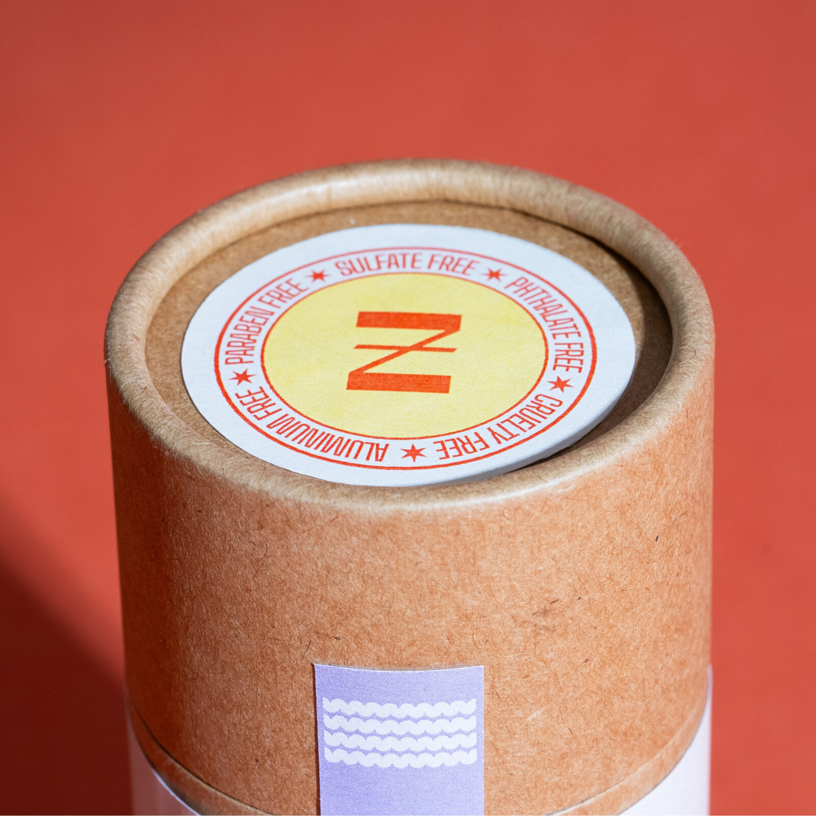
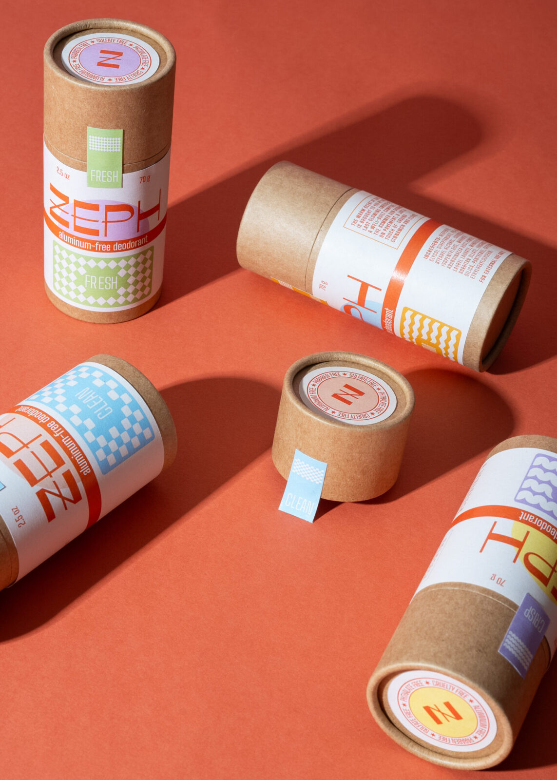
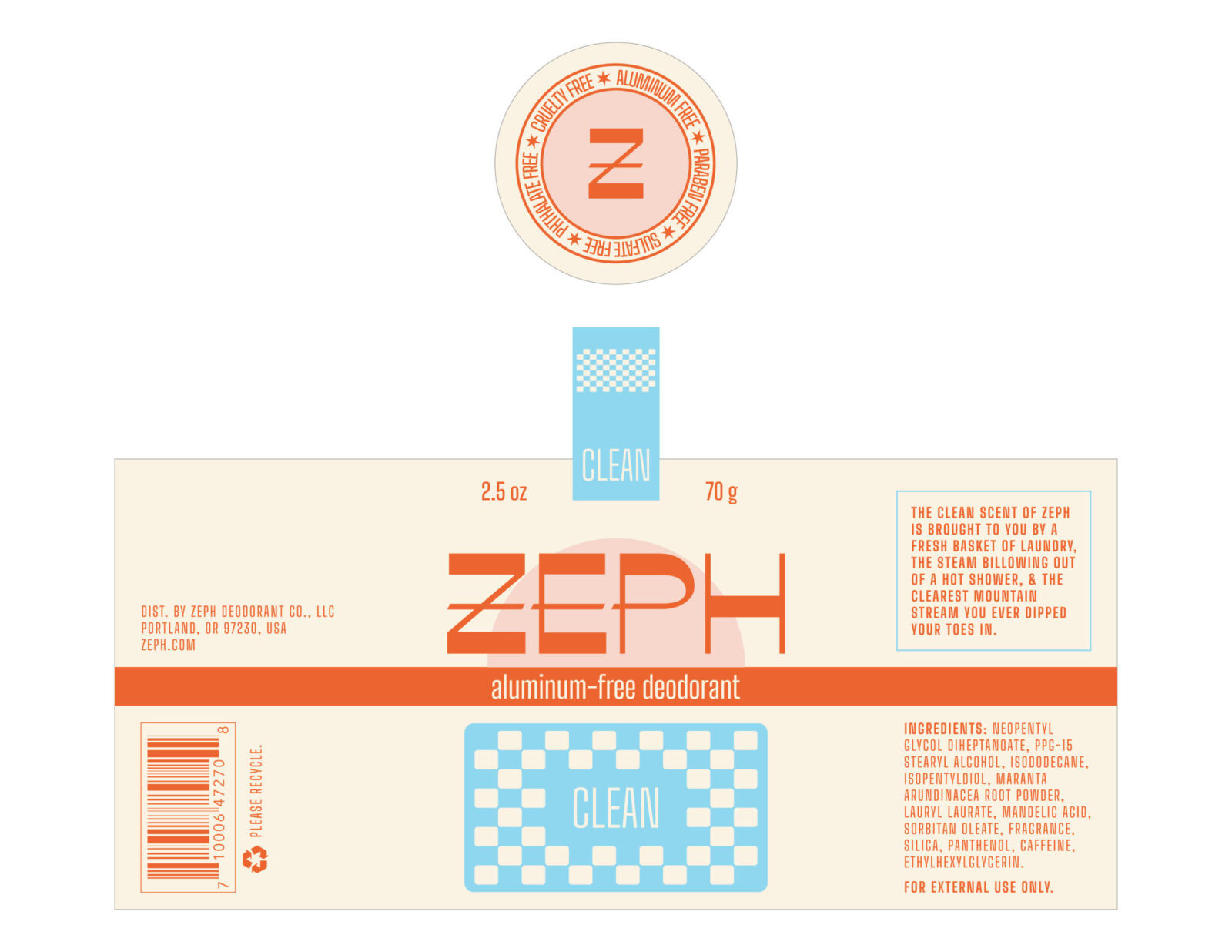
Material choice was an important part of the brand system. I wanted the packaging to stand apart visually, but also ethically, from the plastic-lined shelves that dominate most personal care aisles. Zeph uses an eco-friendly substrate that supports the idea of personal care as something that should be gentle on the body and considerate of the planet. Details like the tamper-proof sealing sticker and the crest on the lid help reinforce that idea in small but memorable moments. They repeat scent information, signal trust, and add a tiny sense of ceremony to the first time the product is opened.
Color pairs and simple pattern motifs give each scent a clear visual identity and make the line easy to navigate. These cues communicate tone and fragrance at a glance without resorting to the heavy gender coding that is so common in this category. The result is a quiet system that still has strong shelf presence because it leads with clarity and intention rather than loudness. Zeph was an opportunity for me to merge nostalgic visual language with contemporary values and to build a brand that invites people in through subtlety, care, and a sense of everyday delight.
CREDIT
- Agency/Creative: Jaimie McKay
- Article Title: Student Jaimie McKay Shapes Zeph Into a Refined and Inclusive Deodorant Identity
- Organisation/Entity: Student
- Project Status: Non Published
- Agency/Creative Country: United States of America
- Agency/Creative City: Julian, CA
- Project Deliverables: 2D Design, Advertising Photography, Brand Creation, Brand Design, Brand Mark, Brand Naming, Brand Strategy, Branding, Creative Direction, Design, Identity System, Label Design, Logo Design, Packaging Design, Product Design, Product Naming, Product Photography, Typography
- Industry: Beauty/Cosmetics
- Keywords: WBDS Student Design Awards 2025/26 , Deodorant, Branding, Label Design, Logo Design, Sustainable Packaging, Product Photography.


