


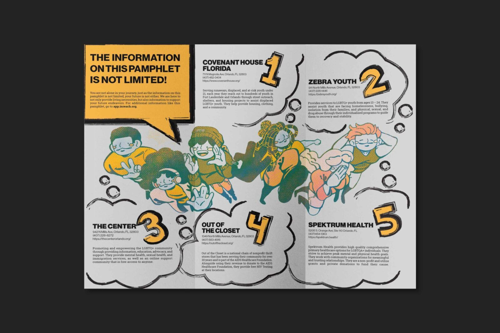
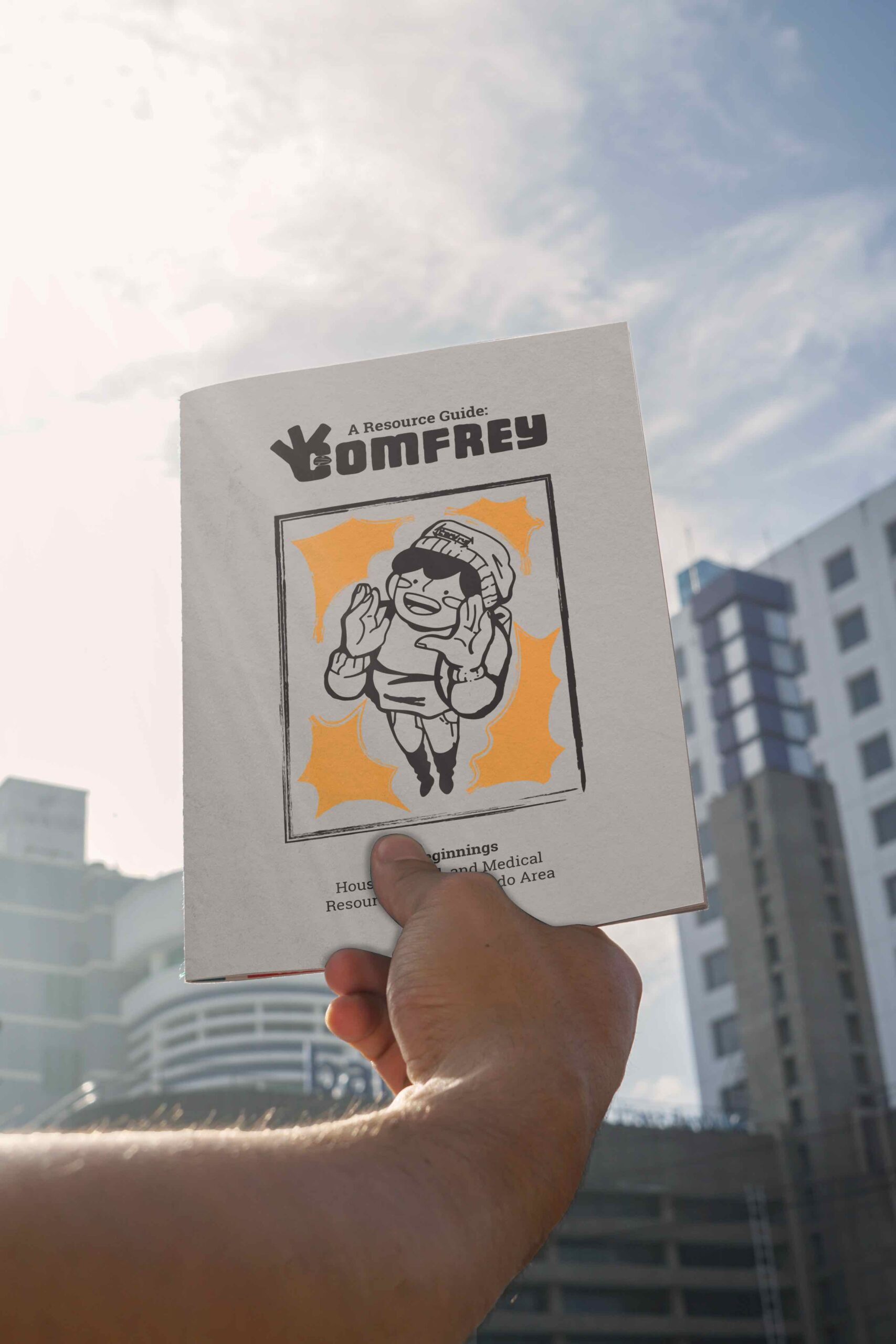
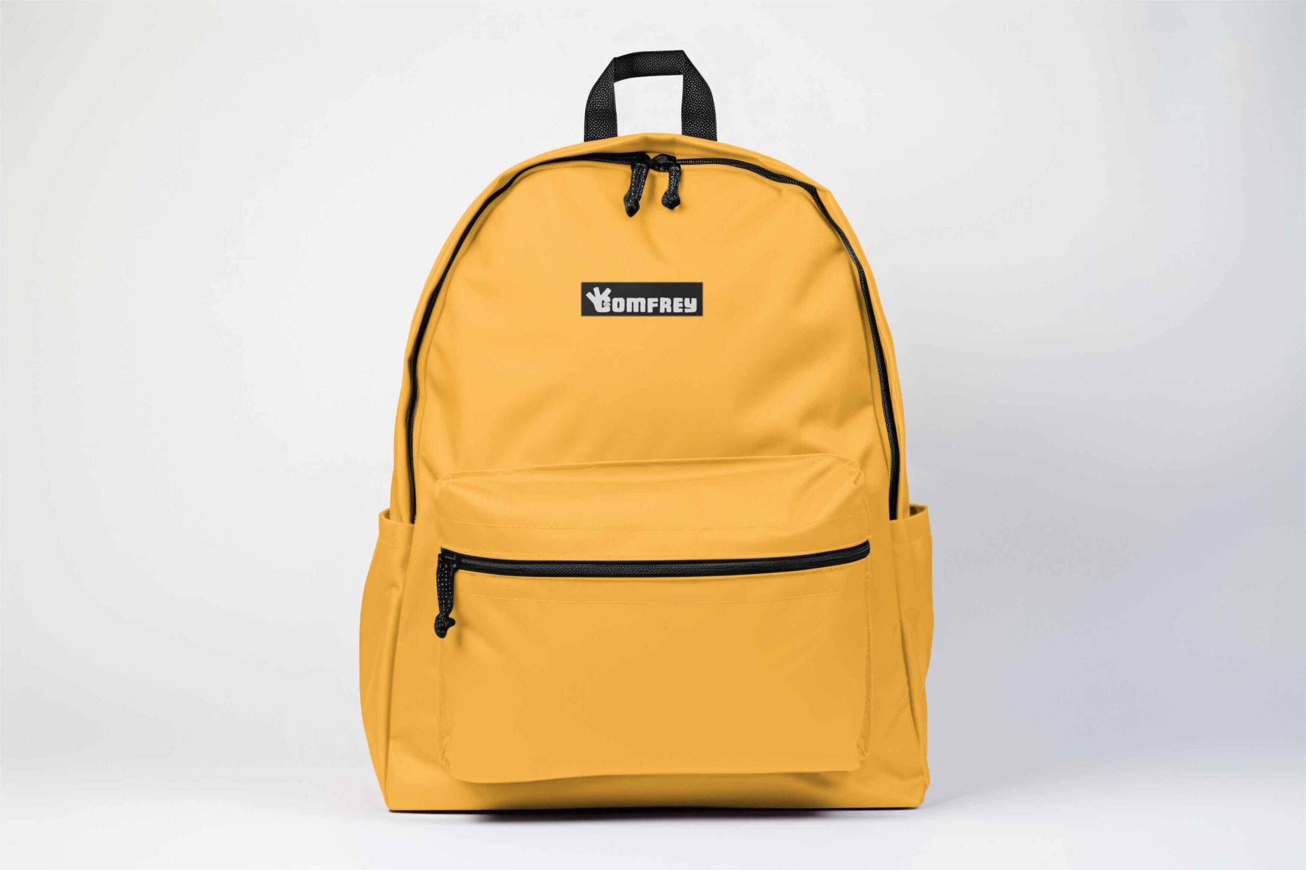
Comfrey is a self-initiated non-profit providing resources and up-cycled items to displaced LGBTQIA+ youth seeking a safe community and opportunities to start new beginnings. Behind the nonprofit, there would be a goal to obtain donated items that are always in need, such as clothing, bottles, socks, or shoes, up cycling them into a backpack with resources and guides for housing, medical needs, and food options.
Due to the ongoing rise of displacement for LGBTQIA+ youth, I aimed at developing a brand identity that was not only warm and welcoming, but closed off to those that do not know the hidden meanings and signs to avoid potential harassment and discrimination for the youth actively involved. This was for the individuals that want a personal community of people and safe spaces that would provide the necessary resources to assist them into better conditions if they wished to pursuit it.
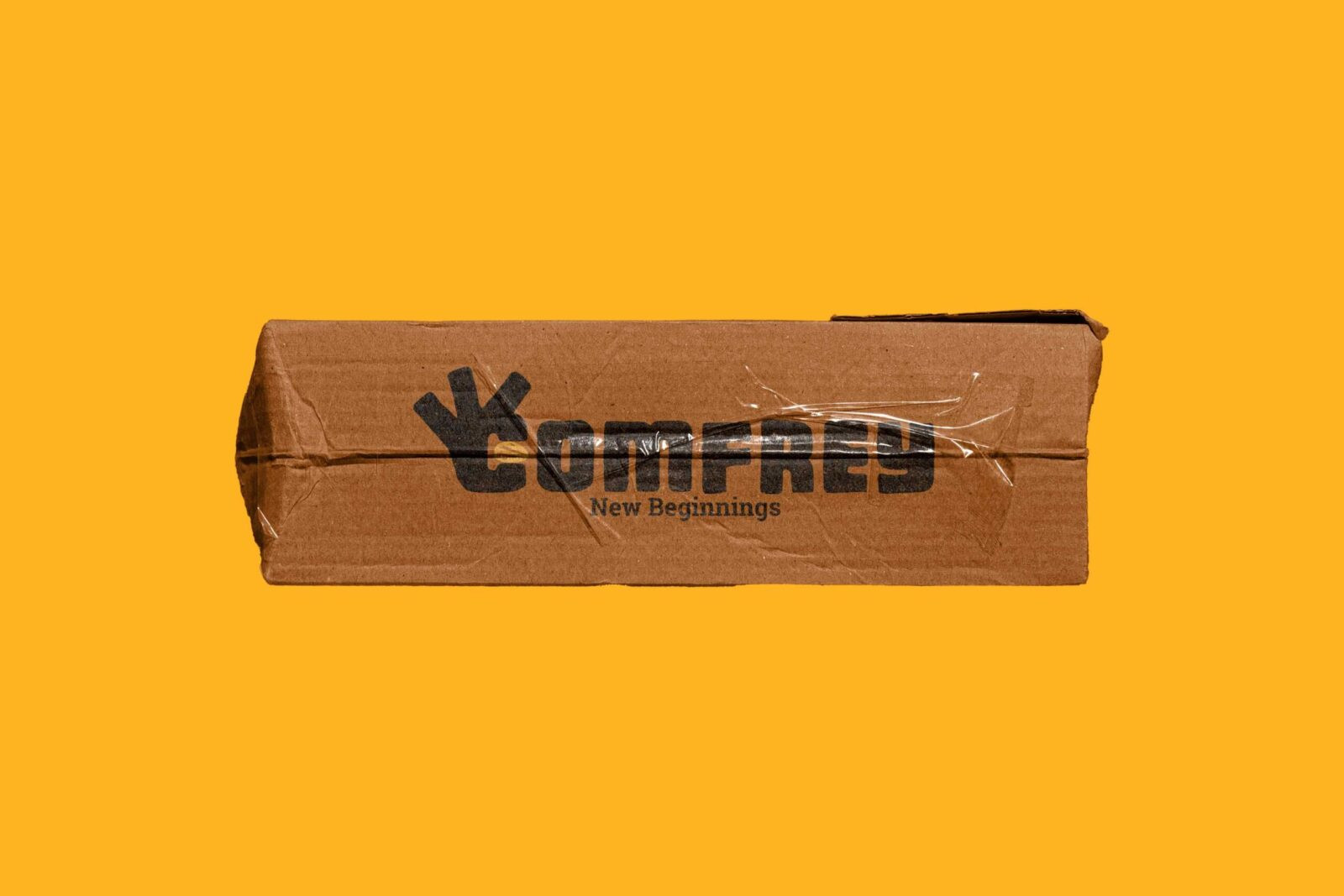
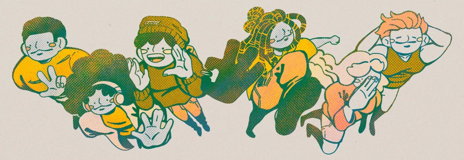
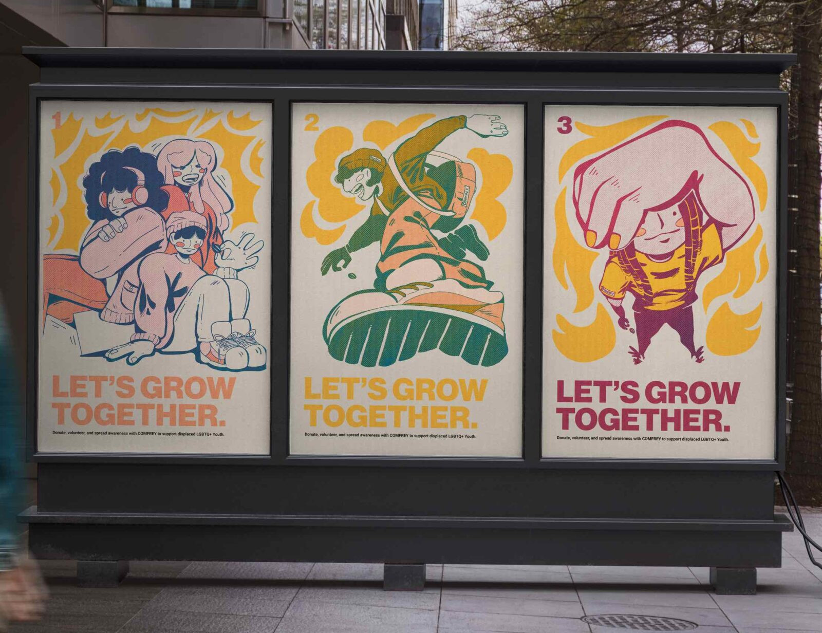
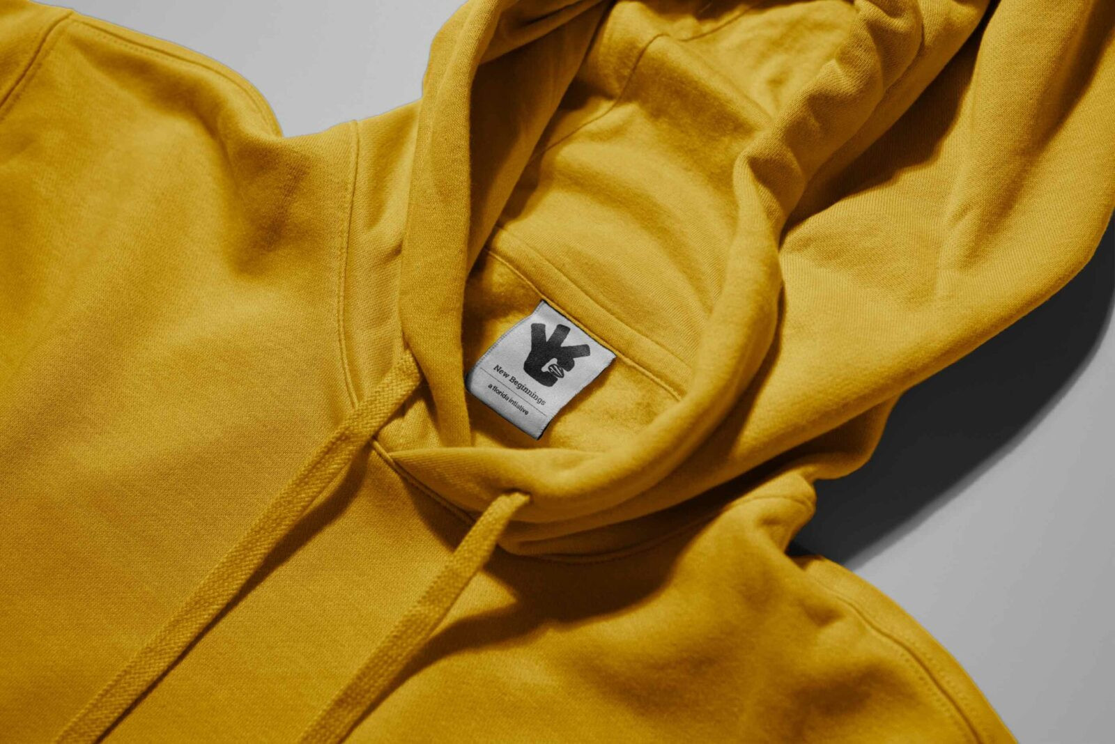
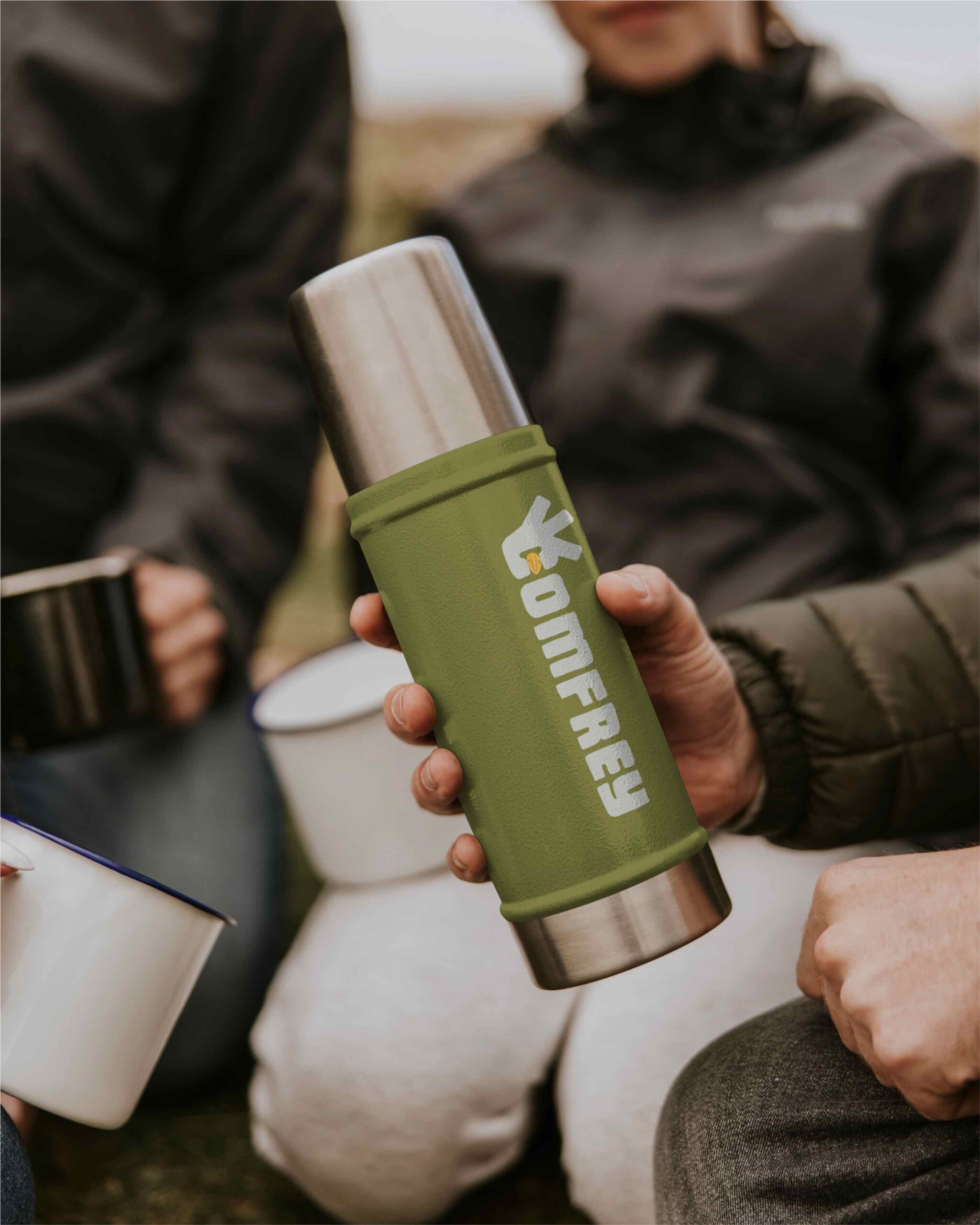
The logo itself is the main indicator for the brand, representing “new beginnings” by planting a new seed to start a new life. The name, Comfrey, originates from a flower that has association of protection and growing together. The entirety of the identity centers around an environment that prides itself on support and community engagement. The illustrations that were developed were colorful, filled with movement, and perspective to express growth, moving forward, and community. The logo itself can be seen throughout the illustrations, a nod to the “discreetness” of the logo and flexibility for its usage in the illustrations.
This project aimed at developing an identity and space for these individuals to feel safe to open up about their situation and ask for necessary resources and guides to assist them. By developing a logo that was versatile, discreet, and the backbone behind the intentions of the brand combined with the welcoming, youthful illustrations; my work expressed my desire to not only keep these youth safe, but to help them in their time of need. Through this brand, I hope to contribute to the LGBTQIA+ community and express my ongoing resolve to develop designs that help the youth through extreme moments of their lives to feel confident in their community and identity. For me and many others, the start of my expression of my identity and new beginnings came from the community and acceptance of those around me; which further motivated me to develop a community that strictly strives to exemplify acceptance.
CREDIT
- Agency/Creative: Hal Smith
- Article Title: Student Hal Smith Creates Comfrey to Unite Support Systems and Upcycled Essentials
- Organisation/Entity: Student
- Project Status: Non Published
- Agency/Creative Country: United States of America
- Agency/Creative City: Orlando
- Project Deliverables: 2D Design, Art Direction, Brand Creation, Brand Identity, Branding, Illustration, Logo Design
- Industry: Human Resources
- Keywords: WBDS Student Design Awards 2025/26 , Illustration, Brand Identity, WBDS Student Design Awards, LGBTQIA+, Logo, Posters, Inclusive


