


OVERVIEW
Elevate is a conceptual conference for Women Who Code, a non-profit focused on advancing and supporting women in technology. The objective of the identity was to create a brand that feels modern, tech-driven, and dynamic, yet warm and human, intentionally moving away from the sterile, corporate aesthetic often associated with the tech industry. The identity needed to communicate confidence and momentum to reflect the conference theme of “Elevate,” empowering women in tech, while also emphasizing community, connection, and shared growth.
APPROACH
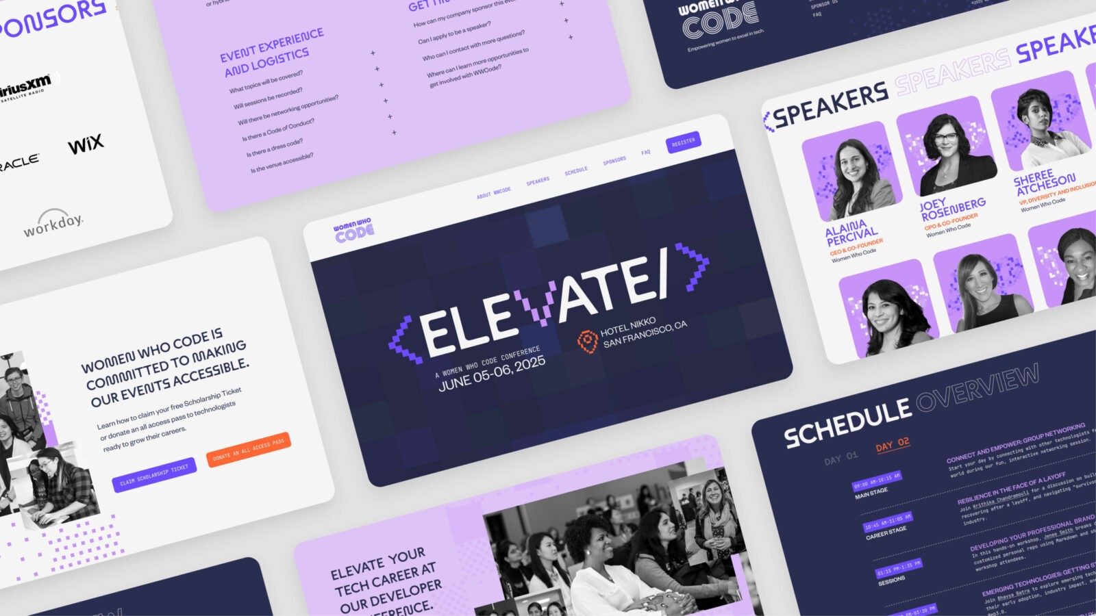
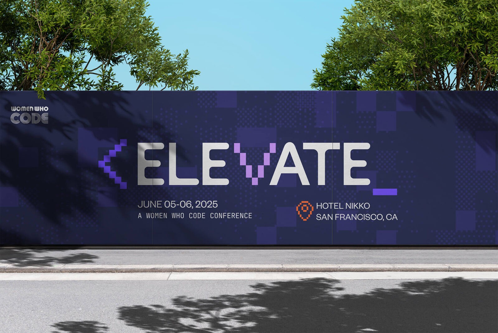
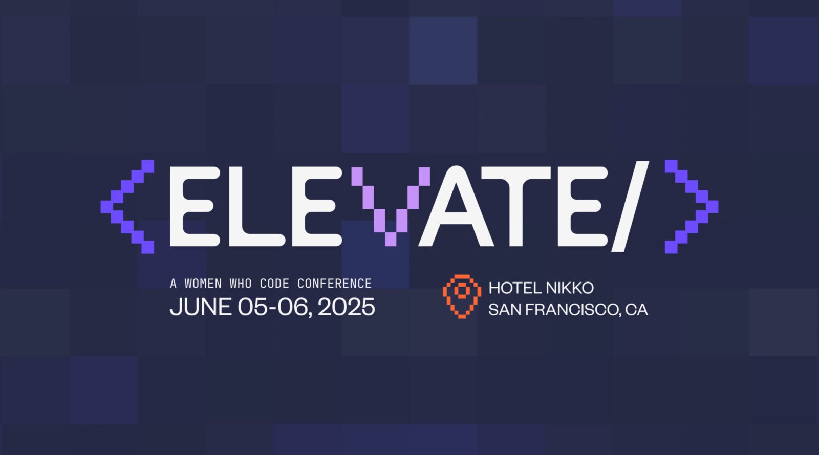
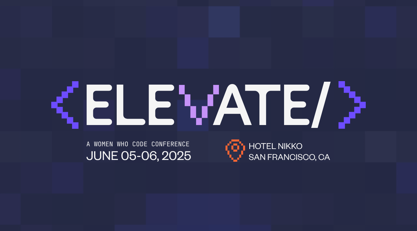
Color selection played an essential role in achieving this tone. Bold purples and oranges were chosen to convey strength, energy, and ambition, while a softer lavender was introduced to balance intensity with approachability. The palette communicates empowerment without relying on expected “tech neutrals,” giving the conference a modern, welcoming, and inclusive feel.
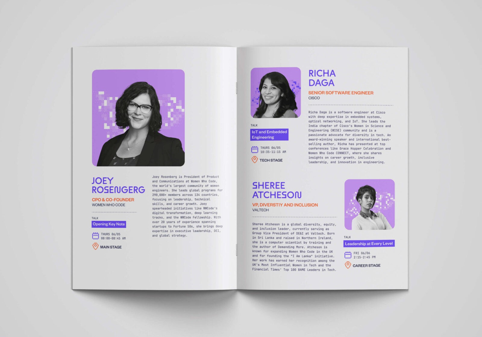
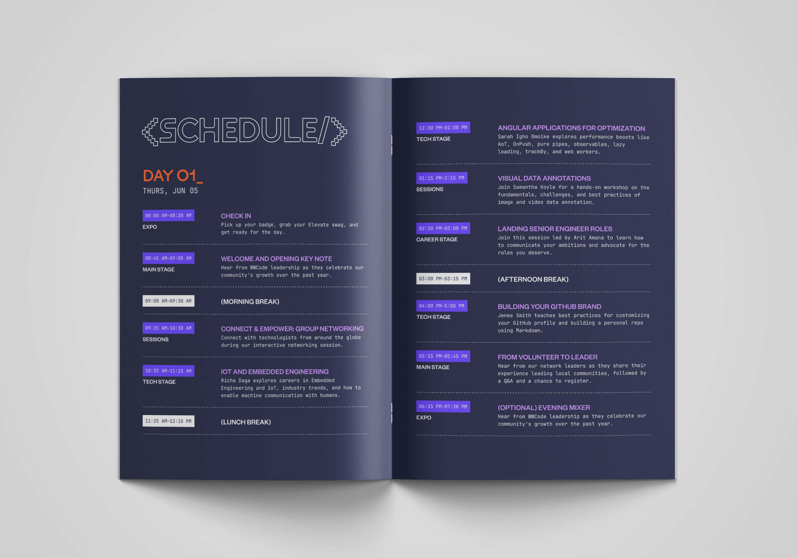
Pixel graphics serve as a core design element. They pay homage to early digital aesthetics and symbolize how individual contributions build something greater, reflecting Elevate’s goal to promote growth, connection, and collective empowerment in technology. Pixel graphics appear as icons and graphic elements across print and digital applications, reinforcing themes of collaboration and movement while maintaining clarity and structure within the system.
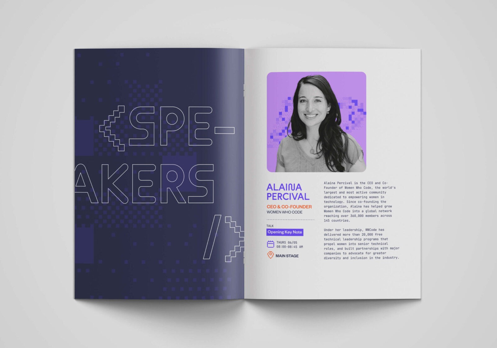
Typography further shapes the brand’s voice. ABC Maxi Plus anchors the identity with a confident geometric presence for headlines. Founders Grotesk supports body copy with clarity and refinement, ensuring readability across both print and digital contexts. JetBrains Mono introduces contrast and a subtle nod to coding culture for technical details and metadata. Together, the three typefaces create a visual language that is modern, tech-forward, and energetic while remaining approachable and human.
The identity extends across a conference logo, a printed program booklet, and a website featuring micro-interactions informed by pixel graphics. These motion elements introduce rhythm and personality while maintaining accessibility and intuitive navigation.
Overall, Elevate presents a tech-centric yet human brand expression, modern, bold, and inclusive, reflecting a conference built on professional growth, community, and collective empowerment.

CREDIT
- Agency/Creative: Gizelle Farinas
- Article Title: Student Gizelle Farinas Develops Elevate to Balance Digital Energy and Community Connection
- Organisation/Entity: Student
- Project Status: Non Published
- Agency/Creative Country: United States of America
- Agency/Creative City: San Diego
- Project Deliverables: Brand Identity, Design, Editorial Design, Graphic Design, Web Design
- Industry: Non-Profit
- Keywords: WBDS Student Design Awards 2025/26, brand identity, webite design, event program


