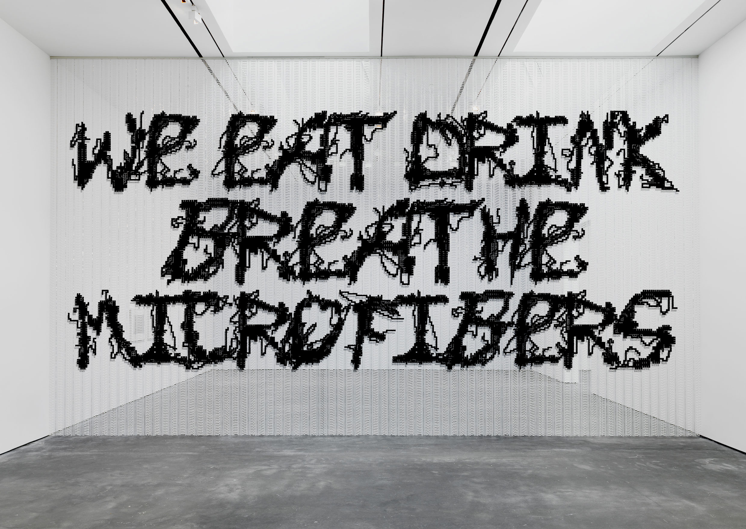
The concept design of the Go for Quality exhibition is dedicated to the problem of microfiber pollution. Synthetic materials represent about 60% of the clothing material worldwide. These man-made materials are highly popular and usually chosen by the fashion industry because of their availability and affordability. When manufactured, washed, and worn, clothes made out of synthetic materials lose tiny plastic fibers that end up in the environment. Plastic that ends up in the environment does not biodegrade, it fragmentizes into smaller pieces. These tiny pieces are called microfibers.
Recent research proves that we are eating and drinking plastic. Microfibers have been found in fish, plankton, chicken, sea salt, beer, honey, and in tap as well as bottled water. We also breathe in these plastic particles due to fiber loss from our carpets, curtains, and other textiles.
The majority of the synthetic clothing produced today are made with poor quality, without longevity in mind and in many cases even planned obsolescence (made to break within a certain time with the intent to create a need for the customers to buy new). Switching from synthetic materials to natural materials comes with other substantial environmental costs. For these reasons, there is no easy fix to this extensive problem.
Because of our dependence on fast fashion, synthetic materials, and washing machines, microplastic contamination of all habitats is likely to increase.
The consequences of the ubiquitous microfiber pollution might be disastrous to animals and humans.
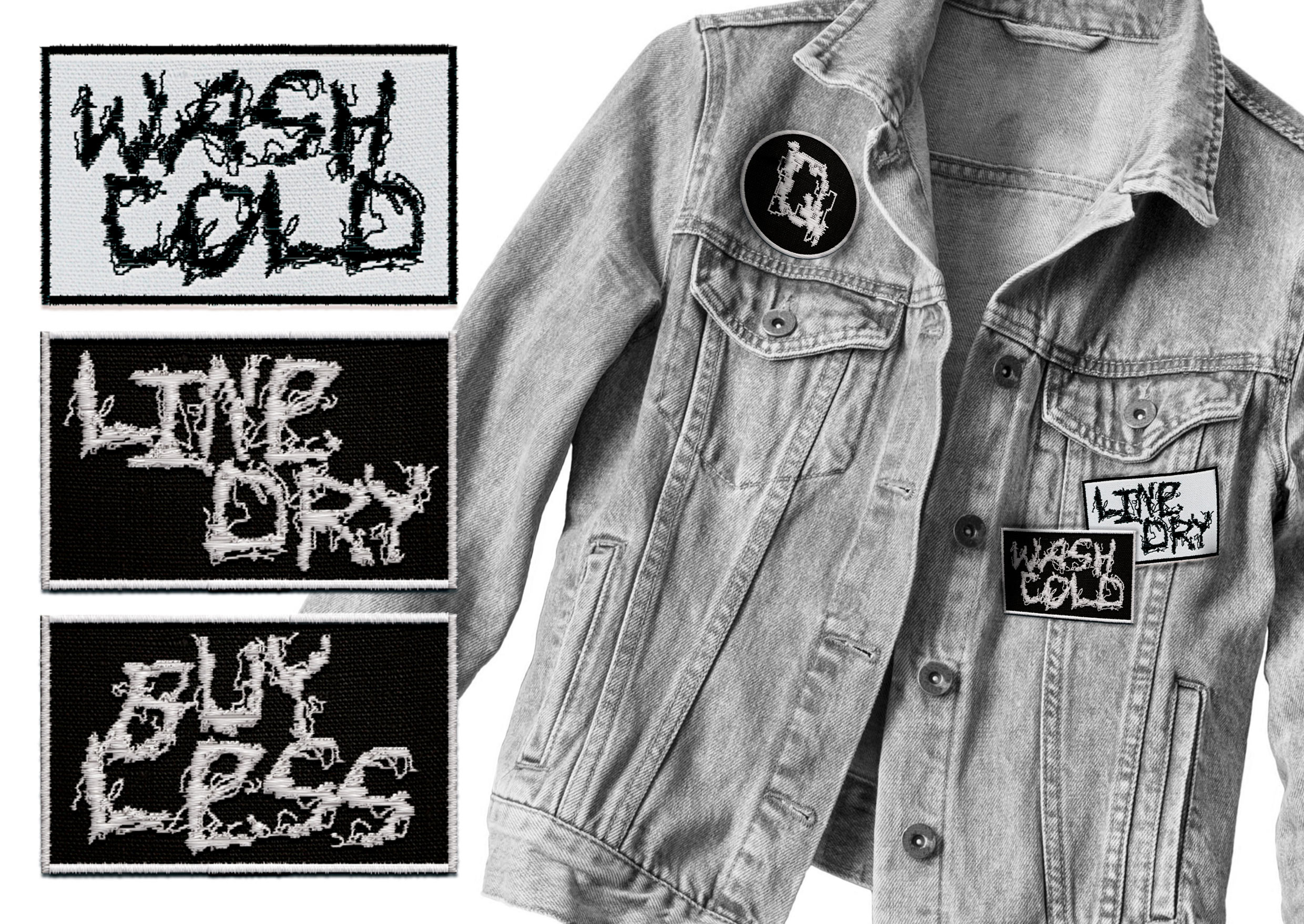
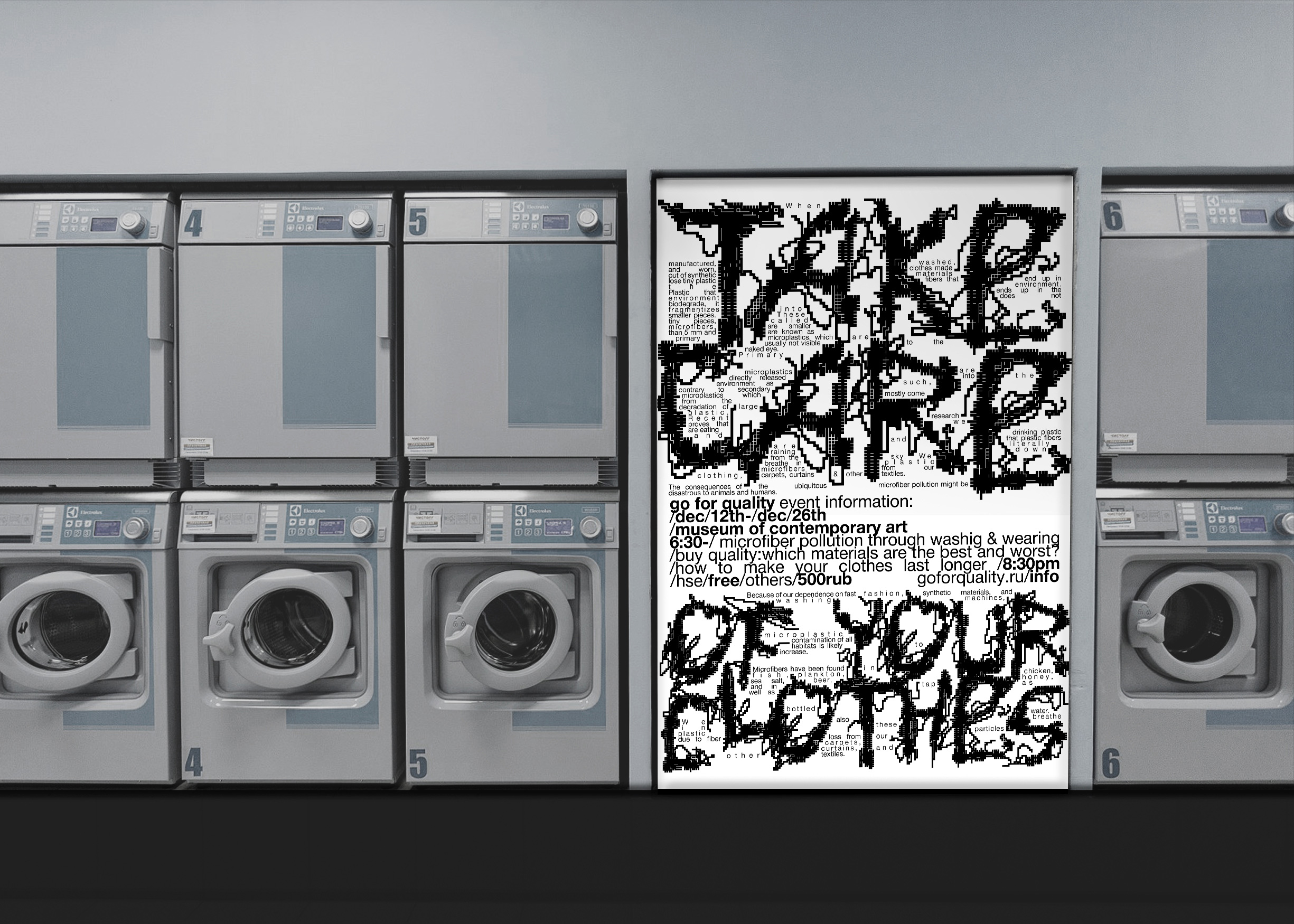
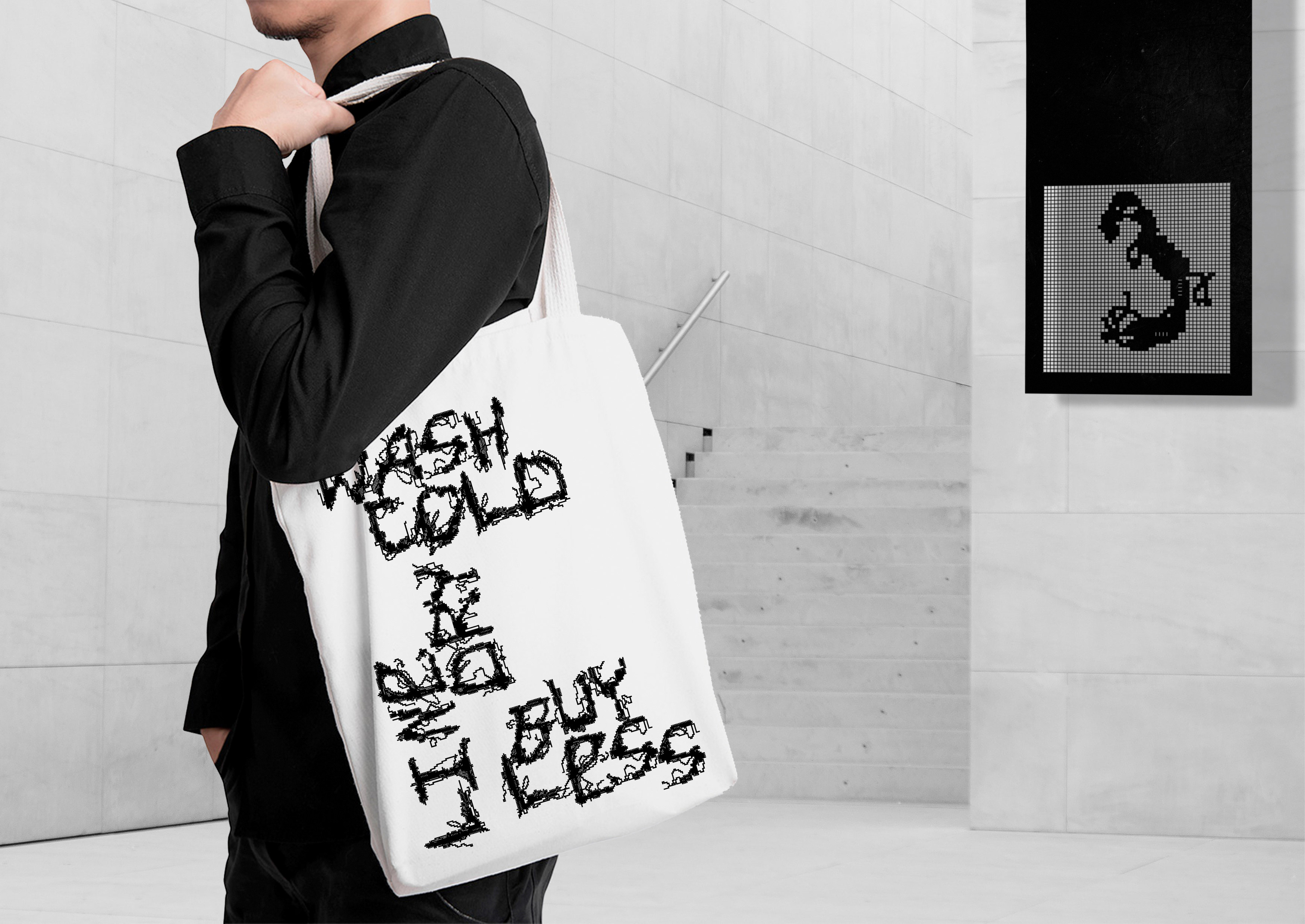
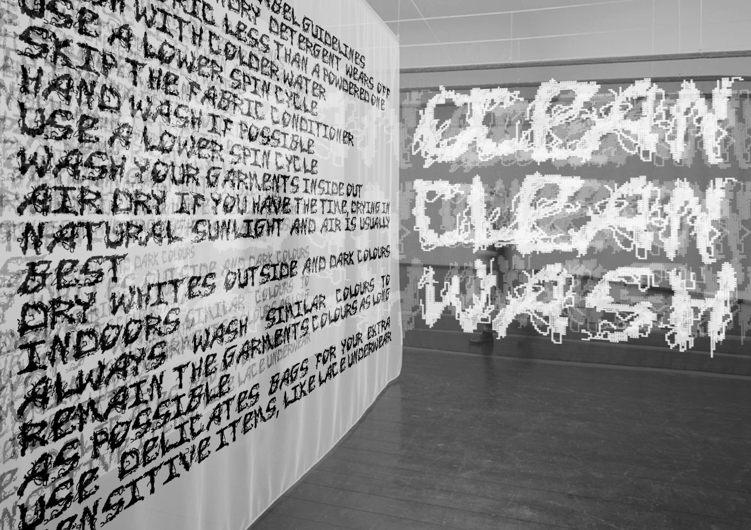
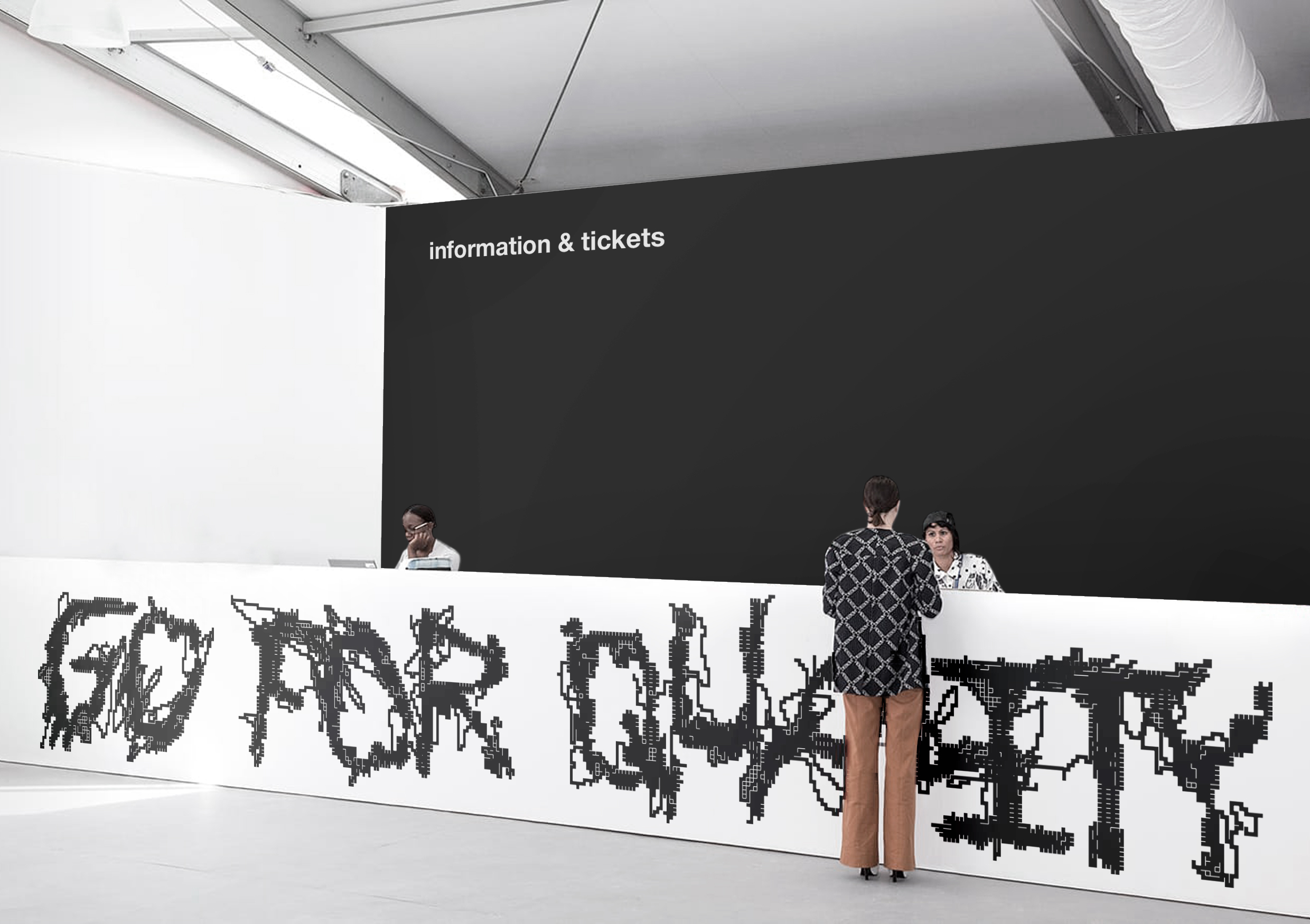
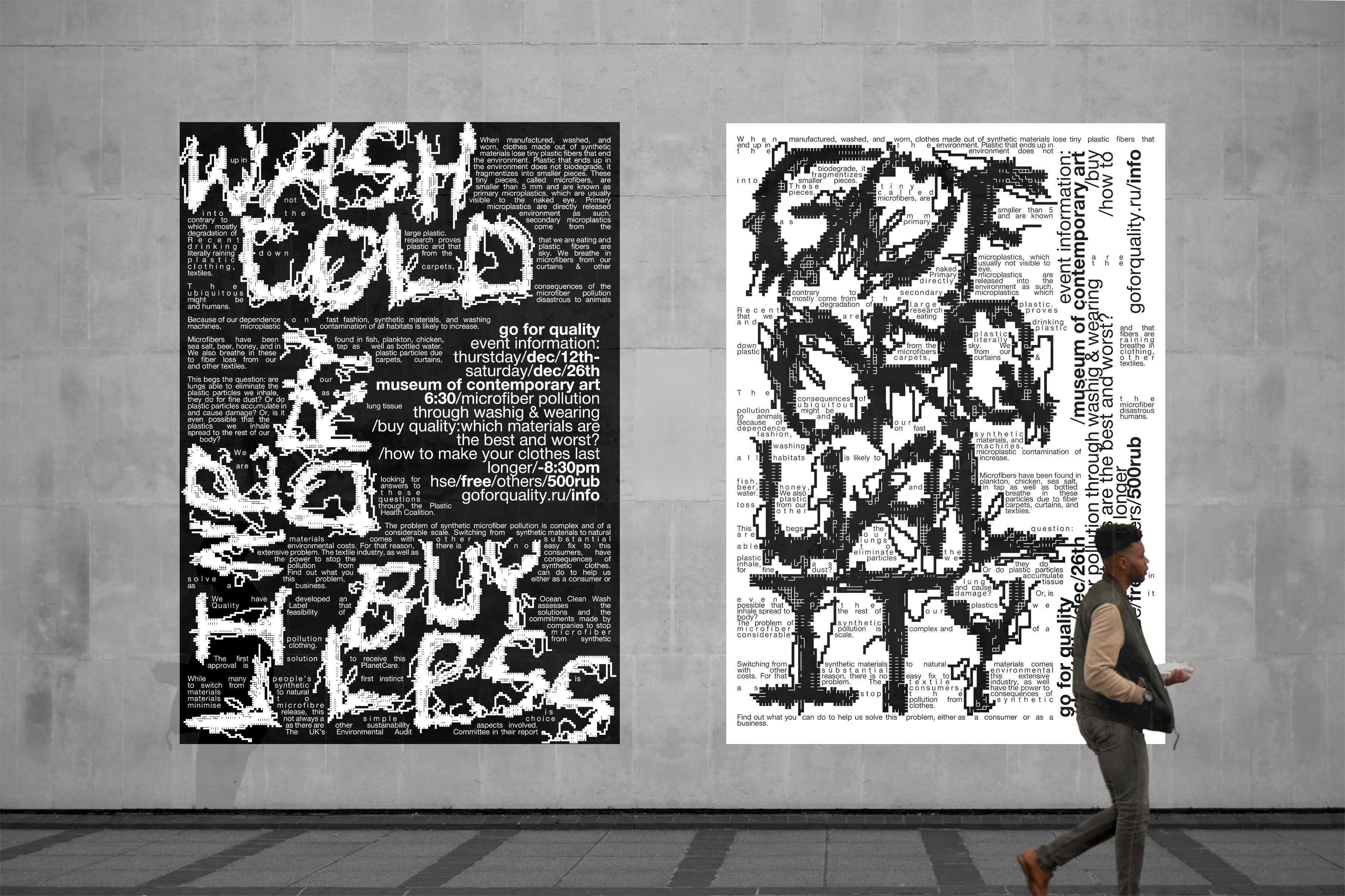
The name and taglines (“buy less, wash cold, line dry”; “take care of your clothes”; “we eat, drink, breathe microfibers”; “ocean clean wash”) of the exhibition call on the consumer to solve a problem which is complex and of a considerable scale.
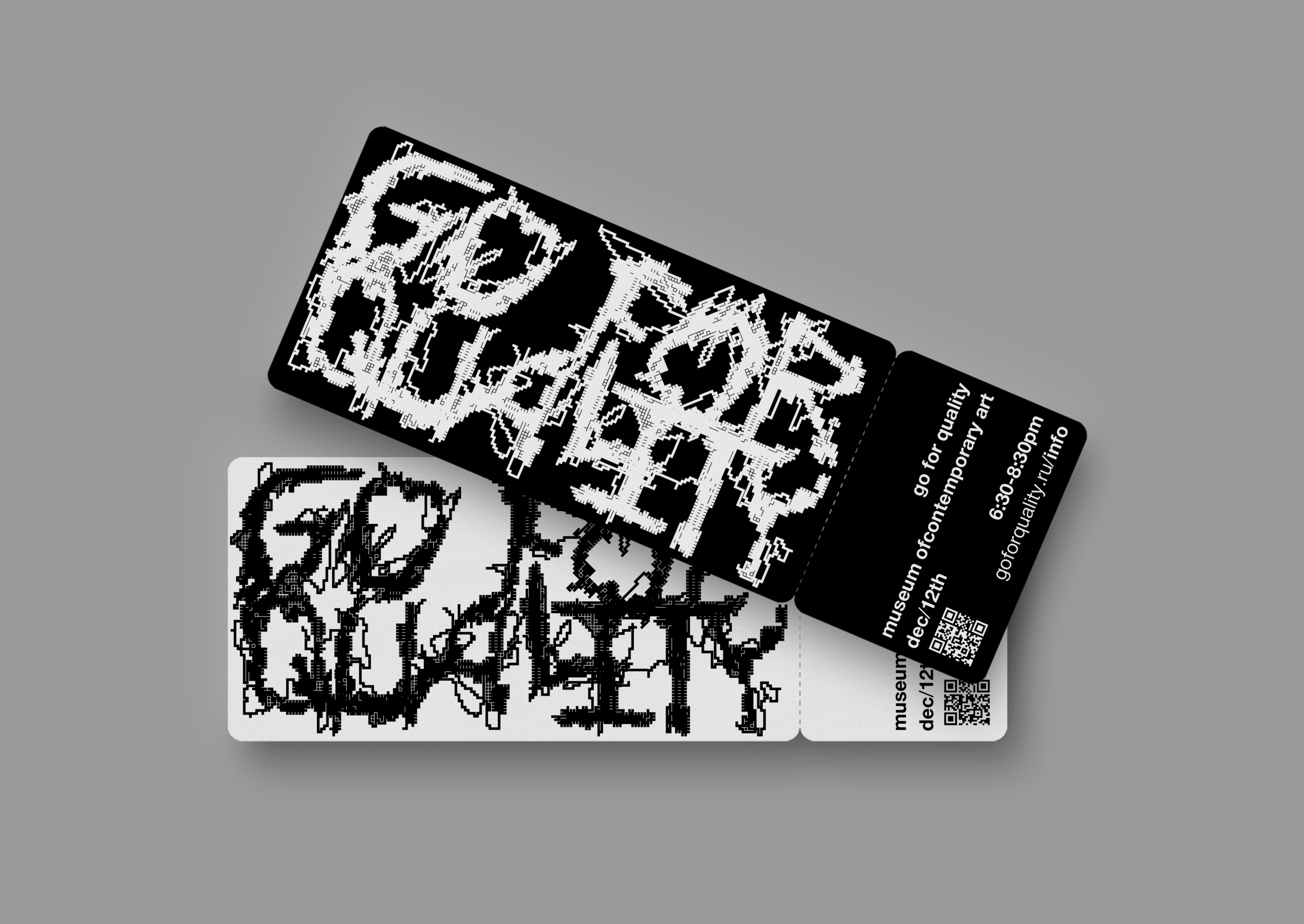
The identity is based on a display font “Raspustilsya sans” that visually resembles holes in the fabric with loose threads. The font is built by cutting elements (microfibers) from the grid (synthetic fabric). It was drawn in a vector in Adobe Illustrator and transferred to Fontlab. “Raspustilsya sans” is well suited for various types of communication: posters, merch, interiors, etc.


CREDIT
- Agency/Creative: Dina Issayeva
- Article Title: Student Exhibition Design Concept Go for Quality by Dina Issayeva
- Organisation/Entity: Student, Published Self Promotional Design
- Project Type: Identity
- Project Status: Published
- Agency/Creative Country: Russia
- Market Region: Global
- Project Deliverables: Brand Naming, Branding, Graphic Design, Identity System, Research, Tone of Voice
- Industry: Education
- Keywords: student, hse, hsedesign, synthetics, microfibers, microplastic, pollution, ocean, identity, exhibition, type, font


