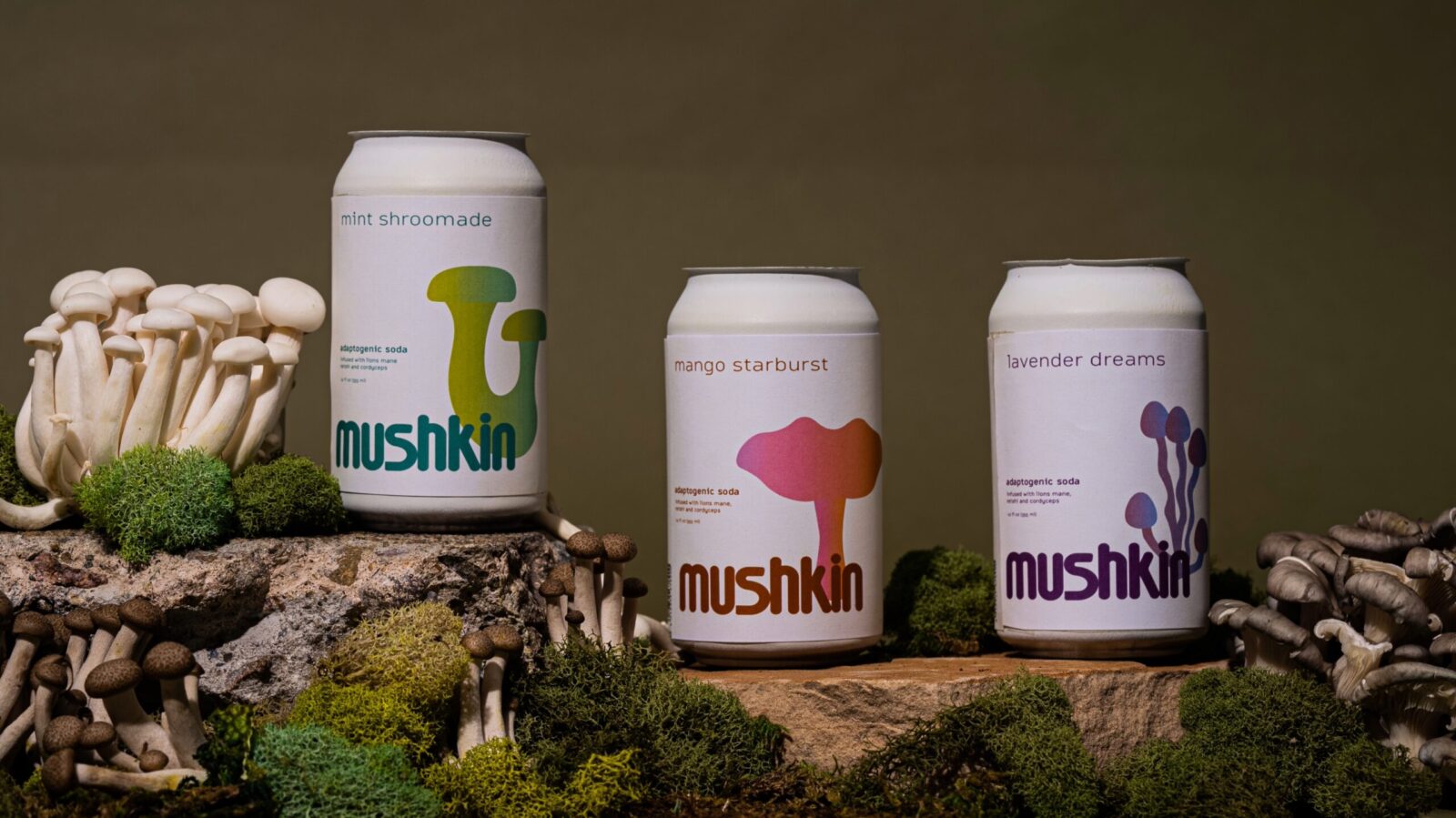
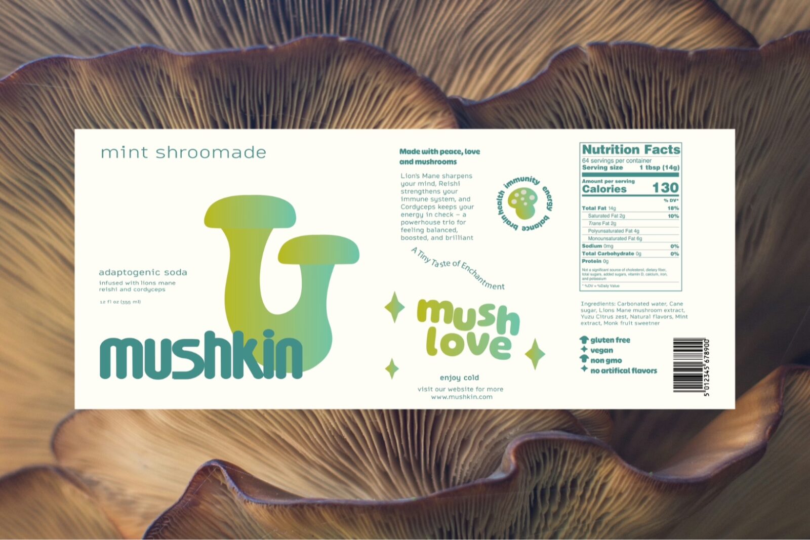
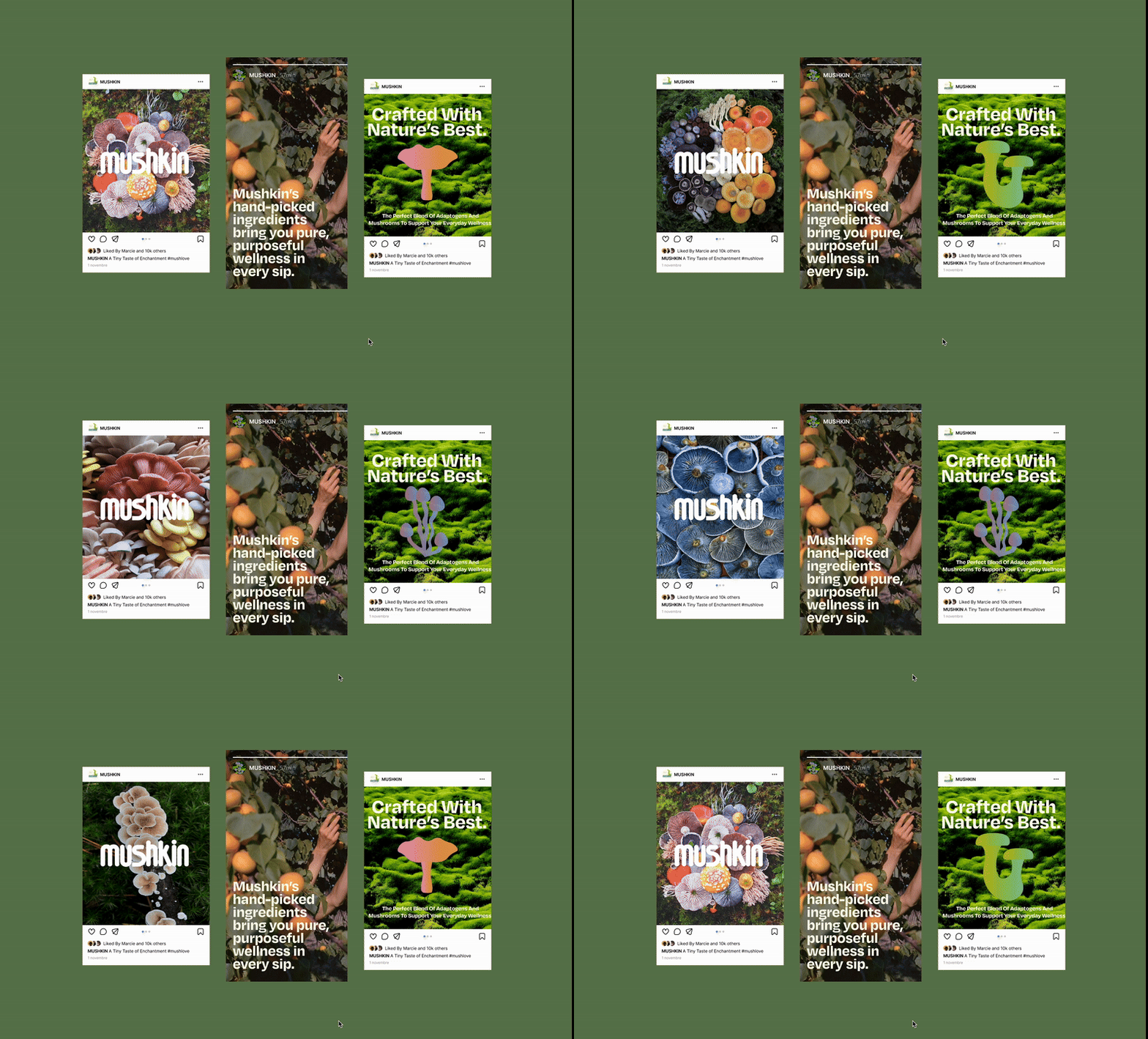
Mushkin is an adaptogenic soda concept designed to break away from the expected. Where many functional beverages lean toward sterile minimalism or overly clinical wellness cues, Mushkin embraces a playful, slightly mischievous character without losing its clean, intentional design language. The brand centers on three distinguished flavors, each built around a unique adaptogenic profile, giving the drink both personality and purpose. Though the flavors are distinct, they share a unifying philosophy: balanced energy, gentle mood support, and a sense of small everyday delight.
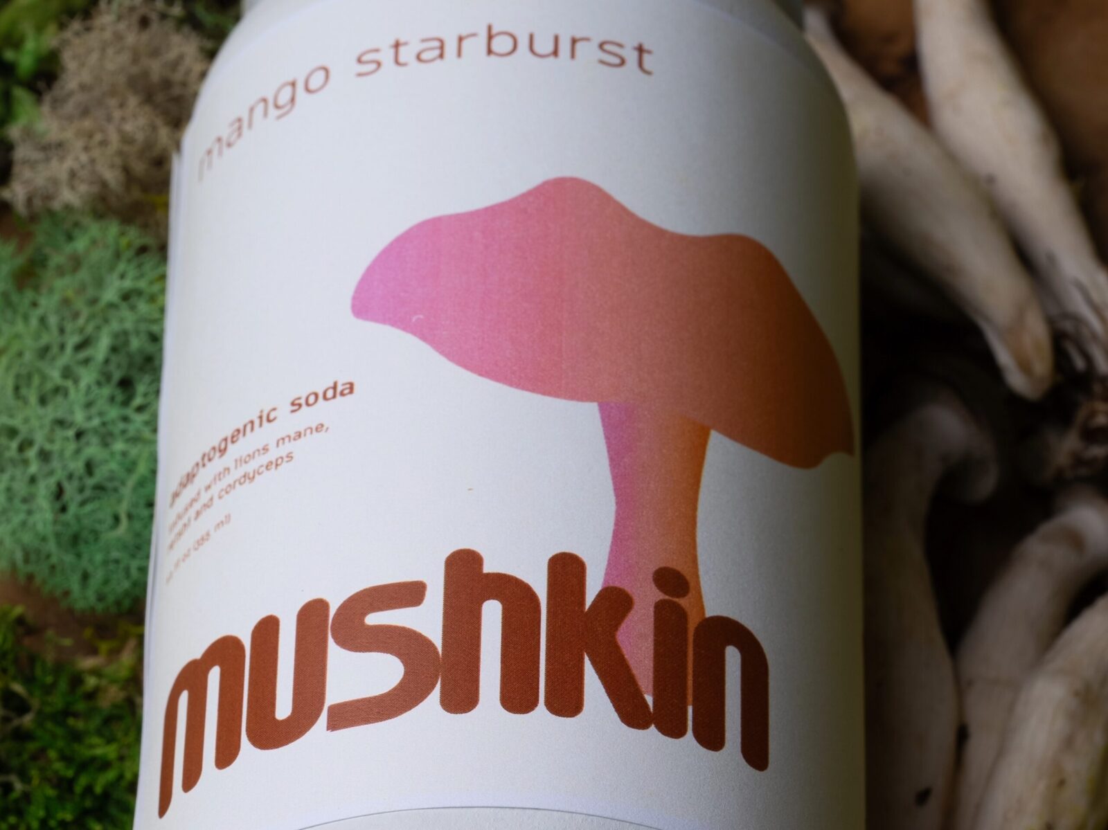
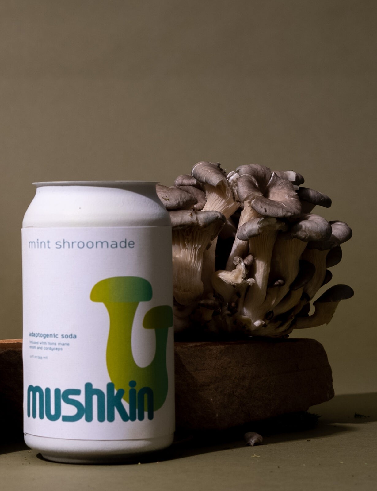
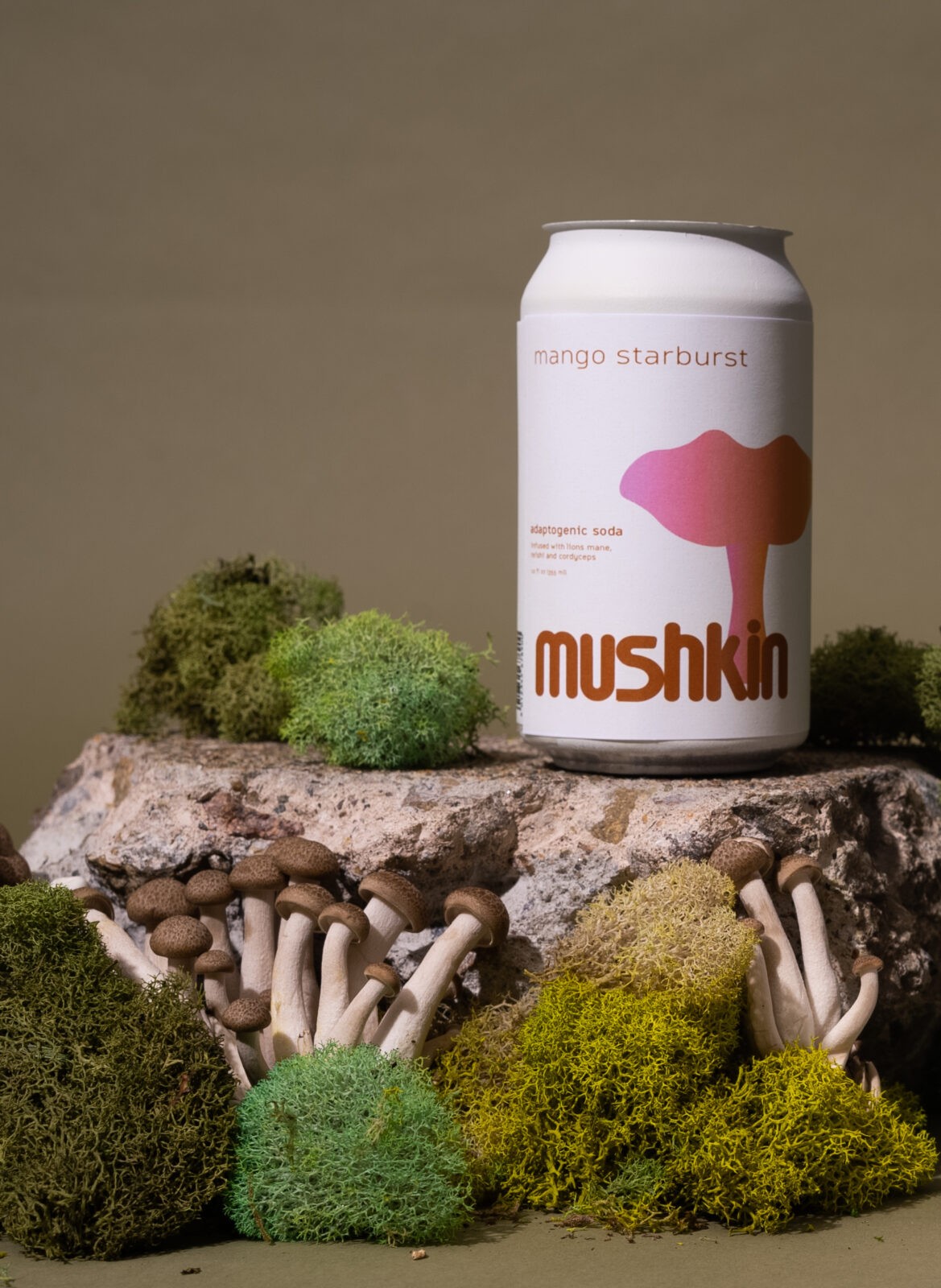
The naming, Mushkin, hints at both the adaptogenic roots—drawing softly from the world of mushrooms and botanicals—and the brand’s playful charm. The word feels friendly which becomes part of the drink’s identity. Each flavor is represented not by flashy illustrations or cluttered graphics, but by minimal, symbolic marks: simple shapes, subtle textures, and a single bold accent color that communicates its mood and taste profile. This approach keeps the packaging clean and modern while still allowing each can to feel alive, expressive, and memorable.
The minimal packaging isn’t about being generic; instead, it gives Mushkin room to stand out through clever restraint. Competitors often rely on dense labels packed with benefits, but Mushkin uses whitespace and color to convey confidence. A soft matte finish, one-line descriptors, and small playful details—like a tiny character icon or a witty phrase tucked near the bottom—invite the consumer to interact more closely with the can.
What truly sets Mushkin apart is its commitment to being serious in function but lighthearted in tone. It communicates wellness without pressure, treating adaptogens not as a strict regimen but as a supportive, enjoyable part of daily life. Each can feels like a small companion: approachable, uplifting, and distinctive. In a market crowded with sameness, Mushkin’s blend of minimal design, bold flavor identity, and gentle playfulness makes it an adaptogenic soda that welcomes curiosity and sparks joy.

CREDIT
- Agency/Creative: Evee Grant
- Article Title: Student Evee Grant Designs Mushkin to Bring Lightness and Balance to Functional Beverages
- Organisation/Entity: Student
- Project Status: Non Published
- Agency/Creative Country: United States of America
- Agency/Creative City: San Diego
- Project Deliverables: GIF Animation, Label Design, Packaging Design, Photography
- Industry: Food/Beverage
- Keywords: WBDS Student Design Awards 2025/26 , Wellness Health Mushroom Beverage Design


