My Transylvanian Rose
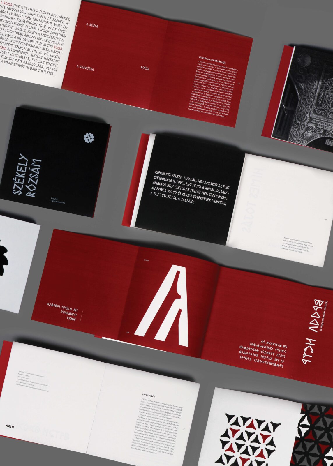
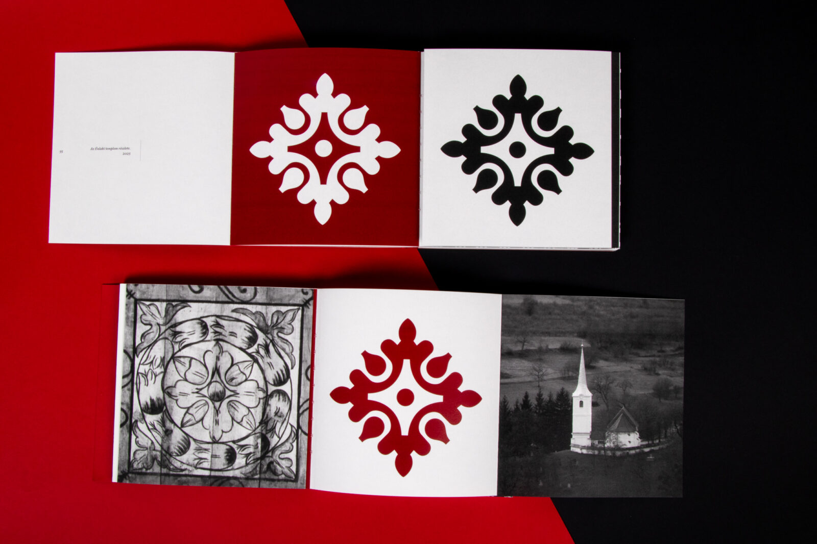
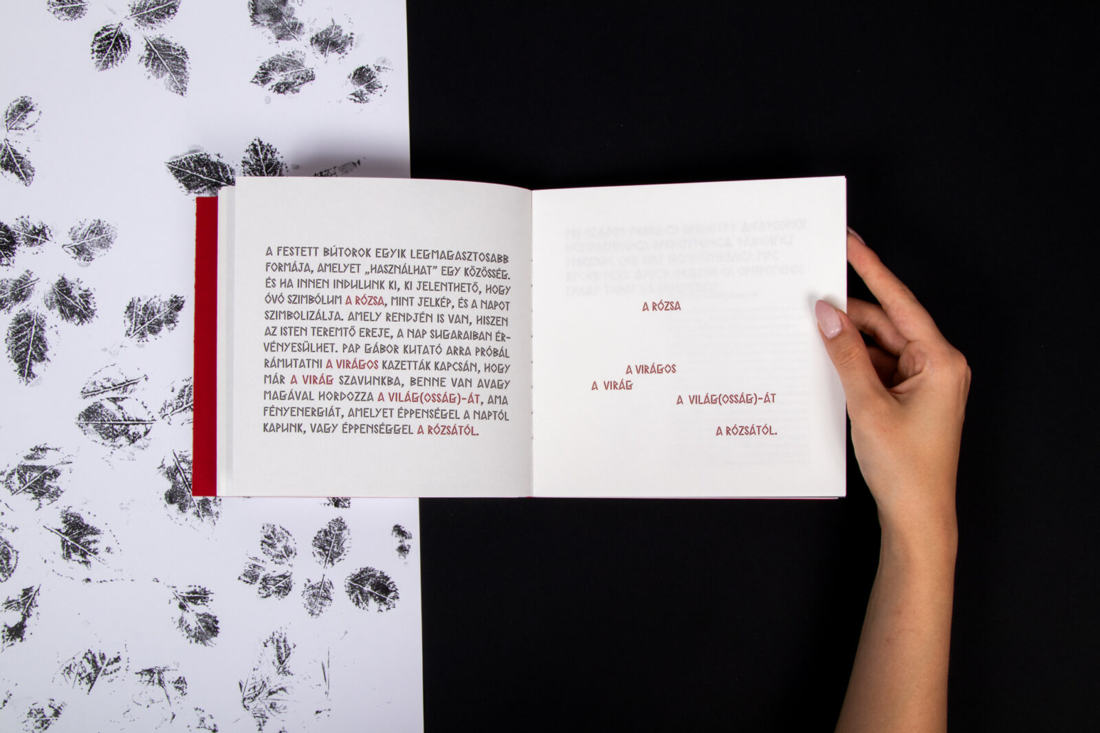
My project, which also serves as my thesis, is based on Székely (Transylvanian) folk art, and at the same time explores the question of personal identity. The central theme of my work is the search for the essence of Székely ethnicity and its preservation; a search I approached through its symbols and visual language. Focusing particularly on its visual world, I chose a single motif as the core of my research: the rose. This led to a comprehensive exploration of the rose motif as it appears in the Székely region. I complemented this with an examination of Székely alphabet script, which is also a distinctive feature of the region’s visual heritage. The publication is divided into two parts, each offering a unique perspective on the rose. Page by page, I aim to reinterpret the heritage of the past through contemporary visual forms, allowing it to become a living part of the future.
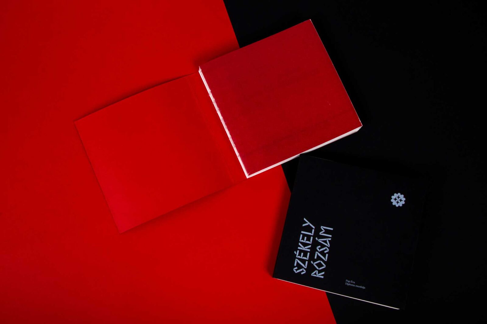
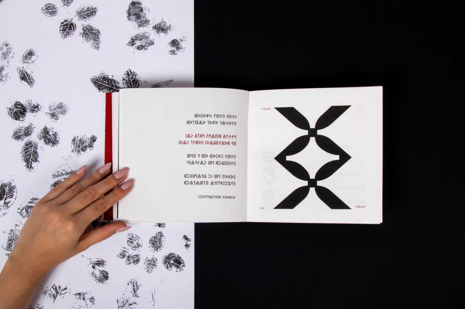
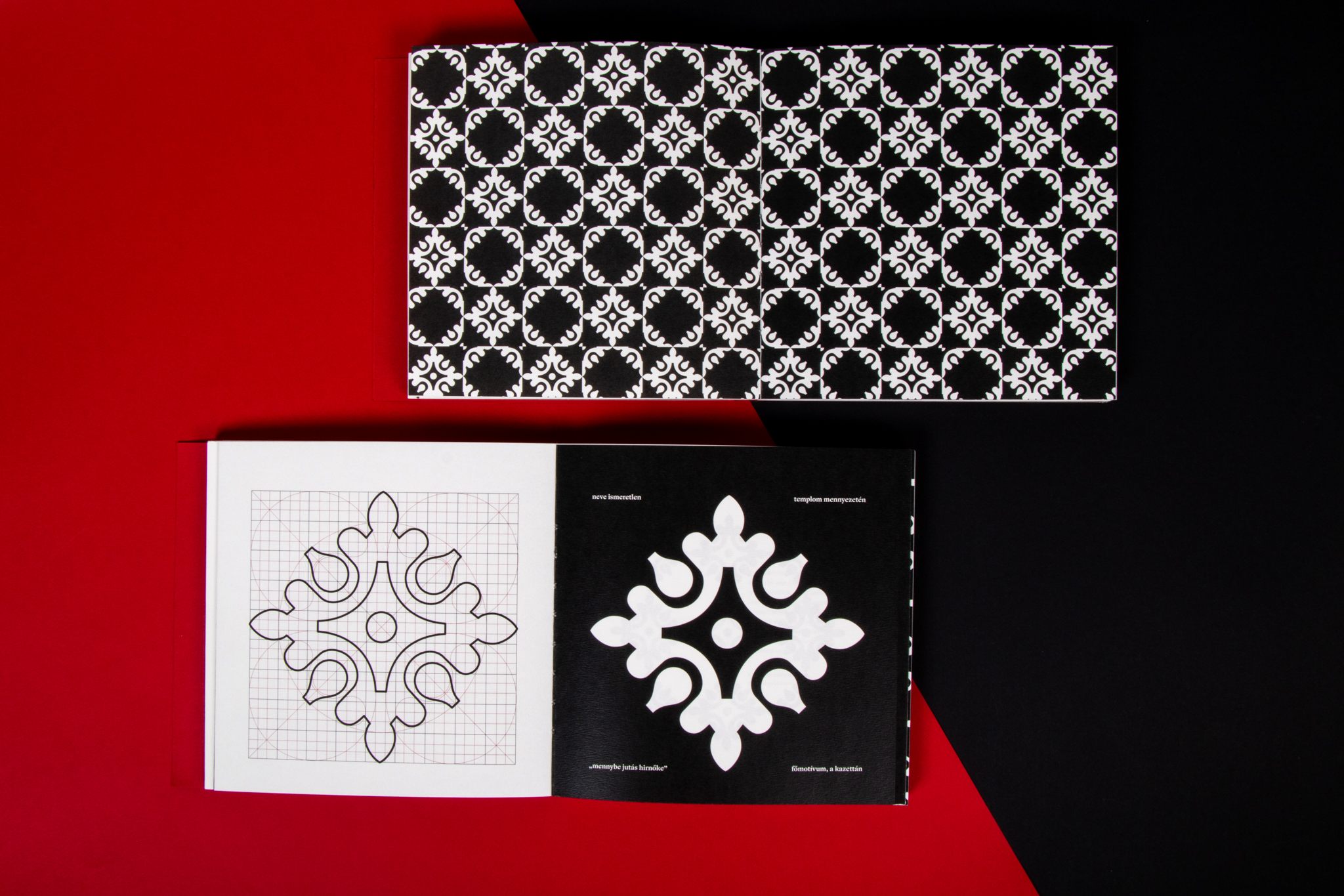
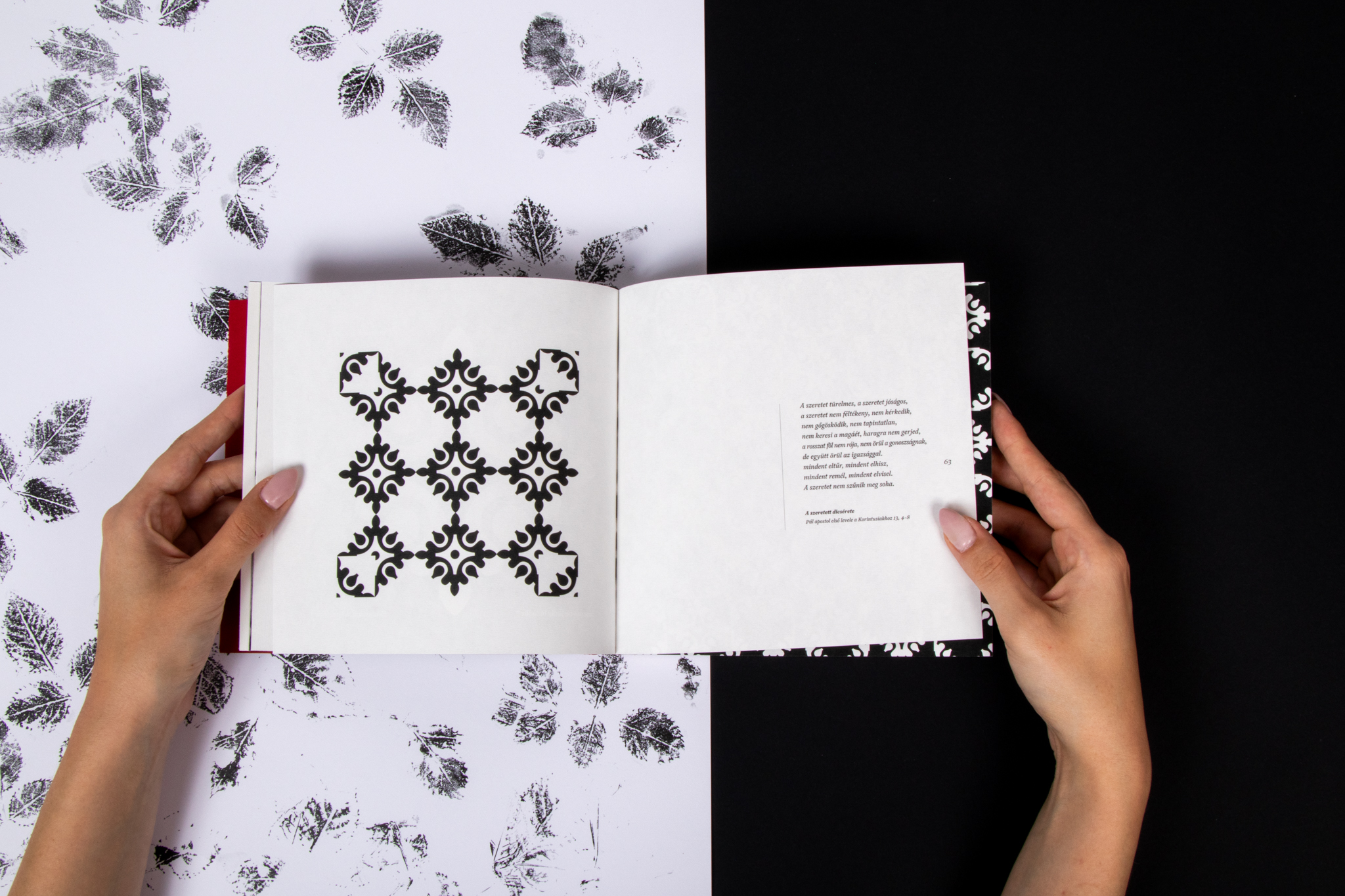
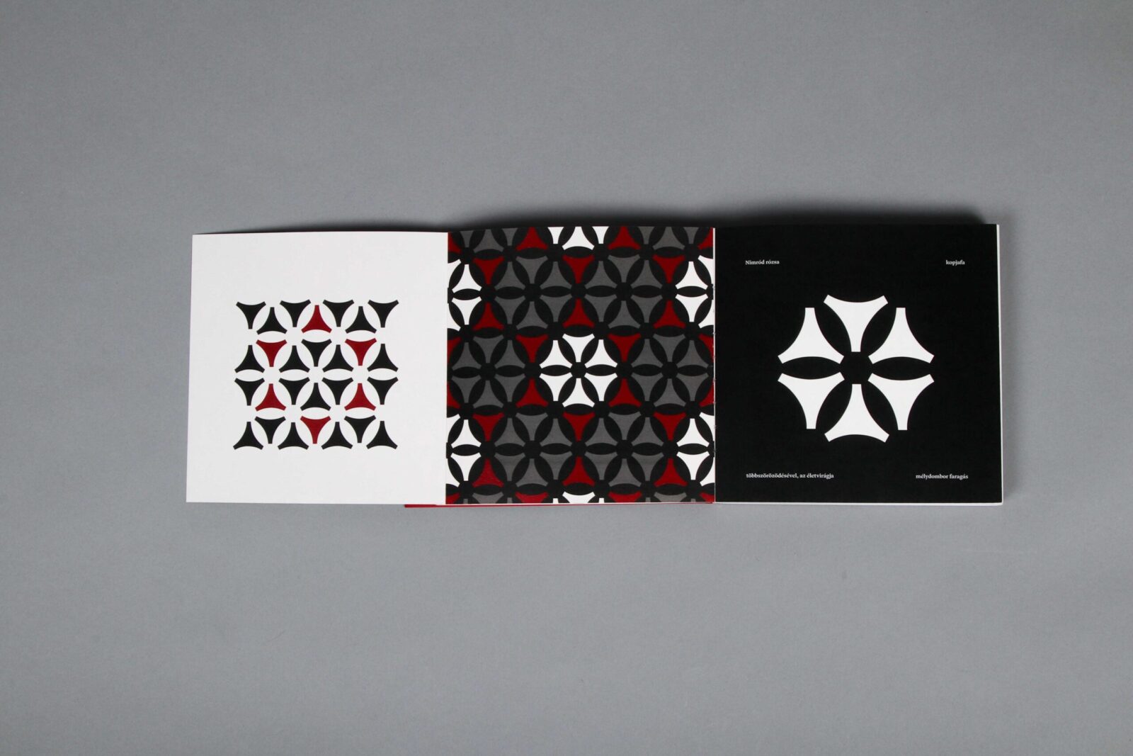
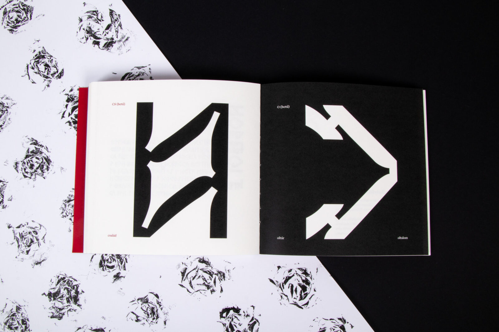
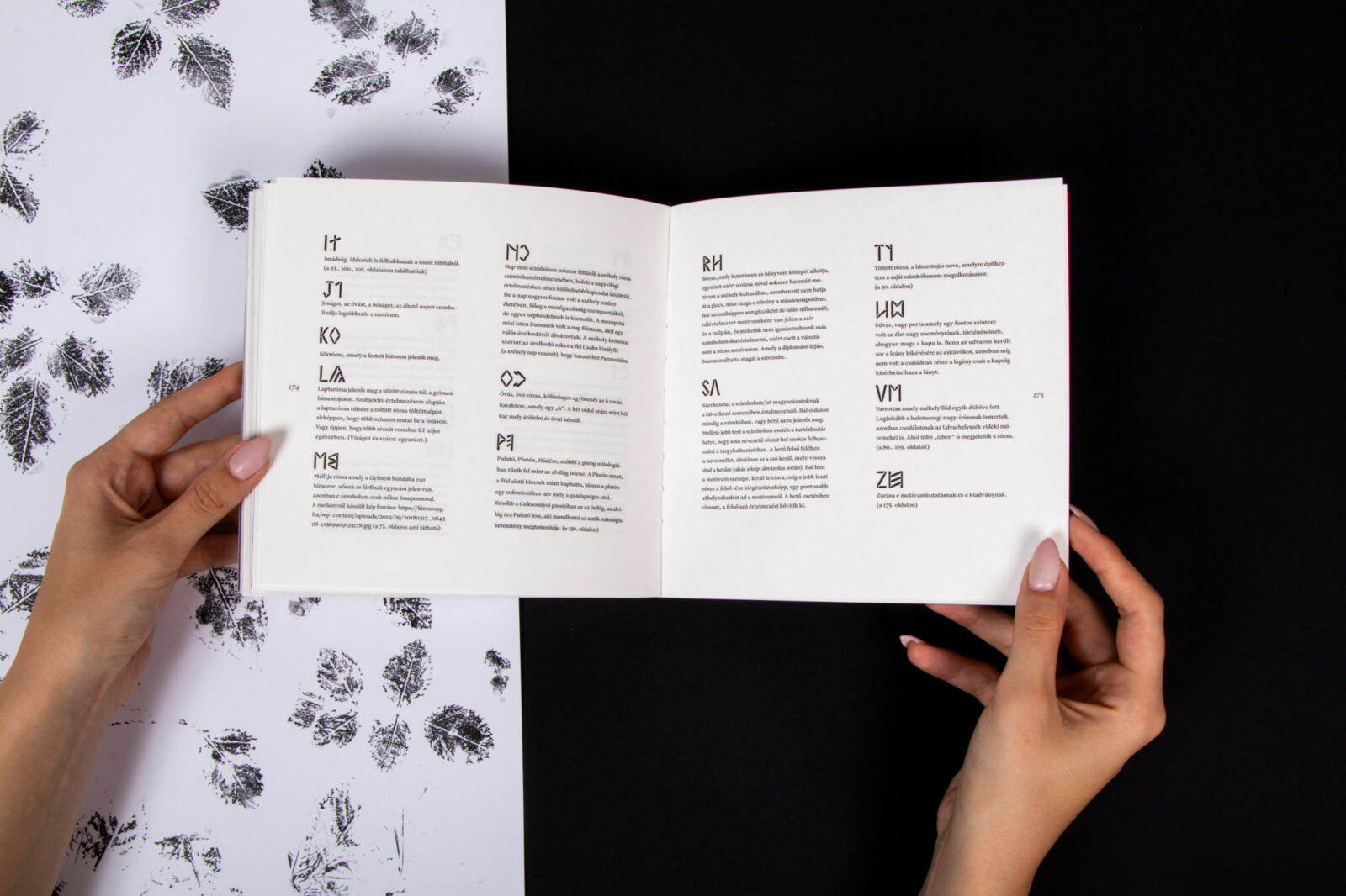
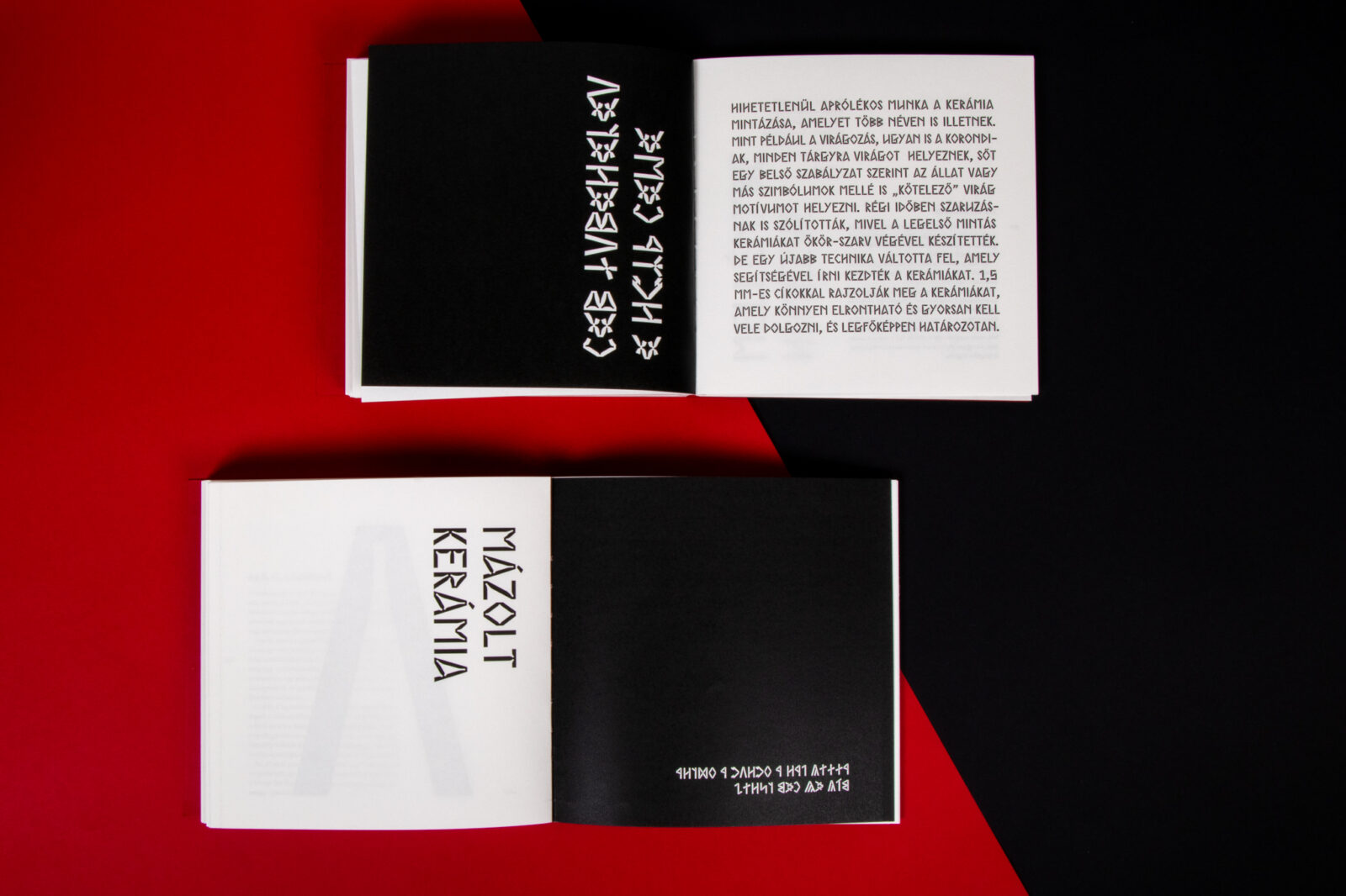
The final result is an 18 × 18 cm book with playful, fold-out pages. The first chapter focuses on the existence and essence of the rose: alongside an image of a rose symbol appears my reimagined rose motif, followed by its stylized decomposition and a repeating pattern derived from it. In the second chapter, I use runic writing to create a typographic visual composition that echoes and analyzes my rose research; the layout of these pages closely mirrors those in the first part.
The common intersection point of my motifs and letterforms is the ink trap. When used in smaller font sizes, it is subtle and does not distract from the text — in fact, it enhances its appearance. In larger sizes, however, the formal qualities of the type become more pronounced and visually striking. I chose this particular typeface partly because the “Székely runic script” differs from the “Hungarian runic script” more commonly used in Hungary. The Székely version is characterized by more defined, straighter lines. This is due to the traditional method of carving runes into wood, which made the use of curves or dots impractical. These strict, angular forms inspired my decision to incorporate ink traps into my type design.
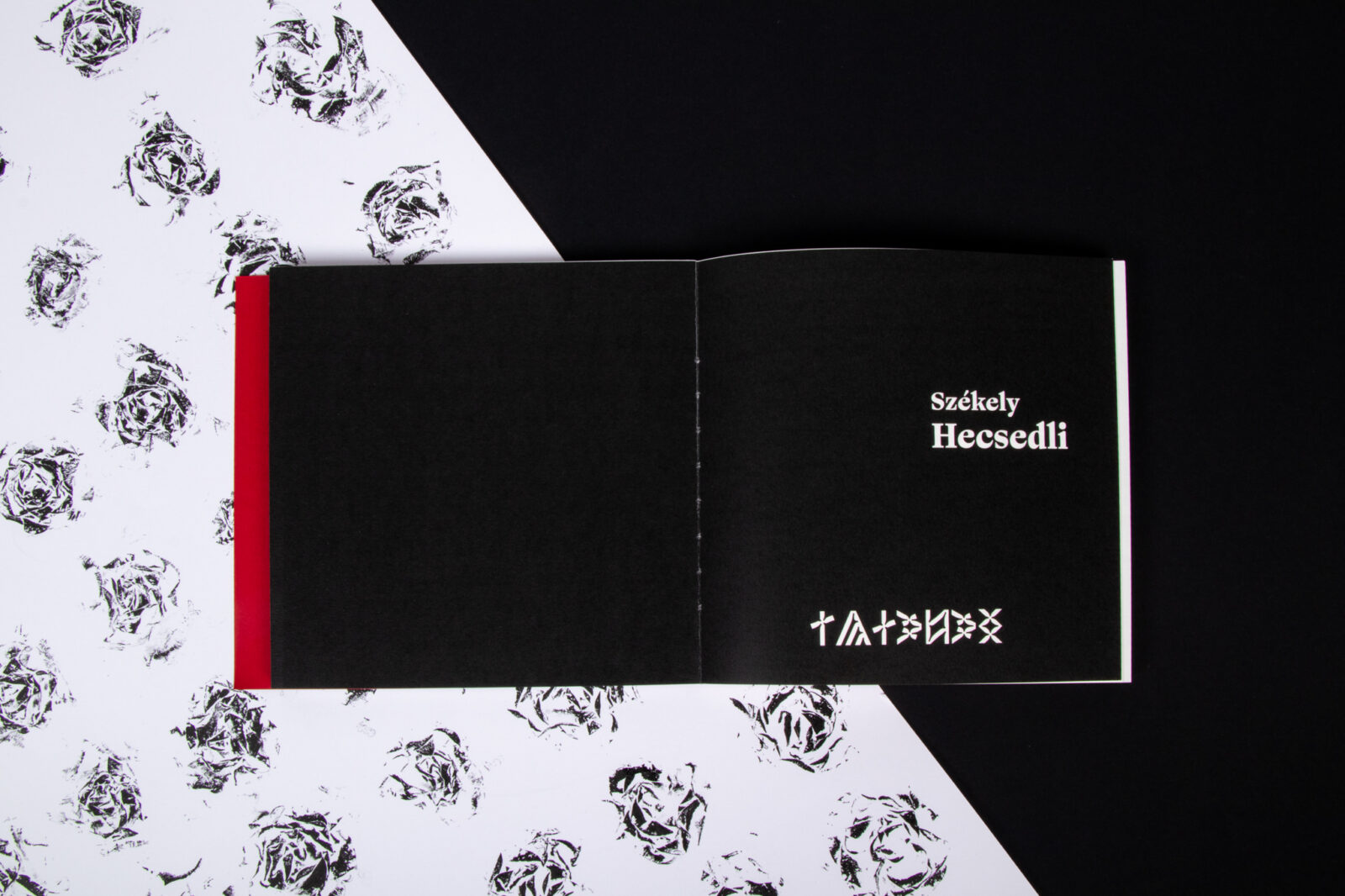
Hecsedli
The name of my typeface, Hecsedli, comes from the central theme of my thesis (namely, is the final form of the rose. Hecsedli (also known as hecserli) is a regional Transylvanian Hungarian word for rosehip, the fruit of the wild rose. This plant’s botanical anatomy, its thorns, toughness, and resilience; reflects the visual and conceptual tone I aimed for in my design. While the rosehip plant also bears delicate flowers, at first glance, it appears somewhat rugged and wild. This duality served as inspiration for the typeface’s personality.
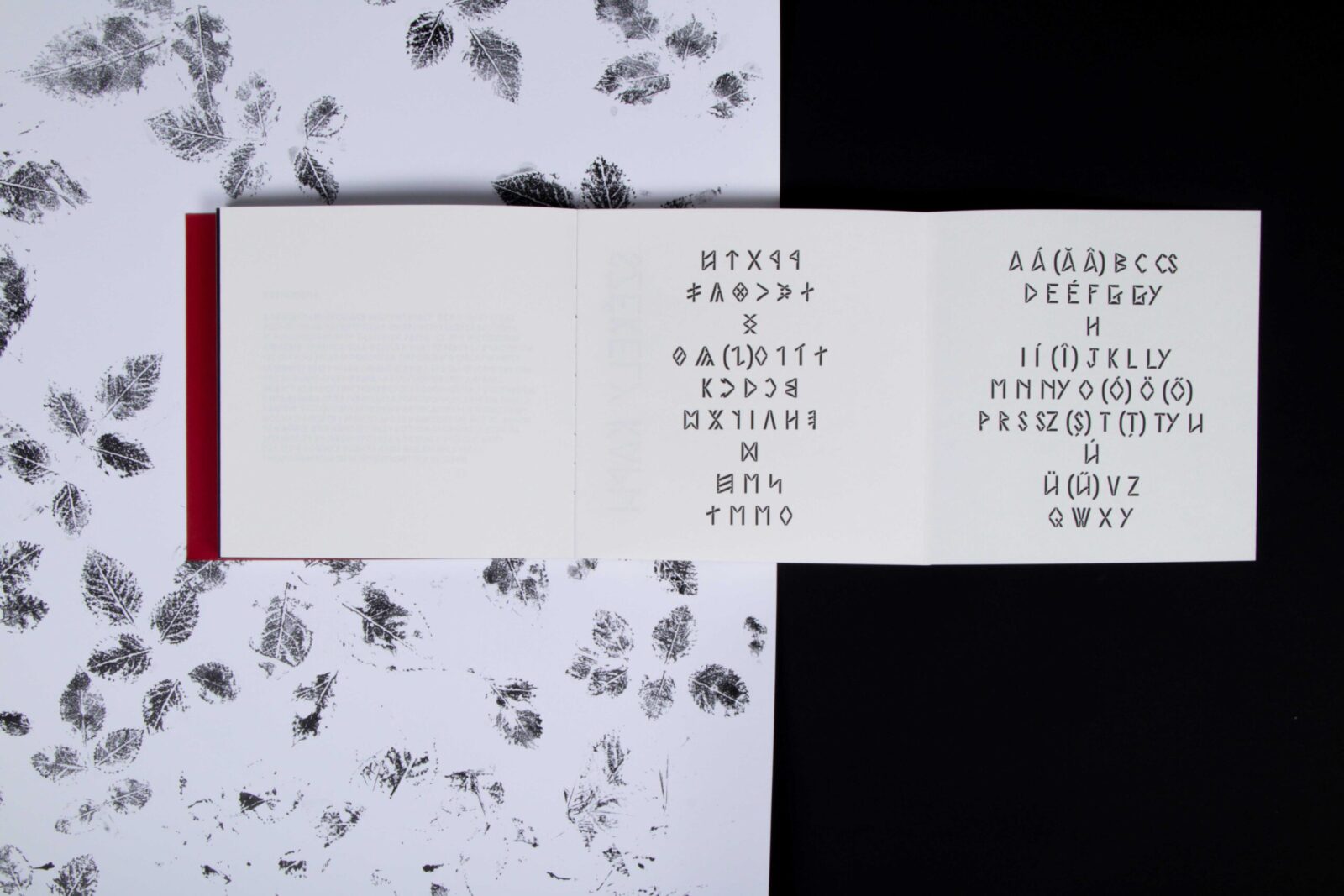
The core of the type design is rooted in Székely runic script and its characters. However, since my thesis is primarily an exploration and reinterpretation of folklore, I also created a matching Latin alphabet to accompany the runes. The common visual element linking the two systems is the ink trap. I worked to harmonize this detail with the structure of both alphabets. One of the unique features of the runic version is the addition of a second form of the letter “k”. Although this might seem like an innovation, such variations are not unprecedented in the runic tradition. In the Latin version, I included a few diacritical characters as well, specifically “á, é, í, ó, ö, ő, ú, ü” and “ű.” Because my project is deeply rooted in Székely heritage, I also incorporated Hungarian and Romanian diacritical letters; such as â, ă, î, ș, and ț; as a reflection of the multicultural environment of the region. Living as a Hungarian-speaking minority in Romania means that elements of Romanian language and culture are part of our everyday lives. I believe this integration deserves visual representation in the typeface as well.
It’s important to note that I only designed the Hecsedli typeface; the accompanying font I used was created by Sharp Type. Initially, I was simply looking for a complementary font to pair with mine. I was particularly drawn to serif typefaces, as they evoke a certain sense of history and craftsmanship. When I set old or traditional texts in serif fonts, I feel like they come to life. Although my own project is youthful and contemporary in its approach, it also pays homage to the old world, much like serif fonts do.
At the recommendation of Professor Oszkár, who guided me throughout the process of designing my fonts, recommended the Ogg type family.
Ogg was created by the New York–based Sharp Type foundry and named in honor of Oscar Ogg, whose hand lettering and calligraphic work served as the primary inspiration for the font. Ogg was a master calligrapher and the author of several books on the subject; including The 26 Letters. His work is characterized by bold, expressive strokes, subtle detailing, and striking contrast. His original letterforms combined calligraphic marks, contour drawings, and white-out (reductive) techniques. This hybrid of calligraphy and constructed form provided the perfect foundation for a contemporary typographic interpretation.

CREDIT
- Agency/Creative: Éva Pap
- Article Title: Student Éva Pap Explores Identity and Folk Heritage Through My Transylvanian Rose
- Organisation/Entity: Student
- Project Status: Non Published
- Agency/Creative Country: Romania
- Agency/Creative City: Miercurea Ciuc
- Market Region: Transylvania and Hungary
- Project Deliverables: Design, Graphic Design, Pattern Design, Research, Type Design, Typography
- Industry: Non-Profit
- Keywords: WBDS Student Design Awards 2025/26 , rovas alphabet or rovas runic, folklor, rose, book, artistbook, ink trap
-
Credits:
Student: Éva Pap


