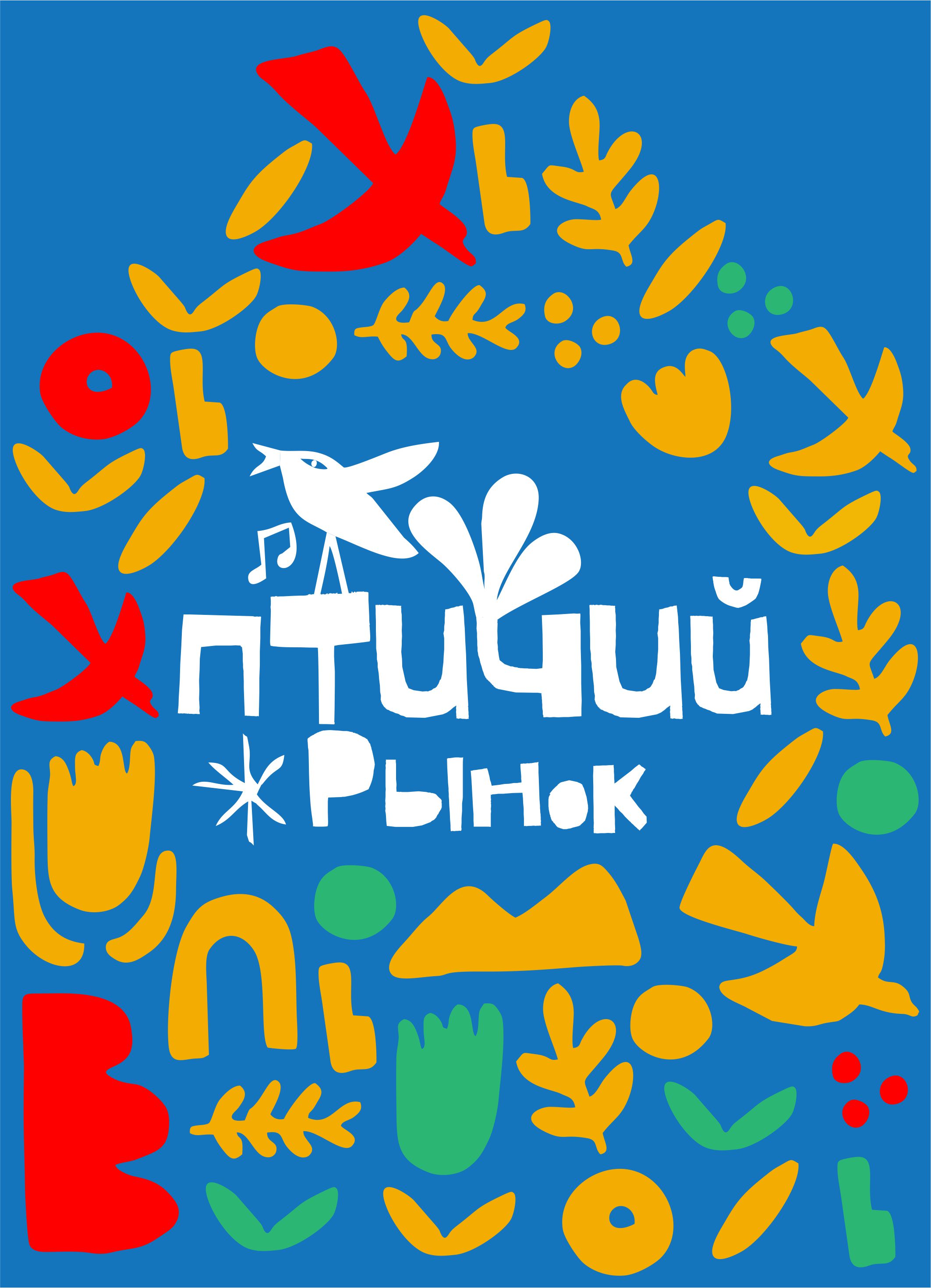
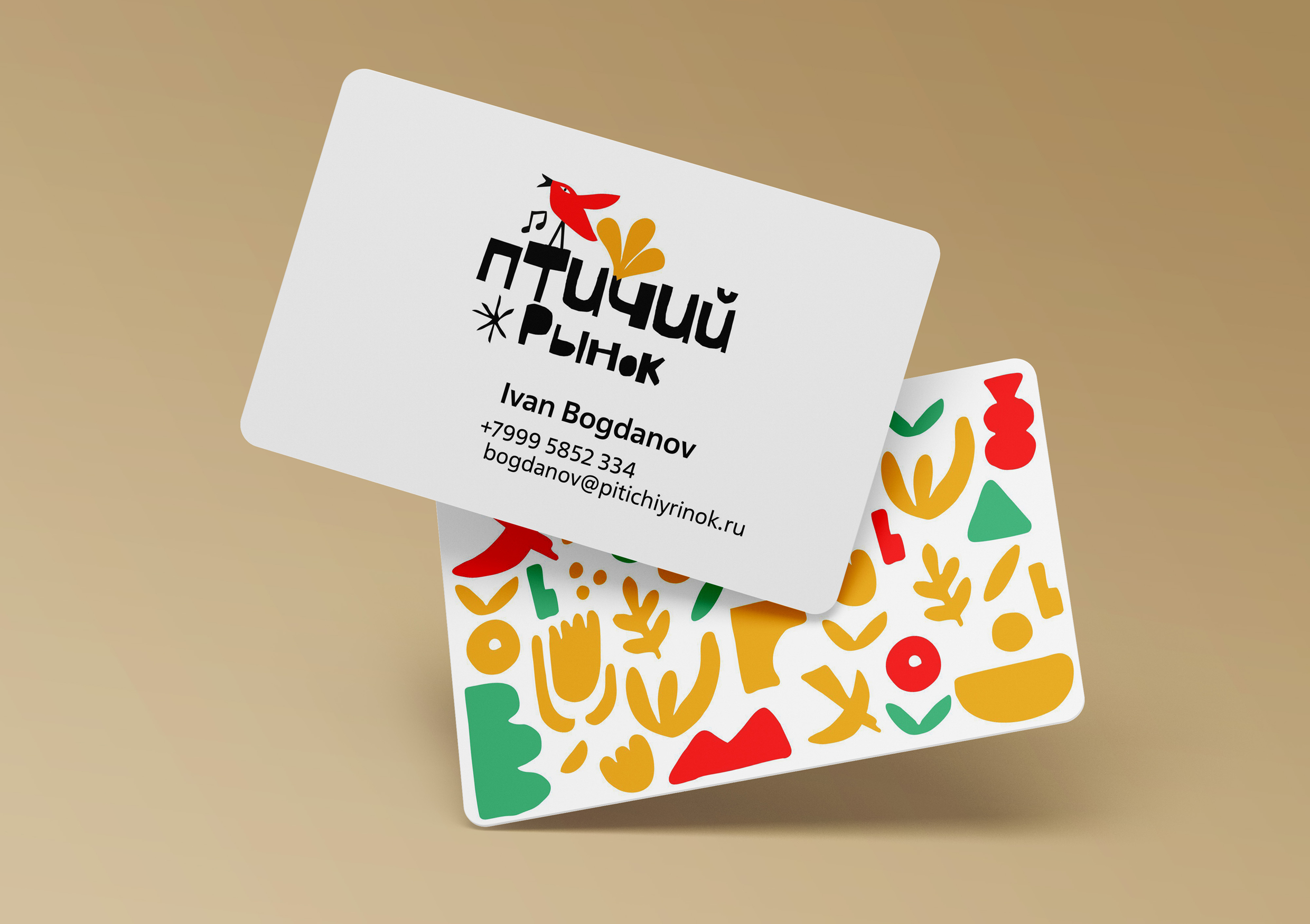
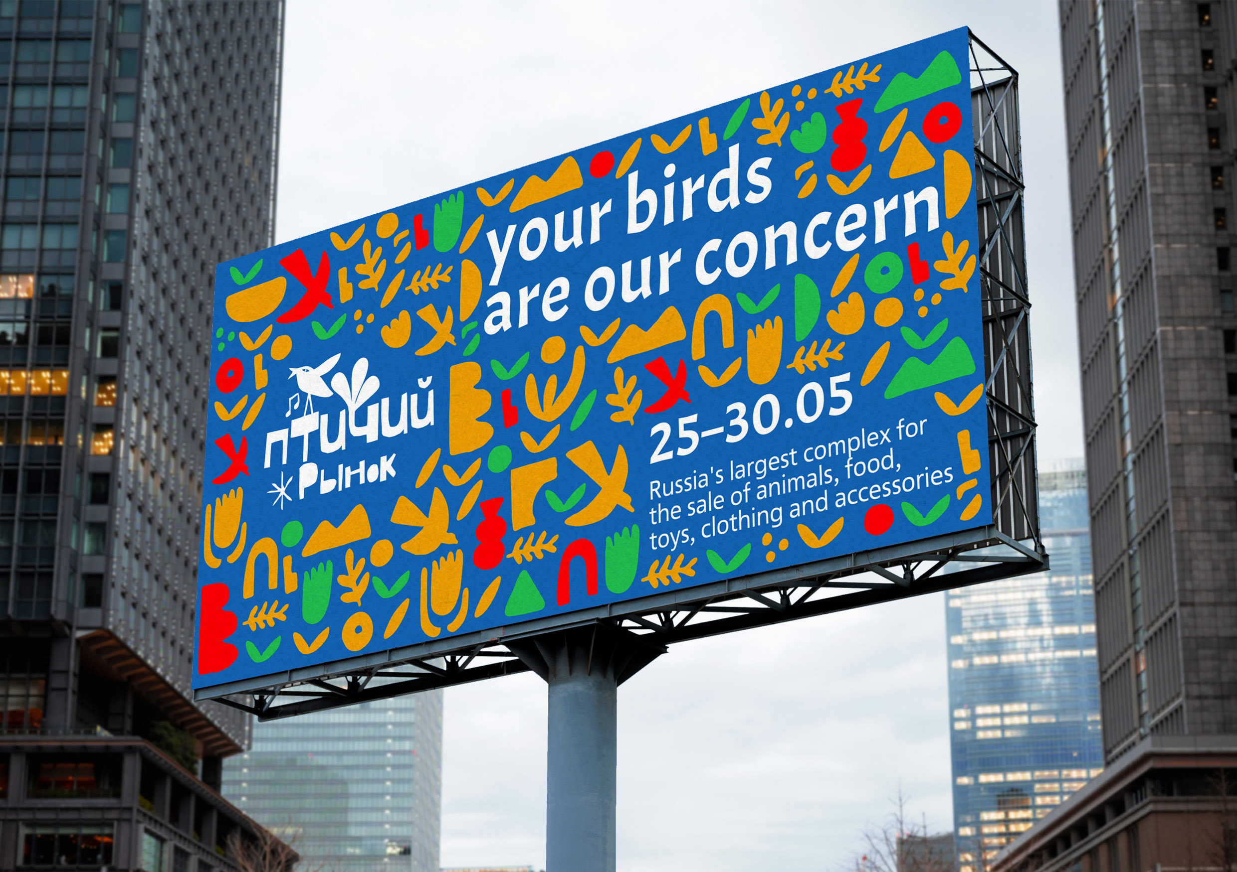
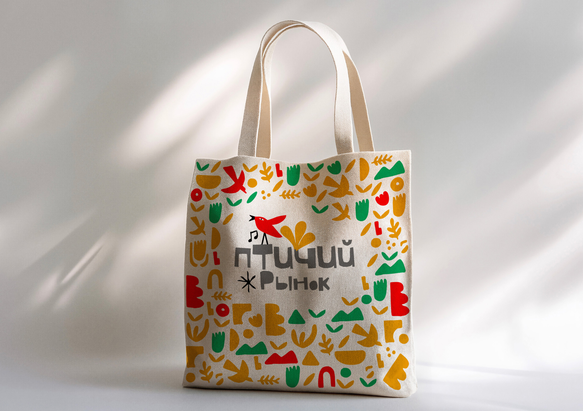
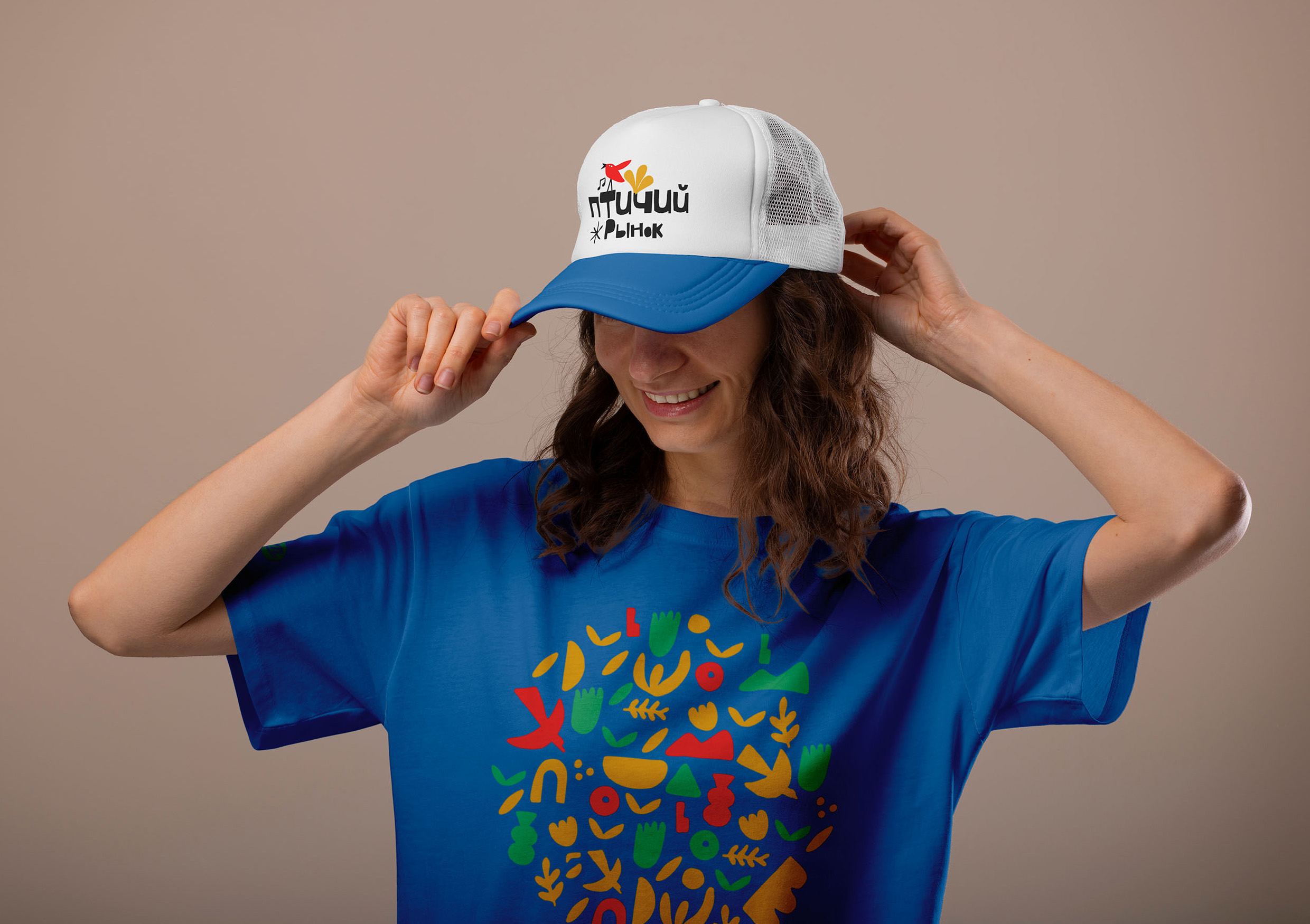
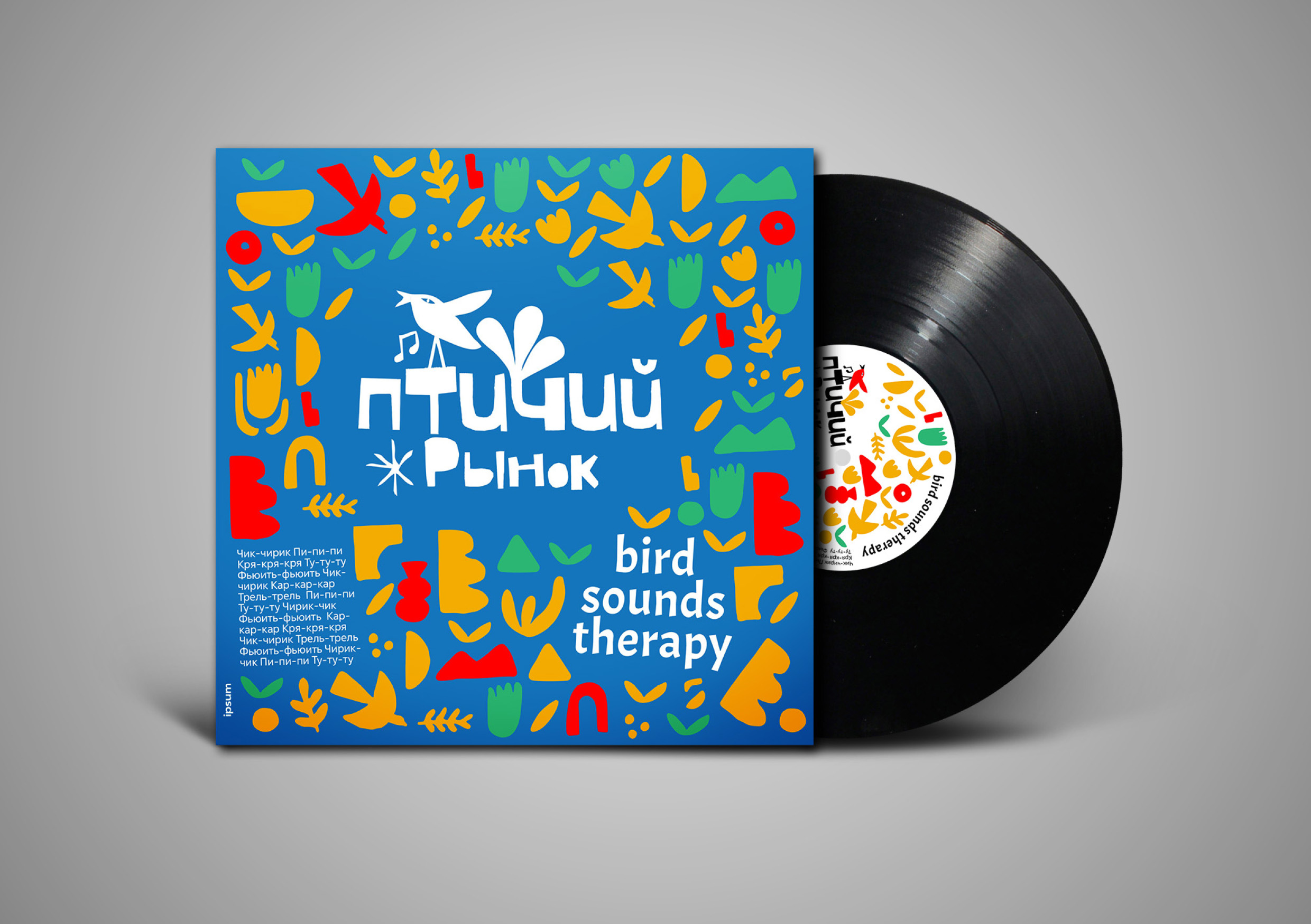
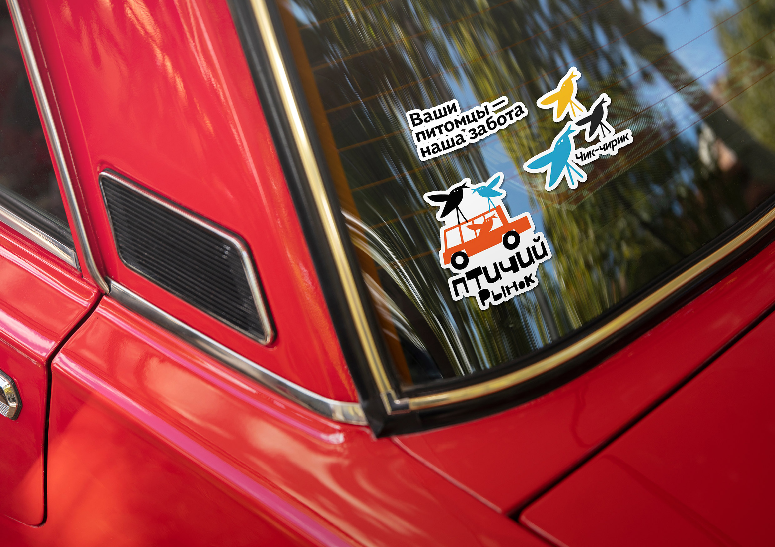
The graphic identity of Ptichiy Rinok is rooted in a blend of folk charm and contemporary playfulness, brought to life through clean cut-out shapes, vibrant colors, and whimsical compositions. The visual system draws from the lively spirit of traditional markets, making it approachable, warm, and culturally rich. The imagery celebrates birds and natural elements in a way that appeals to both nostalgic adults and curious children.
The design concept is inspired by the cultural atmosphere of Russia’s iconic bird markets, where birds, pets, and people coexist in a chorus of motion and sound. The name itself — Ptichiy Rinok — means “bird market” in Russian. The visual language borrows from folk motifs, Matisse-like paper cutouts, and the spontaneous energy of a bustling market. It’s a celebration of community, craft, and connection to nature.
The Visual System consists of…
Folk-Inspired Cutout Illustrations
The illustrations are built from flat, colorful paper-like shapes—birds, leaves, grains, and musical notes. The absence of outlines and texture emphasizes visual clarity and a feeling of childlike joy. Each bird character and natural form feels hand-cut and dynamic, symbolizing life, freedom, and tradition.
Expressive Composition
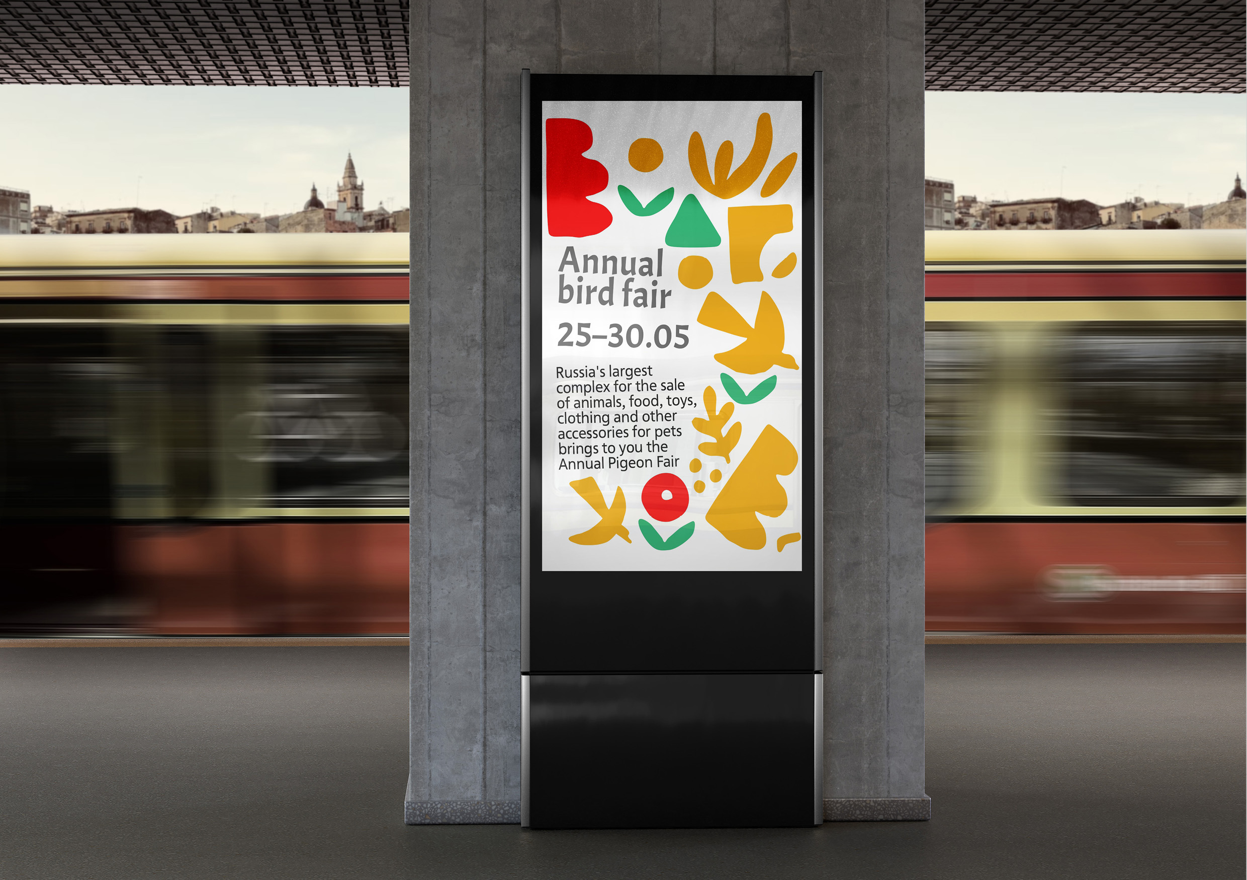
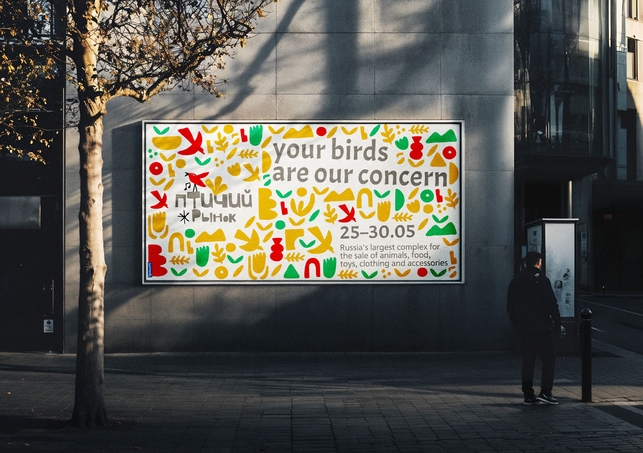
The layout is modular yet expressive, with elements scattered in a carefully unstructured rhythm—mimicking the way birds move and people gather. Whether used in posters, packaging, or merchandise, the composition invites interaction and spontaneity, encouraging viewers to visually “wander” through the scene.
Typography
A clean modern sans serif typeface is paired with the organic illustrations, offering a visual contrast that grounds the design. The choice of font supports readability and simplicity, while maintaining a connection to the minimalist, contemporary aesthetic. It serves as a stable framework amid the visual play.
Final thoughts…
Ptichiy Rinok’s visual identity merges the lively energy of folk culture with a modern graphic language, resulting in a playful yet elegant design system. The combination of cutout birds, rich colors, and thoughtful composition transforms the brand into more than just a visual experience—it becomes an invitation to gather, listen, and feel the rhythm of community and nature.
CREDIT
- Agency/Creative: Dzodzoe Michael
- Article Title: Student Dzodzoe Michael Channels Market Nostalgia into a Playful Brand World for Ptichiy Rinok
- Organisation/Entity: Student
- Project Type: Identity
- Project Status: Non Published
- Agency/Creative Country: Russia
- Agency/Creative City: Moscow
- Market Region: Europe
- Project Deliverables: Advertising, Art Direction, Brand Identity
- Industry: Retail
- Keywords: birds, bird market, pets
-
Credits:
Designer: Dzodzoe Michael
u0421urator: Pavel Borisovsky


