


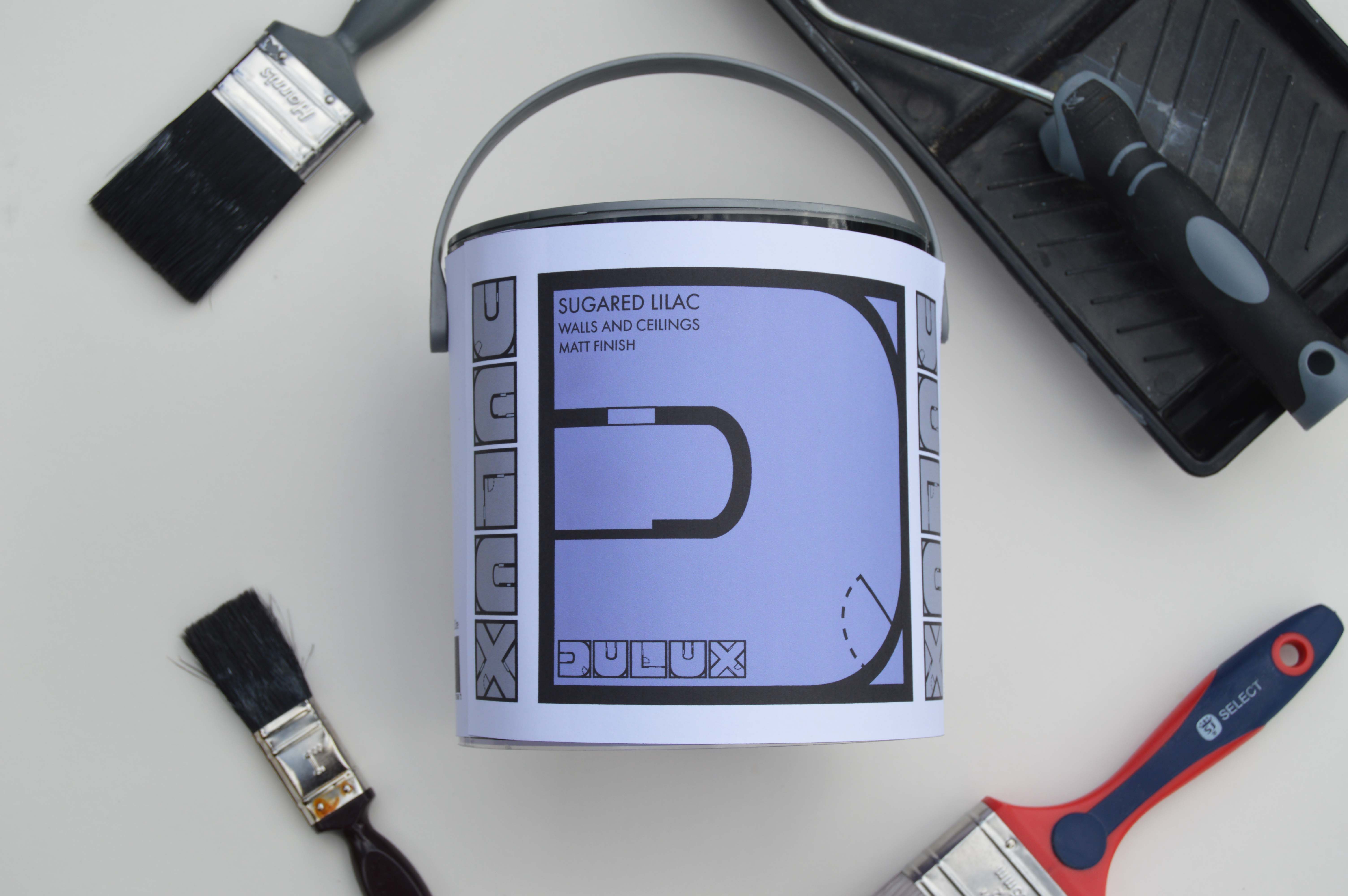
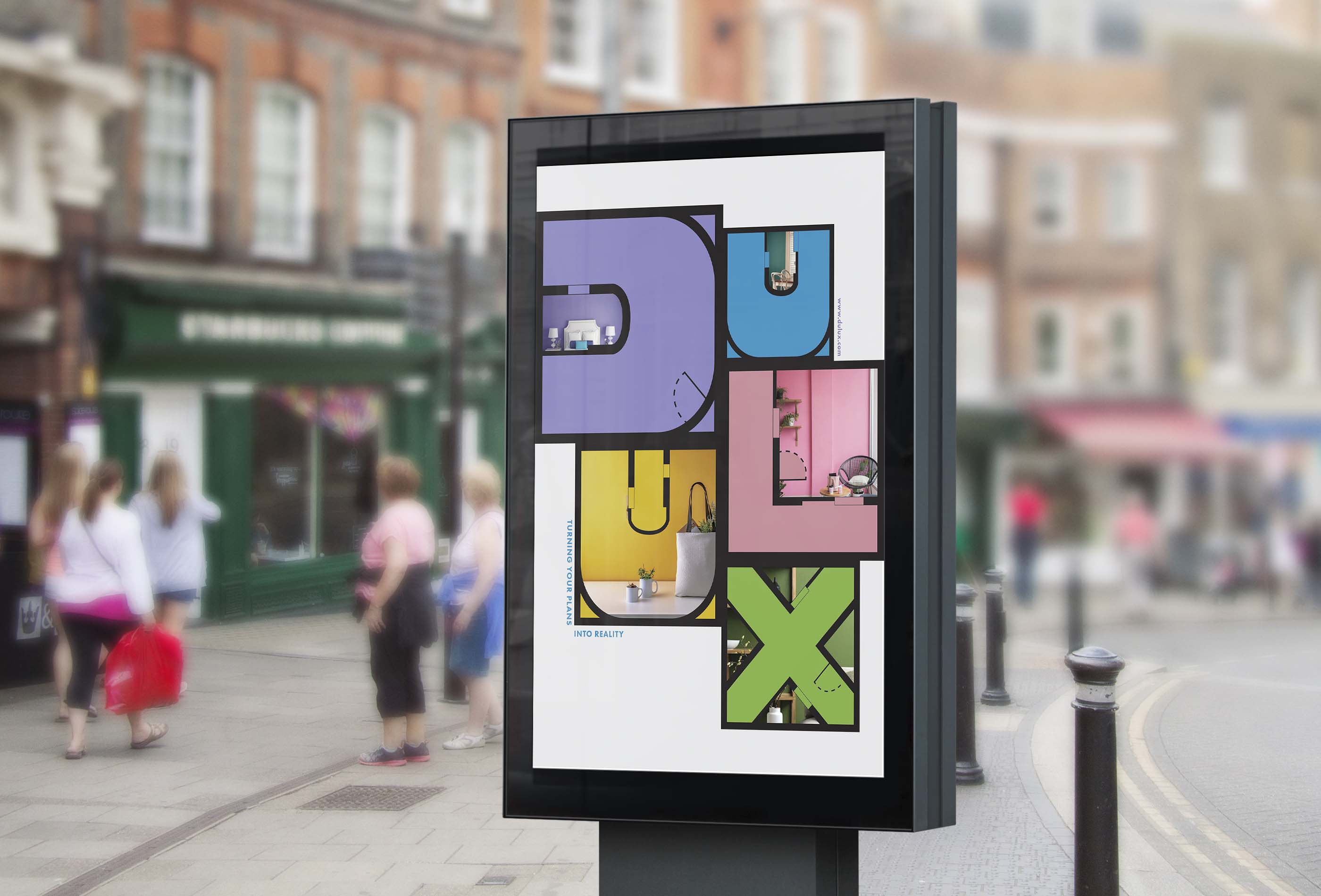
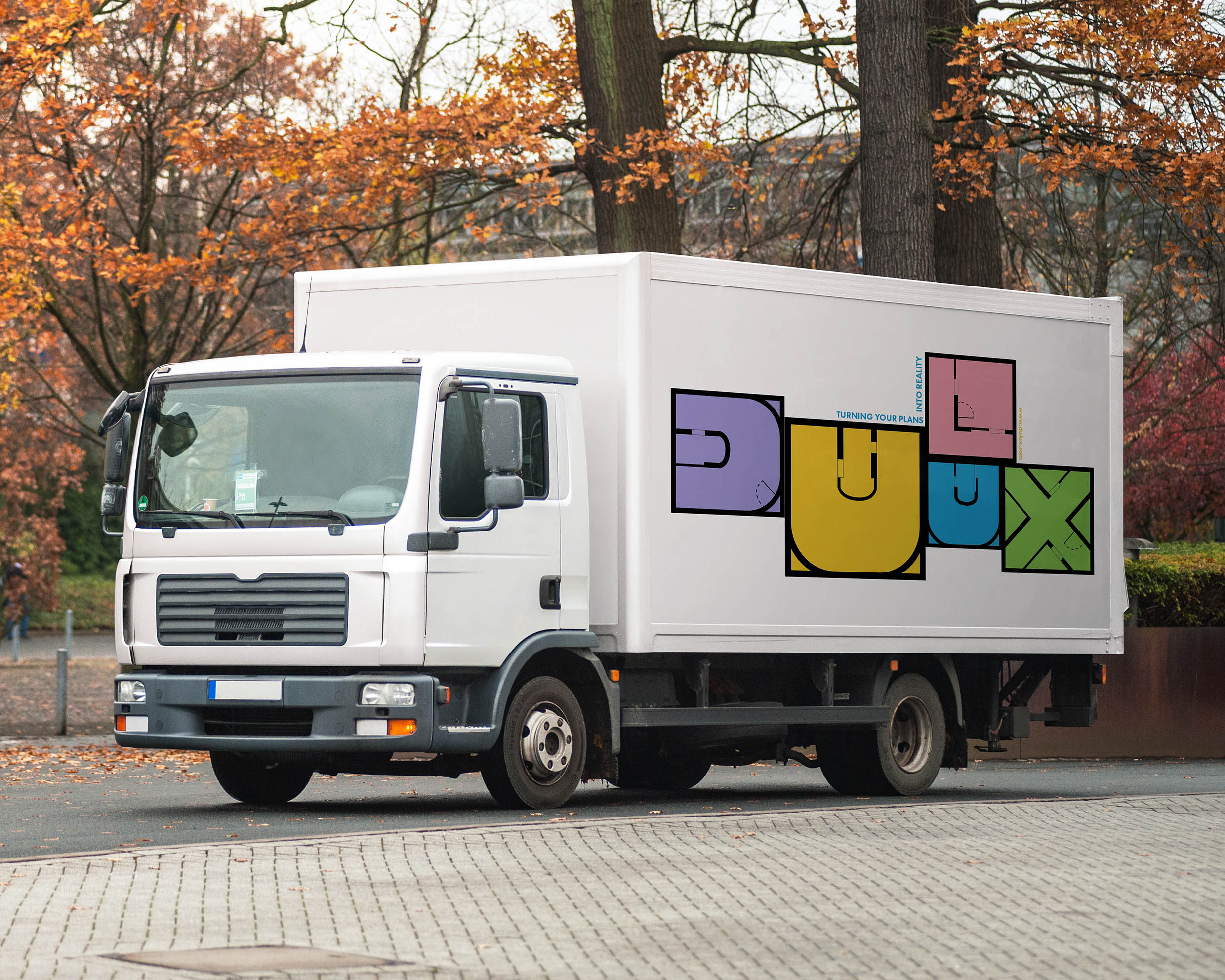
Dulux is a rebrand of the iconic DIY paint brand. Each letter in the logo represents a different room, this is shown through the square shape and the window and door symbols featured along the walls. The advertising for Dulux combines the single rooms of the logo to create a whole floor plan. This features the logo in bright colours with snippets of photographs that show how paint can help make your dream home a reality. As the company has hundreds of colours of paint, I made the packaging in a way that would easily highlight the colour of the paint in each tin whilst showing off the logo design. I chose to keep the logo grey on the paint tins, as I wanted the paint colour to stand out. For the brand redesign I also created colour swatches, which are used for consumers to pick out the perfect shade for them and a social media account.
CREDIT
- Agency/Creative: Jazz Holwill
- Article Title: Student Creates Rebrand of Dulux Paint Brand
- Organisation/Entity: Student, Non Published Concept Design
- Project Type: Packaging
- Agency/Creative Country: United Kingdom
- Market Region: Europe
- Project Deliverables: Brand Advertising, Brand Identity, Brand Redesign, Brand World, Graphic Design, Packaging Design, Rebranding
- Format: Tin
- Substrate: Plastic, Pulp Paper


