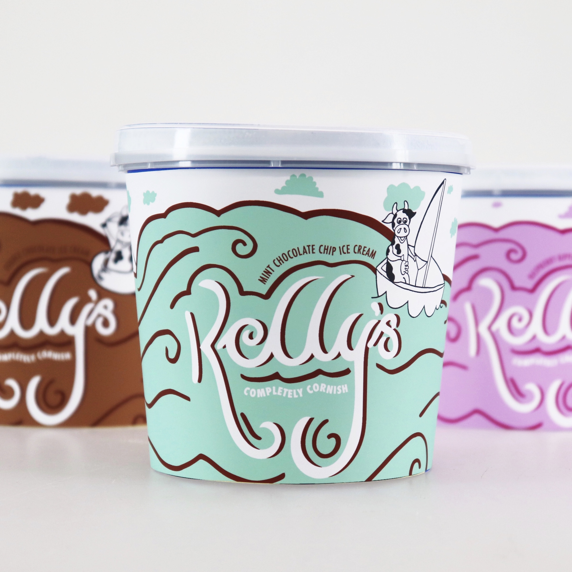
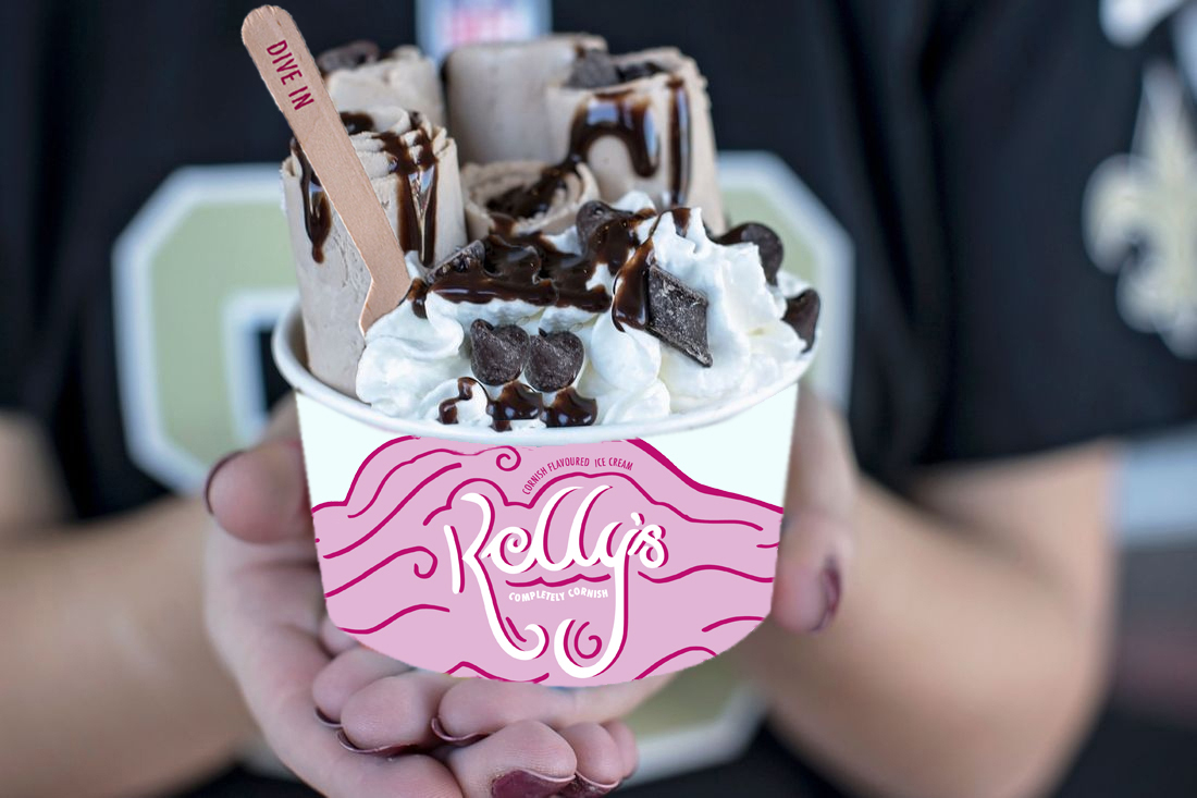
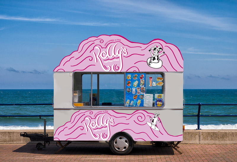
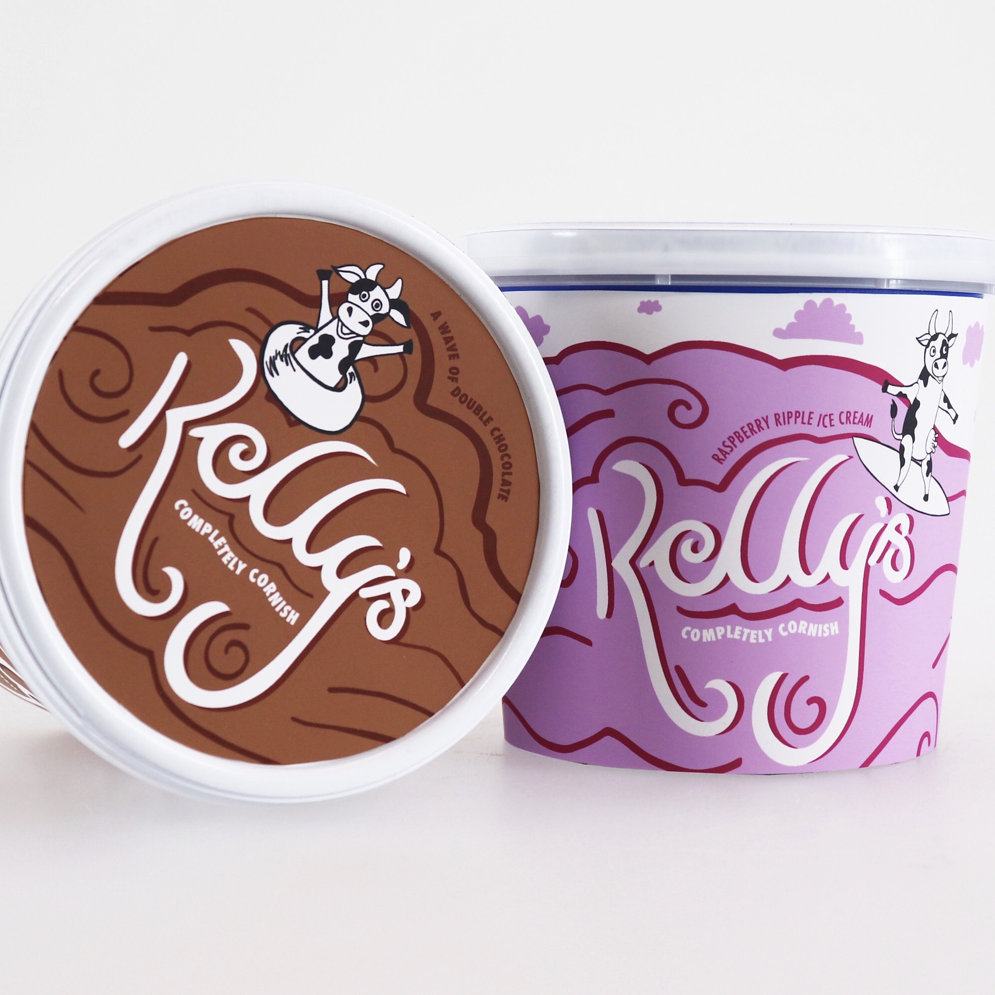
This rebrand for Kelly’s of Cornwall ice cream takes inspiration from everything Cornish. From the beautiful Cornish coastline to the cows that graze on Cornwall’s lush green grass. Kelly’s is a fun loving brand for all the family and there certainly is a flavour for everyone. The quirky typographic approach takes inspiration from the waves surrounding the Cornish coastline giving Kelly’s its own unique personality in addition to bringing a fun element to the brand. Creating hand drawn typography gave Kelly’s individuality which is exactly what they stand for. Using colour and illustrations to represent different flavours allows the consumer to easily distinguish between the different options whilst also allowing the packaging to stand out in a very competitive sector. Creating further brand extensions allowed me to demonstrate how the identity would be applied across multiple factors from the ice cream van to other elements of packaging such as spoons and cones.


CREDIT
- Agency/Creative: Abby Witham
- Article Title: Student Concept Rebrand for Kelly’s of Cornwall
- Organisation/Entity: Student, Non Published Concept Design
- Project Type: Packaging
- Agency/Creative Country: United Kingdom
- Market Region: Europe
- Project Deliverables: Brand Identity, Brand World, Graphic Design, Illustration, Packaging Design, Rebranding
- Format: Pot
- Substrate: Plastic


