


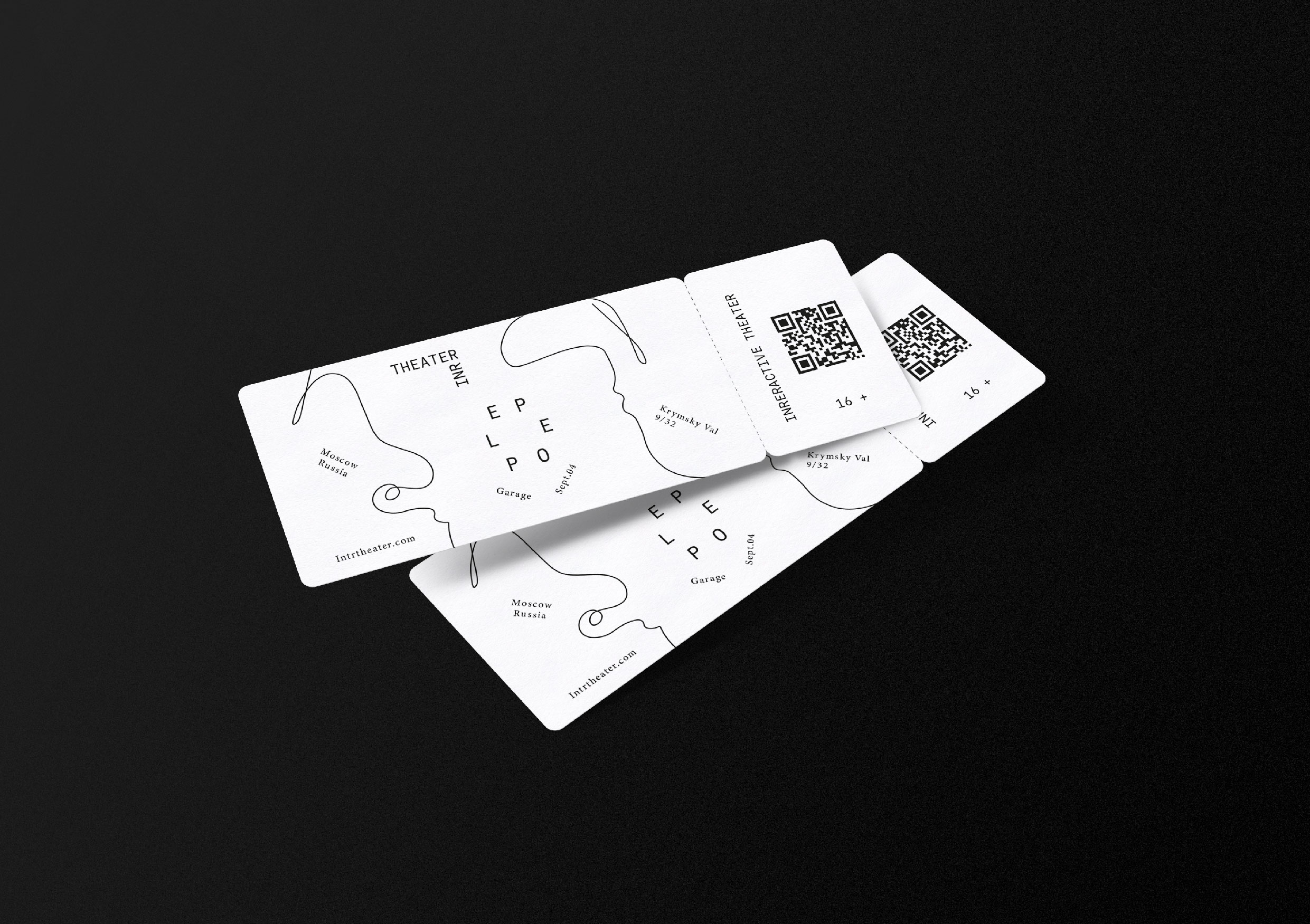
Identity for the festival of interactive theater “People”.
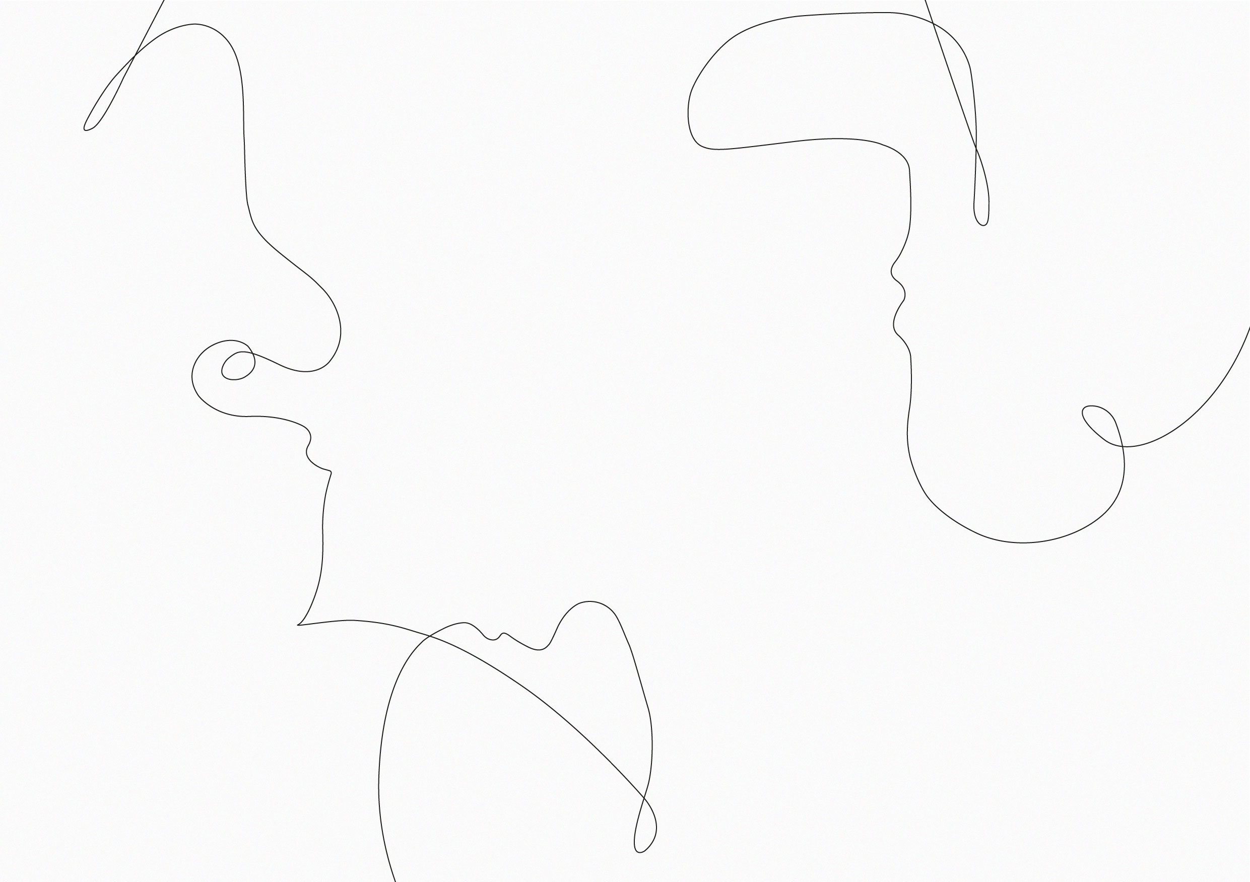
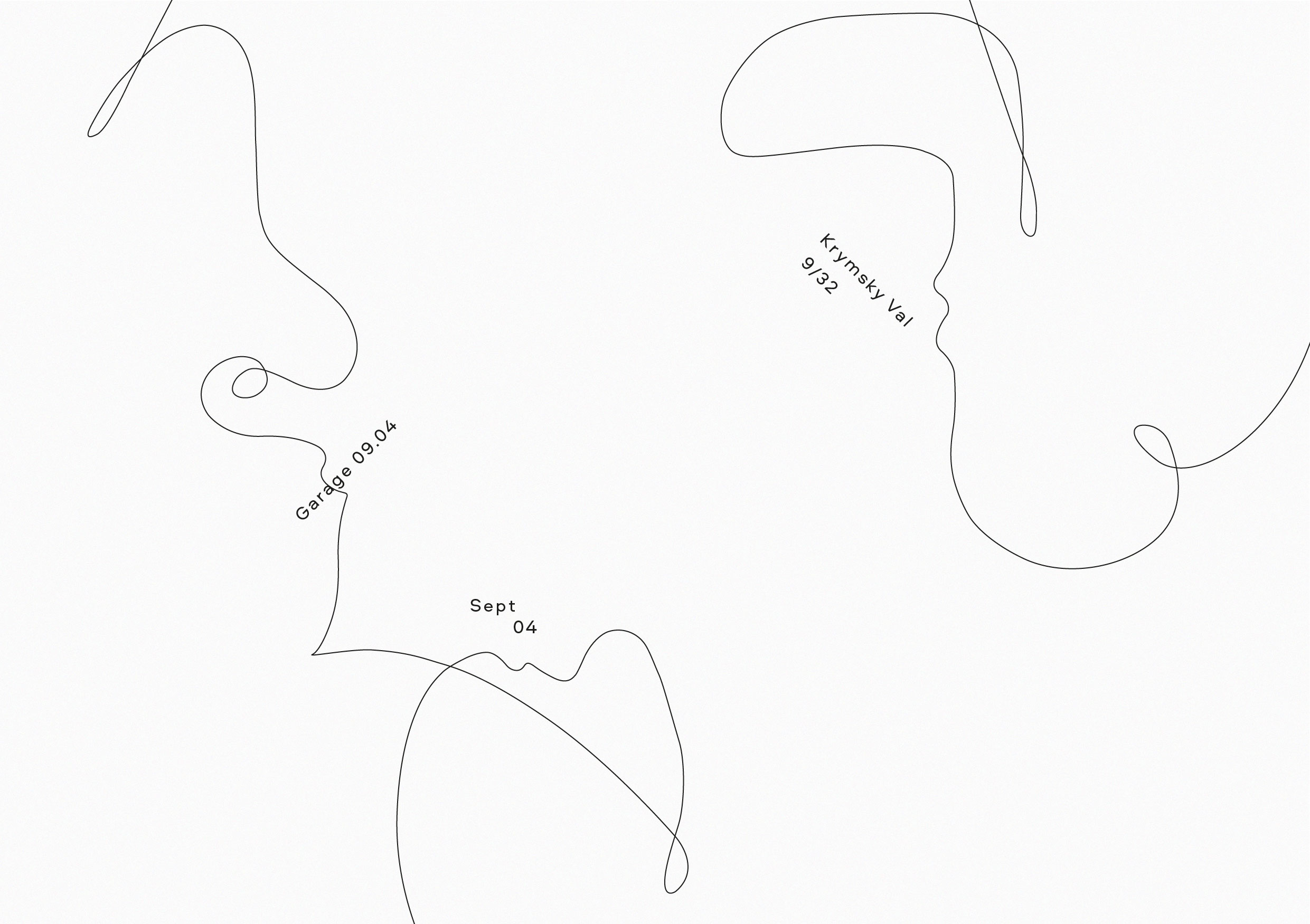
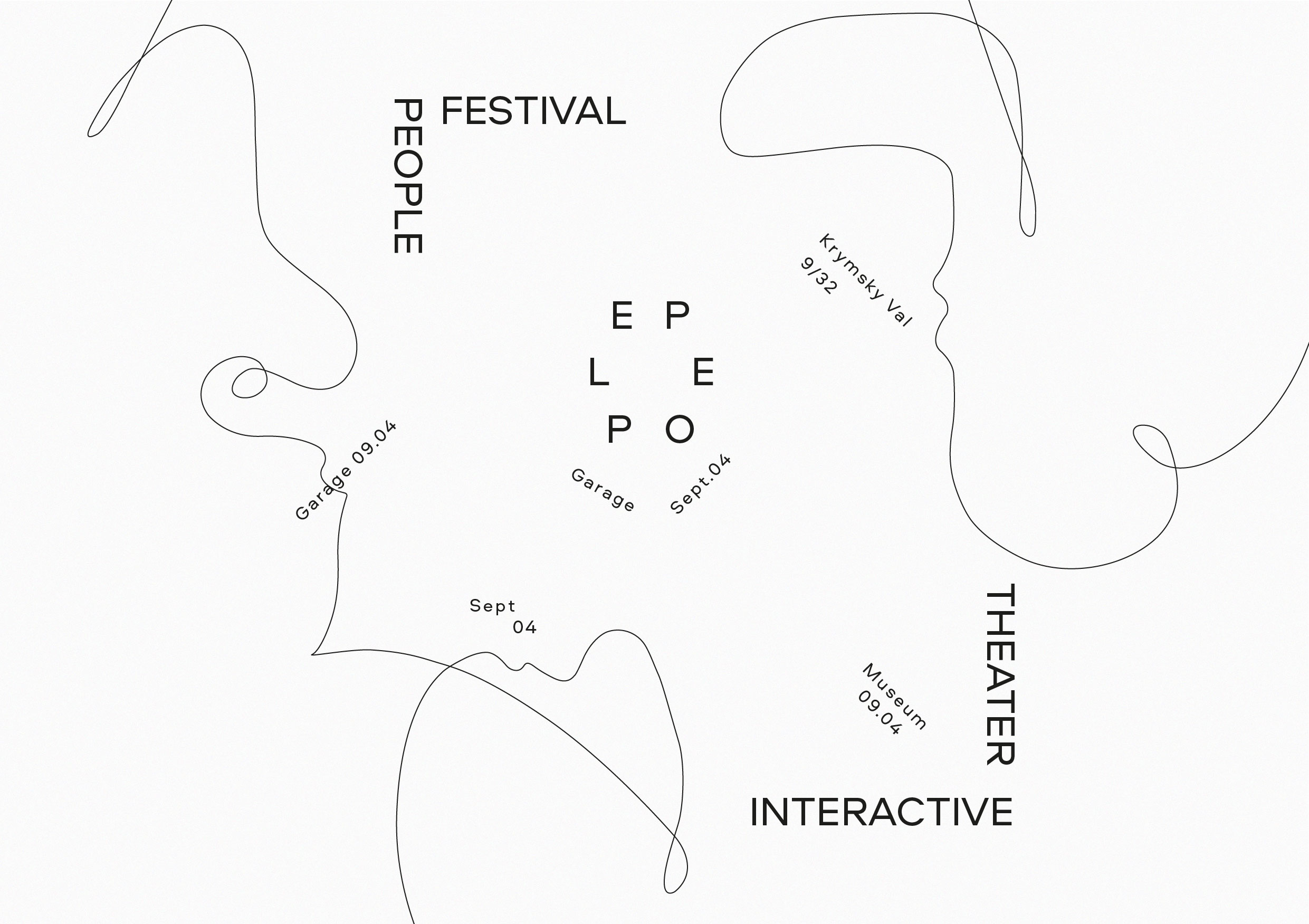
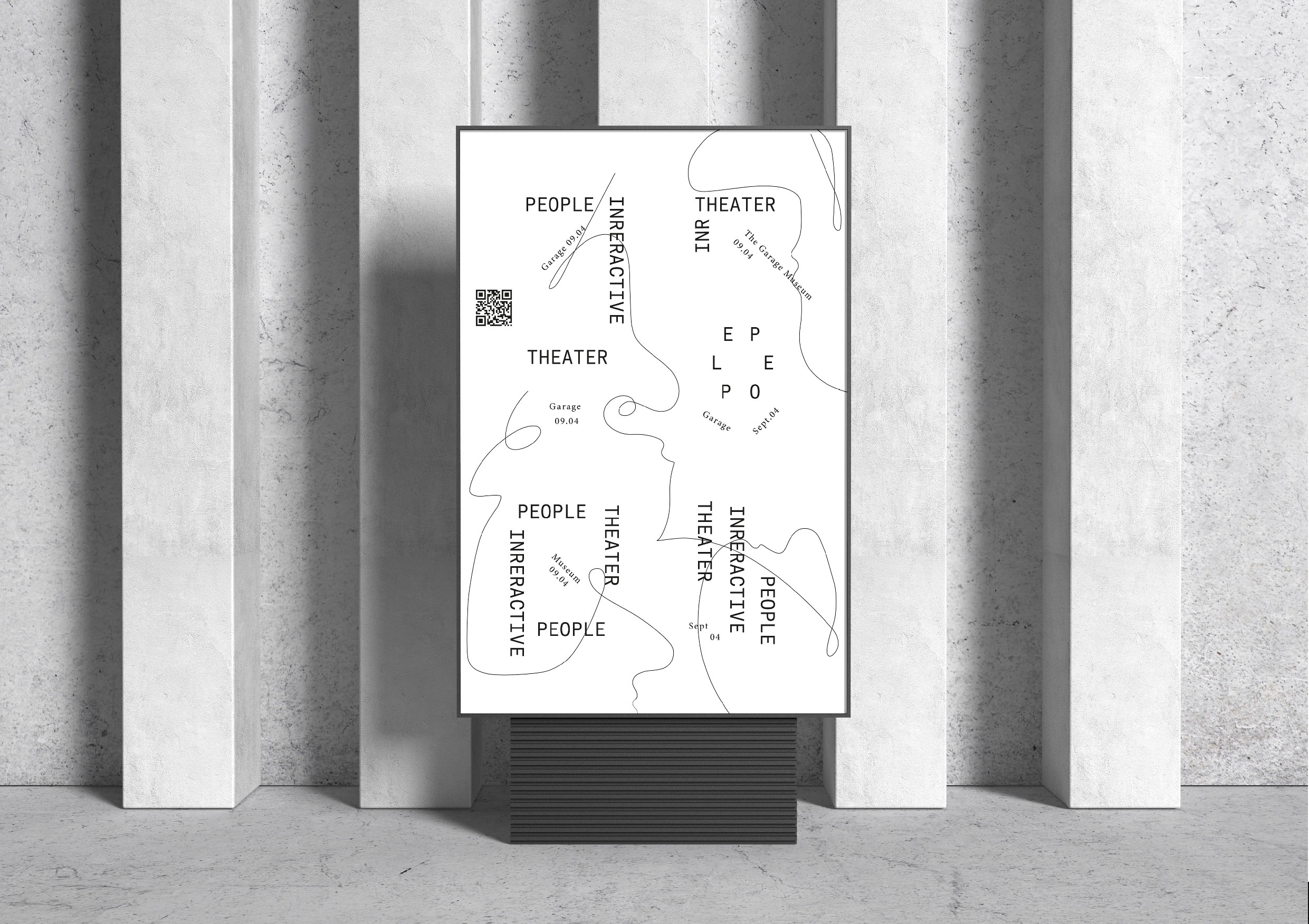
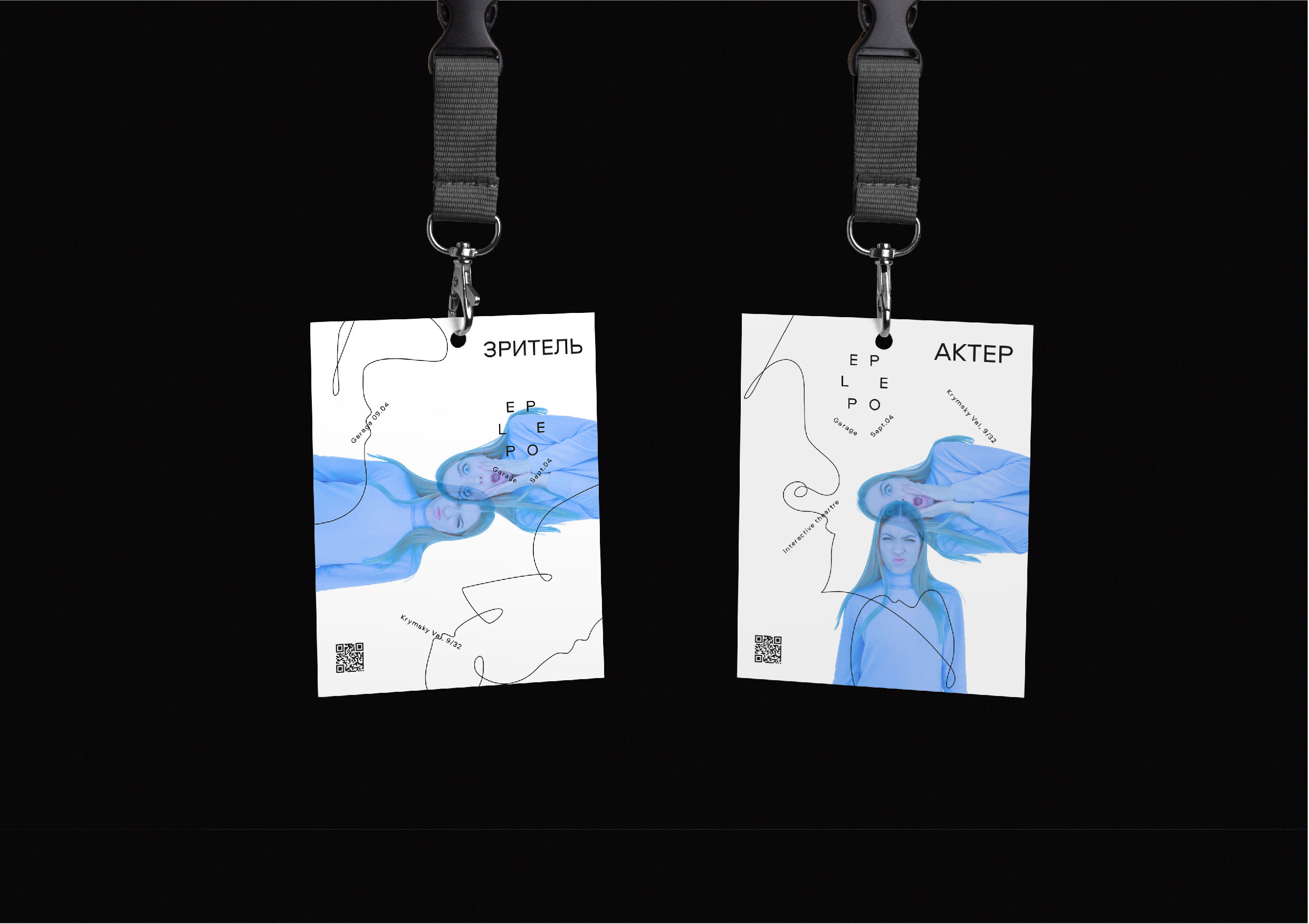
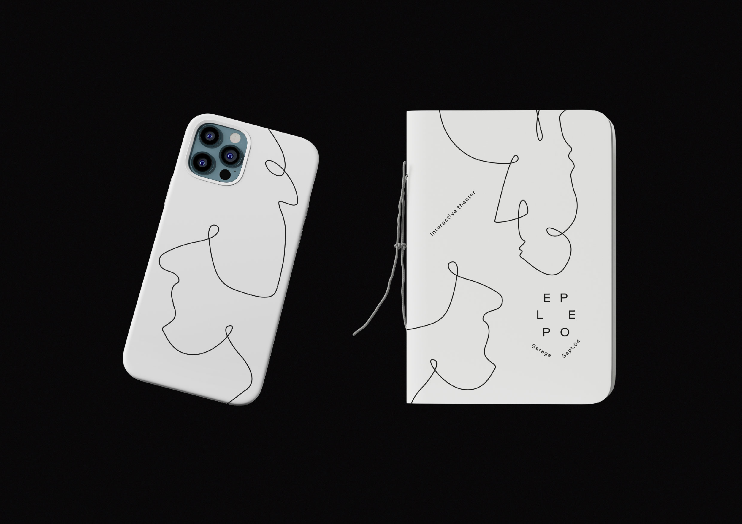
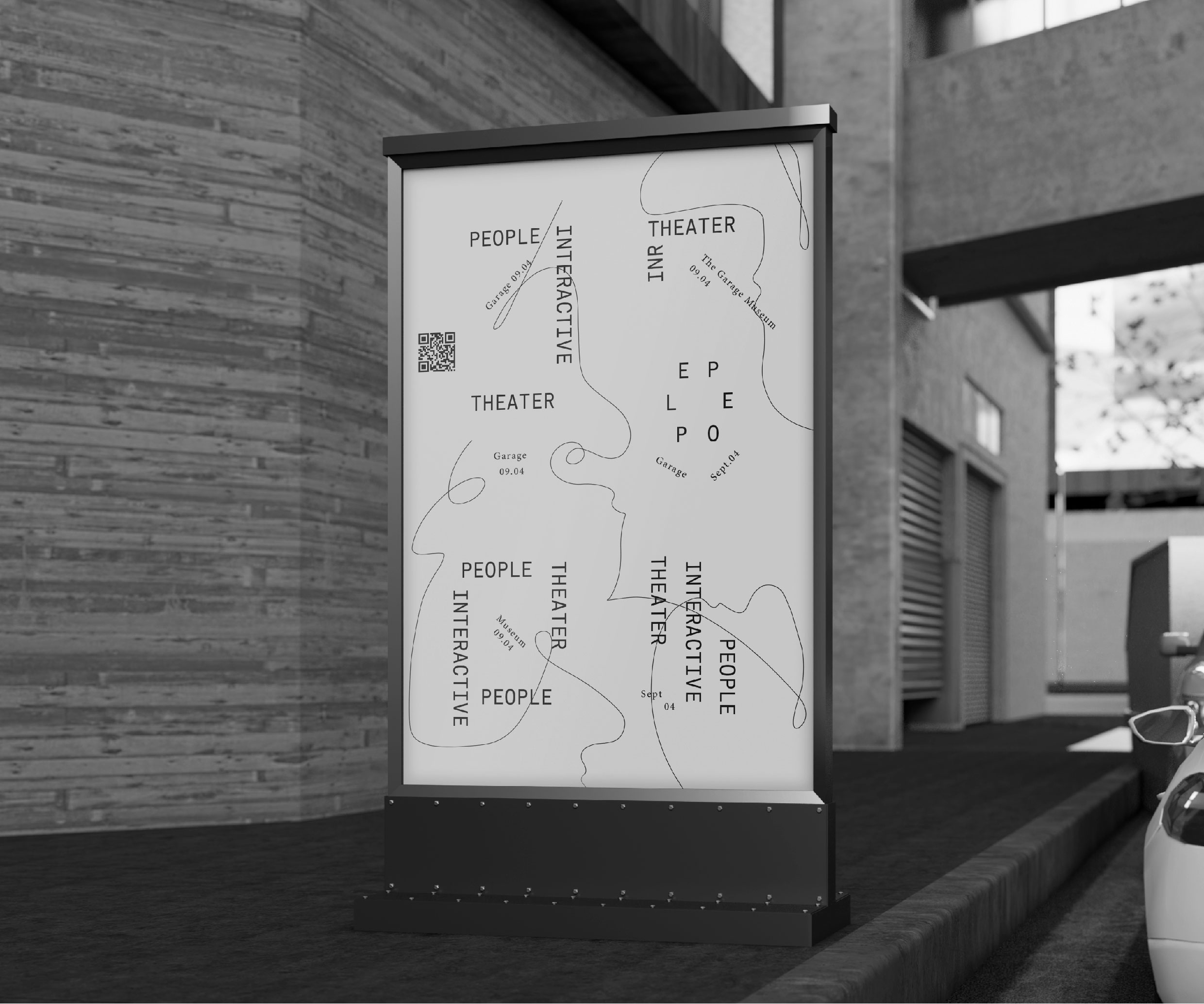
Theater festival, during which anyone can become a part of theatrical action and feel like an actor. The name of the festival “People” gives a direct reference to the theme of the project, since people are the most significant part of interactive theater. A semantic concept was developed, on the basis of which silhouette images of people became the canvas of the identity, which, like thin threads, connect the audience and the actors. They also illustrate the intricacy of theatrical plots and the intricacies of the characters’ destinies.
Flying typography is like sparkling and vivid replicas of the characters in the play. The festival logo embodies the completeness of the social circle and the constant emotional and communication exchange of actors and spectators.
As graphic elements, graceful vector graphics were developed, which vaguely resemble symbolic theatrical masks, as if they look in different directions, expanding the circle of communication and, as if addressing others, inviting them to take part in the action. They also symbolize the ambiguity of the characters drawn by the actors, emphasizing the importance of maximum audience involvement for the full disclosure of the characters. This reinforces the thesis that there are no unambiguous interpretations, but there is a bright, lively and comprehensive emotional exchange and the whole space becomes a scene of action. And photographs are emotions captured in the moment.
As graphic elements, graceful vector graphics were developed, which vaguely resemble symbolic theatrical masks, as if they look in different directions, expanding the circle of communication and, as if addressing others, inviting them to take part in the action. They also symbolize the ambiguity of the characters drawn by the actors, emphasizing the importance of maximum audience involvement for the full disclosure of the characters. This reinforces the thesis that there are no unambiguous interpretations, but there is a bright, lively and comprehensive emotional exchange and the whole space becomes a scene of action. And photographs are emotions captured in the moment.
Approval and contempt, extreme surprise and admiration. These emotions are captured by photographs that are located like arrows on a dial, carrying the idea that the viewer experiences the full range of experiences during the performance and actively expresses his reaction, which greatly enhances the emotional effect of what is happening.
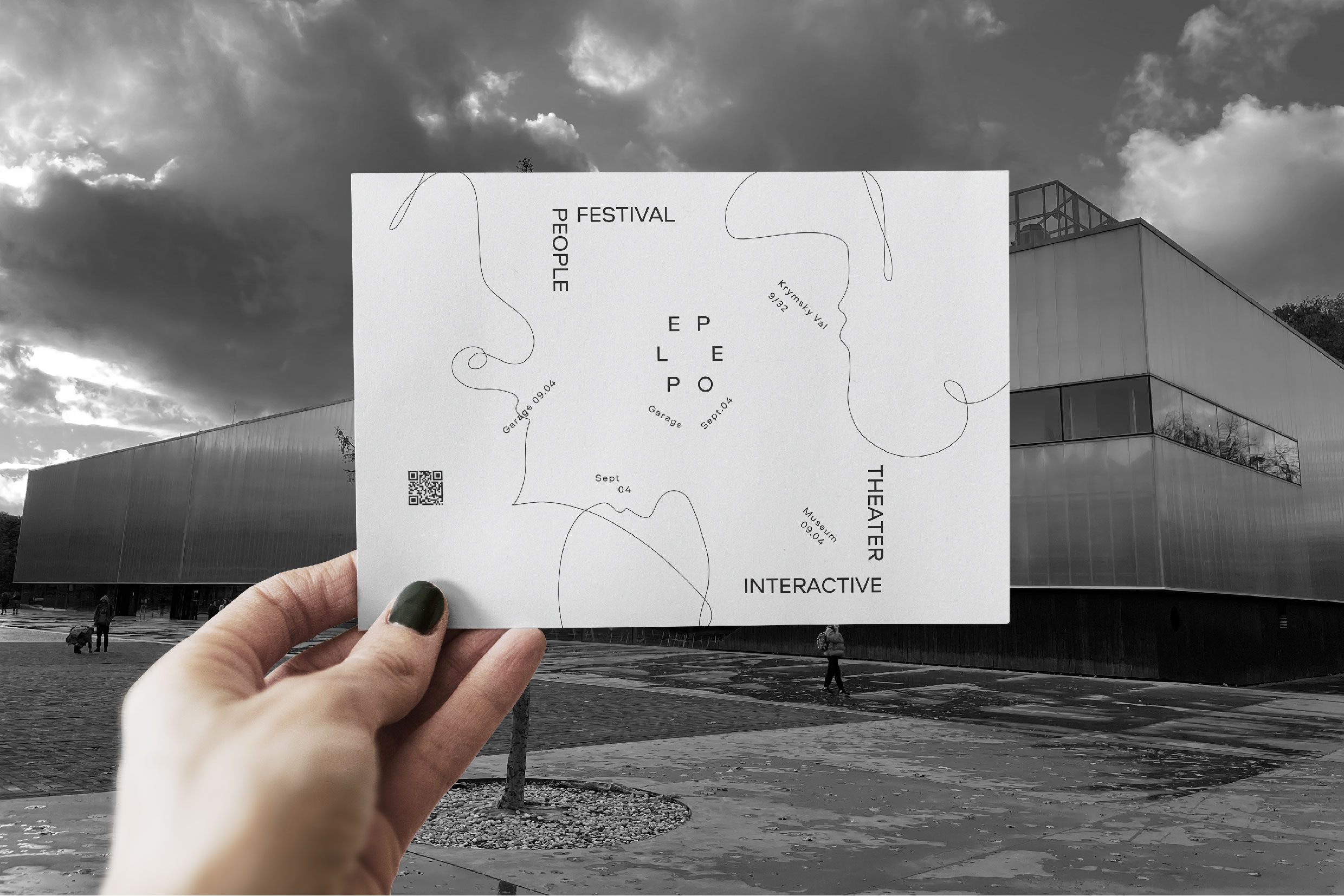
It is no coincidence that the word People is in the center of the image: it is people who make this action so vivid, it is they who, responding and reacting to the play of the actors and the lines addressed to them, make this performance so unforgettable. The circular arrangement of letters in the word People symbolizes not only the completeness of the communication cycle between the artists and the audience, their unity in the process of the performance, but also a bit like a tornado funnel, swirling more and more with the movement of blue arrow-photographs, involving more and more participants in theatrical action and at the expense of this multiplying the emotional effect of what is happening.
It is no coincidence that the color scheme is quite restrained: it resembles a canvas awaiting its artist, or rather, its artists. They will fill this canvas with the colors of their emotions, bring memories, hopes, sadness, joy, irony, rage, love into it … We will write it together. We are People. What will it be? Unforgettable and bright, so that after years, accidentally finding the festival bracelet forgotten somewhere in a drawer of the table, you again feel the whole bright and unforgettable atmosphere of that day (date) and the life then lived …
We did it…
We – “People”.
A curtain!
CREDIT
- Agency/Creative: Sofia Vychuzhanina
- Article Title: Student Concept Identity for the Festival of Interactive Theatre Called People
- Organisation/Entity: Student
- Project Type: Identity
- Project Status: Published
- Agency/Creative Country: Russia
- Agency/Creative City: Moscow
- Market Region: Europe, Global
- Project Deliverables: 2D Design, Art Direction, Brand Design, Brand Identity, Design, Drawing, Graphic Design, Typography
- Industry: Entertainment
- Keywords: Interactive theater, branding, identity, design
-
Credits:
Student: Sofia Vychuzhanina


