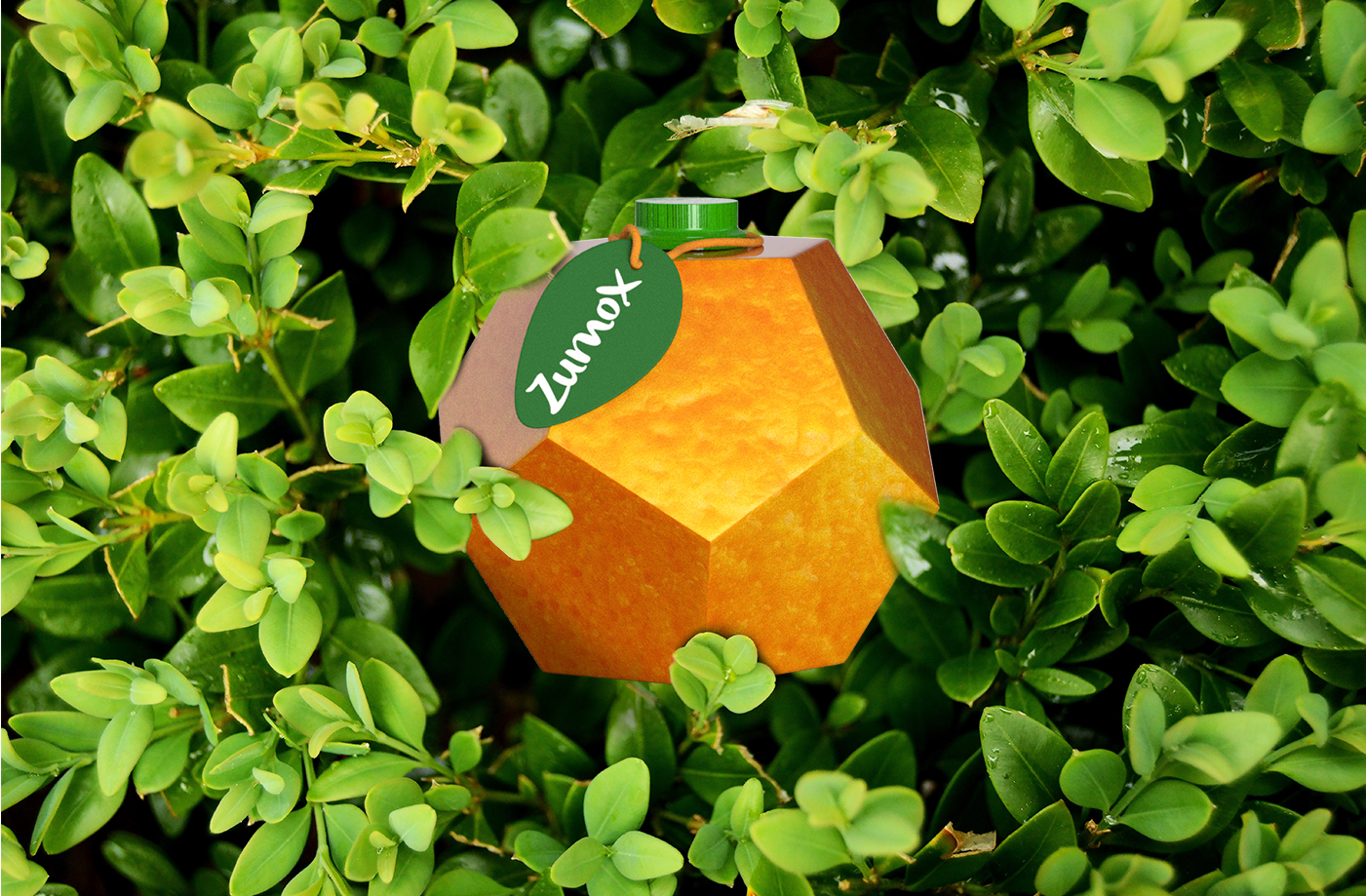
ZUMOX is a new brand of BIO juices that has hit the market. It is characterised by its traditional and sustainable processing, and the use of raw material from organic farming and 100% natural ingredients.
They look for an image that stands out in the lineal at the point of sale and reflects the values of the brand.
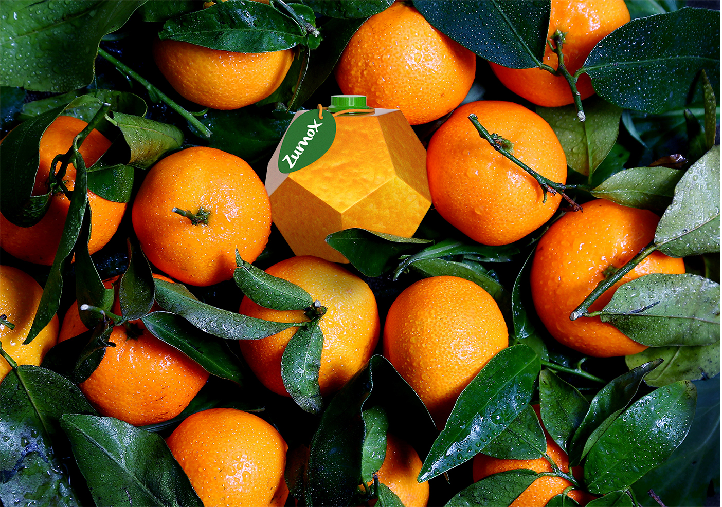
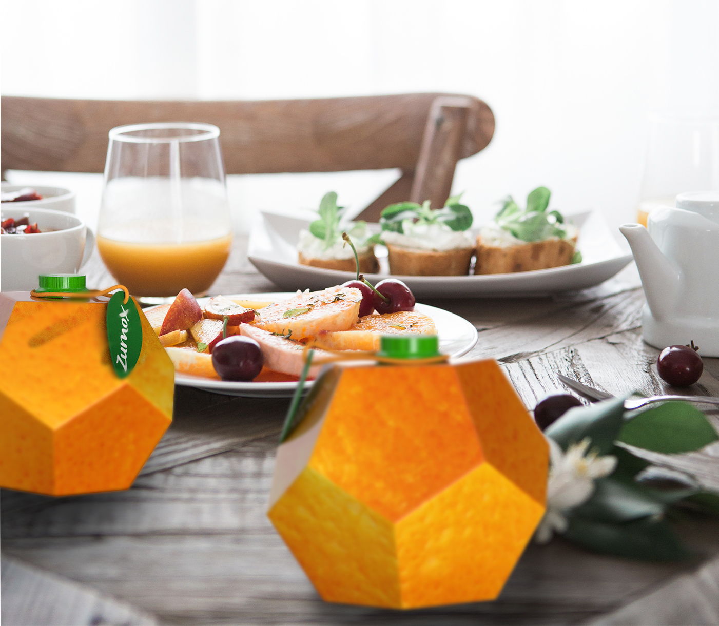
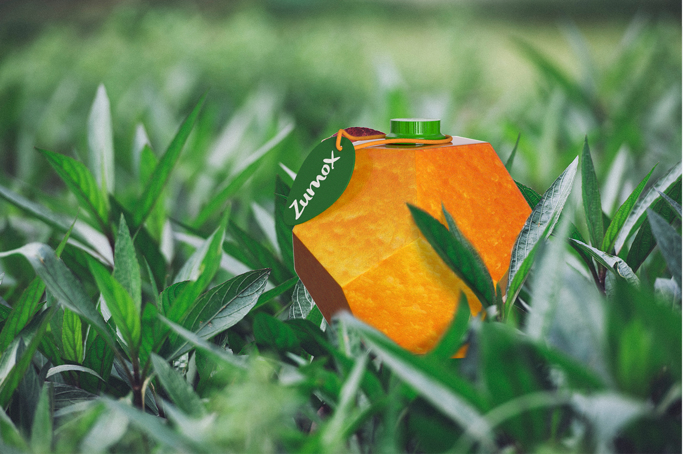
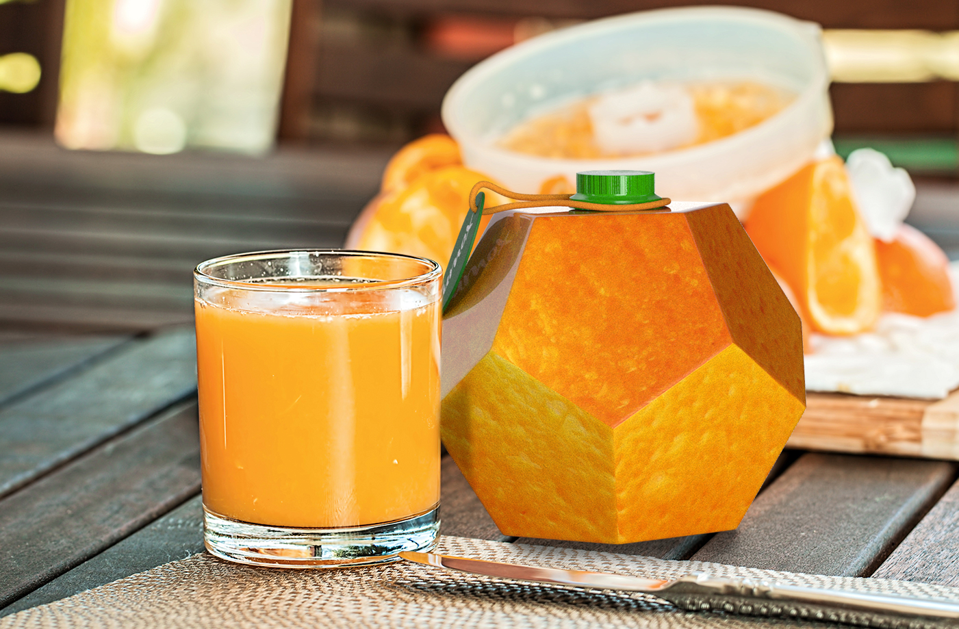
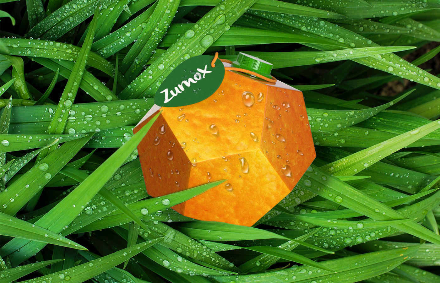
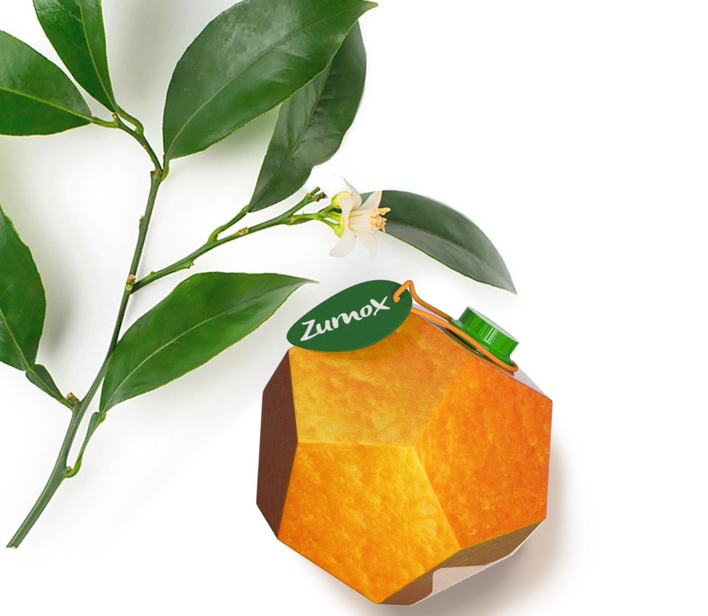
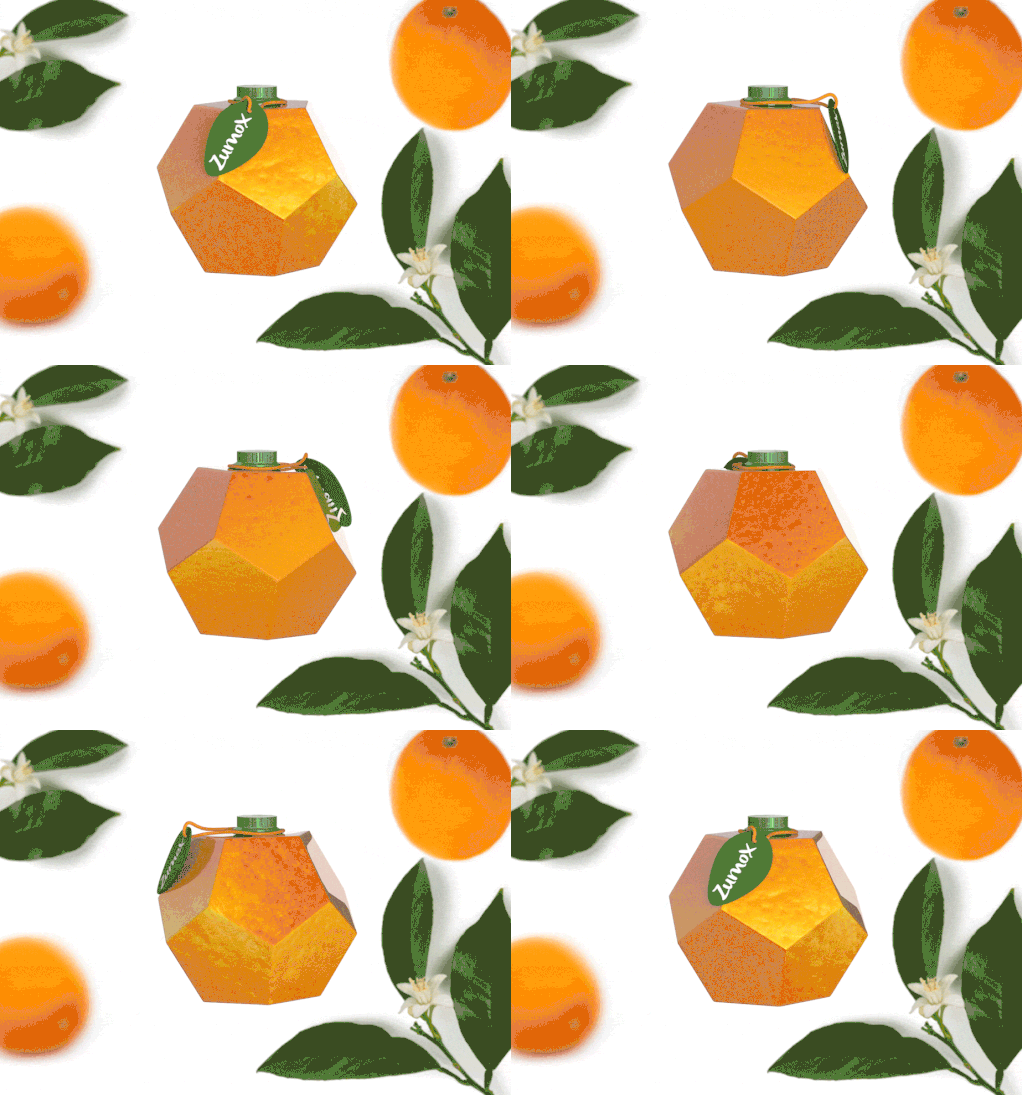
To convey the idea of ecological and natural I opted for a packaging format that refers to the shape of an orange. This idea of what looks like an orange is encouraged by the use of a skin texture of this fruit that covers the packaging, and by the label in the form of a leaf where the name of the brand appears. To finish closing these concepts of natural, traditional and lovingly elaborated, I have thought of presenting the juice containers in wooden boxes similar to those used in the collection of oranges.
The association between form and graphic to the concept of natural, ecological, traditional elaboration and with affection made the packaging unique.
CREDIT
- Agency/Creative: Lola Téllez
- Article Title: Student Concept for Zumox Orange Juice Created Lola Téllez
- Organisation/Entity: Student, Non Published Concept Design
- Project Type: Packaging
- Agency/Creative Country: Spain
- Market Region: Europe
- Project Deliverables: Brand Strategy, Graphic Design, Packaging Design, Product Architecture, Structural Design
- Format: Box
- Substrate: Pulp Carton, Pulp Paper


