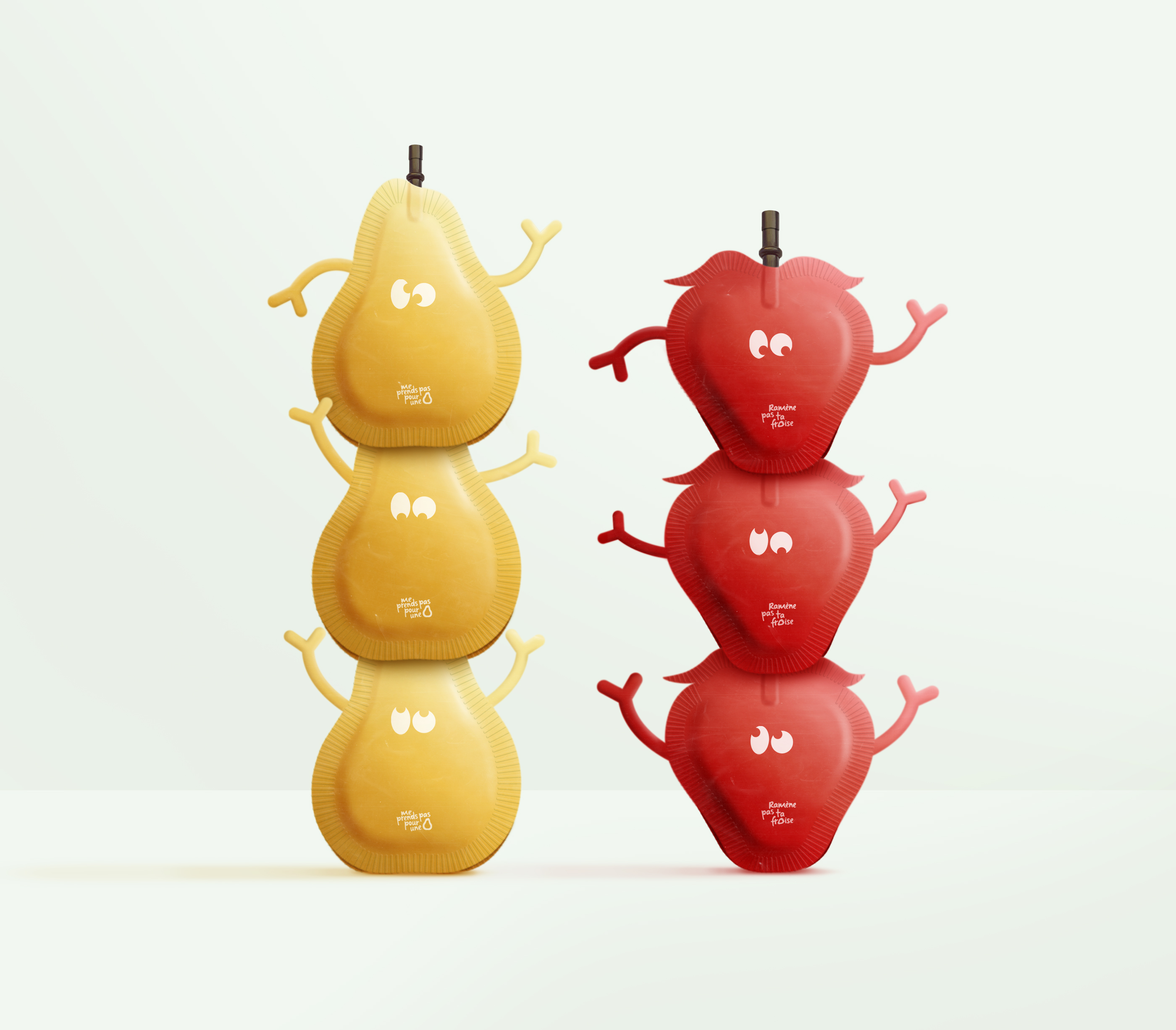
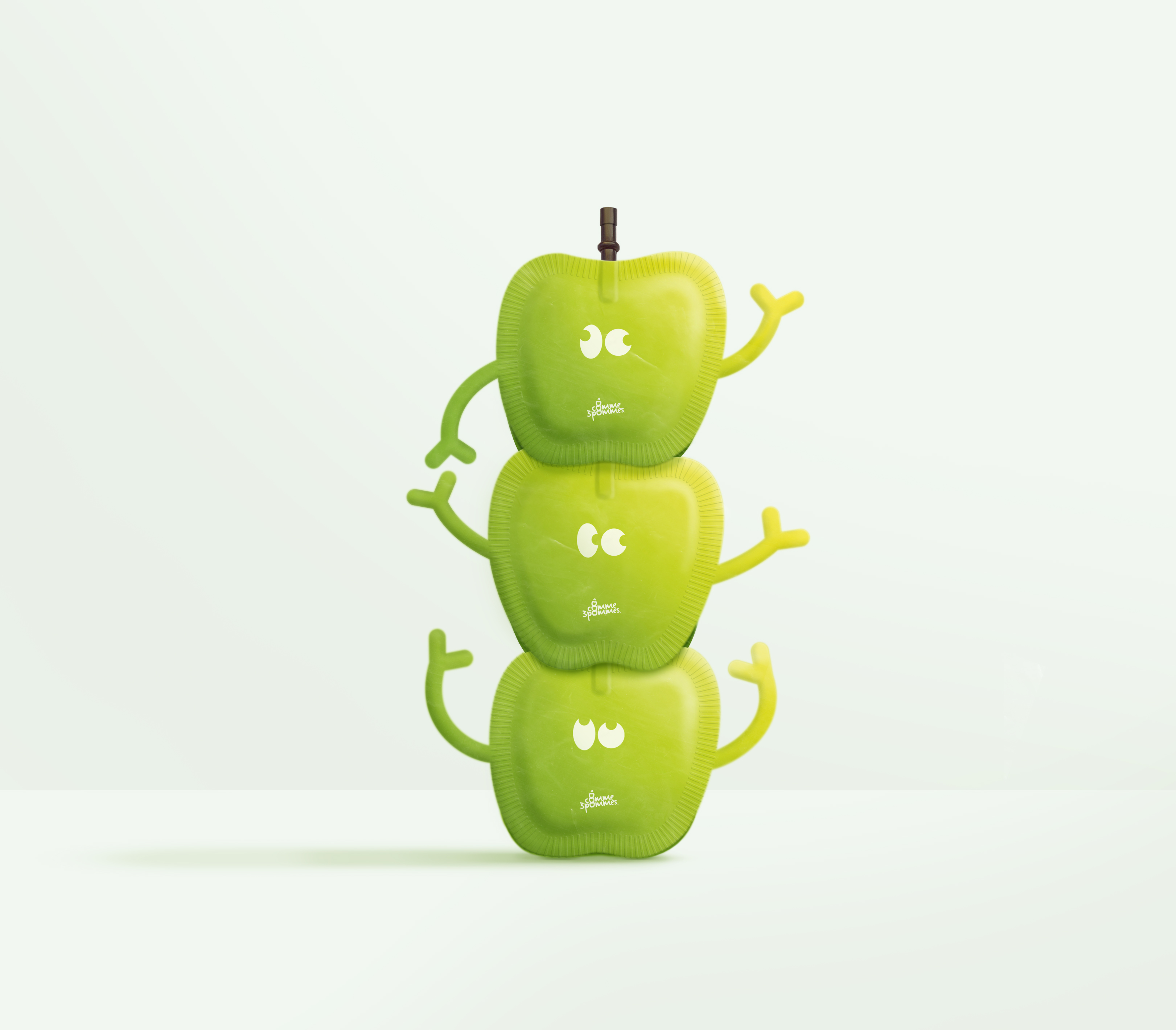
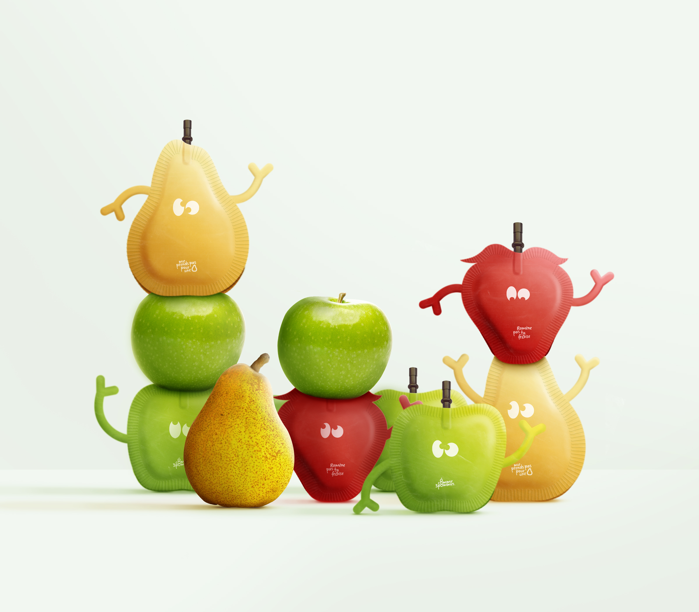
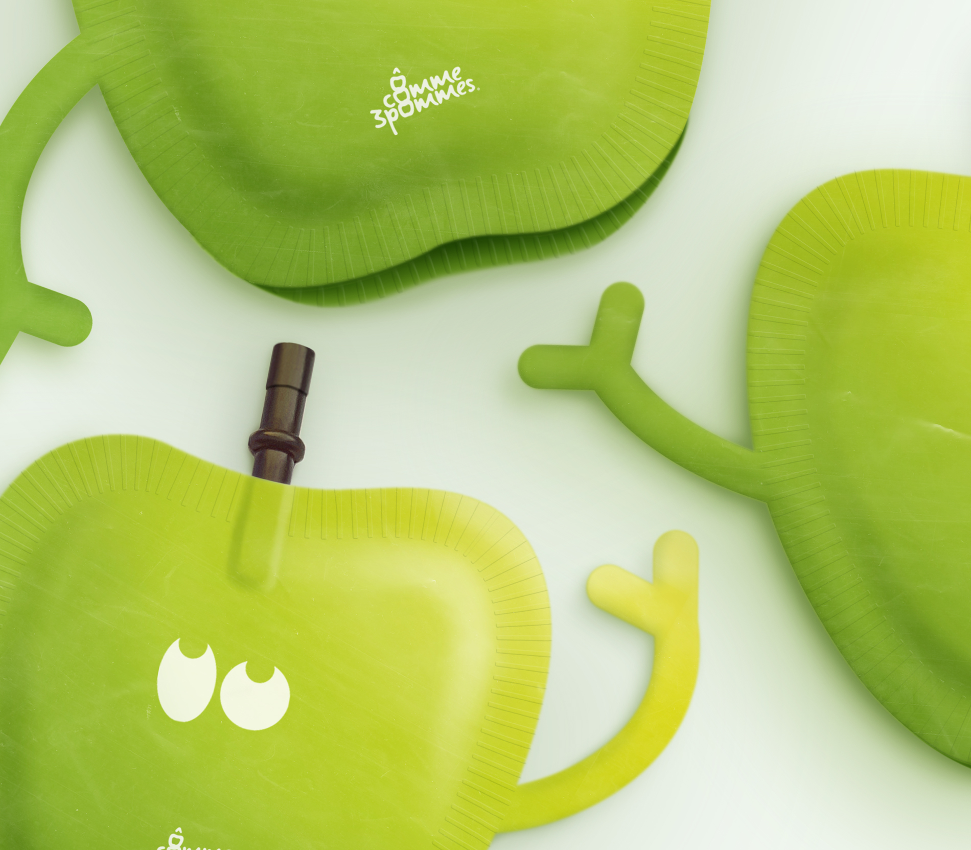
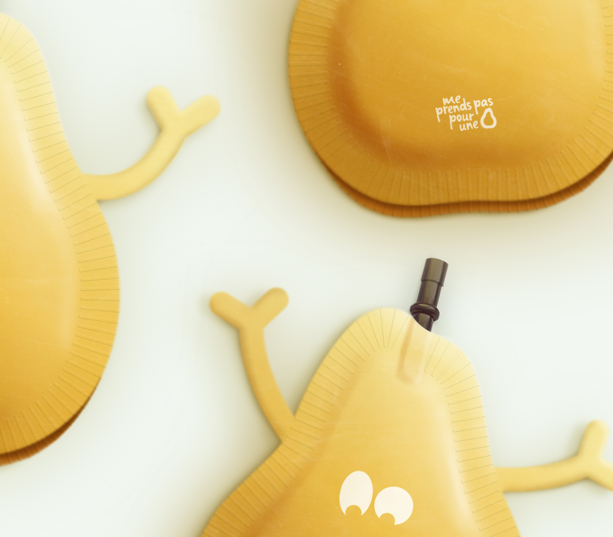
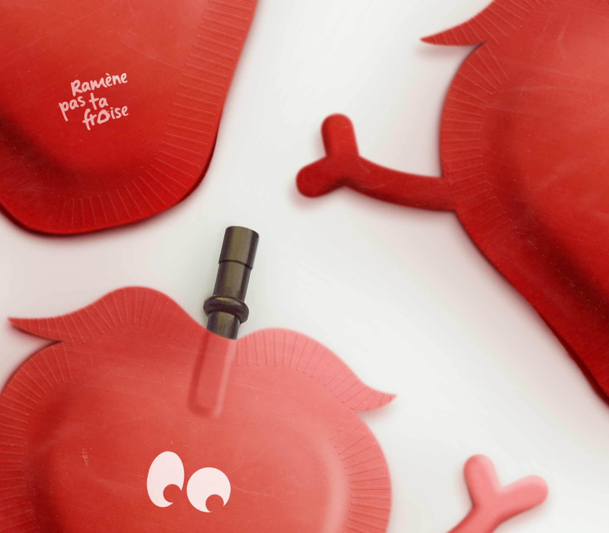
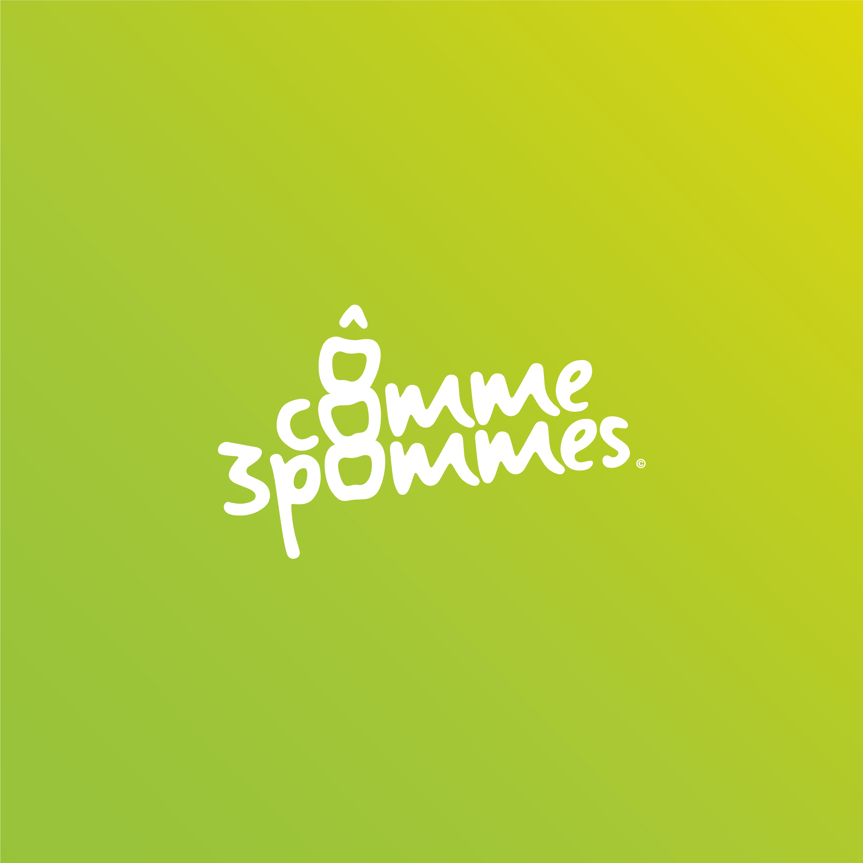
“Ô comme 3 pommes“, “Me prends pas pour une poire“ and “Ramène pas ta fraise“ are product names for a French brand of children’s compotes. Coming from popular expressions, they are often heard by children as for example “Haut comme trois pommes” (high as three apples) designating the latter. This touch of humour from the brand allows it to communicate simply about its products so that children understand better. On the Ô comme trois pommes pictogram alone, arms give energy and make them more expressive. These small stacked apples are enough to understand that this is an apple-based product for young people. The typography used in the logo gives the impression that it was written by the child himself and is therefore linked to his daily life (learning cursive writing at school). The whole has a strong personality that allows it to stand out from the rest and to develop a recognizable universe at first glance.
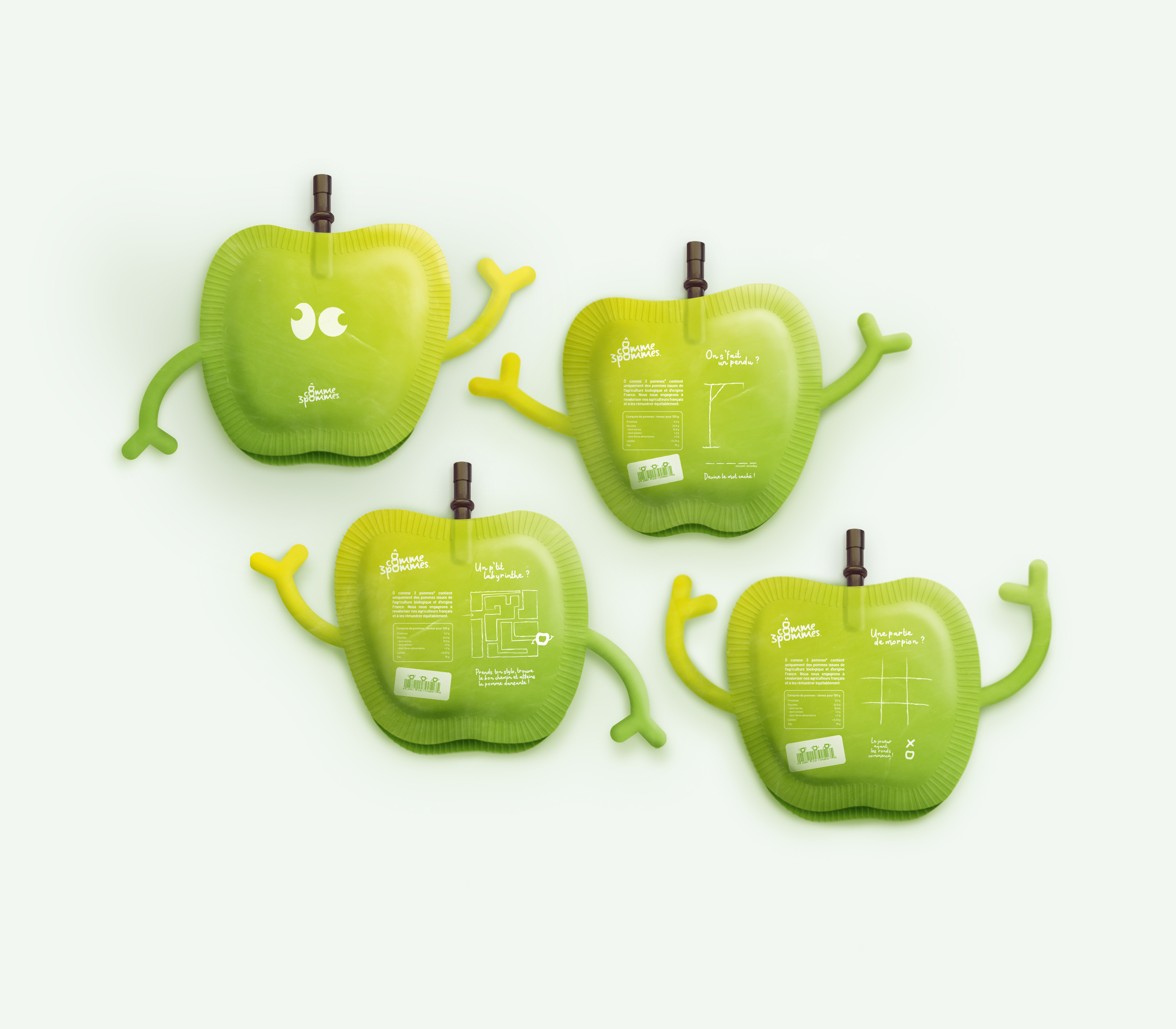
Here are three product names “Ô comme 3 pommes”, “ Ramène pas ta fraise“ and “Me prends pas pour une poire” for a compote brand. Their names are taken from French humorous expressions such as “être haut comme trois pommes” (to be tall like three apples), which refers to a child’s short stature. The packaging of these products takes the shape of the fruit and is assembled in groups of 3 (or more) by means of a straw symbolizing a fruit stalk that fits together on the underside of each package, its separation recreates the sensation of picking a fruit. The shape of the container allows instant identification of contents. Arms and eyes added to the packaging give life to playful characters for children. As compotes are often snacks at school, I chose to put games on the back to distract them during a school break. These little compotes play with our curiosity and encourage us to discover them.
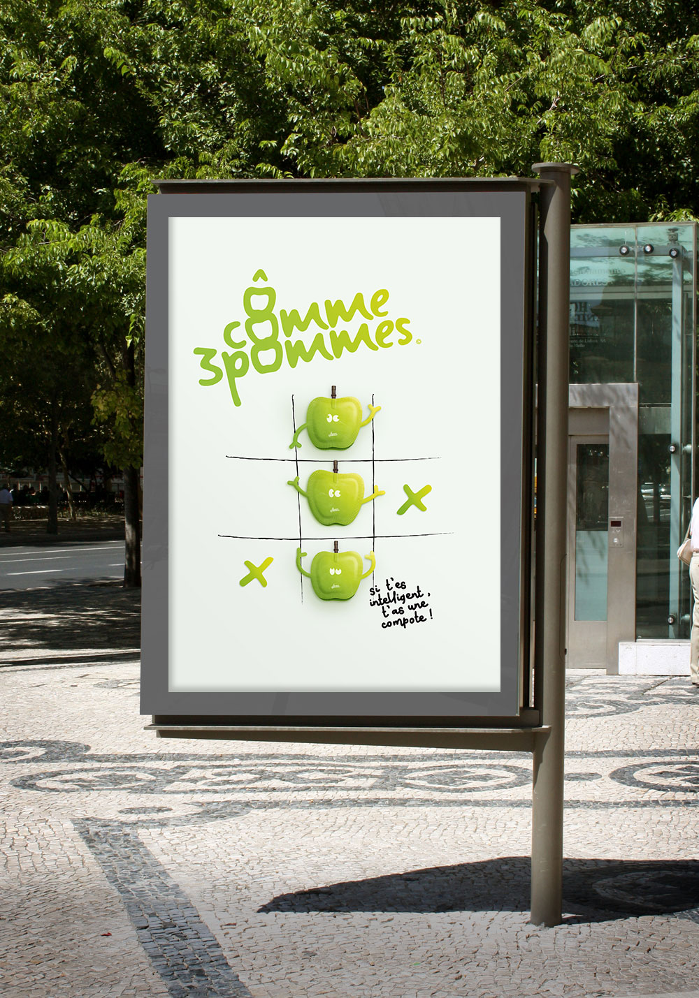
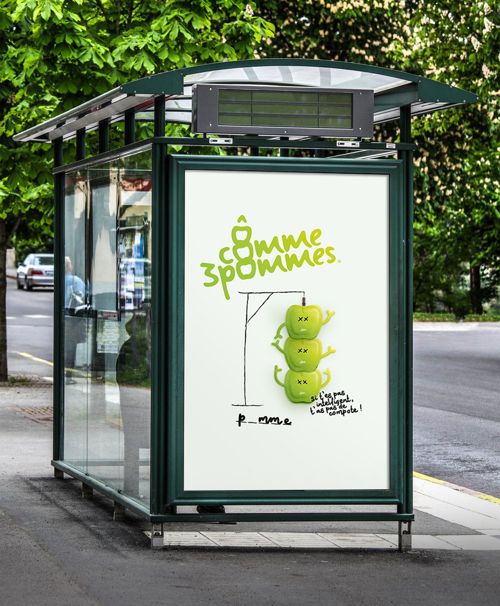
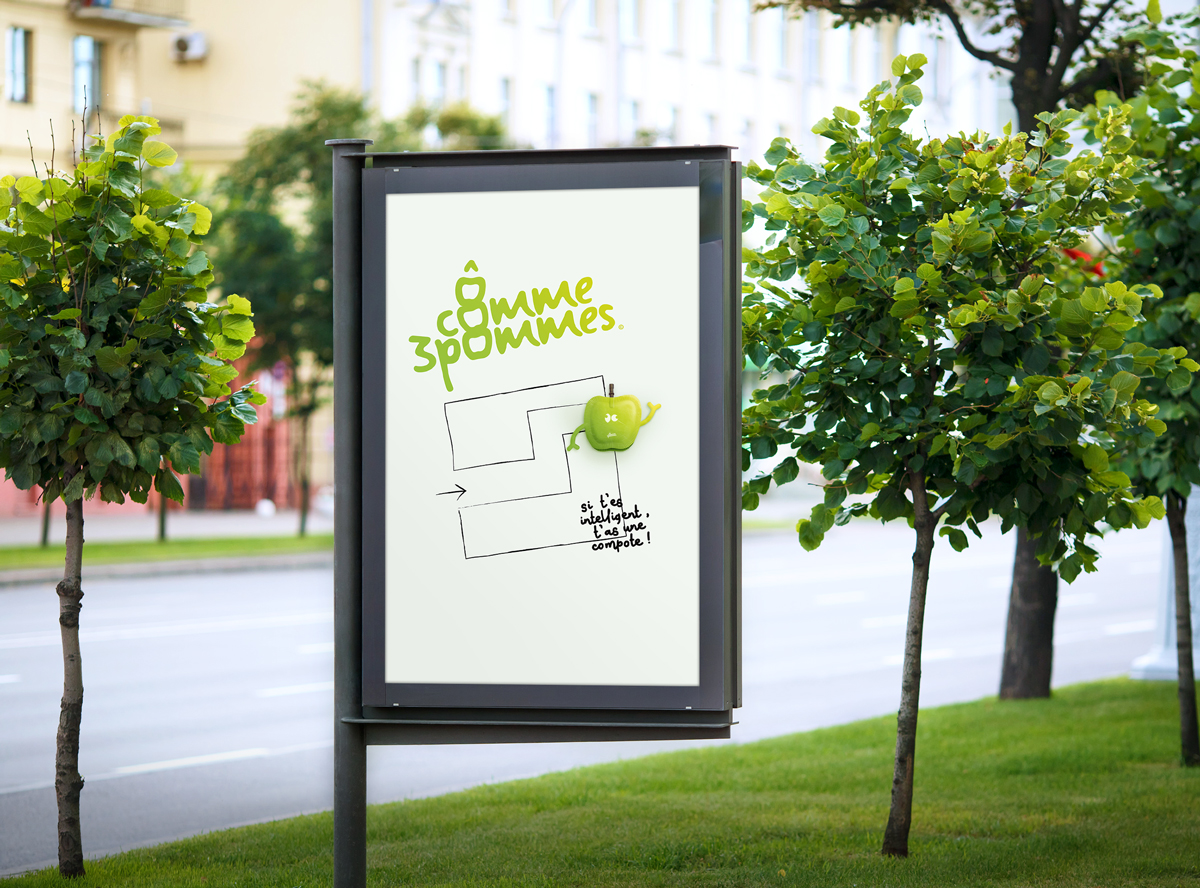
The Ô comme 3 pommes advertising campaign evokes childhood and especially playtime games. The child understands this immediately as it is part of his daily life. I use the same games that appear on the back of my packaging to create a link between the compote and the ad. The games shown are chosen because they are easy to (re)create. All you need is a pen and any medium to have fun. The aim of this advertisement is to show that at any time we need a compote and especially at playtime or snack time. The games are made with irregular lines to reproduce a pen stroke or a child’s handwriting. The advertising has an effective visual impact with the contrast of the colors and the typographic hierarchy. O like three apples is a reflection of childhood.


CREDIT
- Agency/Creative: Hurtikonn
- Article Title: Student Concept for Ô Comme Trois Pommes, a New Brand of Compotes for Children
- Organisation/Entity: Student, Non Published Concept Design
- Project Type: Packaging
- Agency/Creative Country: France
- Market Region: Europe
- Project Deliverables: Brand Advertising, Brand Creation, Graphic Design, Packaging Design, Product Naming
- Format: Pouch
- Substrate: Pulp Carton, Pulp Moulded Fibre


