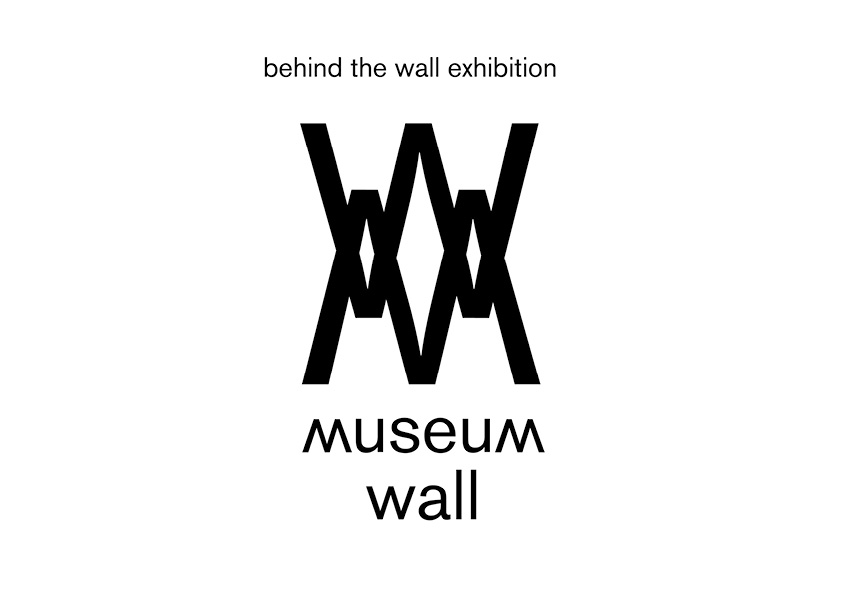
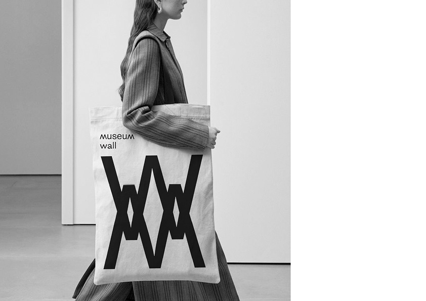
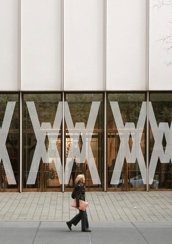
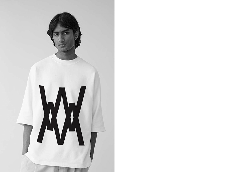
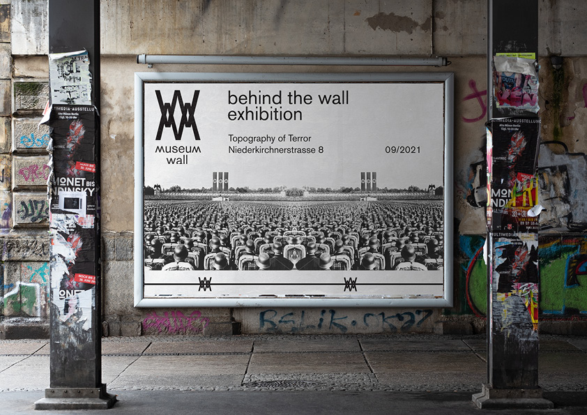
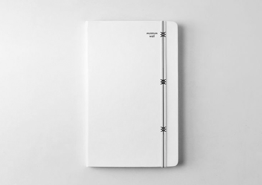
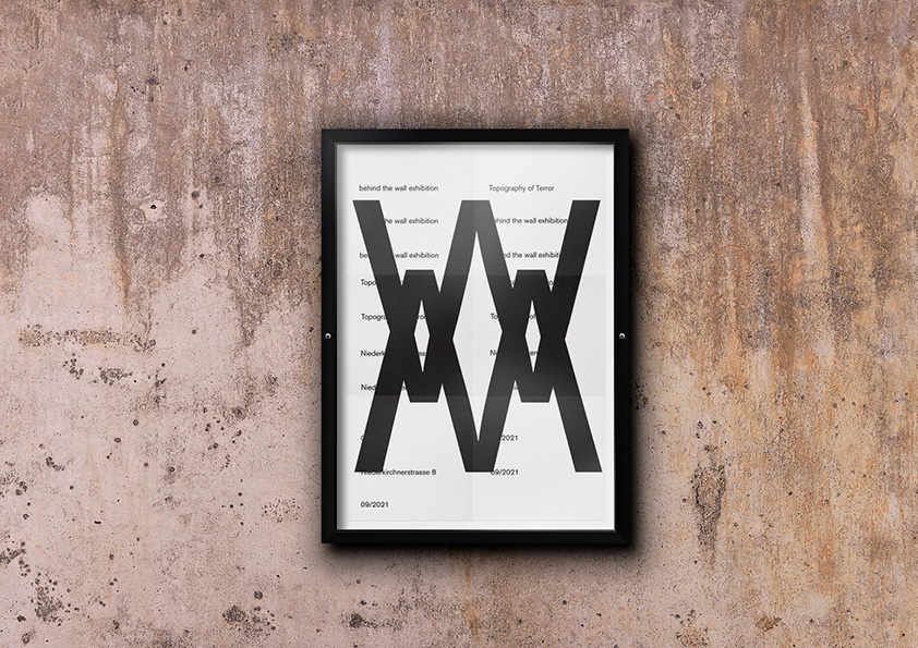
Museum Wall identity for the behind the wall exhibition is based on the typography in the form of barbed wire. The exhibition is dedicated to the concentration camps during the Second World War. The identity of the exhibition is dedicated to the history of people who were sent to concentration camps during the Second World War. Many photographers risked their lives to capture the horror of what was happening behind the wall. The logo for the exhibition of the Wall museum was designed using the typography of the first letters M and W and with the help of an overlay took the form of barbed wire. The photographers ‘ works presented at the exhibition call on people to renounce violence and war. The project was prepared for the day of remembrance of the victory over fascism and as an eternal memory of those who died in concentration camps.
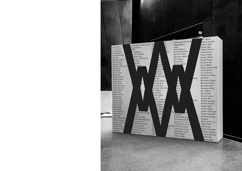
The nature of the exhibition is educational in nature. The exhibition also features a stand with the names of those who died in concentration camps and crossed out with the museum’s logo, as a memorial to all those who died and to understand how many innocent people fell behind the wall. The concept of identity in black and white symbolises both black-mourning for the dead and white-peacetime.
The importance of the project is that people around the world should remember the consequences of fascism and war and do everything possible to preserve peace. The corporate identity of the museum and the exhibition will be clear around the world and will not frighten the horrors of what was happening behind the wall of people who saw the identity of the museum.
CREDIT
- Agency/Creative: Polina Sergeeva
- Article Title: Student Concept for Museum Wall, Behind the Wall Exhibition
- Organisation/Entity: Student
- Project Type: Identity
- Project Status: Non Published
- Agency/Creative Country: Russia
- Agency/Creative City: HSE design
- Market Region: Global
- Project Deliverables: Art Direction, Brand Identity
- Industry: Non-Profit
- Keywords: WBDS Student Design Awards 2021/22
-
Credits:
student: Polina Sergeeva


