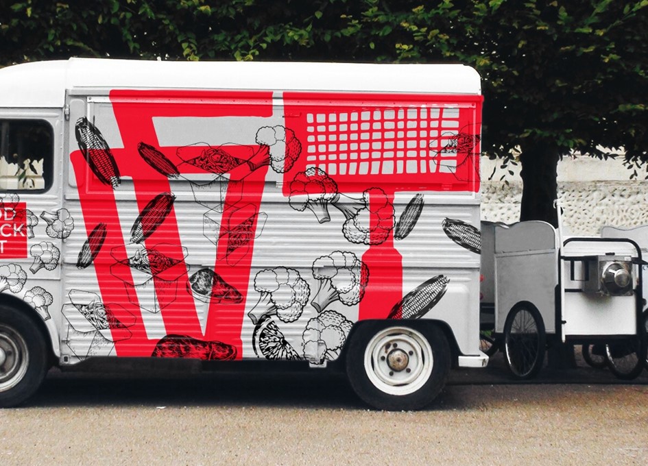
Street food festivals are held annually in different parks of the city and have become very popular recently. They attract both local residents of the city and tourists, so the task of the festival’s corporate identity is to quickly draw attention, to be easily perceived, so that a person passing by car can quickly consider the theme of the festival.
Nature, trucks, food, people, music, smiles, laughter, games and good mood — all this includes the food truck fest. Before I started working, I found the associations: “trucks”, “food”.
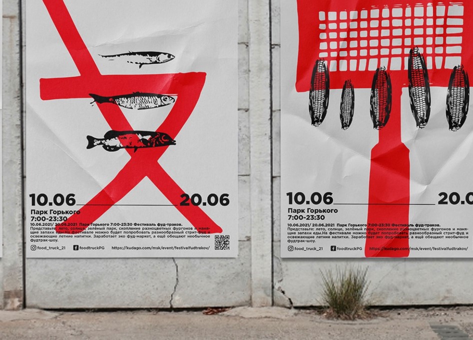
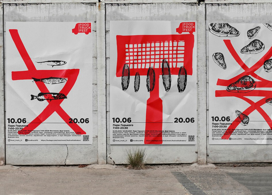
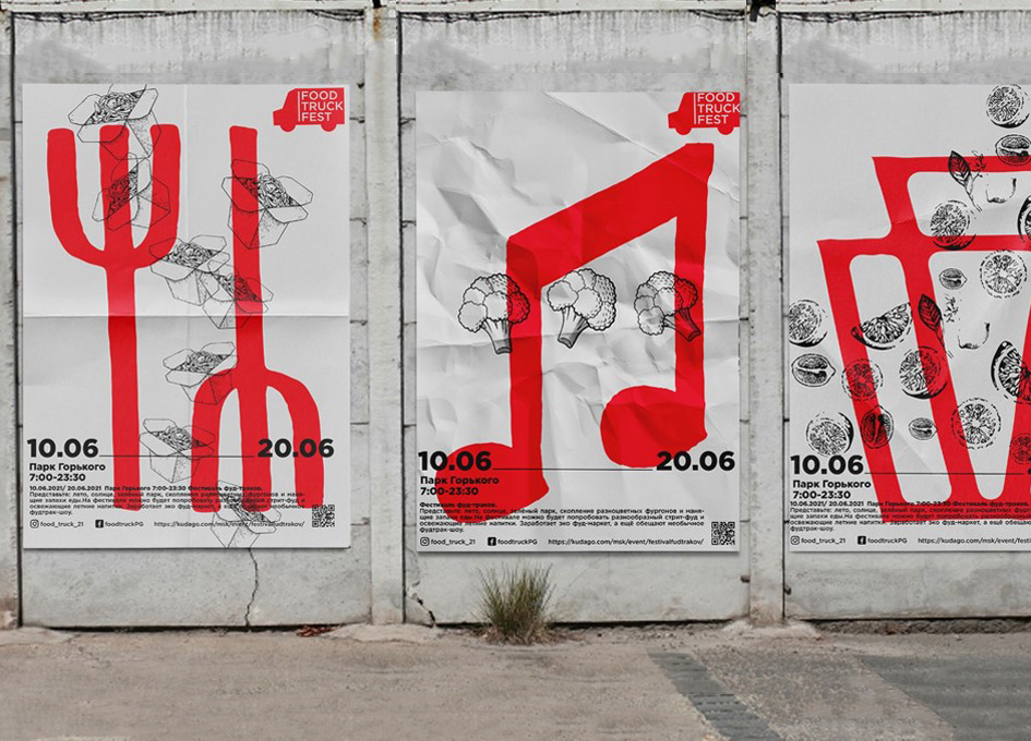
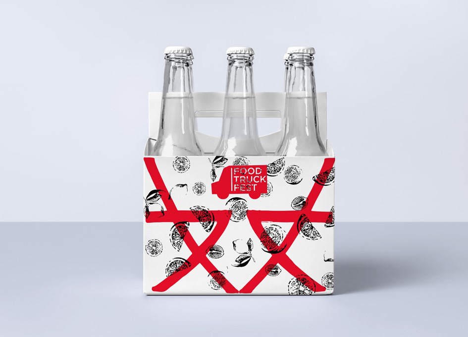
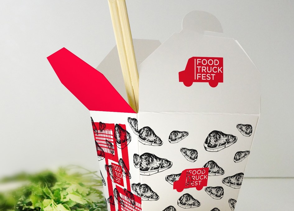
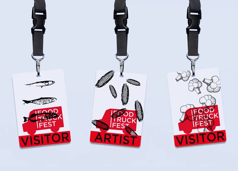
The result is a large red graphic sign associated with the word “trucks” — a chair, grill, music, table, disposable cups. And I also drew graphic black illustrations — these are the food that is prepared at street food festivals, for example, meat, fish, broccoli, hot corn, popcorn, vegetables and fruits. All the graphics work in contrast to each other.
The corporate identity will be visible from afar due to the red accidental signs and interesting when viewed up close, thanks to the pattern of engravings. The logo is a silhouette of a truck with the name of the festival written on it.
Food truck fest is an island of food inside a large metropolis, so the nature of the festival’s corporate identity is bright, contrasting, noticeable, causing a desire to come to the event and try different food that is prepared directly in the car. The target audience of the festival is residents of a large city (families, young people, children, pensioners – people of all ages). The brand’s character is friendly, modern, challenging, and memorable. The hand-drawn art illustrations are reminiscent of the craftiness of food and are combined with a simple, typeset font to make it easy to read the information. This graphic language is relevant at any time of the year and can be used for several years in a row.
My posters are placed on the walls of the city, as well as in the park where the festival takes place. This is an advertisement for the festival, which can be seen from afar. If desired, the posters can be used as advertising banners on Internet sites. Corporate identity with illustrations is located on the packaging of branded food and drinks of the festival, as well as on the cards of participants of the festival and the design of trucks. Bon Appetit!
CREDIT
- Agency/Creative: Diana Sinitskaya
- Article Title: Student Concept for Food Truck Fest Corporate Identity by Diana Sinitskaya
- Organisation/Entity: Student, Non Published Concept Design
- Project Type: Identity
- Agency/Creative Country: Russia
- Market Region: Europe
- Project Deliverables: Brand Advertising, Brand Architecture, Brand Creation, Brand Design, Brand Identity, Brand World, Branding, Graphic Design, Identity System, Illustration, Research
- Industry: Food/Beverage
- Keywords: Food, fest, truck, street food, poster,Time To Eat


