


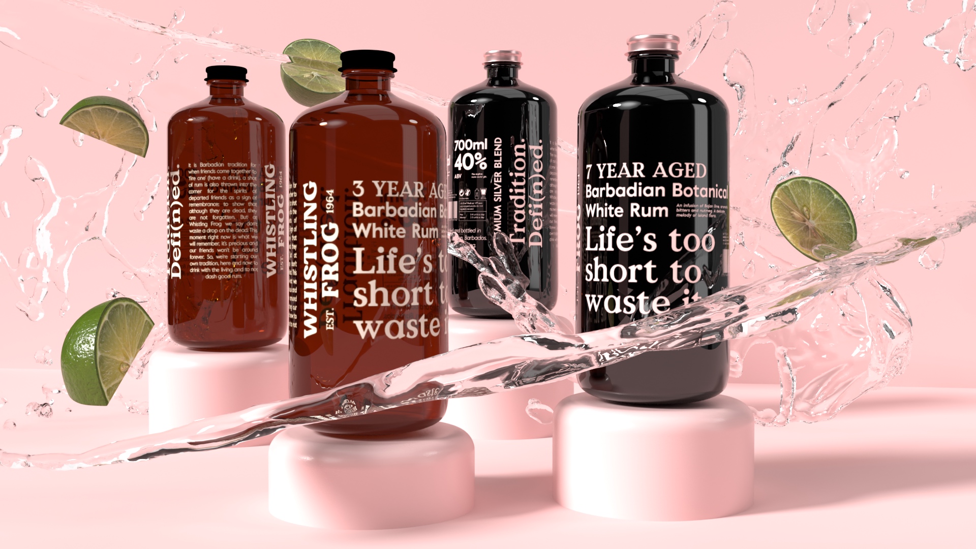
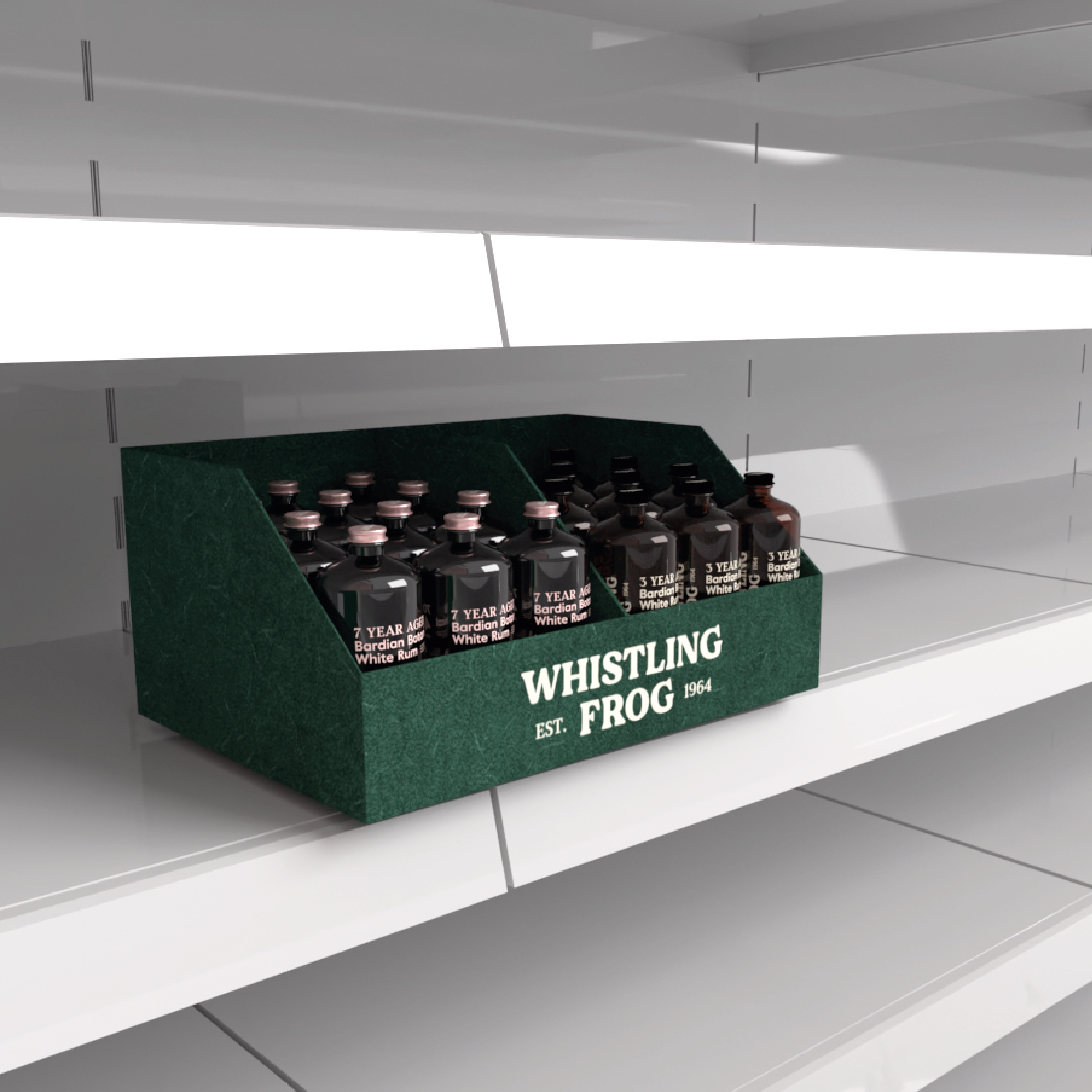
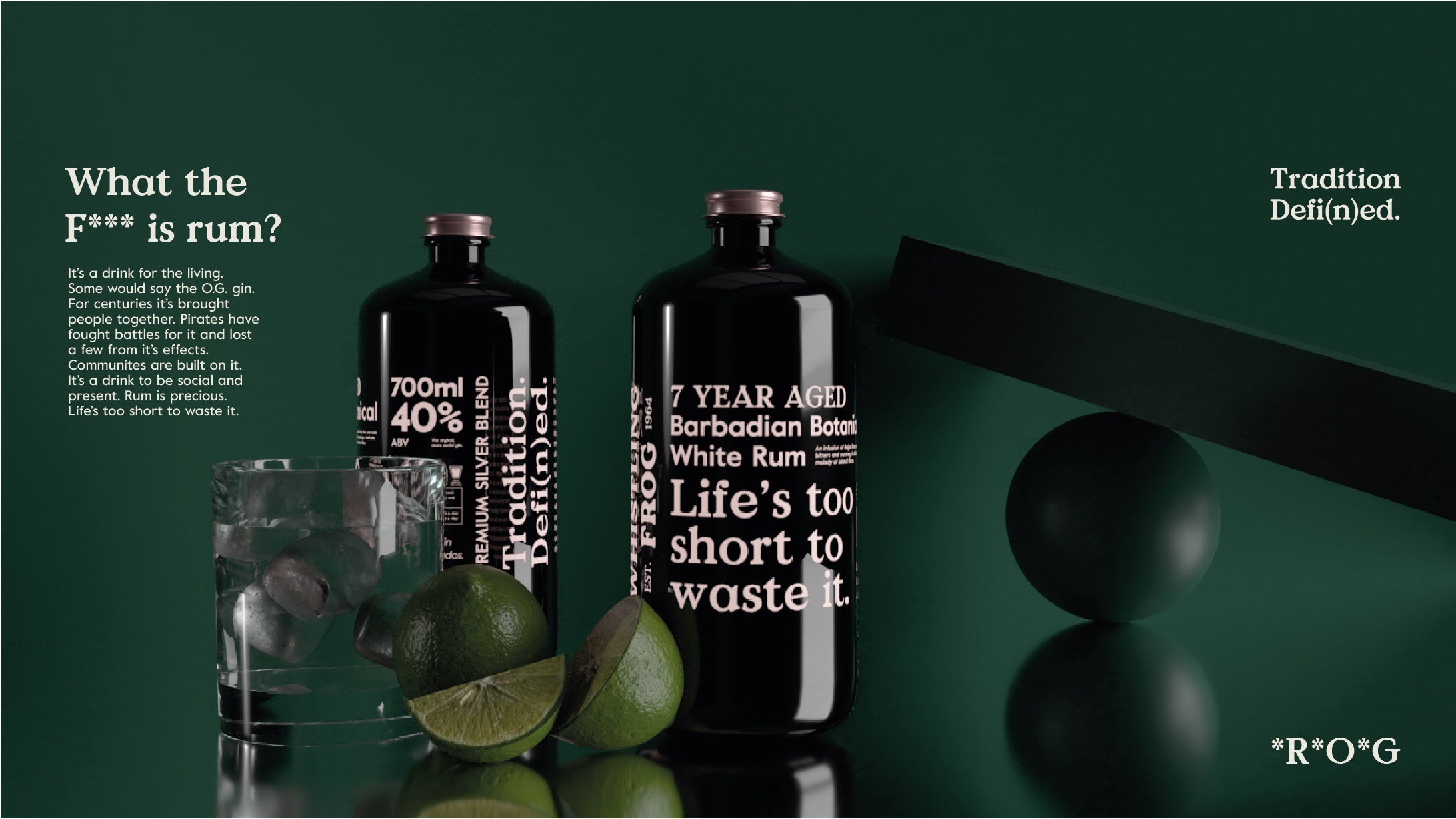
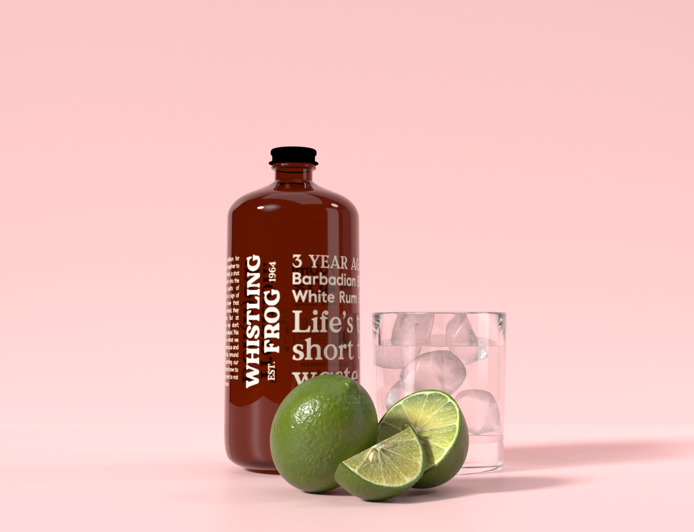
The brief was to with specific insight create an identity and appropriate bottle design for a standard and premium botanical rum from Barbados called Whistling Frog.
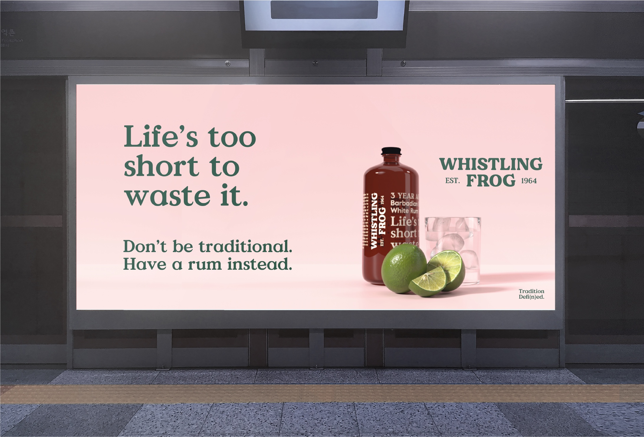
Whistling Frog is a botanical white rum, originating from Barbados.
targeted at busy, career-focused Millenials. It is said that the sound of Whistling Frogs on the island of Barbados are voices of the departed calling out to the living.
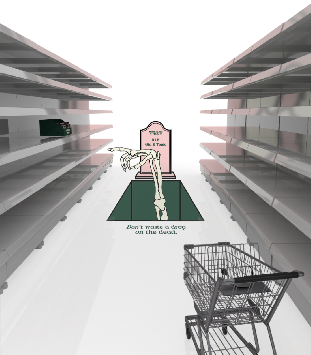
The brand challenges the Barbadian tradition of throwing a shot of rum in the corner to remember departed friends. We say our rum is too good to waste a drop on the dead, and we already know our friends won’t be around forever so are starting our own tradition to drink with the living and to not dash good rum.
Whistling Frog is unapologetic, frank and disruptive in attitude.
The brand is framed around the tagline Tradition Defi(n)ed. We are defying the past Barbadian tradition and defining a new one. The brand is centred around the preciousness of life, the bottles and type heavy labels a nod to medicinal bottles that connote control and measure of something precious.
Due to the effect of Covid-19 the final bottles were rendered digitally rather than physically produced due to lack of access to facilities.
Alongside the packaging design, a short film was curated using free stock footage as lockdown has meant limited access to filming equipment. The film has been made to convey the brand’s ethos and underlying meaning amongst our usual sarcasm and blunt humour.
In an ideal situation, the film would hypothetically follow one person through life and show all the people with whom they interact with that make life so wonderful.
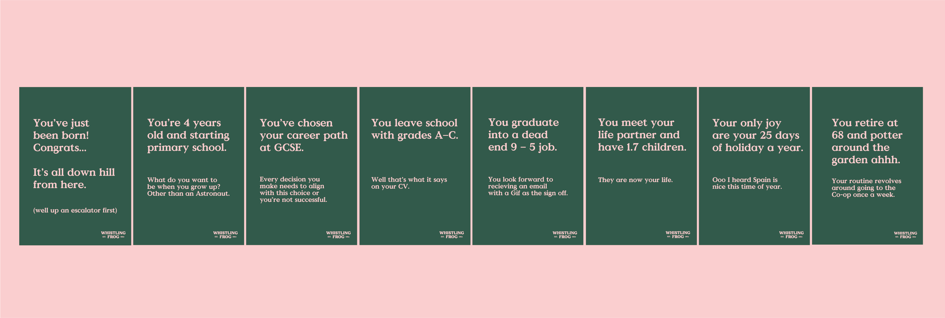
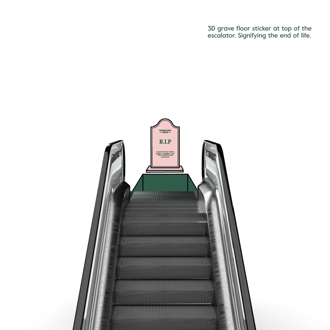
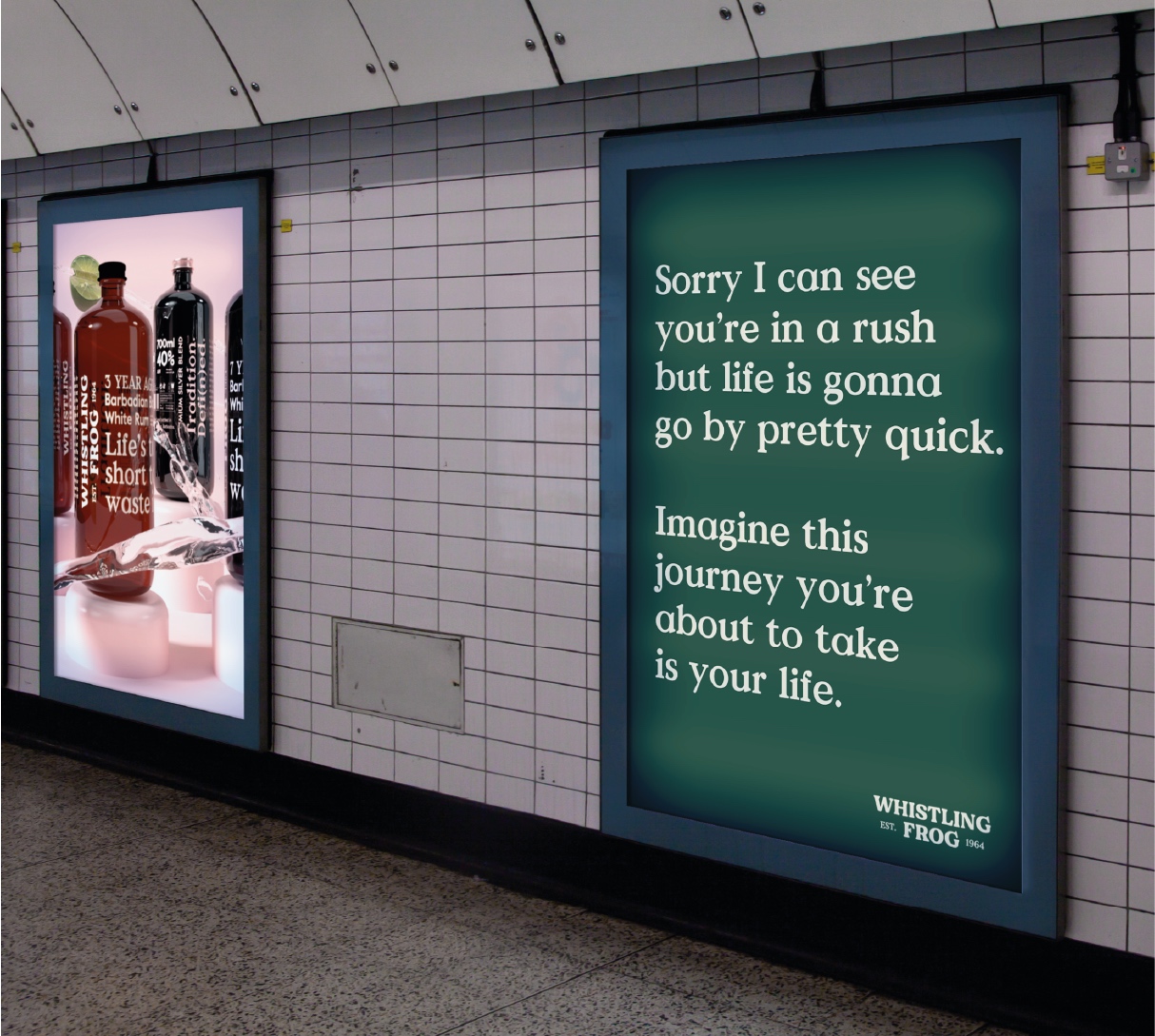
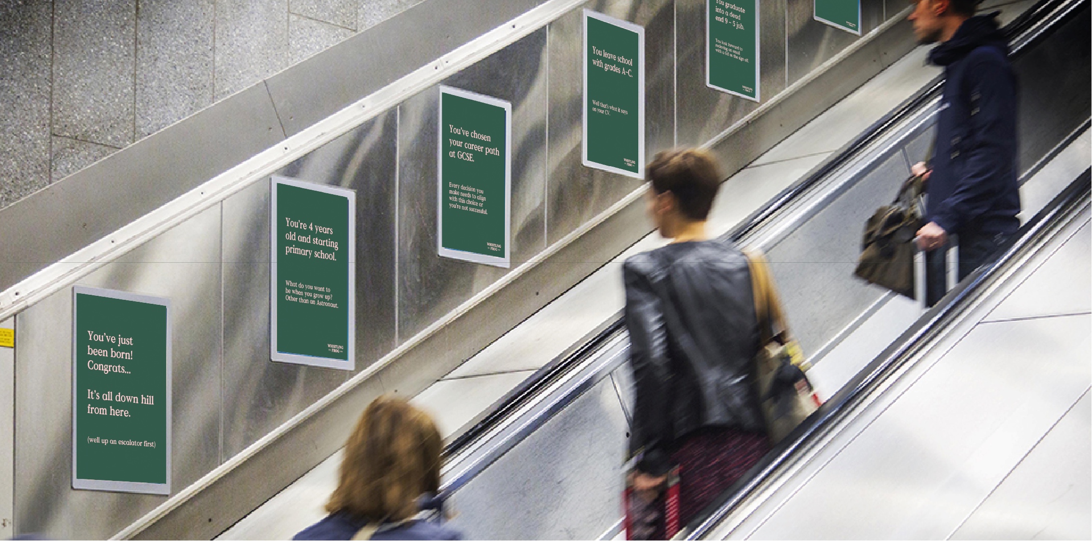
In addition to this, an ambient media launch campaign was created that was takeover a London Underground tube station, targetting our audience first hand as it’s the least likely placed the target audience (busy millennials) are to stop and think about how short life really is. . The campaign treats the journey out of the tube station as the journey of life. Beginning at the bottom of the escalators. The posters up the escalator highlight the average (pretty mundane) life of a Brit. It’s satirical and blunt. As the commuter reaches the top of the escalator a 3D sticker appears as though they’ve moved through life and are tossed into a grave. The final board seen pulls the campaign together, leaving the commuter with a call to action to switch up from that of a typical boring consumer.
CREDIT
- Agency/Creative: Ben Clarke
- Article Title: Student Concept Encouraging Friends to Cherish Their Time Together
- Organisation/Entity: Student, Published Self Promotional Design
- Project Type: Packaging
- Agency/Creative Country: United Kingdom
- Market Region: Europe
- Project Deliverables: Brand Advertising, Brand Architecture, Brand Creation, Brand Identity, Brand Strategy, Branding, Graphic Design, Packaging Design, Product Architecture, Product Naming, Research, Tone of Voice
- Format: Bottle
- Substrate: Glass Bottle


