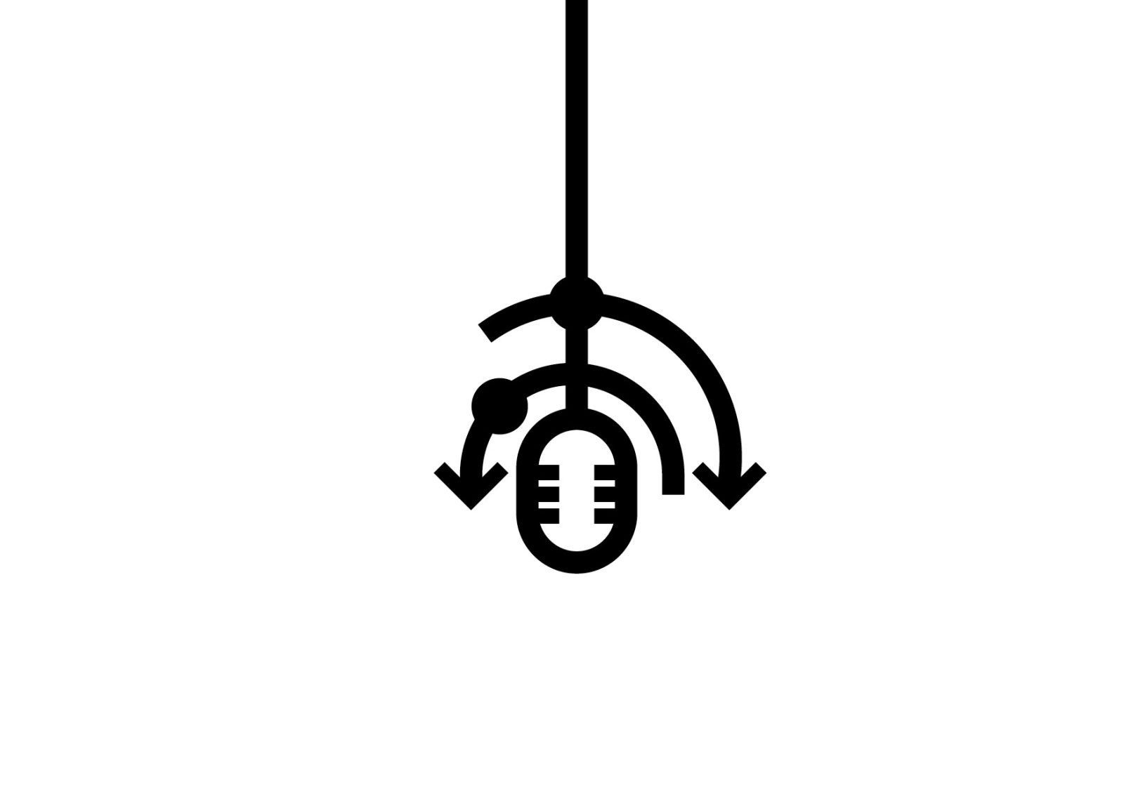
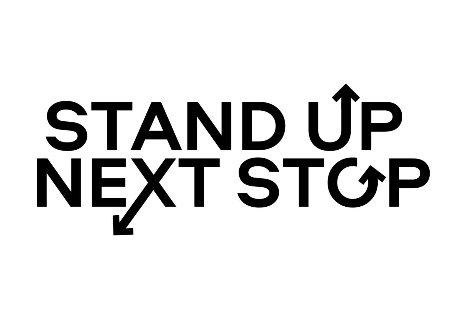
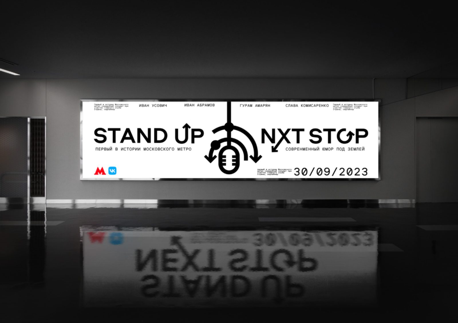
It all started with an idea. How to develop communication that will simultaneously read the subway and stand-up? I started with a symbol that would combine these two seemingly opposite concepts – stand-up and subway, it was the logo that became the basis of the whole style of this event. Who clearly and clearly reads the microphone – this is what no comedian can do without at a humorous concert, then our eye catches metro lines and transfers from station to station – this is perhaps one of the most recognizable elements of the subway, combining these images formed a sign which became the basis of the whole brand of communication with the concert spectators and passengers of the subway.
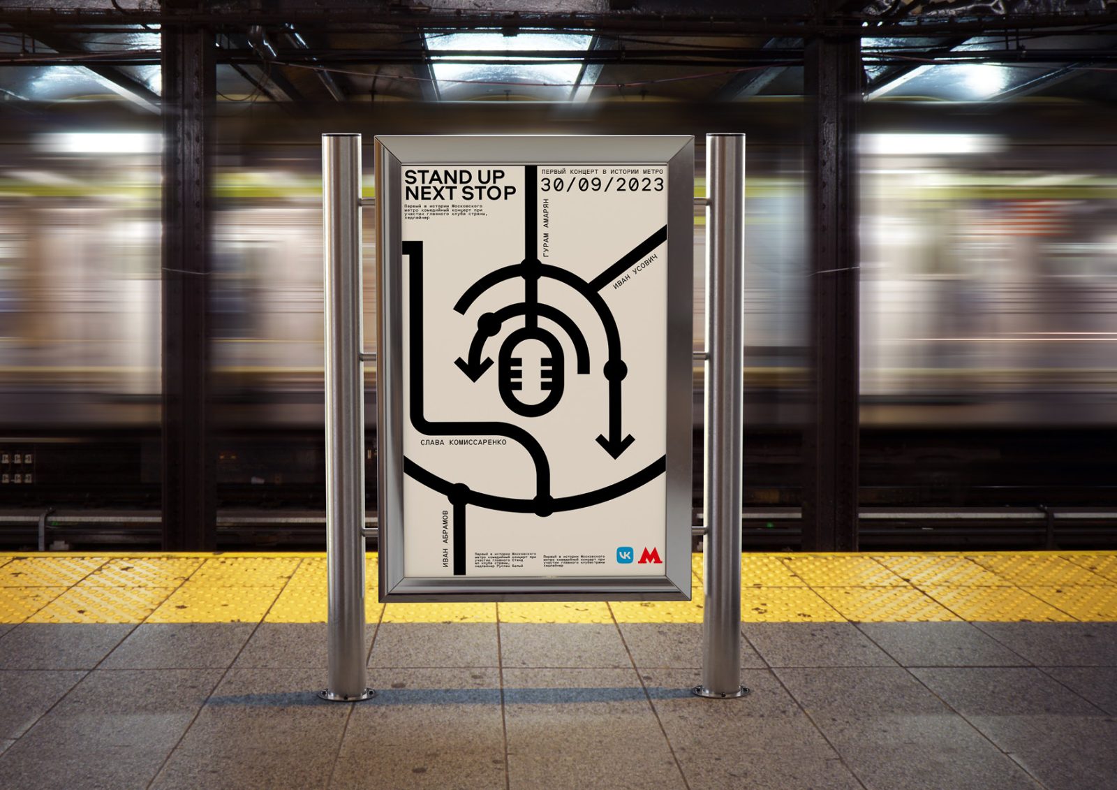
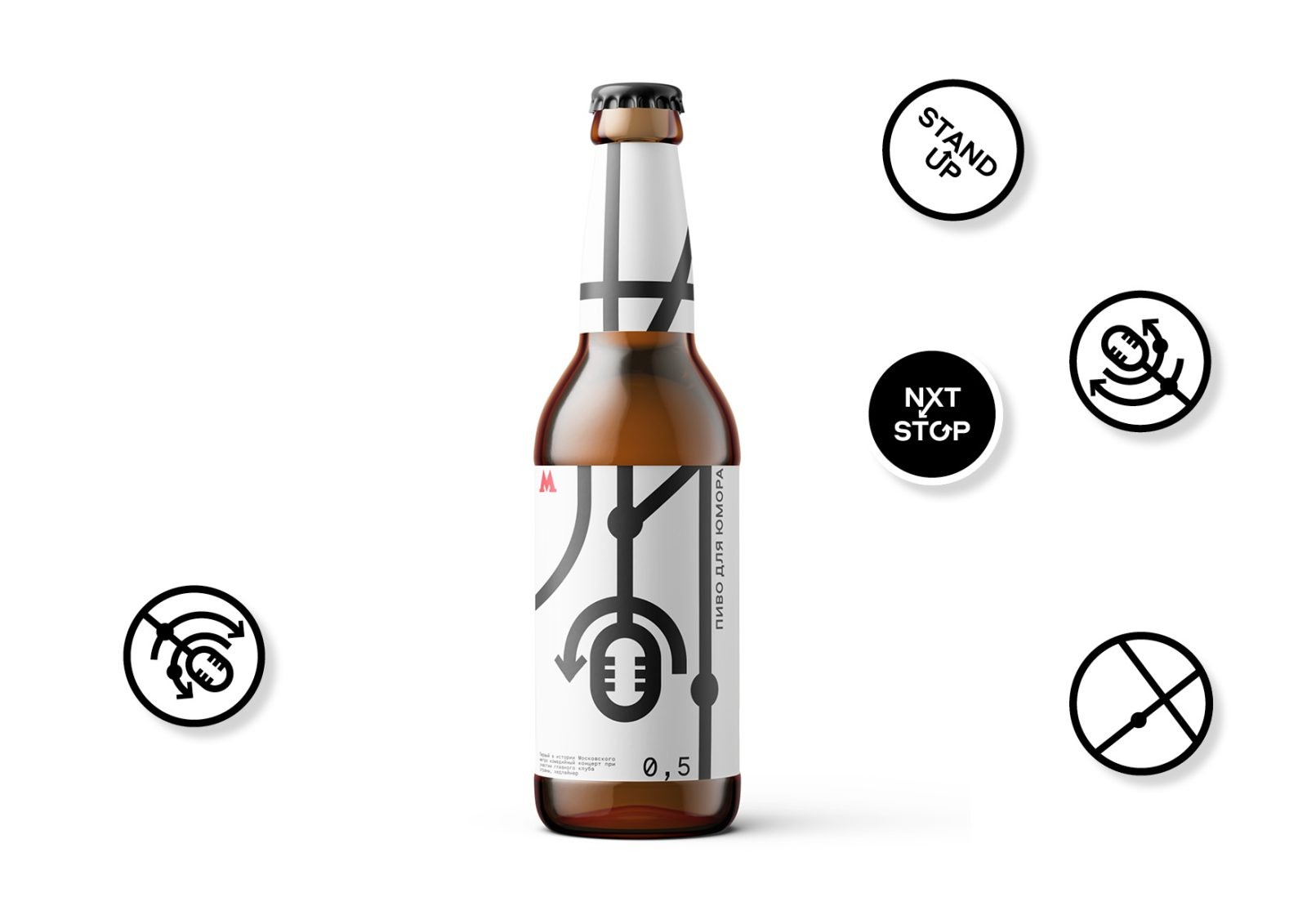
For the event were designed banners, promotional posters and merch event held one day so that was the task to win the attention of the audience bright, clear, throw and in a good sense simple communication!
The nature of the graphics is downright strict and yet flirty since Stand-Up is quite harsh humor for adult brutal guys, but we play a game with the viewer – a sort of arcade, when in posters with a subway scheme he sees not at all the way to home or work, And the way to an exciting evening where humor awaits him underground is his next stop! ” Stop! The guy’s here and you’re halfway there!” – This is the message that is embedded in the communication between the audience and the concert, it’s simple and fast – like the subway is fun and loud – like humor. I hope you enjoy watching this project, because this is your stop! Thank you!
CREDIT
- Agency/Creative: Polina Klyueva
- Article Title: Student Concept Branding for the Stand-Up Subway Concert
- Organisation/Entity: Student
- Project Type: Identity
- Project Status: Published
- Agency/Creative Country: Russia
- Agency/Creative City: Moscow
- Market Region: Europe
- Project Deliverables: Brand Identity
- Industry: Entertainment
- Keywords: Brand Design, Brand Identity, Typography
-
Credits:
Designer: Polina Klyueva
Tutor: Leonid Slavin


