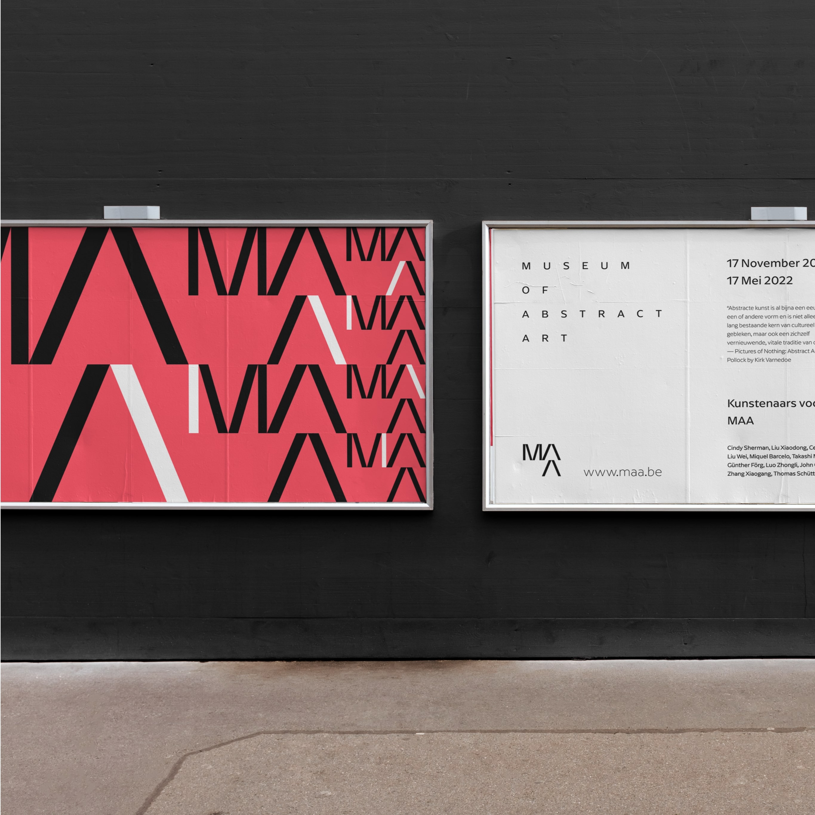
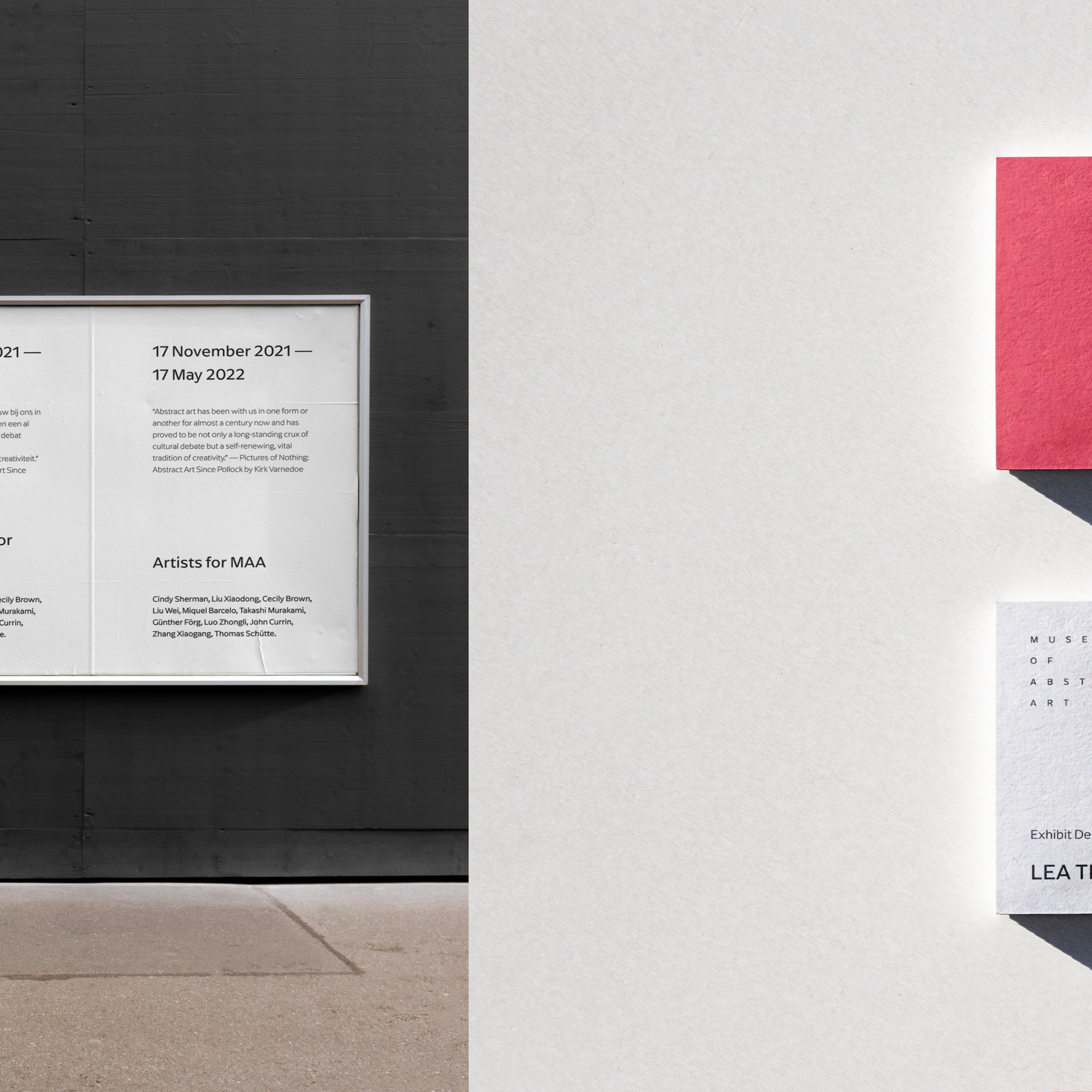
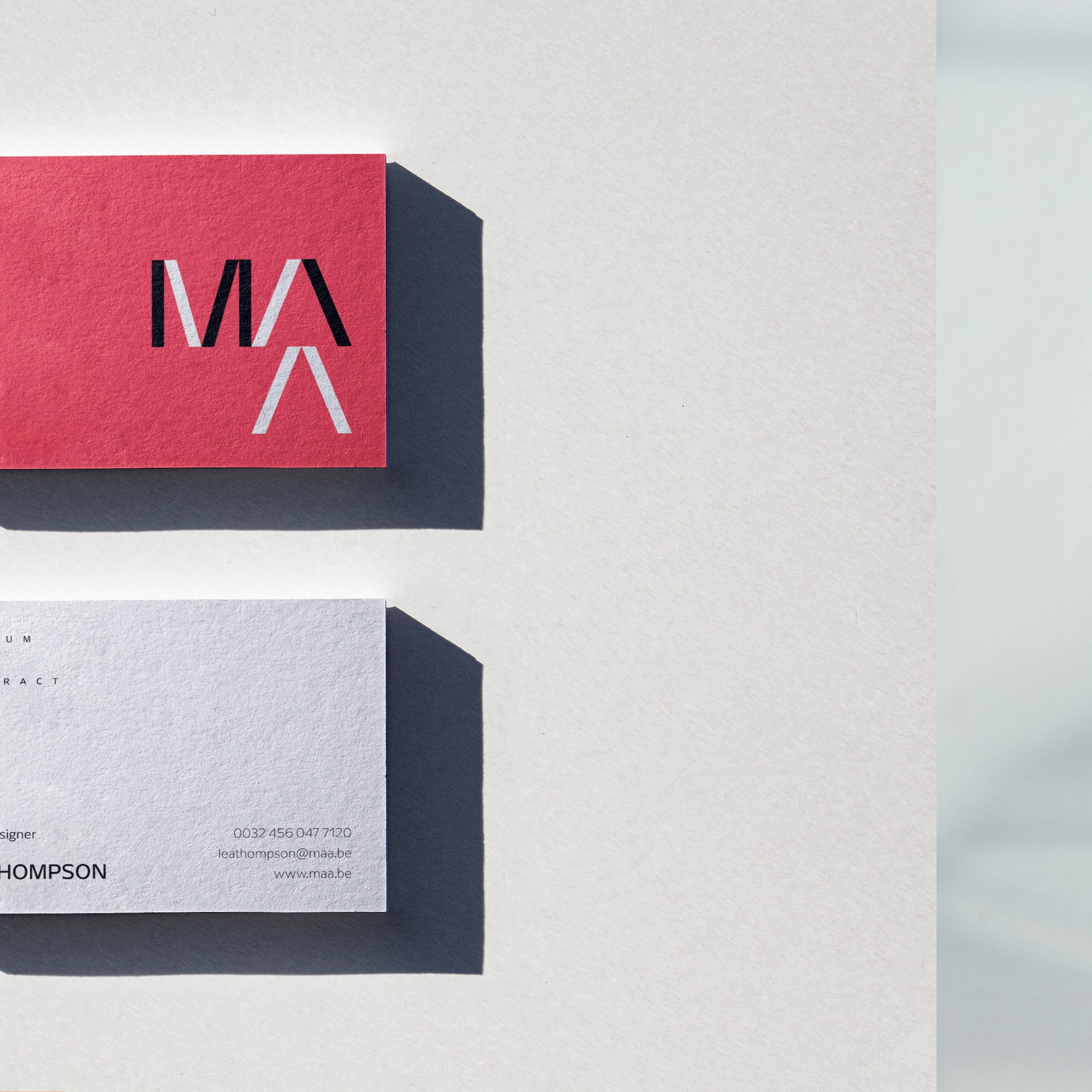
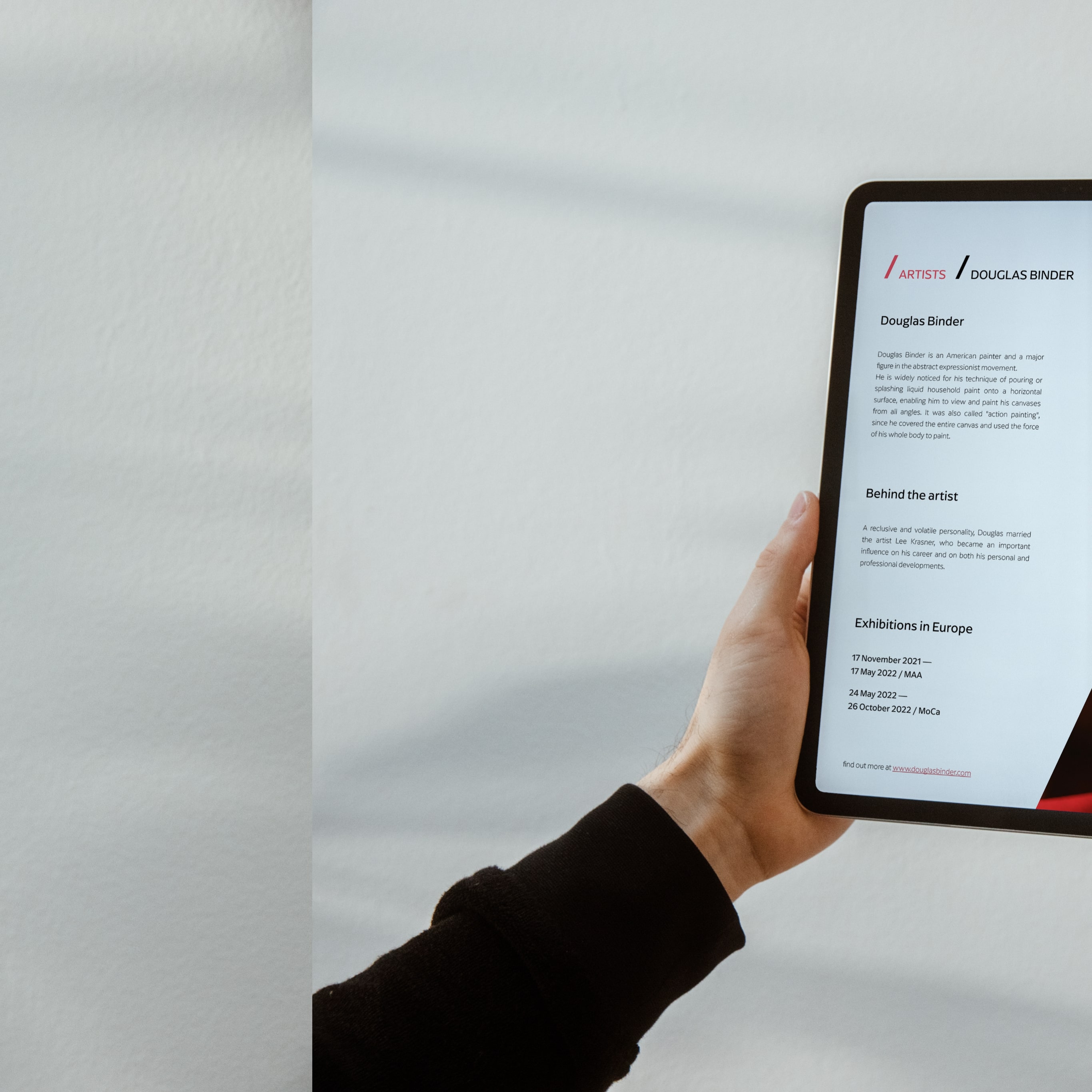
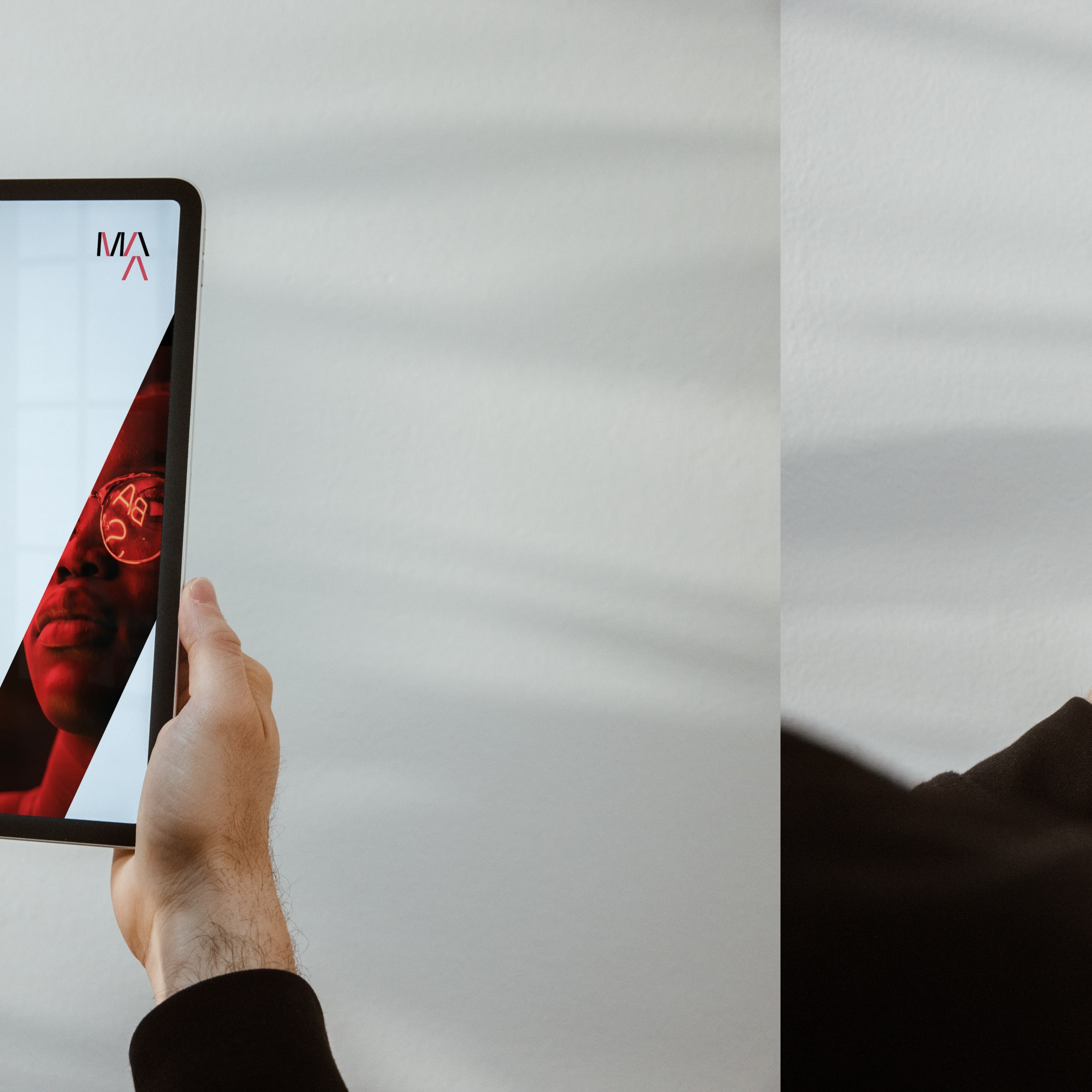
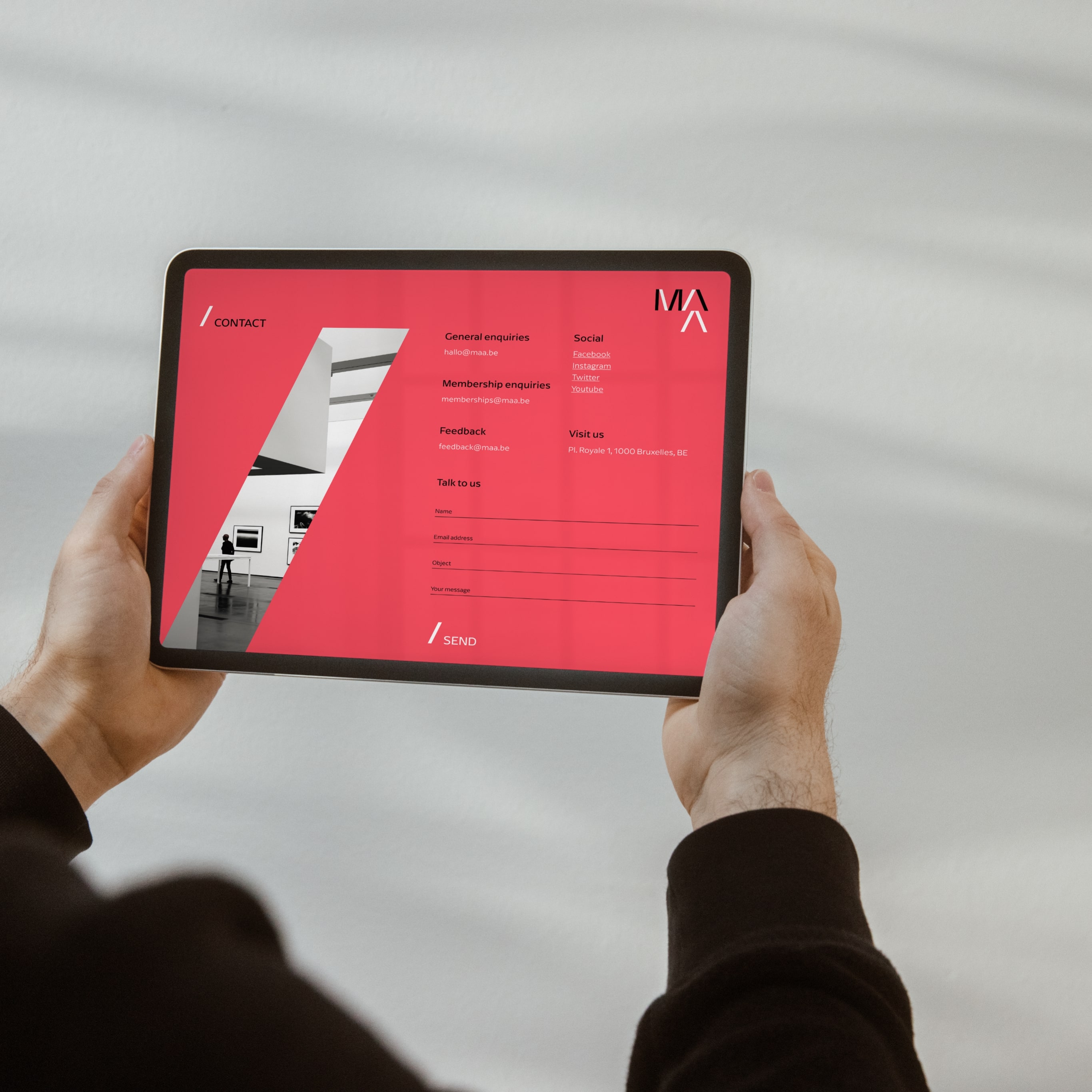
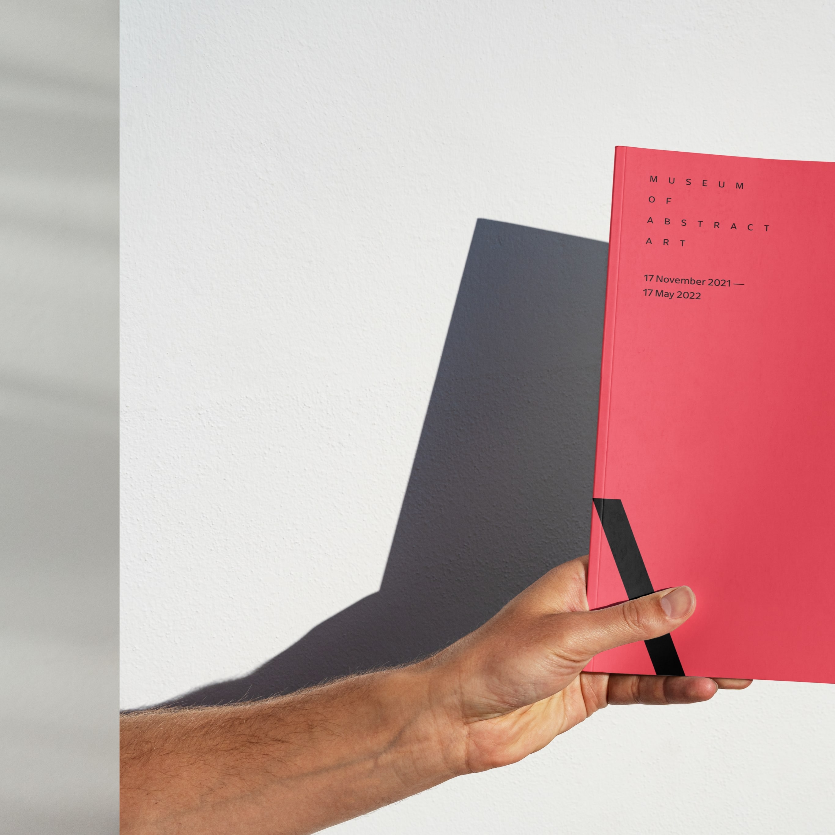
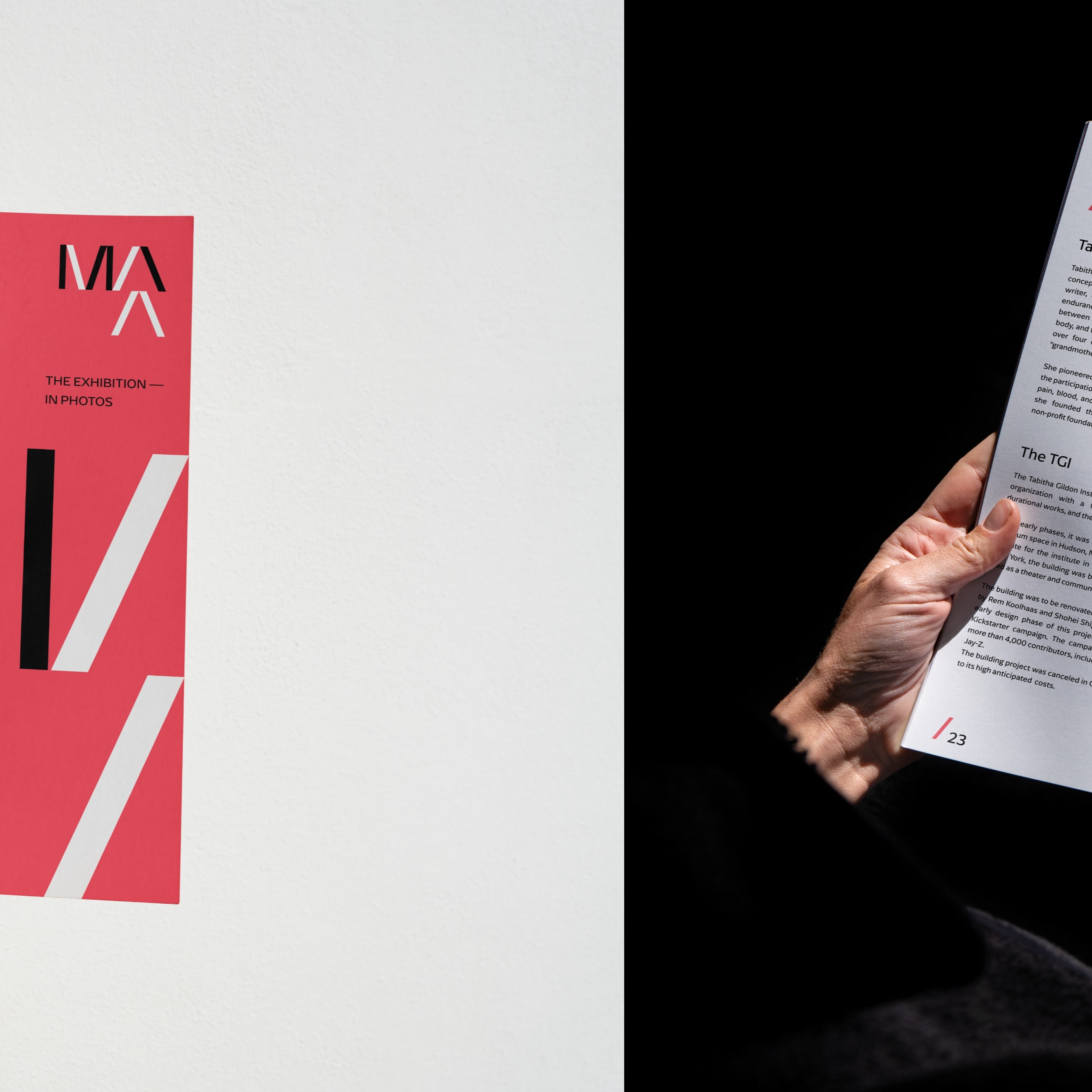
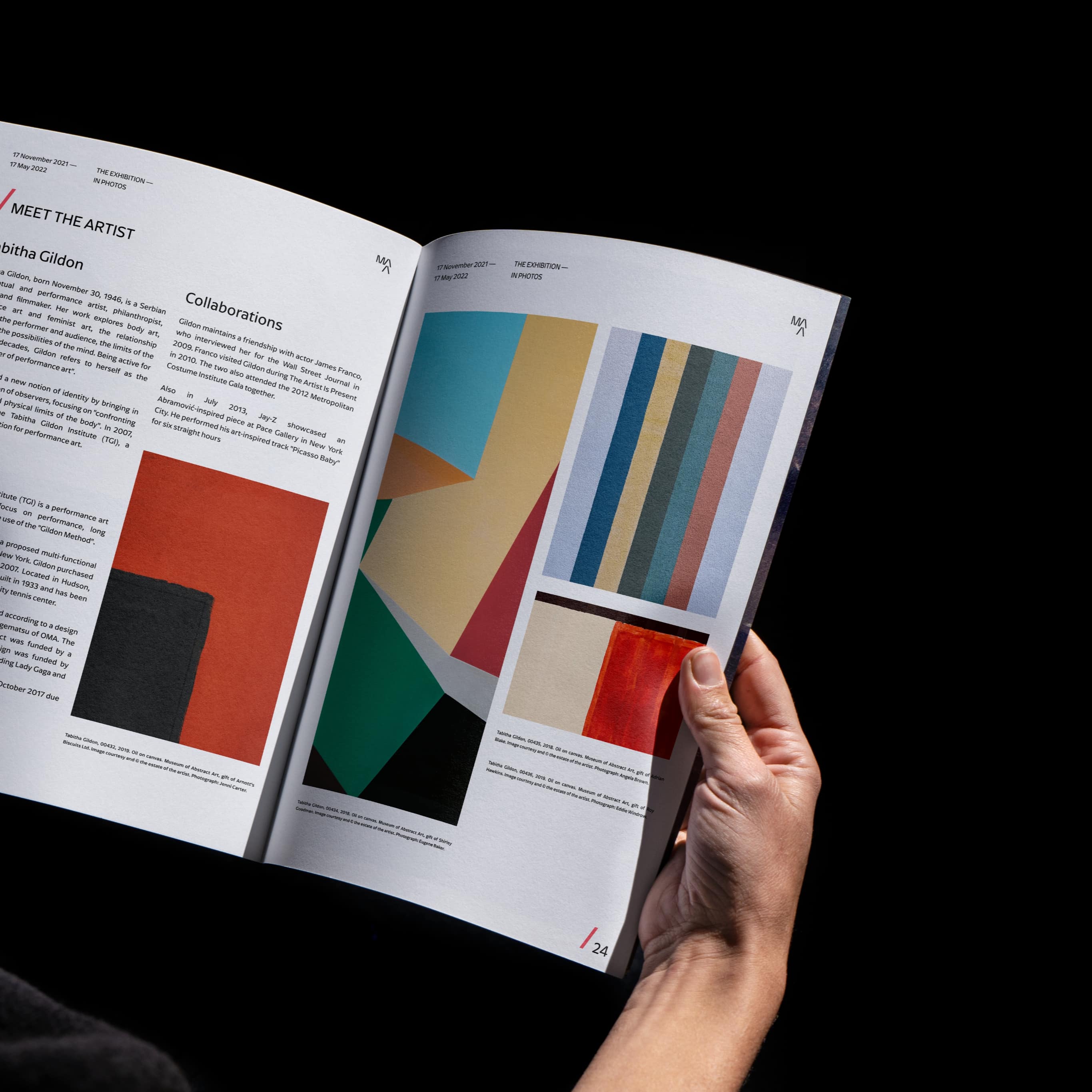
This project experiment the areas of logo design, visual design and web design. The three keywords of this project are Simplicity, Clarity and Elegance. With this case I decided to experiment and come up with a modern and fresh idea for a new logo, visual and UI design for an hypothetical Museum of Abstract Art. Starting from the fact that in Belgium is present a Museum of Abstract art, I decided to located it there. This visual design case sees the slash symbol as the protagonist of the whole brand identity: I have in fact played with the letter composition (MAA) and the colours black red and white using the recurring slash shape in the website, printed book and posters. The slash symbol indicates either the presence of a link, button, or path of the website. The simple architectural structure of the website allows the user to find all the information at a glance: the website provides information and details in an extremely direct way, providing always the location of the user in the site. The typeface used for this project is Arpona Sans (Regular, Medium, Light) by Felix Braden. The logo as well has been originated from this typeface and later on customised.

CREDIT
- Agency/Creative: Cristian Zennaro
- Article Title: Student Concept Branding for Museum of Abstract Art
- Organisation/Entity: Student
- Project Type: Graphic
- Project Status: Published
- Agency/Creative Country: Netherlands
- Agency/Creative City: Amsterdam
- Market Region: Europe
- Project Deliverables: Brand Design, Brand Experience, Brand Identity, Digital Art, User Experience, User Interaction, Web Design
- Industry: Entertainment
- Keywords: Museum, Art, Exhibition
-
Credits:
Student Designer: Cristian Zennaro


