Overview — Teatro del Maggio is a premier opera and music venue in Florence, Italy that hosts a range of operas, concerts, dance performances, and school shows. The theater’s namesake originates from the Maggio Musicale Fiorentino, the third oldest opera and symphony festival in Europe dating back to 1933. This festival serves as a center of dissemination for modern and contemporary European musical culture, proposing unconventional ideas and interdisciplinary performance arts. While the festival’s origins date back to the early 20th century, Teatro del Maggio was inaugurated in 2011 to provide a new home for the festival along with the orchestra and chorus of the Maggio Musicale Fiorentino.
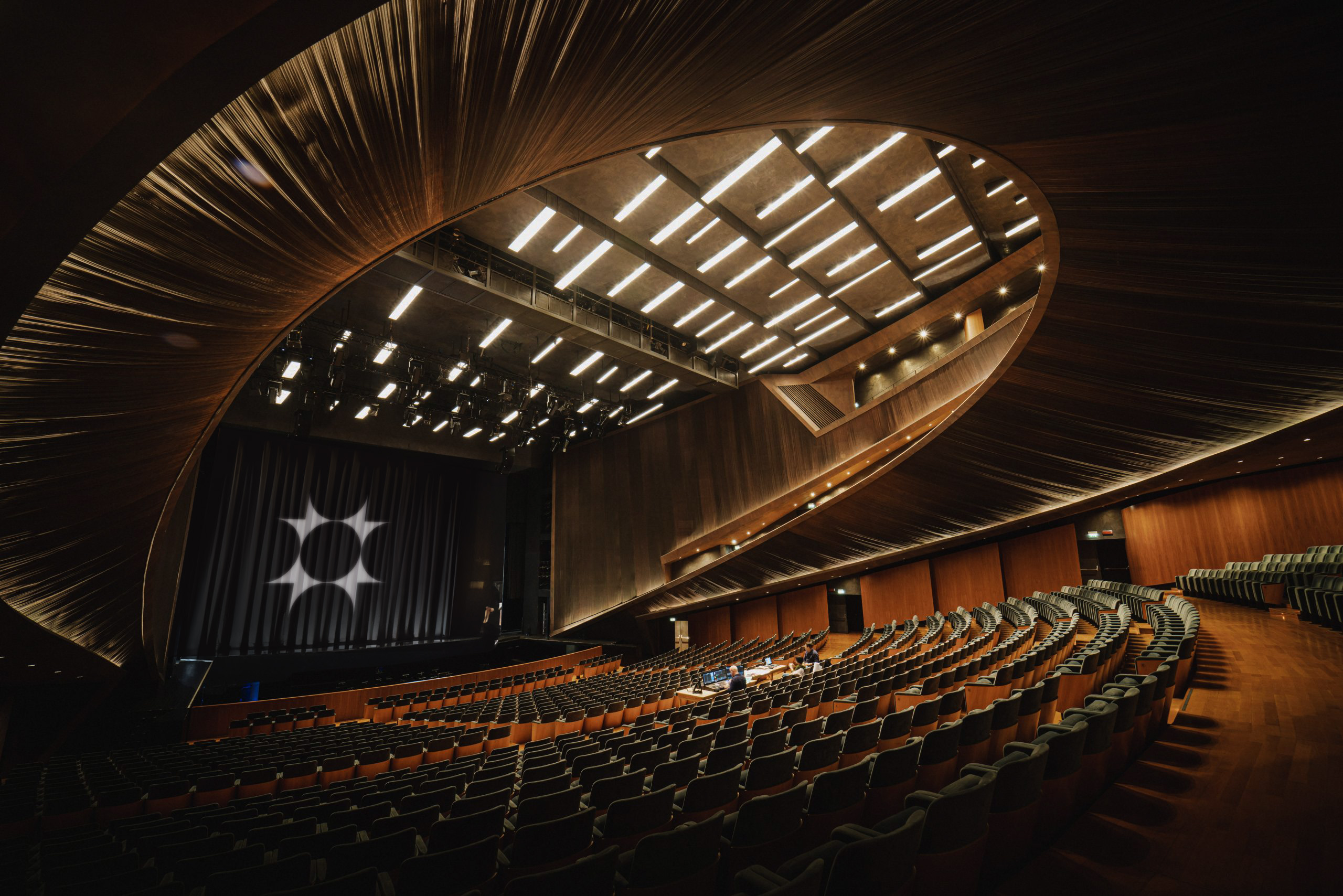
Architecture — Designed by the renowned architect Paolo Desideri, the theater is a innovative work of contemporary architecture that reflects a blend of contemporary aesthetics with a respect for classical traditions. The exterior is modern and geometric, consisting of rectangular forms that establish a sense of balance and dynamism that culminate in a prominent facade at the entrance. The interior continues the geometric shapes through the curved balconies, seating arrangement, and ornamental features. The auditorium is the prime example of these curved shapes. To align with traditional opera houses, the auditorium is shaped like a horseshoe, which curves echo the arrangement of an orchestra and contrast the rectangular shapes of the exterior facade. The auditorium is also modular, making the room compatible for smaller events and performances.
Challenge — Teatro del Maggio, which serves as a home for contemporary performance arts, has struggled to find a visual identity system that aligns with the theater’s contemporary architecture while differentiating itself from other Florentine organizations.
Solution — My proposal for the rebranding of Teatro del Maggio aims at differentiating the theater through an identity system inspired by the theater’s contemporary architecture, performance spaces, and programming.
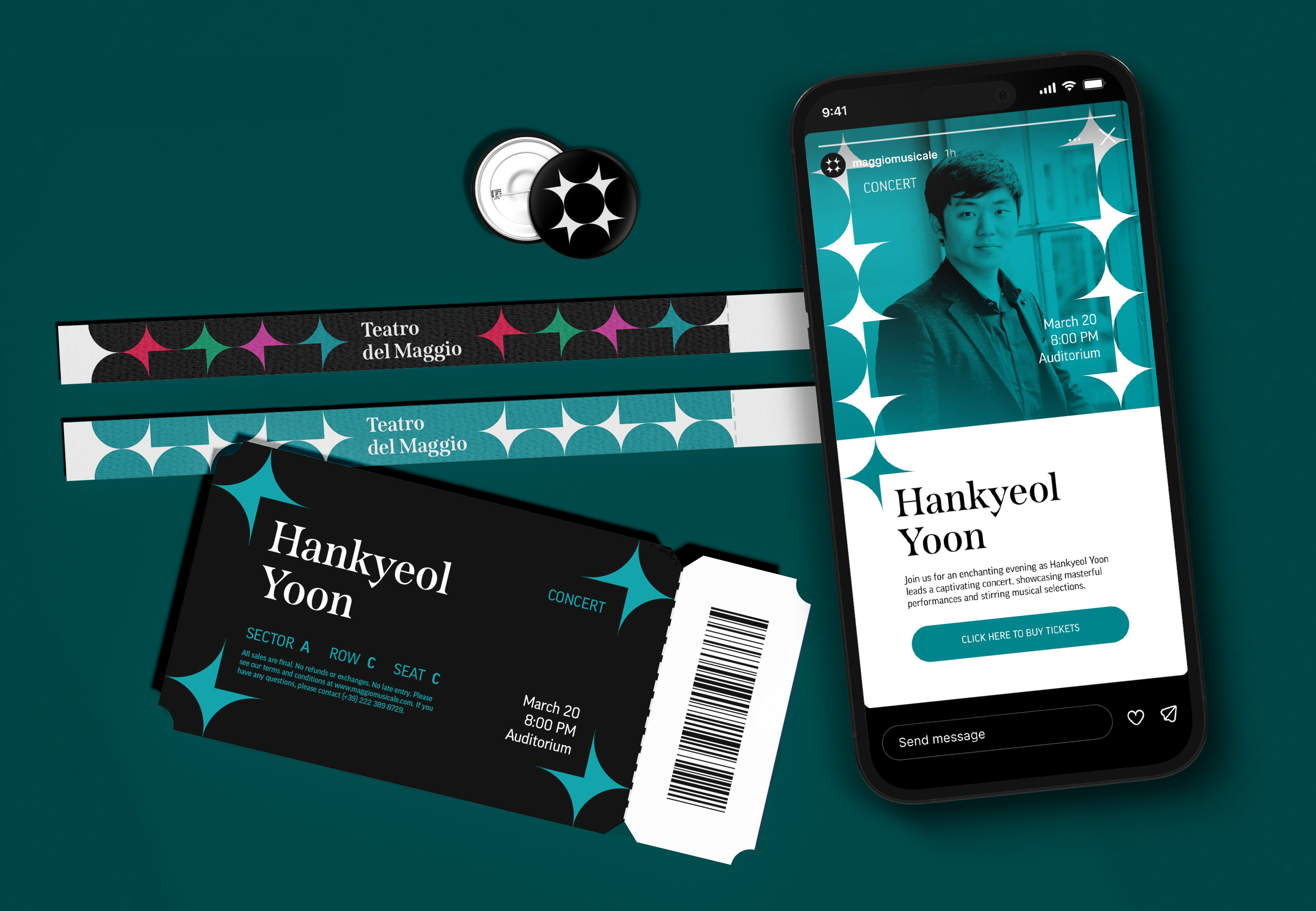
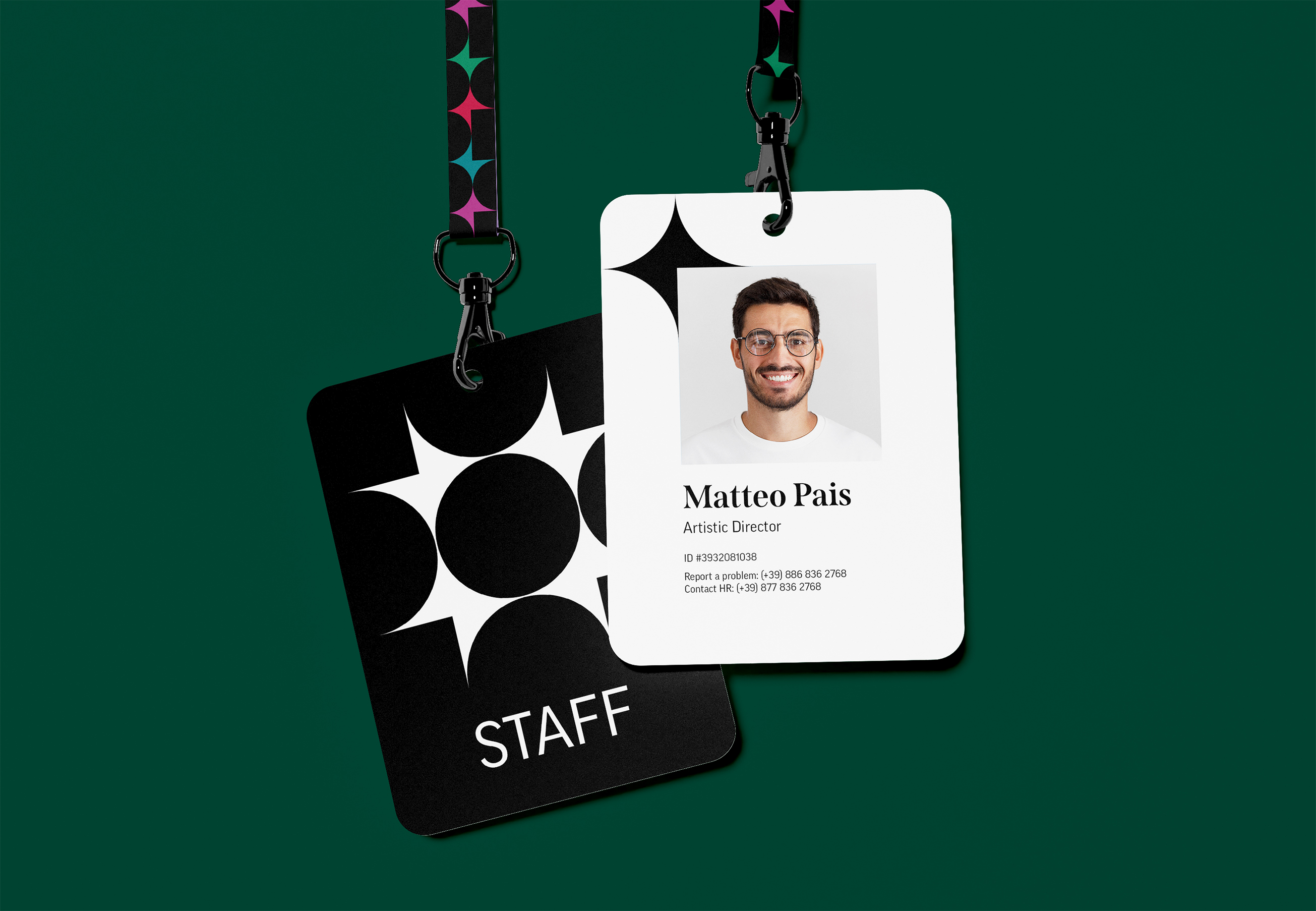
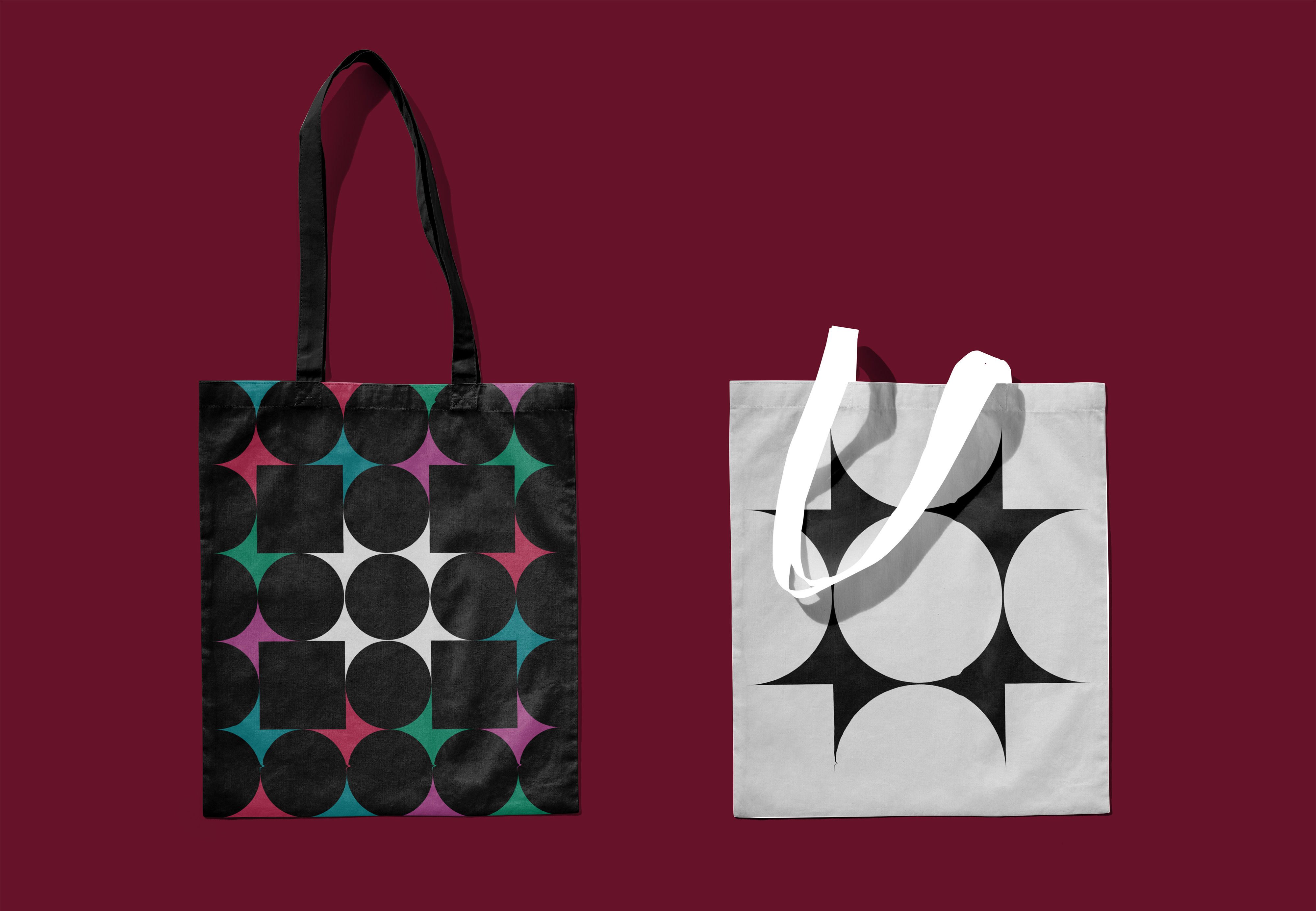
Logo: The logo is derived from the curved and rectangular forms in the theater’s architecture. The curved, semi-oval forms alludes to different facets of the interior, such as the the horseshoe-shaped galleries of the auditorium, the curved foyer, and the arrangement of the orchestra. The rectangular forms allude to the geometric exterior and prominent facade. The final logo is comprised of one element that reflects four times to form a circle, representing the four types of performances that primarily occur at the theater. This reflection of the element is also used as the primary behavior in motion design.
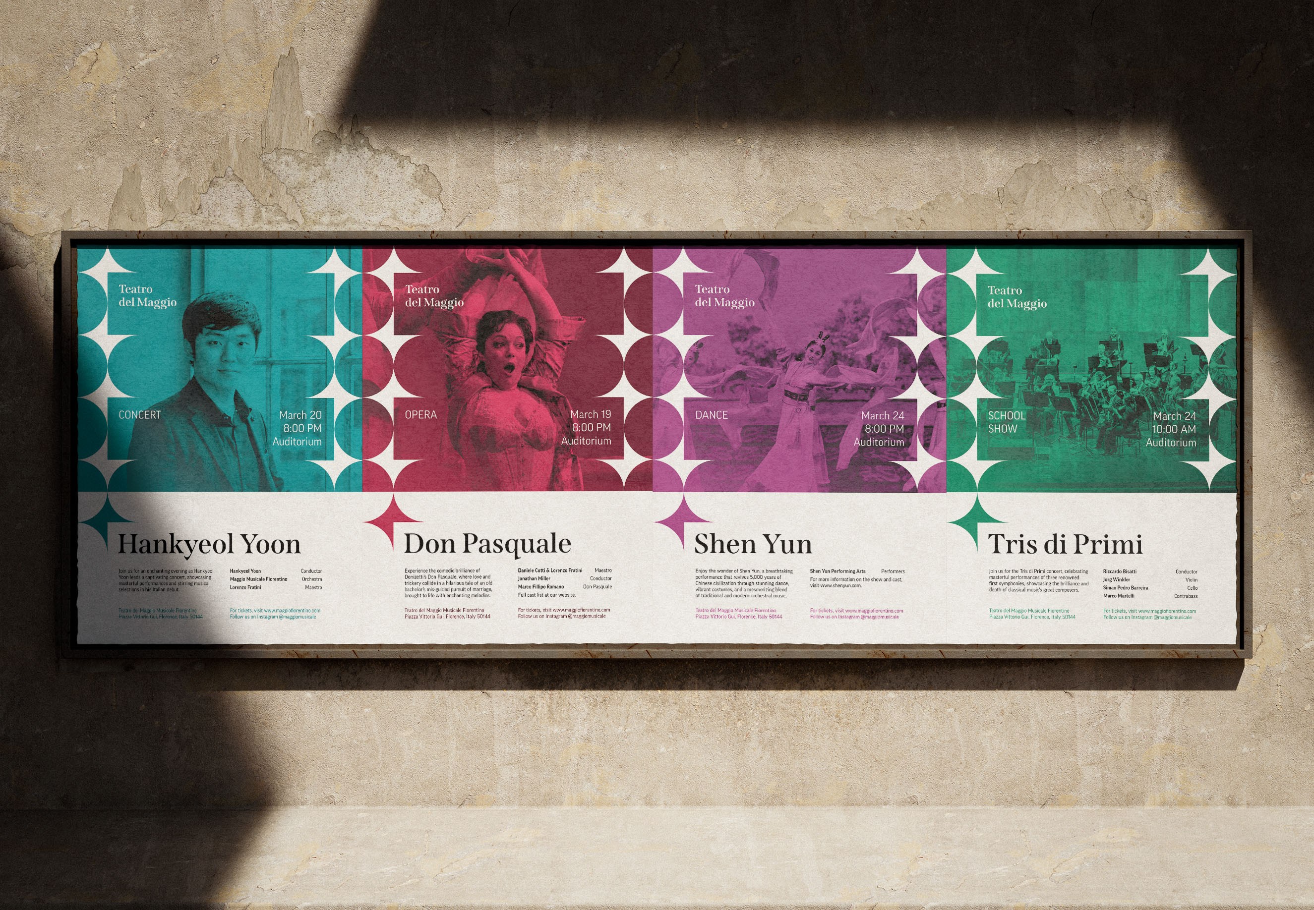
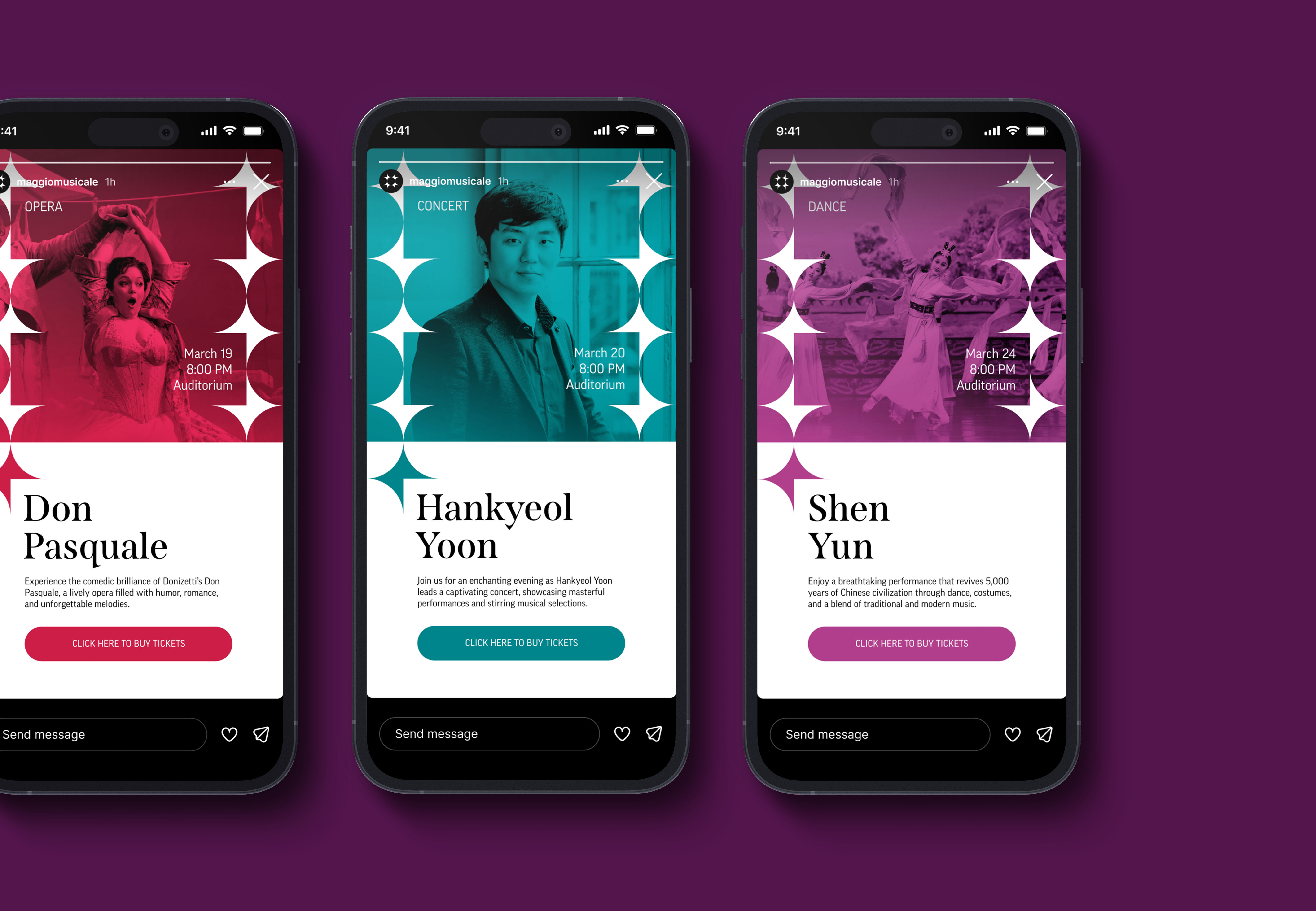
Design Elements: The primary design element in the identity system is one of the four elements in the logo. The sharp perpendicular side of the element is used to frame text and imagery across different mediums, providing a recognizable, consistent branding element. For example, the element is used to frame the performer’s name and other text while bordering the image in the poster. When not creating the complete logo or framing the primary heading, this design element should be placed adjacent to the side of the composition and reflected perfectly to the other side. This choice promotes consistency across different media and allows for motion, specifically the reflecting element behavior, to be easily applied across the design system. With the use of the design element, it is not necessary to use the full logo because the design element is distinct by itself, it is repetitive to add the full logo, and if desired the logo can be formed by adjoining posters.
Color: The theater’s color palette consists of black, white, and a color designated for the types of performances — blue represents concerts, red represents opera, purple represents dance, and green represents school shows. The theater generally has a one opera and one to two concerts per week, so this color system allows the public to clearly identify the type of performance for the given week.
Impact — The proposed identity for Teatro del Maggio will provide differentiation from Florentine organizations, consistency across a variety of media, and cohesion between the theater’s architecture, programming, and visual identity.

CREDIT
- Agency/Creative: Sean Brosnahan
- Article Title: Student Concept Brand Redesign for Teatro del Maggio by Sean Brosnahan
- Organisation/Entity: Student
- Project Type: Identity
- Project Status: Non Published
- Agency/Creative Country: United States
- Agency/Creative City: St. Louis
- Market Region: Europe
- Project Deliverables: Brand Redesign
- Industry: Entertainment
- Keywords: WBDS Student design Awards 2024/25 , Redesign
-
Credits:
Educator's Name: Silvia Agozzino
Educational Institution: Washington University in St. Louis - Sam Fox School of Visual Art and Design - Communication Design


