Project Overview
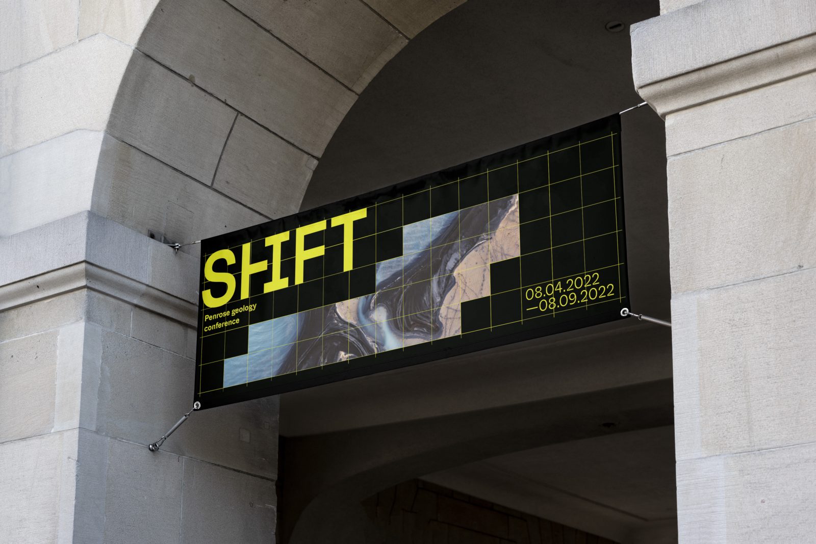
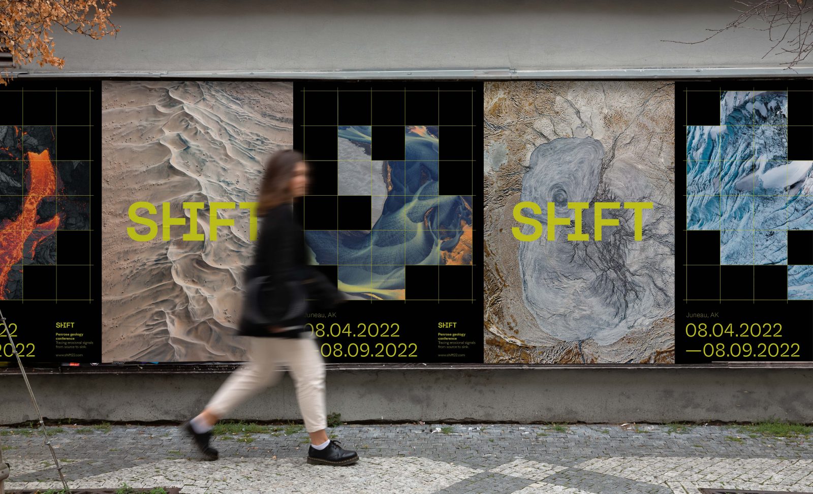
The Penrose Geology Conference is an annual conference that focuses on leading research in the field of geology. The theme Shift was chosen for the 2022 conference that will be focusing on the processes of erosion and sediment transport. The design needed to convey a freshness and technicality which matched the cutting-edge technologies that the conference was centered around. The goal was to create a visual system and identity that would draw the attention of the target audience, geologists and geology students, and differentiate from the bland and predictable branding in the science sector.
The brand identity is a simple wordmark that has a clever ligature between the H and I characters. This ligature gives the mark a unique quality, while still retaining readability and strong kerning. The simple mark helps give flexibility to be used over photos and in complex environments.
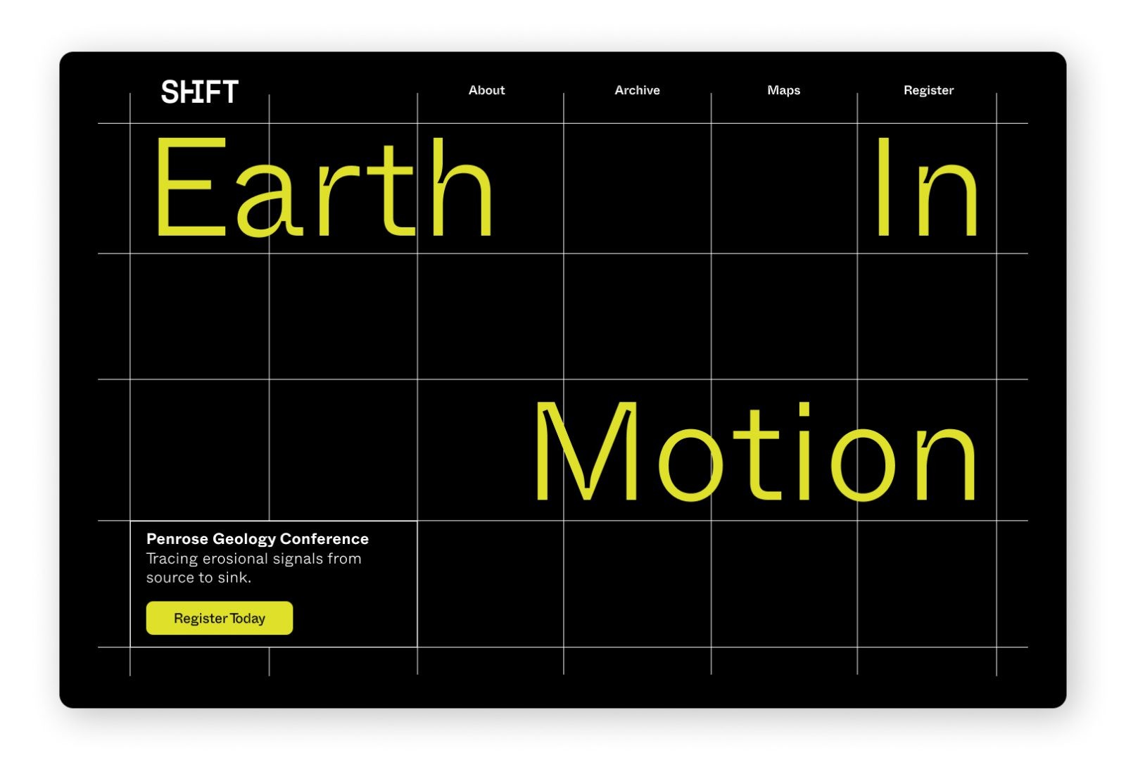
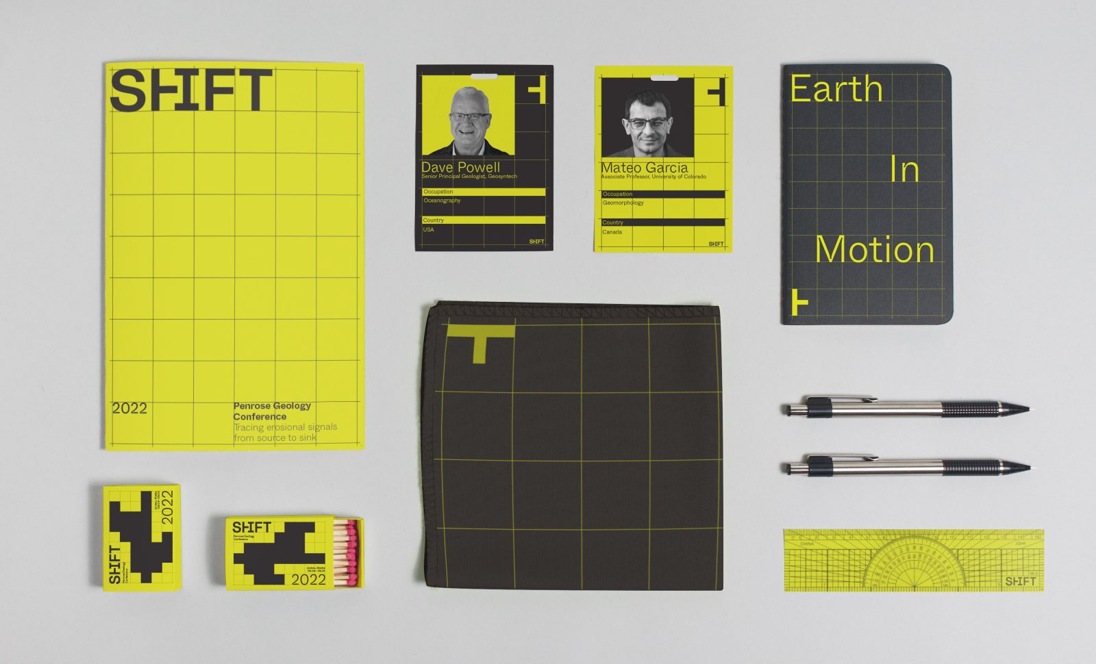
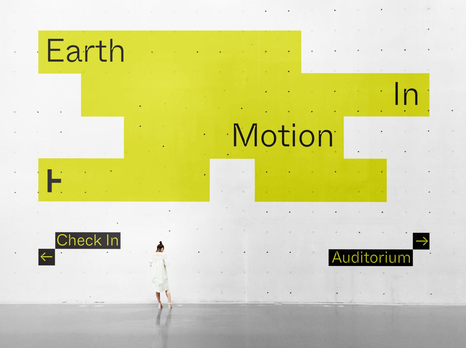
Conference collateral makes use of the Whyte typeface family, which provides an inktrap variant for bold headlines, and a regular version for dependable body copy. This unified type strategy gives the conference a minimalist quality, without being boring. A bright yellow color is used with a warm dark neutral as a distinctive and differentiating element for the brand. Grid elements are used—layered with type, image, and block elements—giving the conference materials a structured, rational, but also edgy appearance. Designed to be simple and straightforward, the website makes all necessary information readily accessible to users.
Conference Program
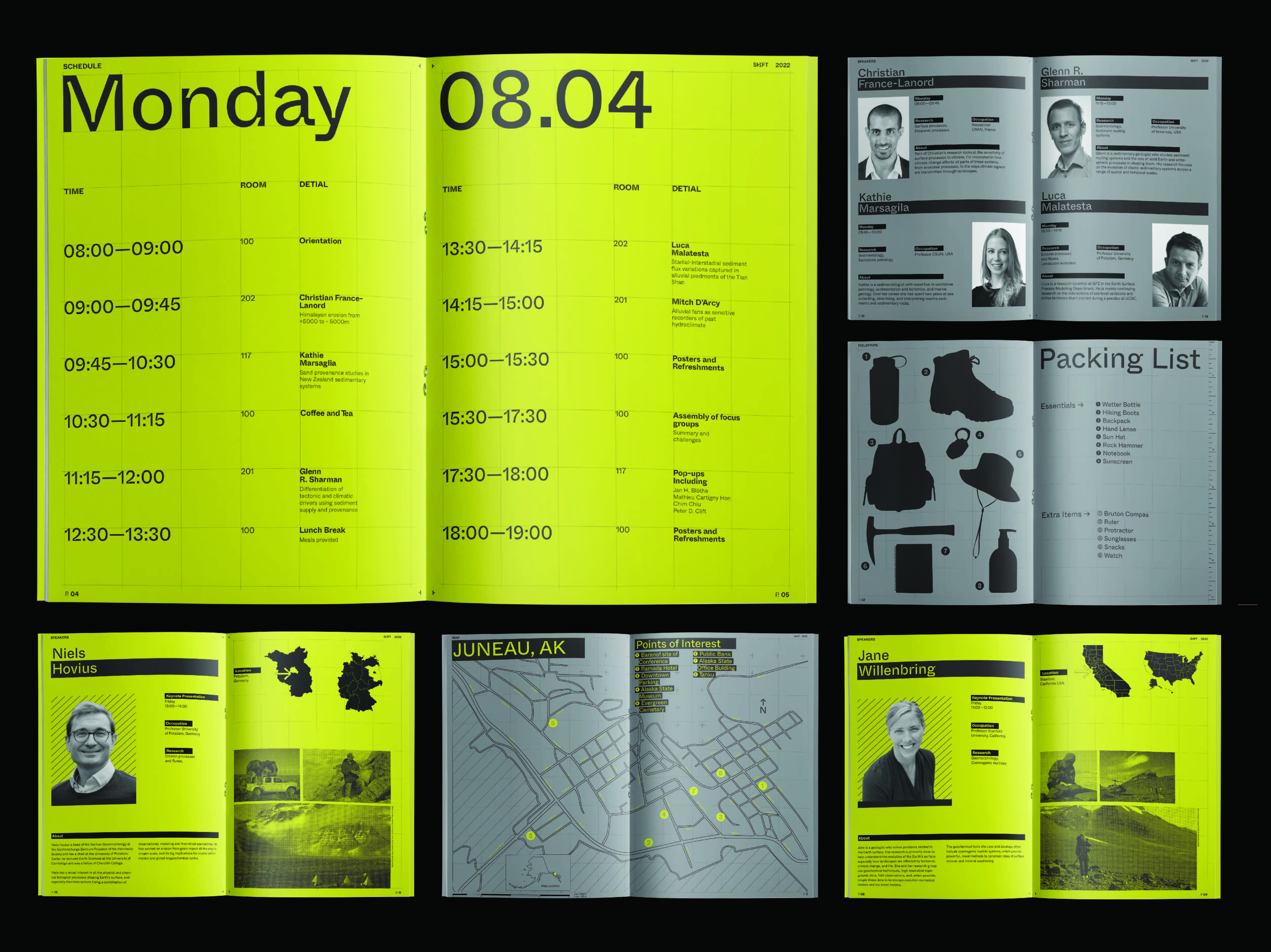
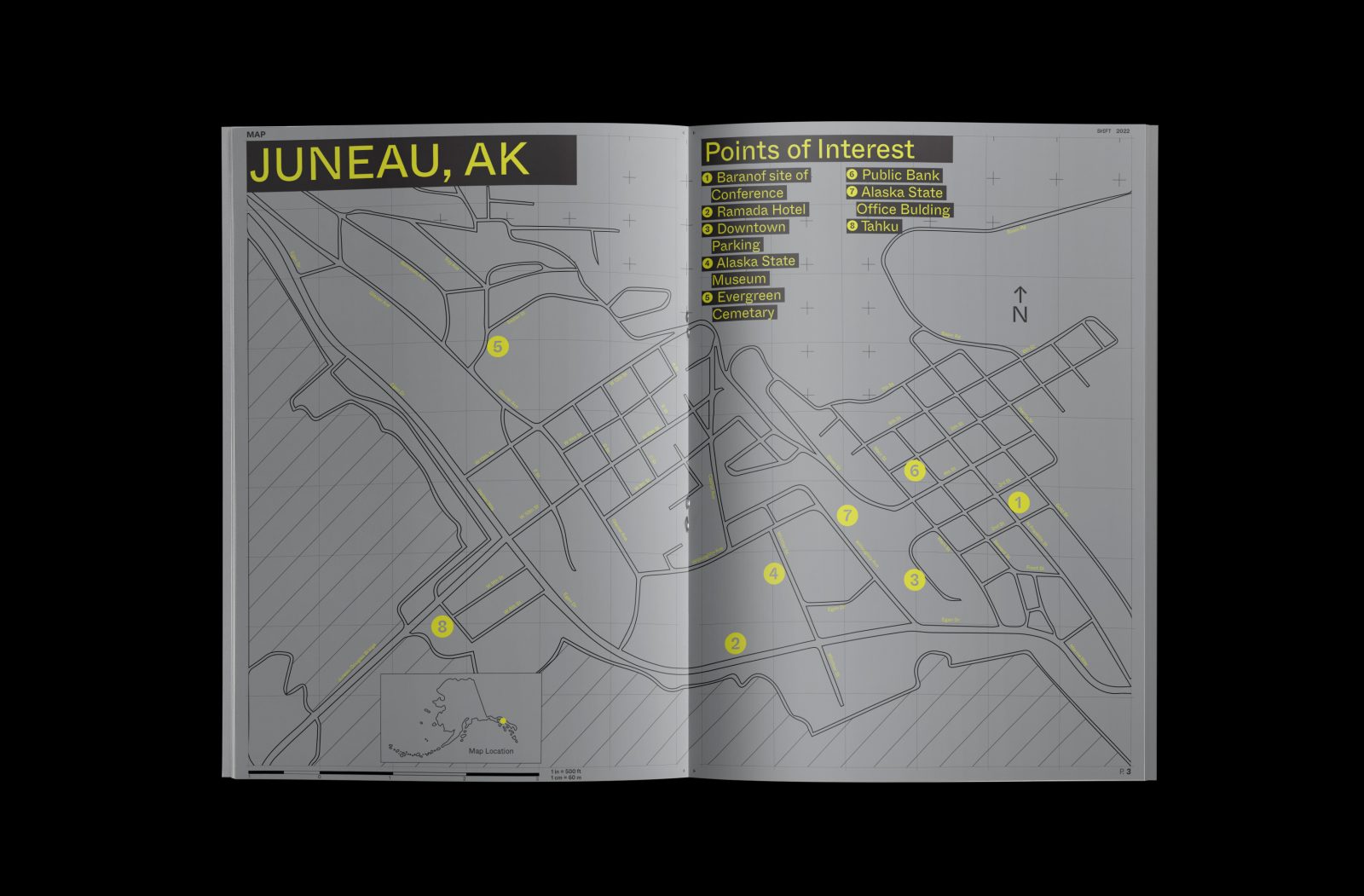
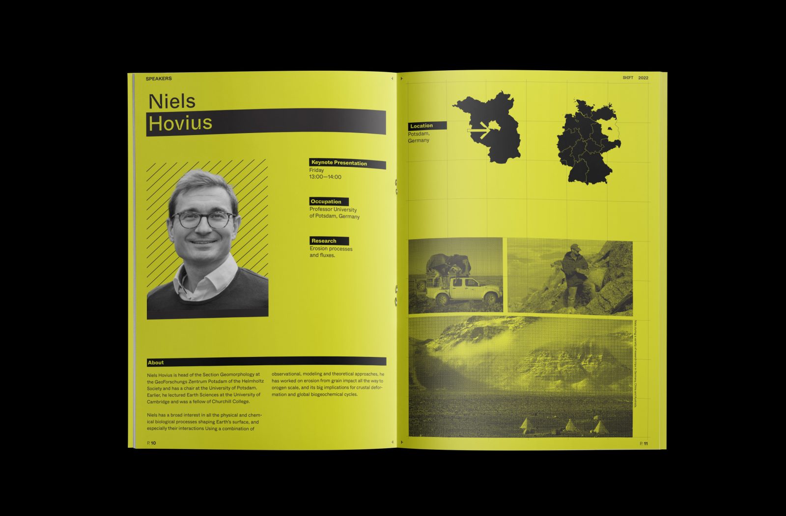
The program was designed over a 6×8 grid giving a rational technical feel that reinforces the theme of the conference. Simple hierarchy and structure help convey information at a glance. Speaker portraits were cut out and treated black and white to give them a unified appearance. Subtle icons, text highlights, and silhouette images give the program a bold graphic quality.
CREDIT
- Agency/Creative: Jonathan Welch
- Article Title: Student Branding Concept for Shift Conference
- Organisation/Entity: Student
- Project Type: Graphic
- Project Status: Non Published
- Agency/Creative Country: United States of America
- Agency/Creative City: San Diego
- Project Deliverables: Brand Design, Branding, Graphic Design, Typography
- Industry: Education, Entertainment
- Keywords: WBDS Student Design Awards 2022/23
-
Credits:
Educational Institution : San Diego City College - Sean Bacon and Bradford Prairie - Graphic Design


