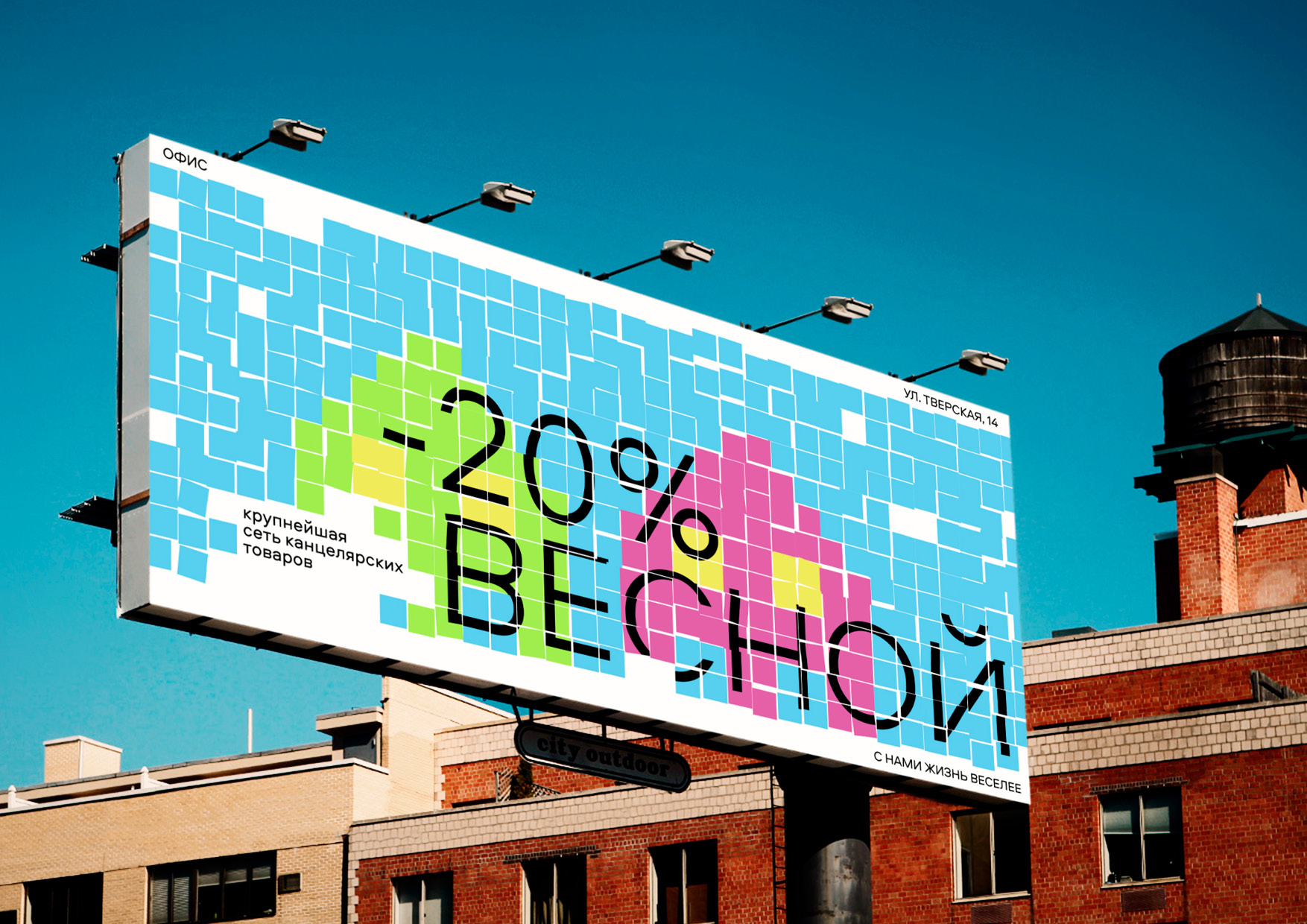
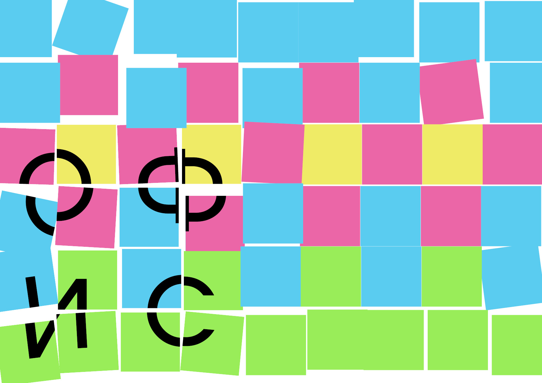
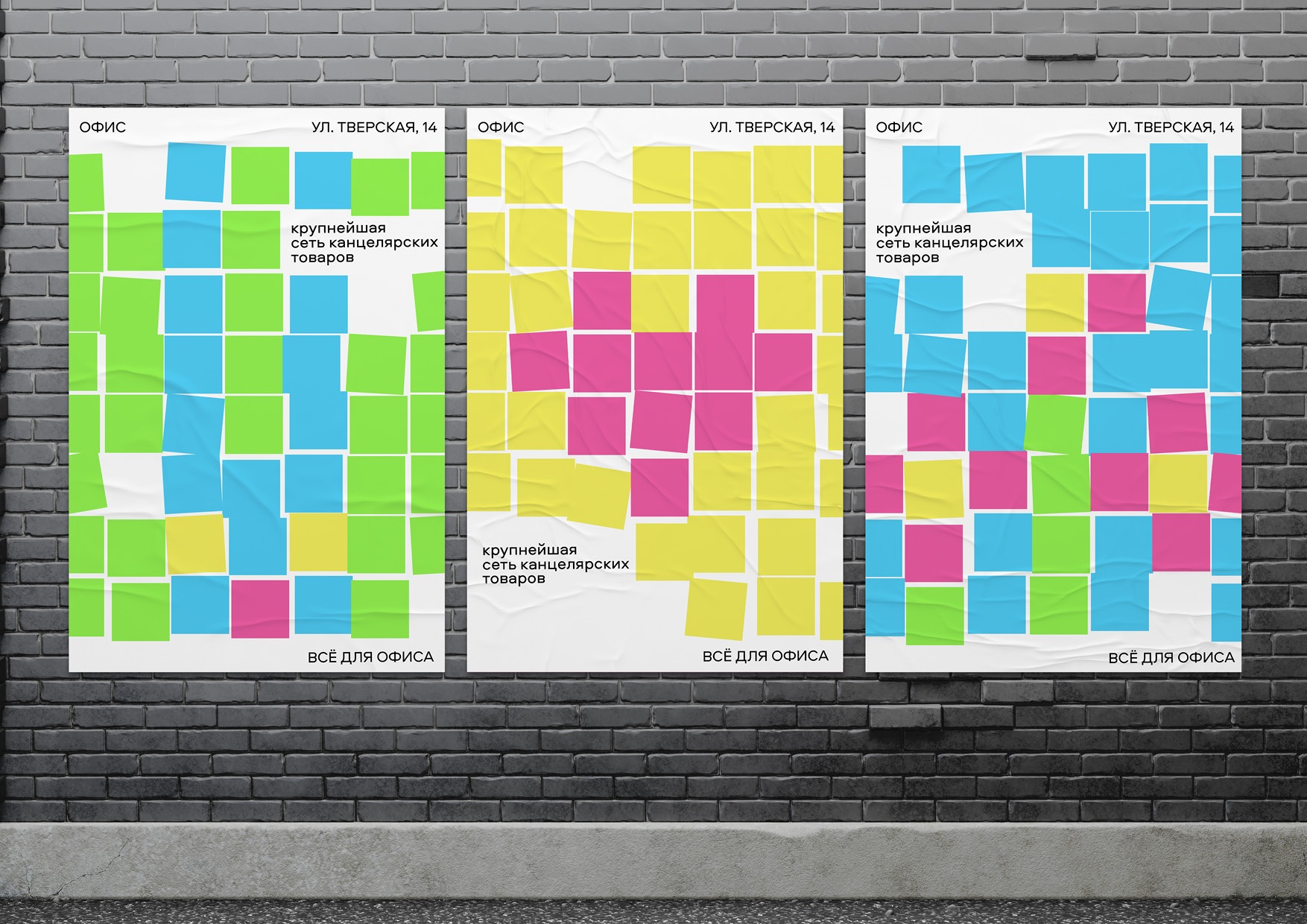
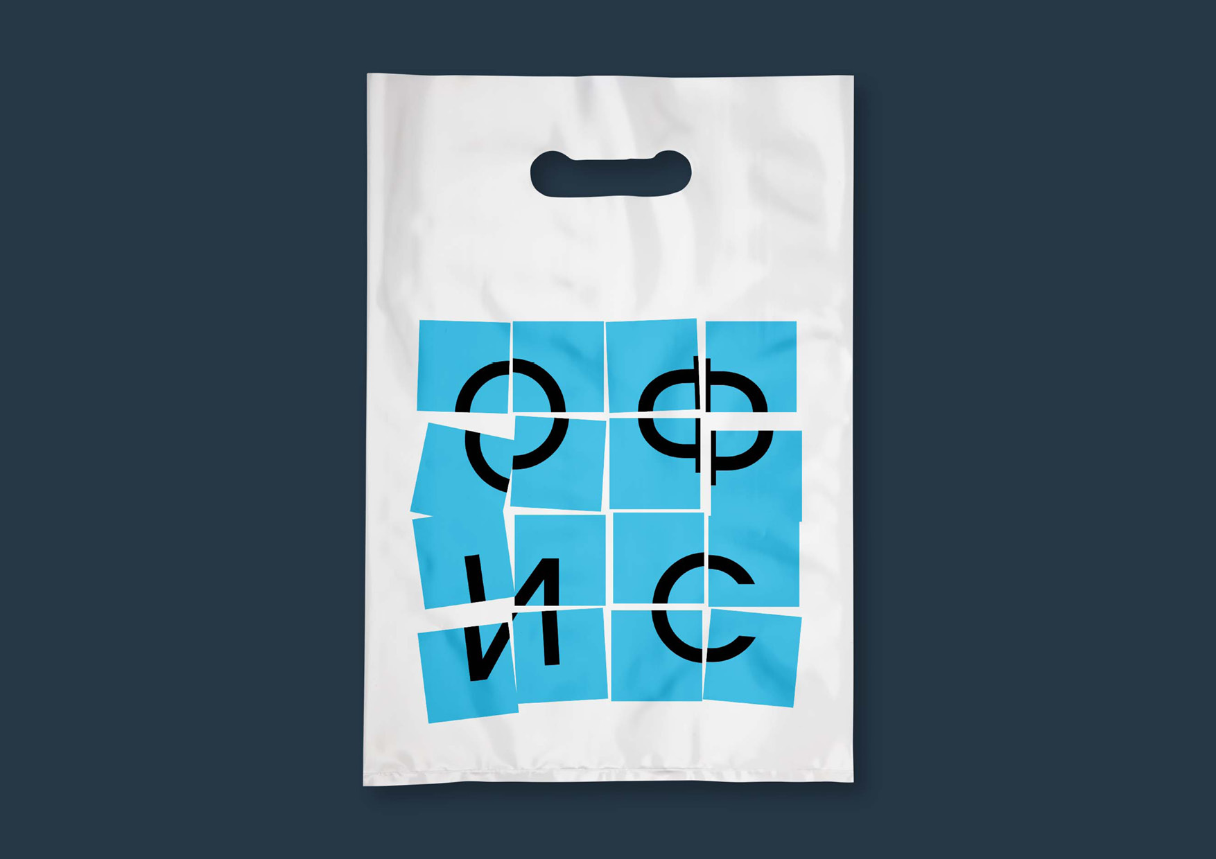
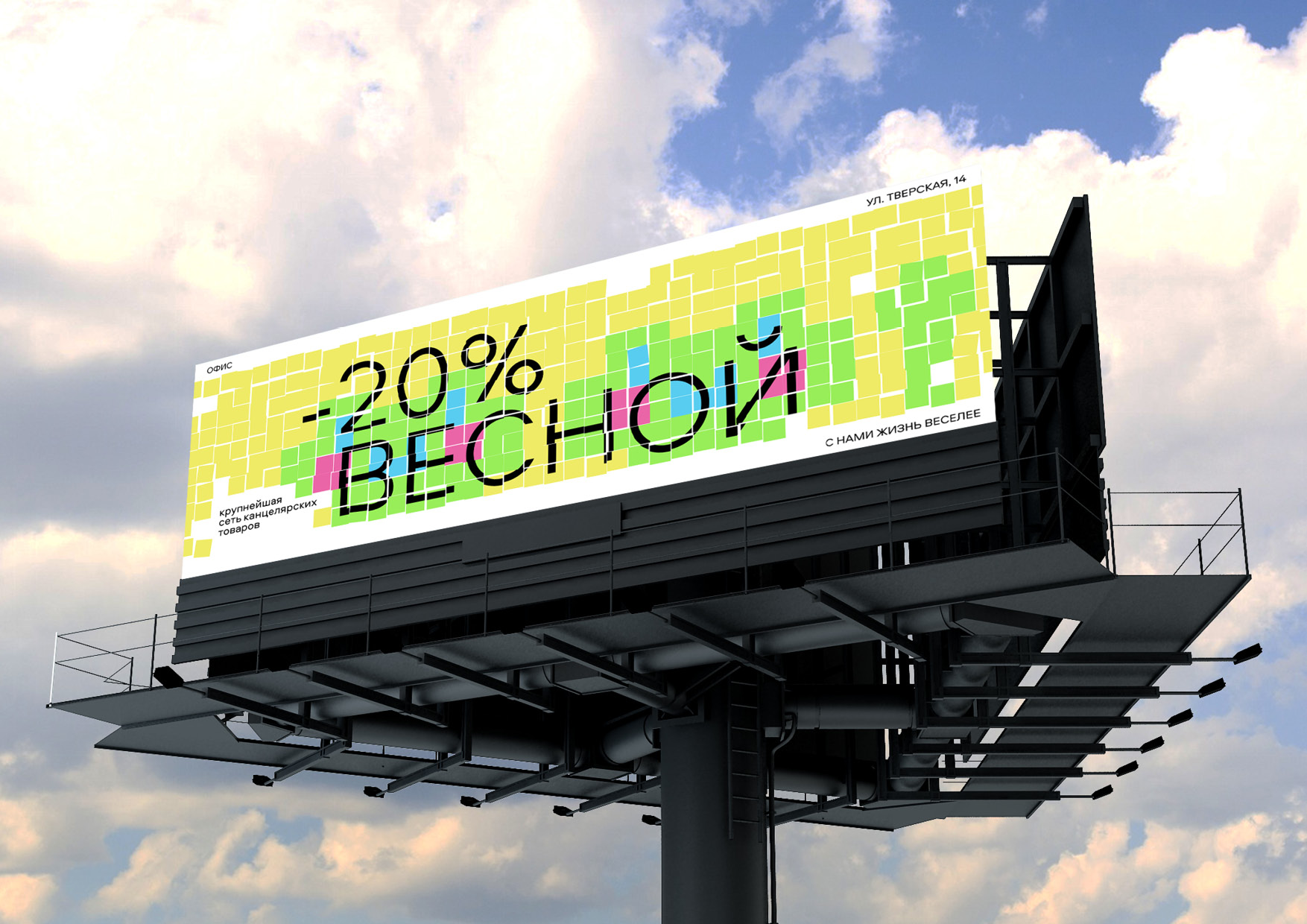
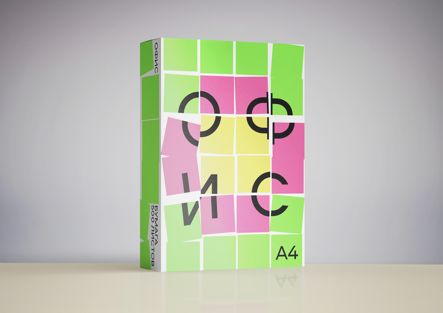
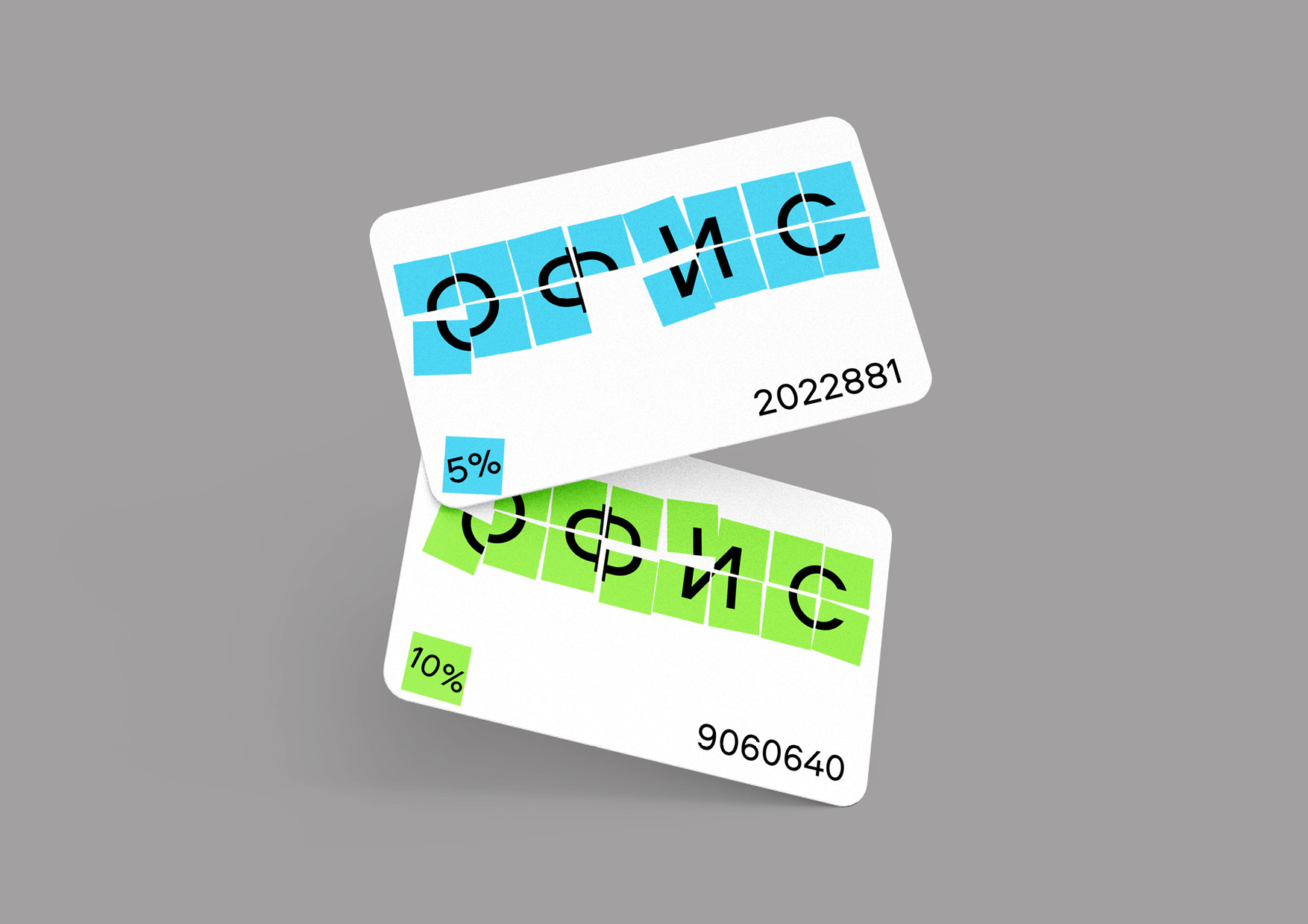
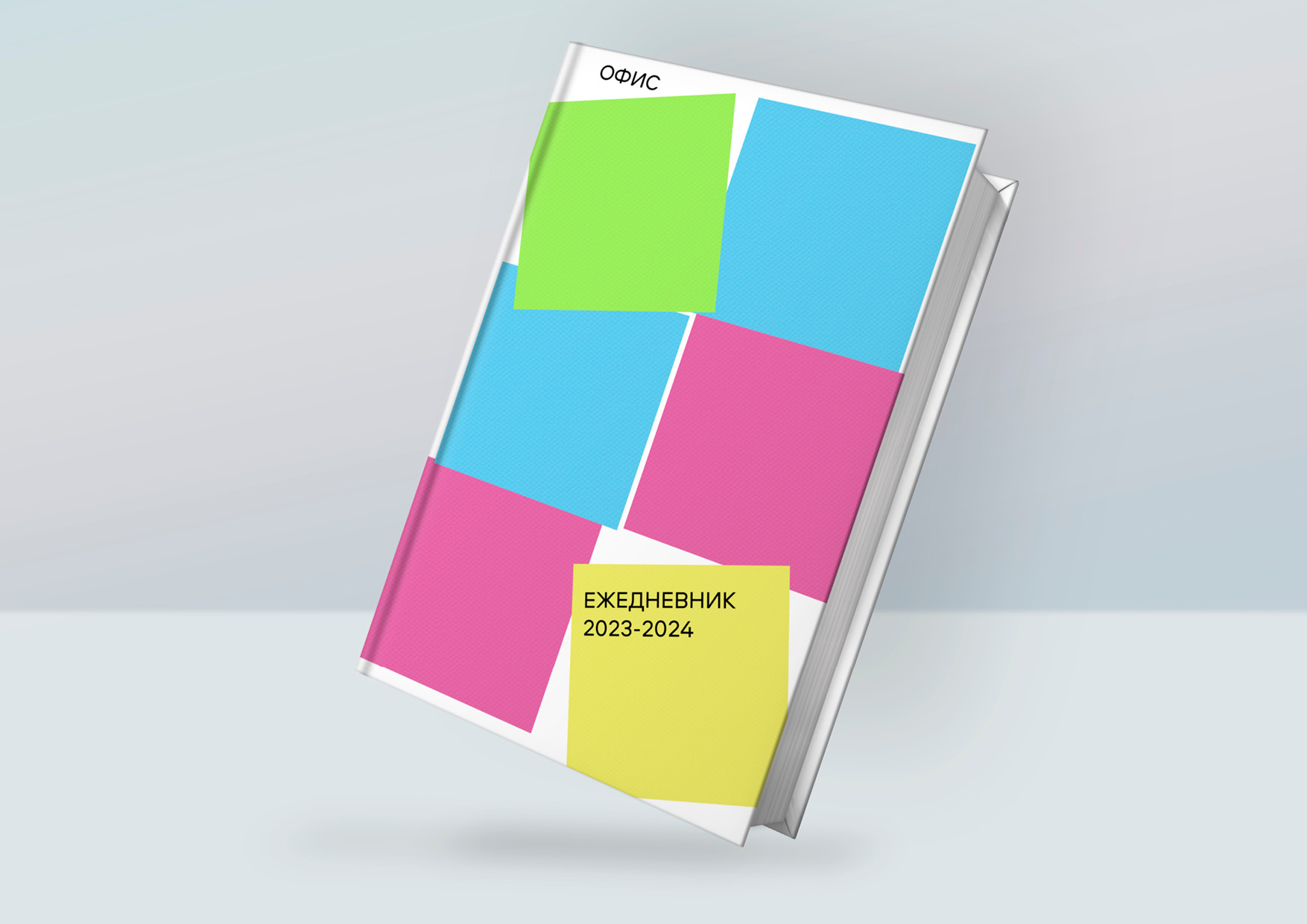
The identity for the “Office” stationery store is based on the corporate culture of collecting pictures from sticky colored stickers. Stickers are a necessary thing for office work. They help you make the necessary notes so that you don’t forget anything in a difficult job. What is noteworthy is that stickers exist in different colors, everyone can choose a color to their liking.
Based on this parameter, it occurred to people to collect pixel images from them. Based on the allowed area for a bright mosaic, it is possible to assemble from a low-detailed to an ultra-detailed picture. The advantage of stickers is that they can be easily peeled off, this fact gives a scope to creativity and removes the fear of making a dirty surface with an ugly picture and makes it possible to change and reassemble the image. Thus, you can change the look of a boring office every week.
Many office employees have a creative streak that just needs to be developed. This is useful not only for developing creativity in work, but also in preventing depression at the workplace. Also, collecting stickers is a team effort, since it takes a very long time to assemble a large panel by one. This activity can become a good tradition and help build wonderful relationships in the company.
In addition, sticky stickers are not expensive, but the impression of collecting a picture will remain a warm memory. Often, offices look gray and unsightly, which creates an unpleasant feeling during a long working day. Collecting pictures from sticky stickers has found a response in many large offices, where it is very boring to do only work. Such a gesture in the identity defuses the strict office atmosphere and allows you to enjoy the colors of life. An important point in the graphic language is that office stickers can be torn off and written on them, this is what the visual style is built on.
CREDIT
- Agency/Creative: Arina Khramova
- Article Title: Student Branding Concept for “Office” Stationery Store
- Organisation/Entity: Student
- Project Type: Identity
- Project Status: Non Published
- Agency/Creative Country: Russia
- Agency/Creative City: Moscow
- Market Region: Europe
- Project Deliverables: Identity System, Typography
- Industry: Retail
- Keywords: HSE Art and design school
-
Credits:
Art Director: Leonid Slavin
Educational Institution: HSE Art & Design


