


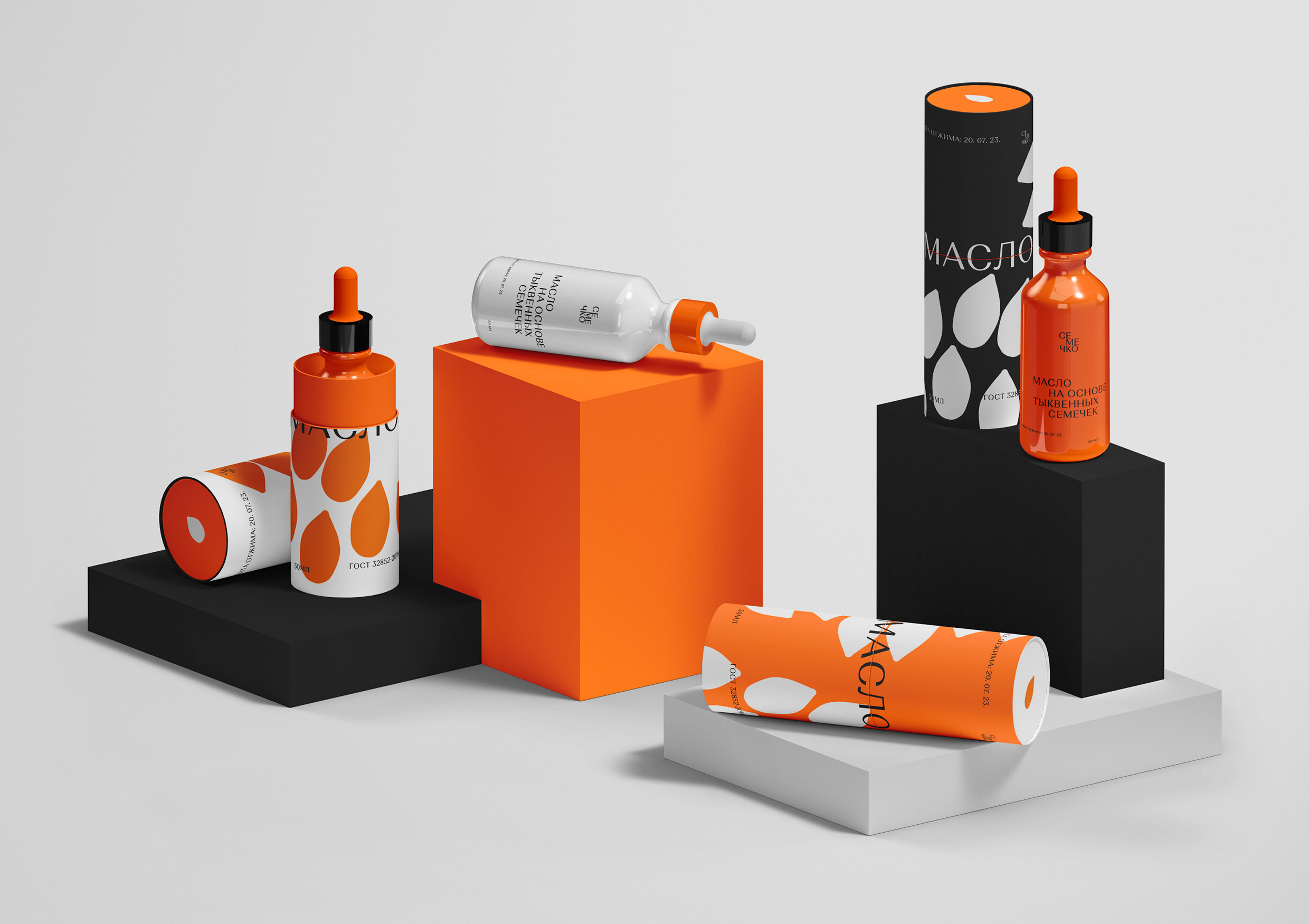
SEMECHKO is a conceptual project of the brand identity of a company that manufactures cosmetic care products based on seed oils of vegetables, fruits and berries growing in Russia. The company creates organic cosmetics that protect and restore the skin in the conditions of life in the city, where human health is affected by many environmental factors. Poor quality of food and water, sudden changes in air temperatures, scorching sun, severe frost, stress and other aspects can cause dryness, the appearance of wounds and cracks and other violations of the integrity of the skin. Body care products with a natural and transparent composition will provide the necessary care. The essence of the brand is eco—friendly cosmetics made from seed oils of Russian vegetables, fruits and berries, which reflects the needs of the target audience – girls aged 15 to 25 years who sometimes feel the harmful effects of the environment and prefer natural and budget skin care.
When creating a corporate identity, the main source of inspiration was the shapes and colors of plant fruits, diverse and bright. Organic cosmetics of Russia gives confidence in the transparency of the composition and peace of mind for your health.
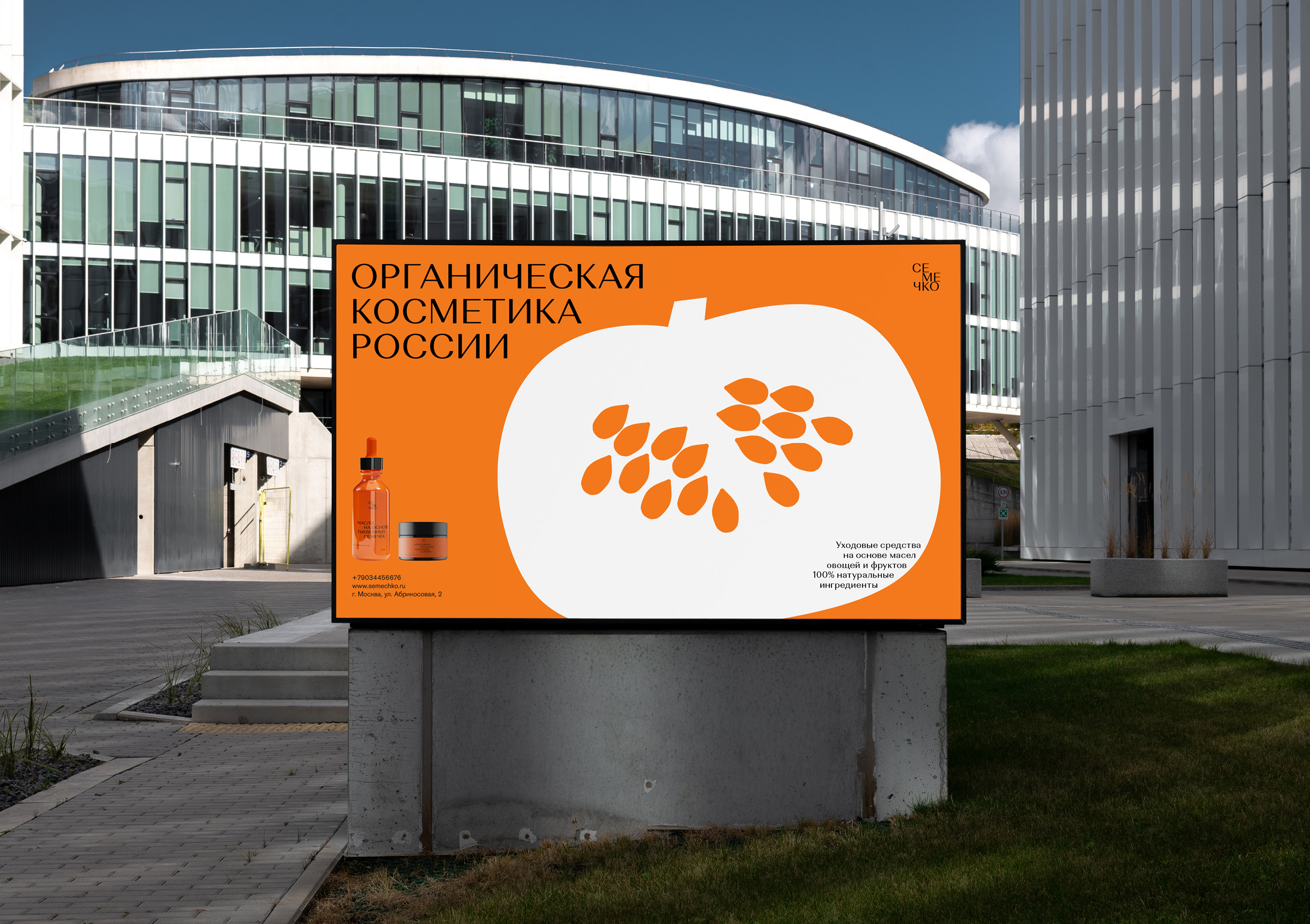
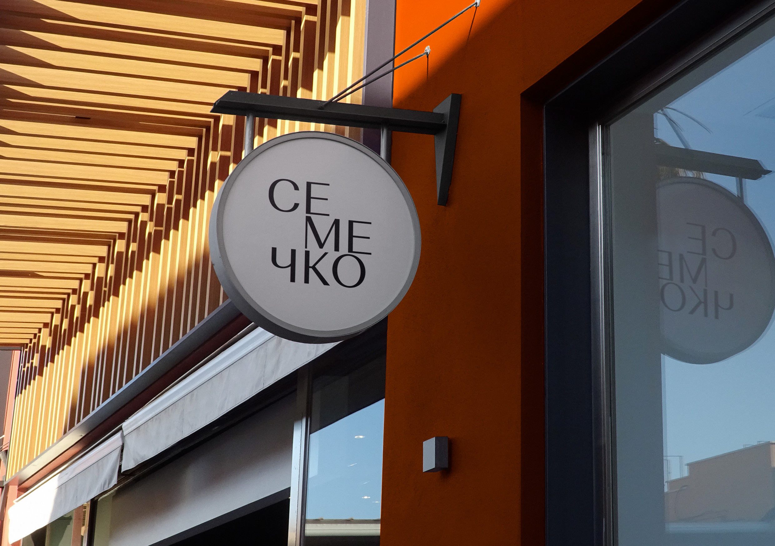
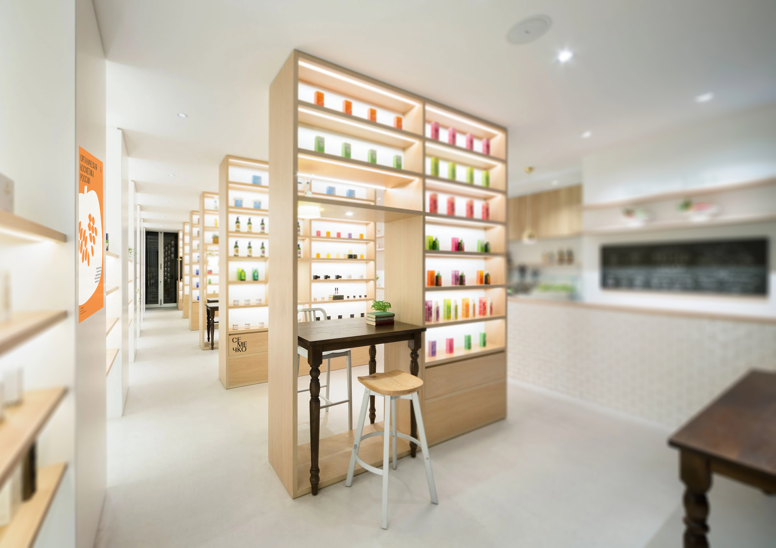
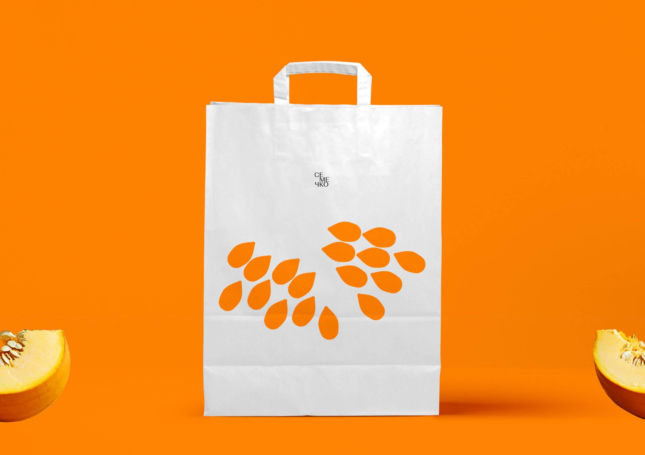
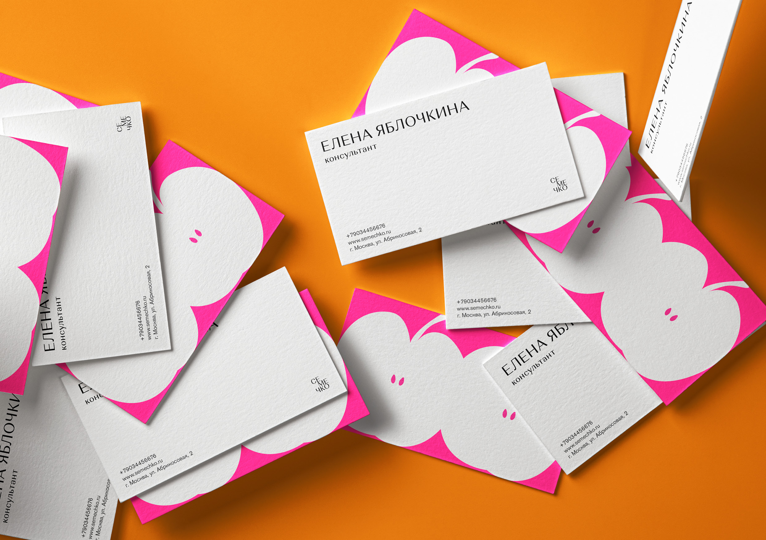
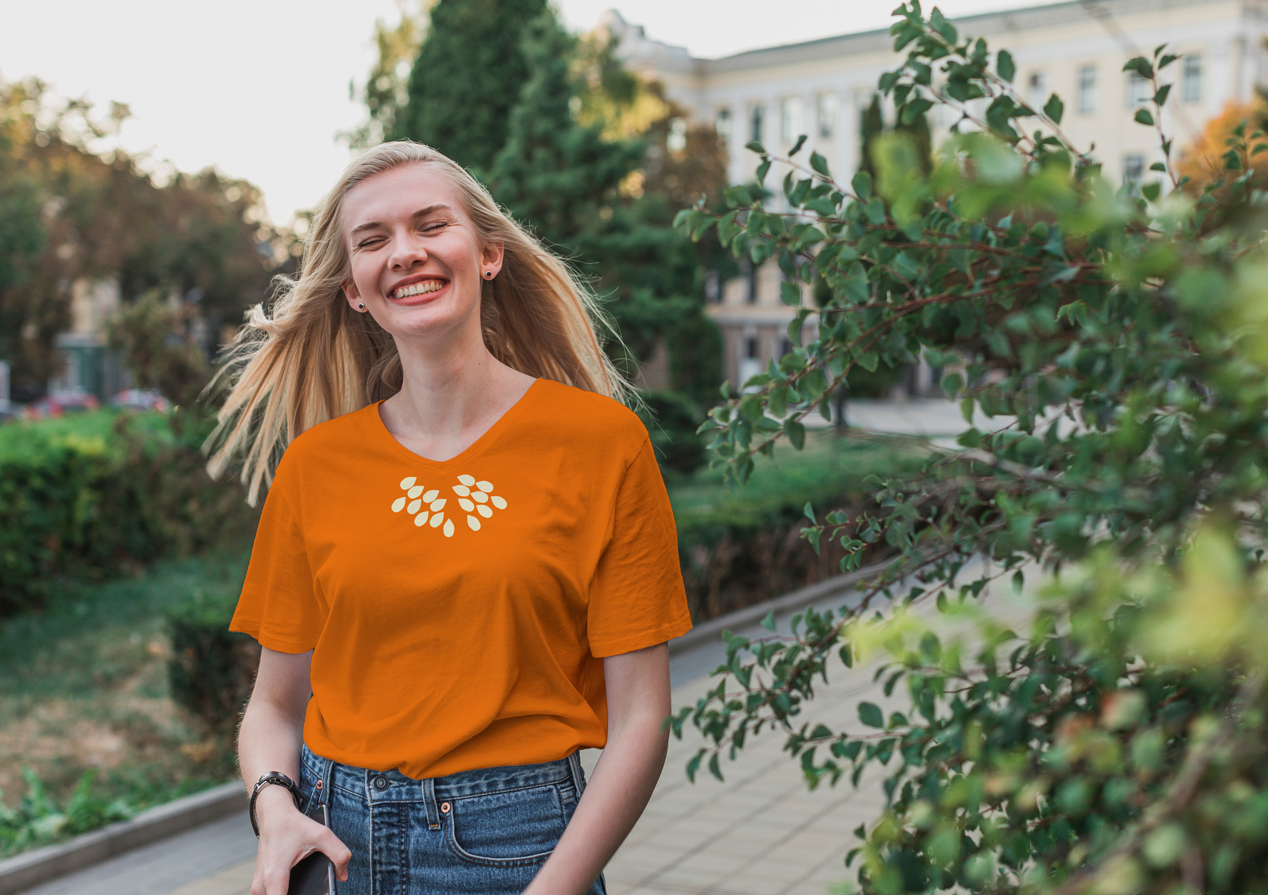
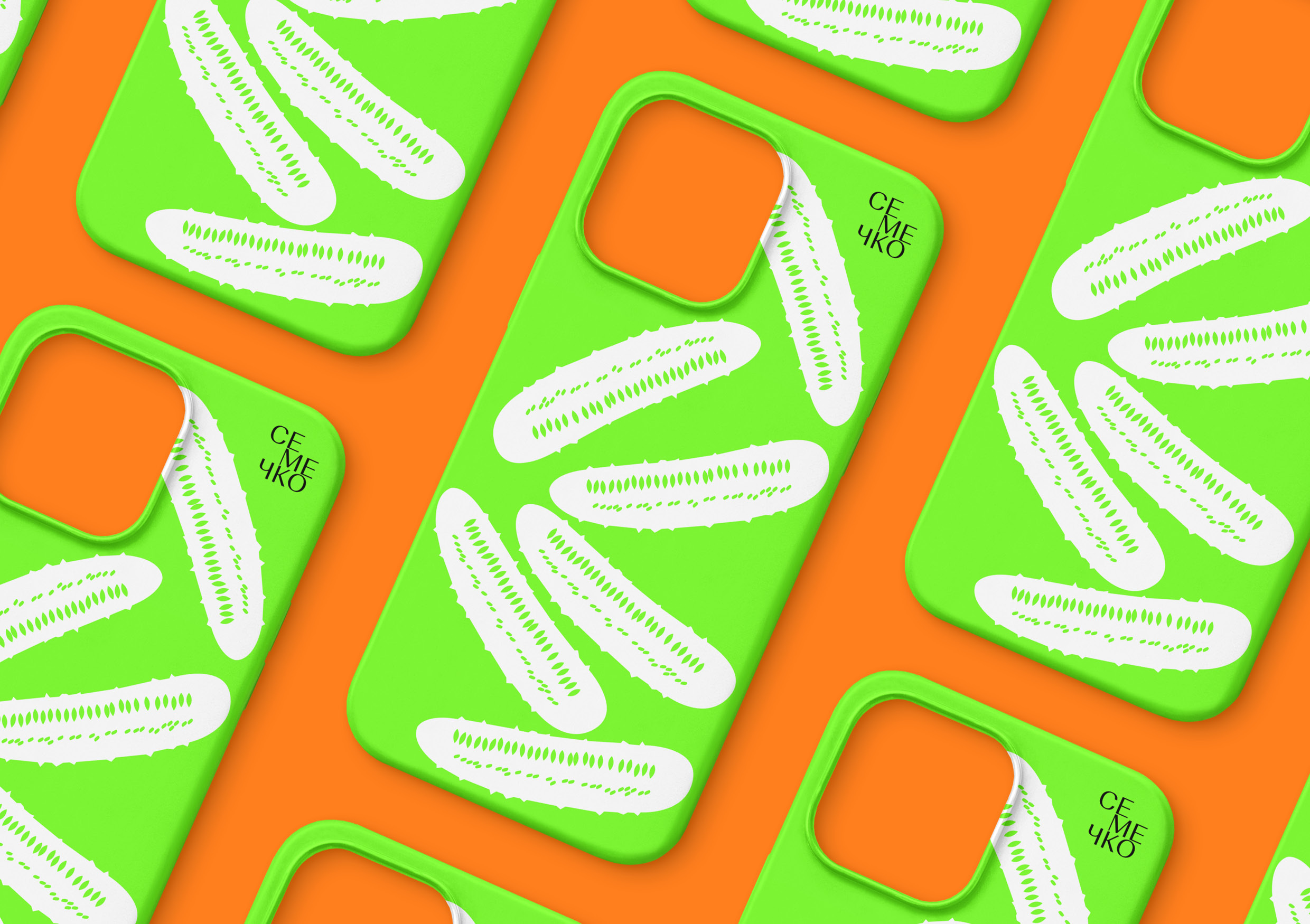
The design concept is based on the silhouettes of vegetables and fruits in the section, which is associated with the purity and clarity of the ingredients contained in cosmetics. The playfulness, accessibility and naturalness of this graphic accurately reflects the attributes of the brand. Youth dynamism is reflected in the bright color palette of the project. In addition, orange, green and pink remind of the colors of vegetables and fruits. Minimalistic, but characteristic grotesque font complements the style. Silhouettes of seeds work on carriers together with the forms of plants to which they belong, and without them. The logo reflects the principle of the layout of typography in style, imitating the embedding in the shape of a vegetable or fruit. The graphics have variability, which makes it easy to scale recognizable silhouettes to different media, and most importantly, the identity perfectly reflects the values of an eco-friendly way of skin care.
Special thanks should be given to the Russian Higher School of Economics (HSE Art and Design School) and personally to the tutor Tanya Dunaeva.

CREDIT
- Agency/Creative: Anastasia Cherkasskaya
- Article Title: Student Brand Identity Concept For The Company Of Cosmetic Care Products Based On Seed Oils “SEMECHKO” by Nastya Cherkasskaya
- Organisation/Entity: Student
- Project Type: Identity
- Project Status: Non Published
- Agency/Creative Country: Russia
- Agency/Creative City: Anastasia Cherkasskaya
- Market Region: Global
- Project Deliverables: Brand Identity
- Industry: Beauty/Cosmetics
- Keywords: Anastasia Cherkasskaya, The Brand Identity, "SEMECHKO"
-
Credits:
Tutor: Tanya Dunaeva


