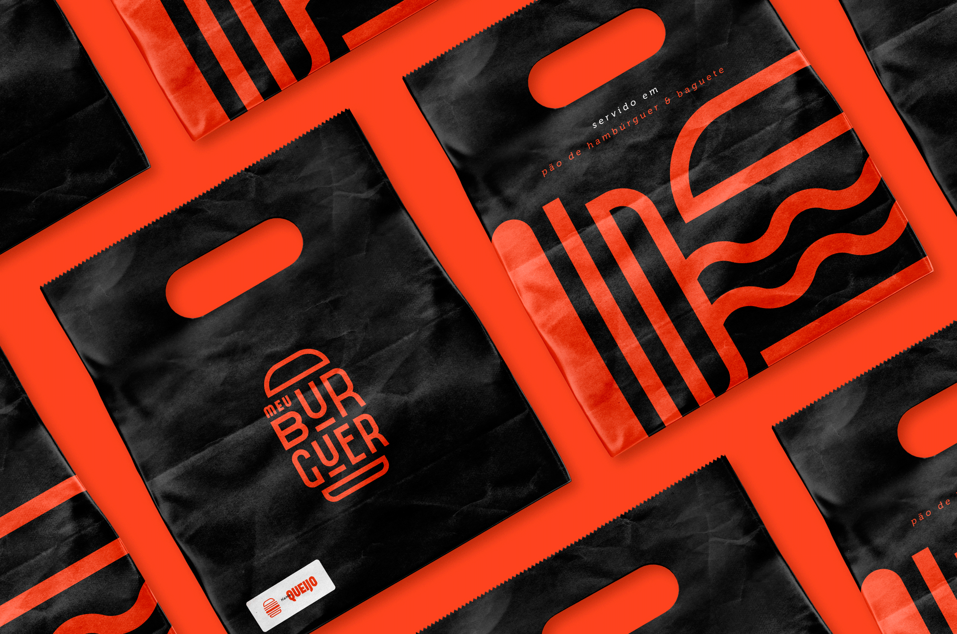
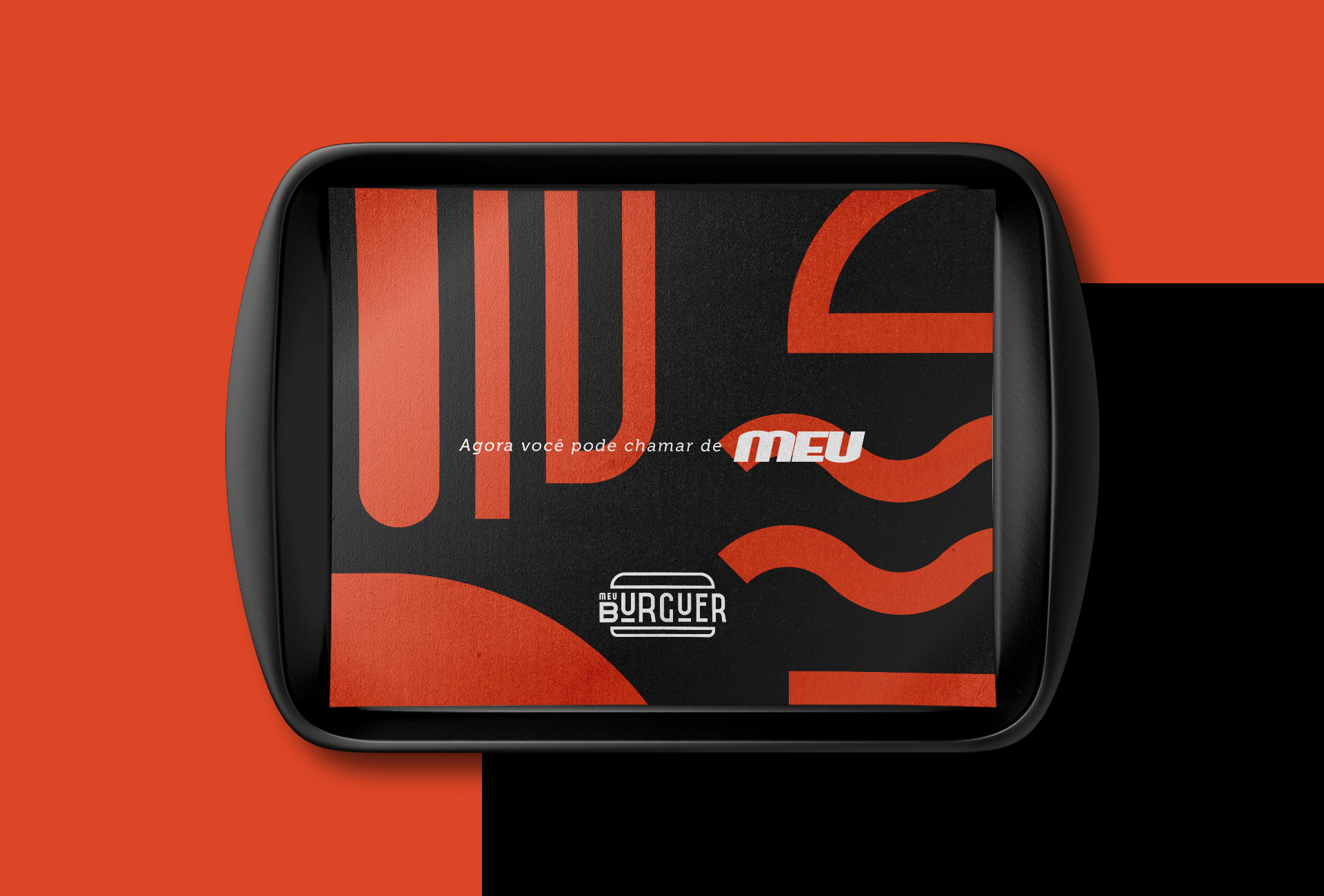
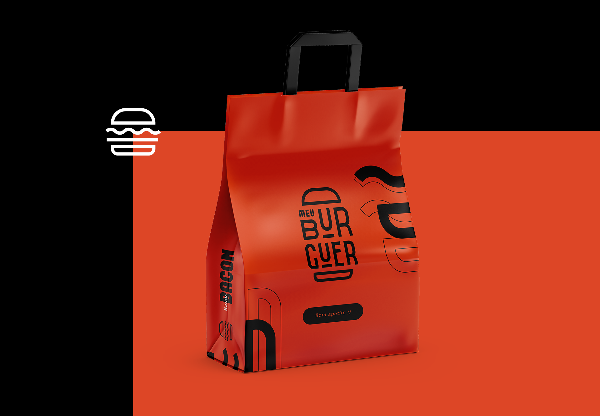
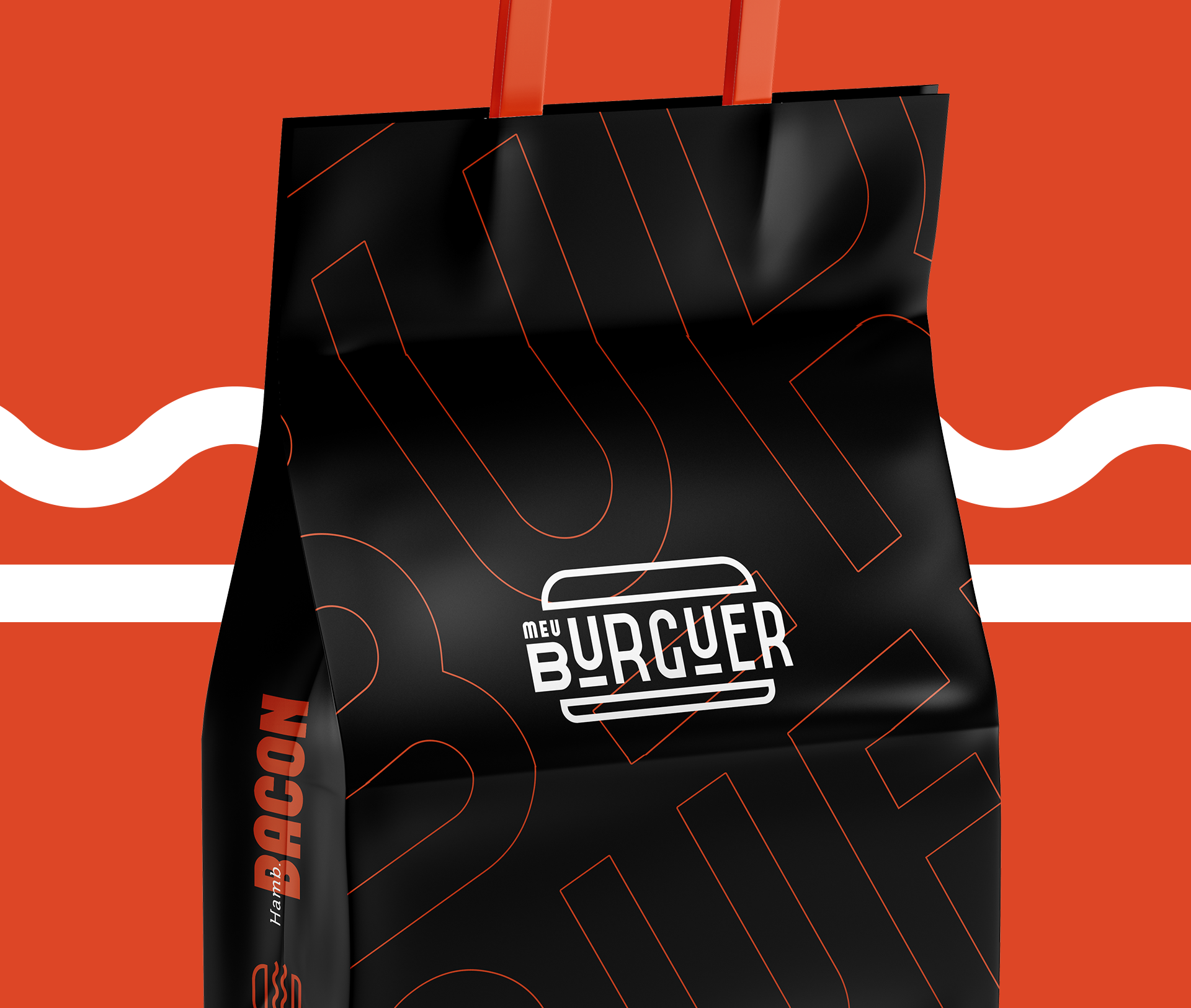
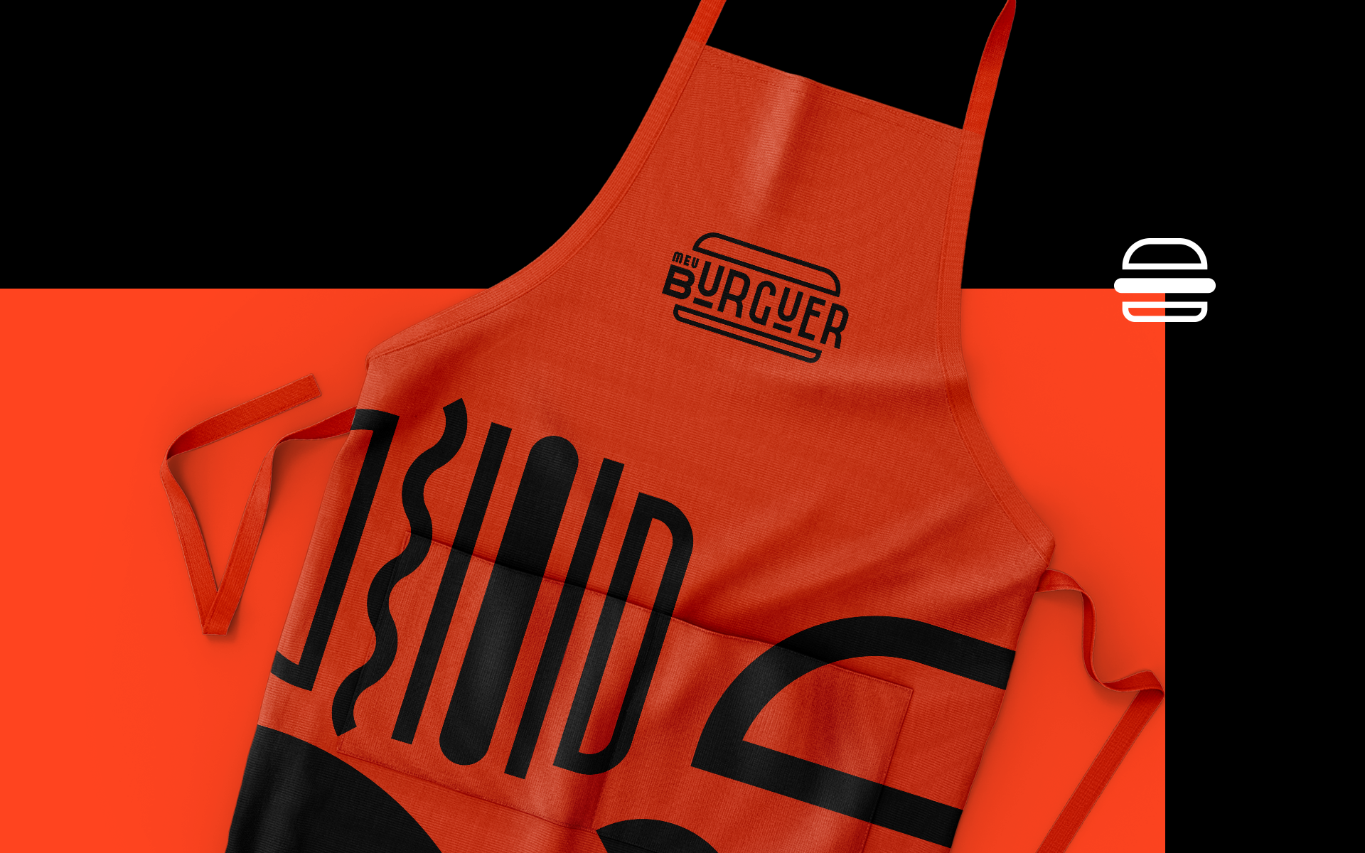
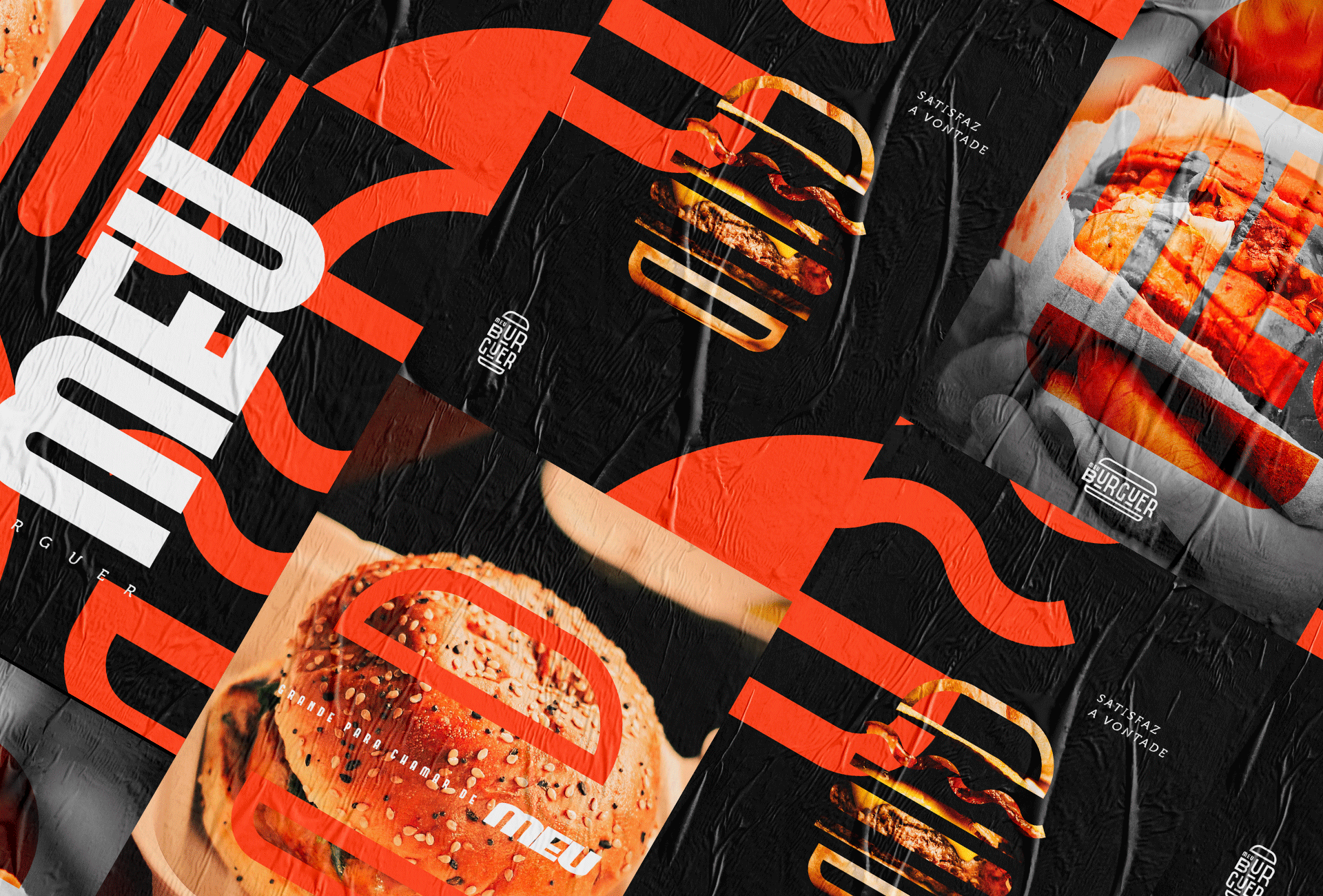
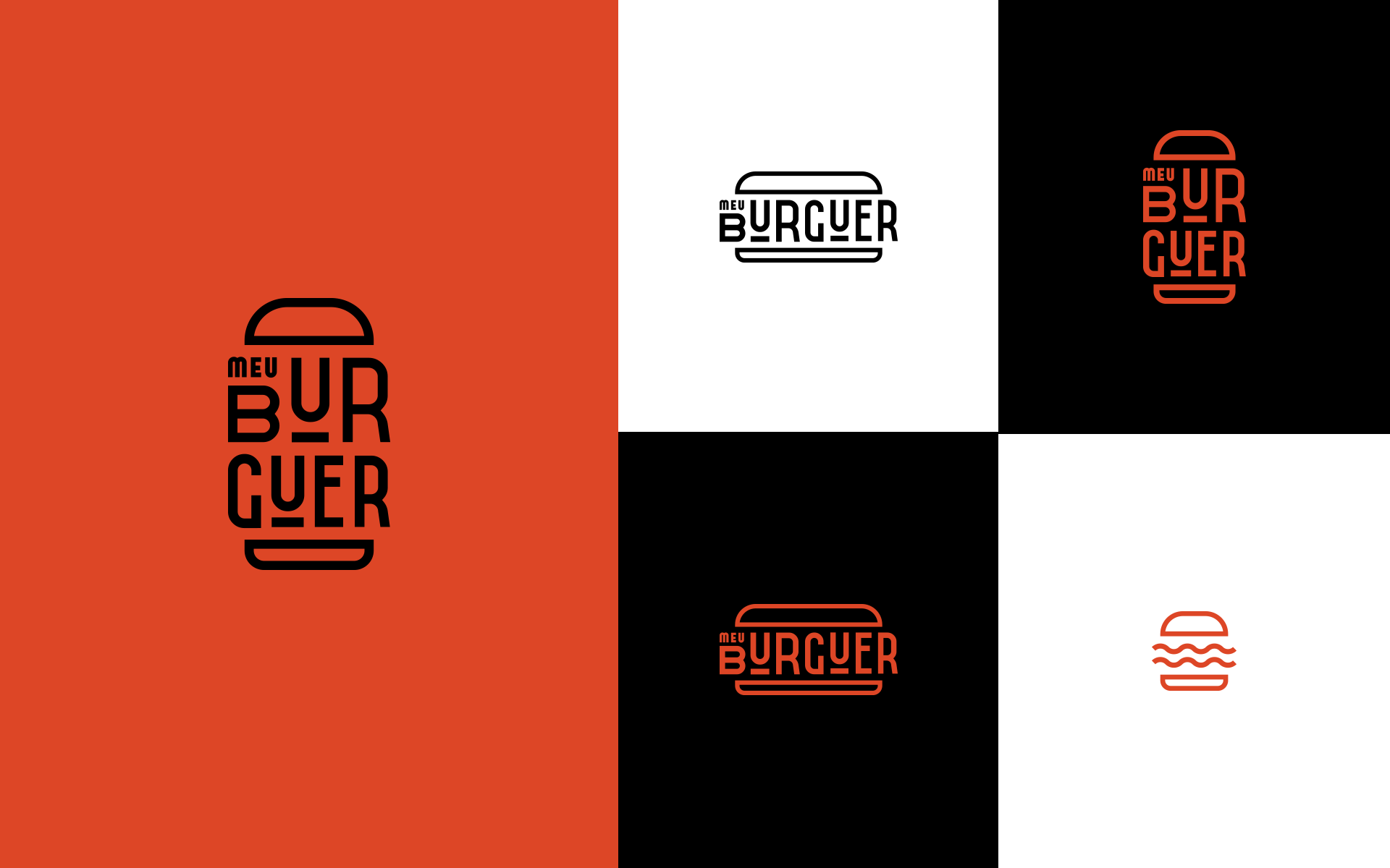
When it comes to hamburgers, we immediately think of ember, charcoal, fire and a lot of barbecue smell, and it is no different when it comes to the identity of My Burguer.
The elaborated communication reinforces the idea of having an intimate hamburger on your board accompanied with rustic potatoes, that hamburger that you don’t assemble, but it is practically as if it were. The idea of “mine” was to work intensively with reference to the brand itself.
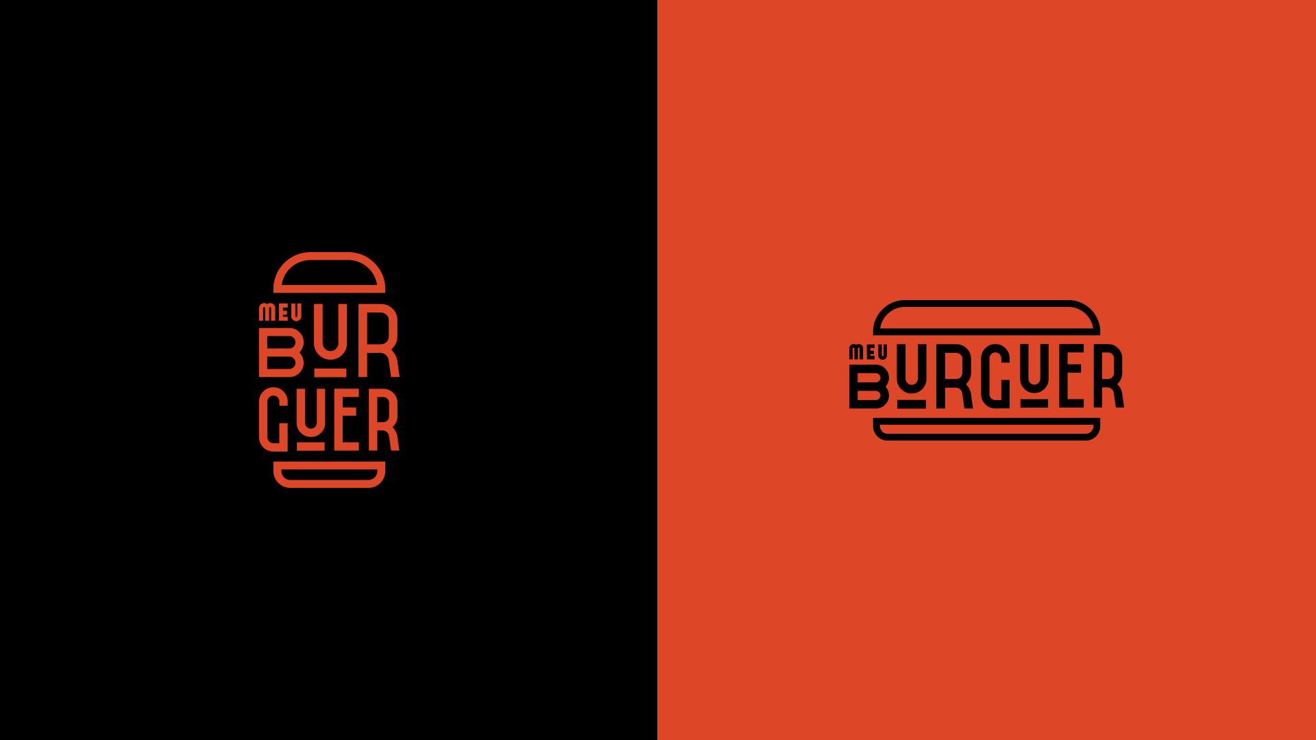
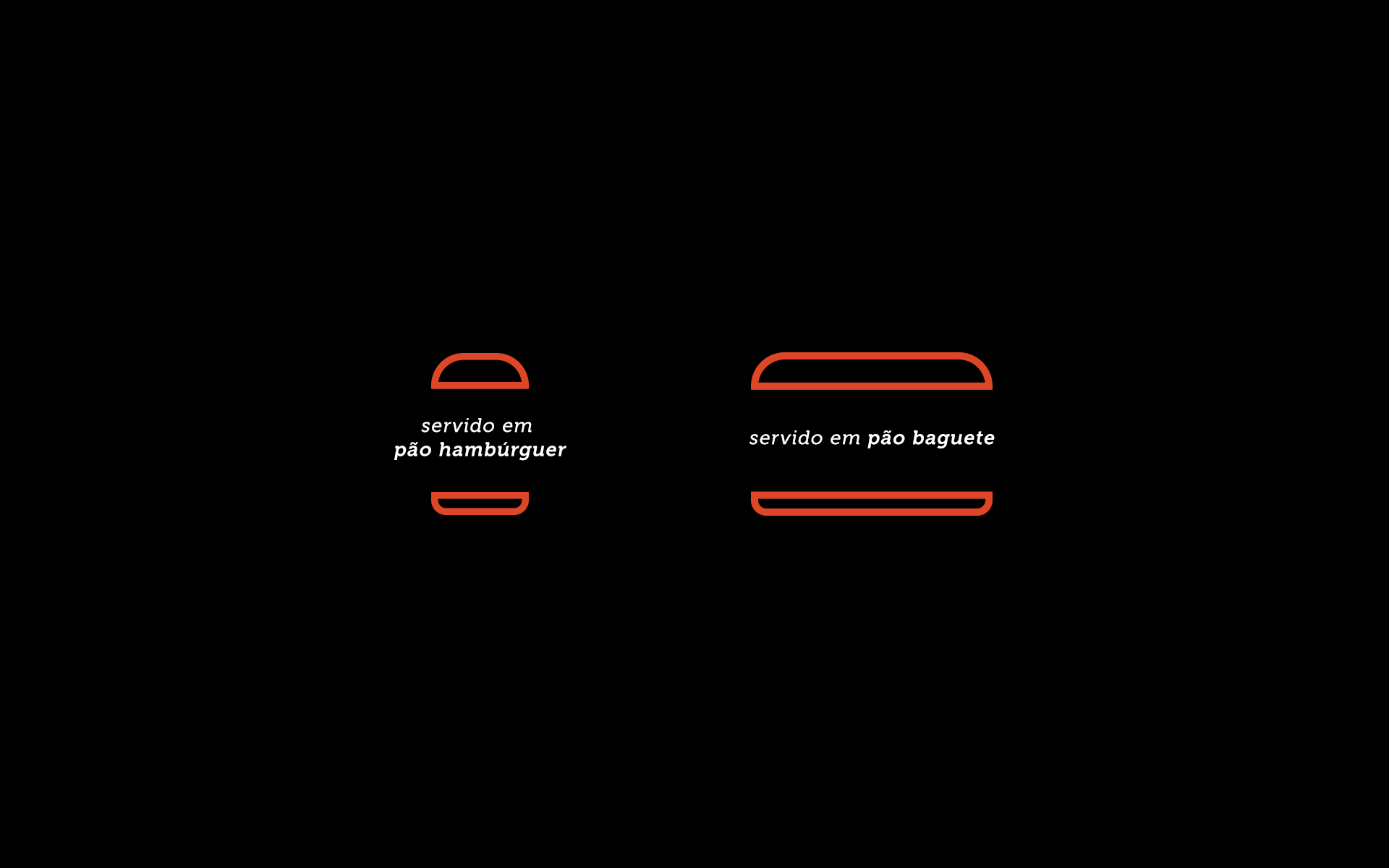
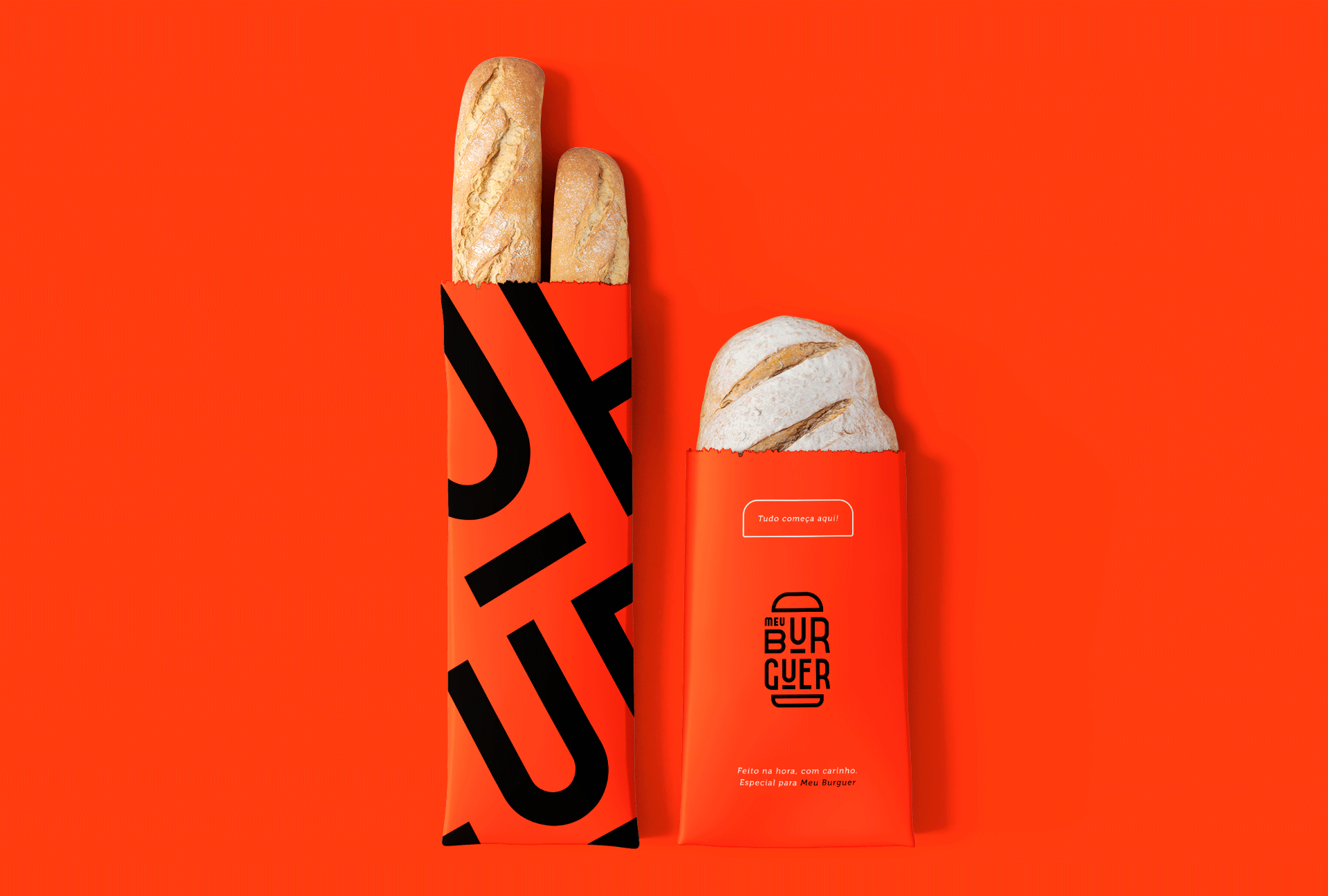
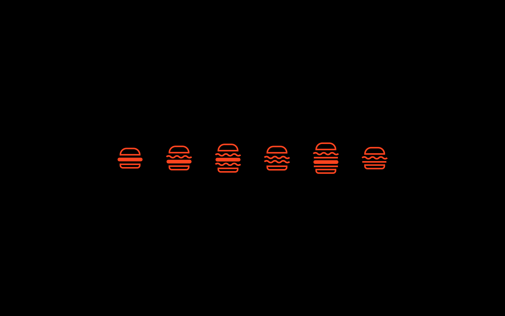
Served in hamburger and baguette bread, the brand has variations for the customer’s preference.
CREDIT
- Agency/Creative: Luiz Matera
- Article Title: Student Brand Identity Concept for Meu Burguer Created by Luiz Matera
- Organisation/Entity: Student, Published Commercial Design
- Project Type: Identity
- Agency/Creative Country: Brazil
- Market Region: South America
- Project Deliverables: Brand Creation, Brand Experience, Brand Identity, Brand Strategy, Branding, Graphic Design, Identity System, Packaging Design, Product Naming
- Industry: Food/Beverage
- Keywords: BRANDING, BRASA, BURGUER, DESIGN, HAMBURGUER, LOGO, LOGO, DESIGN, TIPOGRAFIA, BRAND
FEEDBACK
Relevance: Solution/idea in relation to brand, product or service
Implementation: Attention, detailing and finishing of final solution
Presentation: Text, visualisation and quality of the presentation


