


Welcome to the Farmers Vegetable Fair, an event where the bounties of nature are showcased with pride, passion, and authenticity. This fair acts as a rare amalgamation of all the tantalizing colors and enchanting aromas of the fields, presenting a fascinating picture of rural charm and healthy produce.
This fair offers you an exceptional opportunity to explore a broad spectrum of fresh vegetables, each grown with a personal touch, organic methods, perseverance, and a genuine love for farming. These vegetables come straight from the nearby farms, reinforcing their freshness and health-giving properties.
As you step into the vegetable farmers’ market, you become part of a verdant oasis teeming with vibrant leaves and floral varieties symbolizing the freshness, vigor, and quality of the produce here. Every farm stand is a unique experience in itself, featuring an exciting combination of vegetables ranging from staple varieties that are a common sight in every household to exotic species that add a unique flavor to any dish.
A trip to the fair will provide you with everything your kitchen and palette need for a wholesome, tasty, and nutrient-rich diet. Perfectly ripe tomatoes, crunchy bell peppers, aromatic herbs, sweet corn – the variety is sure to surprise you.
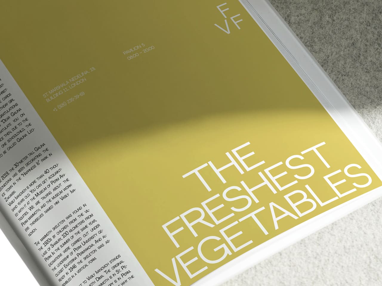
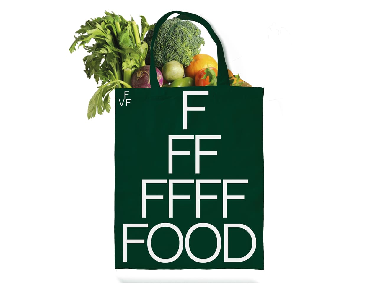
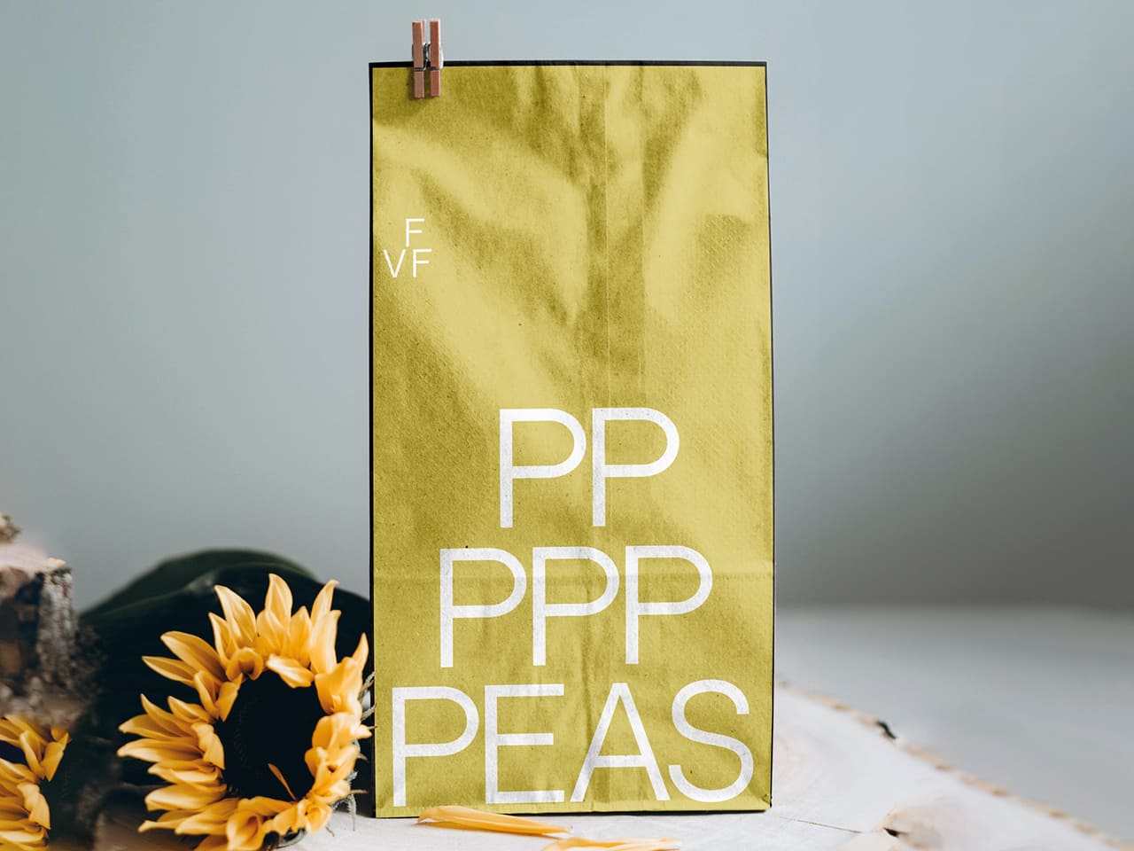
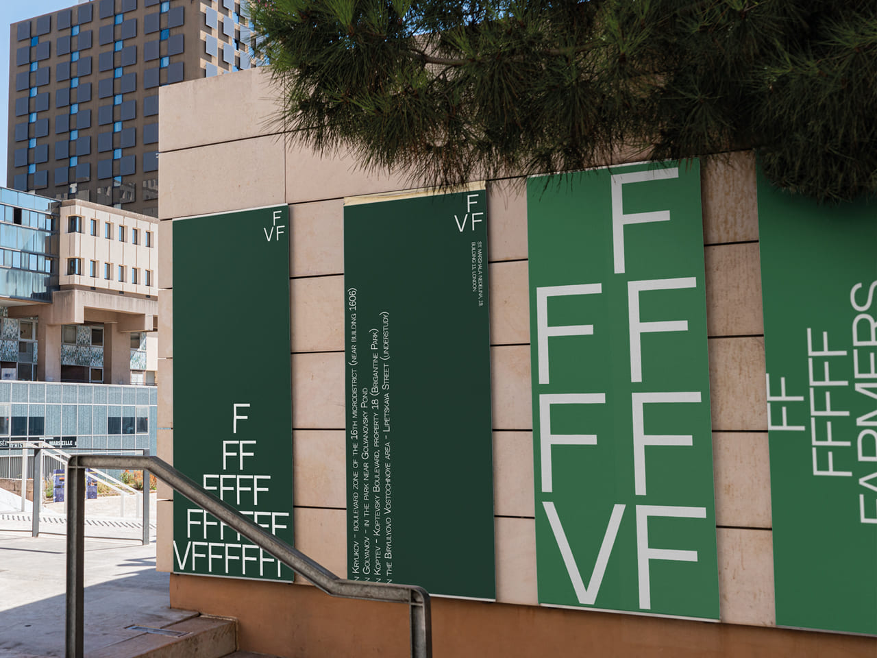
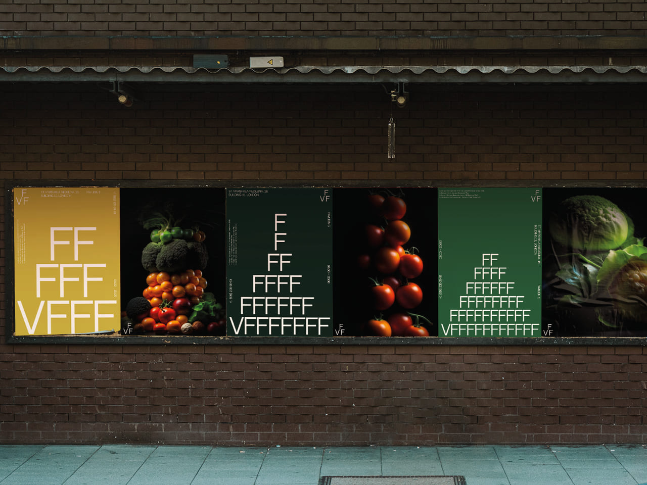
Underpinning the visual appeal of our fair is an ingenious design concept that revolves around the display of our offerings. The vegetables are meticulously arranged in pyramid forms on the counter, creating not just an aesthetic appeal but also symbolizing the abundance and richness of our farms.
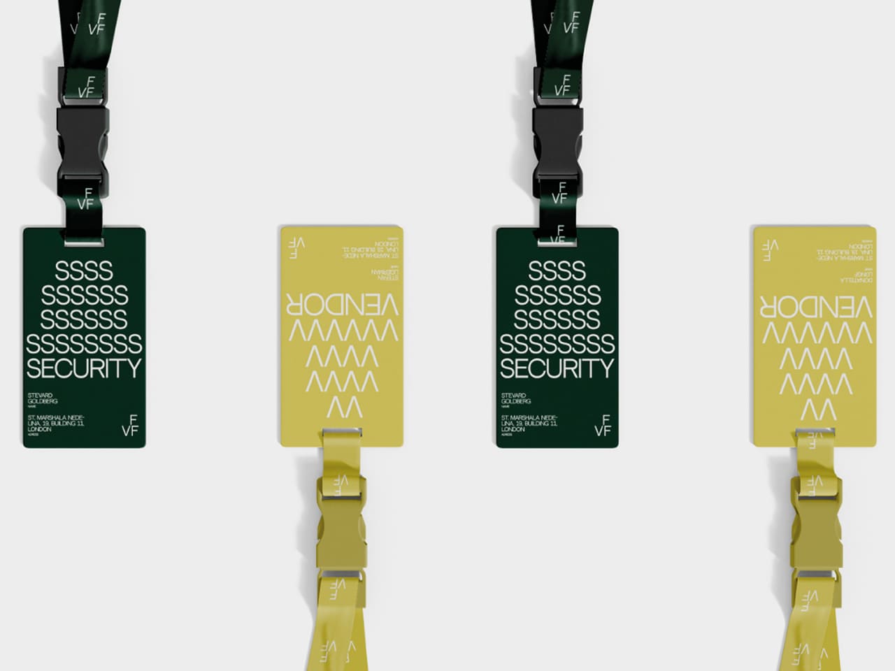
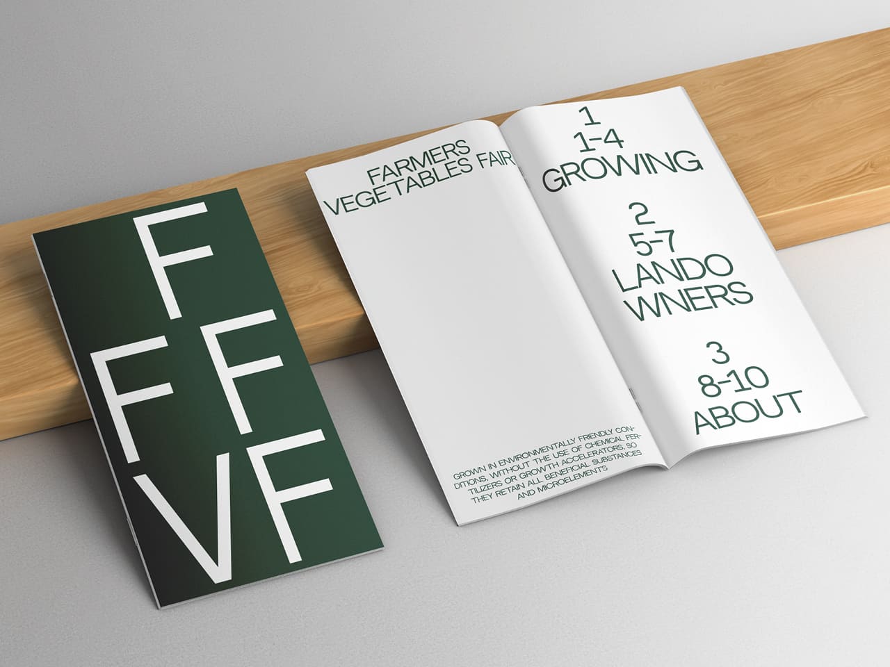
The core of our brand’s identity merges design and language by creatively folding the first letter of the logo into a pyramid. This scheme then extends to other elements of the brand – from the first letters of names to words in sentences, everything is encapsulated within this unique pyramid visual.
Our entire brand identity pays homage to minimalism, emphasizing clarity, precision, and purposefulness. This has been done to underline the exceptional quality and unique nature of our fair, which is a class apart in honoring the dedication, hard work, and skills of our local farmers.
The fair’s aesthetic palette draws from five main colors, symbolically representing the most common hues found in vegetables and herbs. These colors inject life into the fair, creating a feast for the eyes and setting the right atmosphere for a delightful experience.
We eagerly look forward to your visit! Come, be part of a remarkable celebration of nature’s bounty and appreciate the beauty of farming and fresh produce in their purest forms. Step into our world where fresh meets taste, health meets joy, and nature meets human ingenuity.
The materials used in the project: Good Mockups, Design Shidai, Unblash, Mockuptree, Pixeden, Neutral Face font from Vadym Aksieiev. This project was completed as part of my art directing course at the HSE School of Design.
CREDIT
- Agency/Creative: Yanina Kuznetsova
- Article Title: Student Brand Identity Concept for a Farmers Vegetable Fair by Yanina Kuznetsova
- Organisation/Entity: Student
- Project Type: Identity
- Project Status: Non Published
- Agency/Creative Country: Russia
- Agency/Creative City: Moscow
- Market Region: Global
- Project Deliverables: Advertising, Art Direction, Brand Identity, Identity System
- Industry: Food/Beverage
- Keywords: identity, farmers vegetable fair, food, Yanina Kuznetsova,
-
Credits:
Designer: Yanina Kuznetsova


