Woodstock Film Festival is an independent film festival local to the Hudson Valley region in New York. Launched in 2000, it aims to showcase a wide range of high-quality independent films and promote culture, diversity, community, educational opportunities and economic growth.
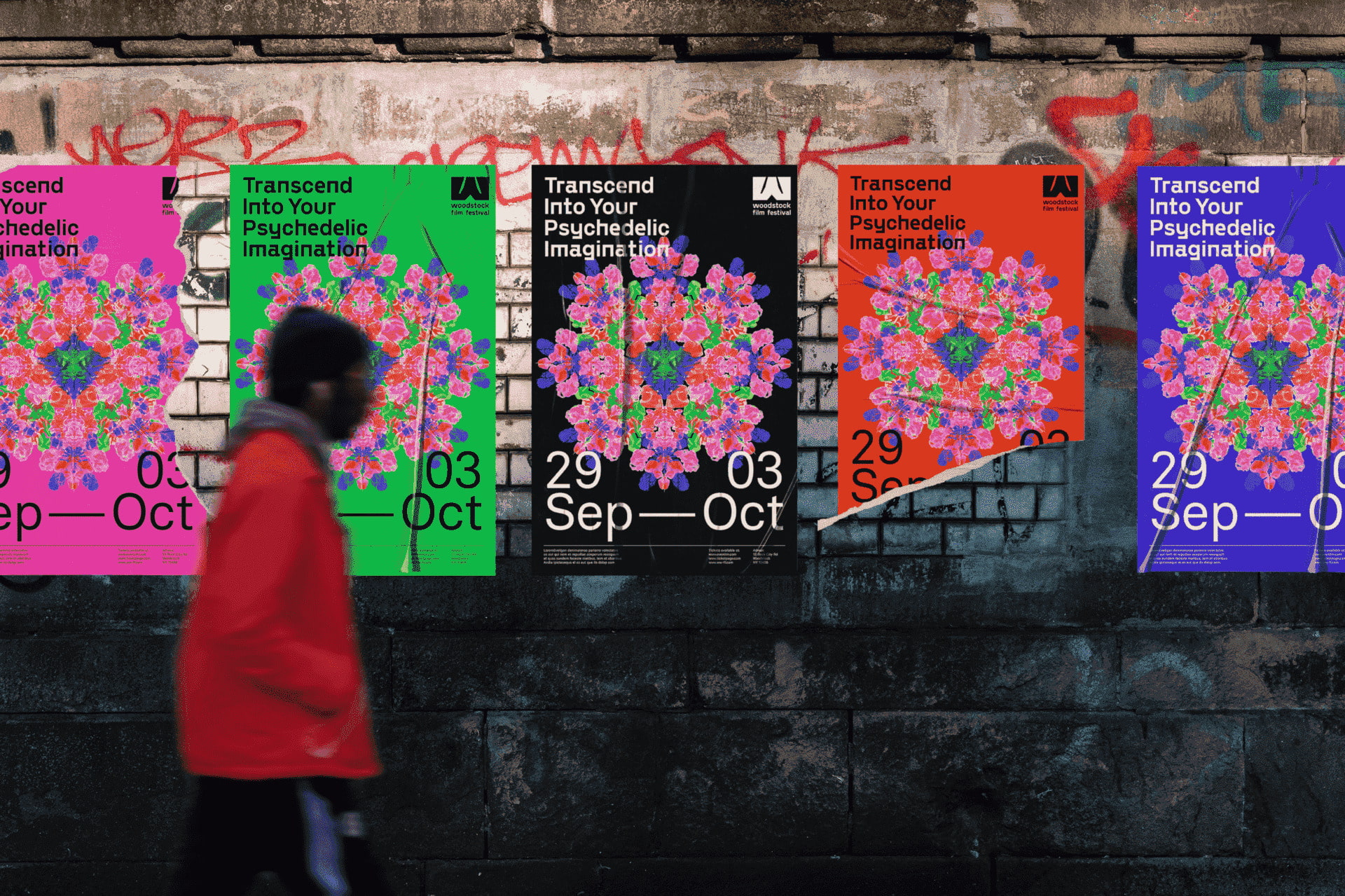
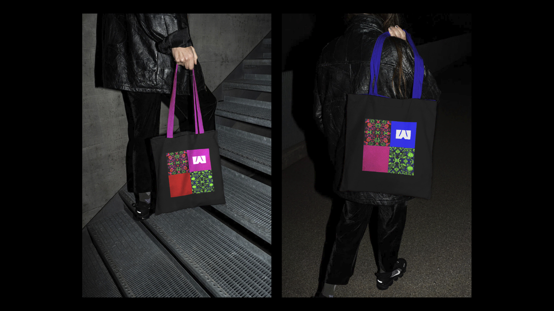
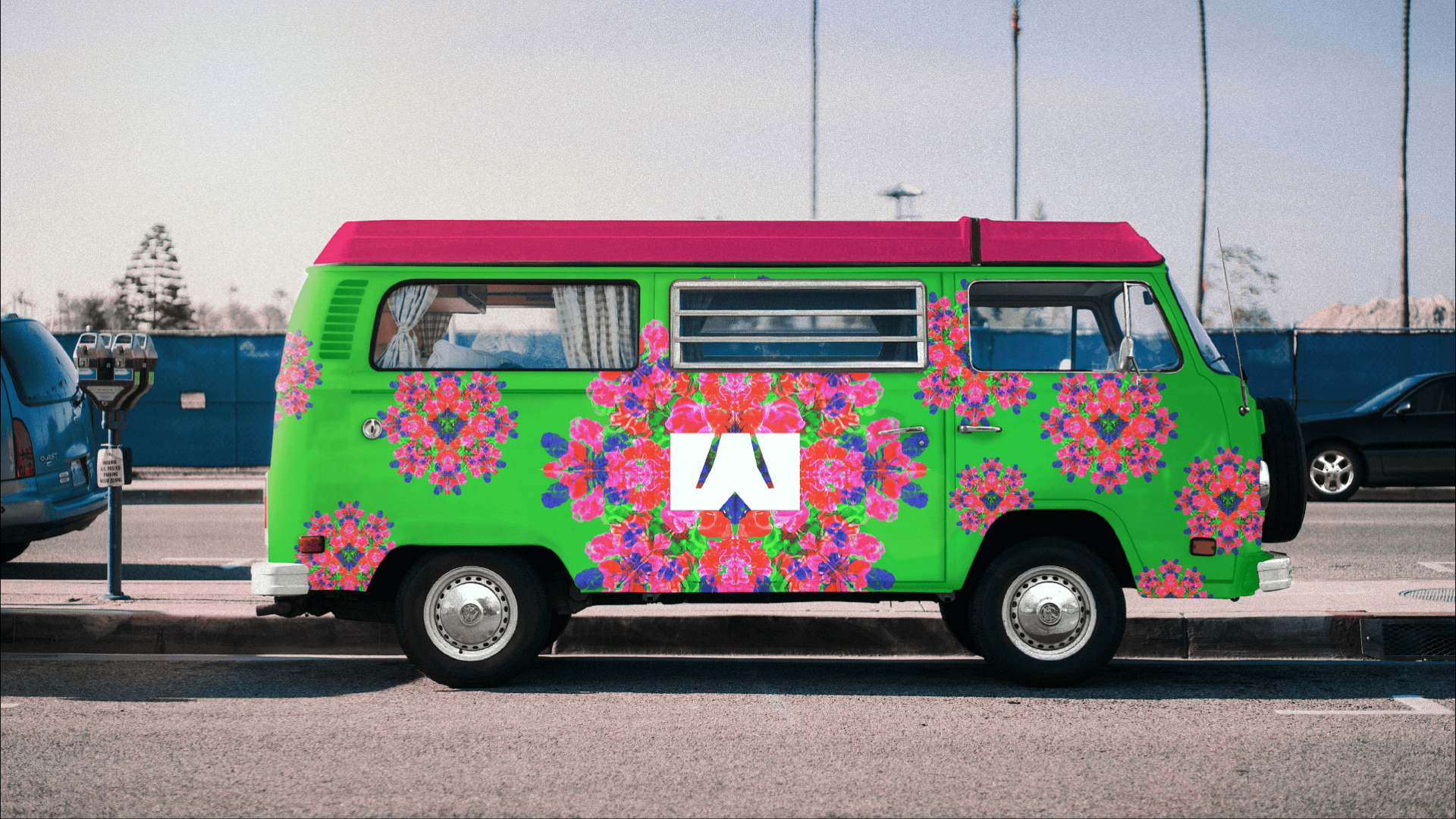
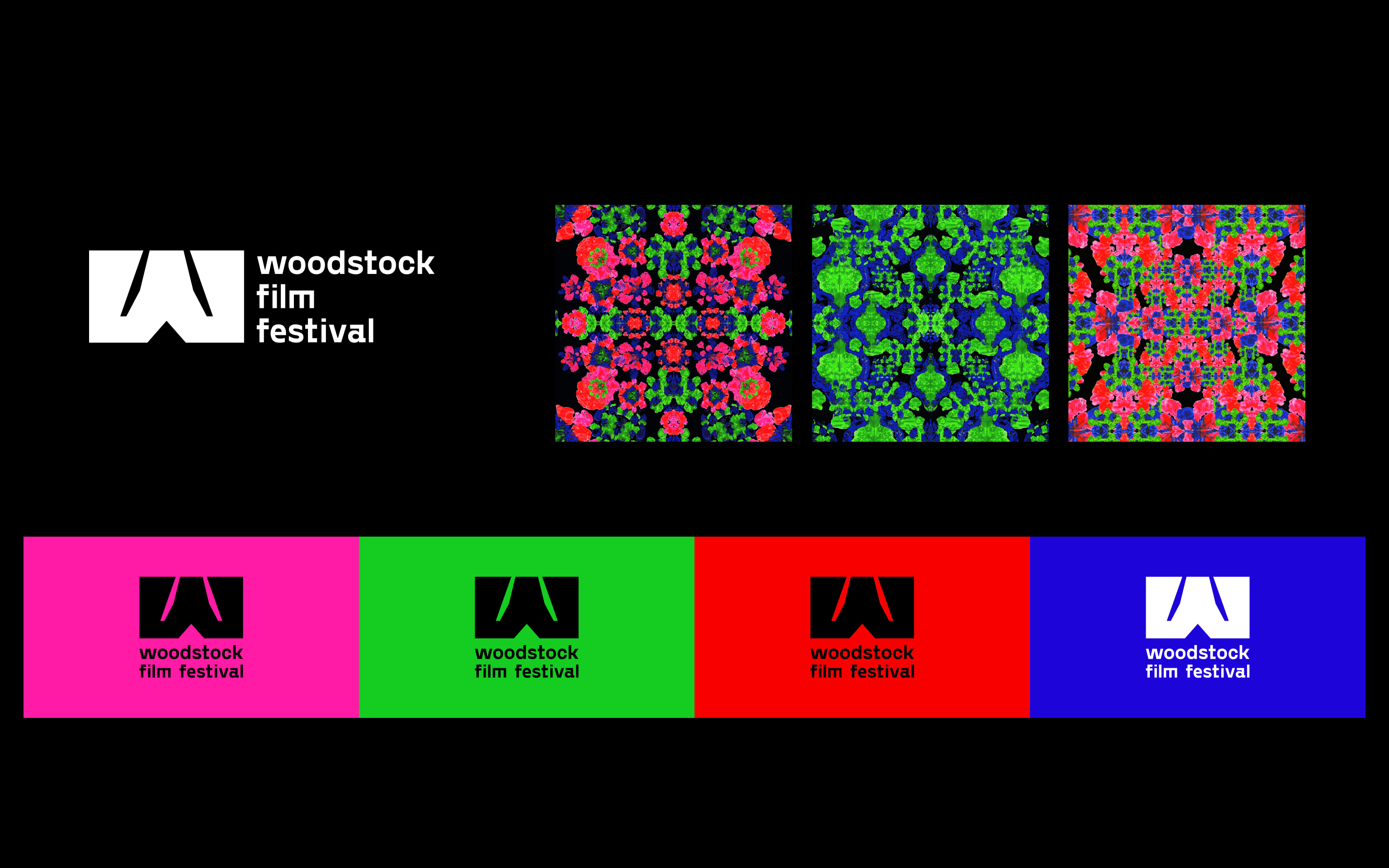
In this typography class project at the MFA Design program at School of Visual Arts, my team of 5 was randomly assigned to use psychedelic design style to rebrand a film festival. My team chose to rebrand Woodstock Film Festival. Inspired by the inkblot test, which explores how abstract imagery stimulates diverse psychological reactions, we crafted a mesmerizing base pattern that echoes the festival’s commitment to showcasing a diverse range of films, evoking unique emotional responses. We used paint and scanner to produce the pattern and applied the kaleidoscope effect for a iconic psychedelic style. This also symbolizes how film is a medium to showcase the vicissitudes of life.
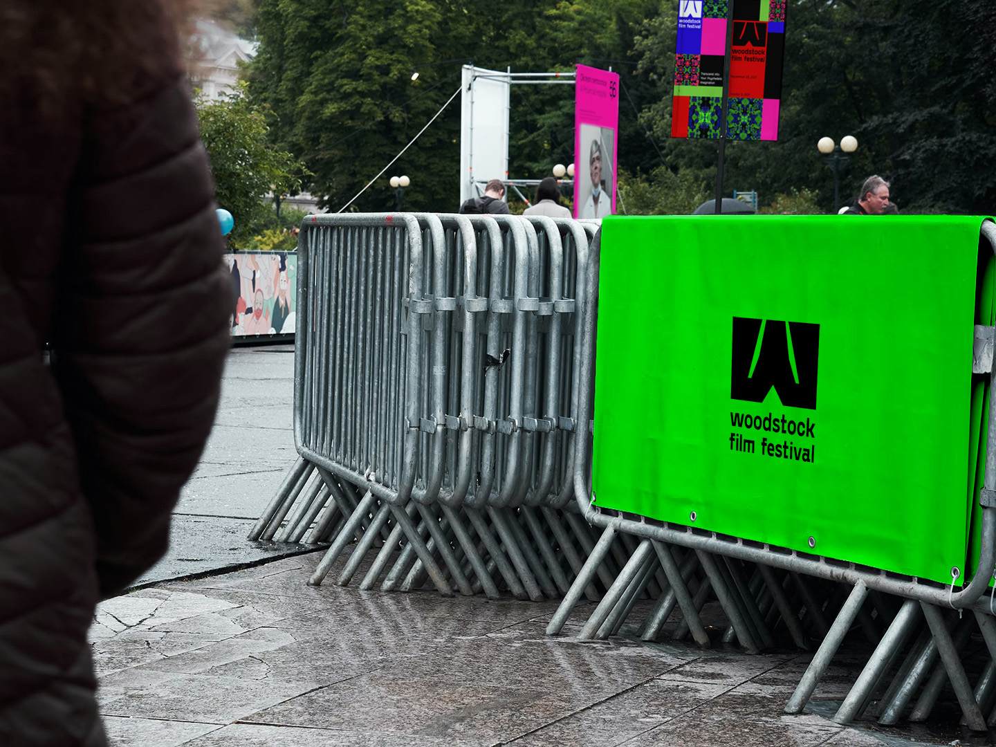
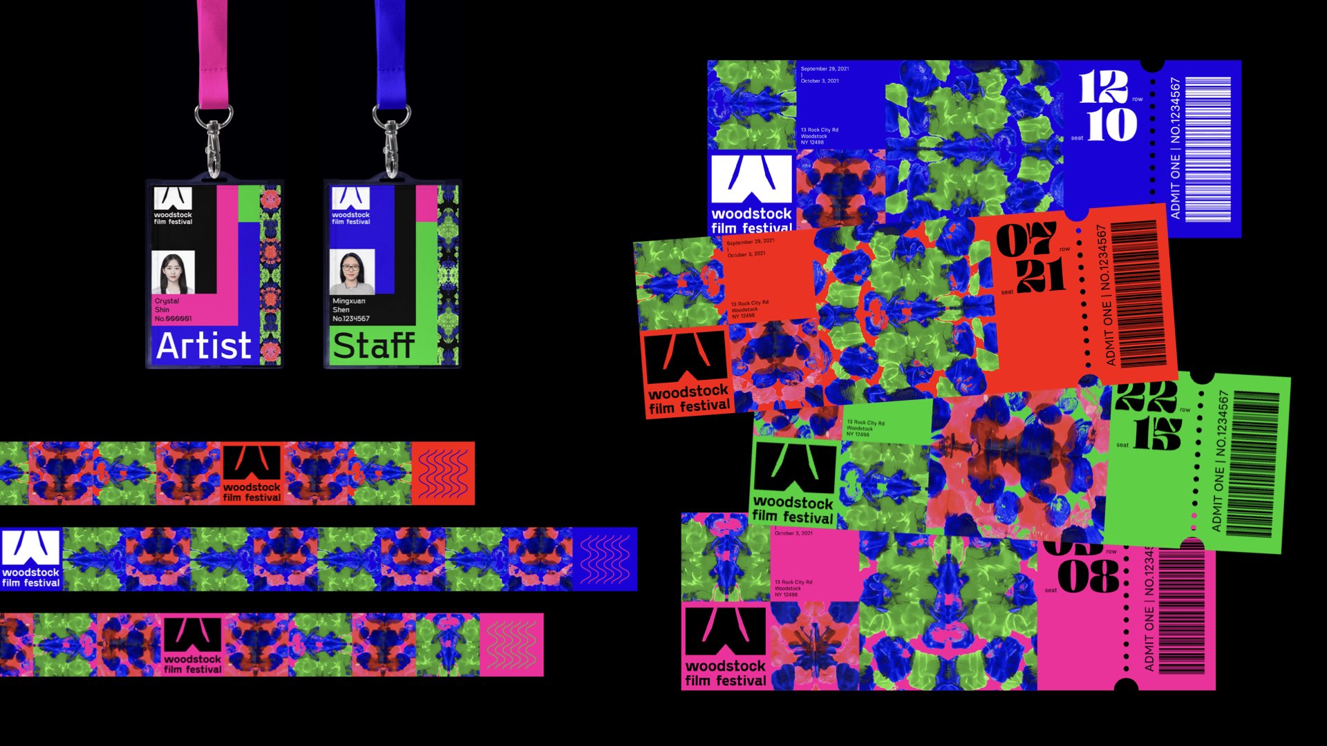
We paired it up with a geometric yet bold logo with brutalist characteristics, another highly-contrasting style from a similar time era. This whimsical style clash increases brand recognizability. The logo has a vertical and a horizontal version intended for different shapes of space left for it. To infuse our rebrand with another layer of contrast and connection to the psychedelic genre, we carefully curated a color palette boasting hues of blue, red, green, and pink.
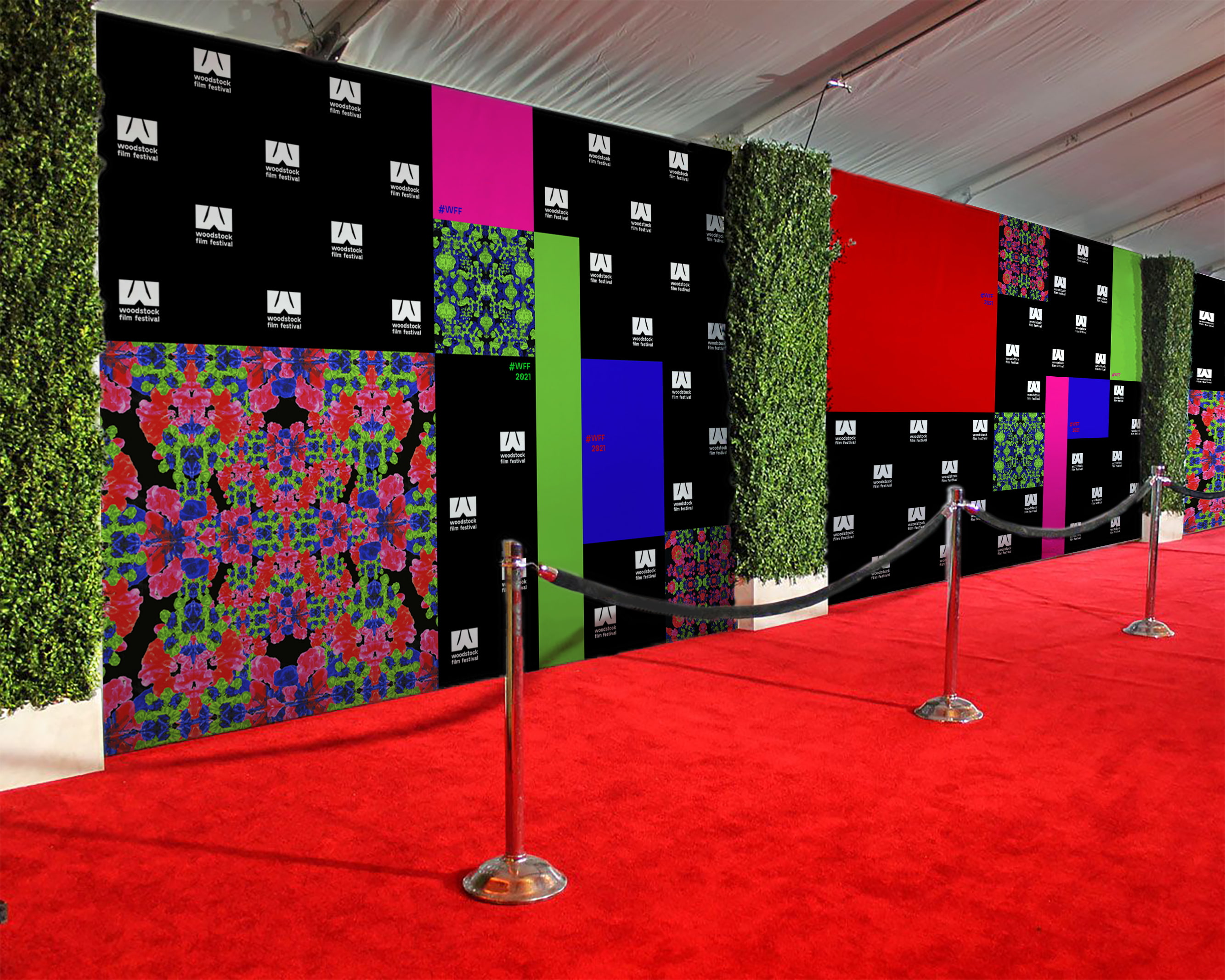
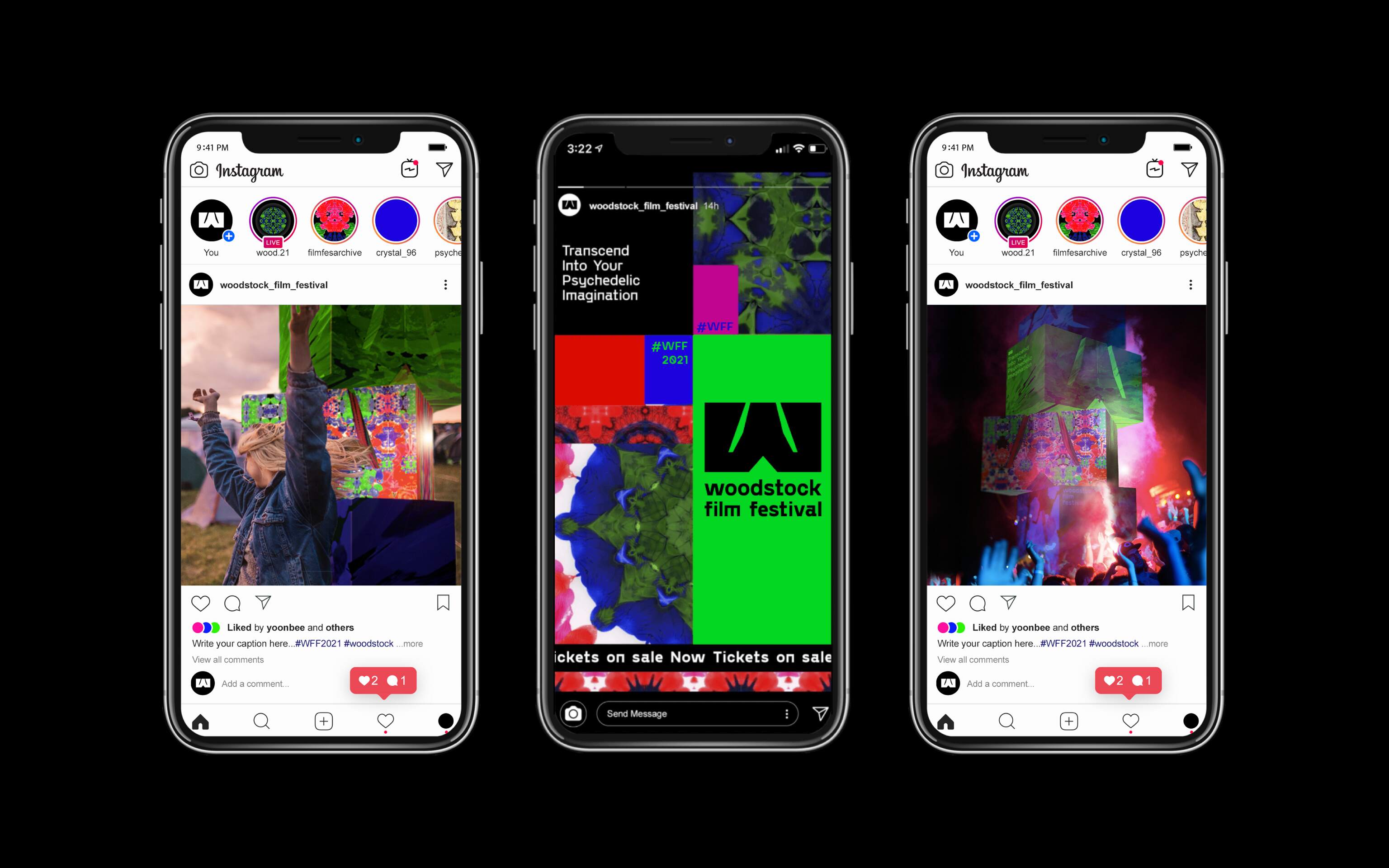
Ensuring a seamless and cohesive visual experience, we employed a versatile 12-column grid system across all promotional materials, such as banners, event tickets, social media posts, media backdrops, and the website.
But our mission didn’t end there. Determined to transport festival-goers into a realm of unparalleled immersion, we conceived a mesmerizing tunnel experience, beckoning attendees to venture through its psychedelic realms and indulge in a vivid simulation. We animated the pattern for all its digital use to add dynamic to the brand, including social media posts, website and promotional videos. We also modled a sculpture with the W logo mark, serving as a beacon of anticipation for the event.
The Woodstock Film Festival, a fusion of art, culture and boundless imagination, invites everyone to embark on a cinematic journey. Prepare to be mesmerized, enlightened, and transported with its new brand identity, as this celebration unveils the kaleidoscope of emotions and experiences that define the power of independent film.
CREDIT
- Agency/Creative: Mingxuan Shen , Emily Barrington , Yoon Bee Baek , Wiebke Meyer-Lüters , Crystal Shin
- Article Title: Student Brand Design Concept for Woodstock Film Festival
- Organisation/Entity: Student
- Project Type: Identity
- Project Status: Non Published
- Agency/Creative Country: United States
- Agency/Creative City: Jersey City , New York
- Market Region: North America
- Project Deliverables: Brand Design, Brand Identity
- Industry: Entertainment
- Keywords: WBDS Student Design Awards 2023/24
- Keywords: Identity, Brand Redesign
-
Credits:
Educational Institution: School of Visual Arts -MFA Design / Designer as Entrepreneur
Educators Name: Justin Colt & Jose Frensneda


