


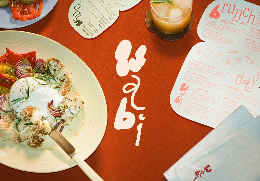
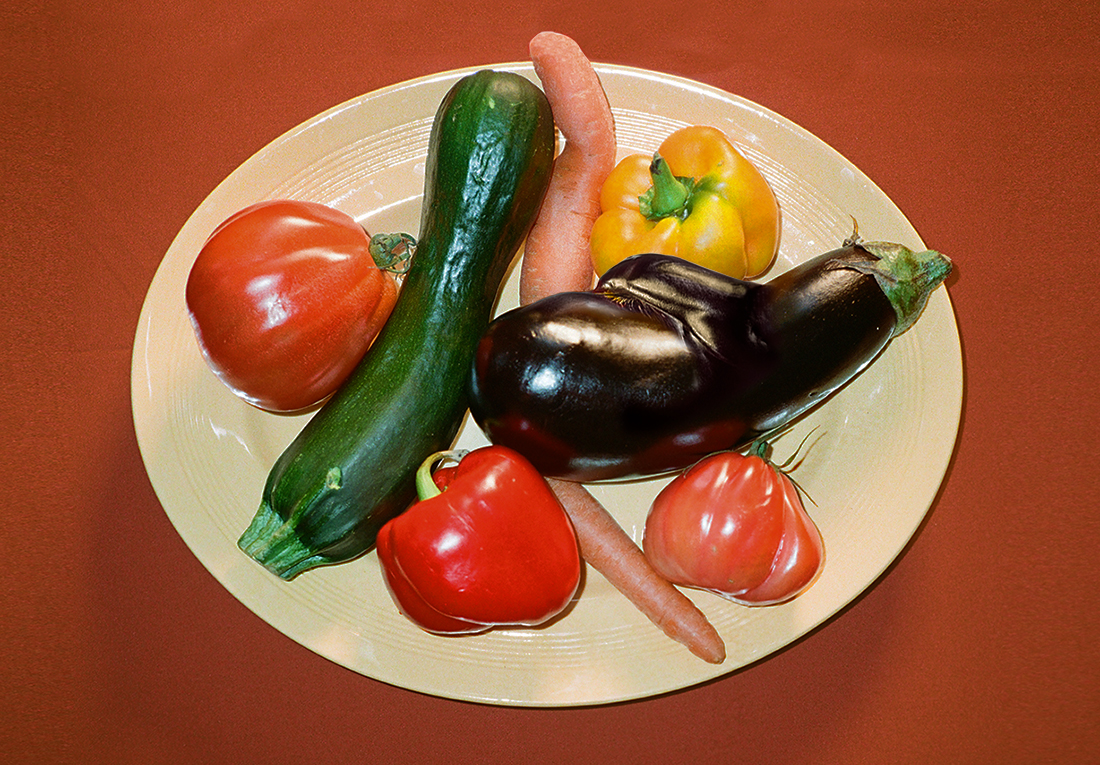
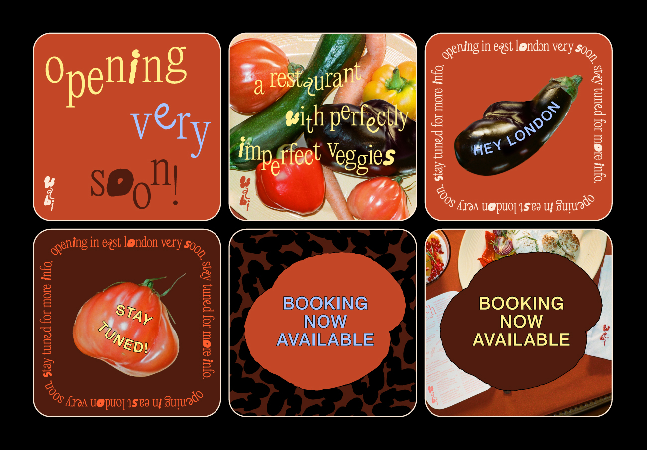
Driven by the purpose to spread the idea of embracing the beauty of imperfection, wabi offers food made with perfectly imperfect vegetables that would usually end up as food waste. The brand name, wabi, comes from the Japanese word, wabi-sabi, which refers to the aesthetic appreciation of natural imperfection.
I developed the brand identity including the brand story, mission statements, art direction, and visual identity from the ground up. With the mission to show imperfection in a positive way through the food and brand, the entire identity was designed to convey brand’s playful and optimistic voice.
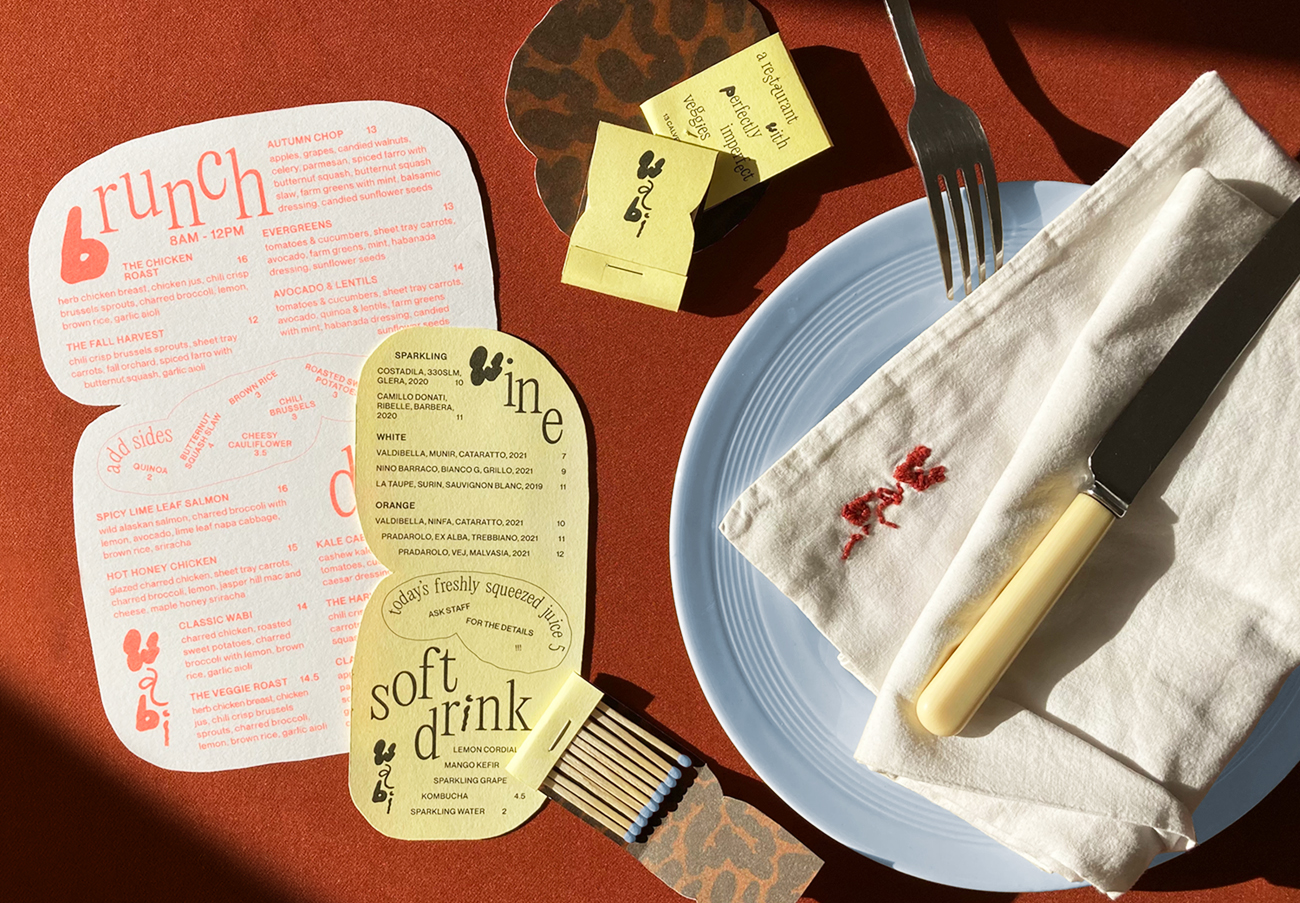
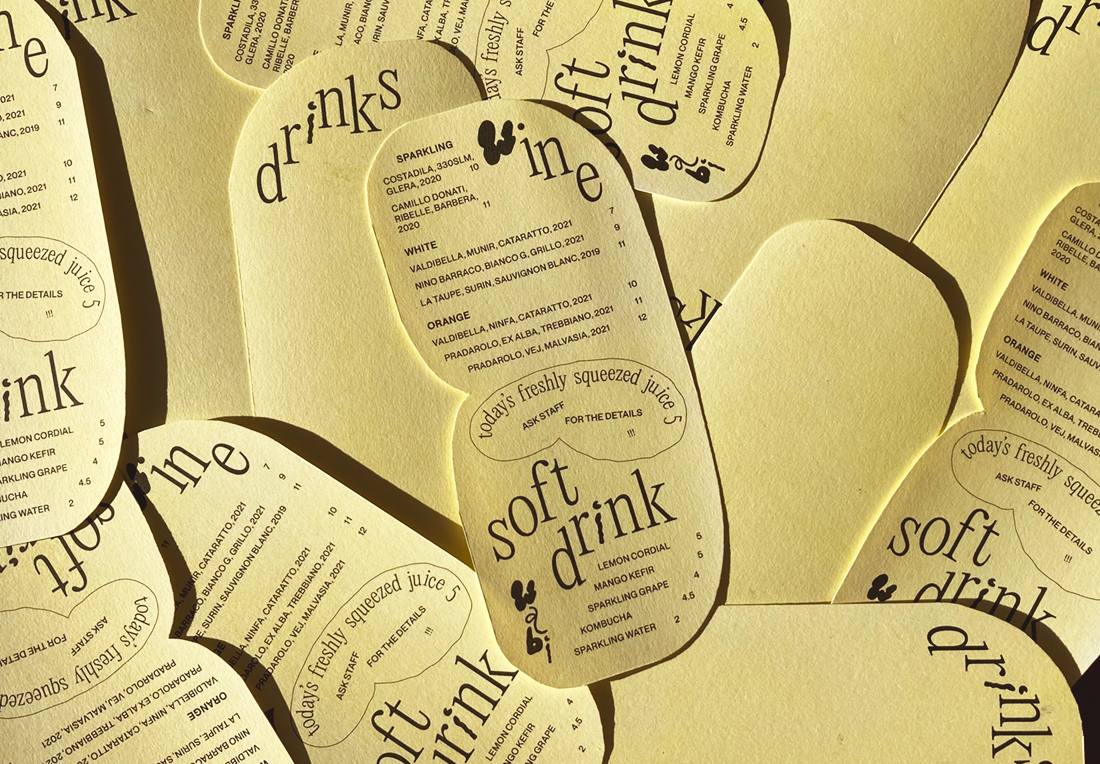
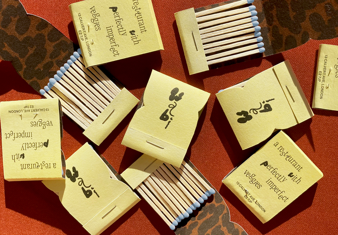
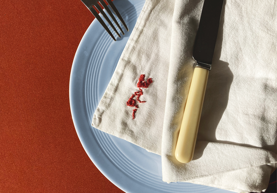
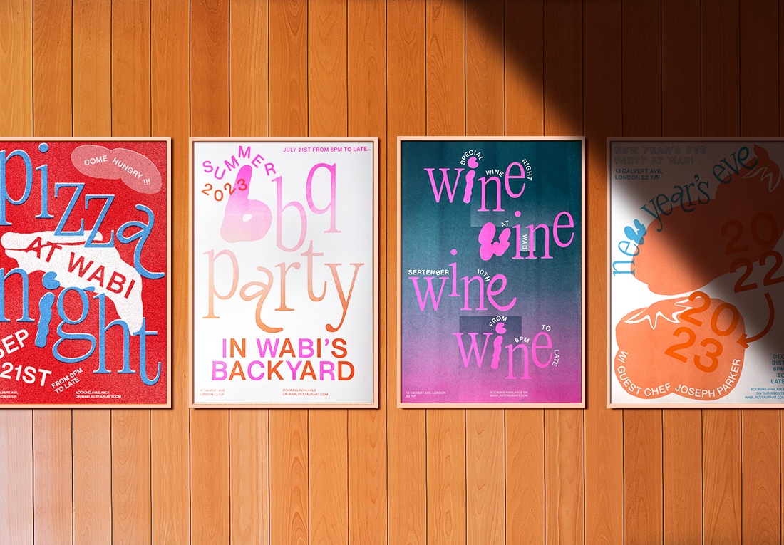
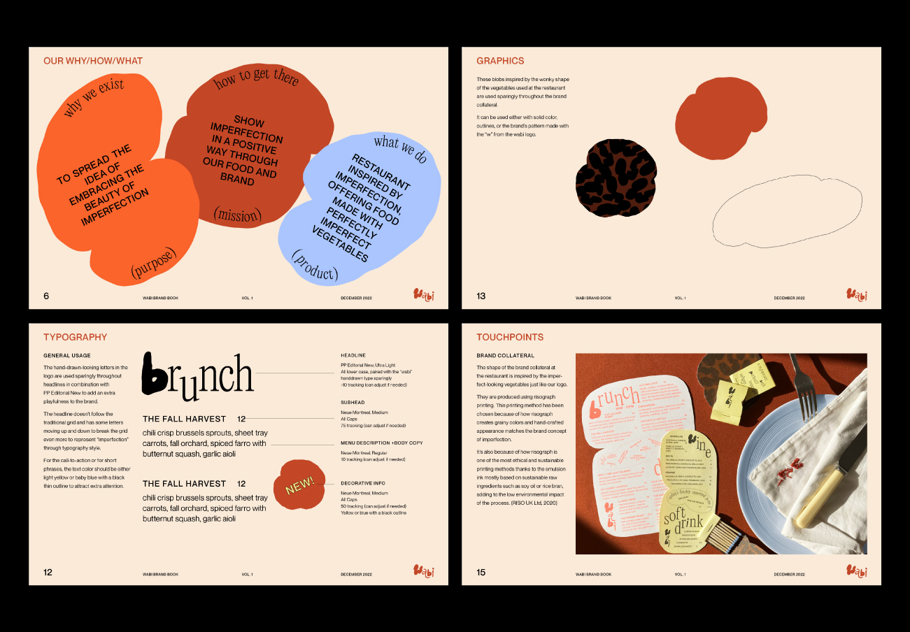
Hand-drawn-looking typeface referencing the shape of the perfectly imperfect vegetables is used for the logo and sparingly throughout the headlines. The main brand colors in the color palette consist of three tones of rust color inspired by the word “sabi(meaning rust in Japanese)” in wabi-sabi. Other lighter colors are added to balance out the darker rust colors and to give the brand a fresh and positive attitude.
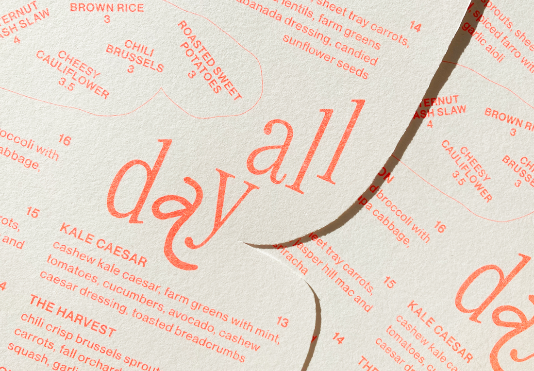
The hand-drawn-looking letters in the logo are used sparingly throughout headlines in combination with PP Editorial New to add extra playfulness to the brand. The headline doesn’t follow the traditional grid and has some letters moving up and down to break the grid even more to represent “imperfection” through typography style.
At wabi, sustainability is at the heart of the brand. The brand collateral is produced using risograph printing, one of the most ethical and sustainable printing methods thanks to the emulsion ink made with sustainable raw ingredients such as oil or rice bran, adding to the low environmental impact of the process.
The grainy colors and hand-crafted appearance that risograph create also represent brand’s perfectly imperfect concept.
CREDIT
- Agency/Creative: Juri Okita
- Article Title: Student Brand Design Concept for Wabi
- Organisation/Entity: Student
- Project Type: Identity
- Project Status: Published
- Agency/Creative Country: United Kingdom
- Agency/Creative City: London
- Market Region: Europe, North America, Global
- Project Deliverables: Advertising, Advertising Photography, Art Direction, Brand Creation, Brand Design, Brand Guidelines, Brand Identity, Brand Naming, Brand Strategy, Brand World, Branding, Creative Direction, Design, Environmental Graphics, Food Photography, Food Styling, Graphic Design, Identity System, Logo Design, Pattern Design, Photography, Poster Design, Tone of Voice, Type Design, Typography, Web Design
- Industry: Food/Beverage
- Keywords: #restaurantbranding #hospitalitybranding #branding #artdirection #graphicdesign #visualidentity
-
Credits:
Brand Designer: Juri Okita


