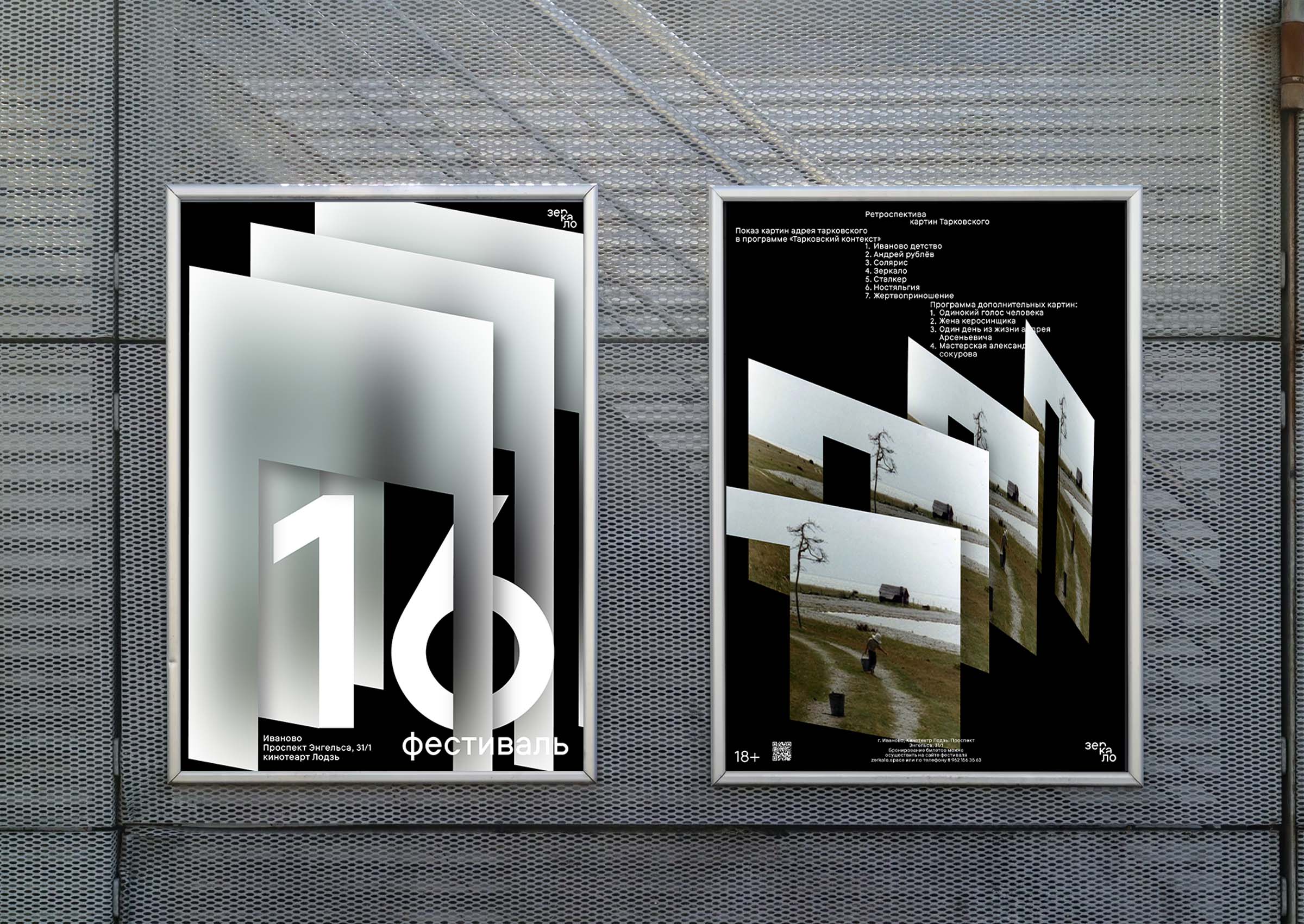
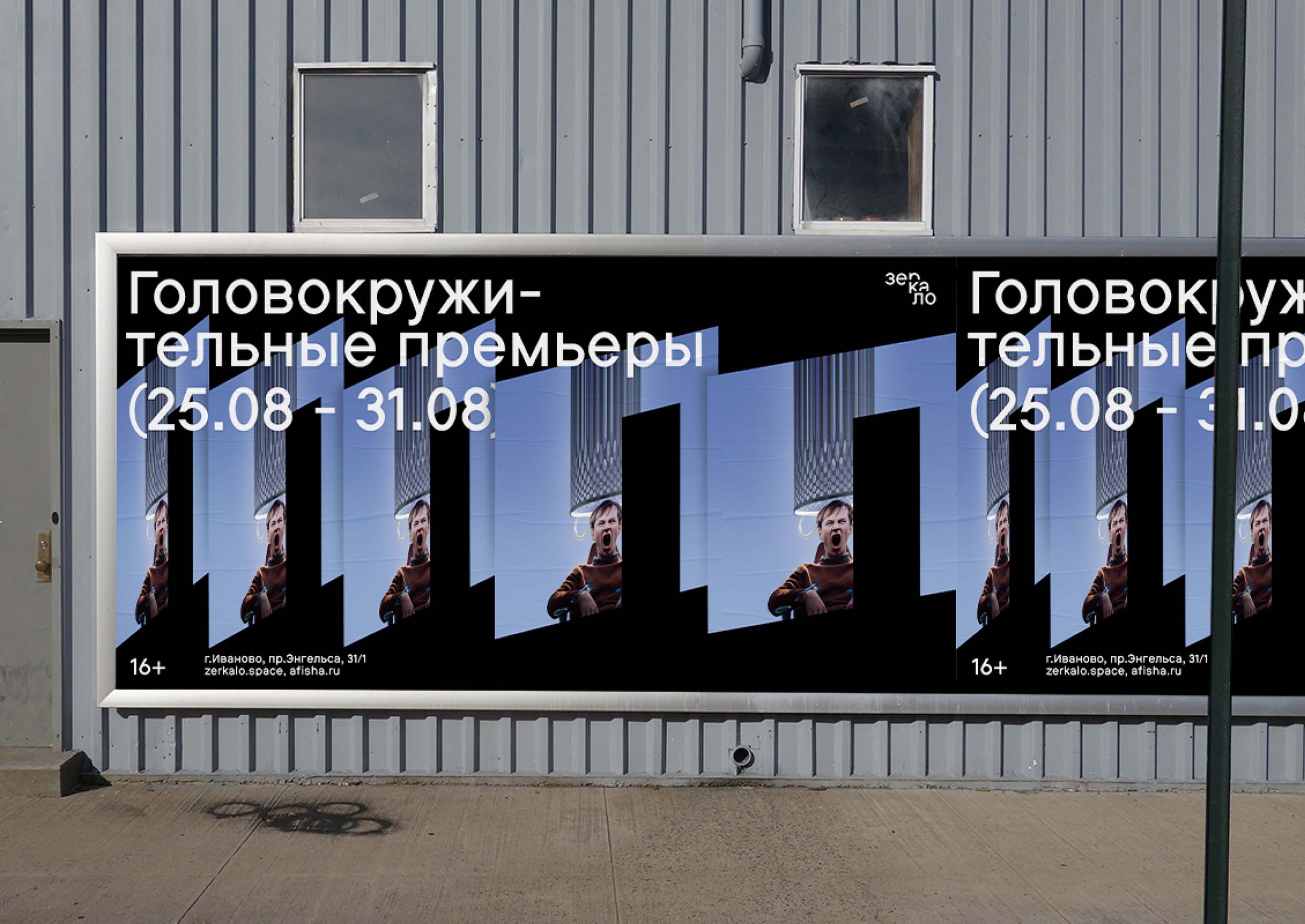
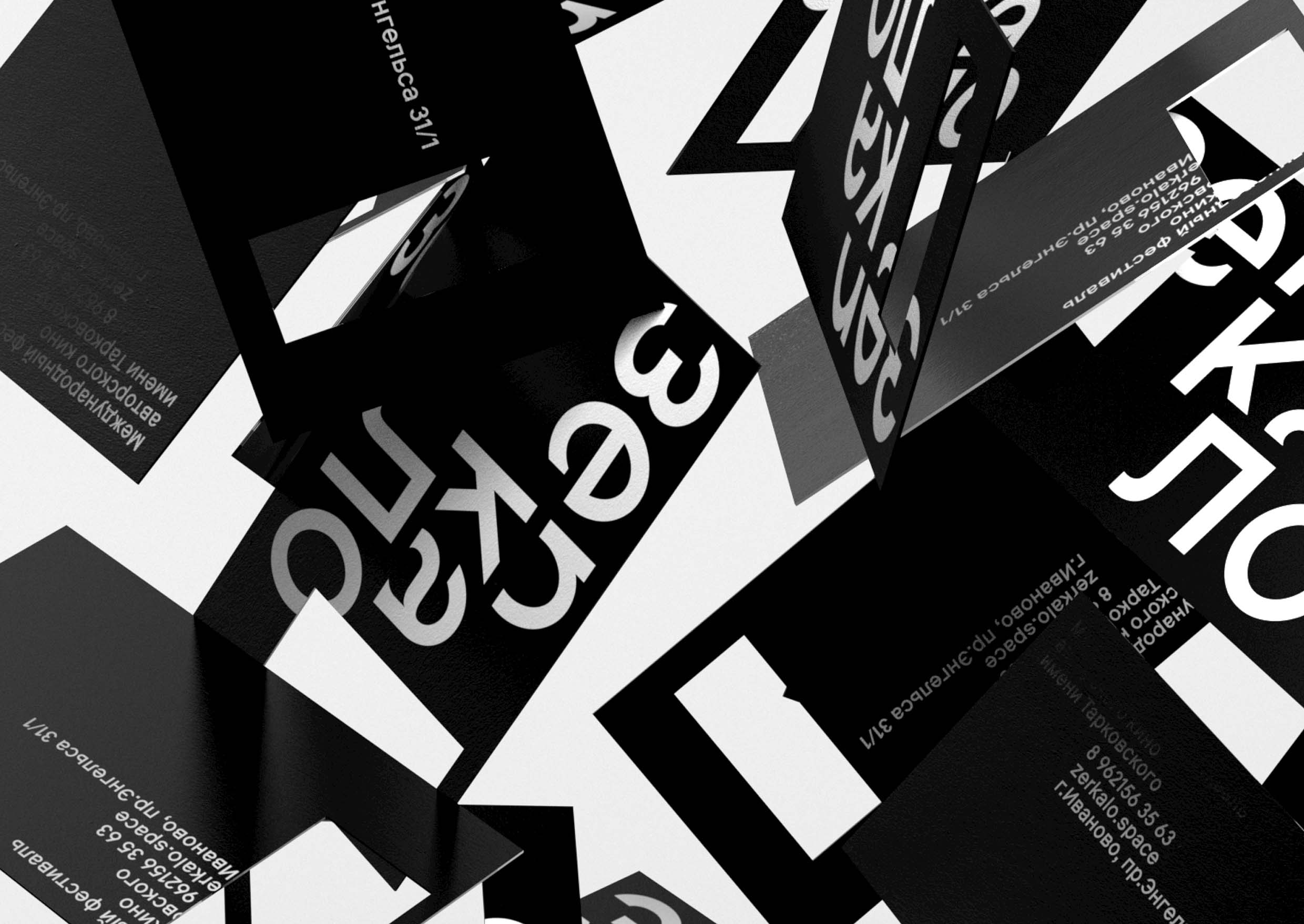
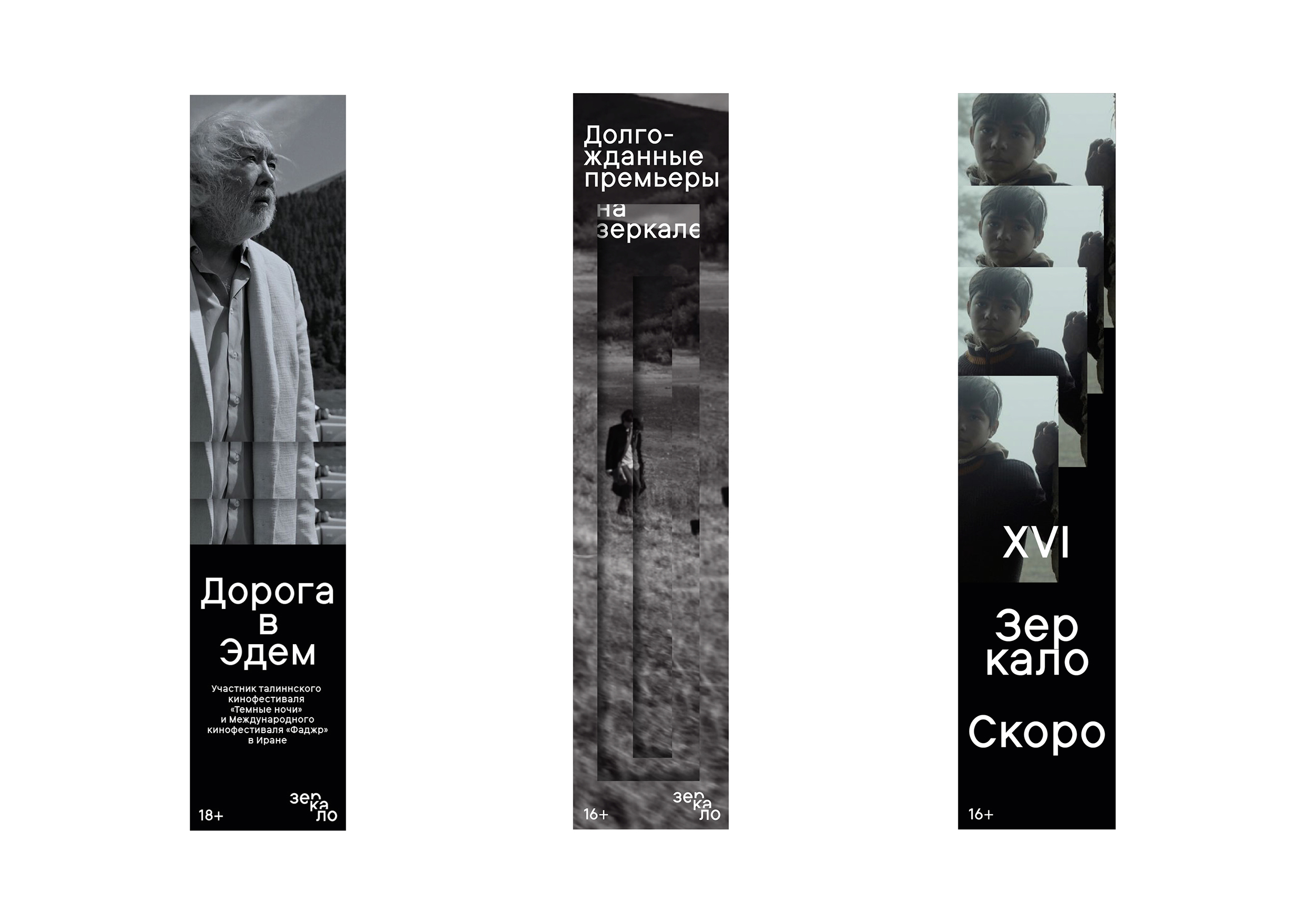
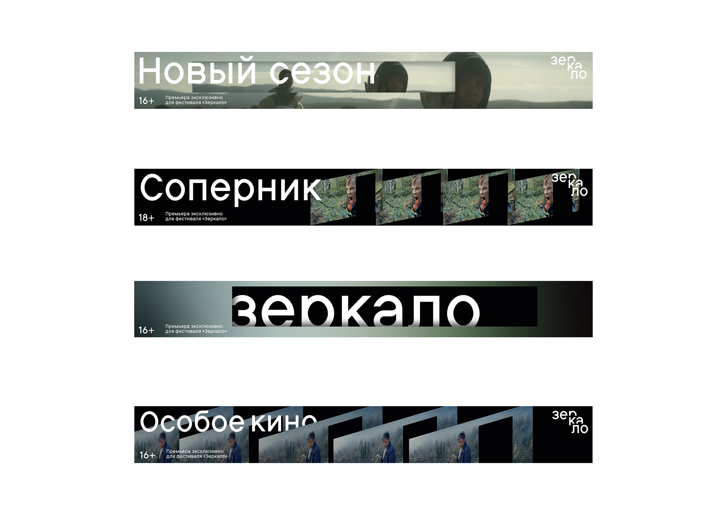
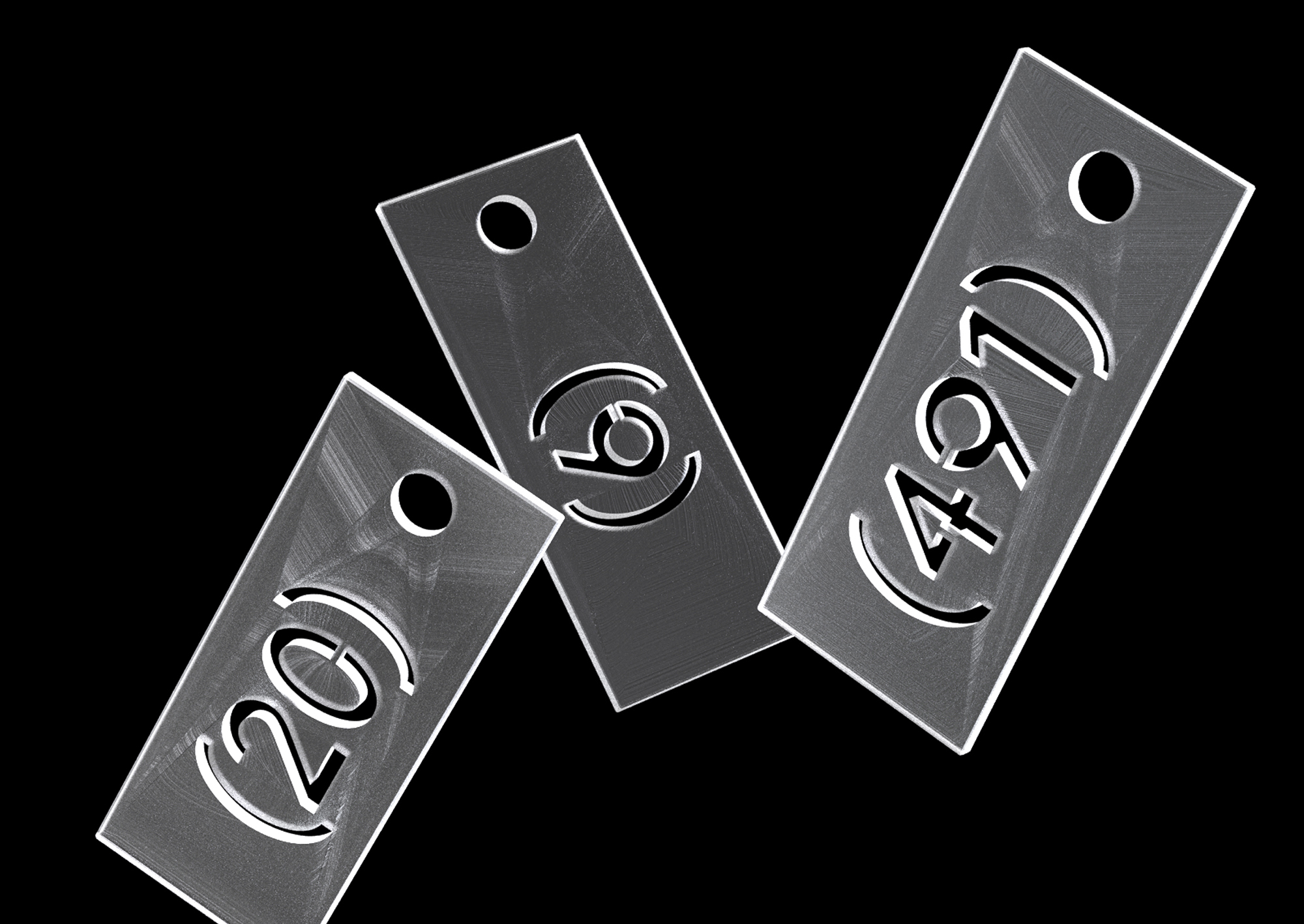
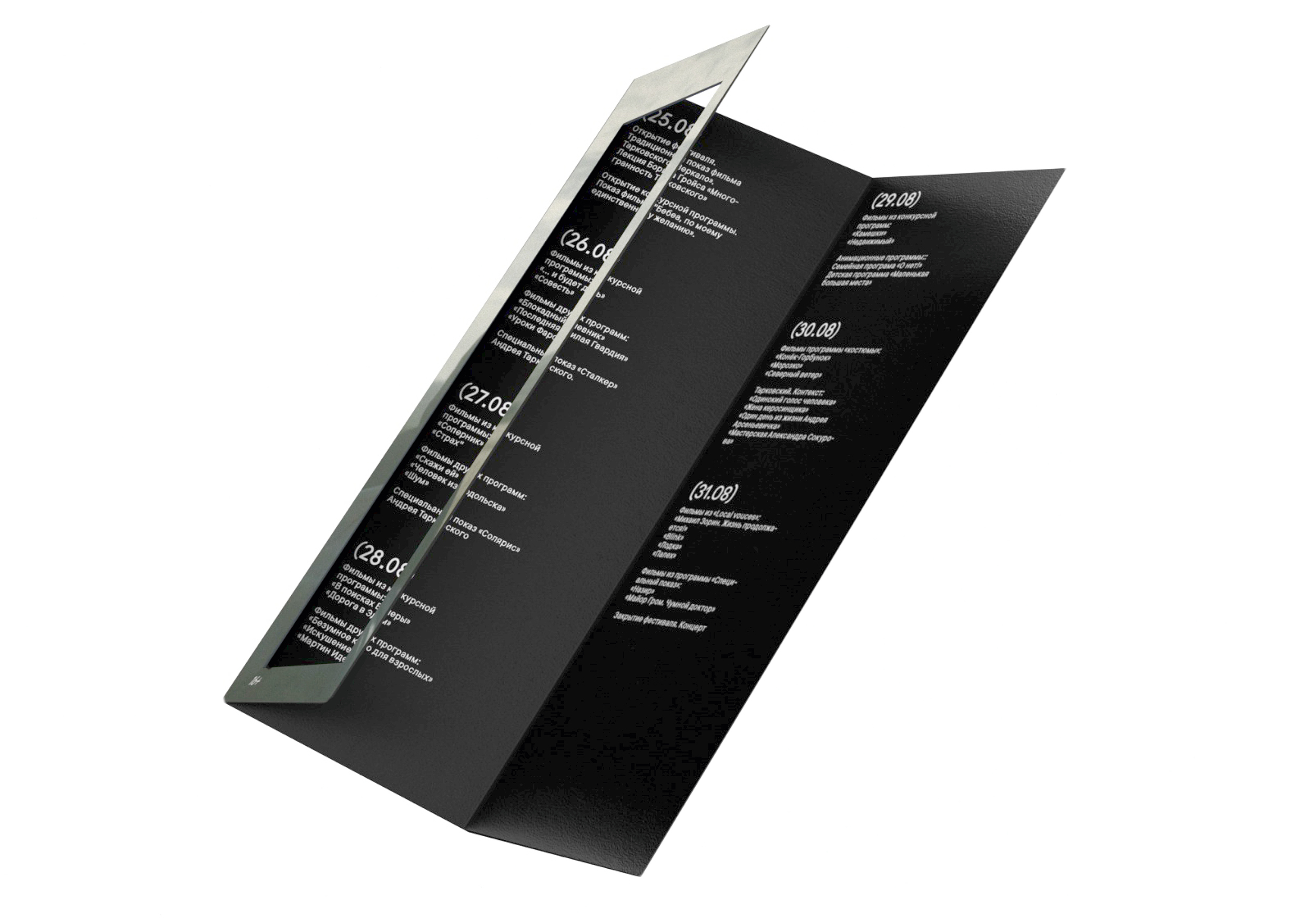
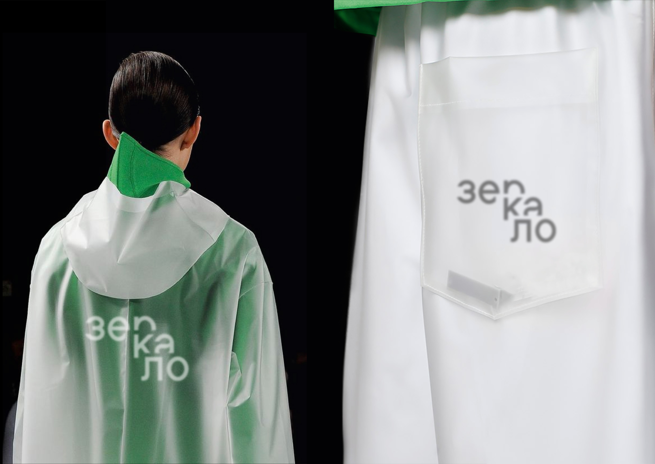
I have created a branding concept for The International Film Festival in honor of Tarkovsky “Zerkalo” (mirror). I tried to build the communication with an idea of doors in Trakovsky’s movies. At the same time I use a physical phenomenon — recursion (when the mirror is reflected in the mirror to infinity) for creating difficult multilevel compositions in 3D area. It translates the idea of the complexity of auteur cinema, which is shown at the festival.
In my branding I try to reflect an idea of the idea of the identity of the audience. This is young people who prefer modern art. They are tired of massive films as Trasformers, Marvel, classic trillers and scary movies. They want to know something new in the world of art cinema. This is a very narrow, special area. And it needs a special festival as The International Film Festival in honor of Tarkovsky. It broadcasts to young people the values that famous soviet producer Andrei Tarkovsky laid down in the cinema of the 20th century in his own films like “Mirror” or “Stalker” and so on.
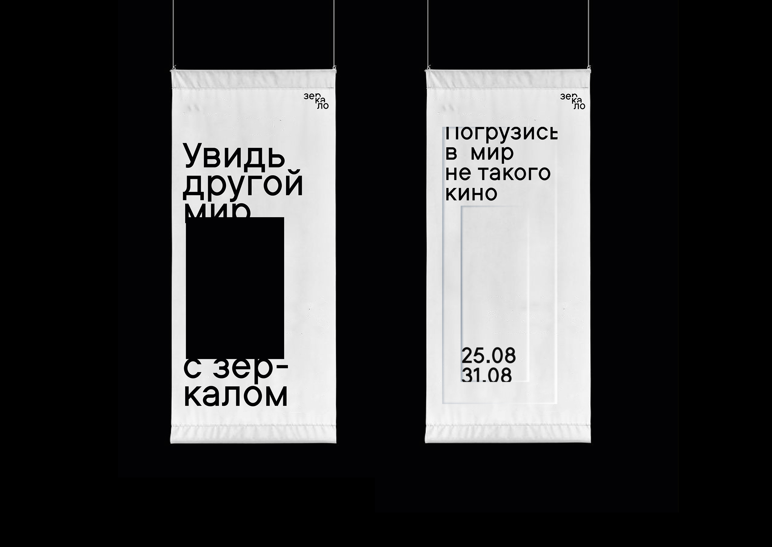
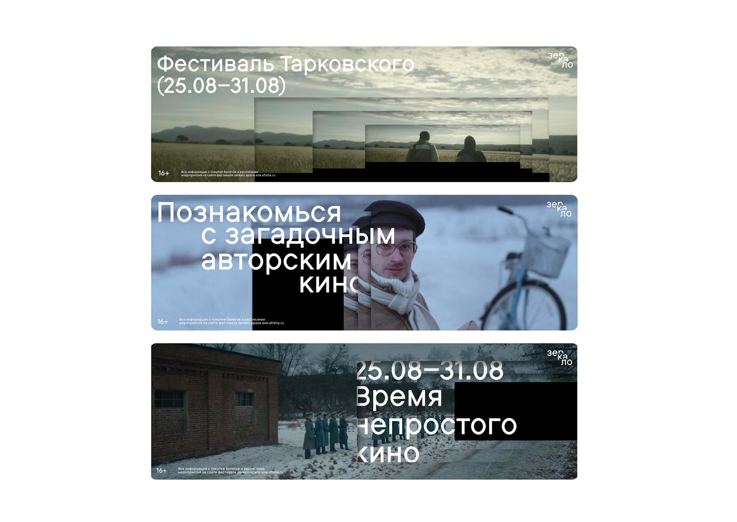
It is important to add, that in my concept I use black color as a general color. It is clear that everyone watch films in the dark room. Moreover, this color helps not to conflict with photos. I choose Bitum typeface for my project. It is strict, tight, restrained. There is a nice contrast with the graphics of frames from films. I rotate the 3D planes in the Maxon Cinema 4D program and control the level of complexity of the layout by moving in space.
CREDIT
- Agency/Creative: Tatyana Lebedeva
- Article Title: Student Brand Design Concept for Film Festival “Zerkalo”
- Organisation/Entity: Student
- Project Type: Identity
- Project Status: Published
- Agency/Creative Country: Russia
- Agency/Creative City: Moscow
- Market Region: Global
- Project Deliverables: 2D Design, 3D Design, 3D Motion
- Industry: Entertainment
- Keywords: film Tarkovsky festival cinema mirror recursion
-
Credits:
Student: Tatyana Lebedeva
Tutor: Evgeny Kashirin


